
Battle Over Renderings of Greenpoint Landing
Anyone who spends any time looking at architectural renderings knows that the built reality may fail to meet expectations. All renderings are political, tools to advance an agenda and a vision, said a story in the New York Times yesterday, taking as its starting point two vastly different renderings that have surfaced of the controversial…

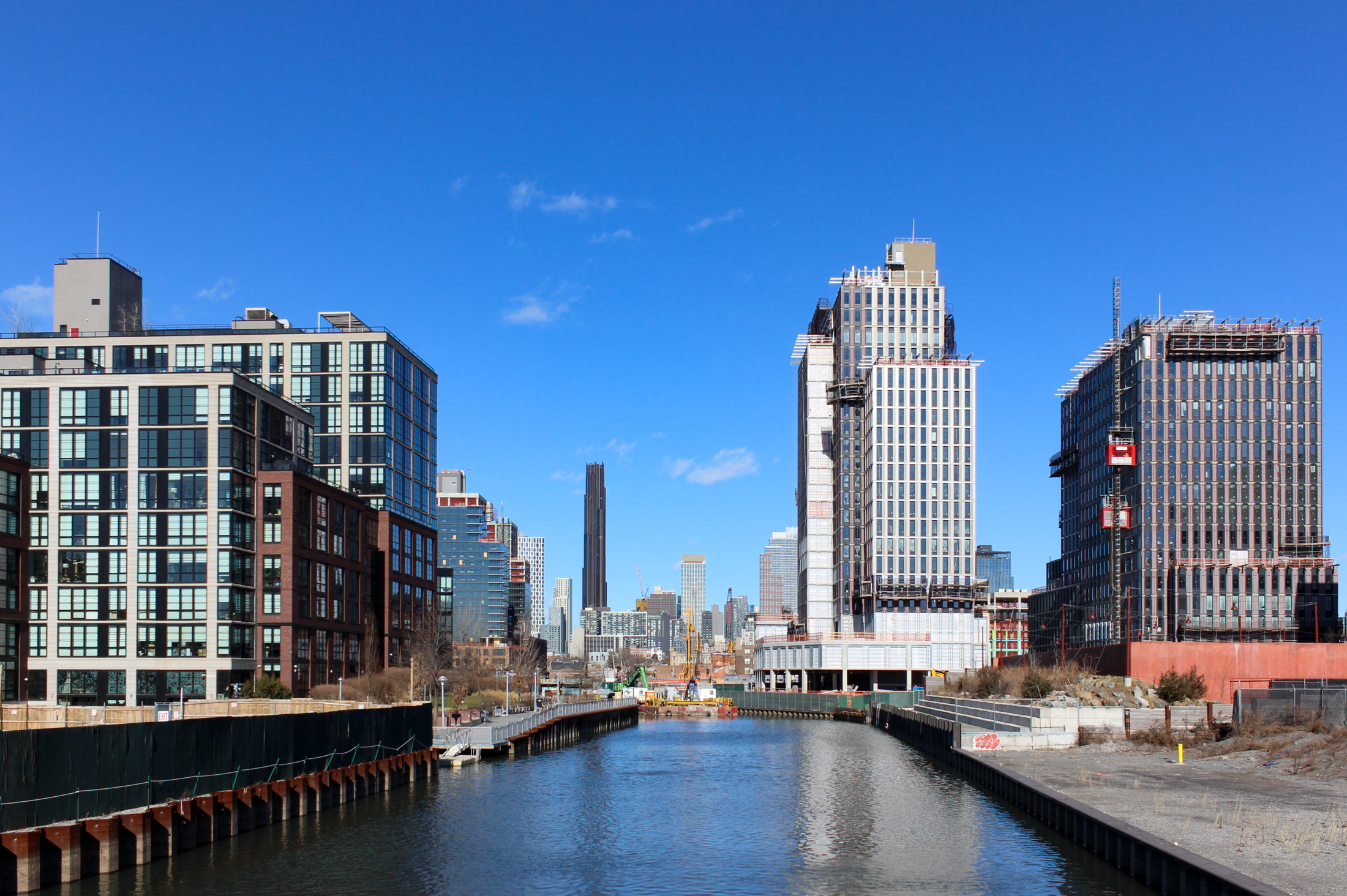
Anyone who spends any time looking at architectural renderings knows that the built reality may fail to meet expectations. All renderings are political, tools to advance an agenda and a vision, said a story in the New York Times yesterday, taking as its starting point two vastly different renderings that have surfaced of the controversial Greenpoint Landing — one from the developers and one from an opposition group. The developer’s version shows glassy blue towers and lots of river; the other brick buildings in what one commenter described as a “putrid” pink color obscuring the river and dwarfing Manhattan. While we don’t deny the power of a rendering to mislead, not mentioned in the story is that the design for the buildings has changed and the renderings reflect that. Or, in the words of a Greenpoint Landing executive quoted in the story, the new design is meant to “blend in” with existing buildings in Greenpoint, and therefore uses brick and casement windows. Click through to the jump to compare the opposition group’s depiction with a developer’s rendering of the new design. Perhaps the new brick design isn’t working and should be jettisoned? What do you think?
Idealized or Caricature, Architectural Renderings Are Weapons in Real Estate [NY Times]
Renderings Via Curbed


Gotta love the NIMBY version where the Empire State Building can barely be seen(if at all). Will they have us believe that Gpt Landing towers are taller than the ESB? LULZ