A New House That References the Past in Windsor Terrace
A somewhat mysterious party wall in a Windsor Terrace house ended up taking a renovation in some surprising new directions. Tax records pegged the house as late 19th century, but clues hinted that it might date from the mid-19th century or even earlier. A peaked roofline in the front of the house just barely visible behind…
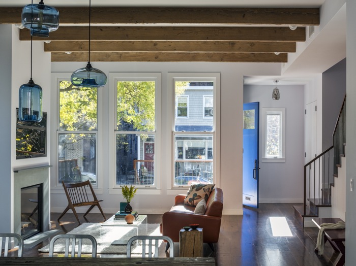

A somewhat mysterious party wall in a Windsor Terrace house ended up taking a renovation in some surprising new directions.
Tax records pegged the house as late 19th century, but clues hinted that it might date from the mid-19th century or even earlier. A peaked roofline in the front of the house just barely visible behind a porch addition looked Italianate-Gothic, as did a dilapidated hayloft behind the house. The house was 25 feet wide and attached on one side, but it had originally been a freestanding house.
The whole thing was a “conglomeration of really ugly boxes,” said architect Alexandra Barker. “It had a double decker front porch, it had been a pitched roof house, and there was a giant two story box on the back.”
The clients, a couple with three children, didn’t give Barker a lot of directives, but were open to something modern. Their main requirements were four bedrooms upstairs and space for entertaining, since they are very social and often host neighborhood gatherings.
As the renovation progressed, however, it became clear that a whole new building was needed. The party wall was unstable and not fireproofed. The wall hadn’t been built to support two buildings, and the neighboring house had been attached like an addition. They also decided to open up the first floor and the basement and raise the ceiling heights, which meant replacing all the floor joists. And last, they initially thought they would save the walls, but they needed to move all the windows. They flipped the staircase to the party wall to maximize light along the unattached side of the building.
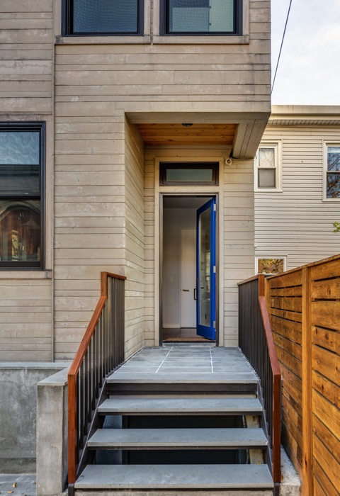
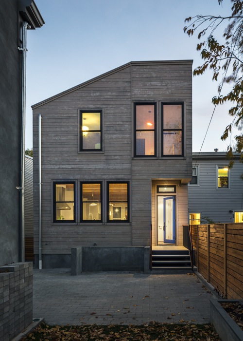
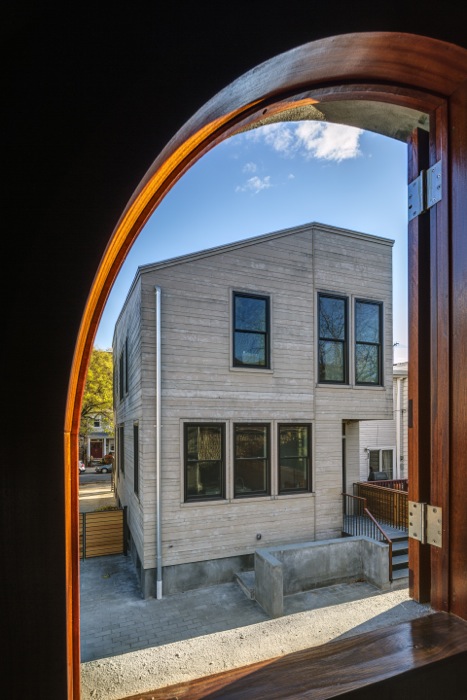
The old building was demolished to the foundation, rebuilt and expanded. The new house is a modern structure with reclaimed elements designed to take maximum advantage of light and views. The old house was a wood frame, and the new one is clad in cedar. Barker was conscious of keeping the new structure in proportion so it didn’t look “too square and stout.” The front entry faces sideways to take advantage of a view.
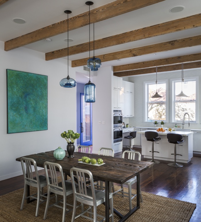
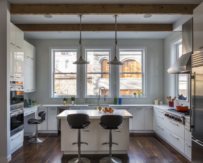
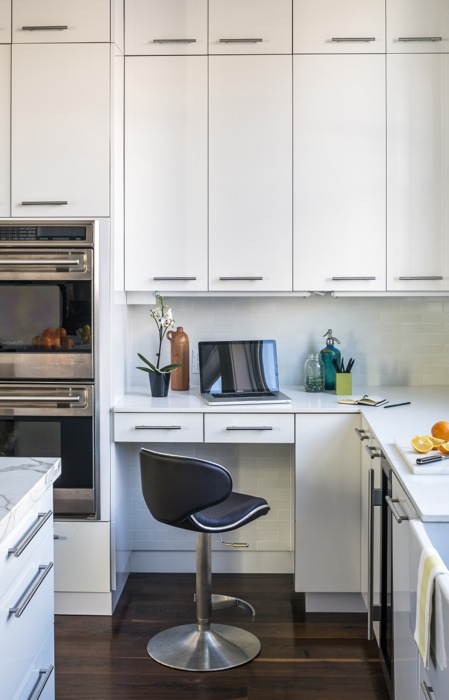
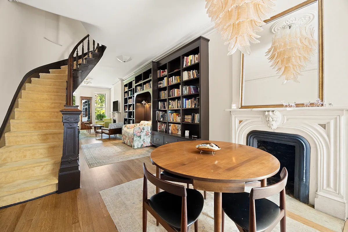
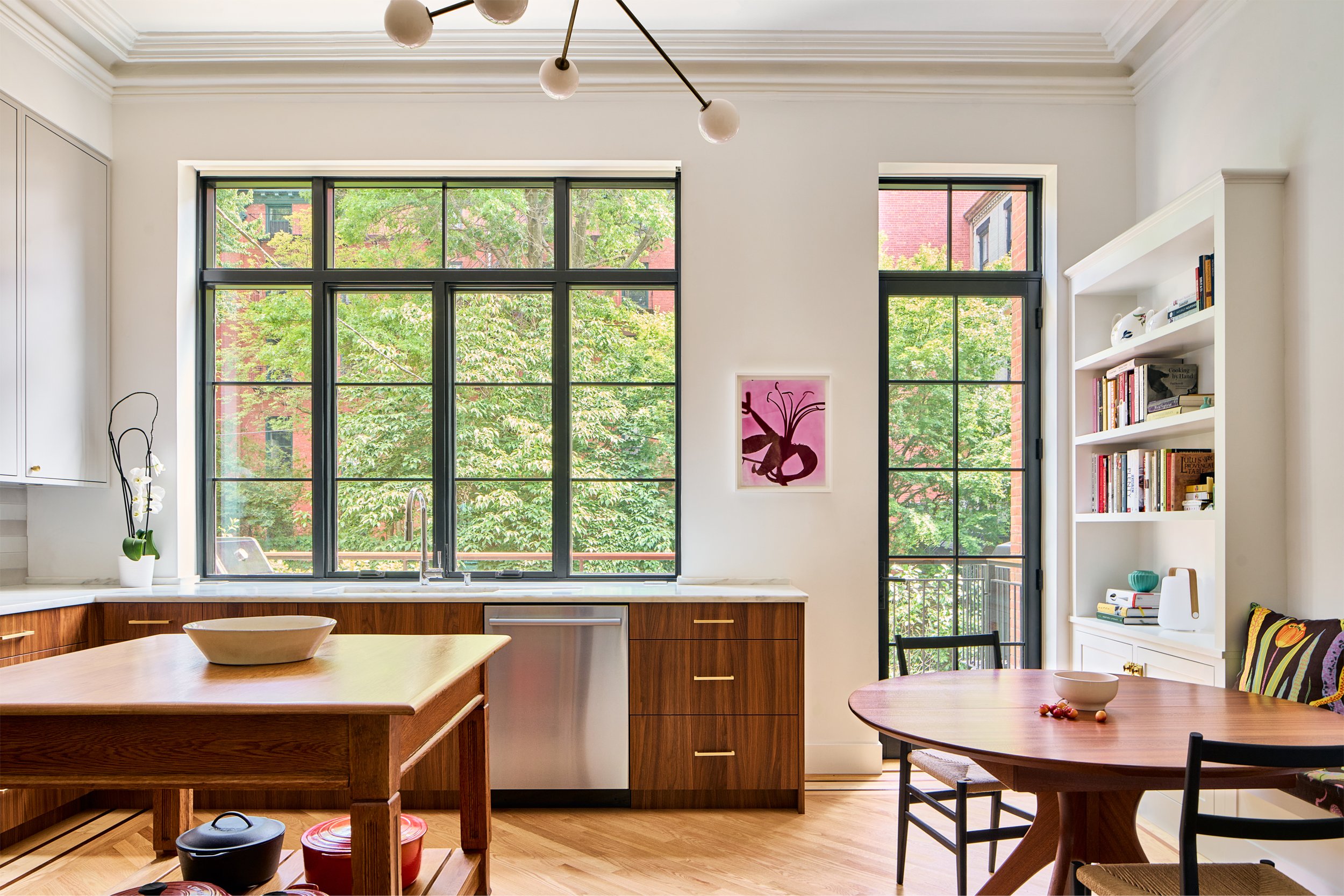
The open plan living-dining-kitchen space includes a mix of minimal modern detailing with traditional elements, including reclaimed wood beamed ceilings, walnut floors, large double-hung windows, and a gas fireplace with a stone mantel. The walnut staircase has a stainless steel balustrade.
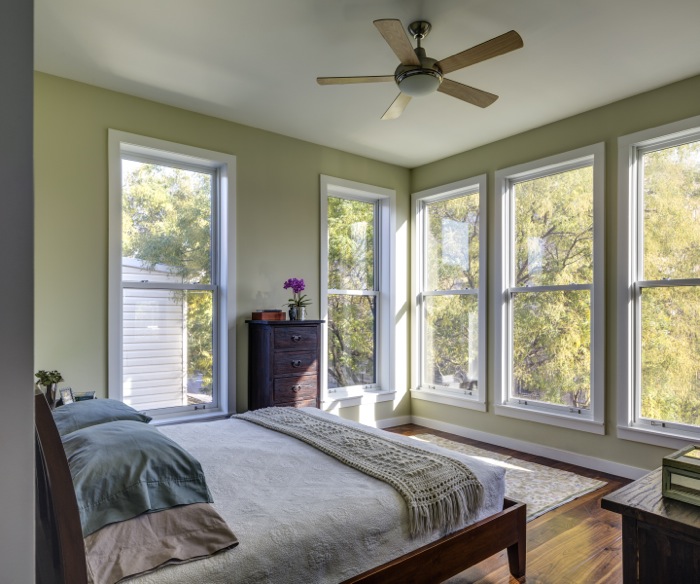
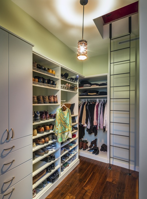
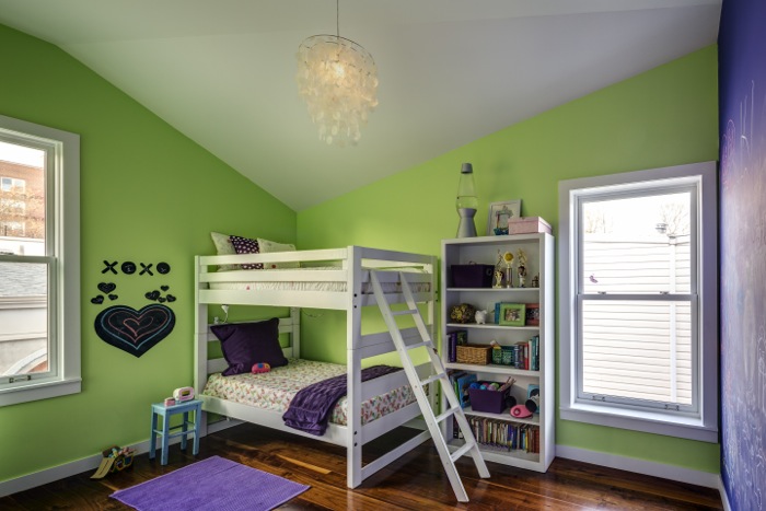
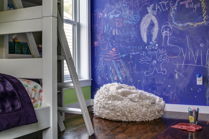
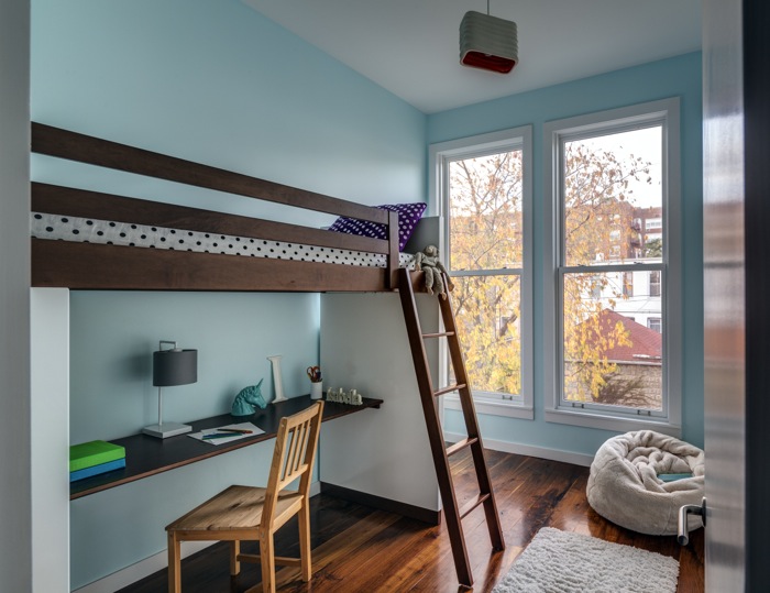
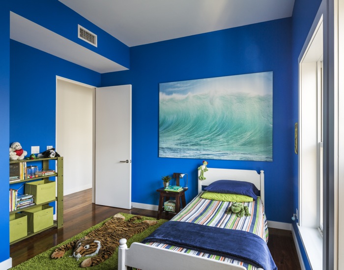
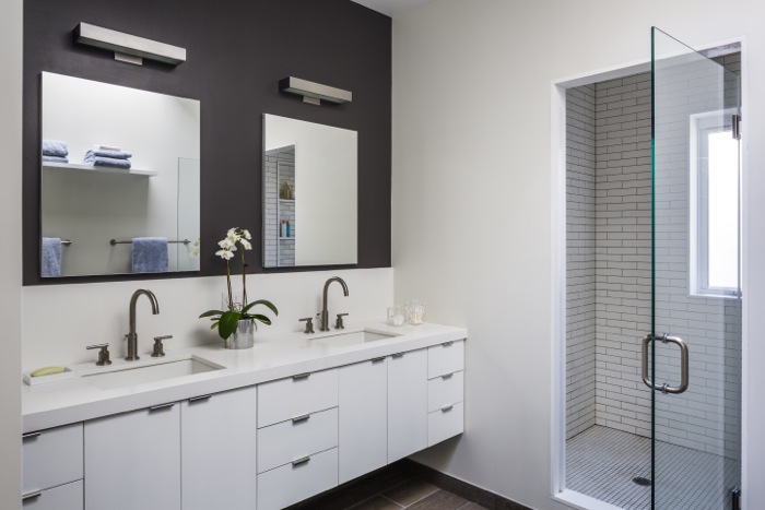
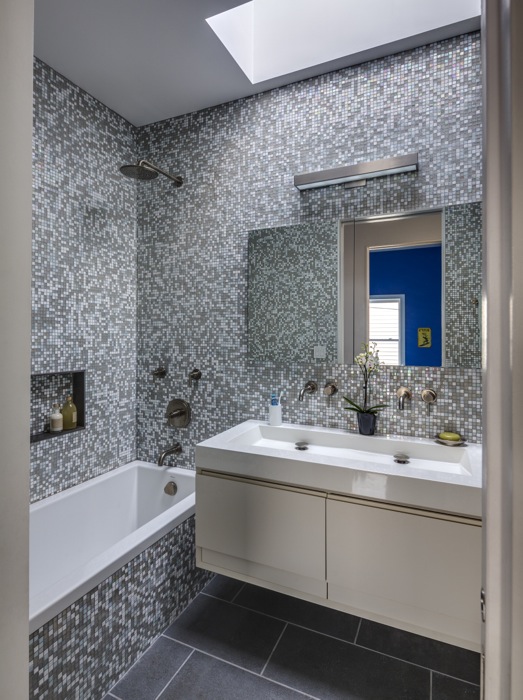
The second floor is divided into parents’ and children’s wings by a pocket door. The front master suite has a skylit bath with a windowed shower room and a windowed walk-in closet. Each child’s room has a unique shape and character, owing to the varying roofline in the rear of the house, designed to bring maximum light into the ground floor. The couple let the children choose the paint color for their rooms. There is also a laundry room on the bedroom floor.
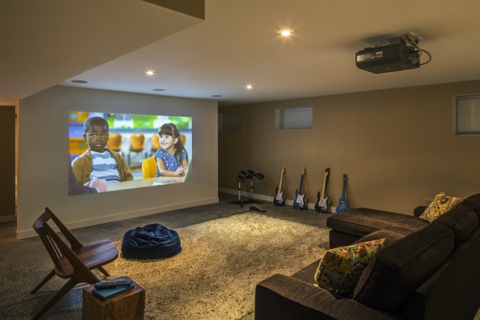
In the finished basement, there is a media room with a projector wall, play space and storage.
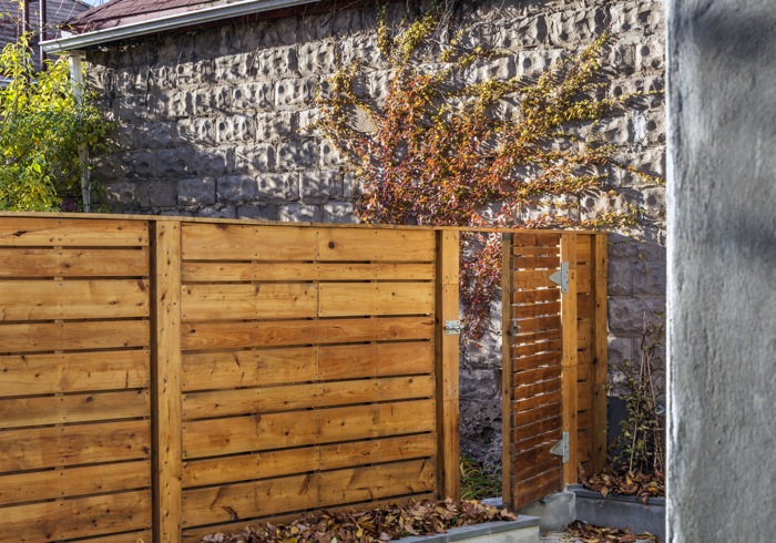
A garage was demolished to enlarge the backyard. A mudroom connects the house to the backyard, where there is enough space to grow vegetables, barbecue and entertain. A new gate leads to the backyard next door, which belongs to friends.
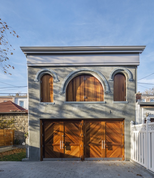
One of the biggest challenges was the hayloft because the DOB doesn’t recognize haylofts as a category of buildings. “It looked like a garage, but it had a second floor, and that started raising flags,” said Barker. They couldn’t run plumbing out there because it wasn’t a residential building. But they wanted to save it because it was unique. So they did minimal work on it, “mostly cosmetic work to clean it up and make it stable,” said Barker. It was reclad with stucco and given a new door and window panels.
The contractor was CK Construction of Hicksville, N.Y. Construction started in fall 2011 and the clients moved in in November the following year.
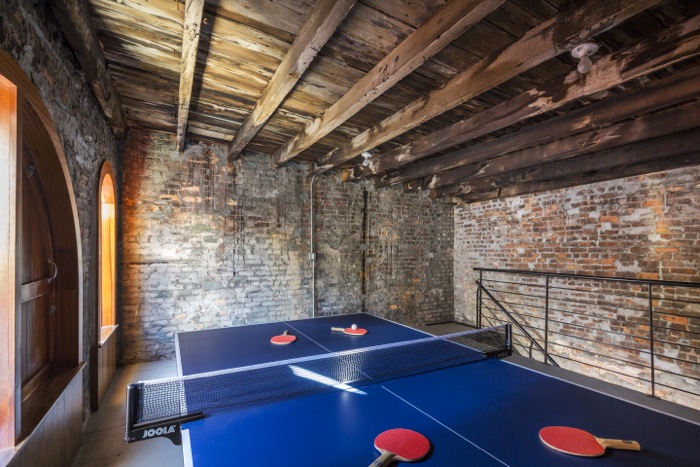
Now the garden is thriving, and they love to throw open the garden gate and invite the neighbors over for backyard barbecues and ping pong in the hayloft.
Photos by Francis Dzikowski
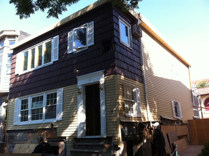
The house as it looked before.
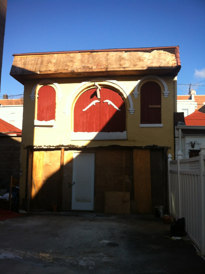
The hayloft before.
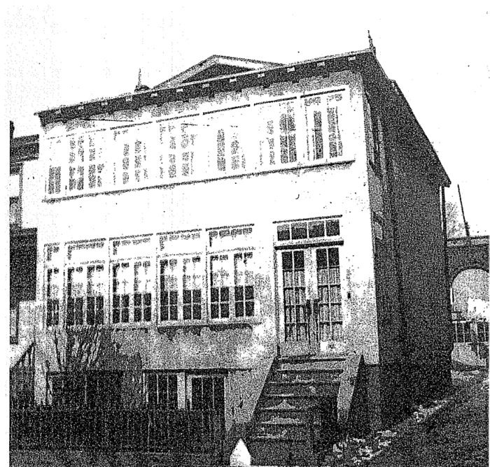
The house as it looked in the 1930s tax photo, with what appears to be a teens or 1920s front addition or enclosure of an earlier porch. An older peaked roofline is just visible behind the addition.
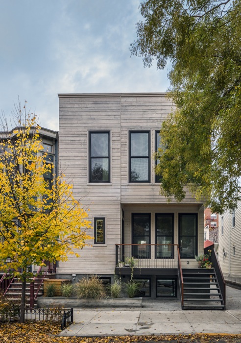
The new house is clad in cedar.
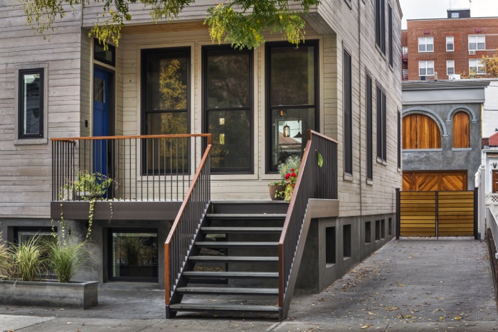
The front entrance faces sideways to take advantage of a view.
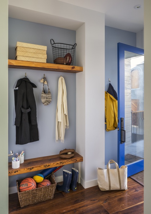
The mudroom at the rear of the house.
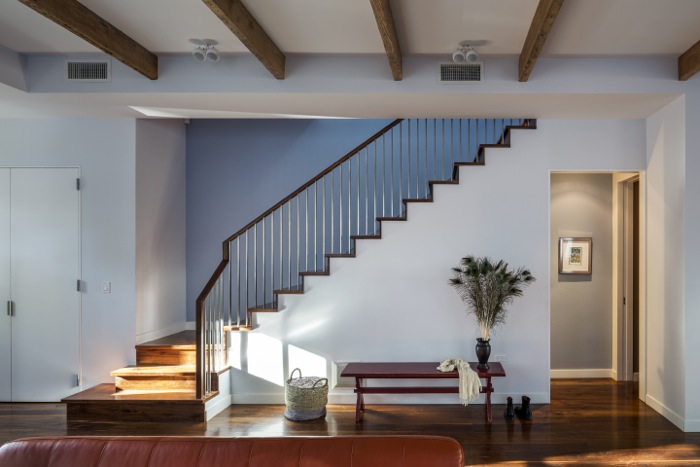



U-G-L-Y. You ain’t got no alibi! You ugly!
great job. any idea what total cost for project was?
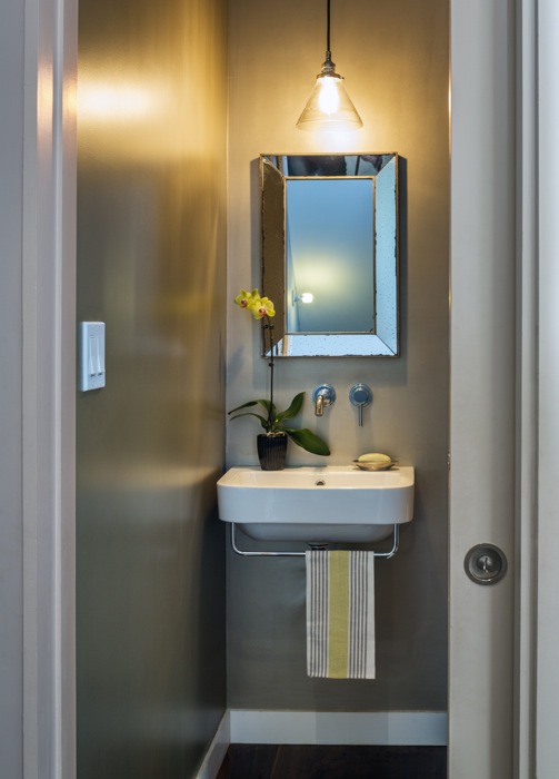
I’m really liking some of the finishes in the interior, the first bath featured looks very well done, nice flow, fit etc. The media room is awesome of course the carriage house outback is such a great bonus. However, I really don’t like the exterior of the home. I don’t know if it is the lighting, or if the texture does not translate well on photos, it looks like bad stucco to me or just bad color choice. Everything else I can applaud.
Love love love it.
This place rocks!