This Passive-House Boerum Hill Condo Building Looks Like It's Dipped in Gold
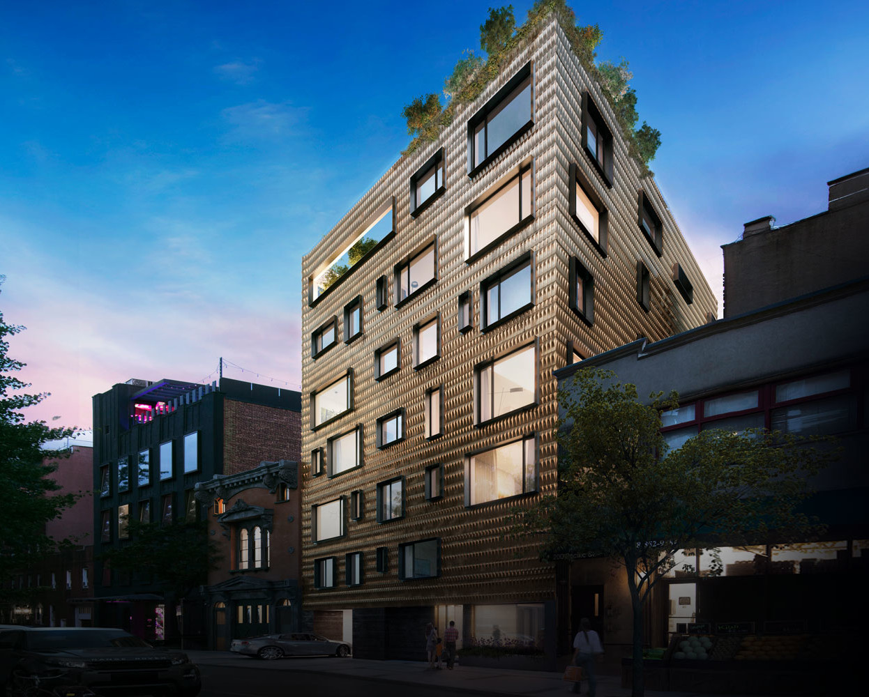
Construction is nearing the home stretch at 210 Pacific Street — a gleaming brass-tiled 10-unit condo building between Court Street and Boerum Place that looks like it’s been dipped in gold. Brownstoner popped by the nearly finished structure to check out its lustrous facade. Covered with more than 13,000 custom brass tiles, the building’s exterior is nothing if…

Construction is nearing the home stretch at 210 Pacific Street — a gleaming brass-tiled 10-unit condo building between Court Street and Boerum Place that looks like it’s been dipped in gold. Brownstoner popped by the nearly finished structure to check out its lustrous facade.

Covered with more than 13,000 custom brass tiles, the building’s exterior is nothing if not unique. Each tile is faceted and appears to be made of solid brass. Do you like the look of it? It’s certainly a bold design choice.

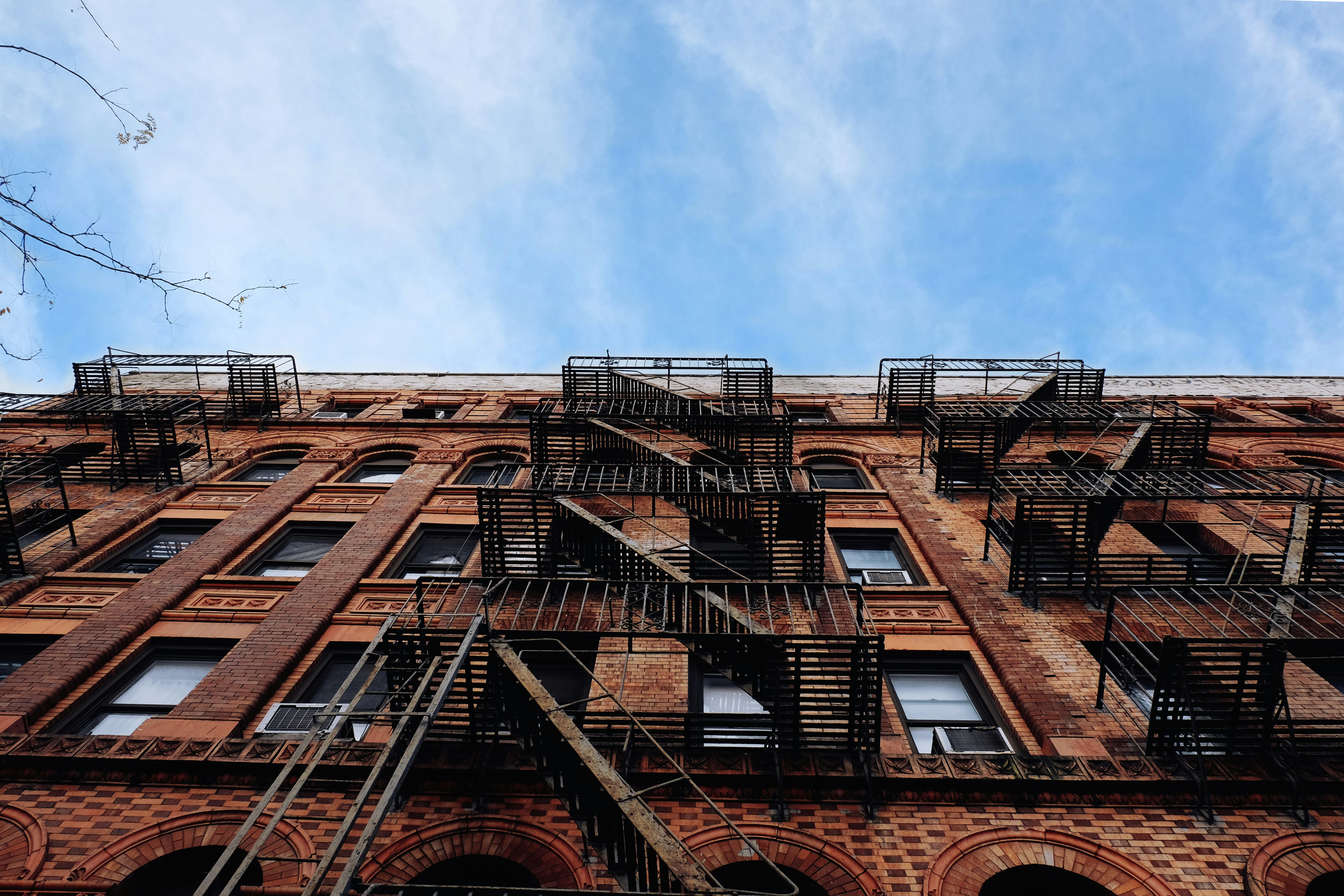
Dimensional tile is a recent interior design trend. It’s all over 19th-century Brooklyn buildings as well, in the form of terra-cotta tiles.
Designed by SBLM Architects, the seven-story, 21,274-square-foot building also uses Passive House techniques for a more energy-efficient living space — including solar-heated hot water. SBLM is known for its LEED-certified designs. The firm also designed the nearby Atlantic Galleria, though that building doesn’t appear to have the same energy efficiency.
The developer of 210 Pacific Street is NAVA Companies — developers of Jersey City’s Canco Lofts. NAVA bought this sizable Boerum Hill lot for $2.8 million in 2012.
Related Stories
Construction Heats Up at 210 Pacific Street
210 Pacific Street Lot Picked Up By Developer
Take a Sneak Peek at the Luxe, Terraced Apartments Rising on Pacific in Boerum Hill
Email tips@brownstoner.com with further comments, questions or tips. Follow Brownstoner on Twitter and Instagram, and like us on Facebook.
[sc:daily-email-signup ]


I think the tiles are beautiful, but its not the most important feature. Curious to hear more about it Passive House features. This is the front lines on sustainable architecture.
Like this, in the photo, at least. Sort of has a deco texture along with a sophisticated European vibe. Love the bling in the middle of relative drabness and the way the warm,, dimensional brass plays against the hideous silver/gray-glass-and-aluminun-skin look that’s ubiquitous now..
It’s even more sparkly in person. I’m not a fan.
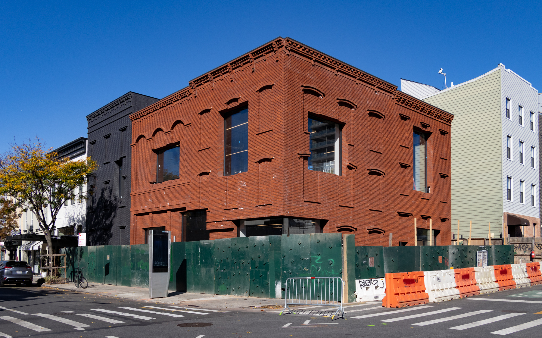
i think it looks pretty sharp and i like how it undermines the historic character that the building to the left tries to impose on the block.
why does everyone have this hard on for old buildings? why must we live in the past?
I never said I didn’t like new buildings. I have no issue with many new buildings. I even like this one, which I didn’t think I would, based on the renderings. I do not, however, like the facade. It’s ugly. And you are reading way too far in to what I said.
i never even read your comment
Typical.
your pop culture references stopped evolving in 1964?
when will you develop a more pleasing patina?