Brooklyn Design Trend: Buildings With Geometric, Tetris-Like Facades
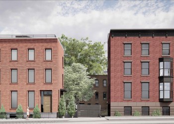
It’s raining Tetris buildings in Brooklyn! We spied another Tetris like facade going up on yet another Bushwick building at 1138 Bushwick Avenue, pictured above. The frame building was undergoing a renovation after it and its neighbors to the right and left caught fire last year. It caught fire again last week, but the facade escaped serious…
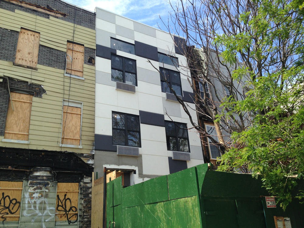
It’s raining Tetris buildings in Brooklyn!
We spied another Tetris like facade going up on yet another Bushwick building at 1138 Bushwick Avenue, pictured above. The frame building was undergoing a renovation after it and its neighbors to the right and left caught fire last year. It caught fire again last week, but the facade escaped serious damage, as we detailed in this post.
By our count, this is one of at least five buildings in Brooklyn whose geometric facades bring to mind the 1980s computer game. Most are variations on geometric patterns.
As far as we can tell, only the brightly colored mural on the facade of 1091 Madison Street, pictured after the jump, appears to be an intentional reference to the game. See and read more below.
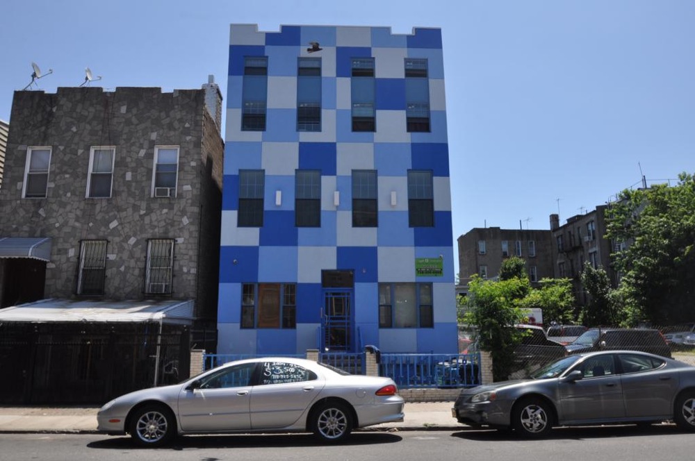
Photo by Christopher Bride PropertyShark
Above, the Ocean Blue Residence at 64 Palmetto Street has a blue and white checkerboard pattern facade. It started renting in 2010, as we wrote at the time.
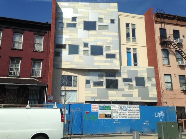
This building at 474 Grand Avenue in Clinton Hill started leasing in March, as we reported then. It was in the works for a long time — about a decade. You can read our extensive coverage over the years of the site here.
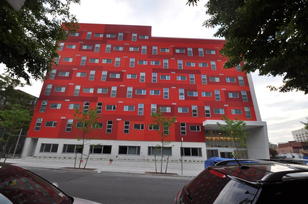
Photo by Christopher Bride for PropertyShark
Even the windows get into the Tetris act on this brightly colored facade at 40 Vanderbilt Avenue in Clinton Hill. It is part of the affordable housing complex called Navy Greene.
The building, which launched in 2011, offers supportive housing for 98 single adults. It was designed by Architecture in Formation and won the Pratt Area Community Council Community Service Award for architectural innovation for special needs.
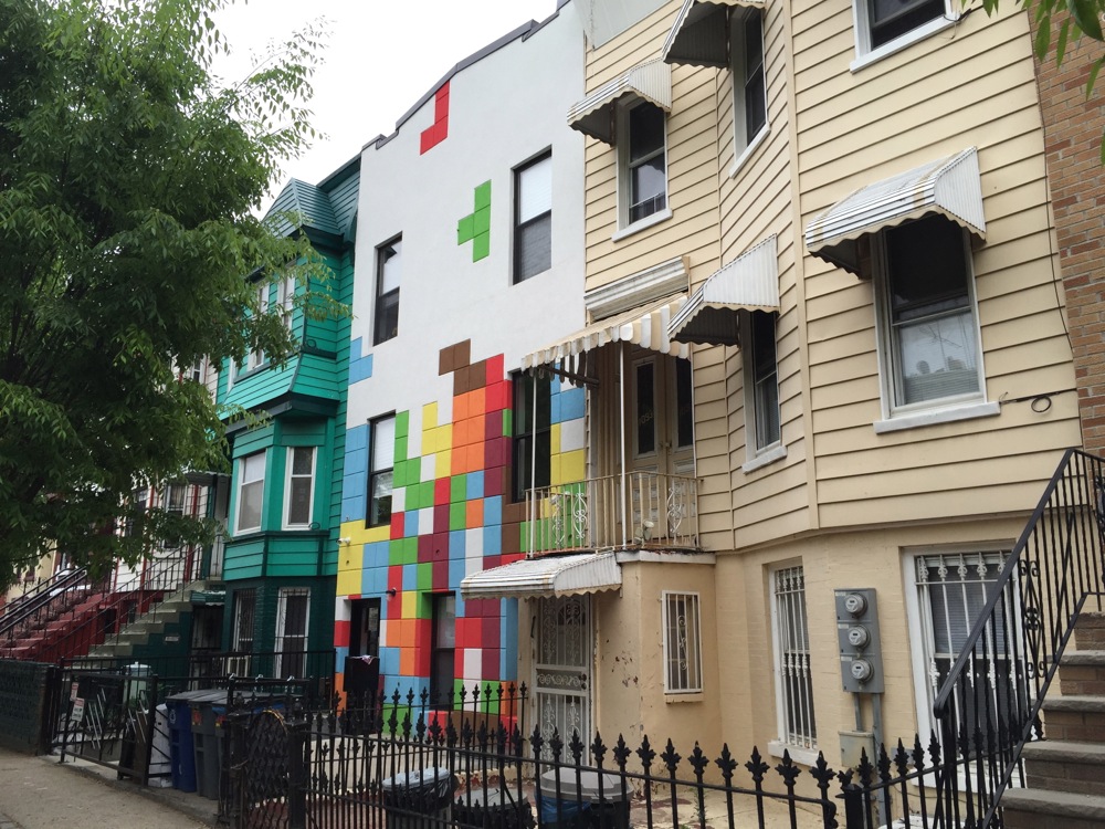
Photo by Steve Sherman
The mural on the facade at 1901 Madison Street in Bushwick looks just like the game of Tetris. Previously the house had white vinyl siding, until the renovation started early this year. You can read more about the renovation here.


Horrific. Maybe it counts as a trend, but I don’t think it counts as architecture.
Ugly. Undeniably ugly.
We can argue forever over whether or not it represents a trend. It will still be ugly.
But unlike a paint job, an area rug, or a drunken clothing purchase, it cannot easily be undone.
The trend is to make Brooklyn look as tacky possible with these new buildings. Not cool.
These designs are getting a lot of criticism.
I guess people prefer the shingle/vinyl/ugly siding from the middle of the last decade. How’s yellow vinyl siding that reminds you of a scene from All In the Family? I’ll take a Tetris siding.
This isn’t a 1970s game show, asked which one you would choose. There are myriad styles for building facades, many old tried and true, and some new, innovative designs by new architects. This is not one of them. This is designed for shock value alone, no desire to make something lasting people want to look at, ponder, enjoy. It’s like dying your hair purple, it’s fine, you want to make a statement about yourself for others to see. But you can grow your hair out, or dye it again before your next job interview.
Not so easy with these facades.
Why are these my only 2 choices?
apparently not a trend, but not an expert 😉
You’re not an expert.
I think it’s a trend.