LPC Rejects Design for New Townhouse on Middagh Street in Brooklyn Heights for Second Time
Commissioners told the architects behind a proposed new townhouse in the Brooklyn Heights Historic District that they need to simplify their design to fit in with such a diverse, varied block.

The second design from December 2020. Rendering by Pratt + Black Architects via NYC Landmarks Preservation Commission
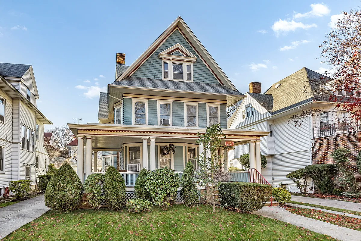
Tuesday morning, commissioners at the Landmarks Preservation Commission told the architects behind a proposed new building on an empty part of the lot belonging to a clapboard house in the Brooklyn Heights Historic District to take another look at their design and come back with something new.
“Simplify, simplify, simplify,” Commissioner Michael Devonshire said as a suggestion.
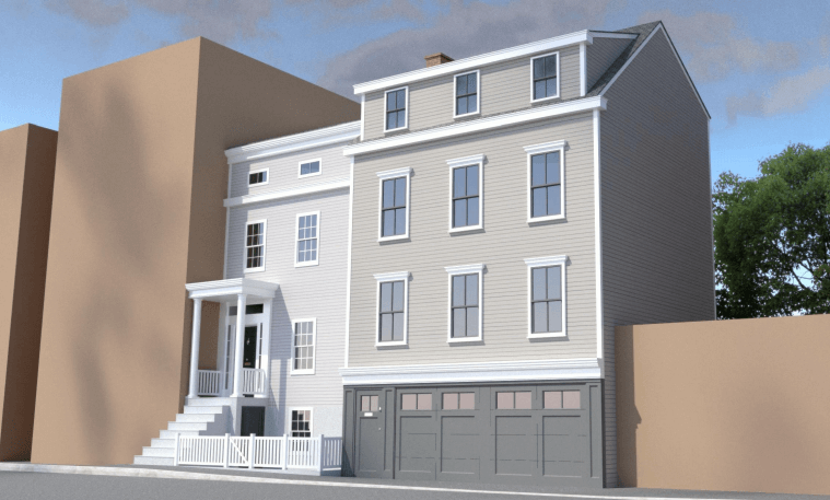
This is the second time that the architects, Elizabeth Pratt and David Black of Pratt + Black Architects, have been in front of the commission with a design for this proposed building, which would take over a side yard at 56 Middagh Street that is currently being used for parking. The first time, in January 2020, they proposed a design that mirrored the property’s 1829 Federal-Greek Revival clapboard house but with a two-car garage on the ground floor. At the time, commissioners felt that the building was too imitative of nearby historic styles and asked them to make some changes.
New designs presented to the commission show a three-story, single-family brick townhouse with setbacks. The garage, part of the original proposal, has been removed. (The one-story garage in the rendering is next door.)
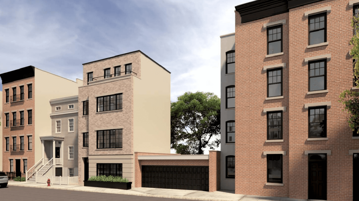
But those changes, as commissioners and the two members of the public who provided testimony noted, still didn’t work. “We are still not enthusiastic” about the design, said Judy Stanton, former executive director of the Brooklyn Heights Association. “In the end, we’re not convinced this reads as a house.”
The architects, who said they had been working closely with the Brooklyn Heights Association for the last 10 months on the design, said they were caught off guard. “We’re a little surprised at some of the comments, which we feel like we’re hearing for the first time,” said Elizabeth Pratt.
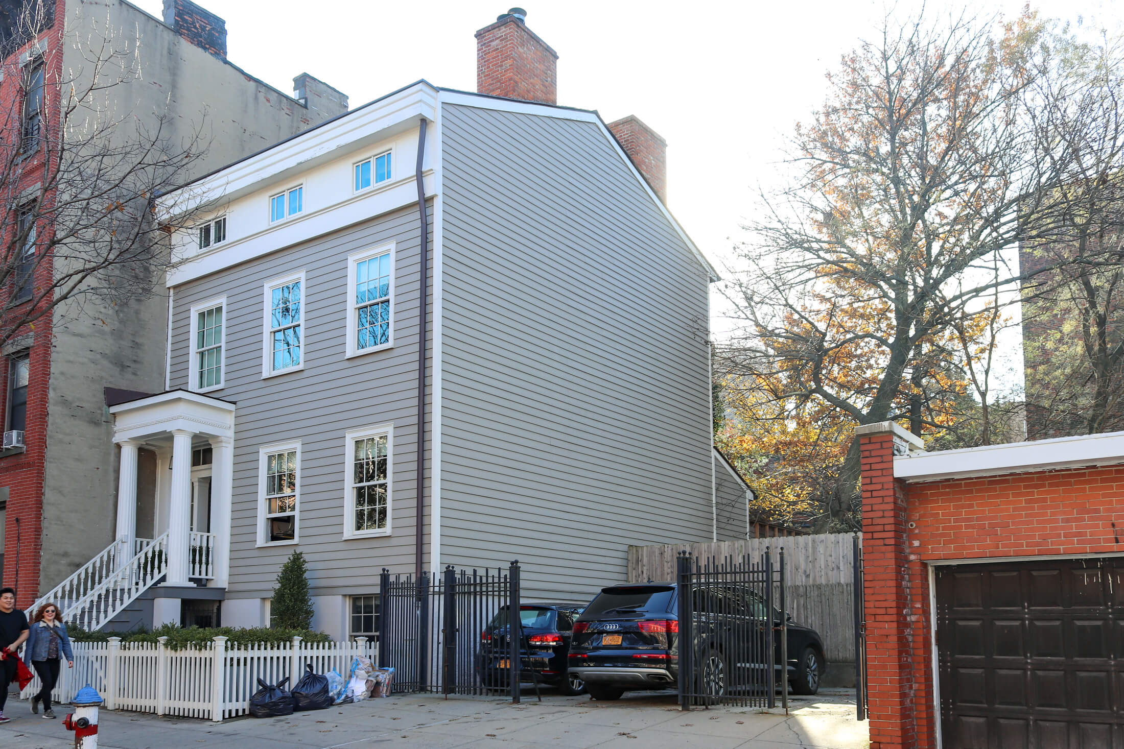
Commissioners were even more explicit in their views about the design. “Moving away from the last scheme, which was an attempt to relate, overly relate, to the existing 1829 house, is the right move,” said Commissioner Fred Bland. But he said the new design was “fussed over too much” and had “too much going on for such a small house.” He suggested that the setbacks, part of the new design, make the building appear “strange” and it might be better to go straight up. “We need to look back at the building as a simple piece of architecture.”
Simple was the key phrase among all the commissioners. Commissioner Michael Goldblum suggested that the architects overthought the new design, especially for this block. “The funny thing about this site is that the street is so diverse, so varied, that really the world’s your oyster,” he said, adding that the design looked like a spec house in Queens.
The architects were, in other words, trying to circle a square: have the design both distinctive and contextual, not imitative but not out of place. “They have tried very hard to make sense of our previous comments,” said Commissioner Adi Shamir-Baron, but the design didn’t get to where it needs to be.
Related Stories
- Residents, Pols Rally for Preservation of Bushwick Avenue Landmarks Ahead of Demolition
- LPC Tells Developers Behind Hebron Development to Come Back With New Designs
- LPC Unanimously Approves Landmarking of Flatbush’s East 25th Street Historic District
Sign up for amNY’s COVID-19 newsletter to stay up to date on the latest coronavirus news throughout New York City. Email tips@brownstoner.com with further comments, questions or tips. Follow Brownstoner on Twitter and Instagram, and like us on Facebook.



What's Your Take? Leave a Comment