From Practical to Ornamental: The History of Dressing Windows
From a practical perspective, window treatments give a home the following: Protection against wind, drafts and cold air in the winter, and strong sunlight and heat in the summer.

A mid-19th century interior, exact location unknown. Drawing by M. Sekim via Cooper Hewitt
Editor’s note: This story is an update of one that ran in 2013. Read the original here.
Those of us who love old houses in all of their different styles and architectural variations are often confronted with what can be difficult choices when furnishing and decorating our homes. Some people feel that a period look is the only acceptable choice, others feel that a modern approach is in line with living in the 21st century, while others take a more eclectic view. From time to time in this column, I’ve given historical perspective on the things in our homes that we talk about and spend a great deal of money on. Bathrooms, kitchens, lighting, floors and ceilings have all been considered here. Today, I’d like to talk about window treatments from an historic perspective. In examining what was original to our homes, we may get a better idea of what we might want to have now.
From a practical perspective, window treatments give a home the following: Protection against wind, drafts and cold air in the winter, and strong sunlight and heat in the summer. Window treatments also offer privacy from outside eyes, keep out crawling and flying insects, and add beauty to the rooms they are in. Now by window treatments, I’m talking about anything in the window box. That includes shutters, shades, blinds, screens, awnings, curtains and drapes.
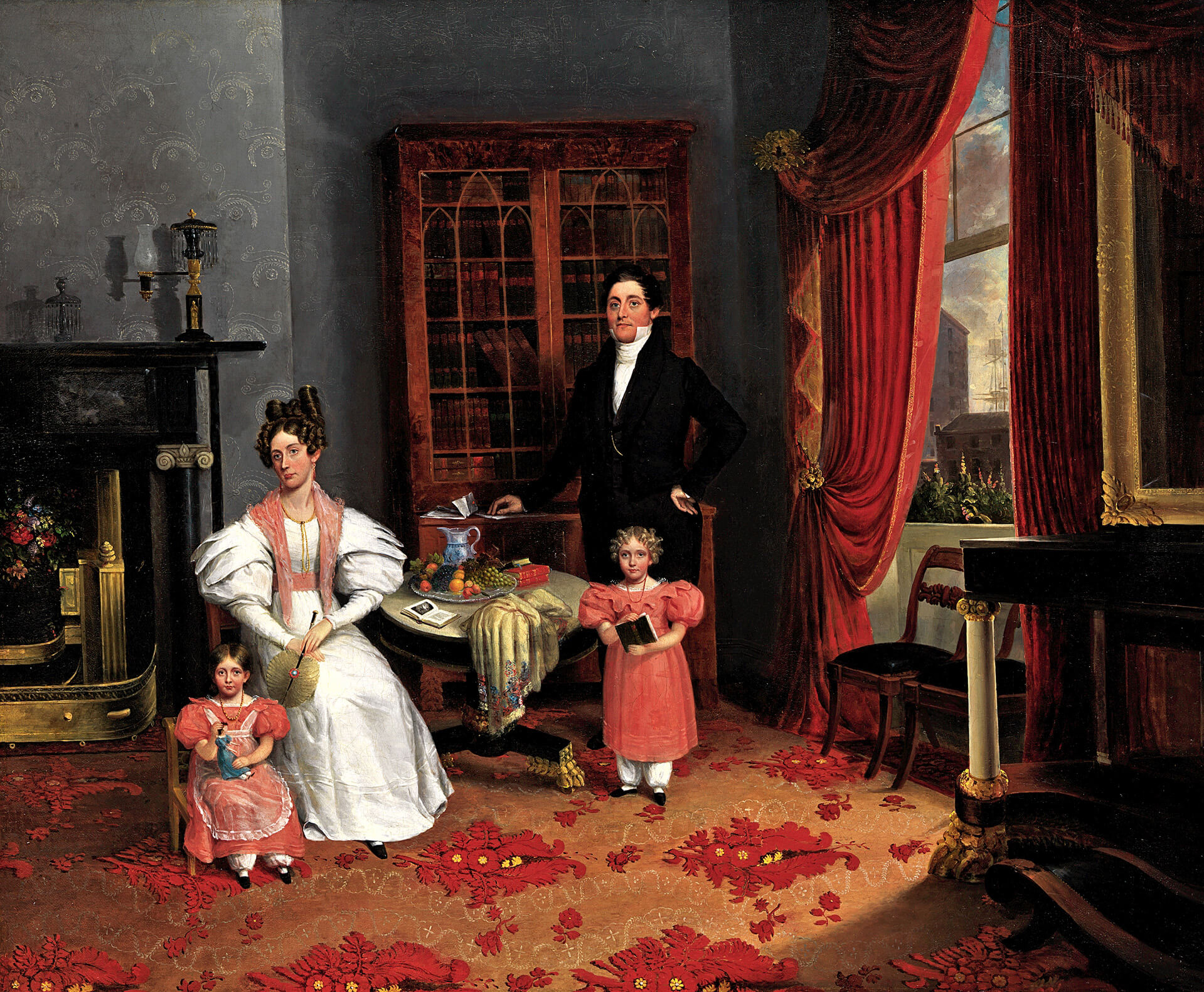
Looking at the houses we have here in Brooklyn, that many of us live in, we’re talking about homes built in the late 18th through early 20th centuries. Two hundred years of architecture and, amazingly, there really has not been all that much change in window treatments. Much of what was familiar in 1840 is familiar today. Let’s start with blinds.
The evolution of the window blind
Chroniclers of late 18th and early 19th century domestic doings called everything pertaining to window coverings blinds. Interior and exterior shutters, Venetian blinds, exterior awnings, roller blinds, various kinds of shades — all were lumped together as “blinds” in the literature. So sometimes it’s confusing to modern researchers, as we tend to think of “blinds” in only a limited and specific way. But call them what you will, all of these window coverings were in use.
The use of exterior shutters as decoration, popularized by the Colonial Revival, has thrown off our sense of how these shutters were actually used historically. Most of the shutters we see today were never meant to actually cover the windows they frame, but that’s what they were originally meant to do in our early frame houses, providing protection against the sun and rain, privacy and security. Very few period homes today, especially up here in the north, have working exterior shutters.
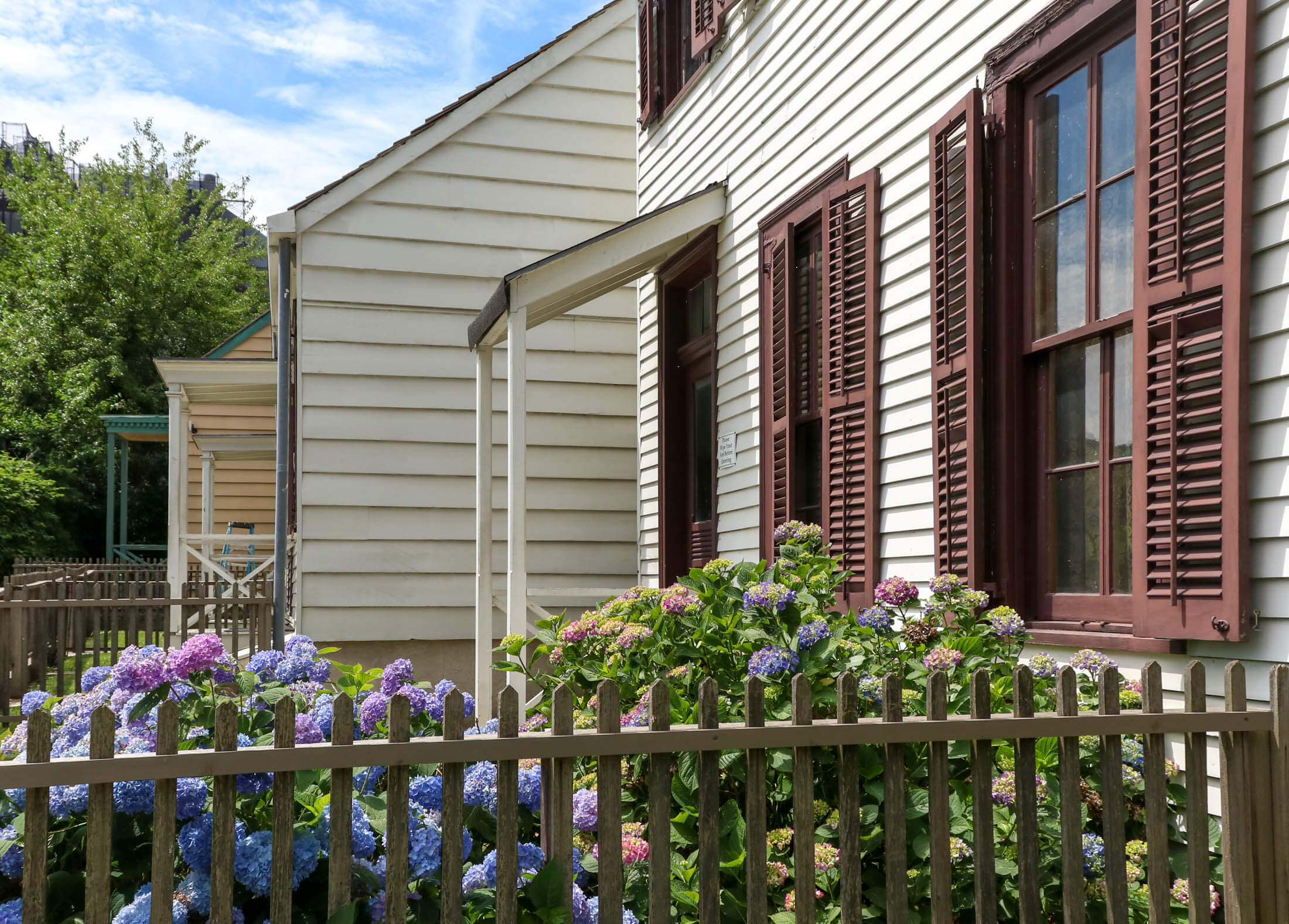
Interior shutters still are in use, however. Almost every row house built in this city once had interior shutters in the front rooms, facing the street. Most of us count ourselves lucky if we still have them, and it’s a special treat to find them, especially when they have been painted into their box frames for close to 100 years. What a moment to cut them out of their painted cases, open them, and discover that the shutters within have never been painted, and all their louvers and mechanisms are intact.
There are several different styles of interior shutters. Some are solid wood all the way across. These would generally be found in earlier homes, before shutters were mass produced and factory cut pieces assembled. Solid shutters could also be found in later homes protecting windows that could be seen from the street. Often the bottom shutters were solid, while the upper ones had adjustable louvers. As window sizes grew and shrunk, builders came up with interesting ways to divide the shutters, and there was usually an upper and lower set, to allow for the seasons, the amount of protection needed against the sun, or for privacy.
By the 1870s, when the Italianate brownstone was king, the “box shutters” as the encased shutters were called, were standard. Movable louvers were also standard, allowing the slats to be adjusted to allow light and air in, but maintain privacy from the outside world. Although other draperies were also highly popular, and we’ll get to that, the shuttered window was the common window covering for the Brooklyn home. Well, for the front windows, anyway. But that was not the only option.
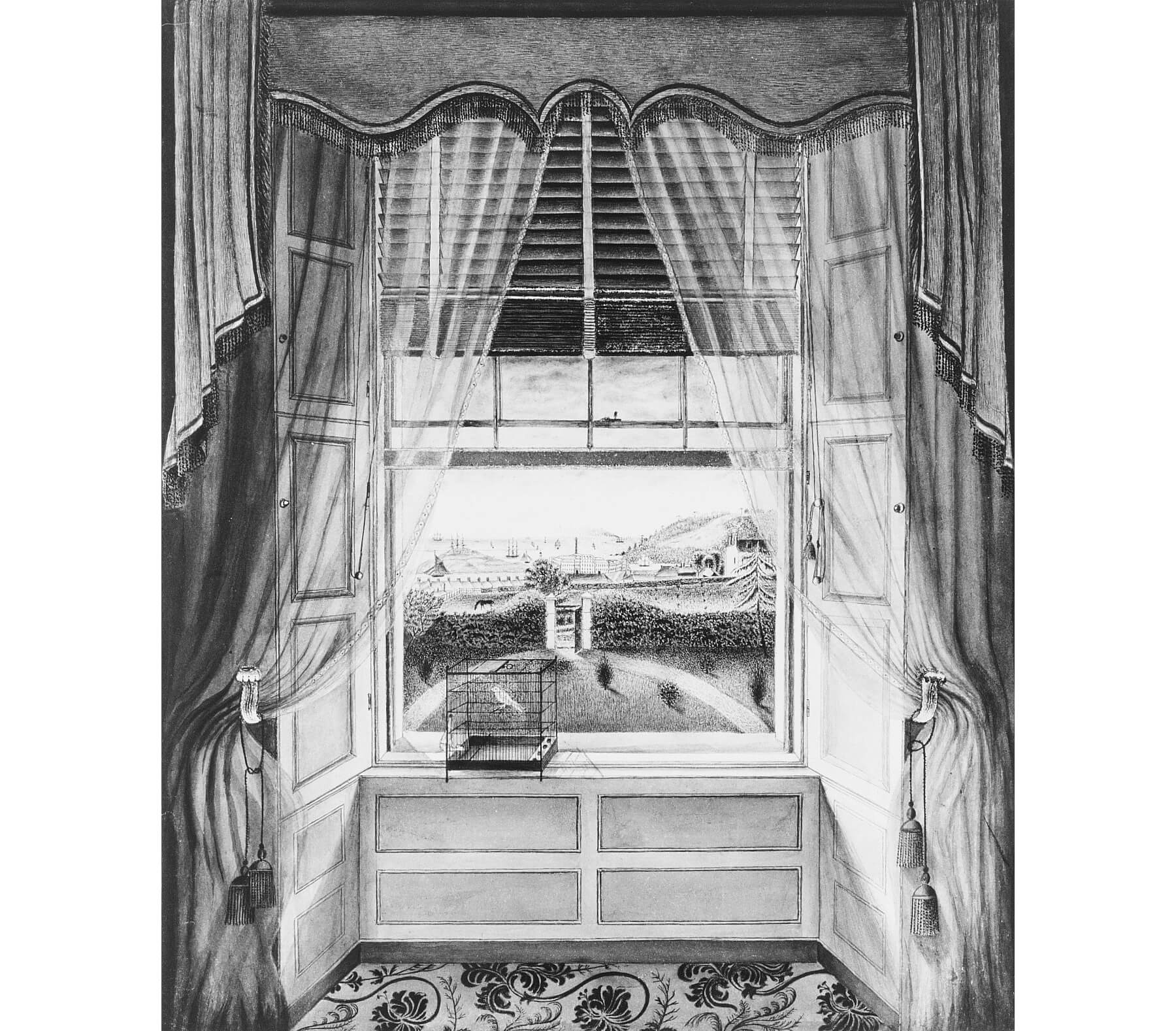
We all are familiar with Venetian blinds. Today they come with metal or plastic slats, or new honeycomb slats. They are also now vertical, not just horizontal. But the classic blind — wooden slats connected by woven tapes and cording, mounted to a wooden frame — have been in use since the mid-1700s. Venetian blinds came in two different styles. One was the style we know today; the other had the blinds running in tracks on both sides of the window. These came in both interior and exterior versions.
Venetian blinds could be made to cover any size window, or any shape. Because the wooden slats were suspended from tapes, and manipulated by cording, fan shaped shades for Palladian windows could be made, as well as narrow shades for side light windows. The opportunities were unlimited, and as manufacturing techniques made the shades more affordable, they were quite popular among the 19th century’s upper middle class and above.
Although more affordable, they still weren’t cheap. The average home had a less expensive alternative, one that is also still with us today, as well: the roller blind. Spring blinds were invented in the 1830s and mass produced by the 1860s, but most homes had pulley operated blinds throughout the 19th century. Roller blinds could be had by almost anyone, they could be made at home, and the coverings could be any commonly available fabric. Linen, canvas, gauze, calico, prints, cotton lawn; any of these could be used.
Godey’s Lady’s Book and other magazines offered instructions on how to make shades, and how to embroider or crochet trim for the bottom and the pull chain. Ladies were encouraged to paint the shades with scenes from nature, or flowers and birds. Factories began producing shades in quantity, and every home had them somewhere. They were easy to put up and take down for washing, and kept the sun out, privacy in, and even kept some of the bugs out of the house in summer.
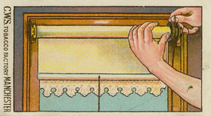
Those who couldn’t afford good quality cloth shades could find brown paper shades, or make them, as manufacturers began producing paper in common widths for windows, offering paper with printed borders. One only needed to measure the amount required for the window and affix it to the rod. Some homeowners began pasting wallpaper to paper and cloth shades, making patterned shades, and that idea too, began to be popular with manufacturers.
This spurt of creativity didn’t suit the high-end tastemakers of the day. Andrew Jackson Dowling, the great landscaper, lover of Gothic Revival architecture and tastemaker thought the painted landscapes and patterned shades a tad gauche, as the shades covered up the wonders of nature outside the windows, but even he had to admit that if one was not amidst nature, as in a city, the patterns would bring nature inside. Today, we still use patterned fabrics and prints on our shades. A good idea can outlast even the best tastemakers.
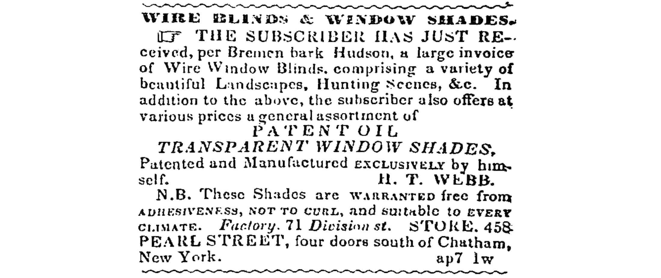
The last form of shade used by the homemakers of the mid-19th century was the metal mesh shade. We still use them. They were made to keep bugs out, just as they do today. But since we are talking Victorian taste, and about a love of ornament and pattern, these metal screens, called in the writings of the day “wire blinds,” were not just put into place. They too, were often painted with landscapes and scenes.
So what about the yards and yards of draperies, the lace curtains, and the entire Victorian window excess that we associate with the period?
Furbelows and flounces
Window treatments get a lot of attention in home decor, and for good reason. Windows are one of the most important elements of a room. They let natural light and ventilation into the home, they allow us a view to the world outside, and keep us from living in caves. They are important for good physical and mental health. We really don’t think of all of that, consciously, when looking for a place to live, but many an apartment is rejected because of the windows, or lack of them. So when it comes to decorating, especially in our older homes, we want these important features to shine. This was also true of the people who first lived in our brownstones, row houses, bungalows, mansions and apartment buildings.
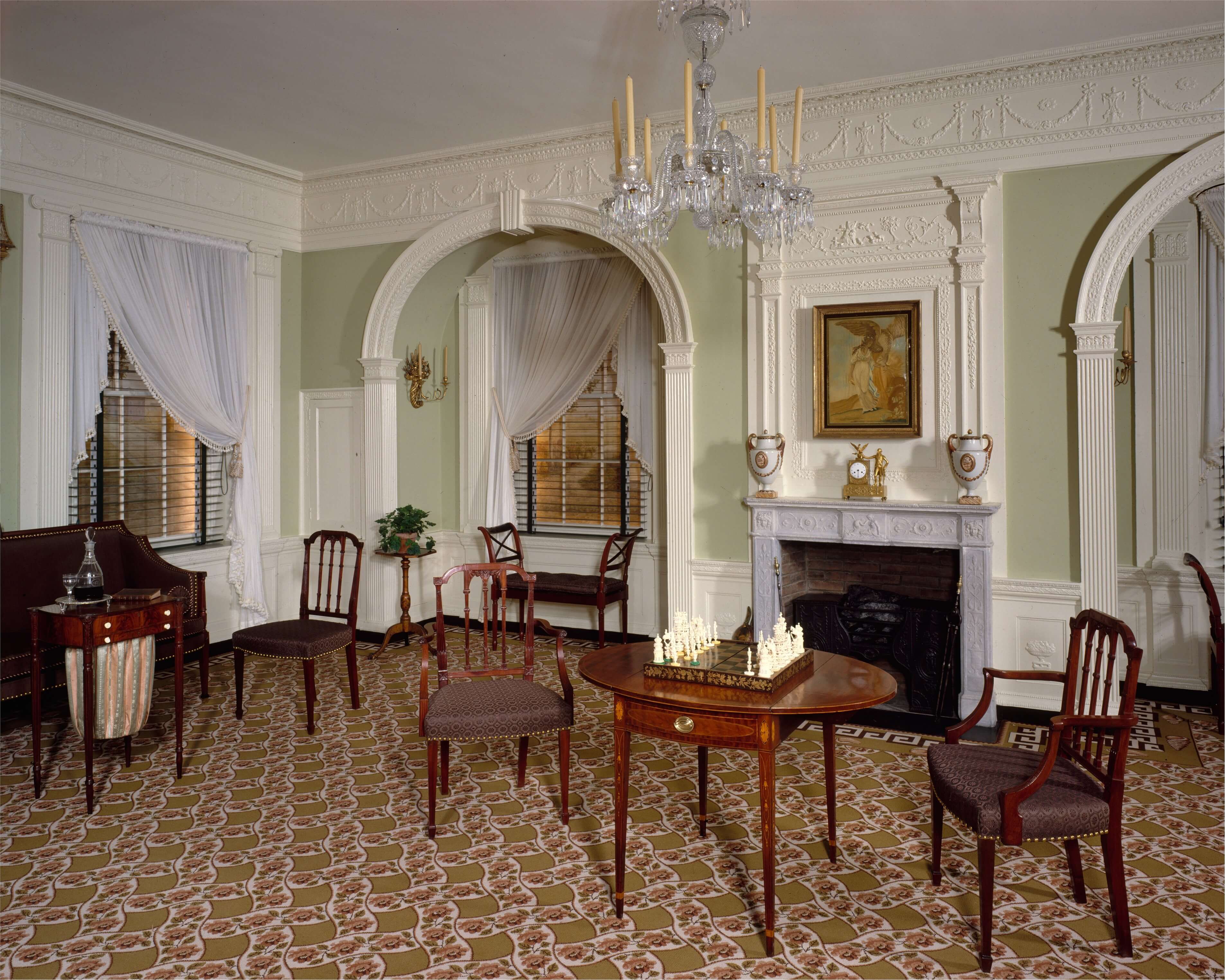
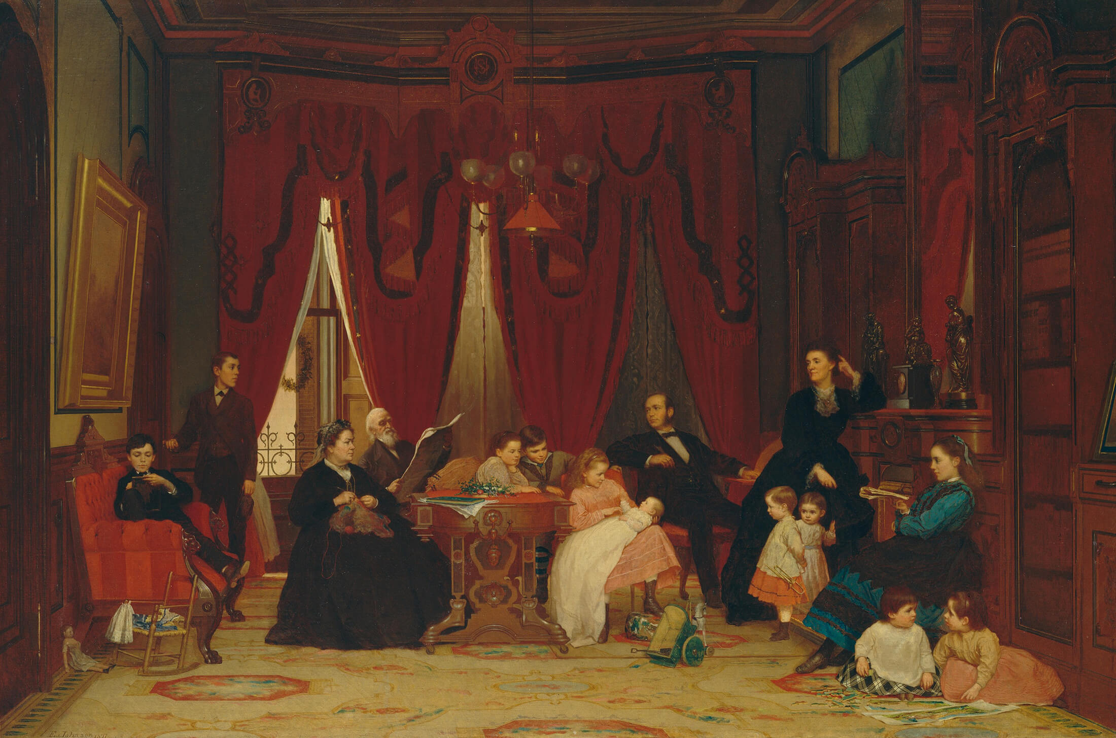
But to say “window treatments” and “Victorian” in the same sentence brings to mind the full power of High Victorian overblown draperies — yards and yards of swagged and draped heavy velvets or damasks, huge overhanging valances, miles of bullion fringe and tassels, and masses of lace. Most of us can’t run far enough away from all this. But read on, you may be surprised at the history behind this popular vision of the classic 19th century parlor.
If you live in an earlier home, a Federal era clapboard, or an early Greek Revival, you might be happy to know that for the average middle class homeowner, these homes were not originally furnished with heavy swagged draperies. Shutters, shades and blinds were the usual coverings, and curtains were simple affairs: a single layer of fabric gathered across the window on a wire or cord, or simple hanging curtains at either side of the window, hanging from rings on a pole. Artificial lighting was pretty minimal, candles and kerosene lamps for the most part, so allowing as much natural light into the home for as long as possible during the day was important.
Of course, the higher you go on the social scale, the more elaborate the window treatments, so I’m not saying that there were not homes with much more elaborate treatments during this period; there were. The mansions of the rich tend to be the ones that become house museums and set the pattern for the era in our minds, so that’s what we see and then go on to identify as normal for the period. The window treatments we’re looking at here are from the early 1830s to the 1850s.
The windows in the parlors often had a wooden cornice, which screwed to the top of the widow frame. It could be covered in fabric or painted to match the curtains. Hanging from the cornice was the valance, a short gathered or pleated length of fabric, often cut to cascade down from a center point, usually trimmed in contrasting fabric or with fringe. On either side of the window, the draperies would hang to the floor, gathered up and swagged with drapery pulls to the side of the window.
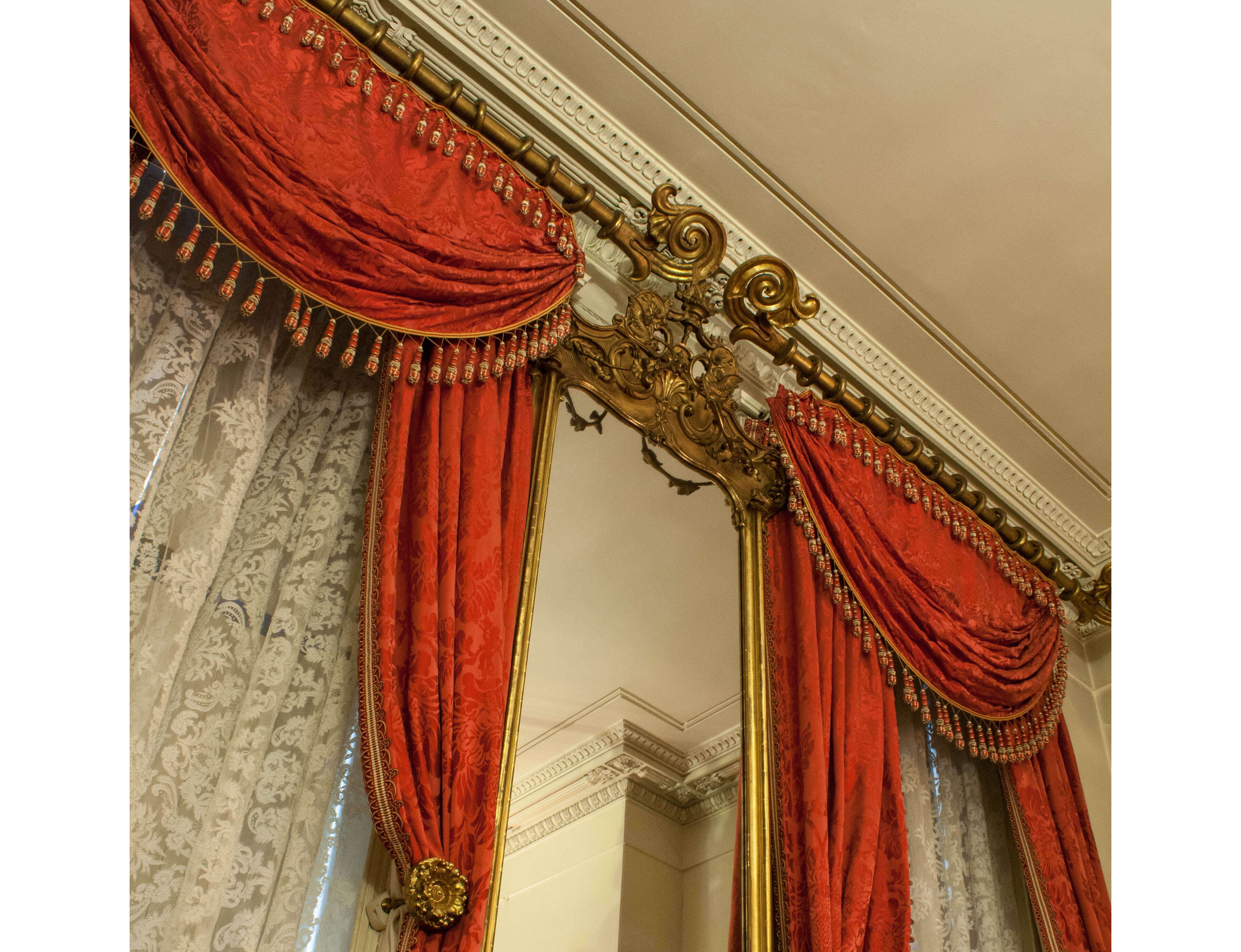
The valance was the most important part of this whole treatment, and as the years progressed, the valances got more elaborate and complicated, with all kinds of swags, tails and draped treatments that went far beyond the average homeowner’s ability to do it herself. A new industry was born, that of the drapery professional, a task usually taken up by an upholsterer. Armed with illustrations, formulas for calculating the correct amount of tail on the overhanging swags, and samples galore of fabrics, trims, curtain rings and poles, this industry is with us still. Only electricity has changed the way things are made.
Of course the writers of all things home related were at odds on all of this. Those tastemakers who were concerned with the average homeowner decried the froufrou and complicated swags, advising their readers to stick to plain and simple window coverings. At the same time, many of the other magazines and books were equally enthusiastic about the more complicated window dressings. These publications were geared towards a more wealthy and striving audience, and showed their readers more and more fanciful window wear, paving the way for the styles of the latter part of the 19th century.
By the early 1850s through the 1860s, huge changes were afoot in American society. The Industrial Revolution was making possible the purchase of all kinds of things that had only been handmade and expensive before, and therefore only available to the wealthy. A growing middle and upper-middle class was being created, and in Brooklyn, homes were being built to house this growing group. The simple lines of the Greek Revival houses were out, and the new Italianate row houses — the classic “brownstones” — were in.
One of the popular interior features of the new Italianates was the parlor decorated with a tall, gilded pier mirror, which was placed on the front wall between the two front parlor windows. Today, if they survive, many of these mirrors have been painted so often their original finish is a mystery. These mirrors were integral to a new and very elaborate window treatment that became all the rage during the 1850s. Godey’s Ladies Book, which boasted they started the trend, called the window treatments “lambrequins.”
To be technically accurate, the lambrequin was part of the drapery, but the elaborate gilded wooden or metal carved cornice frames that topped the window frame, as well as the top of the pier mirror in the middle, set the stage for the rest of the window treatments, which were theatrical indeed. From this cornice hung the lambrequin, which was a fabric frame sometimes stretching halfway down the length of the window. The draperies hung on a pole hidden by the cornice and lambrequin. They were often the same fabric as the lambrequin but could be a contrasting one as well.
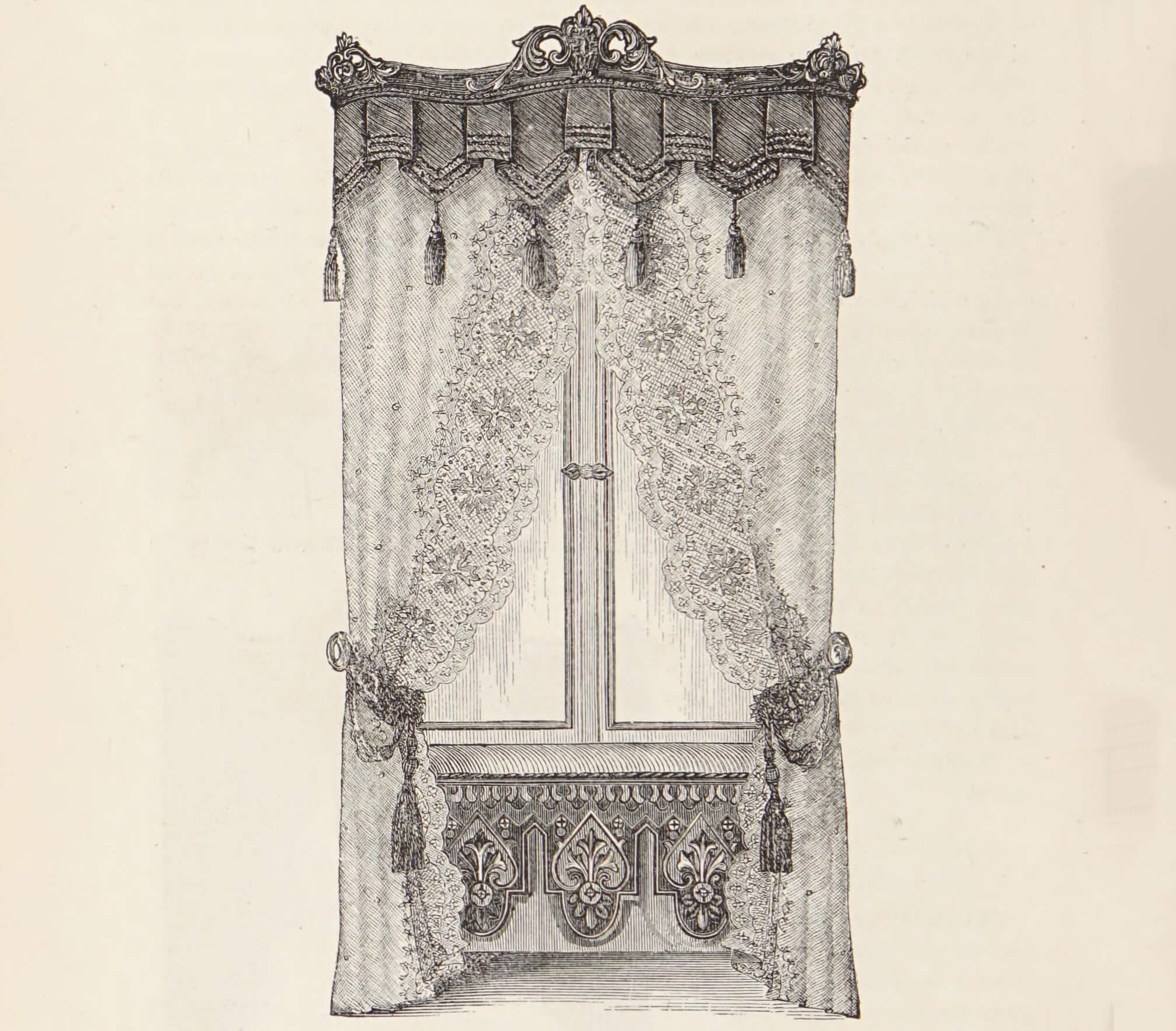
These drapes in and of themselves were rather simple, and were usually overly long, pooling on the floor, if not artfully swagged back by pulls, into pleasing pleated lengths. They were usually lined and, on occasion, underlined with a third layer of fabric to hang heavily. In the winter, they were also great at cutting drafts, but this practical application was an afterthought to beauty. Underneath the drapes were simple lace or muslin curtains called “glass curtains,” probably because they were the only ones actually next to the glass of the window.
If all that weren’t enough, the lambrequins and draperies were further swagged with trims, cords and tassels, which were looped over the top and allowed to hang down. It was all quite elaborate, so much so that it could literally take hours to arrange the windows so that the pleats, swags, tassels and everything else were just so.
While some thought this arrangement to be the height of fashion, there were those who thought it was all just too much. Harriet Beecher Stowe and her sister, Catherine Beecher, wrote and lectured on the modern American woman and her home. They were early pioneers of a simplified and organized home, and were not in favor of the elaborate window treatments espoused by Godey’s. Their idea of a lambrequin was a simple drape, perhaps with a simple pattern, covering the window frame, with simple hanging muslin curtains beneath. Their ladies had better things to do than spend hours arranging the drapes.
The battle between “more is more” and simple would go on in later Victorian decor, as well. As the Italianate gave way to the much more ornate Queen Anne and Aesthetic Movement styles, could miles of fabric be far behind?
The Eastlake years
In 1868, English architect and tastemaker Charles Eastlake published “Hints on Household Taste in Furniture, Upholstery, and other Details.” The book was a runaway hit, both in England and here in the United States, where it was published in 1872. Eastlake’s book became the bible of the decorating world, so much so that six editions were printed here in the next 11 years to keep up with demand.
England, like the United States, was in the midst of the Industrial Revolution, that great time of invention and innovation, when machines and technology had developed that could produce all kinds of products, that before had to be hand made by skilled craftsmen of all kinds. On both sides of the Atlantic, the advances in technology had helped create a new middle class. The white collar worker, and this new class of people had more disposable income than ever before, and they wanted to show off their new station in life with material goods. Just like we do today, they wanted stuff.
Of course, factories were turning out great advances in transportation machinery, medical and scientific equipment, and all kinds of necessary products, but for the sake of this discussion, they were also making tons of consumer goods for the home. It was a new market and a booming one. Skilled cabinetmakers, who apprenticed with masters for years before going out on their own, had been creating only a few pieces of furniture a month, each one handcrafted. Now a factory with the new technology could produce hundreds of pieces of furniture each month with turned wood and carved detail at prices the middle class could afford. And the market was waiting.
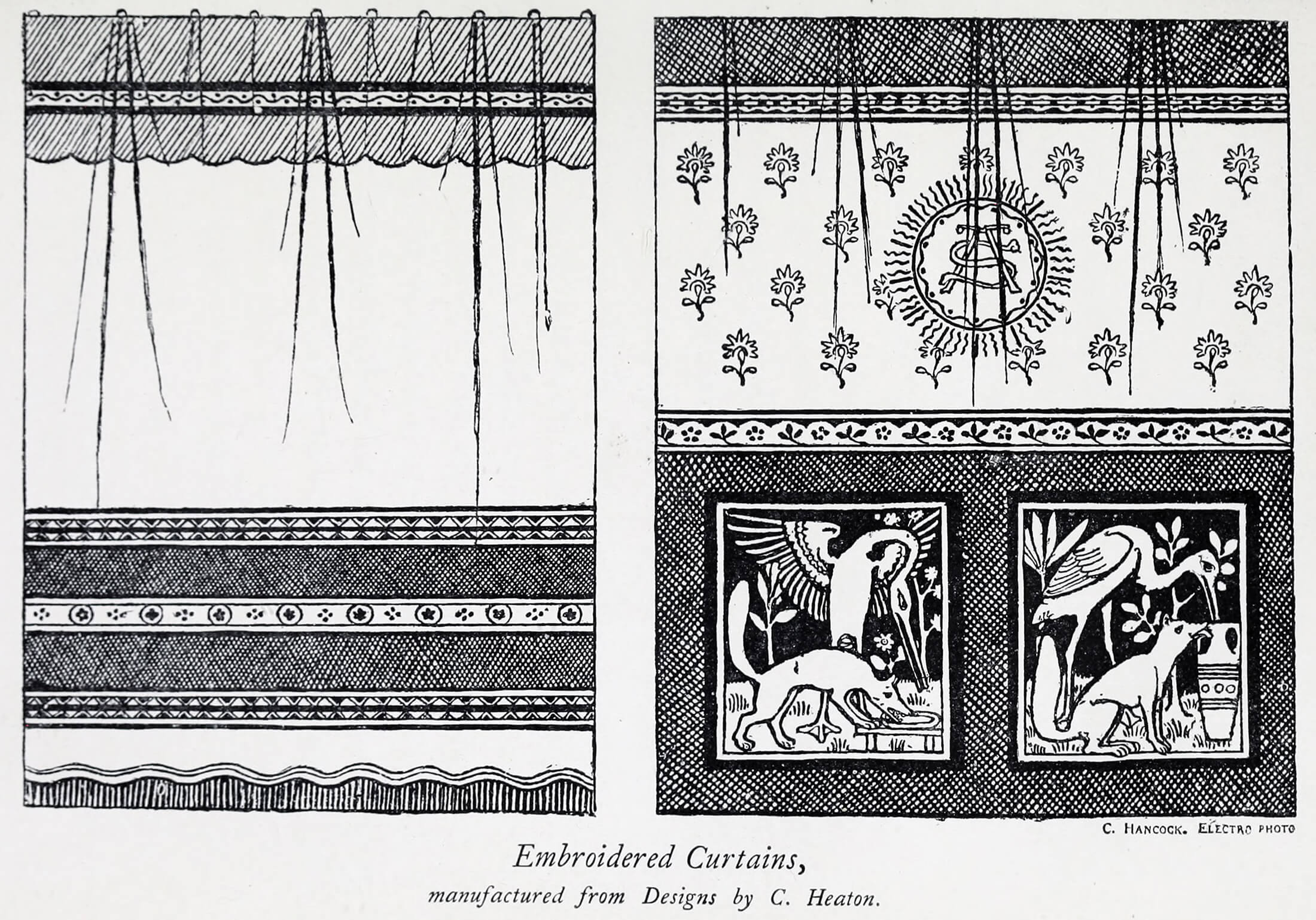
Eastlake saw the trend of “more is more” growing, and he was not pleased. He advocated a return to simplicity and a simple elegance. He especially was distressed at the way furniture makers were loading up furniture with glued-on elaborate machine-carved pieces, and how cheap wood was being stained to resemble better wood. He advocated simpler design, and the use of walnut, oak and other woods, stained only with natural oils, to bring out their beauty.
Eastlake talked a great show, but he never designed a piece of furniture that we know of. Here in the U.S., furniture manufacturers took Eastlake’s ideas and ran with them. They cut back on the florid carvings and began producing furniture with angular surfaces and incised lines and geometric shapes. American Eastlake was here, and it was hugely popular. The designs carried over into architecture, each feeding the other, and this produced the angular lines of our Neo-Grec houses, where the invention of the pneumatic drill had made producing the simple incised patterns on the facades of row houses springing up in just about every brownstone neighborhood possible and cheap.
Inside these houses, the tall parlor-floor windows were framed with natural wood, often with simple carvings on the frames. Depending on the price of the house, fine woods were used, especially on the formal parlor floor, with window casings in oak, walnut, mahogany and other beautiful natural woods. Bedrooms and ground floors had simpler treatments, but all the floors, especially in the front rooms, had windows frames that were worthy to be seen.
Eastlake ruled in the 1870s, but as the decade progressed, his original ideas were so warped and taken out of context here in America, that he grew to hate the term “Eastlake,” as what we were doing had nothing to do with him. The furniture began to be on steroids, as the simplicity was soon gone, and some of the worst examples of High Victorian furniture soon had his name associated with them. The carving became hugely elaborate, the woods ebonized, covered in gold, silver and bronze, and the pieces so over upholstered they became caricatured. It was time for another home revolution.
Yeah, yeah, you say, but what about the windows? Well, again you have two philosophies at work. The true Eastlake mindset championed the simple. Show off the beautiful woodwork with simple hanging draperies, gathered on a pole set into the window frame, held on by brass or wooden rings. Lace or sheer muslin curtains were set behind these drapes for privacy. Utilize the window shutters built into at least the front windows of all brownstones. Mass production had made these shutters able to be louvered up and down to allow for light and air. Draperies could be framed in the windows, or not. Windows in lesser rooms such as bedrooms, kitchens, etc., could have roller blinds with or without the recently perfected spring mechanism. Again, curtains could also be used, if desired.
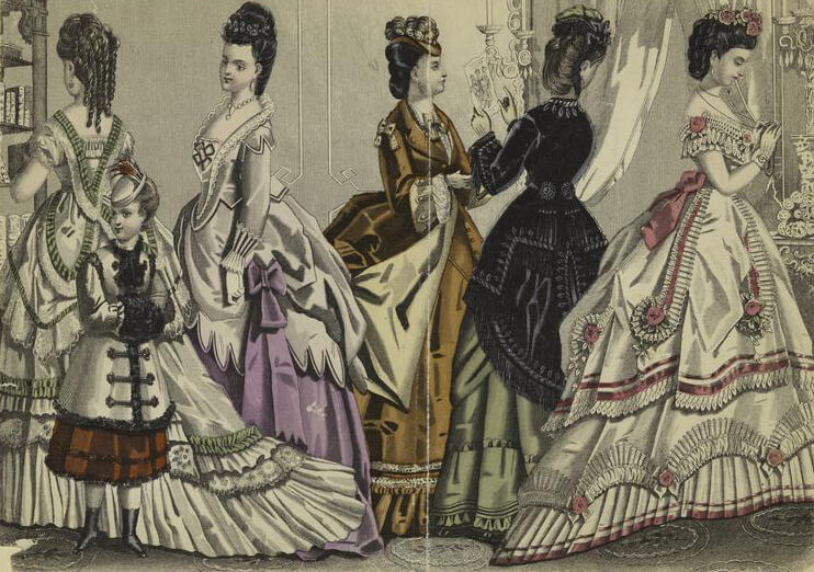
Godey’s Lady’s Book — in its day, the combination of Vogue magazine and House Beautiful — always advocated more is more. Their advertisers were the same drapery and dressmakers whose goods appeared in their articles, so they tended to go big to sell their advertisers’ goods and services. Their windows looked like their ladies’ dresses. The high fashion of the day in the 1870s was the bustle dress, where a stylish woman looked like a wasp, with a tight fitting bodice sweeping out into a bustled backside, with yards of fabric trailing behind her. These dresses were embellished with as much fringe, tassels and trim as possible. Their wearers looked like the very draperies they were often standing in front of. While Eastlake was preaching simplicity, Godey’s was worshipping at the altar of excess, and their illustrations of fashionable windows showed more and more fabric, froufrou, swagging, draping and festooning than ever.
Just as the excesses of fashion and home decor of the 1980s produced the minimalism of the 1990s, so too did the trends of 100 years before. Just as Charles Eastlake had championed the simple and natural, another movement was taking place in England: the Arts and Crafts Movement, as seen by William Morris. Like Eastlake, Morris was also appalled by the excesses of the machine age of furniture making and decor. But he not only wanted to go back to the good old days of English handmade goods, he wanted to go much farther back and embrace the ideals of the Middle Ages.
He and his fellow Pre-Raphaelites began a movement in British art, architecture and home, some of which still lives and is popular today. Humble, natural materials, like oak, brick, stone. Handmade furniture, handwoven fabrics, tapestries and hand embroidered draperies — these were just some of the ideas out of Morris’ fertile mind. Simplicity in line and materials, and a handmade honesty in all things. I’m over simplifying and condensing one of the most important movements in the history of the decorative arts, but only because we’ll never get past him if I don’t. Needless to say, he greatly influenced those decorative arts both in the U.K. and U.S.
Eastlake and Morris are all part of what we call the Aesthetic Movement, which lasted through the 1870s to about 1890. It produced some of the most beautiful decorative arts we have known, and coincides with the building of the majority of the row houses, as well as some of the suburban homes we all talk about here on Brownstoner every day. The Aesthetic Movement gave us ornament, surface decoration, color and pattern; something that was certainly not unknown before, but now in an entirely new way. How did that translate into window treatments?
A turn to simplicity at the turn of the 20th century
If you live in the later brownstone neighborhoods such as Park Slope, Prospect Heights, Bedford Stuyvesant, Stuyvesant Heights, Clinton Hill and Crown Heights, chances are your row house or flats building was built during a time of great changes in the decorative arts, known as the Aesthetic Movement. From the mid-1870s through the 1890s this current, often called the “Cult of Beauty,” mesmerized and then inspired great advances in all kinds of art, literature, music and culture, including architecture and the interior decorative arts.
It was brought to life by William Morris and his Pre-Raphaelite brotherhood. Then the movement gained steam, drew in its other superstars and influenced craftspeople, architects and artists of all kinds as well as the popular culture on both sides of the Atlantic. “Beauty for beauty’s sake” was one of the mantras, and what better place to show off one’s taste and love of beauty than in one’s home?
Like most things in the world of culture and the arts, there is no one moment where one style of anything ends and another is born. There is always a flow, an evolution of design that leads from one form to another. In Brooklyn architecture, the Neo-Grec brownstone, with its Eastlake-inspired incised, carved lines, geometric patterns and shapes, was falling out of favor by the beginning of the 1880s.
Replacing it was the expansive massing of the Romanesque Revival, followed soon after by the freestyle Queen Anne period, which expanded on the Romanesque Revival themes. The Neo-Grec was order and line, Romanesque Revival and Queen Anne were imaginative and open, given to, well, more. In the house itself, more woodwork, more built-ins, more and better lighting, much more stained glass, color and texture.
A trendy homemaker had immense choices now for interior design. Before one stick of furniture was placed, there were decisions to be made for wallpaper and paint, floors and now even ceilings and, of course, windows. And as has been the case in the past, one could choose to go simple or go big. Now there were even more choices than ever.
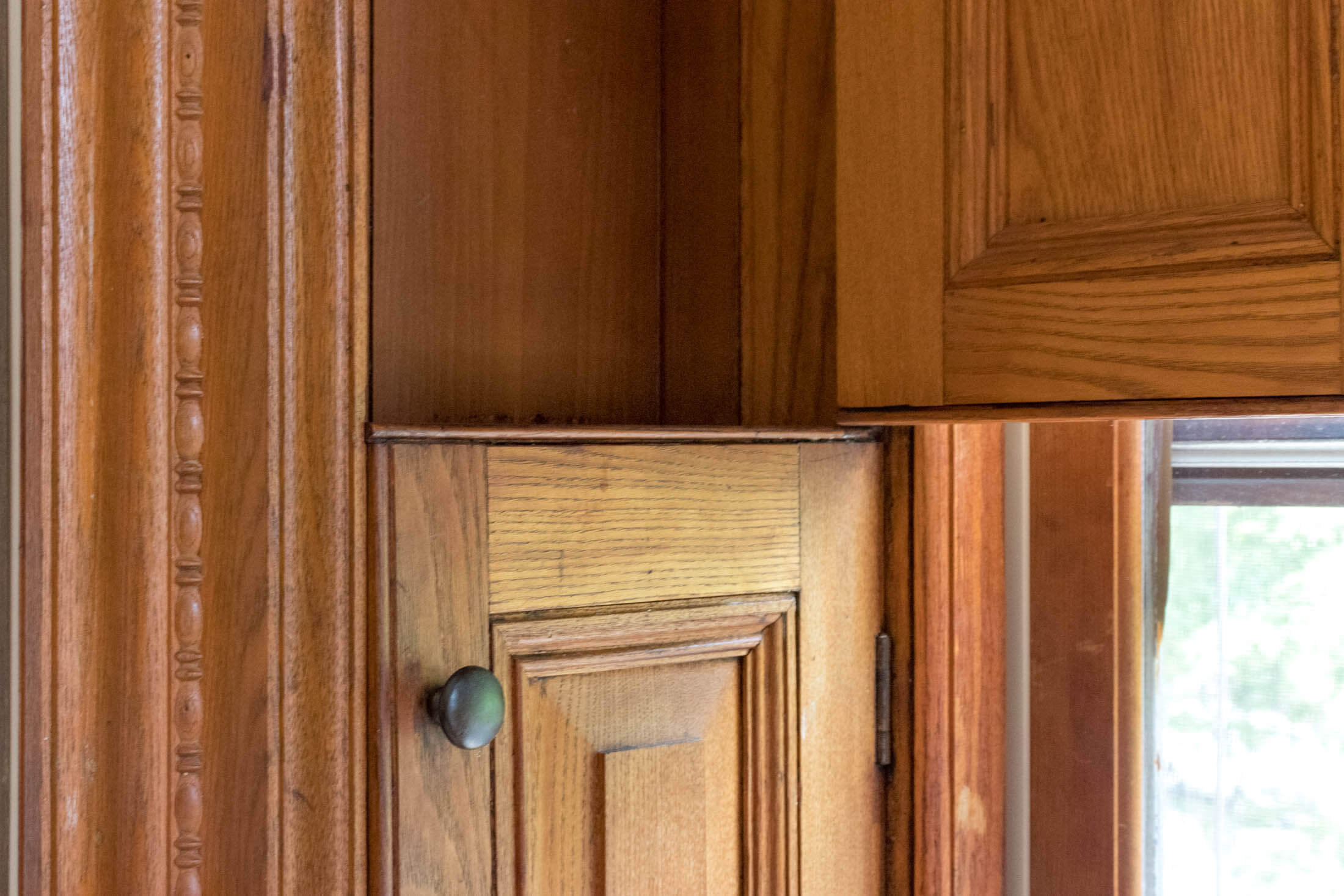
Every house had shutters with moveable louvers, at least in the front of the house. These shutters could fold back into their cases at the side of the windows. Natural wood, polished and unpainted, was the choice of this period, and shutters were usually natural wood themselves, although the magazines did advocate that you could paint the interior shutters to coordinate with the color scheme of the room. Most people left them natural, thank goodness. It was well known that strong sunlight could fade fabrics, so these shutters were usually extended most of the year and most of the day, with the louvers adjusted to admit light and fresh air as needed.
By this time, wire-screened windows had been perfected in the tiny mesh weave we know today and were highly popular to keep bugs, especially mosquitoes, out of the house in the hot summer. The screens were generally painted black or green, but many people bought screens that had decorative landscapes or floral patterns painted on them. Upscale business establishments such as restaurants and stores would often buy the screens painted gold. These screens fit into the window frames and were adjustable, like the ones you can still buy today. Their main function was not beauty, but if some beauty could be added to them, well, what’s the harm?
For windows that did not have shutters, there were roller blinds. Popular for over half a century, they continued to be the covering of choice for windows. No matter what you chose to pile on above, over and around the shade, most people had some kind of window shade for privacy and to keep out harsh sunlight.
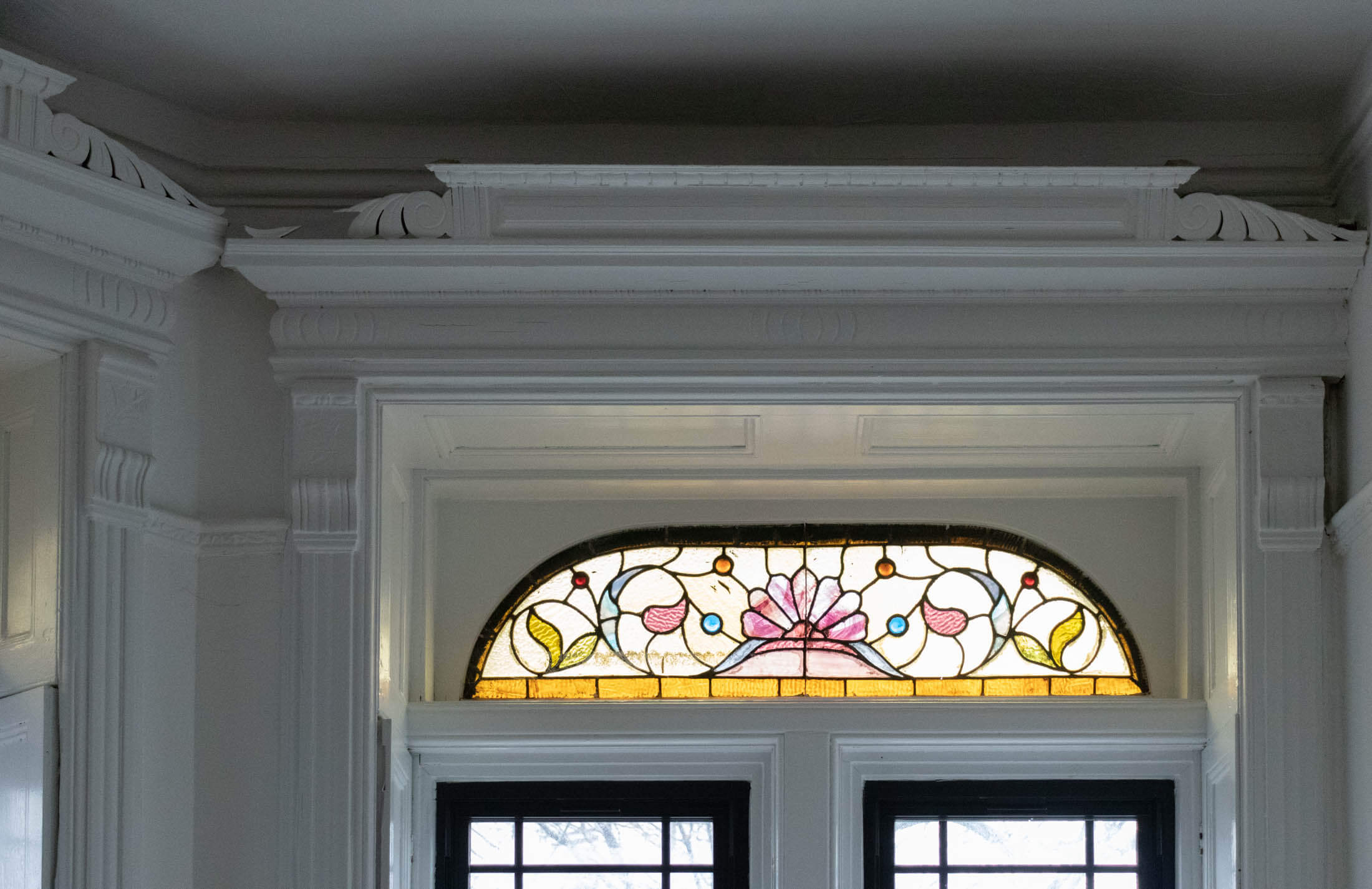
There was something new in window treatments during the Aesthetic Period: a resurgence in the use of ornamental stained glass in the home. The advances in mass production had made it possible for stained glass patterns to be ordered from catalogues, and it was popular for both speculative houses and commissioned mansions of the period to be outfitted with stained glass panels as transom windows, especially in parlors, but also in bedrooms, hallways and formal dining rooms and libraries. The more expensive the home, the more impressive the stained glass. The really wealthy could afford Tiffany or his competitors; spec houses had much simpler and cheaper designs. Today, we find even spec-house stained glass a prized addition to any home.
In higher-end houses, entire windows could be in stained glass, or even an entire bay of windows, especially in rooms such as libraries and dining rooms at the side or back of the house. Here, the window itself became the decoration, and these windows often had no other covering at all or were framed by simple straight hanging draperies. If the window had a stained glass transom, the draperies were often hung below the stained glass window to allow the play of light and color to flood the room. What good is stained glass if you can’t see it?
The Aesthetic Movement coincided with the West’s fascination with “exotic” parts of the world. Japan had been opened up to Western trade, and the public was fascinated by an entirely different cultural aesthetic. They wanted to see and own a part of this new world, and Japanese products and, of course, Japanese knock-offs and Japanese-inspired goods began to flood the market. Some of them were very good, some were atrocious. Japanese design motifs such as the use of cranes, chrysanthemums, peonies and other birds, insects and flora being to show up in wallpaper, fabrics, china and other objects.
The Middle East was also a fascinating place for late Victorians. Well-heeled tourists came back from their Grand Tours with the best and worst objects gleaned from the souks and bazaars of the Middle East. Artists like Alma-Tadema painted scenes of harems and bazaars, with exotic and under-clothed women, and mysteriously garbed men in sensuous scenes. They were both scandalous and exciting, and everyone wanted a little piece of it. Soon “Turkish corners,” or smoking rooms, were appearing in homes, and a large part of this decor involved lots of hanging and swagging of velvet and damask draperies.
The Aesthetic Movement’s ideals were simplicity in which moments of great beauty could be found. Beauty for beauty’s sake, remember? And much of what was produced for the home during this period was truly beautiful. The wallpapers of Morris, C.F.A. Voysey, and others, which were not just panels from floor to ceiling but tripartite and on the ceiling, allowing for pattern upon pattern to be utilized; the futuristic designs of Christopher Dresser, appearing in silver, china and other media; the wonderful inventiveness of Louis Comfort Tiffany, whose designs in glass exceeded his otherwise boundless talents for interior design. And the countless nameless people who designed and manufactured some very nice objects during this period, including the ornate woodwork, parquet floor patterns, stained glass, as well as furniture, fabrics and everything else needed for the home.
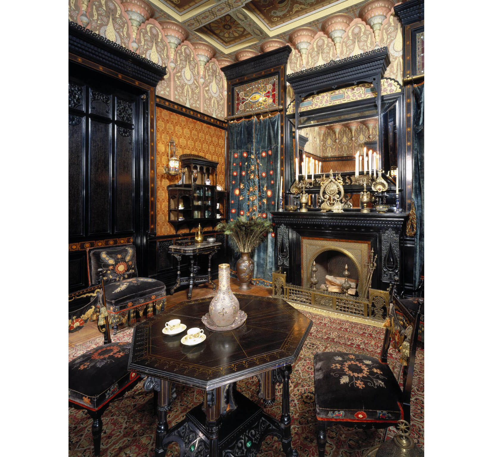
But all of this beauty, and the overabundance of goods to choose from, had the opposite effect in decor. Too many people wanted all of everything and could afford to buy it, and the result was the High Victorian stuffed rooms overflowing with objects and pattern on every surface. And windows were not exempt from this philosophy; in fact, they were front and center.
Contemporary illustrations show the two extremes. On the one hand, you had the spare delicacy of the ideal Aesthetic Movement room, with a lot of pattern in wallpaper and furnishings, but subtly done, with a restrained hand. Here, draperies were simple, hung from rings on poles, usually with contrasting bands of fabric at the top or bottom, but all in all, quite simple.
Then you had full-blown excess, with patterned and papered walls, lots of heavy furniture, heavily upholstered and trimmed, with parquet floors covered in patterned rugs, often layered, with accessories everywhere and on every surface. The draperies here are elaborate, with a heavy valance, layers of heavy drapery swagged and gathered, with under layers of lace, muslin and shades. There is trim on everything: tassels, bullion fringe, cording, you name it.
And if that wasn’t enough, there were draperies between rooms, called portieres, or doorway curtains, which were de rigeur for the period. Most of the brownstones built during the 1880s and after have doorway curtain rods, many of which still survive even though people haven’t used them for many years.
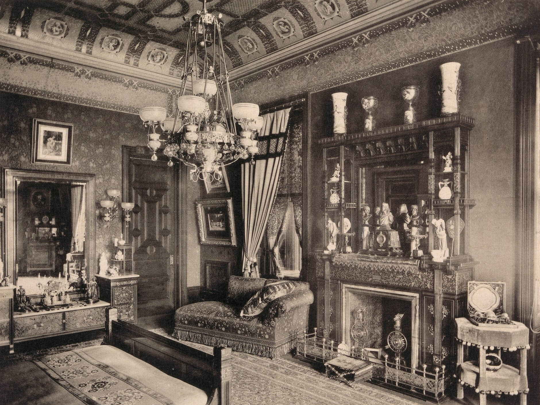
These portieres were inspired by medieval castles and Middle Eastern romanticism, and were seen as important to decor. They were on the parlor level, usually between parlors, in addition to pocket doors, and in the entrances to parlor rooms from the hallway. In many ways, these portieres were more complex than regular drapes, as they were two sided and often were made in contrasting fabrics. They were seen as a perfect place for a homeowner to show off her embroidery skills, as fancy borders were quite desirable. These curtains usually hung from rings on a pole but were sometimes draped and swagged in ways to suggest castle living, with spear poles and other accoutrement. A popular portiere for the period was also made with hanging cords and tassels, which were hung in graduated lengths, so someone could pass underneath easily.
When a fad or style is done to death, and the excess takes over from good taste, the backlash is usually quite the opposite. Soon, the Colonial Revival and Craftsman periods would take tastes back in the direction of minimalism.
From simple to ornate and back again
Period-appropriate window treatments, like most things in interior design, can be plain or fancy. It depends on your taste and budget, because there is historical precedent for both. The first owners of our row houses, freestanding homes and apartments had many of the same choices we do today. From the late 18th through most of the 19th century, fashion went back and forth from ornate to simple, with several constants running throughout the entire time period: window shades, blinds and simple hanging draperies. Fancy windows, with valances, lots of fabric, trims and layers of materials came and went, and got more complicated as the 19th century progressed.
They were all a part of the phenomenon of the proliferation of consumer goods available through the wonders of the industrial and technological advances that dazzled the mid-19th century. The Industrial Revolution created a new workforce of urban factory workers. It created a middle class of management and office workers, and it allowed an elite comprised of inventors, manufacturers, wholesale merchants, financial and real estate men and other wealthy professionals to build great homes and estates and to spend money on all of the new and wonderful things available in all of the enormous stores that were opening everywhere.
But not everyone thought that such mass production of consumer goods was beneficial or healthy. A select group of men and women wanted a return to a simpler life, with less quantity and more quality goods. In England, the movement, collectively called the Arts and Crafts Movement, began as early as the 1860s, with the philosophies and artistry of William Morris, one of the century’s greatest influencers of the decorative arts. The work of one’s hands, not machines, was desirable. Craftsmen and women, like the guild workers of old, were to be treasured. Ironically, this movement, which romanticized the simple country cottage and croft, could only be afforded by the wealthy. Handmade goods, then and now, cost more than machine-made goods.
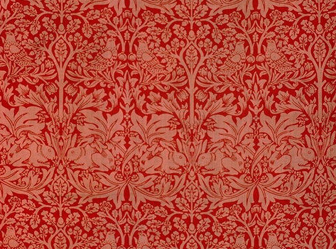
Morris championed simple lines in his work in spite of the profusion of pattern. His draperies and window coverings were simply hung, suspended from drapery rings on poles. He loved handmade embroidery and weaving, and his wife and daughters, as well as their helpers, embroidered motifs on drapery panels and bed hangings.
Over in Scotland, architect and designer Charles Rennie Macintosh was also creating a much simpler, often monastic living environment. His rooms were angular and spare, and in terms of window treatments, also as simple as possible, with plain linens and cottons, often hand embroidered with the simple floral and geometric motifs he liked. Also popular in his windows were plain cotton or linen roller shades, with one simple motif embroidered on the bottom.
These trends came to the United States and inspired our own Arts and Crafts Movement. It was far reaching, with Gustaf Stickley and his Craftsmen homes and furniture, and Elbert Hubbard and his Roycrofters on the East Coast, Frank Lloyd Wright and the Prairie School in the Midwest, and architects like Greene & Greene on the West Coast. The time was now the early decades of the 20th century and High Victorian, Queen Anne extravagance had been traded in for the simple lines of Craftsman furniture, smaller and more intimate bungalow-style homes, and simplicity of line and construction in all forms of interior decoration, including windows.
Styles and periods overlap and were fluid, and trends and styles influenced each other. The Queen Anne style gave way to the Craftsman, but people were also rediscovering their colonial past, as the Colonial Revival style soon became the most popular home-design style in the United States during the first half of the 20th century. It’s still popular now in new home building.
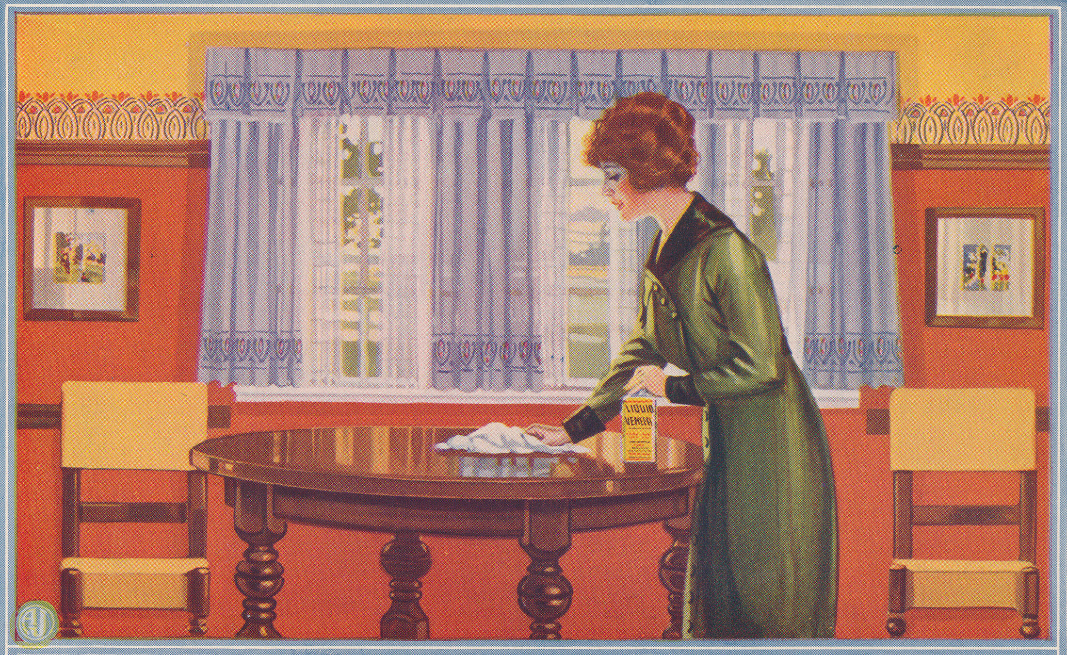
The Colonial Revival was sparked by influences as broad as the centennial of 1876 and the Shingle Style “cottage” houses McKim, Mead & White and others built for the super rich, mostly in New England. Window treatments here harkened back to Colonial times with exterior shutters that were almost always only decorative, and interior treatments that were also as simple as the Arts and Crafts Movement, with simple curtains, roller shades or, increasingly, nothing at all.
Stained glass was still an important window component, as were leaded glass and other art glass panels. In the very late 19th and early 20th century, these windows were not just decoration; they were important design elements that were meant to be seen. Stanford White’s use of Tiffany glass, Frank Lloyd Wright’s geometric patterns and Greene and Greene’s naturalistic patterns were not meant to be covered up by draperies.
In more modest homes, the same was true. Art glass, even factory produced and catalogue picked, was meant to be seen, and was, by the nature of its opacity, a window covering in its own right. The play of light and shadow, color and tint in these windows, both humble and proud, was a part of the architecture and the aesthetic. If they had to be covered for privacy, a sheer curtain was all that was needed.
Where once formal windows had a valance, under which layers of draperies were stacked, the new 20th century home found that only the valance itself was left. A formal parlor could perhaps have Austrian balloon shades, pulled high, or softly gathered mid length, with a simple draped valance to hide the hardware and soften the sides of the shade. In the new Colonial Revival homes, whether mansion or suburban home, the new colors were white: white-painted woodwork, light-colored painted walls or printed wallpaper. The old Victorian velvet draperies and passementerie just didn’t suit this new, more delicate look.
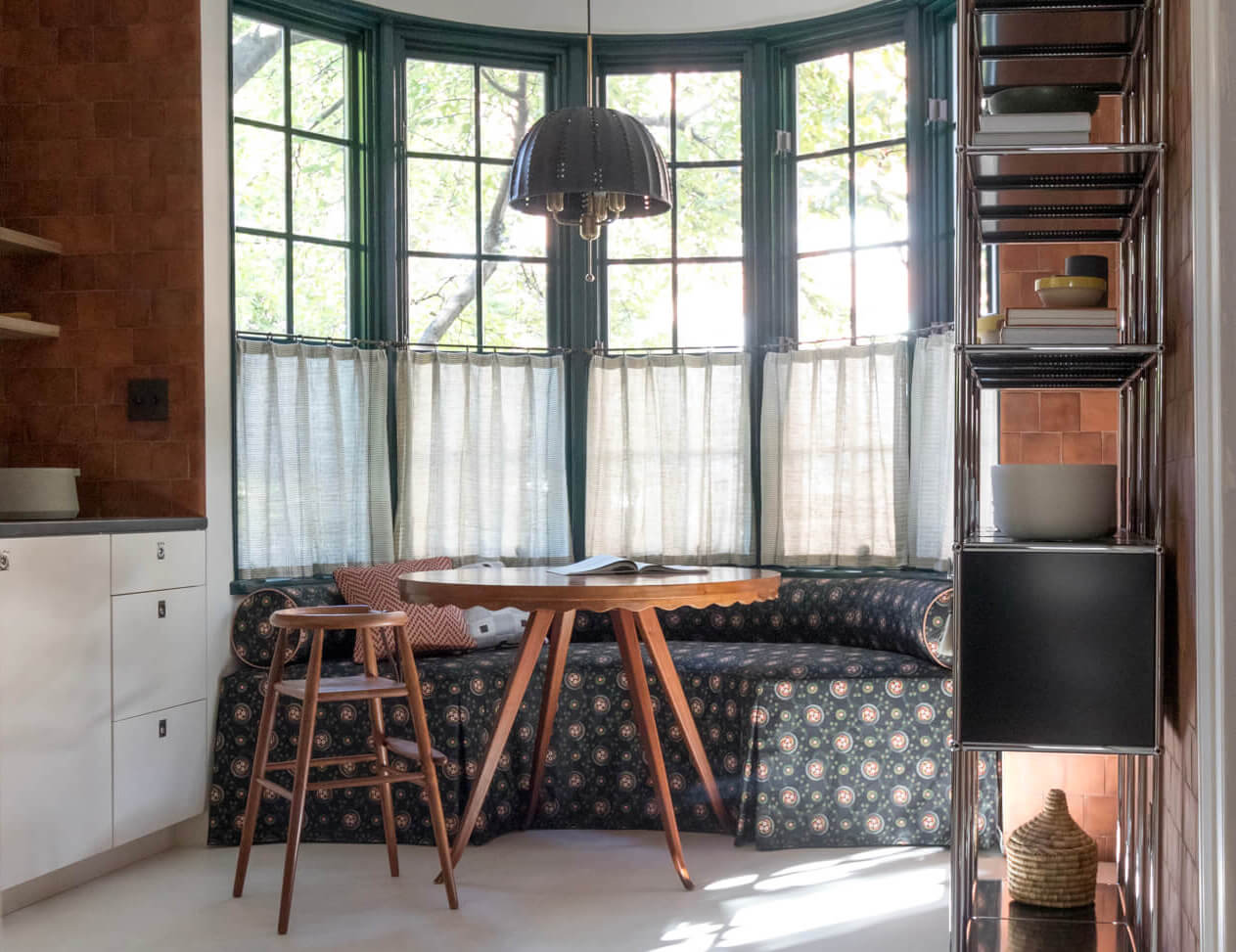
The new century also brought an end to a large servant class. The modern homemaker did not want to be arranging draperies or caring for a ton of fabric. Washable curtains and easy-care draperies were a necessity. Venetian blinds also made a comeback, this time painted white or, as the century progressed, made of white painted metal and, later, plastic. Depending on the use of the room or the formality of the household, they often were the only window treatment. Bamboo shades also start to show up, especially in Arts and Crafts houses, enhancing the natural look of wood.
As the kitchen became the domain of the lady of the house, not servants, the window treatments here took on more importance. Cafe curtains, which hang at the center of the window, allow natural light in above them, but give a sense of privacy. Often a simple valance of less than a foot of fabric was also hung, gathered on a rod, or hung from tabs or rings. Whimsical prints or plain sheers were popular. So too were plain fabric roller shades.
The choices for window treatments in the more modern home were still influenced by magazines and books, but these were now touting the new modern simplicity. Only the most formal rooms of the most formal of homes were swathed in stiff, formal draperies. Many windows had nothing at all, or just a shade. The choices, then and now, depend on the style of the room, and the taste and budget of the homemaker.
Considering today’s myriad styles, it’s fortunate our old houses offer us so many choices. Those old windows have seen just about everything one could do. While we may prefer a plain window with no window treatment at all, draperies and curtains do have certain advantages. They block the sun in the summer, and drafts and cold in the winter. Roller and bamboo shades, Venetian blinds and shutters do the same, and offer privacy as well. We’re back where we started. Whether your look is modern, eclectic or period perfect, good window treatments can enhance the decor, comfort and visual appeal of your rooms. Choose wisely!
Related Stories
- History Underfoot: Flooring in the 19th Century Home
- Feast Your Eyes on the Luxurious Beauty of Aesthetic Movement Design
- From Pakistan to Brooklyn: A Quick History of the Bathroom
Email tips@brownstoner.com with further comments, questions or tips. Follow Brownstoner on Twitter and Instagram, and like us on Facebook.







What's Your Take? Leave a Comment