Vibrant Vibes Enliven a Fort Greene Brownstone
A leap into bold color and a freewheeling mix of furnishings personalize a young couple’s brownstone duplex.

In the rear parlor, Benjamin Moore’s Classic Burgundy is a strong backdrop for a collection of masks and art by family members. The dining table, which came with the homeowners from their previous residence, is a rare concession to modern design; it is surrounded by spindle back Windsor-style chairs from Rejuvenation and illuminated by a gilded metal dome fixture from Shades of Light
Burgundy, mustard, Turkish blue – the rooms in Jackie and Jacob Baskin’s 1870s brownstone roam the paint chart, giving them exactly what they were after: immersive color. “We’d only lived in apartments before, so we thought, ‘If we’re going to spend an unconscionable amount of money buying and renovating our forever house, we might as well make it fun,’” said Jackie, a television documentary producer originally from Chicago. Jacob, a computer programmer who grew up in Toronto, where his parents have a house with a red dining room, was all in. “When I think about welcoming, friendly houses,” he says, “I think of bold colors.”
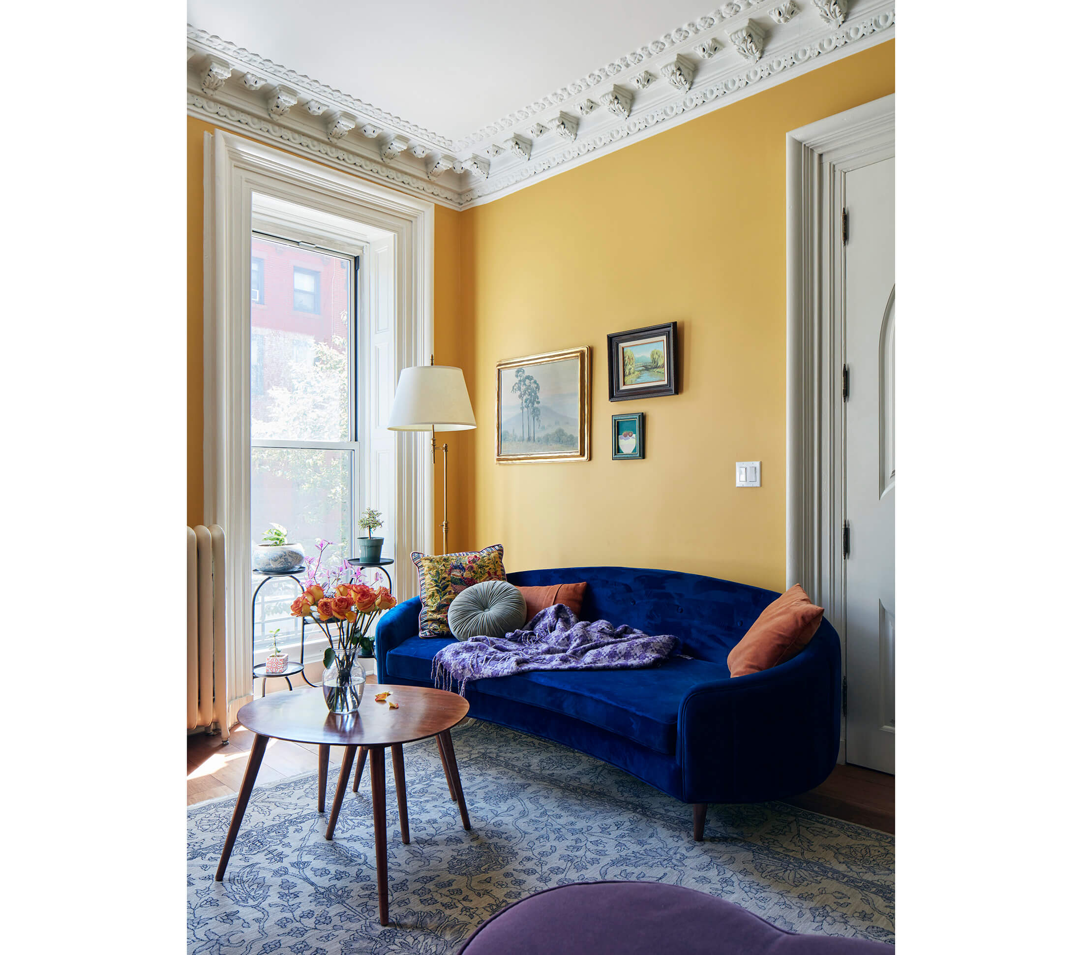
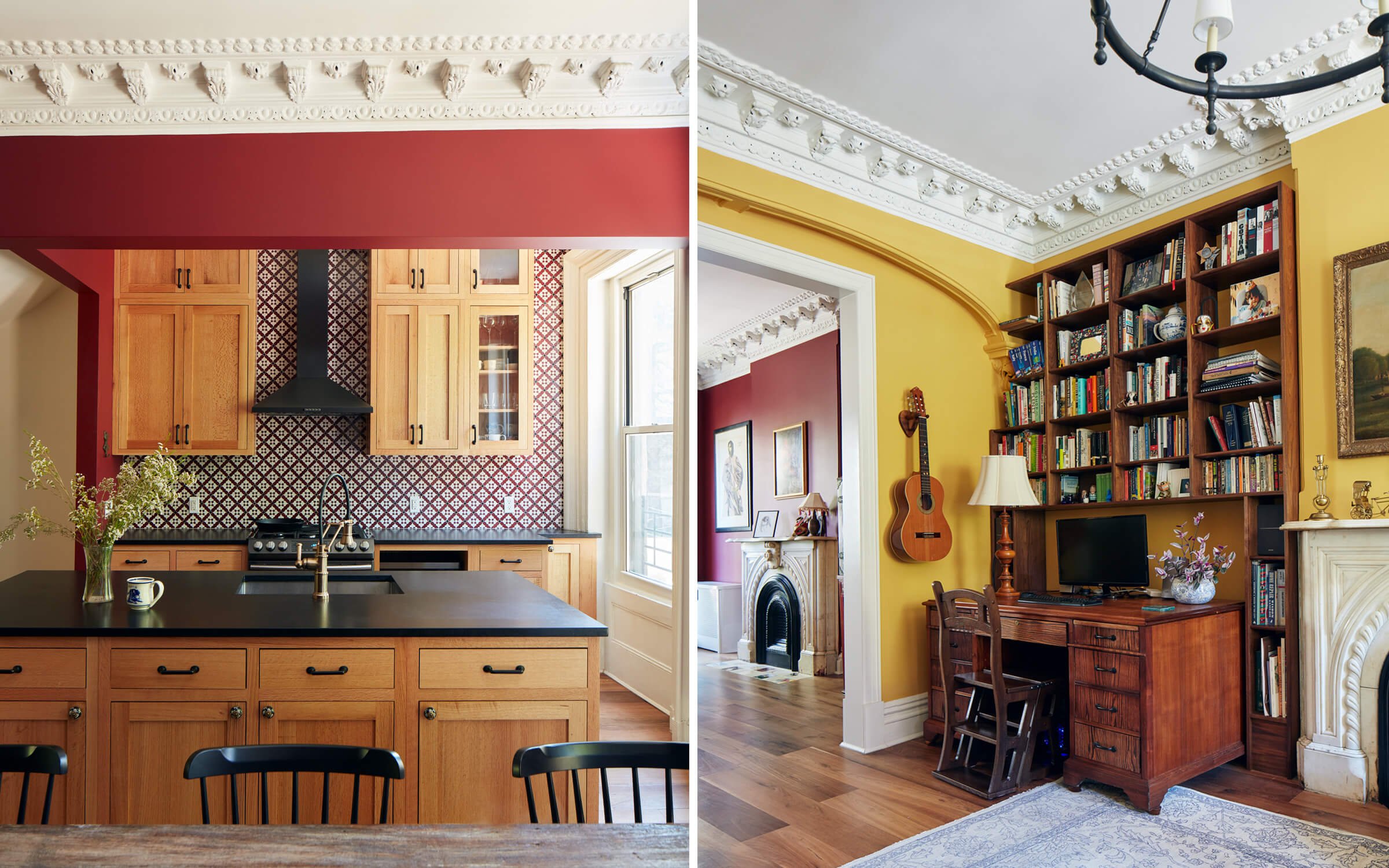
It’s not just courageous color that distinguishes the Baskin’s apartment and the public areas of their four-story row house. It’s also the lovingly layered furnishings, art, and objects that evoke a time before catalog shopping, a place outside 21st century Brooklyn. The furniture hews traditional, which is unusual for a couple in their mid 30s. A 19th century landscape painting in a gilded frame, which once hung in Jackie’s great-grandfather’s house, sits above the fireplace in the front parlor. Floor-to-ceiling walnut bookshelves in that room, custom-made by local millworker Matthew Gribbon, surround a circa 1930 office desk Jacob found in a Gowanus salvage depot, still with old receipts in the drawers, and refinished himself. “The house is old-fashioned,” he says, “and we’re fine with that.”
The couple, who met in 2012, married in 2017, and bought the house the following year, endured a few disappointments on their way to a closing. They’d gone to contract on one house they loved, only to discover there were title issues; another deal fell through when the seller had a sudden change of heart. By the time this 20 by 40 foot row house just outside the Fort Greene Historic District hit the market, “We had a good idea what was out there and what we wanted,” Jackie said. “I saw this house the first or second day it was listed – it was a rainy, gross day – and said, ‘We have to put in an offer immediately.’ Jacob says the reason we bought this house was because of the crown molding, and that’s not totally wrong.”
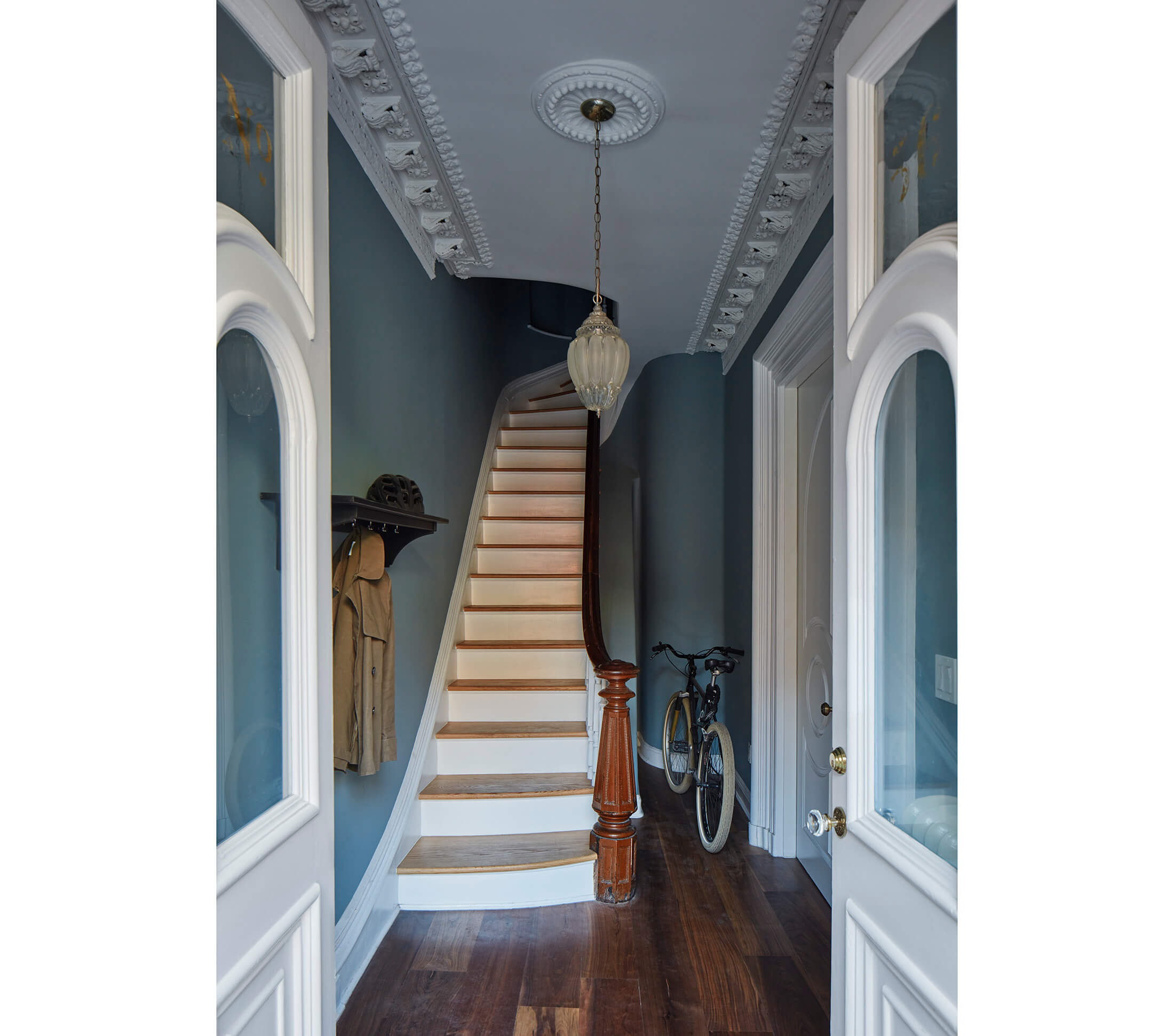
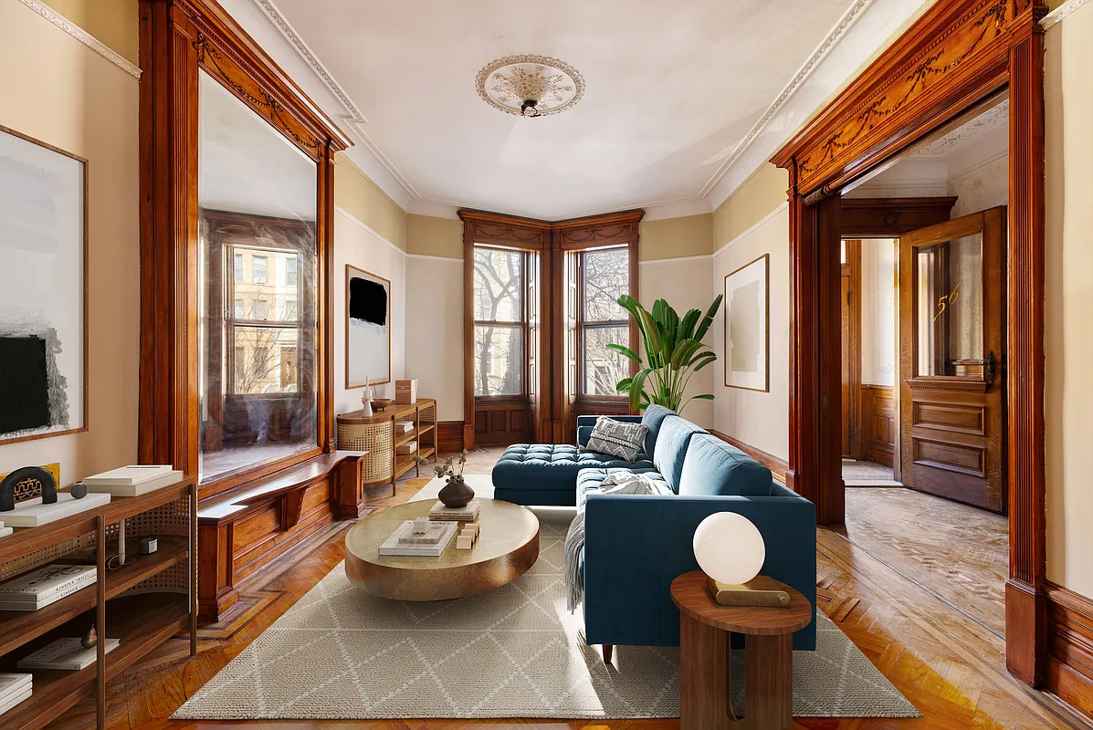
Certainly it was not because the place was move-in ready. In fact, it had been largely unoccupied for some time and was in “terrible condition,” said Sarah Jacoby, the Long Island City-based architect hired by the Baskins to carry out a major renovation. The process, which wrapped up just pre-pandemic, yielded an owner’s duplex on the two lower levels and a duplex rental unit above. “All the beams needed sistering. The floors and fireplaces were caving in. It wasn’t safe,” Jacoby recalled. But despite the structural problems and the need for all-new mechanical systems, kitchens and baths, “a surprising amount of stuff was close to intact,” the architect said, including several marble mantels, an oval skylight at the top of the stairs, and that elaborate plaster crown molding (painted gold, but intact) throughout the parlor floor.
Jacoby paid particular attention to the separation between the two duplex apartments, sculpting a graceful rounded bump-out under the stairs on the parlor floor. In this kind of conversion, the architect said, “You often see the railing lost into a wall. We made it feel less choppy and the partitioning less obvious by following the curvature of the stair.”
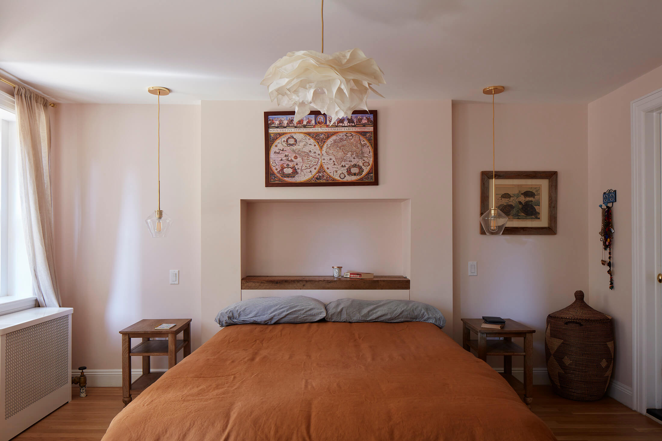
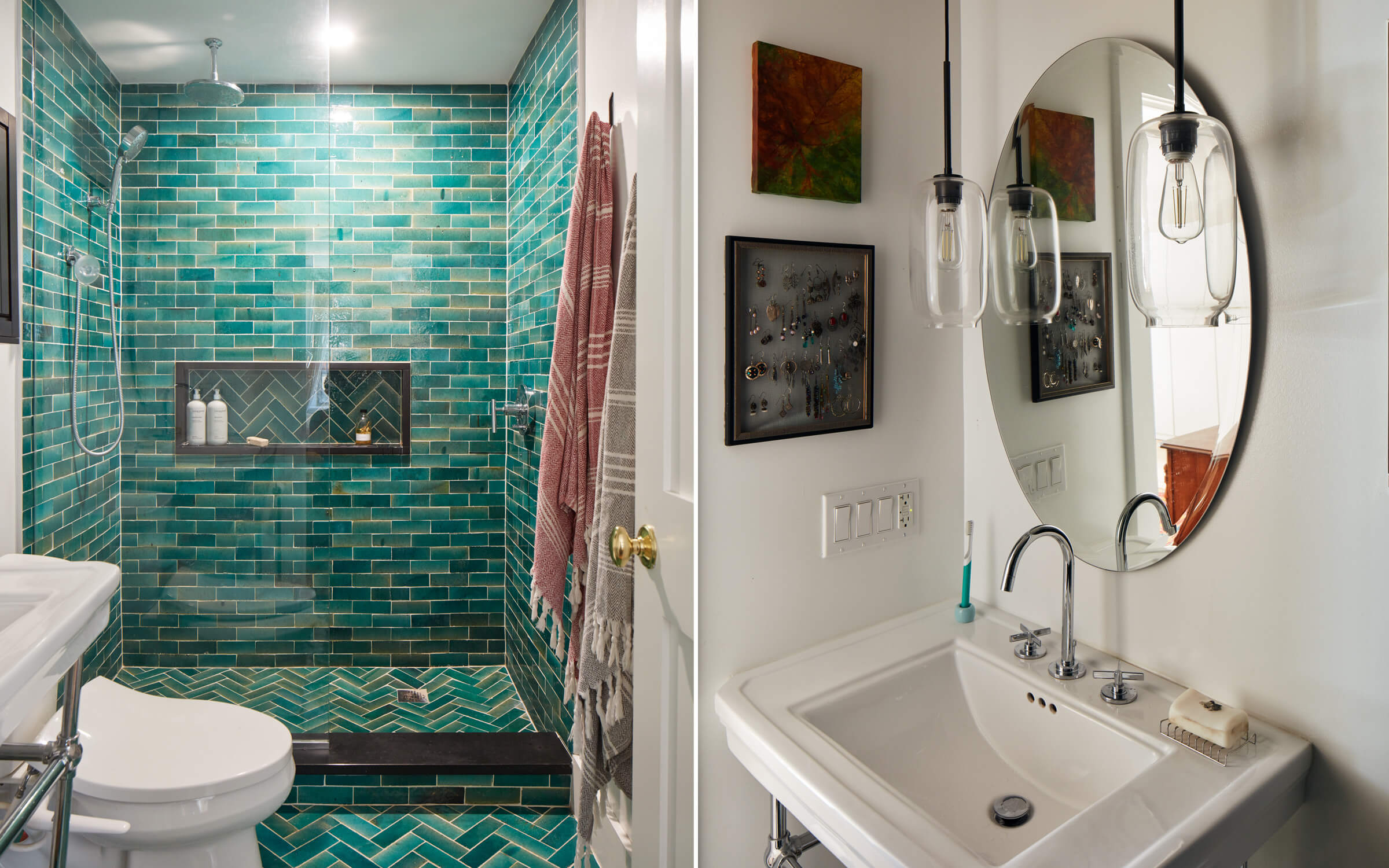
The homeowners took on a great deal of the sourcing, locating reclaimed walnut for the newly laid wide-plank floors and finding a flat-pack kitchen company to supply the red oak cabinets for the kitchen. The kitchen is homey, sans fancy marble or a glass wall. Though Jacoby said her clients had “no huge bathroom dreams,” they splashed out with shiny green Moroccan tiles in the new primary bath, adjacent to the main bedroom on the garden level. The garden floor, which was entirely gutted and rebuilt, has a second bedroom and another full bath, put to good use when the Baskins fostered two teenagers for a time, and now in service as a nursery for the baby girl they welcomed in March.
Even homeowners with confident tastes sometimes decide to consult an interior design professional, as the Baskins did toward the end of the renovation when they found themselves in a furniture placement conundrum. Trying to figure out how to accommodate Jacob’s home office, TV watching and space for conversation with guests all in the front parlor, Jackie said, “We saw options, and all of them were bad.”
Enter Melissa Lee of Bespoke Only, a New York City-based boutique design firm, to resolve the furniture layout, find missing pieces of the furniture puzzle, and buck up her clients’ will on the use of strong color. “The ‘aha moment’ with Melissa was when she suggested a curved couch” for the front parlor, Jackie said. “She helped us realize it didn’t have to be crammed up flush against the wall, which had never even occurred to me. It makes the space feel continuous and organic.”
For her part, Lee was excited to work with color-loving clients. “That’s the secret part of me, but there are not a lot of opportunities” to go uber-saturated, the designer said. “Most people gravitate toward a more neutral palette.” Lee was equally ready to embrace her clients’ interest in the notion of an old English library, “cozy and snug, with a rich, cocooned feel,” as inspiration for the front parlor.
As the concept came together, Lee recalls, “Everybody was on the lookout.” She found accessibly priced furnishings, including the game-changing blue velvet sofa, coffee tables, and an ottoman at sources like Modshop, Zara Home, Jason Home and One Kings Lane. It was Lee who spotted a pair of mint-condition antique wood armchairs, newly upholstered with striped fabric, at an antiques warehouse in Hudson, N.Y., for extra seating in the front room.
The Baskins’ random-mix approach happens to be “a signature of English decor,” Lee pointed out. It’s equally apparent in the deep-red rear parlor, or dining room, whose furnishings include a wood-slab table – a rare concession to modern design – Windsor-style spindle chairs, and a lacquered Chinese highboy found in a flea market. The varied artworks include a vivid rooster painting by Jackie’s mother, an artist and potter; a lithograph by Jacob’s late great-uncle, Leonard Baskin, a well-known sculptor and printmaker; a collection of masks brought back from their travels; and figural tiles hand-painted by the couple on the hearth in front of the fireplace.
What ultimately comes forth in the Baskins’ home is a sense of exuberant welcome, precisely the effect the couple wanted. “It was very important that the house didn’t feel too serious,” Jackie said. “We wanted a warm, non-judgmental space people would feel relaxed in, like they could throw themselves on the couch and be at ease.” That easy feeling begins right up the stoop, at the original double entry doors, which – by the way – are painted magenta.
[Photos by Ty Cole]
Editor’s note: A version of this story appeared in the Spring/Summer 2022 issue of Brownstoner magazine.
Related Stories
- Old Meets New in Workstead’s Meticulously Designed and Crafted Brooklyn Interiors
- Artisanal Home Goods Get a Tryout at Assembly Line in Boerum Hill
- Blithe Spirits: An Inviting, Colorful Ditmas Park House Is a Pick-Me-Up
Email tips@brownstoner.com with further comments, questions or tips. Follow Brownstoner on Twitter and Instagram, and like us on Facebook.



What's Your Take? Leave a Comment