The Insider: Attention to Detail Shines in Loft-like Brooklyn Heights Apartment Reno
A couple purchased two adjacent sixth-floor units and called on Brooklyn’s Shapeless Studio to combine and reimagine them.

Photo by Hagan Hinshaw
Got a project to propose for The Insider? Please contact Cara Greenberg at caramia447 [at] gmail [dot] com.
The late 19th century brick building had been through a lot of changes, from its origins as a warehouse to a part of the Hotel St. George, and then to condo conversion in the 1970s. More recently, a couple with a young daughter purchased two adjacent sixth-floor units, a studio apartment and a two-bedroom totaling 1,820 square feet, and called on Brooklyn’s Shapeless Studio to combine and reimagine them.
What followed was a thoroughgoing gut. “We took out absolutely everything, down to the subfloor,” said Andrea Fisk, an architect and founding partner, with Jess Hinshaw, in the five-year-old Boerum Hill-based architecture and interiors firm. “Everything you see is new.”
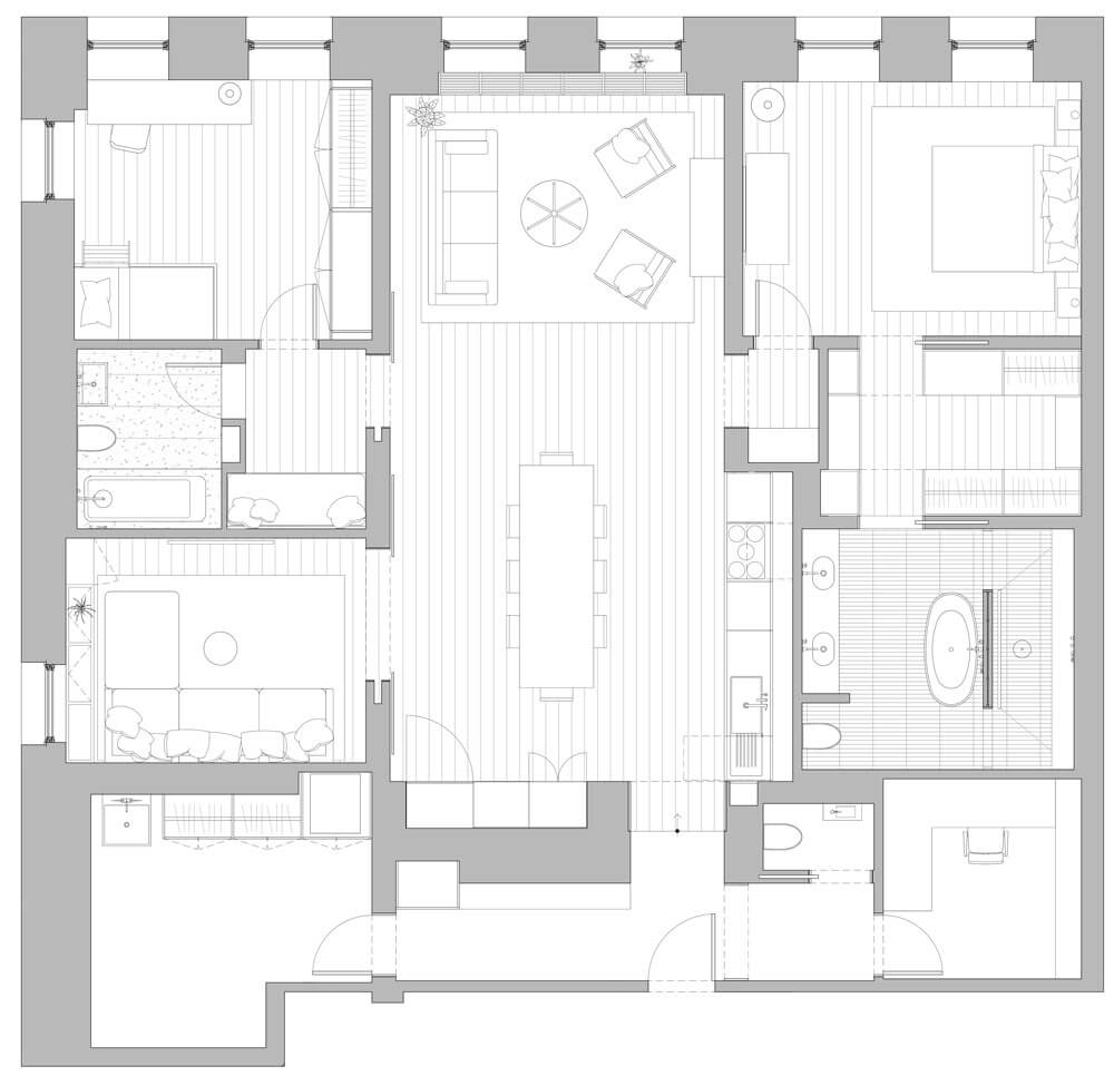
“We wanted to create a large central area that everything pinwheels off of,” said Fisk, with more private areas along the sides for TV watching and a home office. “Before the renovation, the space felt dark and cramped. Almost all the windows are on one side of the building, and the apartment is much deeper than a typical New York apartment, so the main drivers for the project were making sure enough light was able to penetrate deep into the space and figuring out how to use the darker areas. That drove the organization for us.”
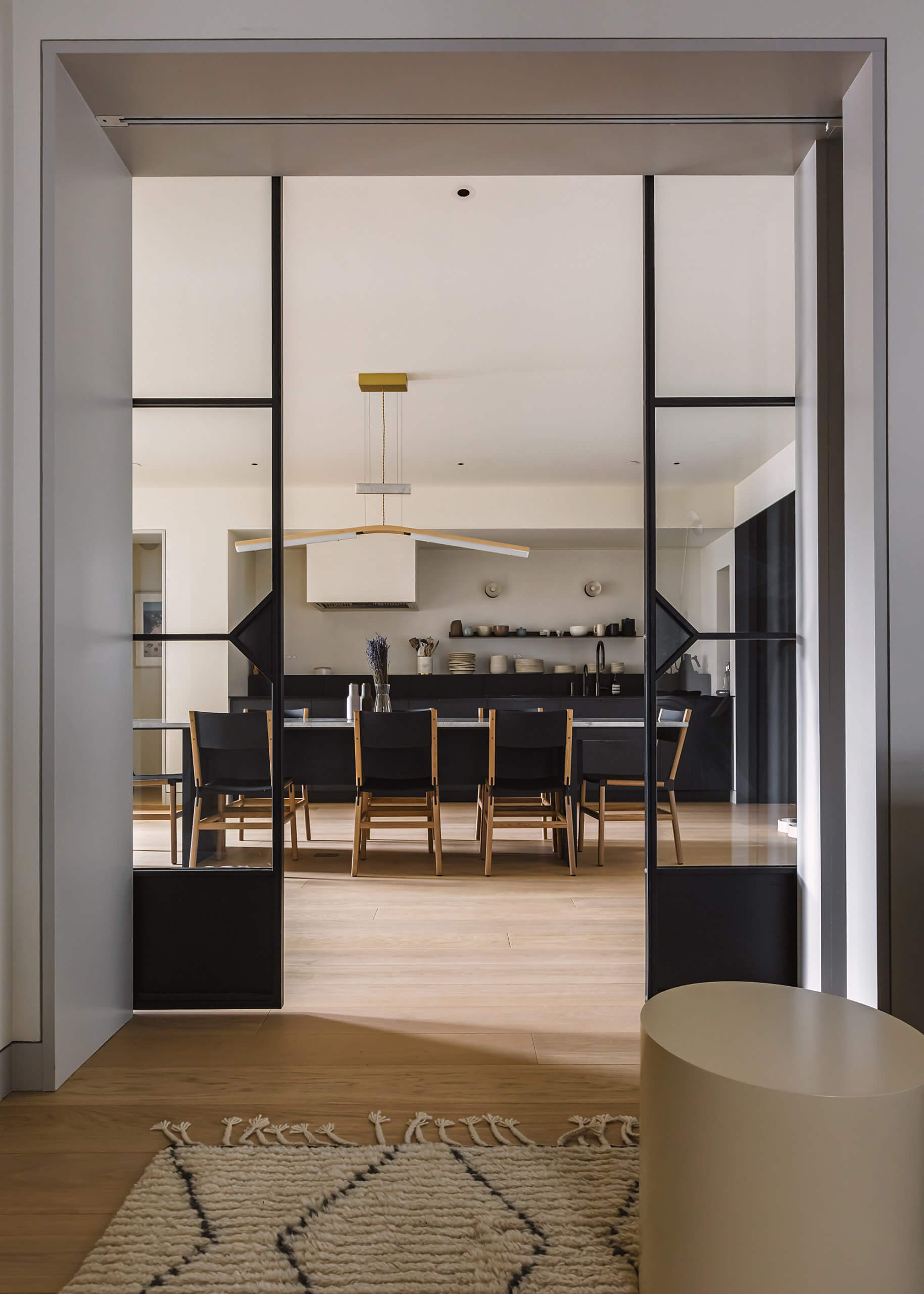
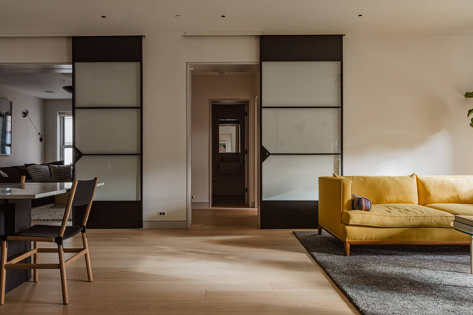
Post-reno, one enters to a foyer of moody navy blue, stepping from there into the bright, loft-like main living space. “That’s our clients’ favorite moment,” Fisk said. There are a home office and powder room to the right of the entry and a walk-in closet on the left, none of which have natural light. The primary suite, with a bedroom, pass-through closet and luxurious though windowless bath, occupy space along one side of the central living space; the daughter’s room and a family room/TV lounge sit along the other, defined by sliding glass and steel doors reminiscent of Shoji screens.
The open, clutter-free kitchen near the apartment’s entry is the soul of discretion, with appliances rendered nearly invisible. “We like designing kitchens that don’t feel like kitchens,” Fisk said. “But we want them to function well for a home cook, so we are always looking for clever ways to do that and to have all the storage.” With this kitchen, “We made it a little more quiet, so the middle of the room still seems like an elegant dining space.”
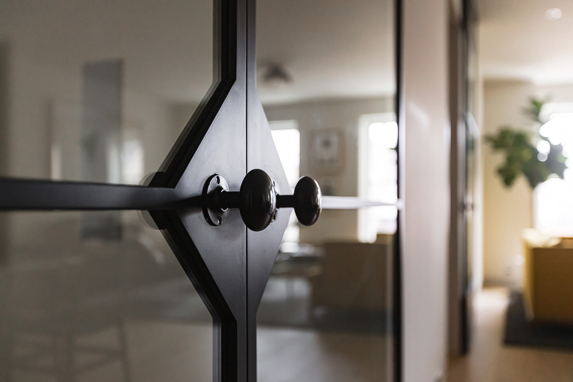
Fisk praises her clients as “gems,” appreciative of and willing to go all in on beautifully crafted millwork by Brooklyn-based ArmadaNY and distinctive custom details, like the triangular plates behind doorknobs.
The apartment’s overall aesthetic has a touch of industrial style suggested by elements of steel, glass and metal in the lobby and communal spaces of the building. Said Fisk: “We love designs that are really simple and have a tactile quality. That shares a lot with Japanese design.”
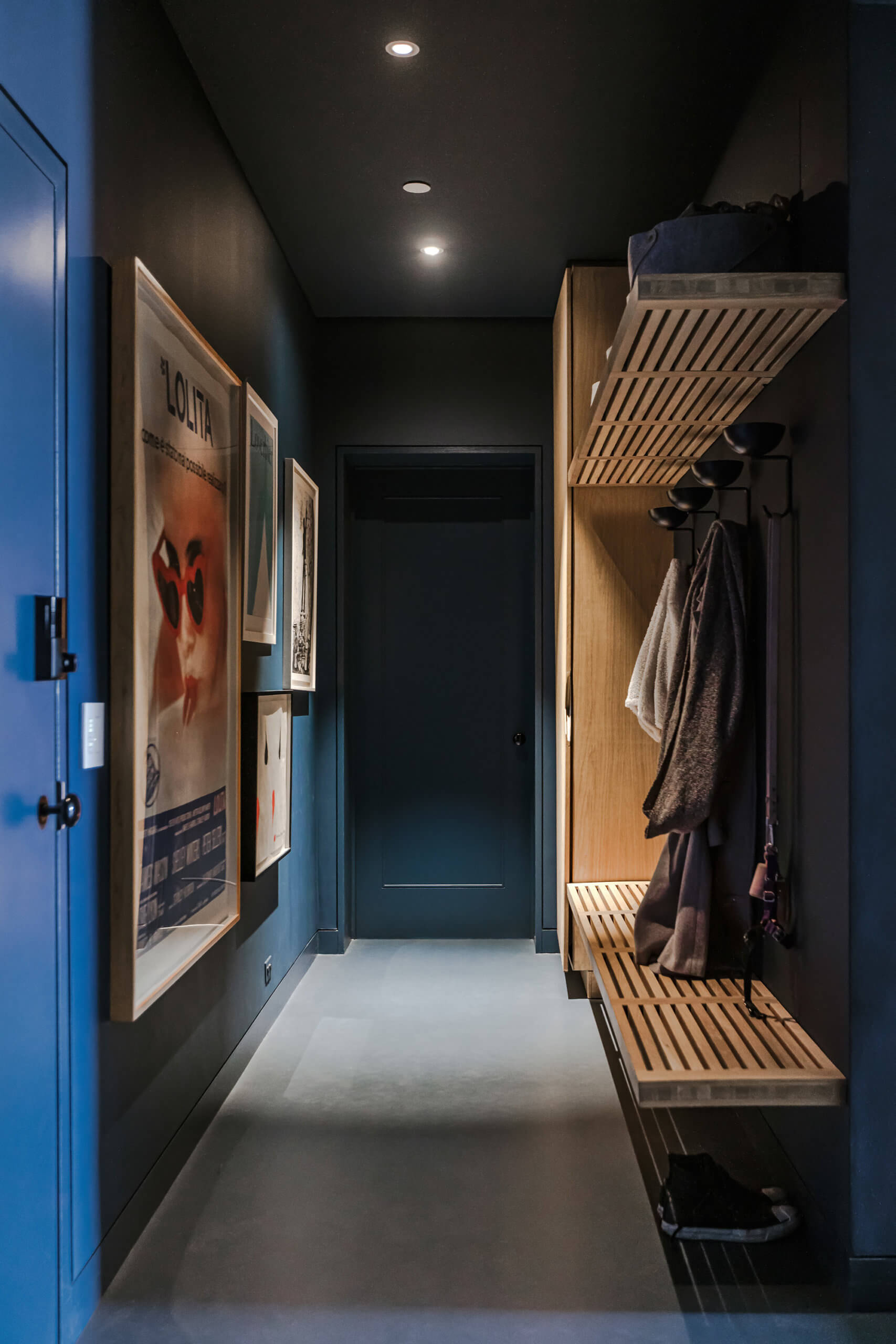
The entrance to the apartment is at the farthest point from the windows, Fisk said, “so we decided to embrace this darker area in a moodier way.” The foyer/mudroom is enveloped in dark blue paint, with a linoleum floor and one of the slatted benches found throughout the apartment.
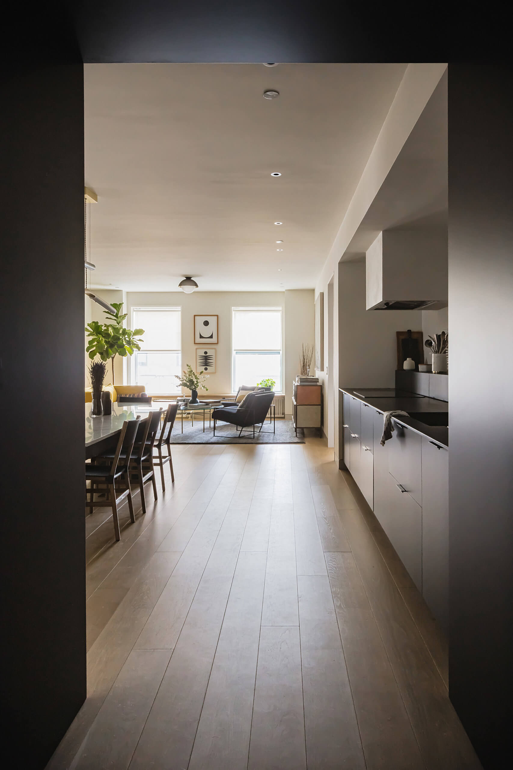
The transition from the saturated entryway to the calm and light-filled main living space is dramatic.
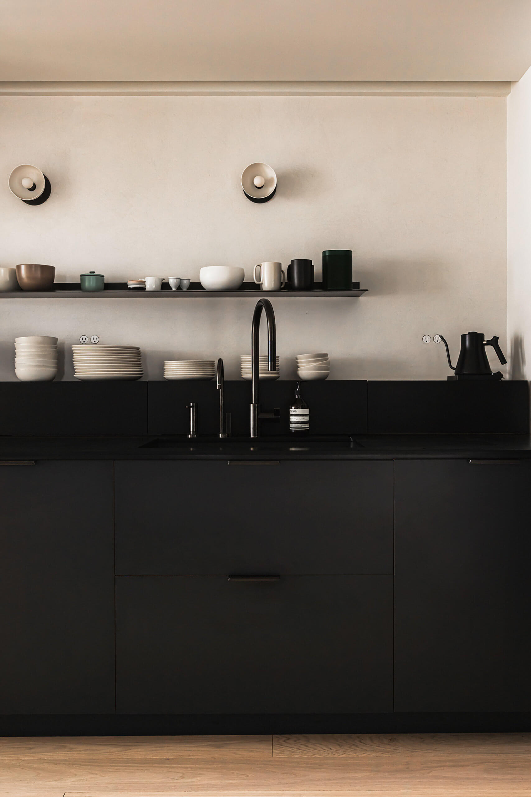
The kitchen cabinetry is navy blue, like the entry, with a backsplash of lightly speckled plaster. A thin metal shelf holds mostly Heath ceramics from California. The round porcelain sconces glow at night.
The countertops are a sustainable material called Richlite, made from compressed paper. Along the back of the counter, closed cubbies house the most-used items, so although there are no upper cabinets, there is still plenty of discreet storage.

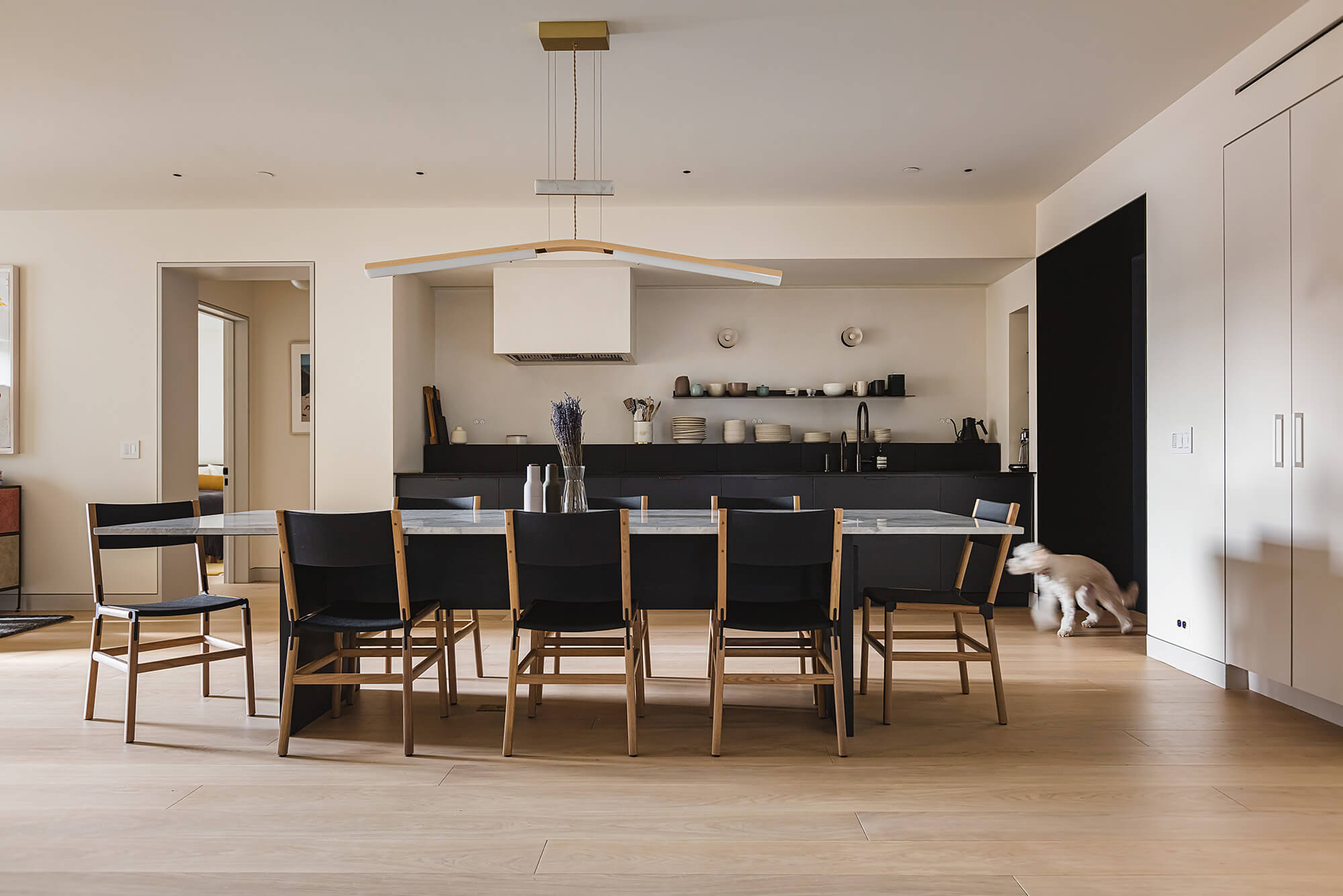
“We wanted the pantry and fridge to recede and become part of the architecture, so we used a lighter-colored cabinetry which blends with the wall color” along an adjacent wall, Fisk said.
Shapeless Studio created an oversized custom dining table with a wood base and stone top, lit by a minimalist wood and marble pendant light from Brooklyn-based Fort Standard. The leather dining chairs were sourced from Croft House.
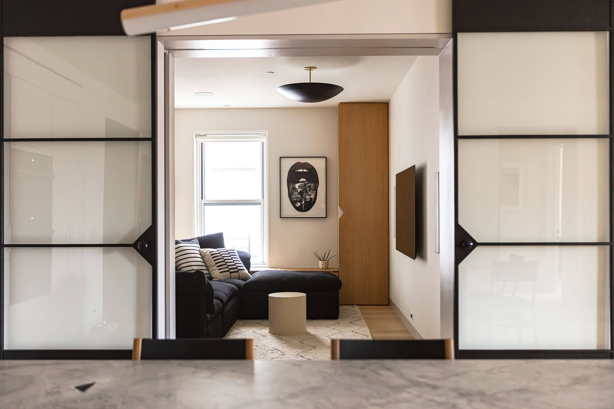
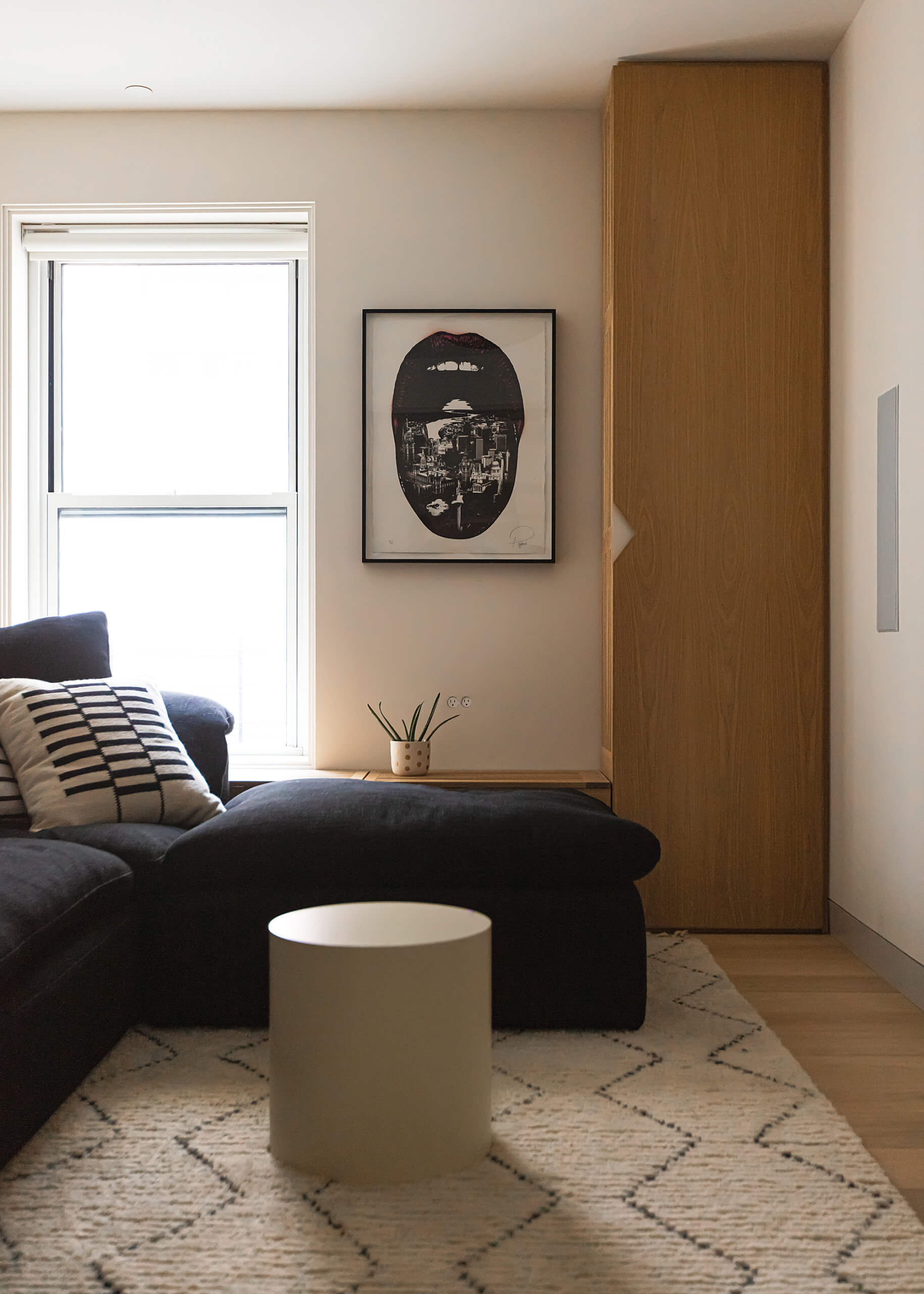
A multi-purpose nook with one side window has a custom-built slatted bench and media cabinet with triangular detail and a soft Moroccan rug.
A curtain to cover the clear glass doors allows the space to double as an occasional guest room.
Playful triangular details, as on the sliding doors, are found throughout the space.
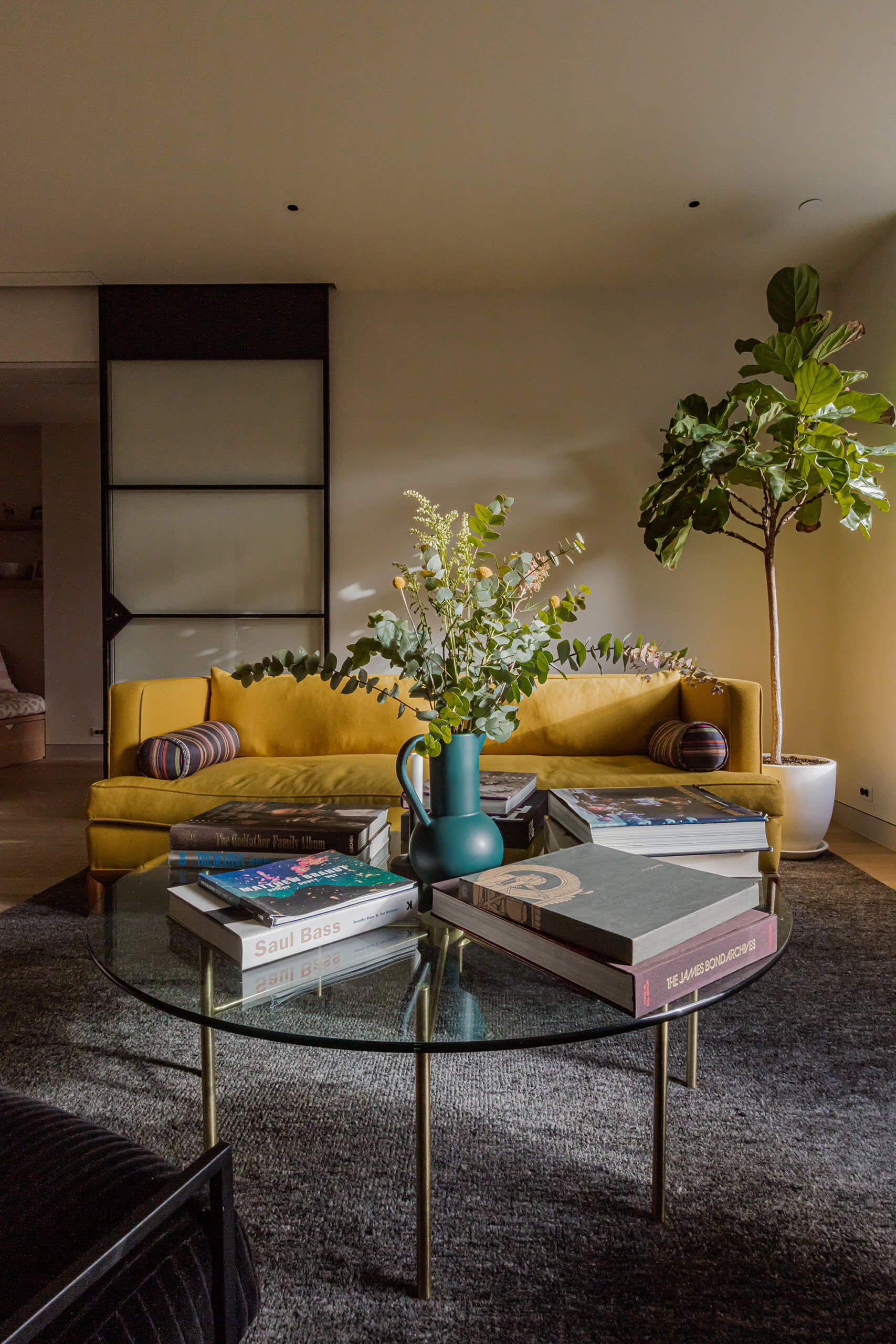
Furnishings were chosen by the homeowners, including the mustard yellow sofa that enhances the sunlight streaming in to the main living area from south-facing windows.

The main bedroom is part of a suite that also includes a walk-through closet and luxurious bath.
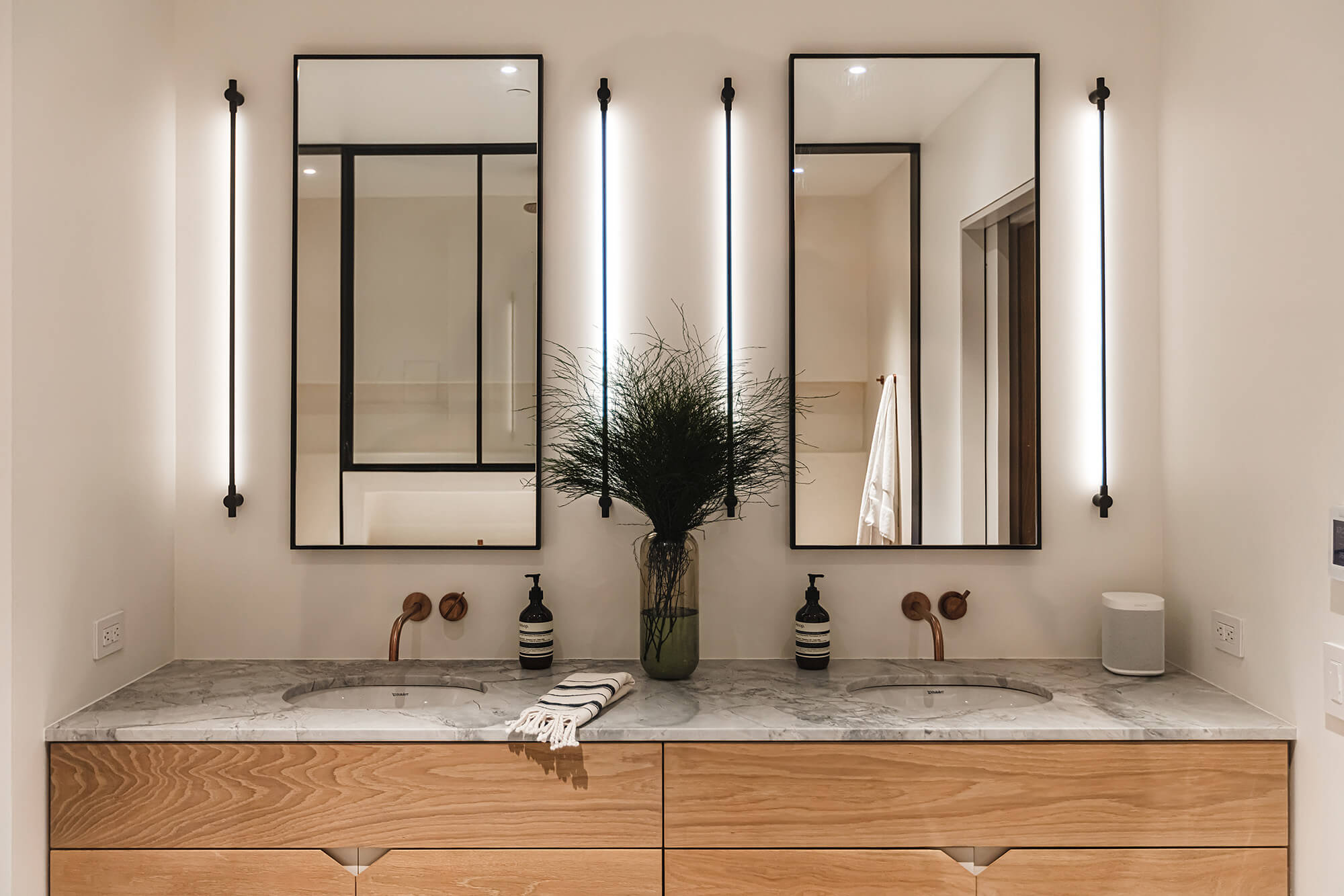
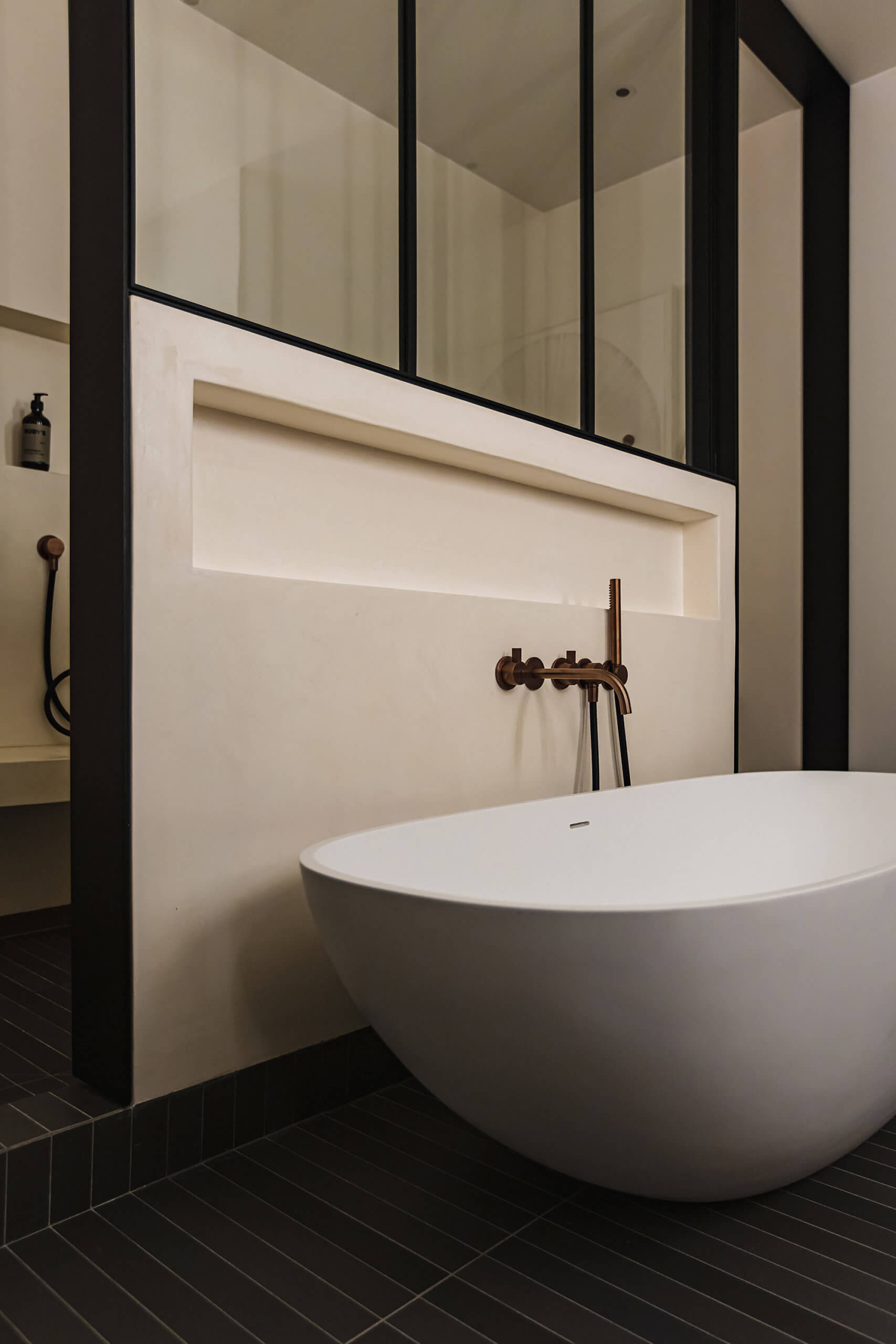
The double vanity’s top is made from the same stone slab as the dining table, flanked by slim surface mount sconces from Juniper. The shower walls were finished with Tadelakt, a waterproof plaster left its natural creamy white.
[Photos by Hagan Hinshaw]
Related Stories
- The Insider: Brownstoner’s in-Depth Look at Notable Interior Design and Renovation Projects
- The Insider: ‘Down to Subfloor’ Reno Updates Cobble Hill Top Floor Apartment and Roof Deck
- The Insider: Modern Minimalism Blends Seamlessly into Victorian Bed-Stuy Townhouse
- The Insider: Gut Reno Brings Warm Minimalism, Loft-like Feel to Clinton Hill Brownstone Duplex
The Insider is Brownstoner’s weekly in-depth look at a notable renovation and/or interior design project by design journalist Cara Greenberg. Find it here every Thursday morning.
Email tips@brownstoner.com with further comments, questions or tips. Follow Brownstoner on Twitter and Instagram, and like us on Facebook.





What's Your Take? Leave a Comment