The Insider: Architect Makes Sense of Awkward Space in Heights Triplex
Batliboi Studio reconfigured a poorly laid out triplex in a converted church to create cohesive, usable spaces and add storage.

Photo by Ashok Sinha
Got a project to propose for The Insider? Contact Cara at caramia447 [at] gmail [dot] com
A few decades back, carving up historic churches into residential units was all the rage in Brooklyn’s brownstone belt. Such conversions often resulted in awkward living spaces. That was the case in this 2,400-square-foot triplex at the rear of a mid-19th century Gothic Revival church converted to co-ops in the late 1970s, one of 10 units in the Brooklyn Heights building.
“All the units have these quirky layouts,” said architect Hormuz Batliboi of Greenpoint-based Batliboi Studio, who was hired by new homeowners to reimagine the space almost in its entirety. “In this instance, it had not been updated since soon after it was first converted to co-ops. It had volumetric dimension — a first floor, mezzanine and third floor above — but a very inefficient layout. Space wasn’t organized in a way that made sense.”
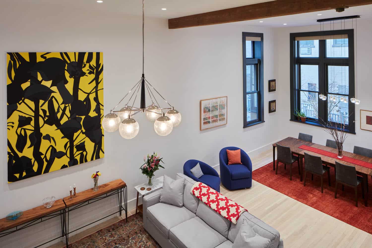
The entry area had a low ceiling and “all this excess space, but not much use for it,” the architect said. “There was a very large powder room you had to navigate around, and not much storage.” Batliboi reclaimed the wasted footage for a new mudroom and closets. Further into the apartment, where the ceilings soared to 14 feet, “There was a raised dining area in the back that created two very separate zones that didn’t flow. The platform had a very ’80s feel, and there was a full wall of mirrors.”
The mezzanine was another problem area, with a switchback stair that ate up potentially useful square footage. “The mezzanine was a hodgepodge with a sheetrock railing,” Batliboi said. “There wasn’t any unifying proportion or logic. You didn’t know where to look.”
To rectify all this, Batliboi Studio made a few major moves. “We took out that raised platform so everything was on the same level. Taking it off created one large volume and unified the space,” enhanced by new white oak floors. They also reoriented the L-shaped kitchen, opening it up to the living room while working around an existing fireplace.
Another big move was dismantling the second run of the existing switchback staircase, from the mezzanine to the third floor, and stacking it above the first, re-using the stringers and stair structure. That created more usable floor area on the mezzanine for a flexible home office/den/media room and laundry room, and on the top level for an expanded primary bath.
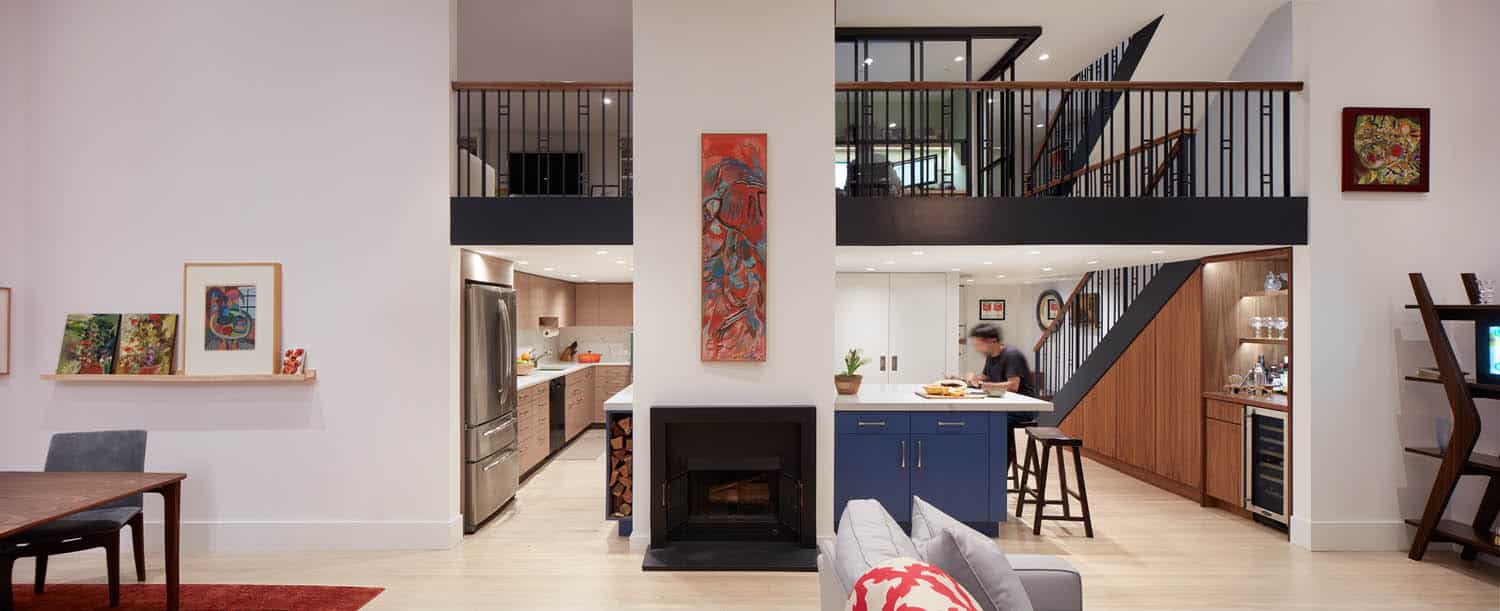
Looking back toward the mezzanine from across the space, Batliboi recalled, “We realized that two thirds of the left side could be closed up to the ceiling, and the right side left open,” instead of what had been one long open run of balcony across the space.
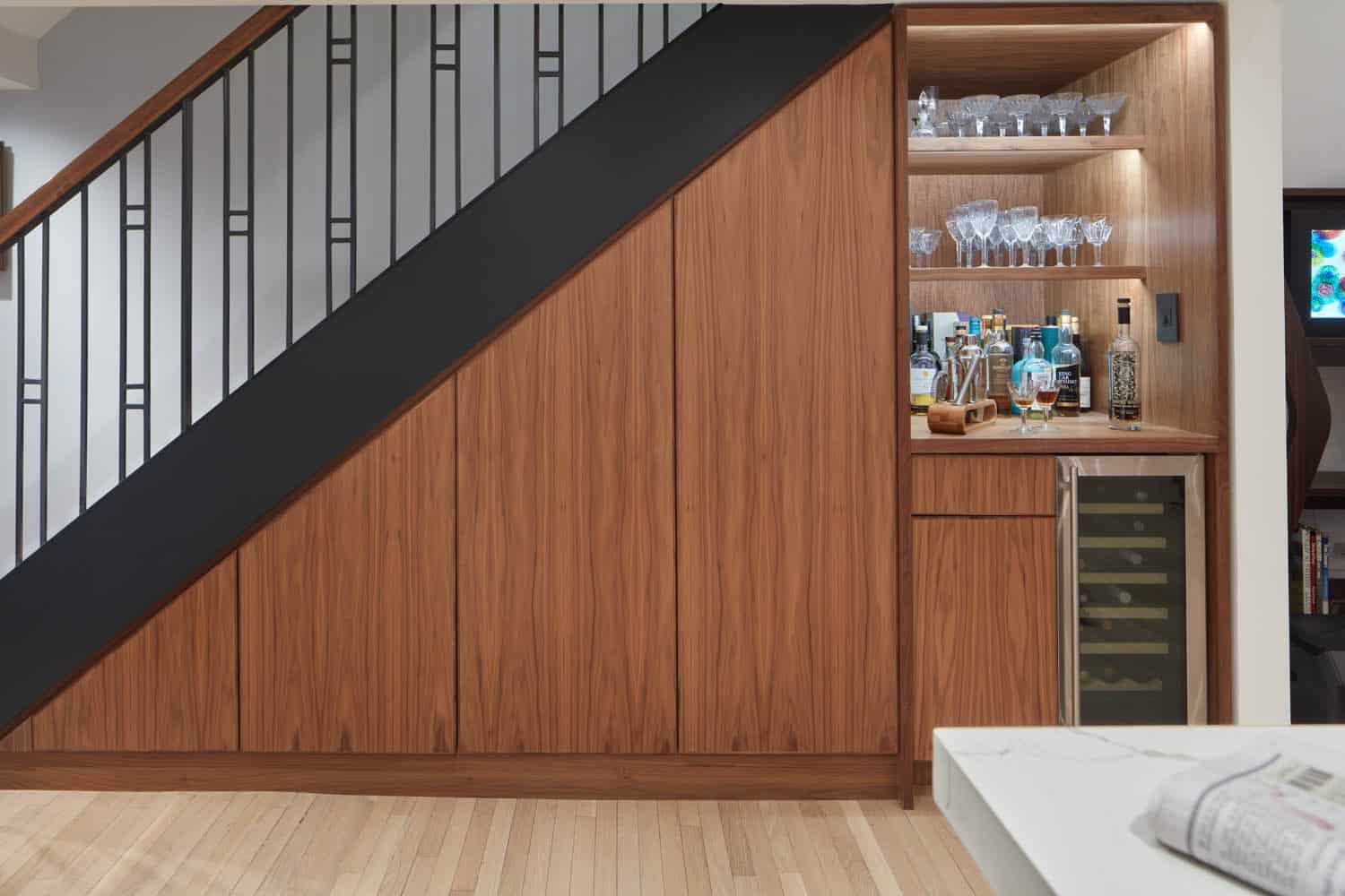
Batliboi was strategic in renovating the kitchen, keeping a large part of the original cabinetry but adding a new blue peninsula/island parallel to the length of the living room, straddling an existing fireplace. He tucked a group of tall new cabinets behind the island, as well as new closets and a bar, clad in walnut veneer, underneath the stairs.
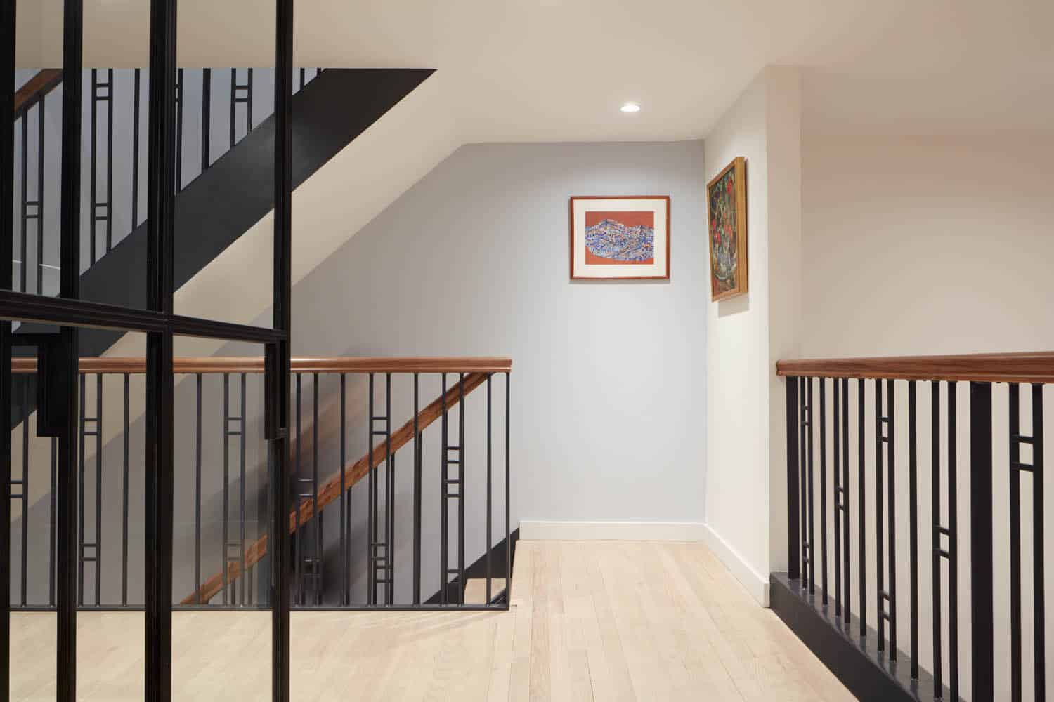
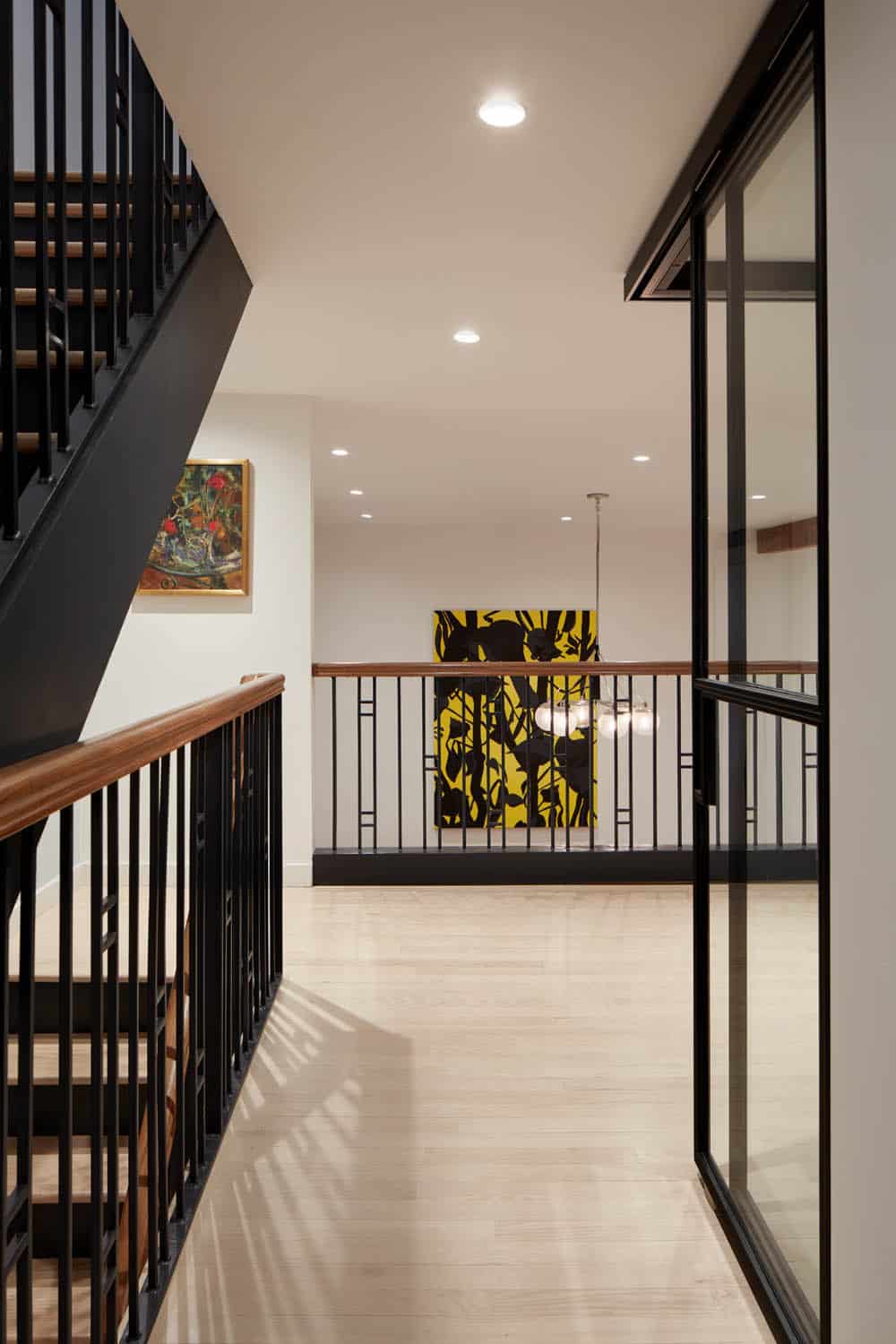
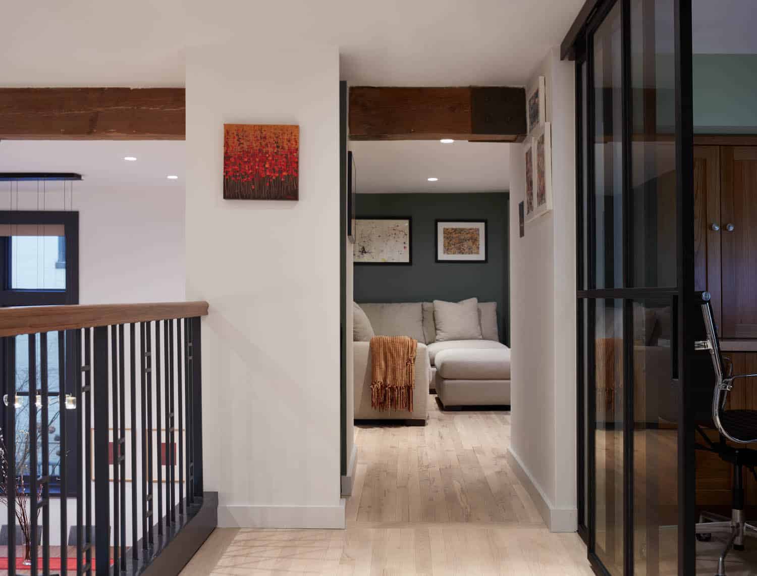
Glass walls with sliding doors — a custom system from the Brooklyn-based company Crystalia Glass — were Batliboi’s solution for discrete but flexible spaces on the mezzanine.
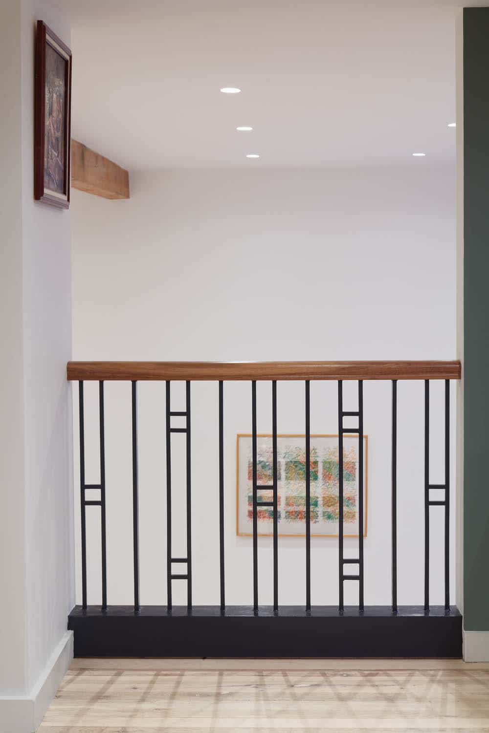
The studio designed custom metal railings for use throughout the apartment by piecing together standard stock sections of wrought iron. “We created this alternating pattern that really brought life to the space,” the architect said.
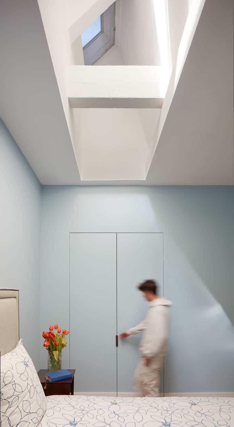
Skylit bedrooms on the top floor have new seamless closets.
“Before” photos below show the dramatic transformation of the unit.
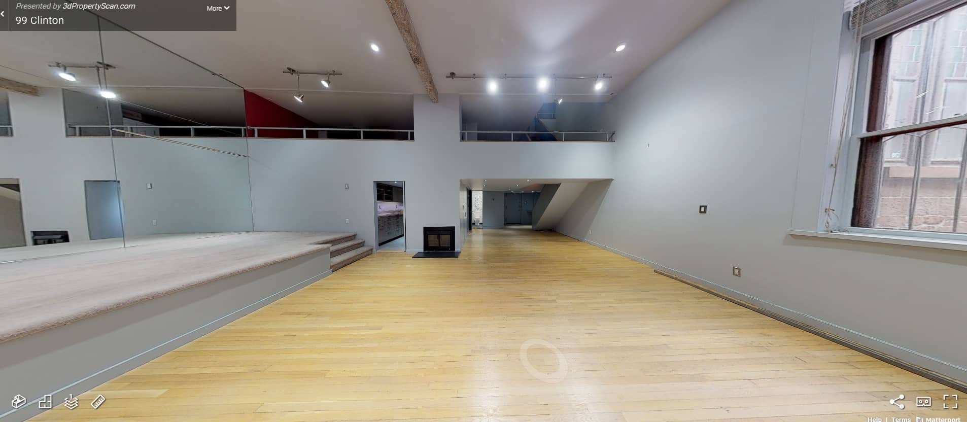
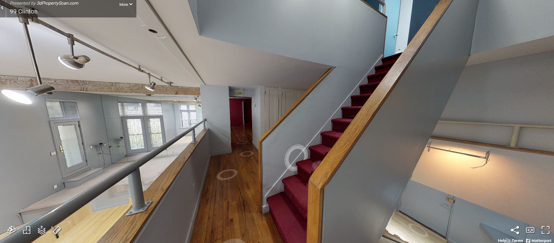
[Photos by Ashok Sinha | “Before” photos via Batliboi Studio]
The Insider is Brownstoner’s weekly in-depth look at a notable interior design/renovation project, by design journalist Cara Greenberg. Find it here every Thursday morning.
Related Stories
- The Insider: Unique Furnishings Lend European Flair to Family’s Bed Stuy Rental
- The Insider: Boerum Hill Townhouse Reno Beefs Up Energy Efficiency, Saves Detail
- The Insider: Wood and Glass Dividing Wall Reshapes Brooklyn Heights Loft
Email tips@brownstoner.com with further comments, questions or tips. Follow Brownstoner on Twitter and Instagram, and like us on Facebook.





What's Your Take? Leave a Comment