The Insider: Thoughtful Space Planning, Earthy Materials Distinguish Heights Townhouse Triplex
New owners of the upper-level unit called upon architecture firm Khanna Schultz to create a home in keeping with the intrinsic elegance of the original architecture.

Photo by Julian Wass
Got a project to propose for The Insider? Contact Cara at caramia447 [at] gmail [dot] com
The renovation of a mid-19th century Greek Revival in the 1980s divided the building into two large apartments. When new owners bought the upper unit, which includes a skylit double-height space at the top of the building, they called upon the Gowanus-based architecture firm Khanna Schultz to create a home in keeping with the intrinsic elegance of the original architecture.
“The upstairs kitchen and attic felt really modern compared to the second floor. We wanted to make the spaces feel like they belonged together,” said Veronica Patrick, who served as project architect along with her colleague Navajeet Khatri. “The goal was to make everything as cohesive and consistent as possible.”
“In a nutshell, we were taking a space with dramatic bones and enhancing its power,” said Vrinda Khanna, a founding partner of the firm. “Everything felt portioned and poky, and the finishes were really tired. A lot of what was done were small plan changes that had great impact in making the space feel more considered and organized.”
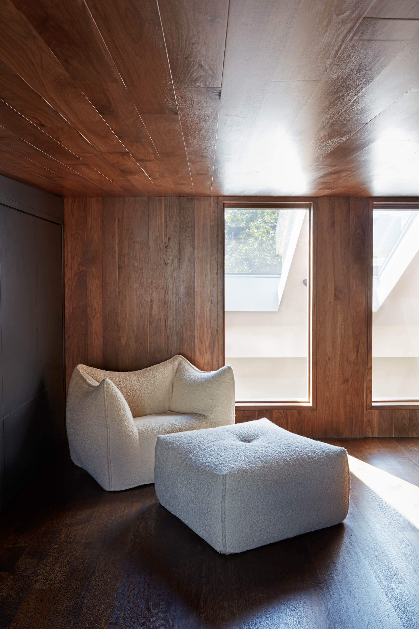
A unified materials palette went a long way toward achieving those aims, especially the use of walnut planks as wall and ceiling paneling in a way that adds both distinction and coziness.
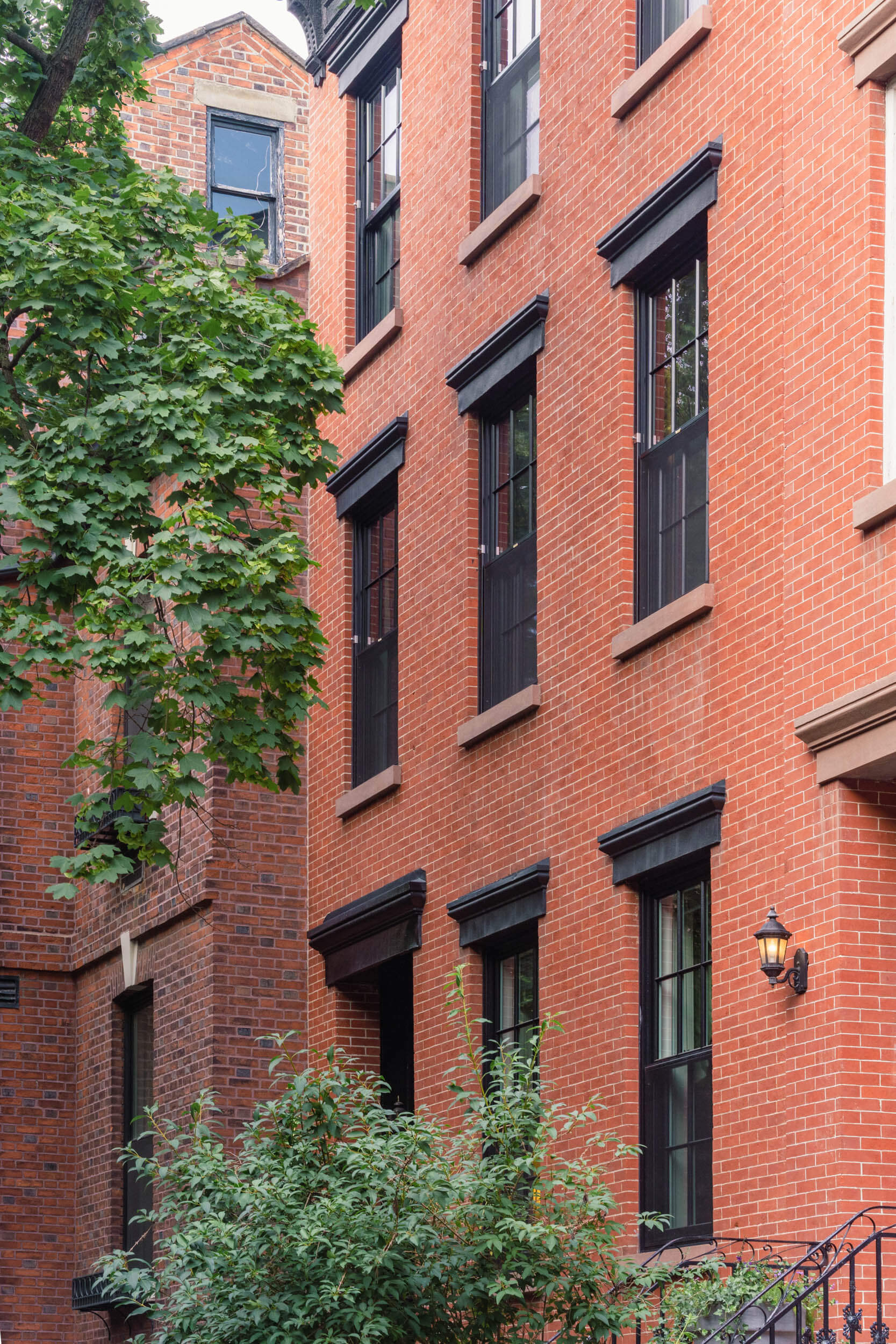
New, energy-efficient six-over-six windows in the front rooms satisfy the Landmarks requirement for the historic district. Beautiful marble fireplaces dating from the building’s original construction remain, with new stone hearths laid flush with dark-stained oak floors. Khanna Schultz designed extensive custom built-ins throughout the unit.
The building’s two units are entered through a shared parlor-level vestibule with two doors.
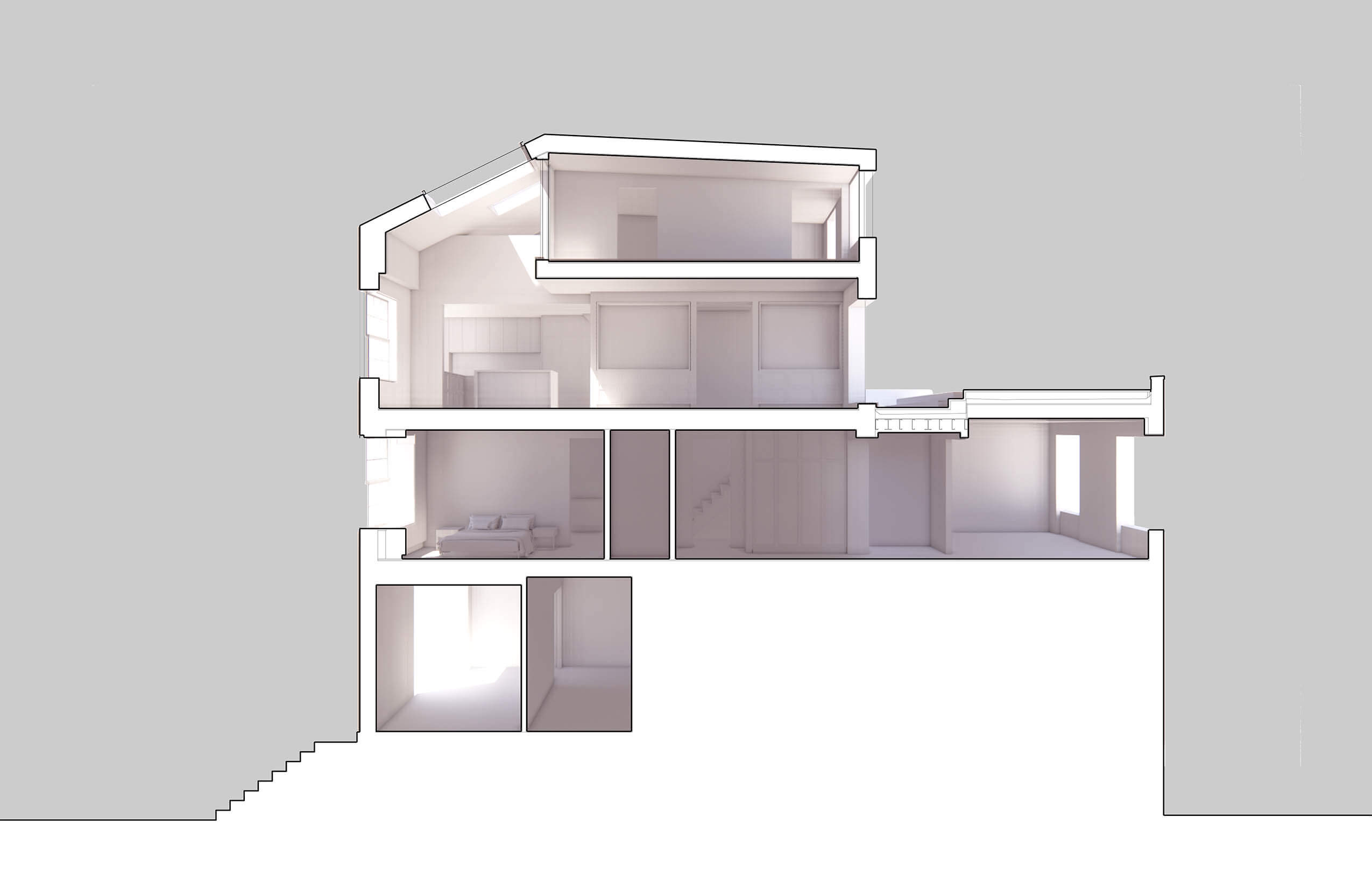
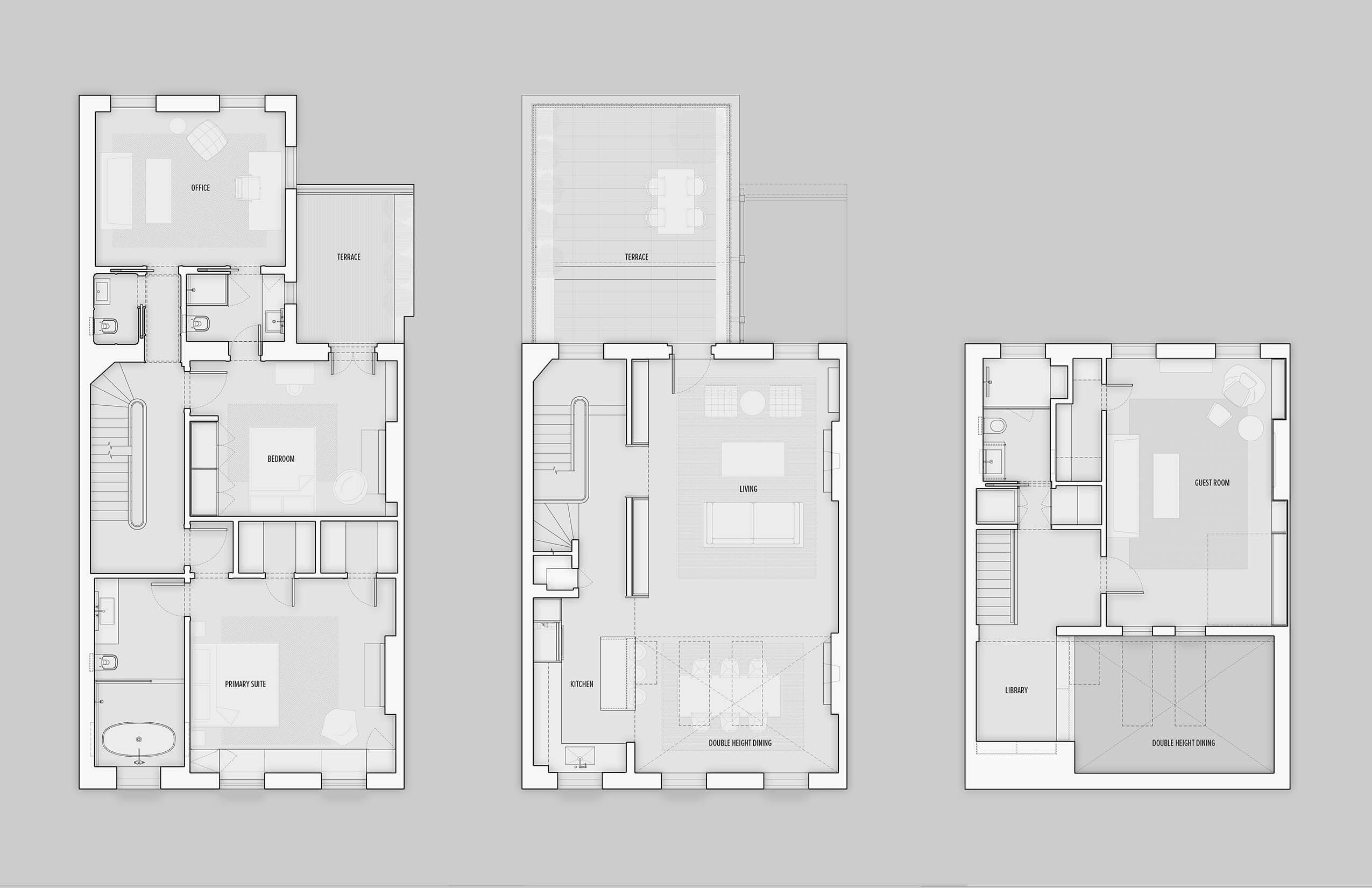
The building’s second floor — the lower level of the triplex, where two bedrooms and a home office are located — is 53 feet deep. The upper floors measure 34 feet deep.
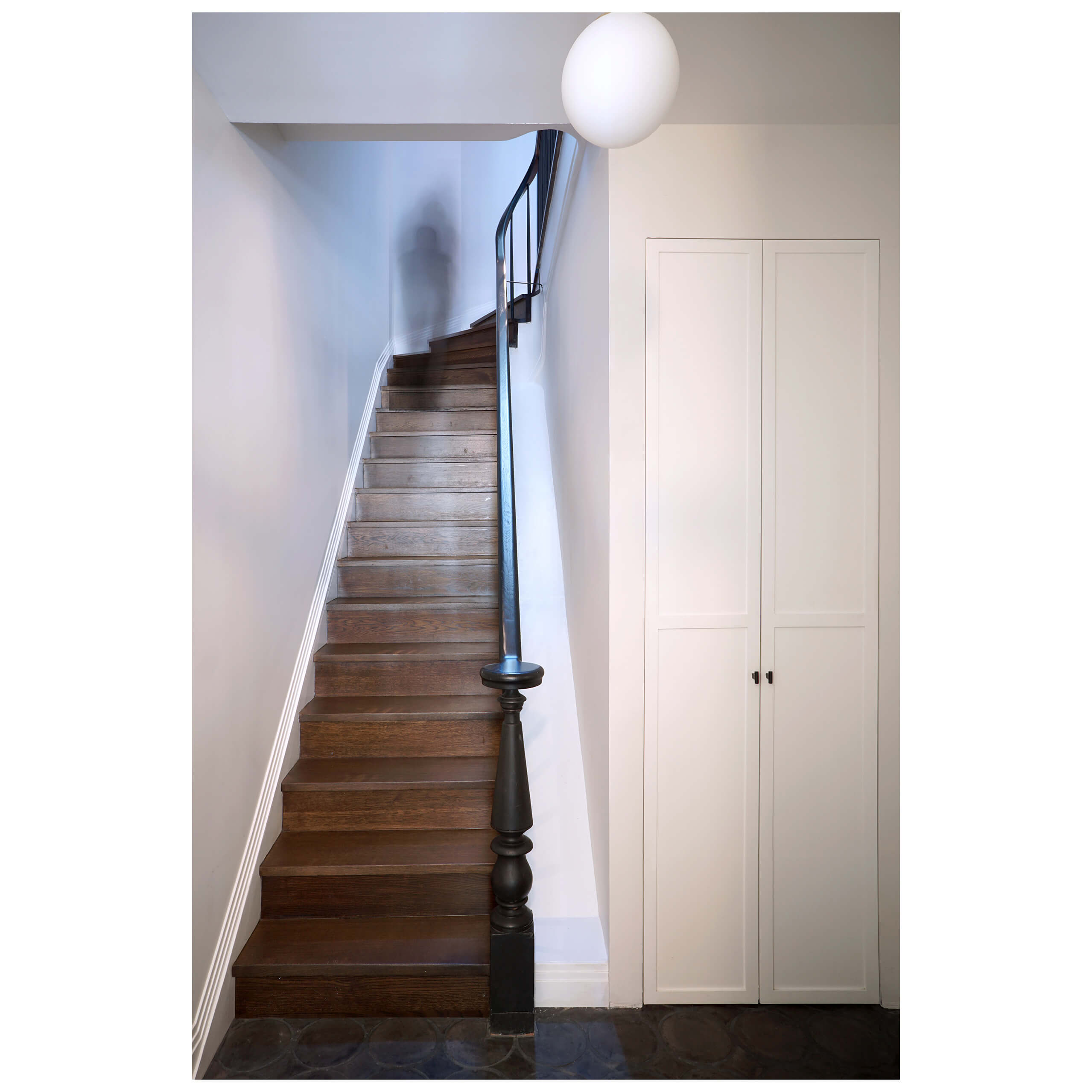
Upon entering the parlor-level vestibule, a long staircase to the clients’ unit lies ahead.
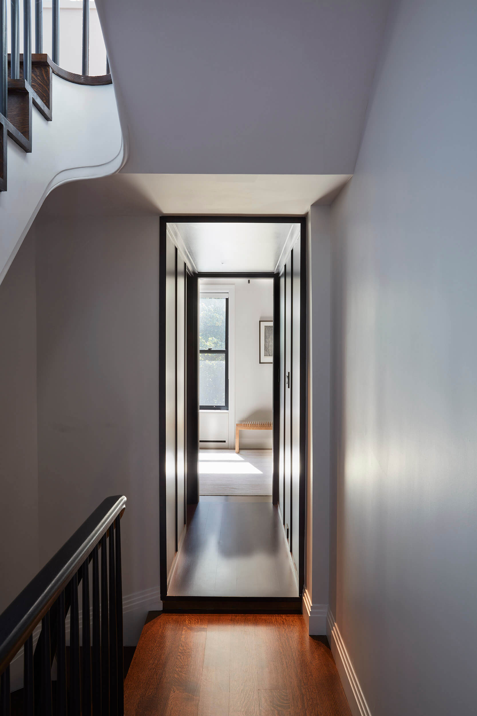
A tunnel-like hallway, painted a deep eggplant color, leads to a home office on the apartment’s lower level. Its floor was raised to accommodate plumbing pipes that couldn’t be moved, happily resulting in a dramatic portal effect.
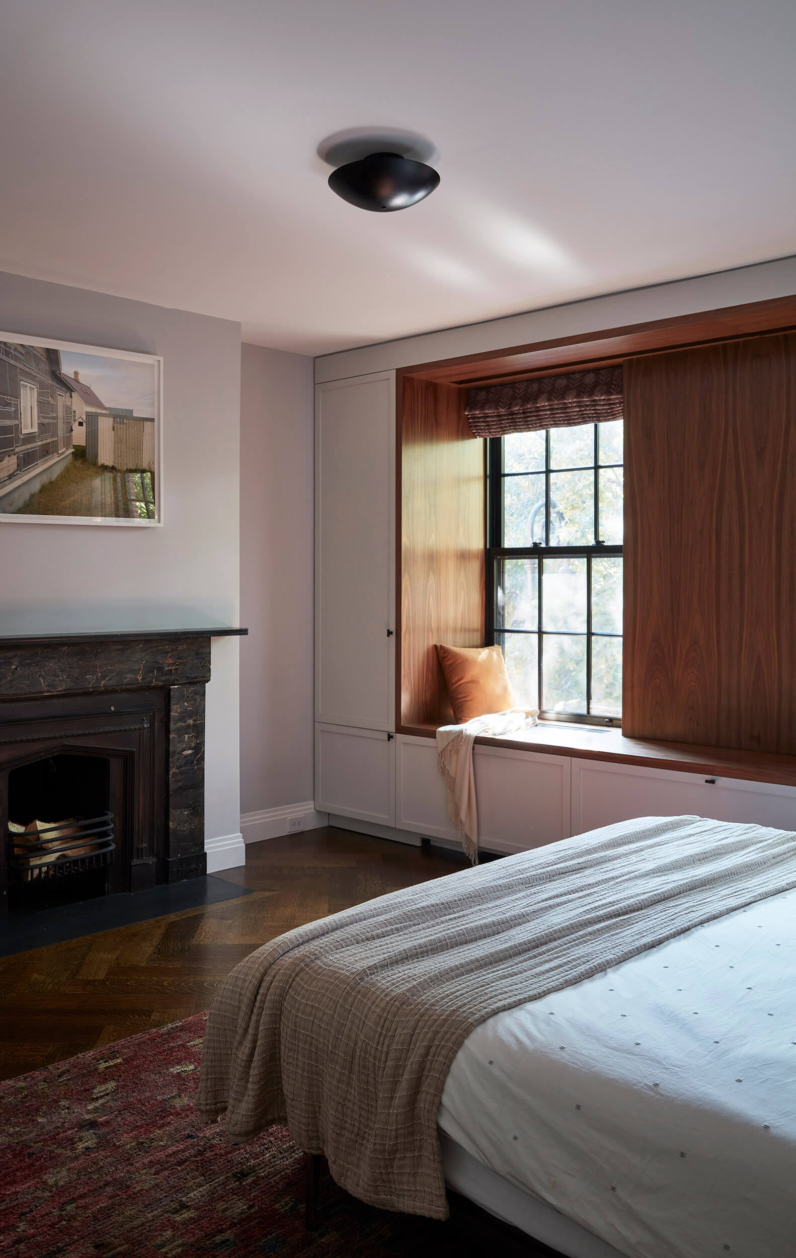
A walnut-trimmed window seat with custom storage around it distinguishes the primary bedroom.
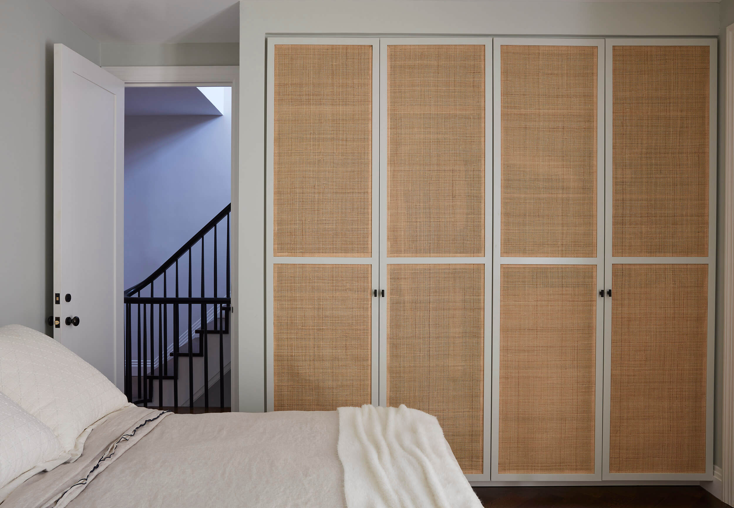
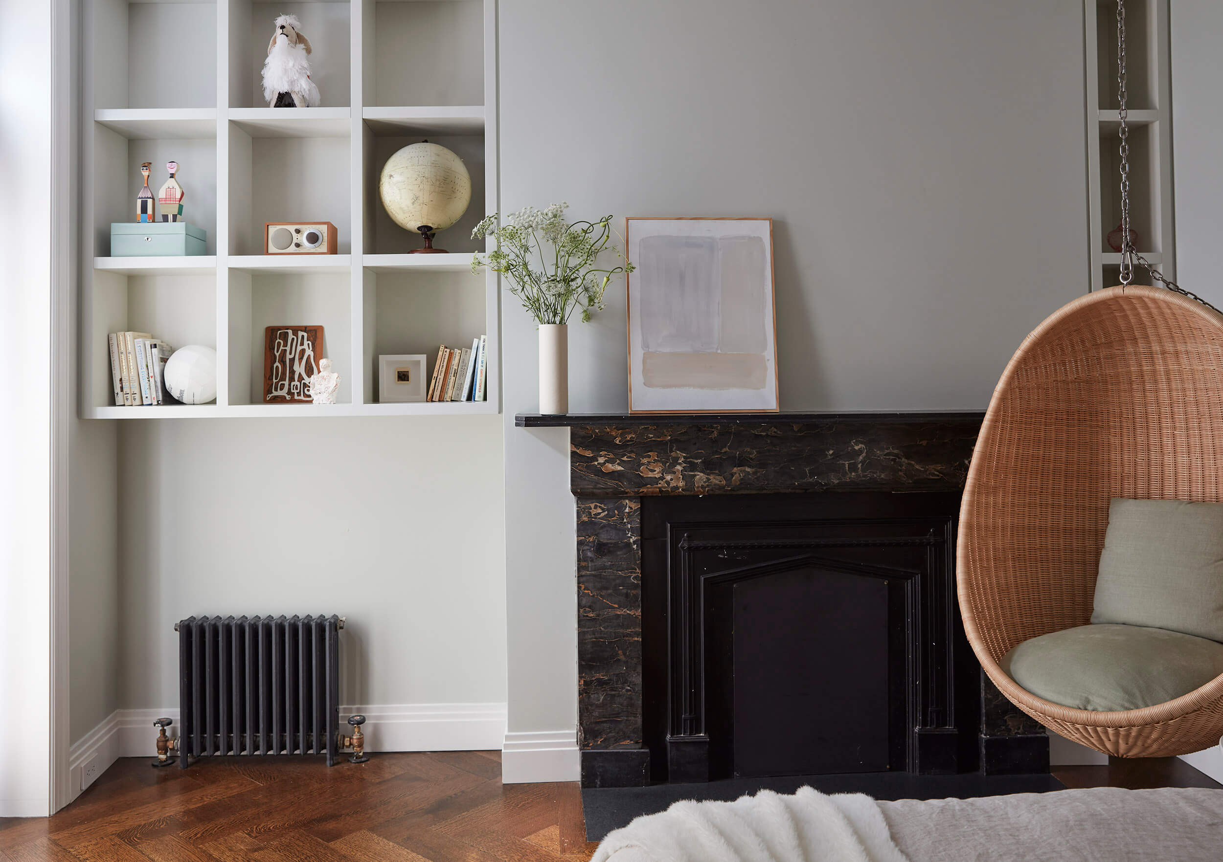
Tucked behind the primary bedroom on the second floor is a guest room with a swinging wicker seat from Fair Design and cane-door closets.
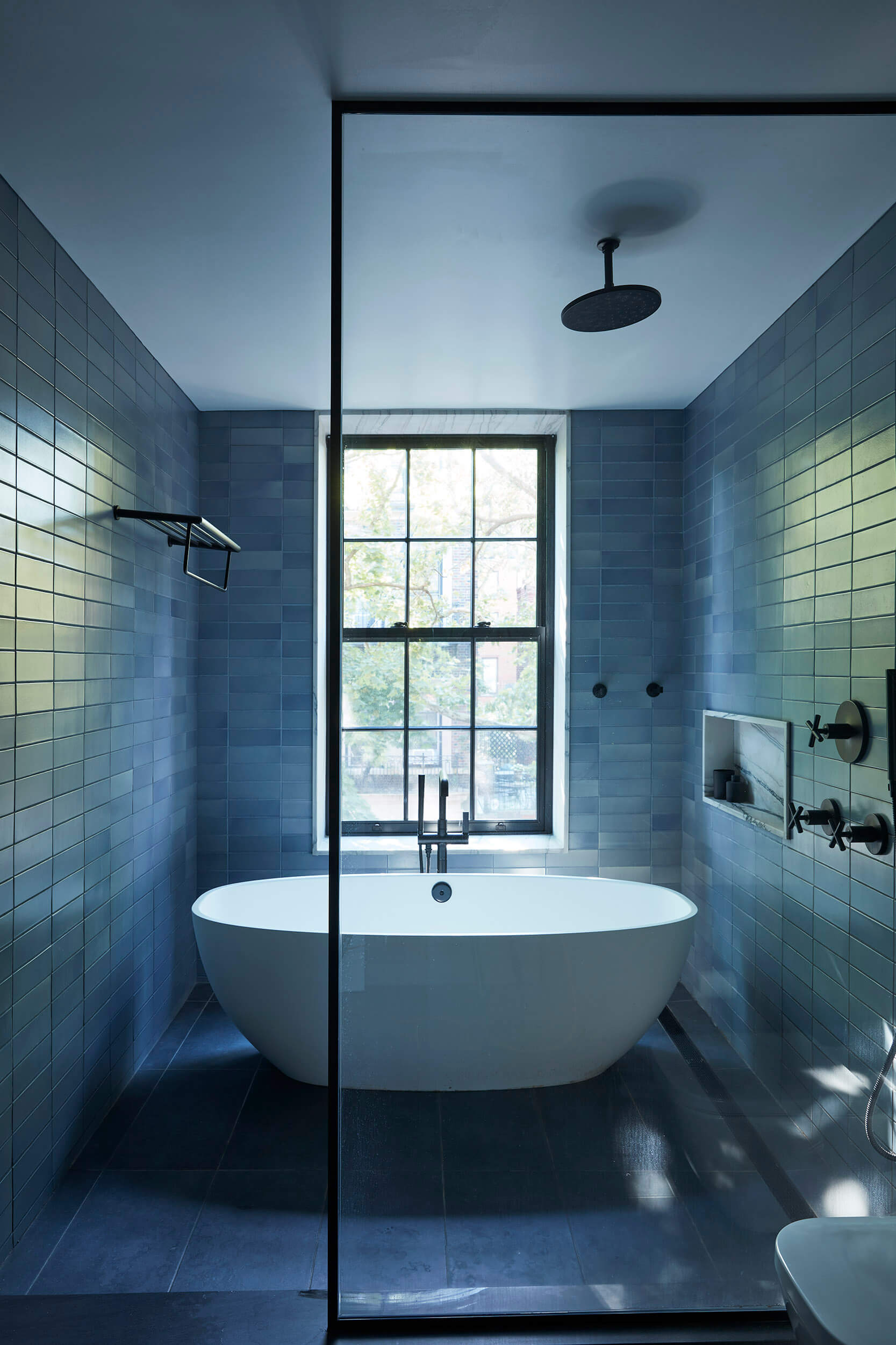
The primary bath was enlarged by incorporating an outside laundry space and reconceiving a pair of closets. Wall tile from Heath Ceramics and floor tiles from Nemo clad the enclosed wet room containing both tub and shower.
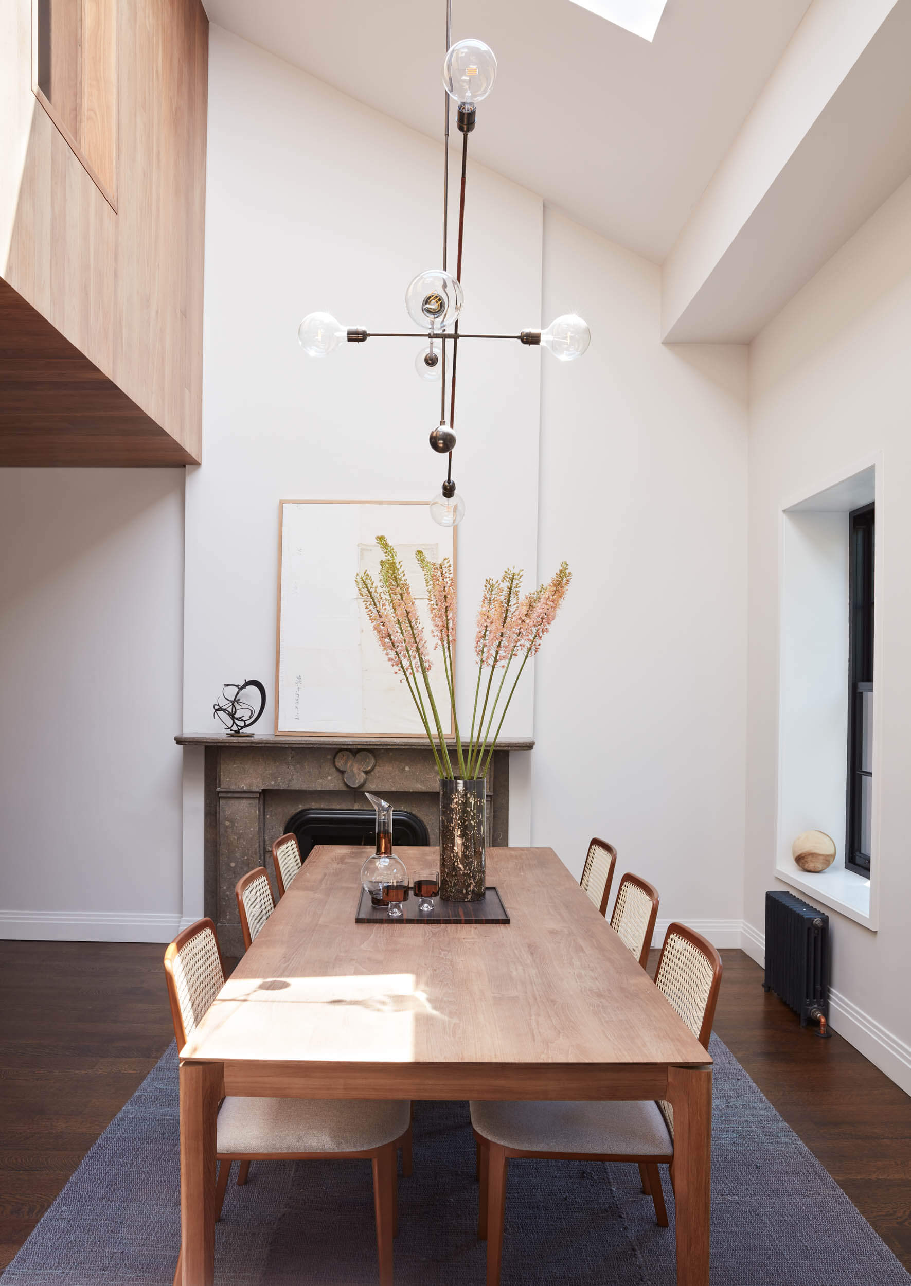
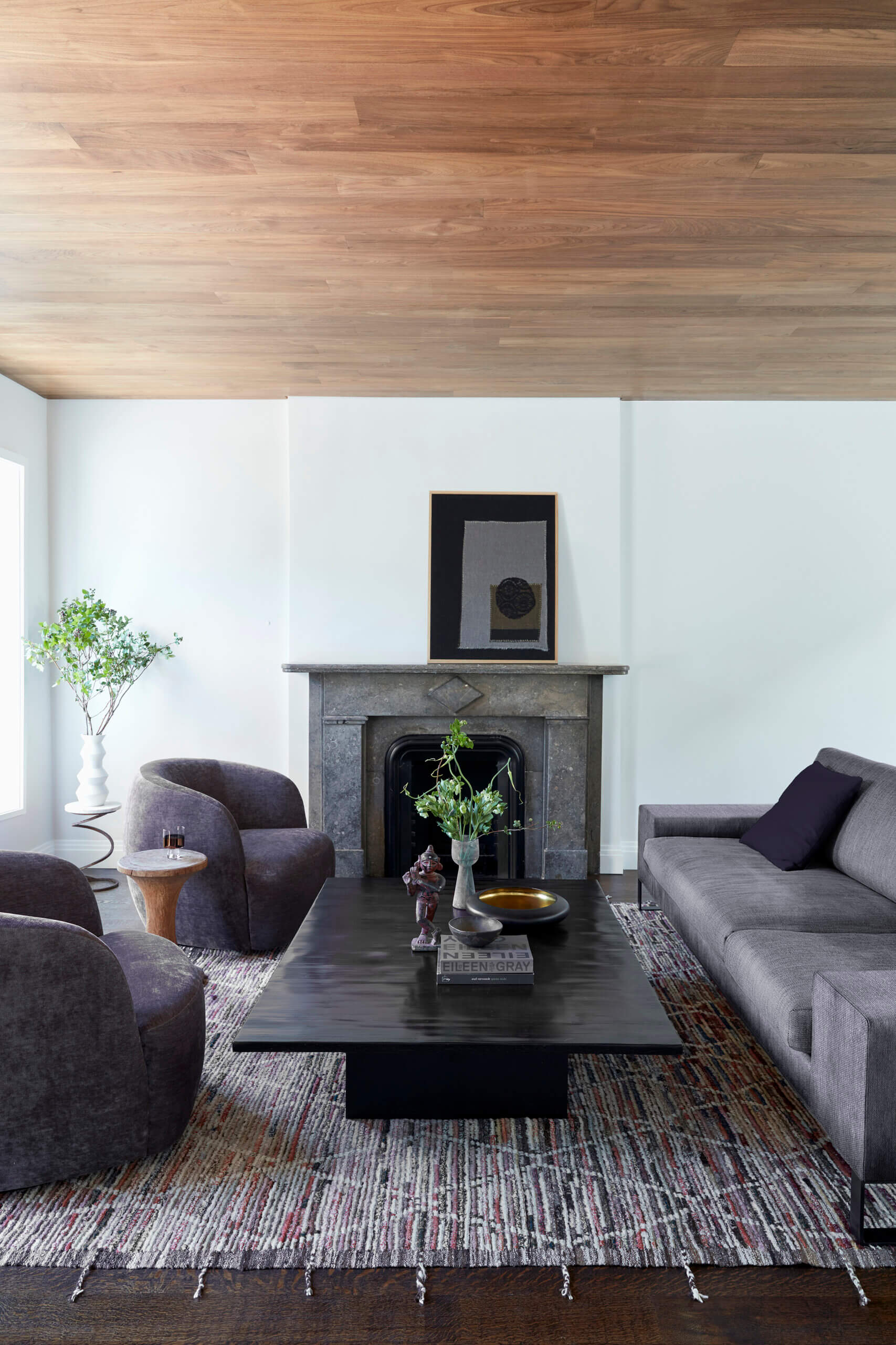
The architects chose walnut planks to clad part of the double-height dining room, the adjacent living room, and sections of the old attic. They deemed the material “both earthy and modern.”
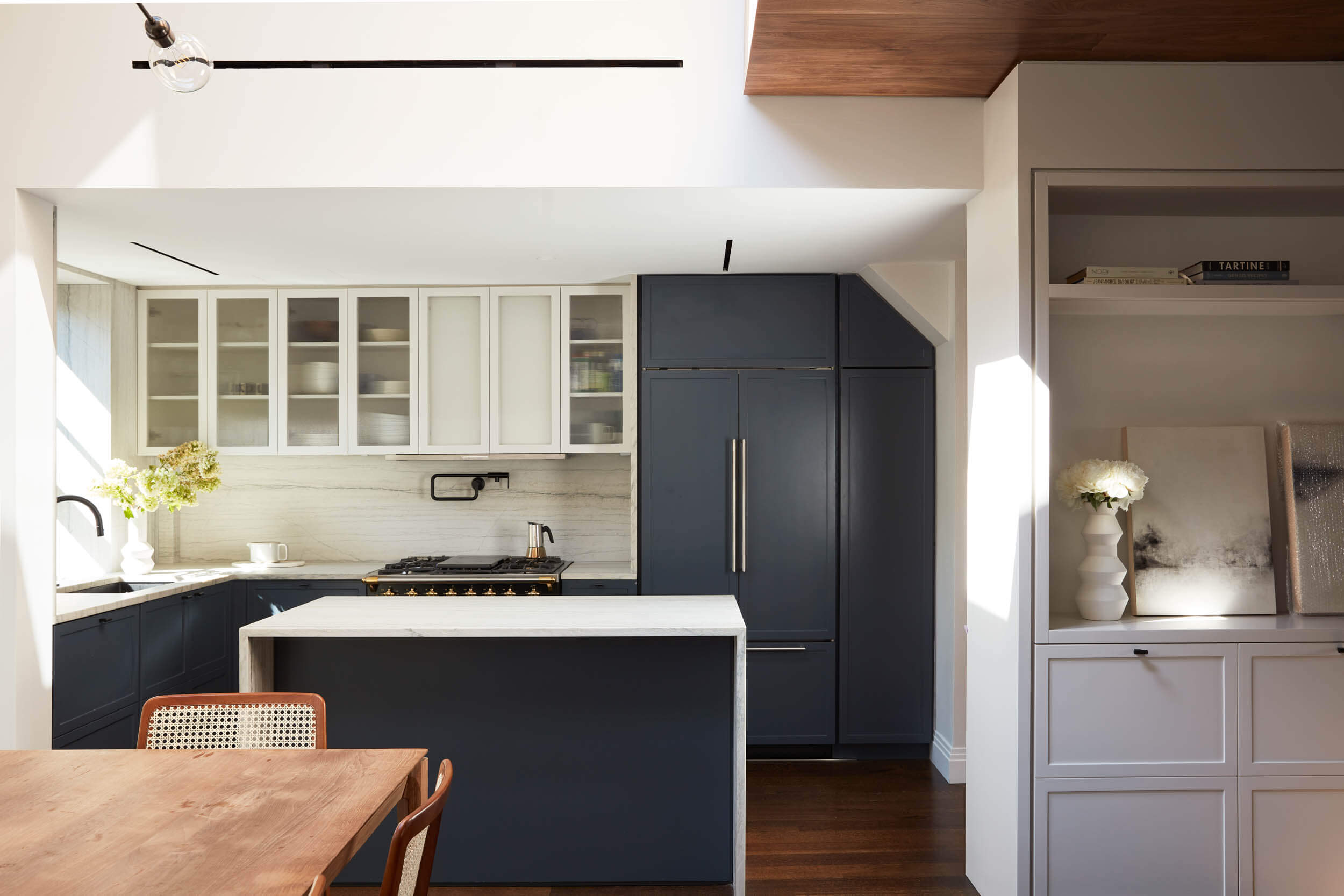
Khanna Schultz kept the palette simple in the open kitchen, using Benjamin Moore Westcott Navy on the kitchen cabinetry, including uppers with fritted glass from Bendheim, and countertops of Luce di Luna marble from Stone Source.
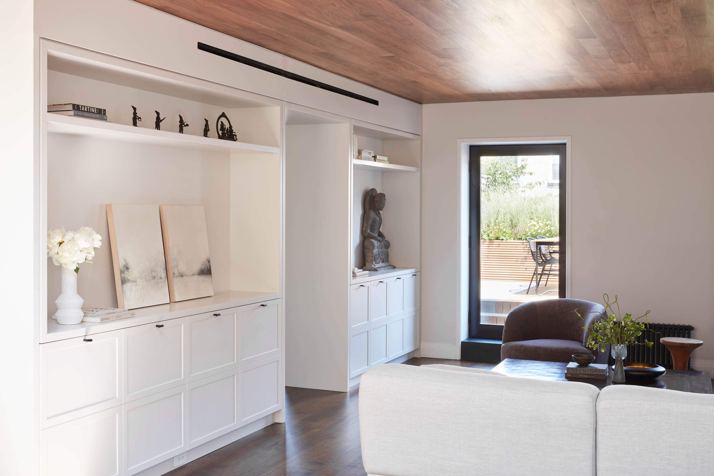
A combination of custom-built drawers and cabinets with uniformly located hardware adds function to the living room at the rear of the house. The sophisticated furnishings, mostly purchased new, were primarily the work of the homeowner, with help from Shani Mims, a local interior designer.
The adjacent terrace sits upon the existing building extension on the lower floors. Khanna Schultz lowered a portion of the terrace to make the door full height, as opposed to the hobbit-sized one that was there before.
A quirky attic room, with interior windows that line up with existing skylights, is used as a study, den and sometime guest room (there’s a Murphy bed). Walnut planks on wall and ceiling “take a poky space and make it special,” Khanna said. The white lounge chair and ottoman were sourced from B&B Italia.
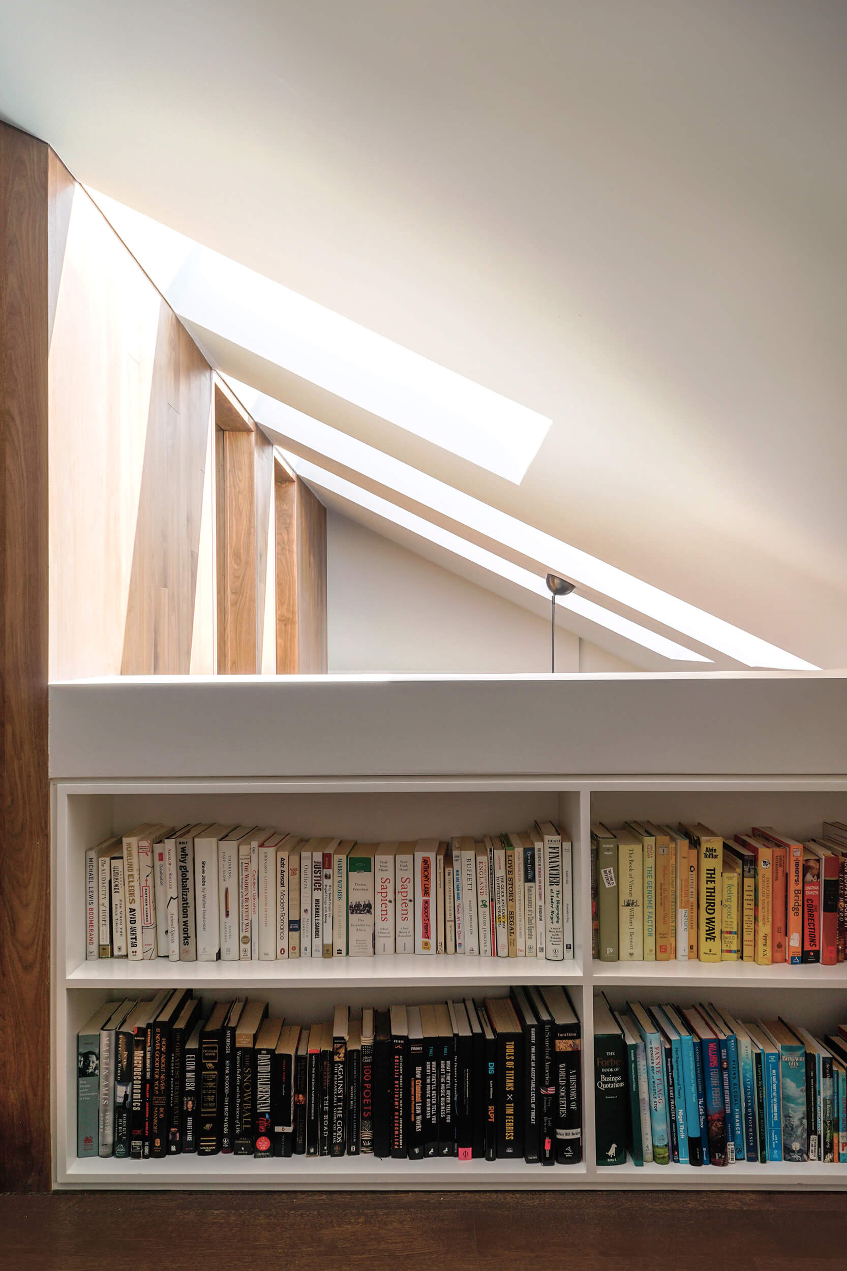
A low bookshelf “turns a railing moment into something usable,” Patrick said.
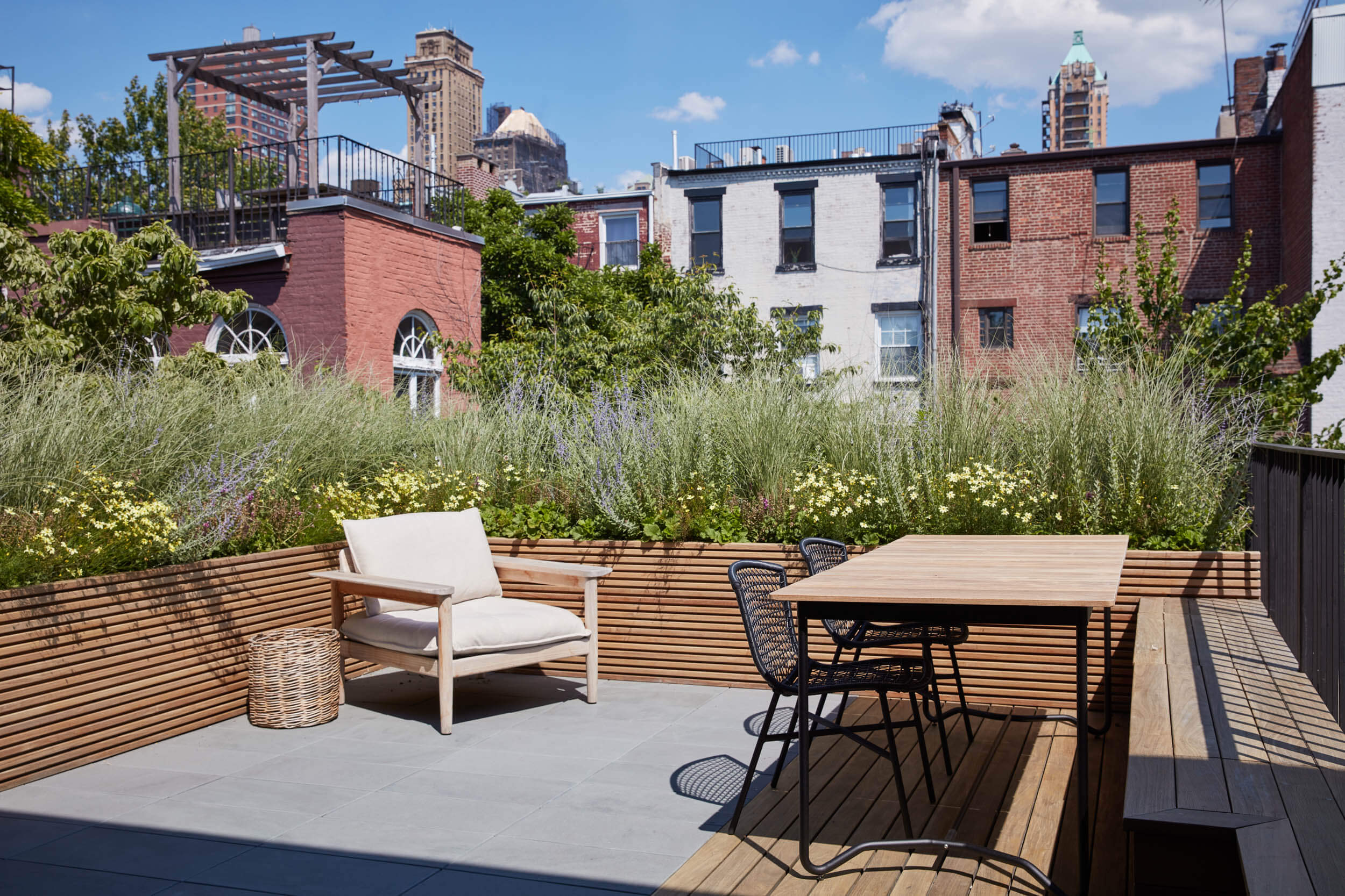
The terrace, landscaped by Julie Farris of XS Space, extends the interior language of the apartment into the outdoors and gives this upstairs unit a backyard.
[Photos by Julian Wass / Styling by Carin Scheve]
The Insider is Brownstoner’s weekly in-depth look at a notable interior design/renovation project, by design journalist Cara Greenberg. Find it here every Thursday morning.
Related Stories
- The Insider: Gut Renovation Elegantly Resolves Challenges of Angular Park Slope Prewar
- The Insider: Carroll Gardens Townhouse Reborn With Both Traditional and Modern Elements
- The Insider: Stylish ‘Upside Down’ Owner Duplex Crowns Greenpoint Townhouse Renovation
Email tips@brownstoner.com with further comments, questions or tips. Follow Brownstoner on Twitter and Instagram, and like us on Facebook.





What's Your Take? Leave a Comment