Colorful Yet Practical Furnishings Refashion Bed Stuy Townhouse for Young Family
Designer Jennifer Morris’s signature is her use of impactful color, joyfully deployed in a young family’s vintage townhouse.

Photo by Jacob Snavely
Unlike some of designer Jennifer Morris’s clients, Lizzie and Jed Dederick did not come to the initial meeting armed with tear sheets and Pinterest boards. They came with something arguably more important: open minds. Their vision for the three-story brick row house they had just bought on the cusp of Clinton Hill and Bed Stuy was non-specific. They knew they wanted “a comfortable family home” for themselves and their two very young children, said Lizzie, a social worker/psychotherapist. “Not too precious, with lots of color and texture.” They put their trust in Morris, who had been recommended to them by the real estate agent who sold them the house. “The great thing about working with an interior designer is you get to benefit from their creativity,” said Jed, a technology executive.
The Park Slope-based Morris has deep experience in both residential interiors and the hospitality industry. The couple responded to her color-positive work in other vintage townhouses across several Brooklyn neighborhoods. Shortly after the closing in late 2019, just before the pandemic hit, the trio sat down to hash out a plan.
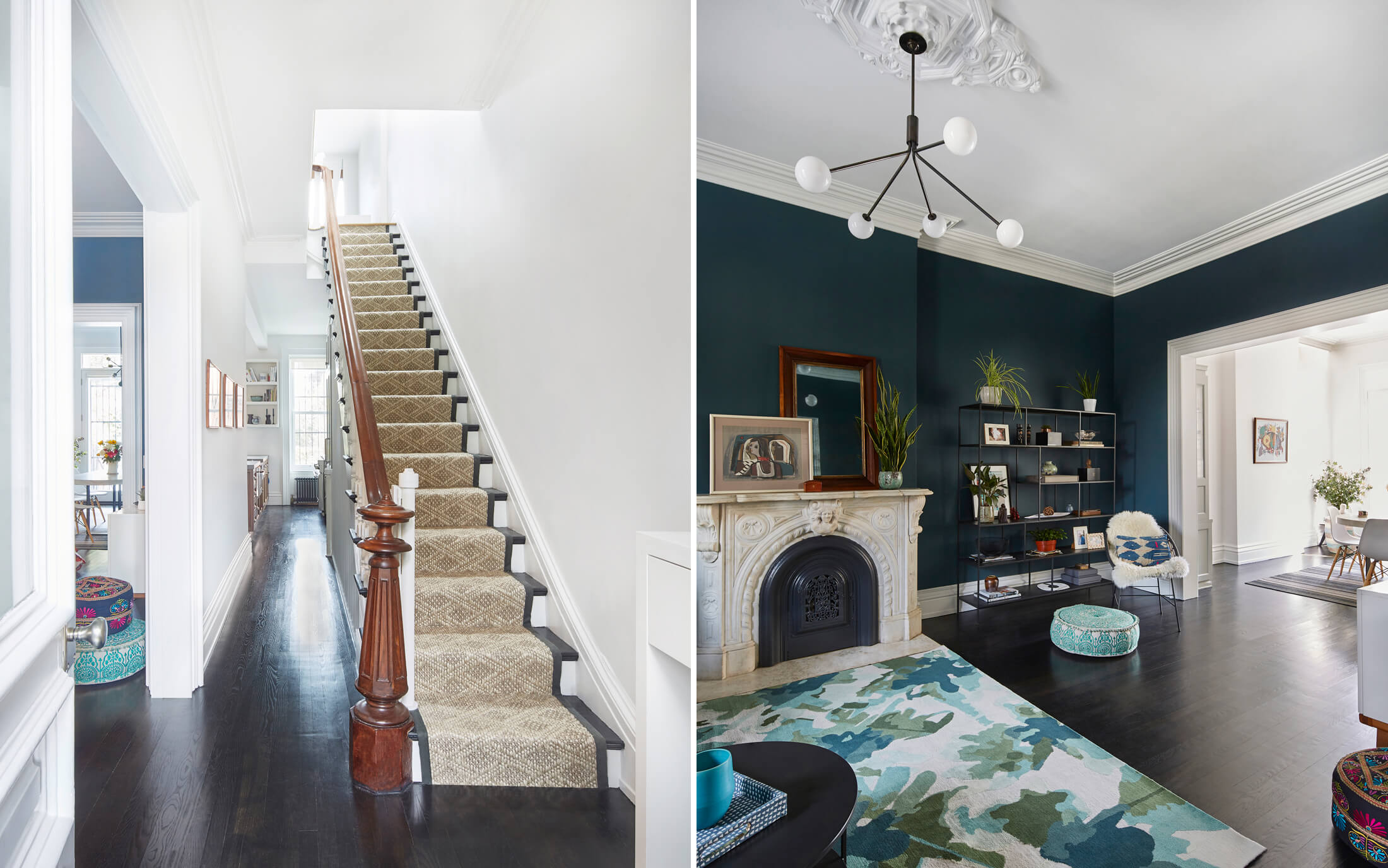
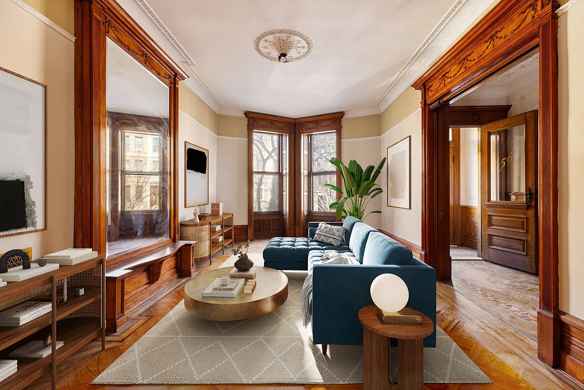
The house was in very decent shape structurally, mechanically, and even cosmetically, with restored moldings, an original staircase and marble mantel, and an updated kitchen and baths. What was needed was decorating, or what Morris calls “the fun part.”
Off they went on a lightning tear. “I performed miracles,” Morris admits, pulling together a team of painters, floor refinishers, and other craftspeople, and helping her clients select wall color, drapery, furniture, rugs, and lighting, all in about a month and a half. “It’s a lot of coordination even on that light remodel level,” the designer said.
Morris advocated giving the plaster walls a skim coat treatment for a fresh start. “You can put paint on the walls or you can get someone in to tape and patch the cracks and relayer the walls to feel like the surface of an egg,” she said. “Then it seems like a brand new home, even if it’s 150 years old.” The floors were sanded and stained dark for a slightly more formal feel on the parlor level, where the living room, kitchen, and dining area are located. The downstairs mudroom, children’s bedrooms, and playroom, and the primary suite and family room on the second floor, are paler in tone.
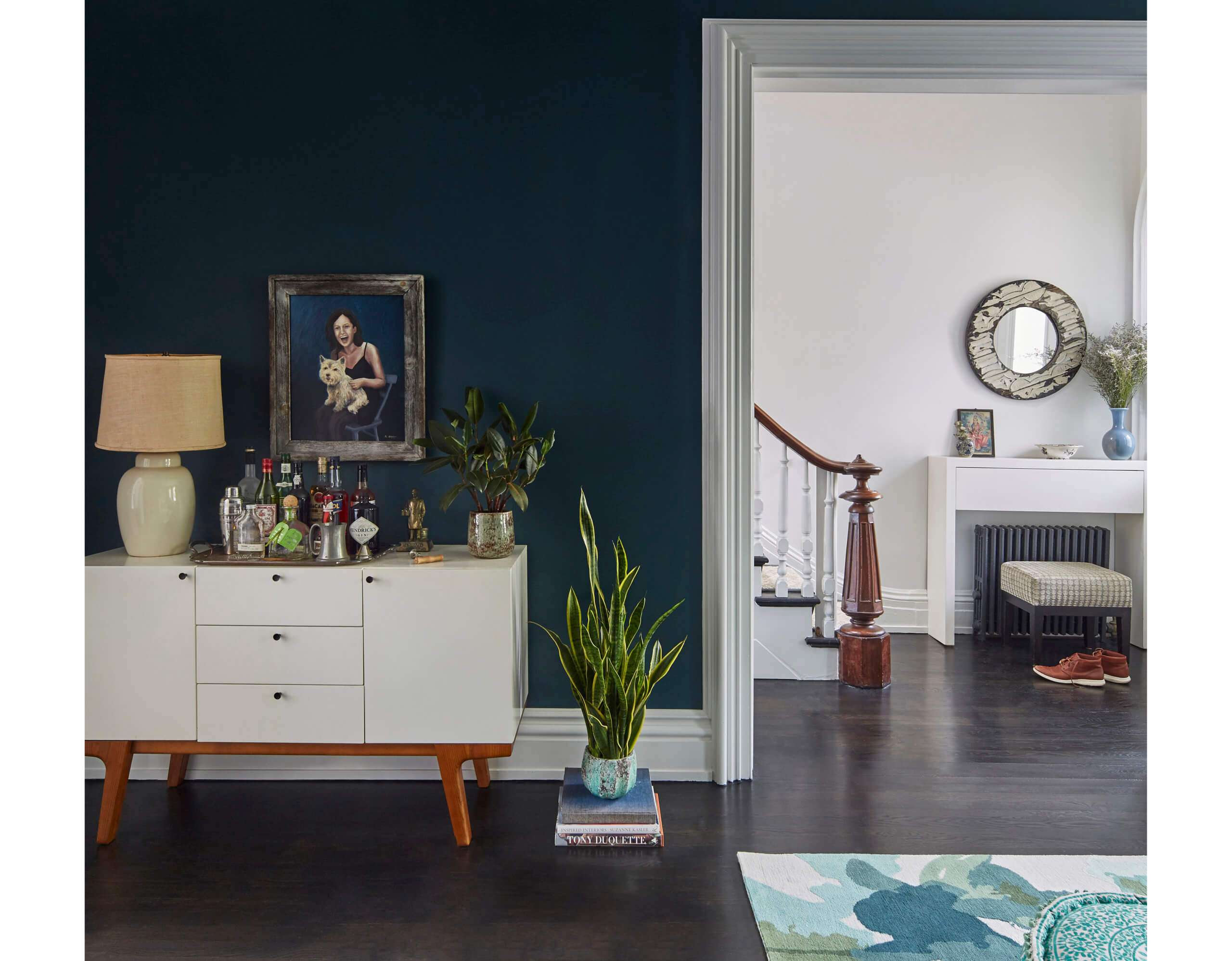
Morris exalts color almost above all else. “Color is a transformative tool,” she said. “Even a subtle color can enrich a space.” Morris spec’d some bold hues for the project, but distributed them judiciously, so that the house remains overall light and airy. “It’s a given in a brownstone that you’re always looking for more light,” she said.
Citron-colored wallpaper from Hermès in the entry vestibule is “a cheery hello,” as Morris puts it. “If there’s anywhere to splurge, it’s a place where you only have two square feet.” Benjamin Moore’s Vanderberg Blue, a deep blue-green, is leavened by white trim in the front parlor, forming a dramatic backdrop for a mix of the Dedericks’ existing furnishings and newly purchased pieces.
“Coming from a two-bedroom apartment, we had to buy a lot of new stuff,” Jed said. “Also, the style of our previous apartment was modern, and we were coming into an older house.” For most of the furnishings, Morris relied on readily available pieces from accessible sources, eschewing anything custom made or with long lead times – except for the modernistic chandelier from Allied Maker and the multi-colored, hand-knotted rug by Emma Gardner, both in the front parlor, which she deemed “worth the wait.”
But they didn’t need to furnish totally from scratch. Morris repurposed the couple’s blue velvet sofa and a white sideboard from West Elm in the front room, which worked well with the Giardino leafy drapery fabric from Élitis that was the taking-off point for the room’s color palette. The fabric’s richness and pops of yellow led to the wall color and choice of rug, whose pale ground, Morris points out, “balances the room’s sultry darkness and keeps things bright.” Morris made sure to find places for the framed artwork, most of it created by members of Lizzie’s artistic family or collected by Jed’s grandfather, that gives the house a uniquely personal feel.
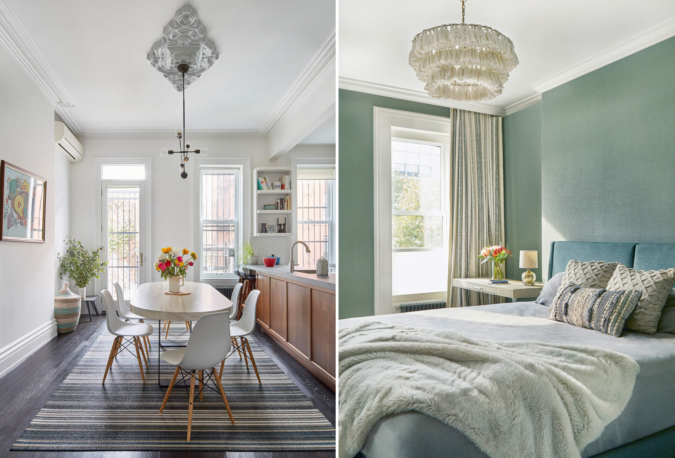
In contrast to the moody front parlor, the white kitchen and dining area at the rear of the parlor floor are absolutely flooded with light. “I love experiencing the depth of the living room, then having it open up to light spilling in,” Morris said. “That’s the space where 70 percent of family life happens. Having that sun come in is how everyone wants to start the day.”
As a mom herself, Morris was ever mindful of furnishings appropriate to the busy bodies of two children under five. The racetrack-shaped hardwood dining table from Gather Table Co. has rounded corners for safety and for “sliding in extra butts,” she said, with an open base to allow for benches, chairs, or ottomans as needed. A wipeable woven polypropylene rug from Bolon nods to the blue-green in the adjacent parlor and protects the wood floor.
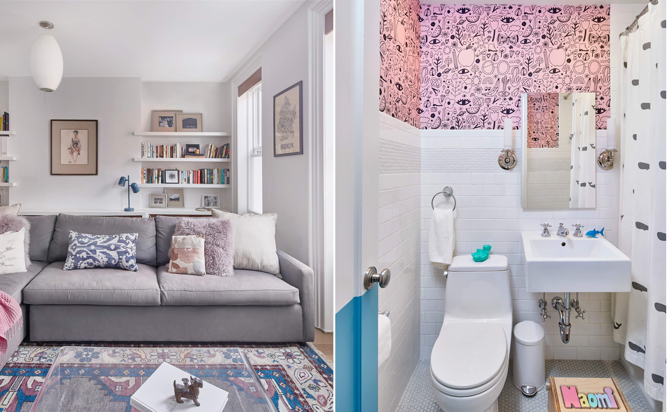
Equally practical is the Wolf-Gordon wall covering in the primary bedroom. “It wears hands down better than paint,” the designer said. Though vinyl, Morris feels “its depth of materiality brings back the beauty and glamor of the prewar years.”
The children’s rooms on the garden level were a happy excuse for all-out exuberance. Benjamin Moore’s Seaside Resort, a vivid aqua, was applied in one bedroom as a painted wainscot on the lower half of the wall; the same company’s Fan Coral enlivens the playroom. Self-adhesive wallpaper from Chasing Paper in the nursery and children’s bath, and durable shiplap siding in the mud room and playroom, coated with wipeable paint, stand up to fingerprints and stroller traffic. It’s all part and parcel of how Morris “considered our needs as a family in a very practical way,” Lizzie said.
Satisfied homeowners are just one part of Morris’s equation. Responding to the architecture is just as important to the designer. With a home as full of intact original detail as this one, she said, “One of my joys is balancing the gorgeous wood, plaster, and stone elements with modern sensibilities, highlighting those lovely details, and giving them new life and space to breathe.”
[Photos by Jacob Snavely | Styling by Annie and Bee Bruce]
Editor’s note: A version of this story appeared in the Fall/Holiday 2022 issue of Brownstoner magazine.
Related Stories
- Vibrant Vibes Enliven a Fort Greene Brownstone
- Old Meets New in Workstead’s Meticulously Designed and Crafted Brooklyn Interiors
- Blithe Spirits: An Inviting, Colorful Ditmas Park House Is a Pick-Me-Up
Email tips@brownstoner.com with further comments, questions or tips. Follow Brownstoner on Twitter and Instagram, and like us on Facebook.



What's Your Take? Leave a Comment