Brownstone Boys: Is It a Good Idea to Build a Bedroom With No Window?
Sometimes the best place to put a third bedroom is in the middle of the house.

The gorgeous mural by Lauren Kaelin is the masterpiece of the room with no window
Editor’s note: Welcome to the 55th installment of Brownstone Boys Reno, a reader renovation diary about renovating a brownstone in Bed Stuy. See the first one here. They also blog at www.thebrownstoneboys.com.
There are some givens in the design of a 19th century Brooklyn brownstone. With very few exceptions they are narrow and long. You will almost always open the door to a vestibule, then a foyer, and then a staircase going up the side wall. You’ll have three windows across the upper floors, and on the parlor floor you’ll have the stoop with front door and two windows. All of these very common layout features create a similar situation that anyone renovating one of these old buildings has thought through. If you want three bedrooms on an upper floor, how do you fit them in so they have windows and are a usable size?
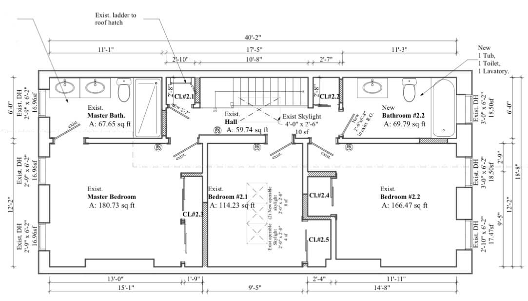
We all know the little 5 to 6 feet wide rooms that end up in front and behind the stairs. They don’t really pass the usable size test. First thought might be to move the wall over to create two more-equal sized rooms, but there are two problems. That wall is almost always load bearing and how do you handle the three equally spaced windows? Even just moving that wall a foot is going to put it right up next to the middle window, and is it really worth the expense of moving a load bearing wall a foot? One creative solution we’ve seen is to create a zig-zagged wall that creates a narrower room by the windows but more space for the rest of the room.
Sometimes the best place to put a third bedroom is in the middle, far from the windows at the front and back! Many people wonder if this is legal and how to get it approved, or even how they will like a room with no window. In our case, we planned for a skylight that met the the city’s requirements for light and ventilation. Typically they will require an openable window that is 10 percent of the square footage of the room. Our middle bedroom is about 9.5 by 12 feet so this created quite a large skylight. Everyone who comes into the place during the day comments on it. It really is now the brightest room in the house.
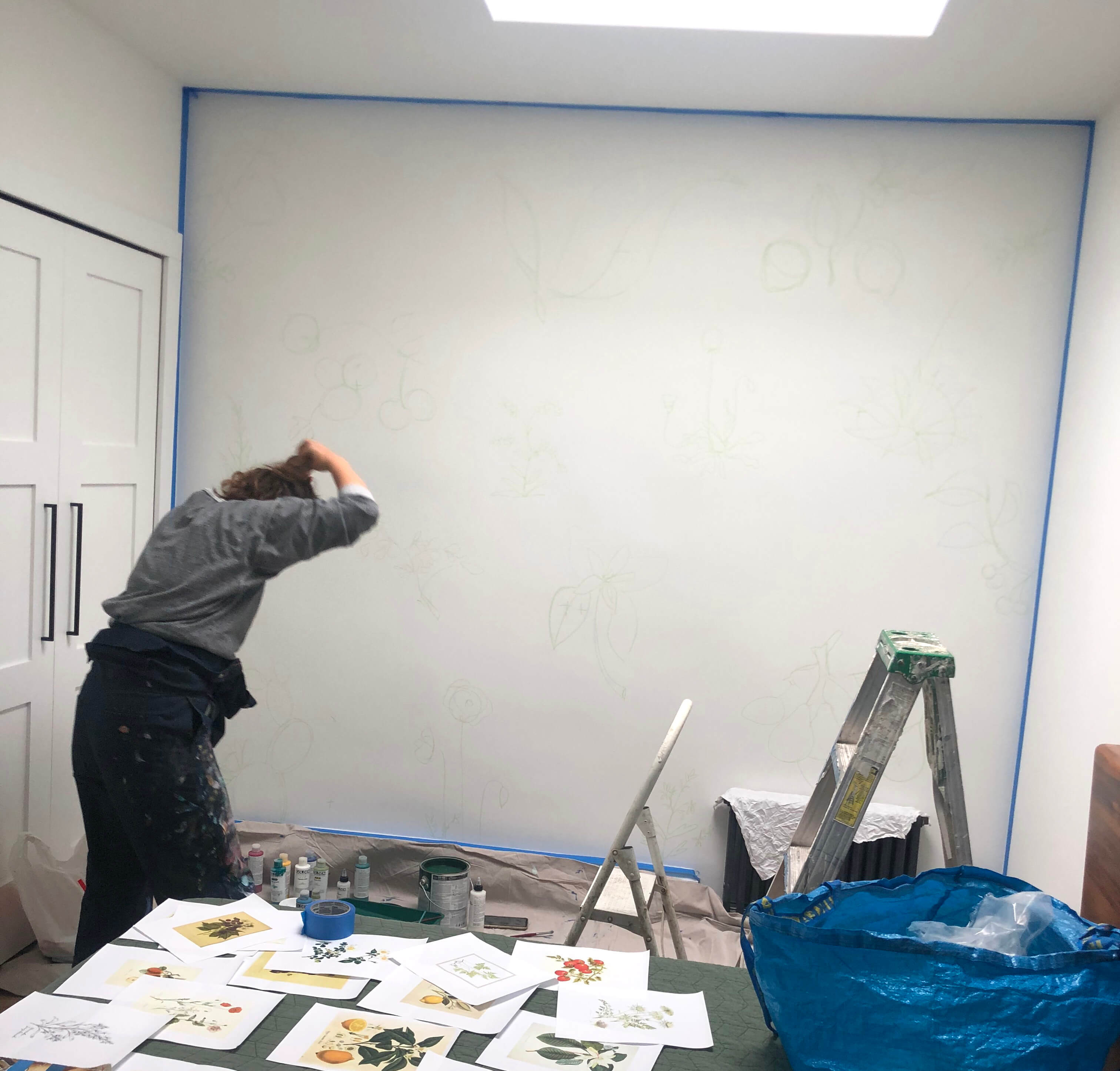
So our middle bedroom is a great size and has lots of light, but the one thing it was missing is a view. No matter how much light our skylight is letting in you still can’t see the trees. So we decided to create our own view.
An amazing artist (and good friend of ours), Lauren Kaelin, painted a giant mural on an entire wall that brings in the outdoors. For inspiration, we sent her vintage botanical prints of vegetable, fruits and flowers.
We were blown away when she sketched the entire mural out in less than an hour. Then the greens went up. Various shades of leaves and stems. Next came the color. Red tomatoes, yellow lemons and purple flowers. Finally, a wood stain wash over the entire wall gave it a vintage quality we were looking for.
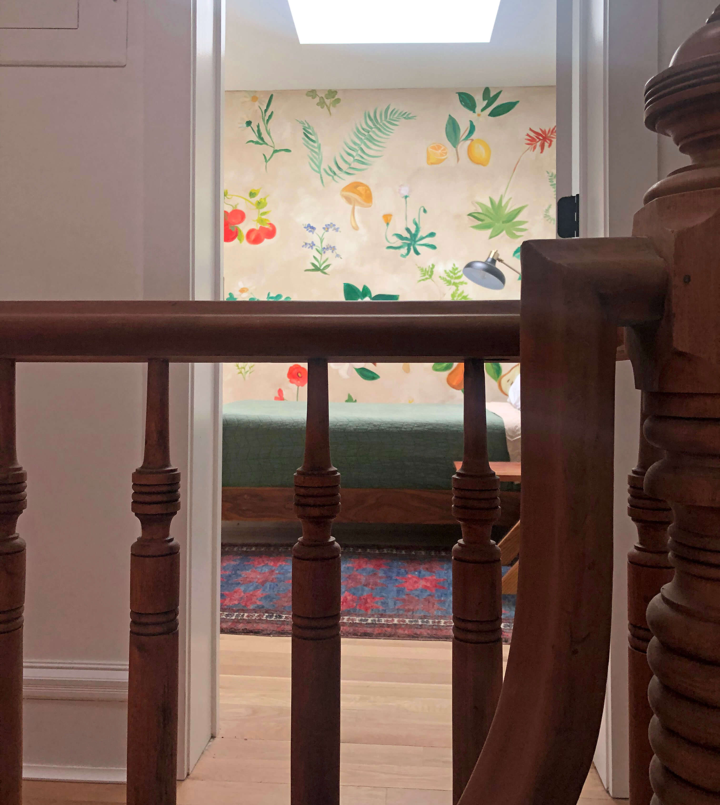
We can’t even explain how this mural changed the feel of this room. All of our guests comment on how they can’t wait to wake up under the skylight and next to that mural. The room with no window is one of the most popular in the house. One unexpected benefit is the glimpse you get of the mural as you walk up the stairs and onto the top floor.
We were as worried as you might be about creating a bedroom with no window. But it gave us the opportunity to creatively solve the problem. The skylight makes the room brighter than any other and the mural gives it one of the best views in the house. We ended up with a room that has a personality of its own and that makes us glad it doesn’t have a traditional window. Guests welcome!
[Photos via Brownstone Boys]
Related Stories
- Brownstone Boys: A Room With No View
- Brownstone Boys: When Do You Need a Structural Engineer?
- Brownstone Boys: Adding Character With a Custom DIY Coat Nook
Email tips@brownstoner.com with further comments, questions or tips. Follow Brownstoner on Twitter and Instagram, and like us on Facebook.



What's Your Take? Leave a Comment