Brownstone Boys: Living in the Living Room
Now that we’re in the last few weeks of our renovation, we’re confronting a problem many townhouse owners have: Where to put the couch?

Photo via Compass
Editor’s note: Welcome to the 35th installment of Brownstone Boys Reno, a reader renovation diary. We’re excited to publish their tale of buying and renovating a brownstone in Bed Stuy. See the first one here. They also blog at www.thebrownstoneboys.com.
We’re in the last few weeks of our renovation, so in addition to scratching things off the very long list of construction items, we’re thinking about furniture placement. This has us revisiting the layout of the parlor floor and we’re confronting a problem many brownstone (and townhouse/row house) owners have: where to put the couch!…and by extension…the entire living area so that it works for our lifestyle.
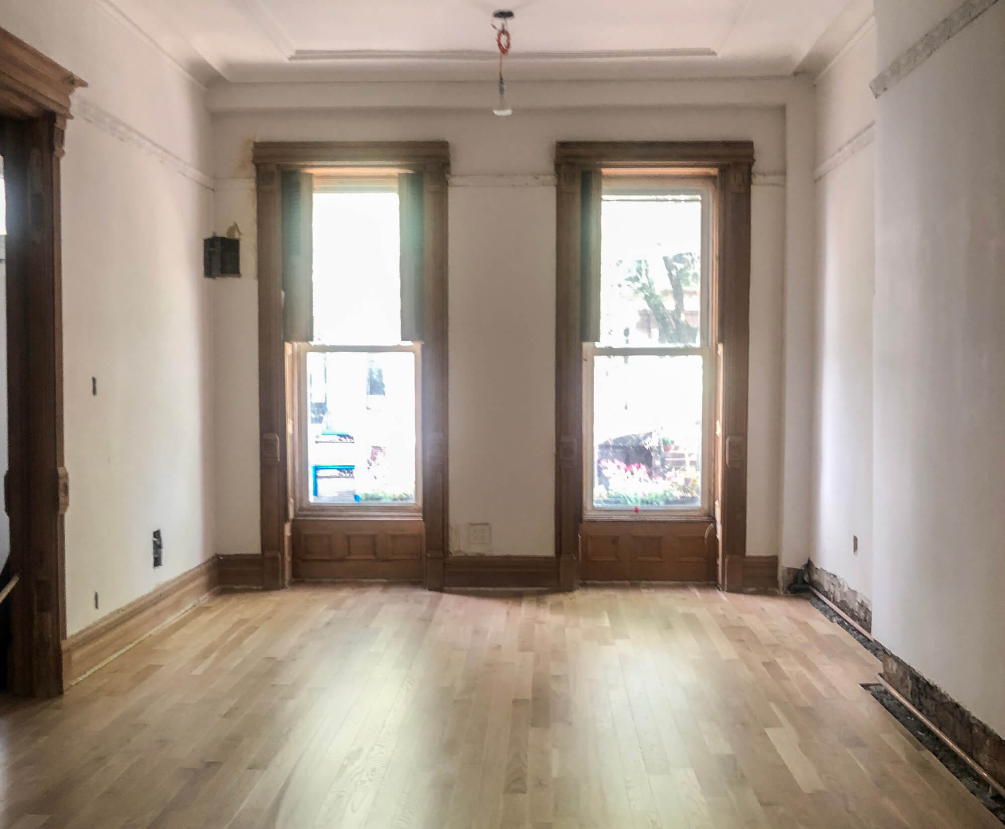
Brownstones, townhouses and row houses are long and narrow. Usually they are 20 feet wide, but 45 to 55 feet deep. With the stairs and foyer area usually about 6 feet wide, that leaves about 12 to 13 feet for the width of the interior of the living area on the parlor floor. In our case, we have 12.5 feet, and since we opened up the space to the back of the building we have the full depth of 40 feet to plan our living area layout.
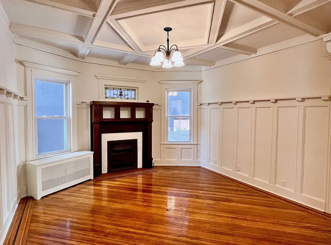
Other than those dimensions, there are other features to work around that usually create a problem. A common one is the large double doorway that leads into the room from the foyer, and the original fireplaces (or the remnants of them).
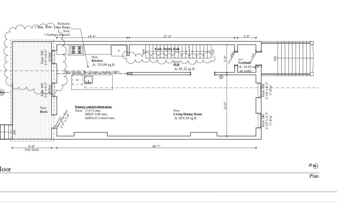
We’re couch and TV people. As much as we like to entertain and want a great space for it, for us that consideration doesn’t take priority over our daily routine of relaxing on the couch and watching some Netflix. So, with no apologies to those who believe a room shouldn’t be designed around the TV (? we know we’re not alone!), one of our requirements is to have the couch opposite it. Therein lies the problem.
Of course, we designed the layout with a plan, but we cant help but to rethink it right now. We’ve seen a lot of ways to configure the space. After looking at many, many places we have noticed some recurring themes and we can’t help but chuckle at some of the solutions. So that leaves us considering our options. We thought the best way to understand how others have configured their spaces was to take a little real estate tour! Here’s what we found and let us know if you have any other ideas.
The couch jammed in the corner technique
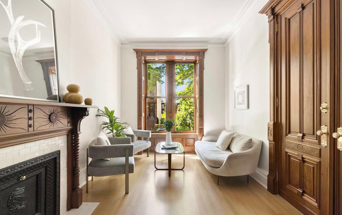
At first thought, it probably makes the most sense to put the living area in the front of the building close to the front windows and the entry. But one of the most difficult considerations is the short space that the double doorway from the entryway creates in the front. It usually just sits about 7 feet from the front wall. In our place the fireplace bump out is opposite the double door. That doesn’t leave enough space between the two to comfortably have a full sized couch positioned facing one of the walls.
The tiny loveseat technique
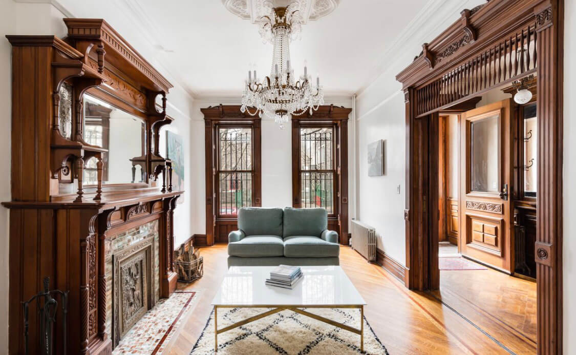
We told you some of these had us chuckling. The space is narrow and if you want to maximize floor space and minimize furniture this might be for you, but that couch will not fit two grown dudes and an 85-pound lab, so it’s not for us.
The grand sitting room technique
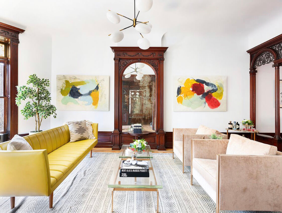
This is the way we would assume the builders of these places intended the rooms to be used. It is a parlor, made for sitting and hosting guests. And with no TV to waste your life away watching you would sit and look at your guests as you speak with them and sip a Tom Collins or Sazerac. Although it sounds and looks amazing.
The living area in the middle (the current front-runner!)
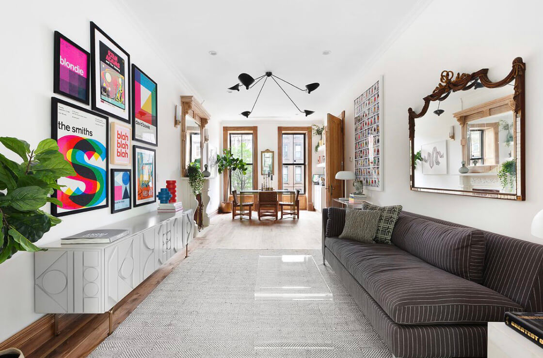
This solution is our current plan. It gives us the ability to have the couch facing the TV. The drawback is that the living area is not a pass-through space. The main walkway to the back of the building (for us, to the kitchen) will go right through it. Is that too much of a price?
The couch in front of the door
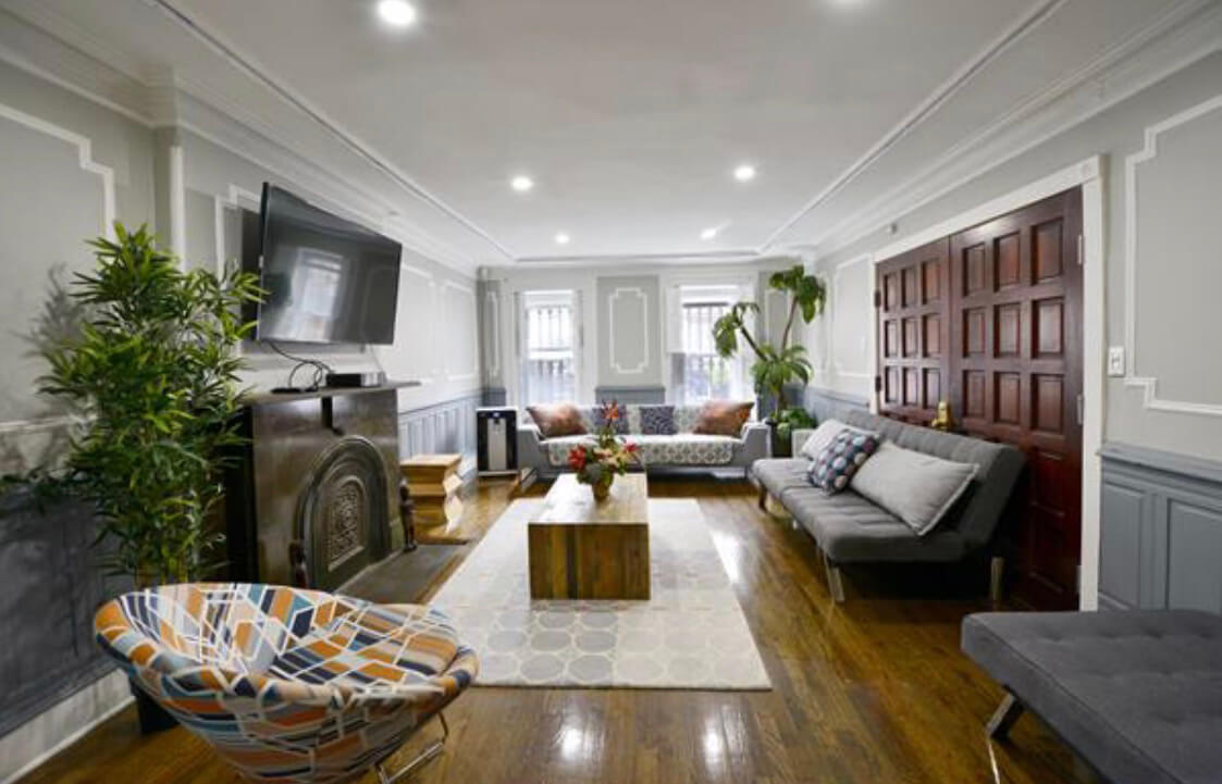
How do they get in there?
TV haters
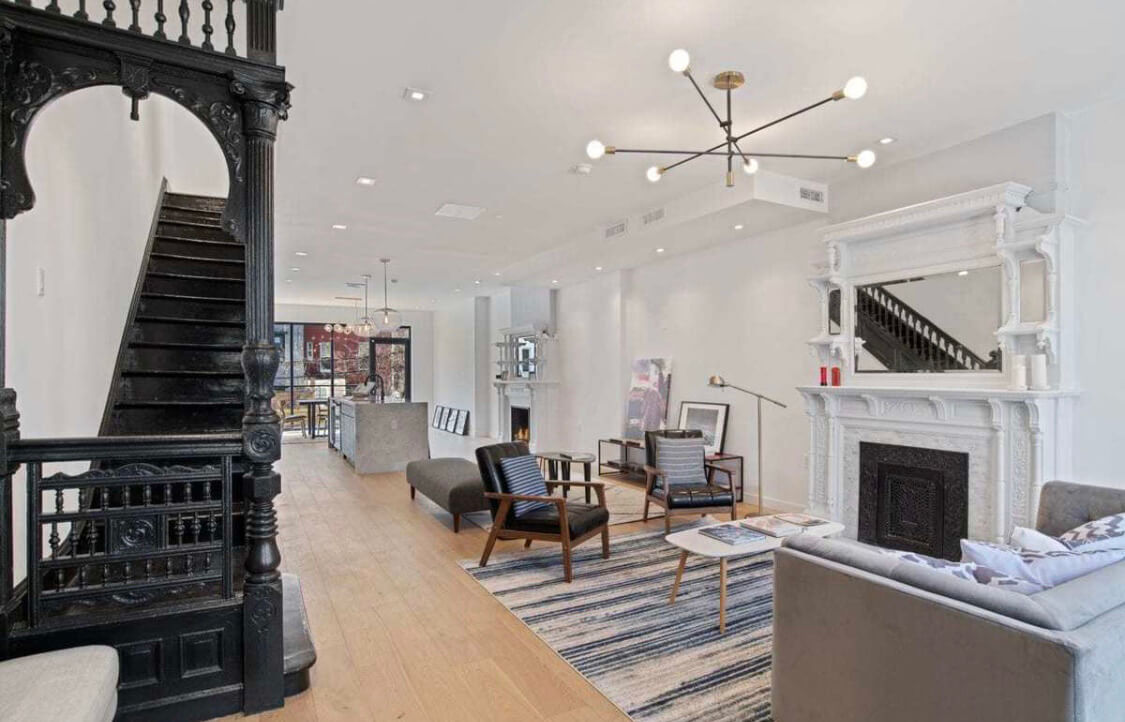
Good for these guys. Only the quiet of their thoughts, a good book, and each other to keep them company (the TV room is probably in the basement).
Floating TV
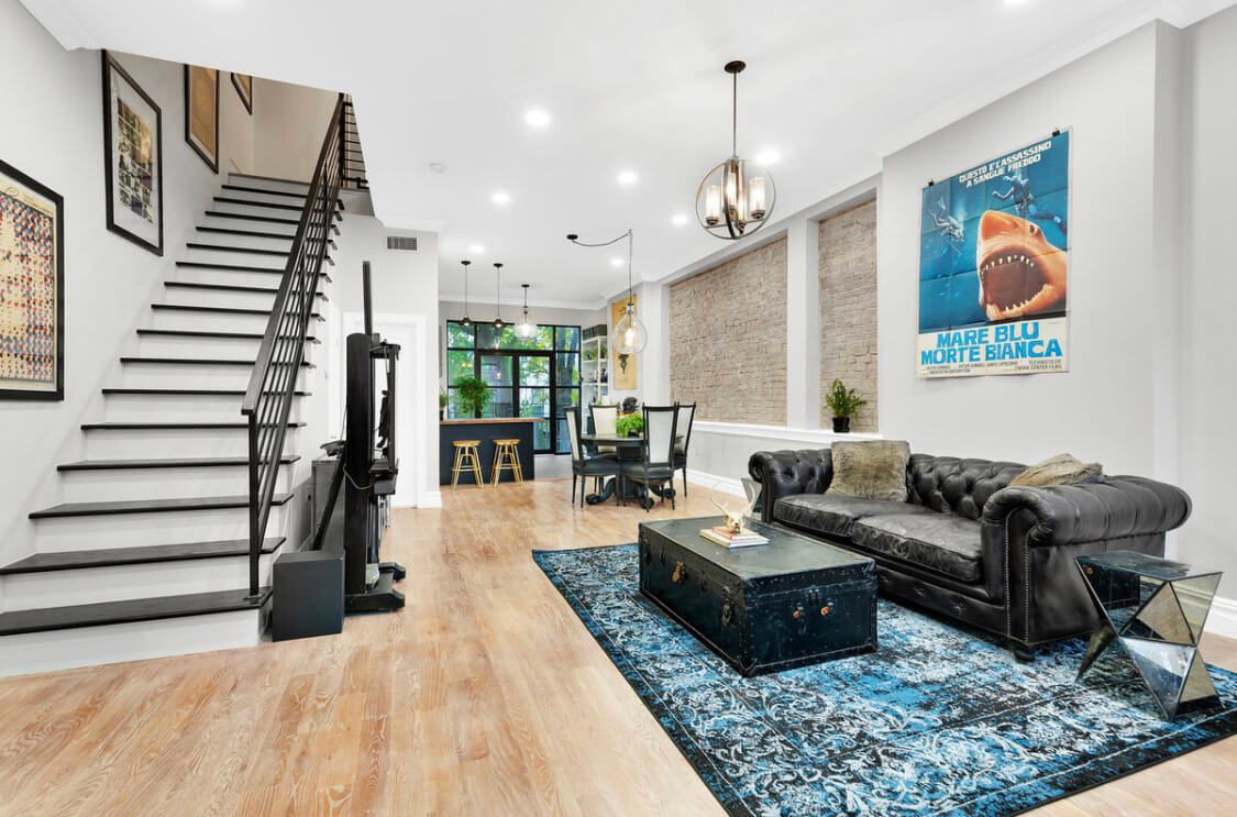
These folks thought long and hard about how to solve this problem and no doubt found this solution/contraption floating in the open air.
If it wasn’t for our Netflix habit we would probably go for the grand sitting room. We would create a perfectly defined area with a couch and chairs facing one another centered on our no-longer-existing fireplace bump-out. But since that option won’t work for us, we’re feeling like that leaves us with the living room in the middle.
It was our intention from the beginning, and unless there is a brilliant option out there that we haven’t considered yet, it’s where we’re headed. We have a good 13-foot-long wall where we can comfortably put a couch with the same amount of wall space opposite for the TV area. That means we’ll put the dining table in the front. It’s actually sized pretty well for it. So we’ll have to live with the longer walk from the kitchen to the dining table and also the fact that the living area will be a pass-through space.
For us, it’s not a bad tradeoff.
[Photos via Brownstone Boys unless noted otherwise]
Related Stories
- Brownstone Boys: Getting a Reno Project Started
- Brownstone Boys: Getting the Grout Right
- Brownstone Boys: Water, Water and Water
Email tips@brownstoner.com with further comments, questions or tips. Follow Brownstoner on Twitter and Instagram, and like us on Facebook.


What's Your Take? Leave a Comment