Brownstone Boys: How to Add Character With Recessed Shelves and Niches
We remember walking through several brownstones in the search for our perfect home and finding interesting ornate niches built into the staircase.

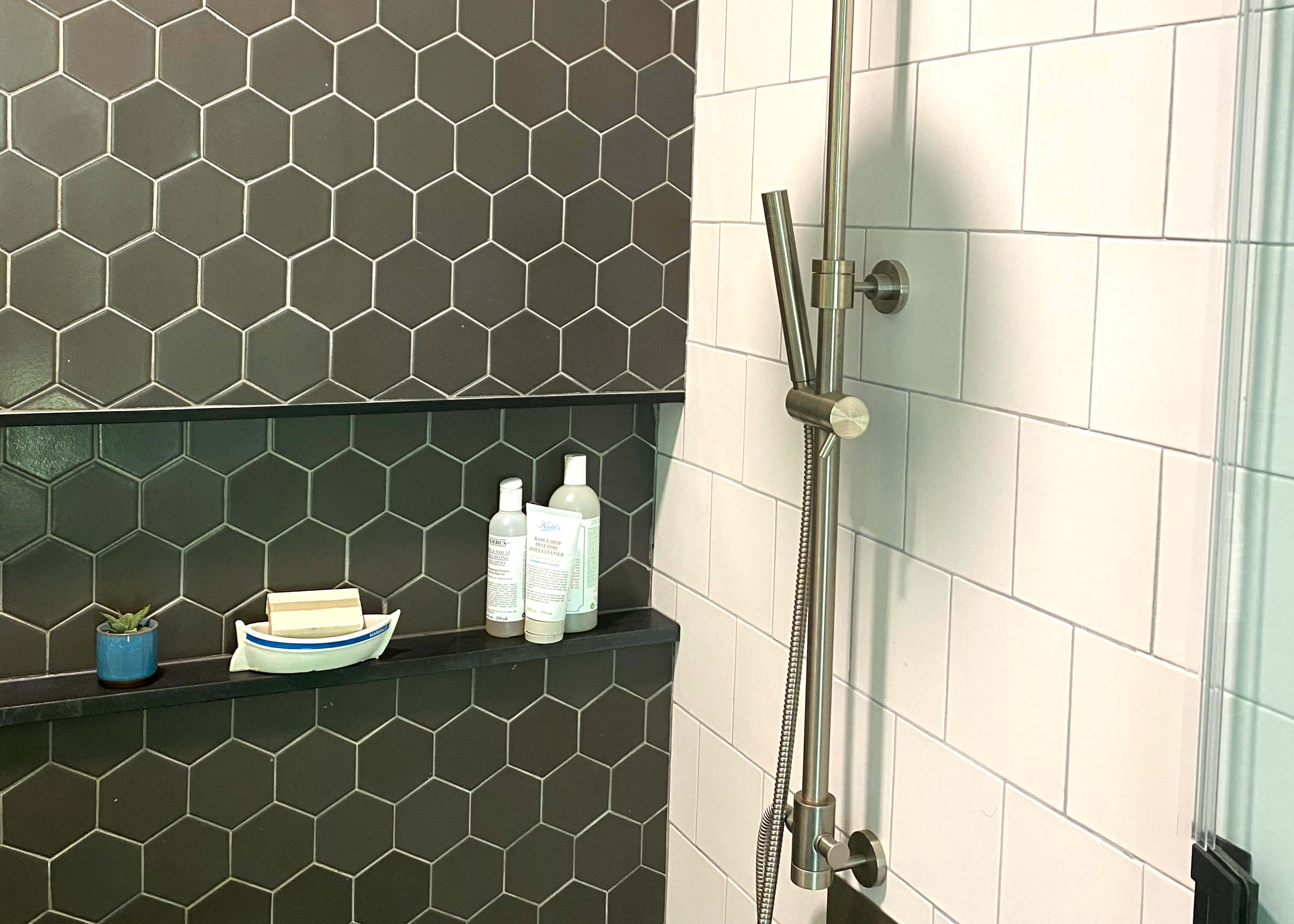
Our guest bathroom niche helps with storage. Photo by Brownstone Boys
Editor’s note: Welcome to the 76th installment of Brownstone Boys Reno, a reader renovation diary about renovating a brownstone in Bed Stuy. See the first one here. They also blog at www.thebrownstoneboys.com.
We always loved the small touches of character in historic homes like original built-ins nooks and niches. So much care was given to creating interesting features and moments in the design. We remember walking through several brownstones in the search for our perfect home and finding interesting ornate niches built into the staircase. Some were staged beautifully with statues, vases and pictures. But some looked like they haven’t been touched in quite possibly 100 years. When we purchased our home, there were some beautiful original details, but a lot of what was here originally was removed over the years. We don’t know if the place may have had a few of these architectural touches at some point, but we felt like some areas could use a bit more character. We wanted to put something back into the place to create some of these interesting moments, even if it wasn’t necessarily going to resemble something that was original.
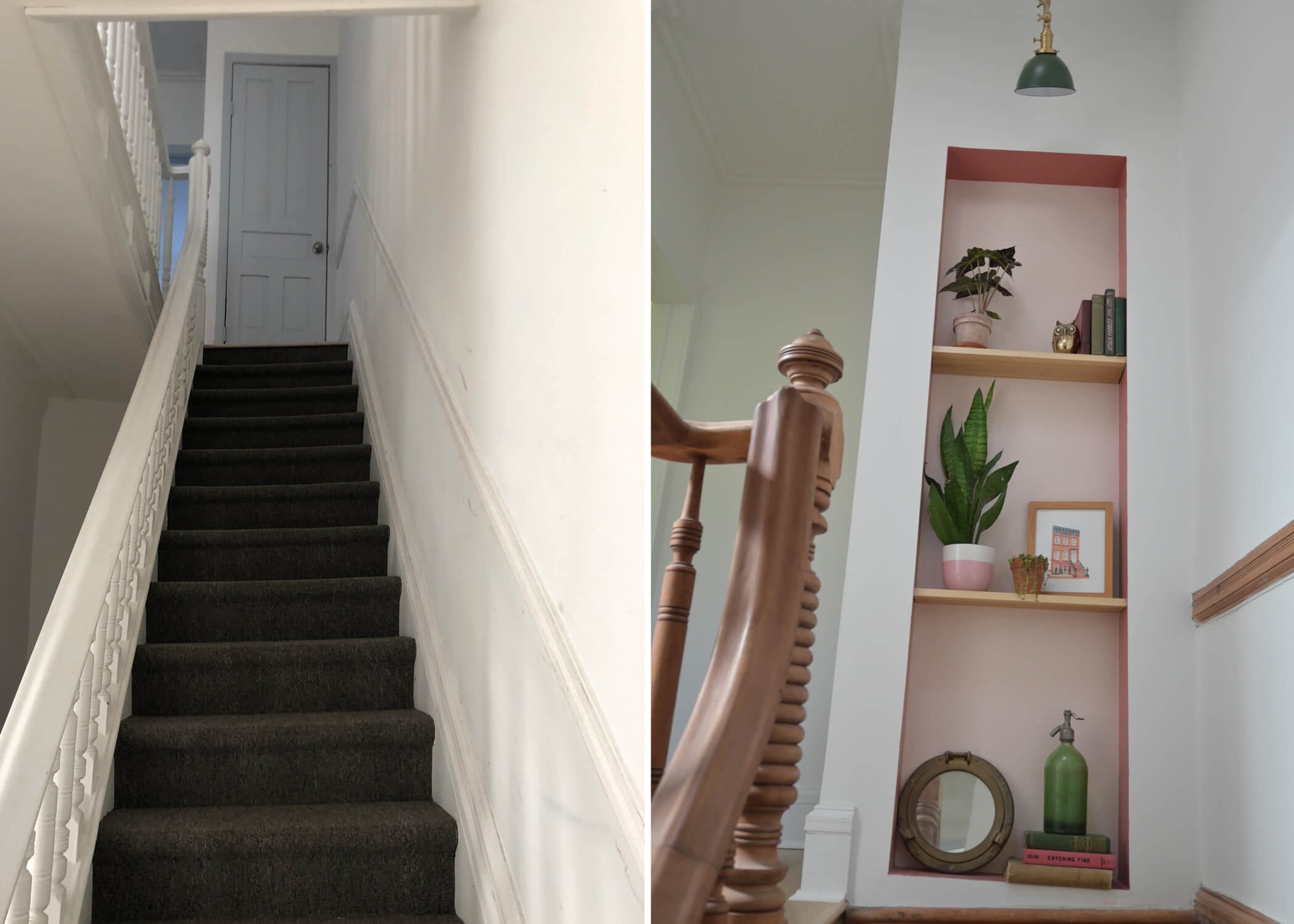
When we bought our place we noticed that the first thing you saw when walking in was an unattractive, very utilitarian door at the top of the stairs that led to the roof hatch. We felt like we could do better as a first impression when walking in the door. We relocated the roof entrance around the side of the wall and built a niche of our own! Albeit a more modern version of the ornate original ones that we loved so much. It cost us basically nothing extra to build since we were doing so much work already. Our hope was to create an interesting feature much like the intention of some of the original versions we loved. We really love the way it turned out and feel that it fits in very well with our place.
Our guest bathroom is one of the few brand new spaces in our home. It was formerly a small bedroom, so we needed to build all of the plumbing and completely transform the space. We were drawn to making it feel like it has been there for many years. All of the finishes and fixtures have a vintage feel. We thought this would be a great place to create another built-in nook. It’s one of the features we get the most compliments on when people use our guest bathroom and again it costs nothing extra to build. It gives the bathroom some interest rather than just having 4 flat and boring walls. It also helps the room feel more like it was always supposed to be this bathroom.
In our master bathroom we built a big double shower that extends across the entire width of the room. It’s the primary feature of the space and we wanted to give it a useful feature that would be the icing on the cake! We built an inset niche that spans the width of the back shower wall, just as the shower spans the width of the room. It’s a useful place for us to keep shampoo and soap bottles, as well as succulents and other items that make our shower more interesting.
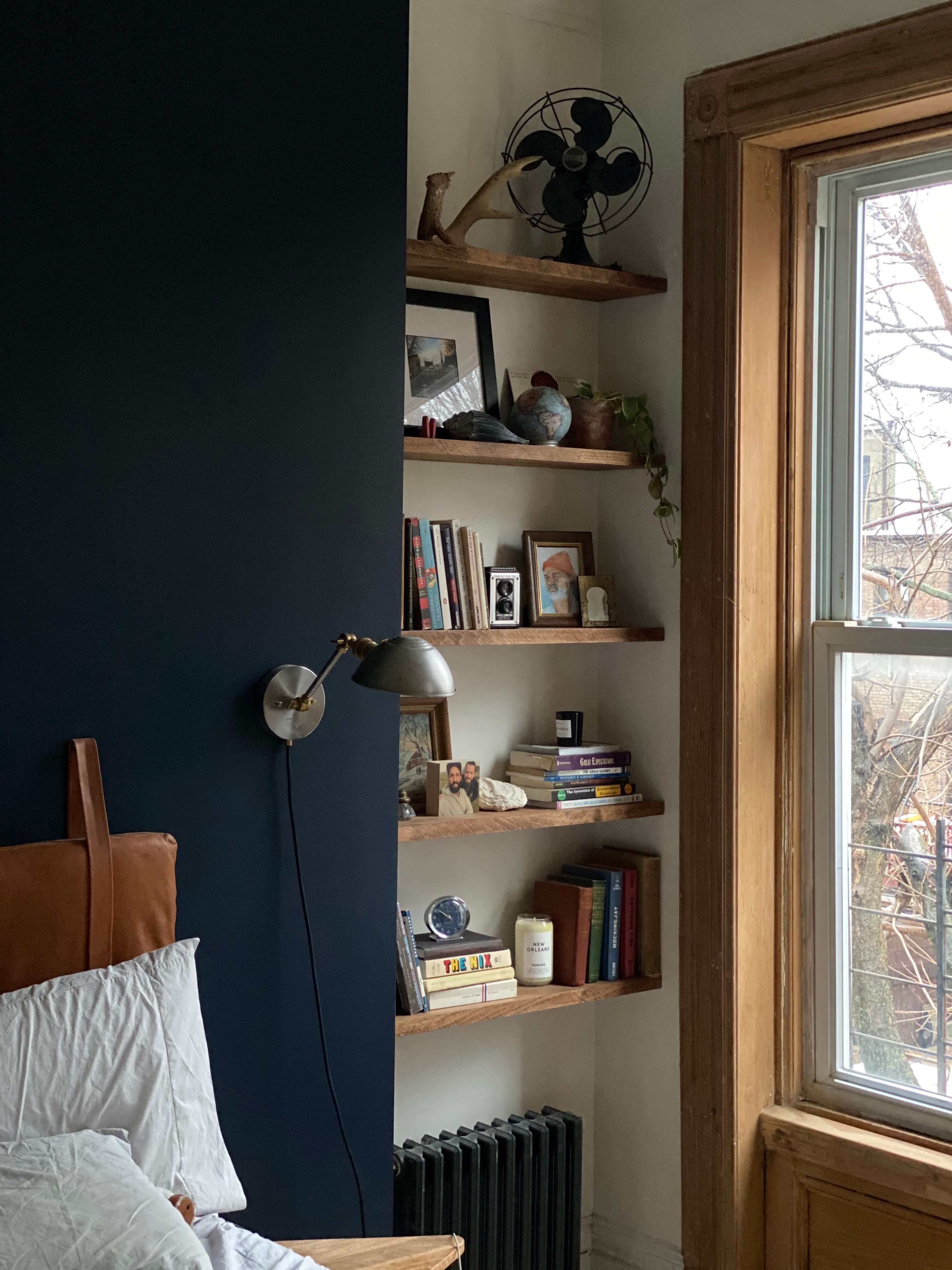
The last built-in feature that we created was in our bedroom. This one happened more out of necessity. Our bedroom, like many in Brooklyn, has an old fireplace bump out. The fireplace is long gone. Removed and bricked up in a prior senseless renovation. What’s left is just a 5 foot section of wall jutting out into the room. It made it very difficult to figure out how to place our bed on that wall and the bump out was not centered in the room. . Our solution was to build a wall to extend the length and center it in the room. Now we have a bump out that extends most of the room and is a perfect backdrop to our bed, but it leaves about 2 feet of space on each side. On one side one of our closet doors slides comfortably into it, and on the other side our radiator is at the bottom. We decided that this little space that was created out of necessity would make a great built-in shelf feature! We used an old Ikea table top that was left in our basement, cut it into shelves, and stained them. It cost us a few hundred dollars to have our contractor build the wall, but it cost us nothing to put in the shelves into this special nook. It’s one of the things that gives the room it’s character and something that makes us happy to see everyday.
None of these features were especially hard or expensive to create. Although we know it’s nothing like what original brownstone builders would have done, it makes us feel like we have contributed something back into what is the living, breathing, and evolving (for better or worse) character of our home.
[Photos by Brownstone Boys unless noted otherwise]
Related Stories
- Brownstone Boys: Backyard Makeover Reveal and Tour
- Brownstone Boys: How to Enhance Your Space With Custom Furniture and Built-ins
- Brownstone Boys: Lighting Design 101
Email tips@brownstoner.com with further comments, questions or tips. Follow Brownstoner on Twitter and Instagram, and like us on Facebook.



What's Your Take? Leave a Comment