The Insider: Toning Down an Ornate Park Slope Townhouse
Intact original woodwork may top the “want” list for Brooklyn house-hunters, but once they get it, it can be a challenge for modern folks to work around. The elaborately carved moldings and doors in this late Victorian brownstone — shades of classical revival and Aesthetic Movement, with a helping of gingerbread thrown in — were…
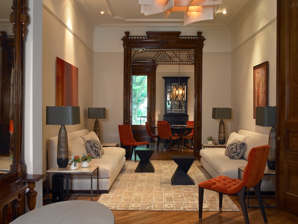
Intact original woodwork may top the “want” list for Brooklyn house-hunters, but once they get it, it can be a challenge for modern folks to work around. The elaborately carved moldings and doors in this late Victorian brownstone — shades of classical revival and Aesthetic Movement, with a helping of gingerbread thrown in — were in superb condition when a couple in the education field, parents of a young son, acquired the four-story, one-family house.
Though the new homeowners certainly appreciated what they had, they still wanted the décor to have a contemporary feeling. Right away, they called upon Brooklyn Heights designer Kathryn Scott to furnish the house in its entirety (they kept only a couple of chairs and some artwork from their previous home).“We gravitated toward simplicity to neutralize the ornate detail,” Scott said. At the same time, by choosing pale wall colors and pared-down, clean-lined furnishings, “we brought out the beauty of the detail by diminishing other distractions that would compete.”
Scott also did significant kitchen and bath remodeling. Working with contractor Tambi Kat, she made major changes on the second floor, where there had been a sliver of kitchen in the rear hall. “This tiny apartment kitchen was totally out of proportion in a full townhouse,” she said. To make matters worse, the formal dining room was (and still is) at the rear of the parlor floor, so food had to be carried down a flight of stairs, “which was nerve-wracking and a lot of work.”
Scott created a spacious, welcoming eat-in kitchen by removing a line of upper kitchen cabinets that had divided the narrow kitchen from the room next door and ringing the expanded space with newly built custom cabinets.
She resolved the disconnect between the kitchen upstairs and the dining room downstairs with an old-fashioned device: a dumbwaiter. Serendipitously, there was a closet in the dining room, with an original carved door, located directly beneath the kitchen. Scott was able to install an electric dumbwaiter in space formerly occupied by a fridge; it runs down a shaft to open into the dining room, where it is completely hidden behind vintage woodwork.
See and read more below.
Top: Two white Cisco sofas, Giza side tables from Nuevo Living and lamps from Arteriors are the main elements of a sophisticated entertaining space in the middle of the parlor floor.
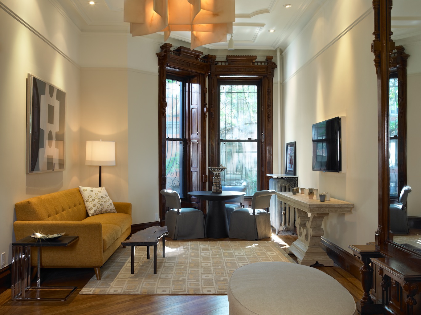
The front parlor serves as a family room, with a TV over a console table from CFC/Noir. The yellow Nixon sofa is from Clubcu, the alabaster glass chandelier from Lightopia.
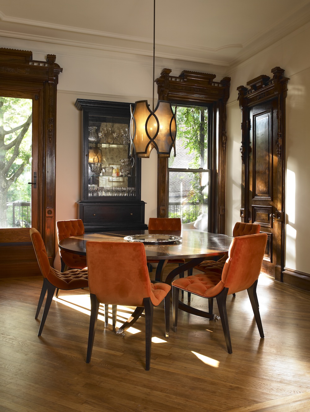
Tufted dining chairs from Addison House, covered in a plush red fabric from Holly Hunt, surround a splayed-leg table from Dessin Fournir. The chandelier is from Urban Electric.
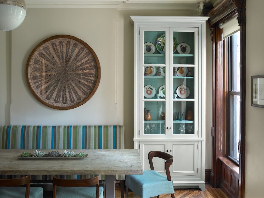
New white custom cabinetry in the expanded kitchen, built by Chris Jewett of CEJ Design, along with the bright turquoise and green stripes of the Lee Industries settee, are fresh counterpoints to the dark wood moldings around the doors and windows. The table is from Clubcu. Scott had new seats and slipcovers made for the chairs, which are from Nuevo Living, to make them more comfortable and luxurious. The round piece on the wall is a print from Natural Curiosities.
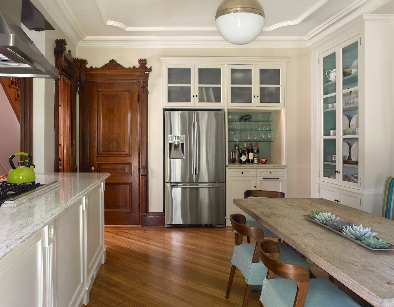
In the newly expanded kitchen, the existing island was retained and painted white. Upper cabinets that once hung above it were removed to open up the space. The fridge was relocated from the sink wall to make room for a dumbwaiter.
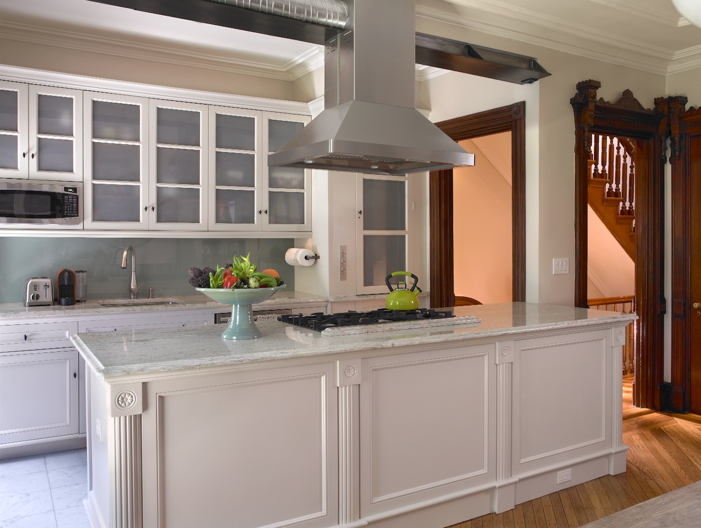
The sink counter and cabinets above it, along with the marble-topped kitchen island, were all existing but dark in color like the house’s original woodwork. “It was oppressive,” Scott said. Painting everything white and installing a new glass backsplash behind the sink brightened the space considerably. The new dumbwaiter is at the right-hand end of the sink wall, where a refrigerator used to stand. Its frosted glass door matches the upper cabinets; the dumbwaiter’s control buttons are seen to the left of the door.
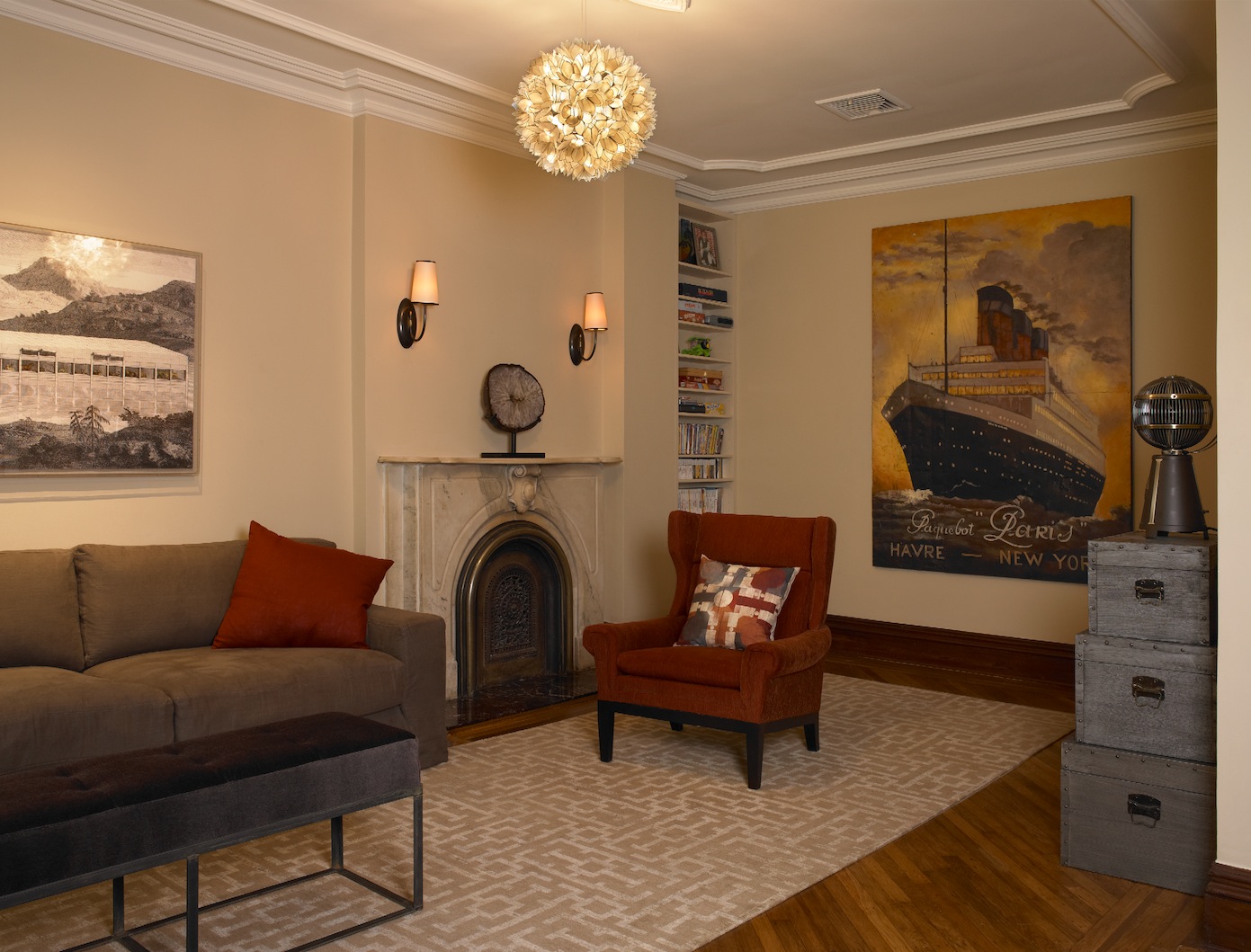
A den on the second floor also serves as a guest room, with a queen-size bed from Zoom Room that slides out of the bottom drawer of a cabinet along the right-hand wall (not seen in photo). Sofa and chairs are from Cisco; all rugs in the house are custom, from Mastour Galleries.
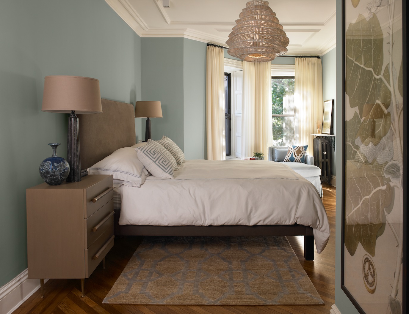
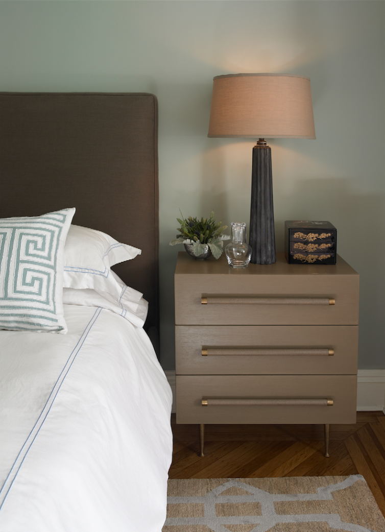
The master bedroom walls are painted a serene blue from Farrow & Ball (Light Blue #22, to be exact). The chandelier is from Roost.
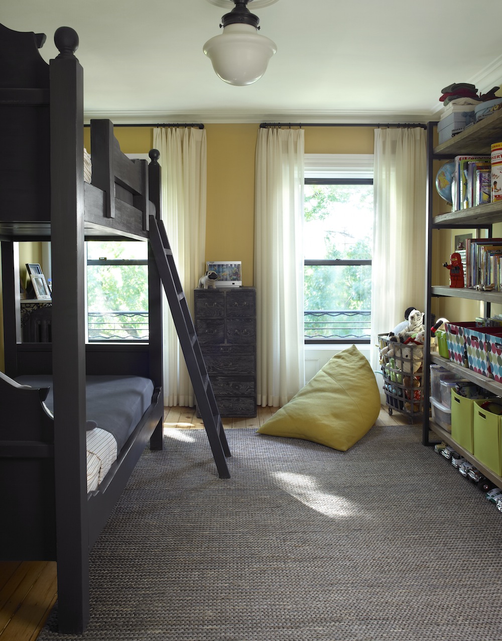
The wall color in the son’s bedroom, Farrow & Ball Straw #52, was chosen by the young man himself.
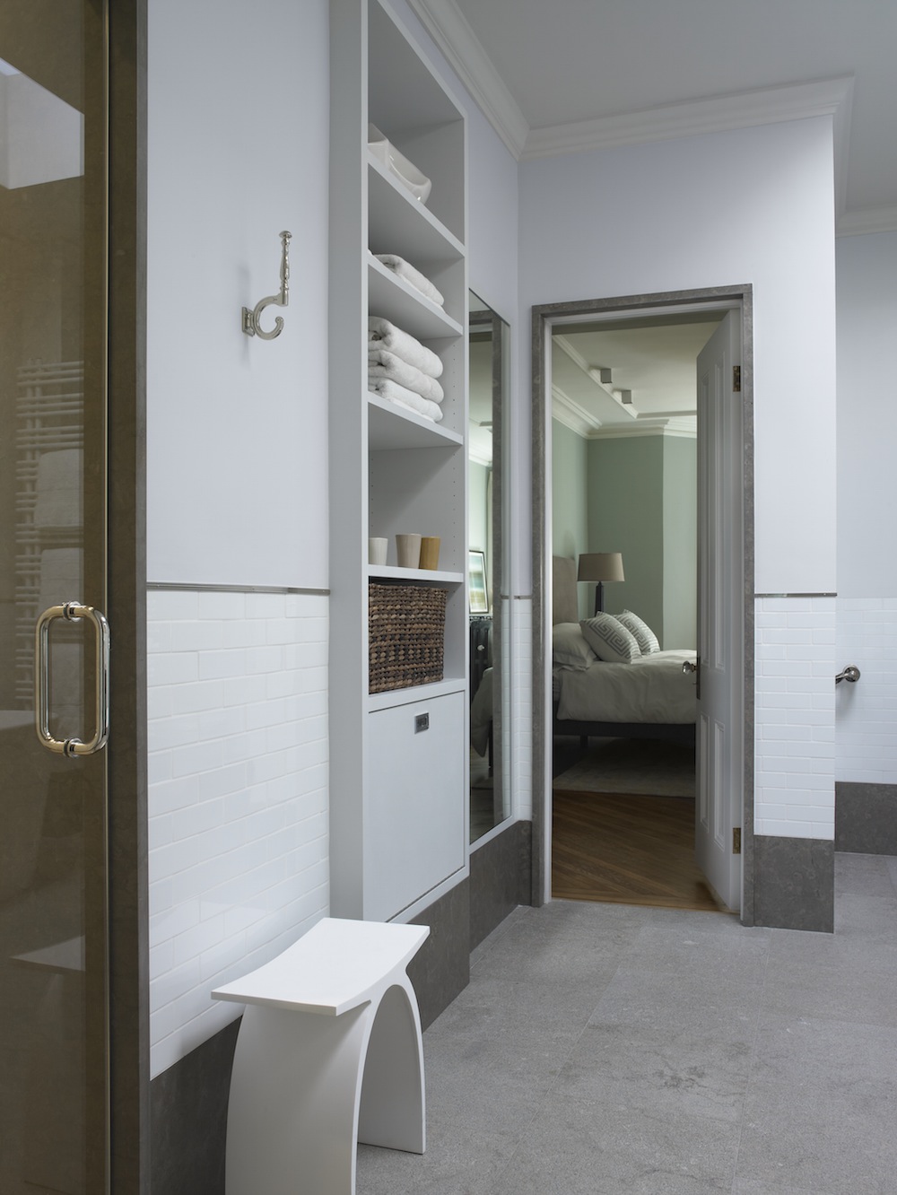
The remodeled master bath has a new steam shower. Stone was used for baseboards and the door jamb as well as for the floor. The walls are white subway tile with nickel edging; the white stool is sculpted of Corian. The door at the bottom of the built-in cabinet is a laundry hamper that opens into the laundry area on the other side of the wall. The mirror next to it is actually a giant medicine cabinet.
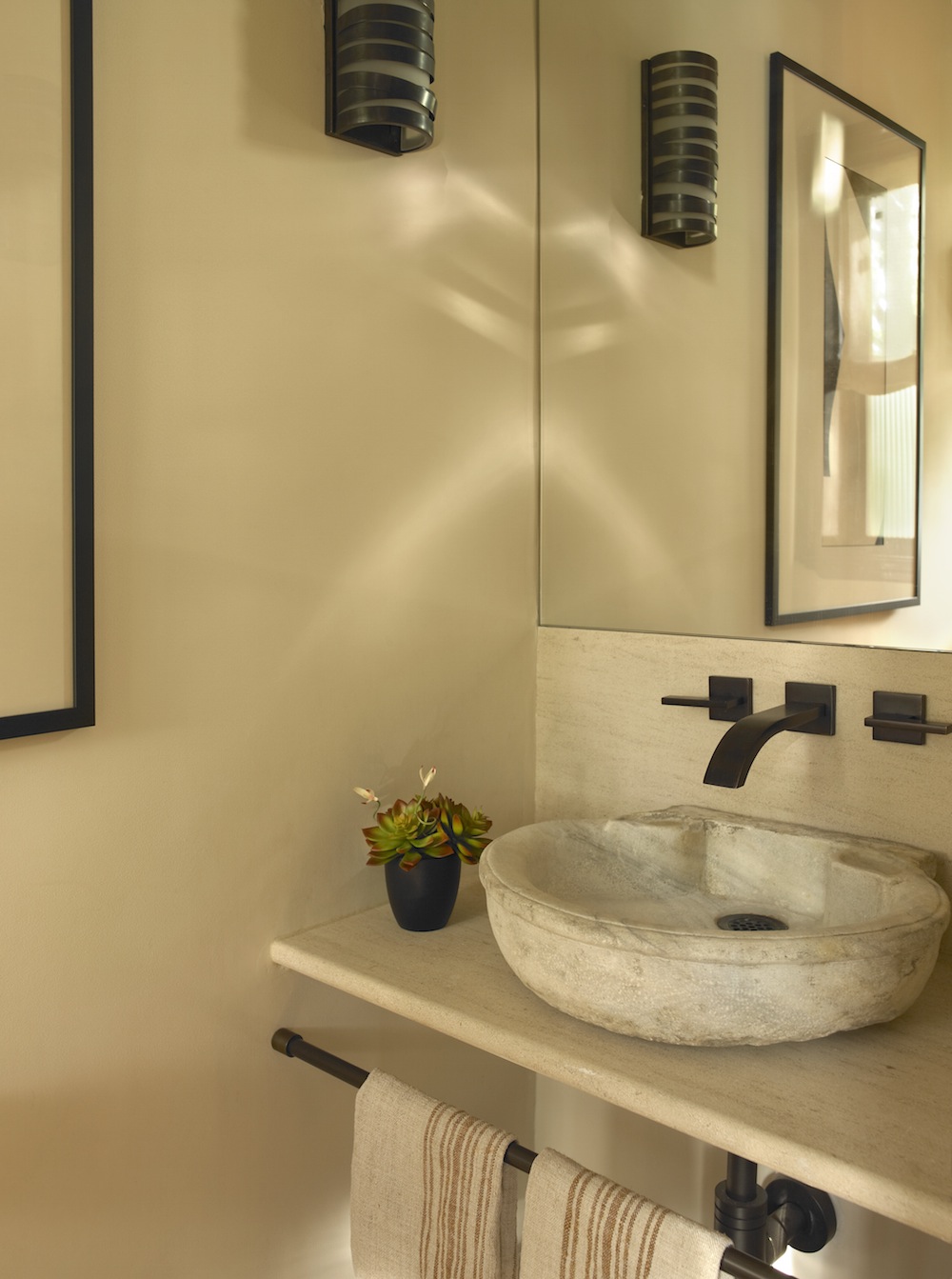
A new powder room outside the dining room has a sink from Ani Ancient Stone, with Whittington wall-mounted faucets in an oil-rubbed bronze finish.
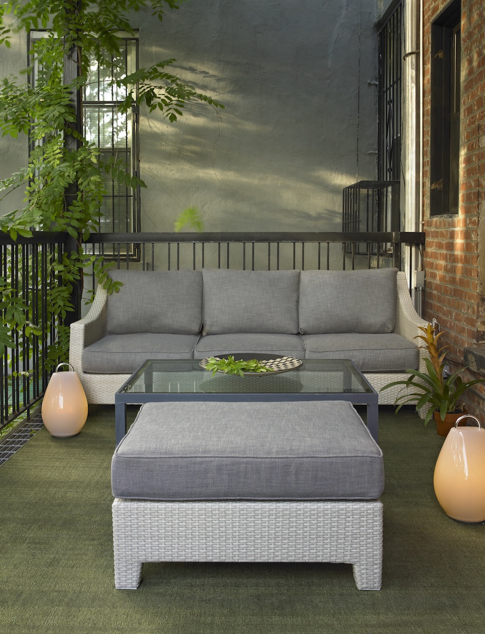
Oversized wicker furniture from Restoration Hardware sits on the deck outside the dining room.
Photos by Ellen McDermott
The Insider is Brownstoner’s in-depth look at a notable interior design/renovation project, by design journalist Cara Greenberg. The stories are original to Brownstoner; the photos may have been published before. If you have a project to propose for The Insider, please contact Cara at caramia447 at gmail dot com.
Businesses Mentioned Above
Related Stories
The Insider: Architect’s Waterfront Penthouse Capitalizes on Harbor Views
The Insider: Architect Takes Bold Steps to Make a Small Park Slope Home Feel Bigger
The Insider: “Transformative Moves” Light Up a Park Slope Kitchen











Some choices are bland, but the overall breadth of the project is inviting and livable. It’s not overdone at all.
Some choices are bland, but the overall breadth of the project is inviting and livable. It’s not overdone at all.
horrible furniture
horrible furniture
Some really bad photoshopping here.
Some really bad photoshopping here.
My mother taught me never to discuss “money issues” with anyone–never to ask a person, How much do you make? and never to answer the same question. And that is why I left out the question microfiche and copper maven ask, though I have to admit, as an “education professional” myself, I have to agree the question begged.
To paraphrase the Katz’s Delicatessen woman: I’ll have what they’re having….
No rental on the ground floor. They have a home office and guest room there.