The Insider: A Couple Transforms a Wreck Into a Rustic-Modern Row House in Bed Stuy
WELCOME TO THE INSIDER, Brownstoner’s weekly in-depth look at a notable interior design or renovation project, written and produced by journalist/blogger Cara Greenberg. Find it here every Thursday at 11 am. SOMETIMES A GUT JOB is the only answer, as was the case with this 15-by-44-foot four-story row house in Bed Stuy. It had been ripped apart by a…
WELCOME TO THE INSIDER, Brownstoner’s weekly in-depth look at a notable interior design or renovation project, written and produced by journalist/blogger Cara Greenberg. Find it here every Thursday at 11 am.
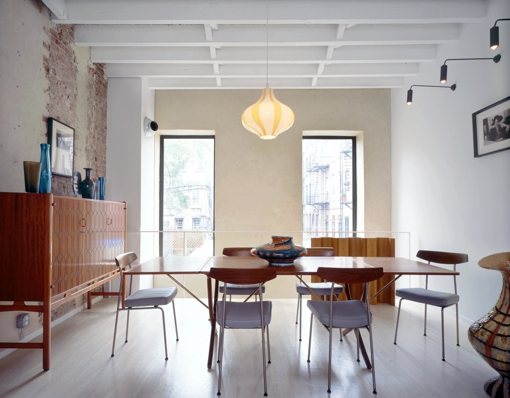
SOMETIMES A GUT JOB is the only answer, as was the case with this 15-by-44-foot four-story row house in Bed Stuy. It had been ripped apart by a developer and then abandoned during the recession, even becoming home to squatters for a time.
“It was a total wreck. There was nothing at all worth saving,” says Gitta Robinson of Brooklyn-based Robinson + Grisaru Architecture, the firm hired by new owners to transform a shell into a home.
Brick party walls and wood joists were practically all that remained. At least the joists were in decent shape.
The architects decided to keep them uncovered on the two lower floors, to add ceiling height, and painted them white. Exposed brick was likewise kept exposed.
“There was a debate on whether it would stay natural or be painted white,” Robinson recalls. Natural won.
Where a chimney breast was removed in the dining area at the rear of the parlor floor, above, the void was patched in with mortar. The homeowners — he is a graphic designer and she a landscape designer — loved the effect and kept it, even matching the mortar treatment on the rear wall of the parlor floor.
In a bold design stroke, the architects removed 2.5 feet of flooring at the rear of the parlor level, creating an open two-story slot that connects the garden and parlor floor acoustically and lets in extra light. Ideally, the architects and homeowners would have liked to replace the whole back wall on the two lower stories with glass, but a tight budget prevented it.
Instead, they created a big glass opening on the lower level only and retained the two original window openings on the floor above, where they frame views of the garden.
As a neutral foil for the homeowners’ constantly rotating collection of mid-20th century furnishings, walls and ceilings throughout most of the house are white (Benjamin Moore’s Super White, to be exact), and the new oak floors have a white pickling stain.
See and read more below.
Photos by Catherine Tighe
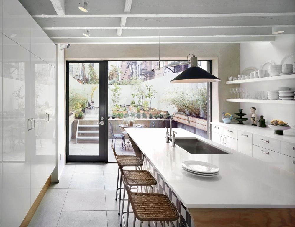
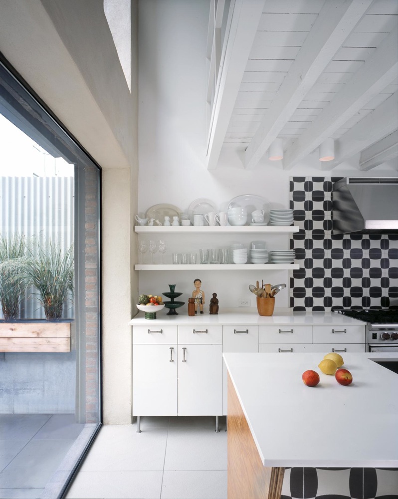
High-end Sugatsune drawer and cabinet hardware elevates IKEA cabinetry in the kitchen. The custom island is wrapped with CDX exterior grade plywood for a rustic character; countertops are Caesarstone ‘Blizzard.’
Cement tile from Spain, in a modified checkerboard pattern, decorates the front of the island and the wall behind the stove. Porcelain floor tiles match the concrete pavers in the backyard in both size (2 by 2 feet) and color; they’re even lined up in the same grid pattern for a seamless transition between indoors and out.
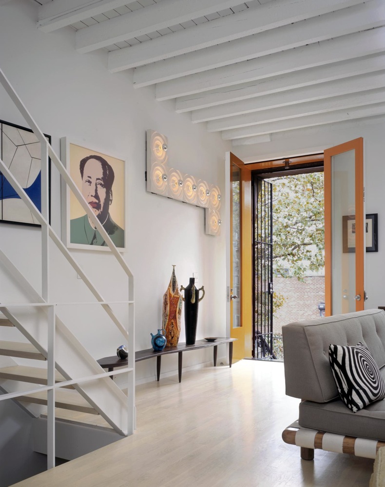
Simple steel stairs, designed by the architects, were fabricated locally and painted white. The architects decided to forgo a vestibule at the parlor level entry.
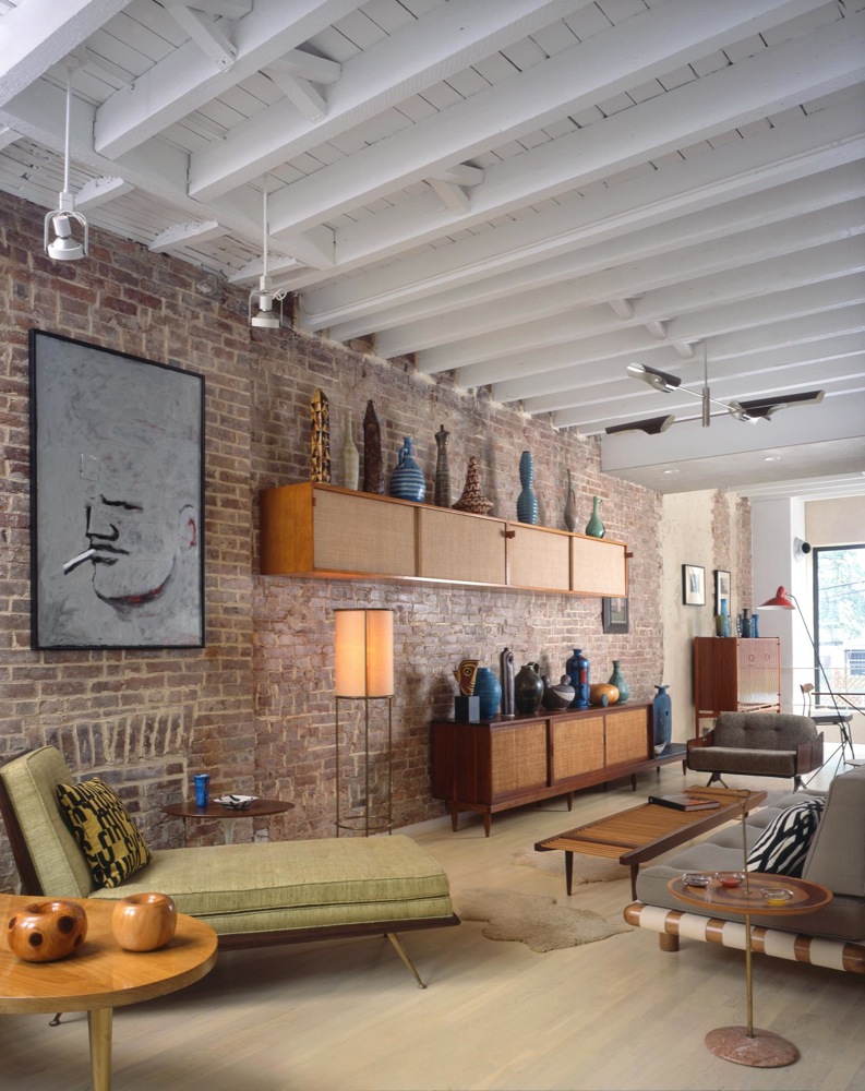
A living area kitted out with a collection of vintage mid-century furniture and lighting occupies most of the parlor floor.
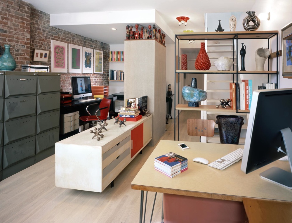
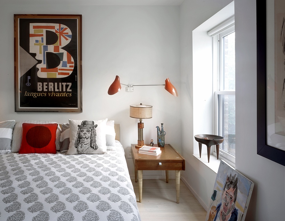
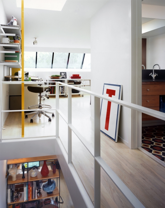
The third floor contains the husband’s graphic design studio, above, and a bedroom for the couple’s college-age son.

A bathroom on the third floor, with a new Duravit tub and Spanish concrete floor tiles, is one of three new bathrooms in the house.
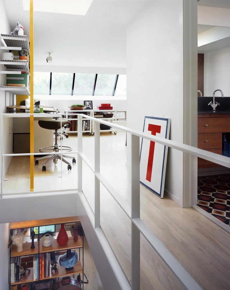
The master bedroom, master bath, and landscape design office are located on the top floor, where there’s a new elongated skylight reminiscent of a Paris garrett. A yellow ladder leads to the roof.
Want to see all that The Insider covered in its previous incarnation? Go here to find the entire archive.







hi all, thanks for the shout-outs. It’s good to BE back!
hi all, thanks for the shout-outs. It’s good to BE back!
i love it all except that tub against the brick is not ideal
i love it all except that tub against the brick is not ideal
What a great choice to re-inaugurate The Insider! I’m not getting any deja vu vibes. The colors are not my palette, and many of my own choices would likely have been different, but that’s why I look at shelter magazines and websites–to see anew. I love the light they have brought into this house, definitely the art and furnishings, the kitchen, the workspaces–wonderful. I also “elevate” Ikea cabinets with other high-end surprises in kitchens. A shell turned into a lovely home. May the owners spend many happy hours there.
i think people have been a little overly critical of the new ownership. let’s give them a minute to get their shit together before deciding they place is getting ruined…..
i think people have been a little overly critical of the new ownership. let’s give them a minute to get their shit together before deciding they place is getting ruined…..
i guess i just prefer a cleaner look in a bathroom. and agree about the shower curtain.
i guess i just prefer a cleaner look in a bathroom. and agree about the shower curtain.