The Insider: Pared-Down Detail, Natural Materials Distinguish Greenpoint Gut
A 19th century wood-frame townhouse in Greenpoint was reworked to let in light and highlight furniture crafted by the homeowner.

Photo by Alan Tansey
Got a project to propose for The Insider? Contact Cara at caramia447 [at] gmail [dot] com
To hear architect Alexandra Burr tell it, the two-stories-plus-basement row house their clients had just purchased could hardly have been less promising. “It was one of those quintessential wood-frame townhouses, vinyl clad, modest in size, with cavernous rooms with very little light,” she said.
If the feng shui alone wasn’t enough to call for a full-on gut, the safety conditions were. Built as part of a row of five, said Burr, who cofounded Gowanus-based AlexAllen Studio in 2013 with architect Allen Slamic, “You could see from the roof cavity down through all five buildings. It was such a fire hazard. The first thing we did was tell them they had to seal up their building and disconnect it from their neighbors.”
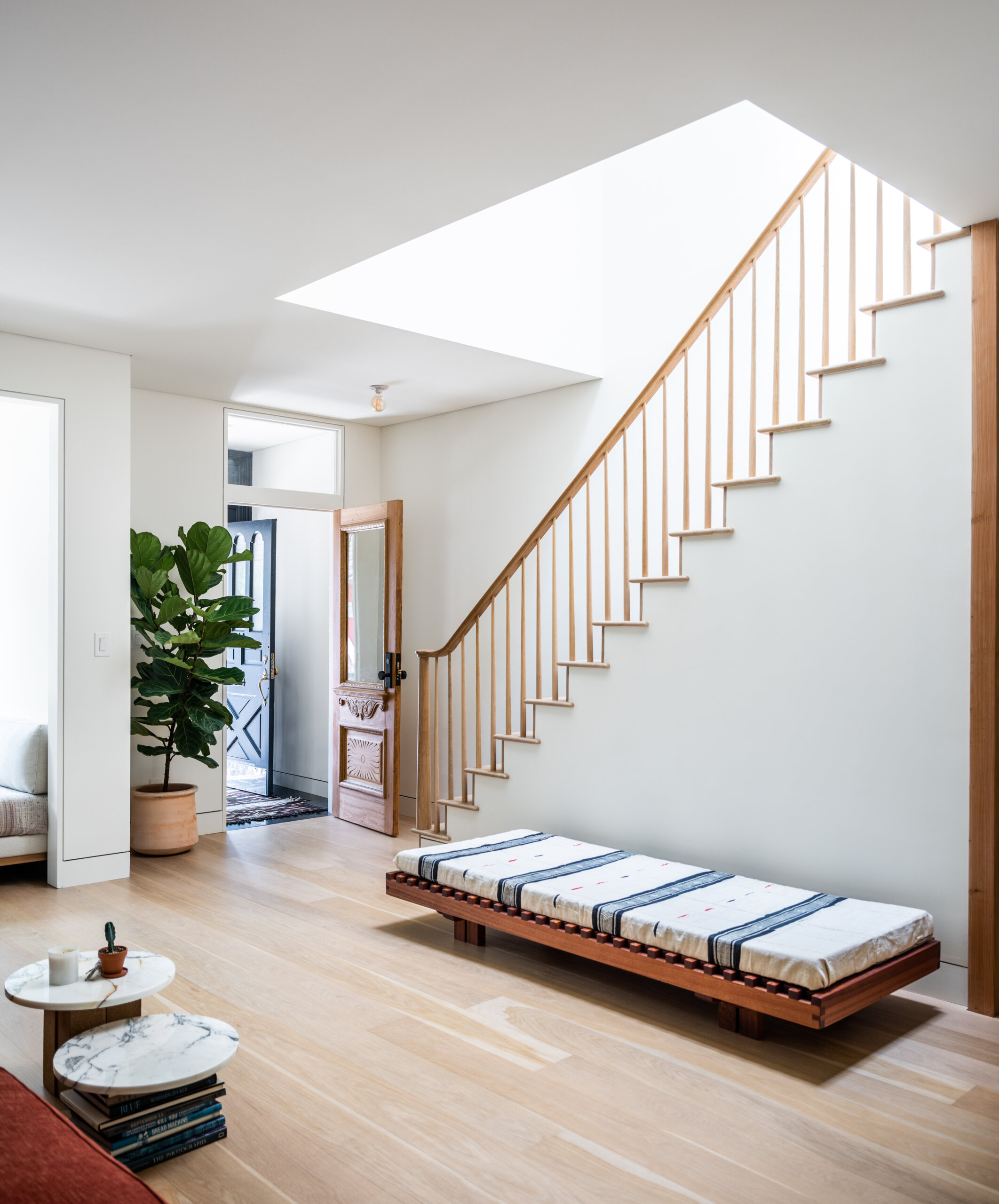
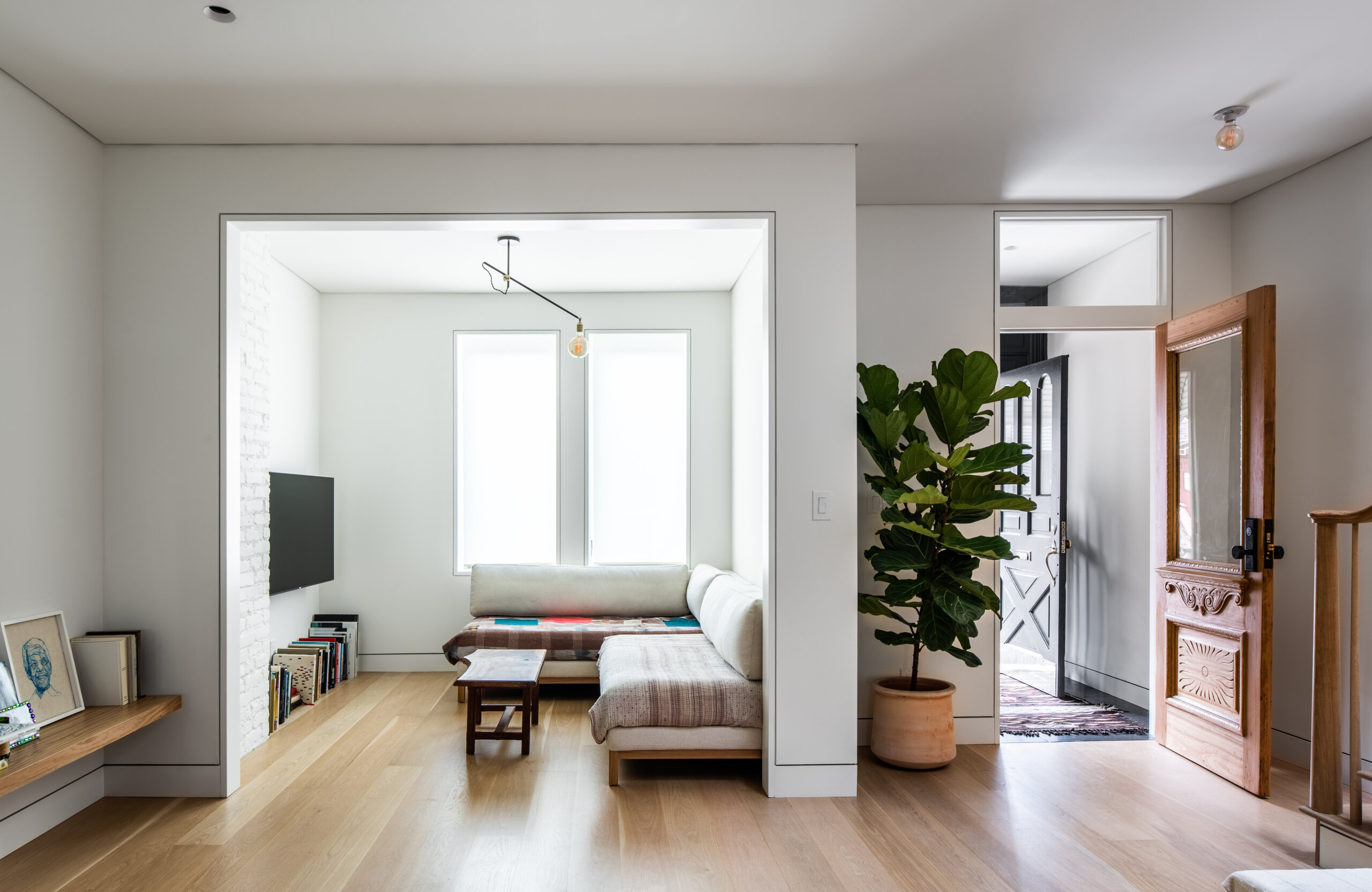
In the ensuing renovation, AlexAllen (which handles not only architecture but also interiors, furniture, and lighting design) removed walls on the ground floor and part of the second floor to increase the flow of daylight. They even sacrificed a bit of floor space upstairs to enlarge the stair opening and help banish the gloom. They also increased the size of an existing skylight and created larger window openings on the rear facade. “The difference in light is drastic,” Burr said.
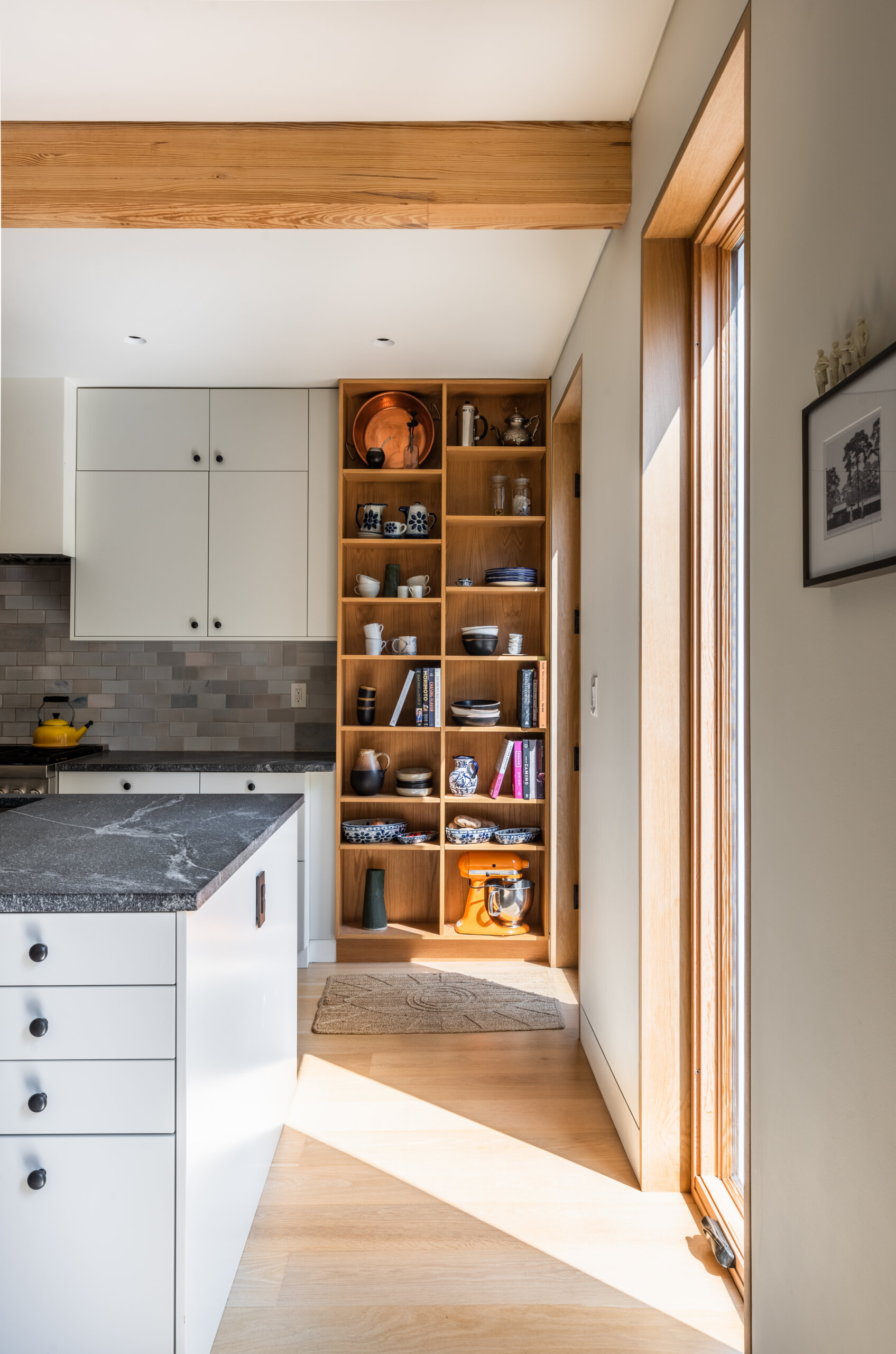
They built two new baths upstairs, inserted a powder room on the ground floor, and replaced all windows with double-glazed tilt-and-turns, except in the kitchen, where the tall windows are casements that operate with a crank. “The house functions much better from an energy standpoint,” Burr said. “We also replaced all the HVAC and other mechanicals, things you don’t see.”
Attention to detail you do see was paramount throughout. “We looked at the historical elements and retained some of them, but really pared it down,” Burr said. “The stair is one instance of that, with traditional spindles, railing, and newel post but in a much simplified version.”
AlexAllen took great pains to use reveals in lieu of moldings for a clean look where walls, ceilings and other planes meet. “One thing I love about this house is we emphasized those moments with reveals, which create a shadow line. The reason crown and base exist is to hide those juncture moments. This is much more time consuming.”
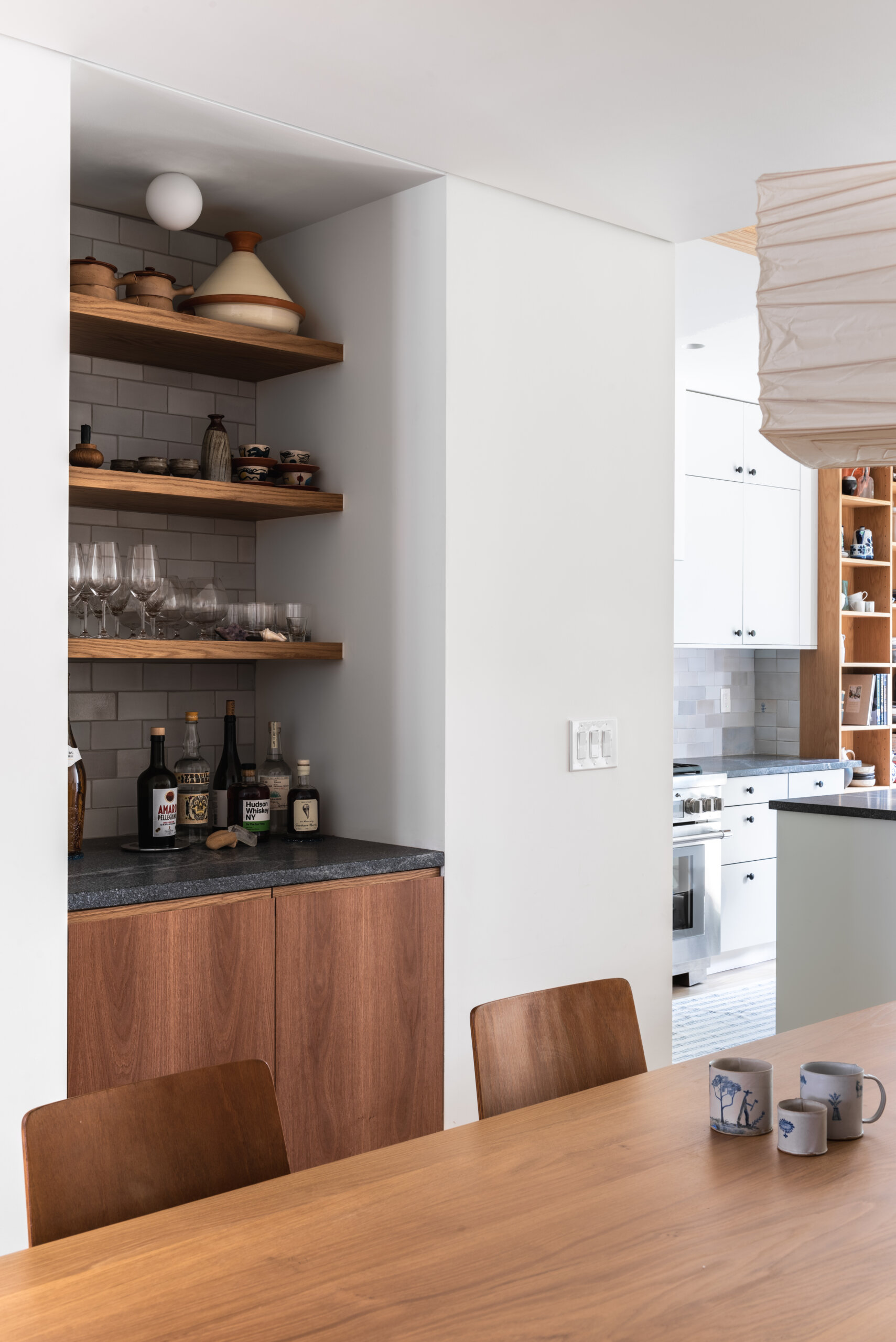
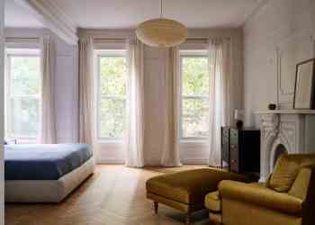
One of the homeowners is a photographer, film director, and hobbyist woodworker. From the basement wood shop came many of the home’s furnishings, including the kitchen table and stools, a day bed in the living room, the bed in the primary bedroom, and children’s furniture.
AlexAllen rebuilt the stair structure, keeping the stairs in their existing location but replacing all the spindles and treads.
The inner entry door was originally covered with yellow paint. The owners hand-stripped and retained it.
The large nook off the main living space serves well for the family of three, Burr said. “They have a kid who wants to watch cartoons. The TV is tucked away.”
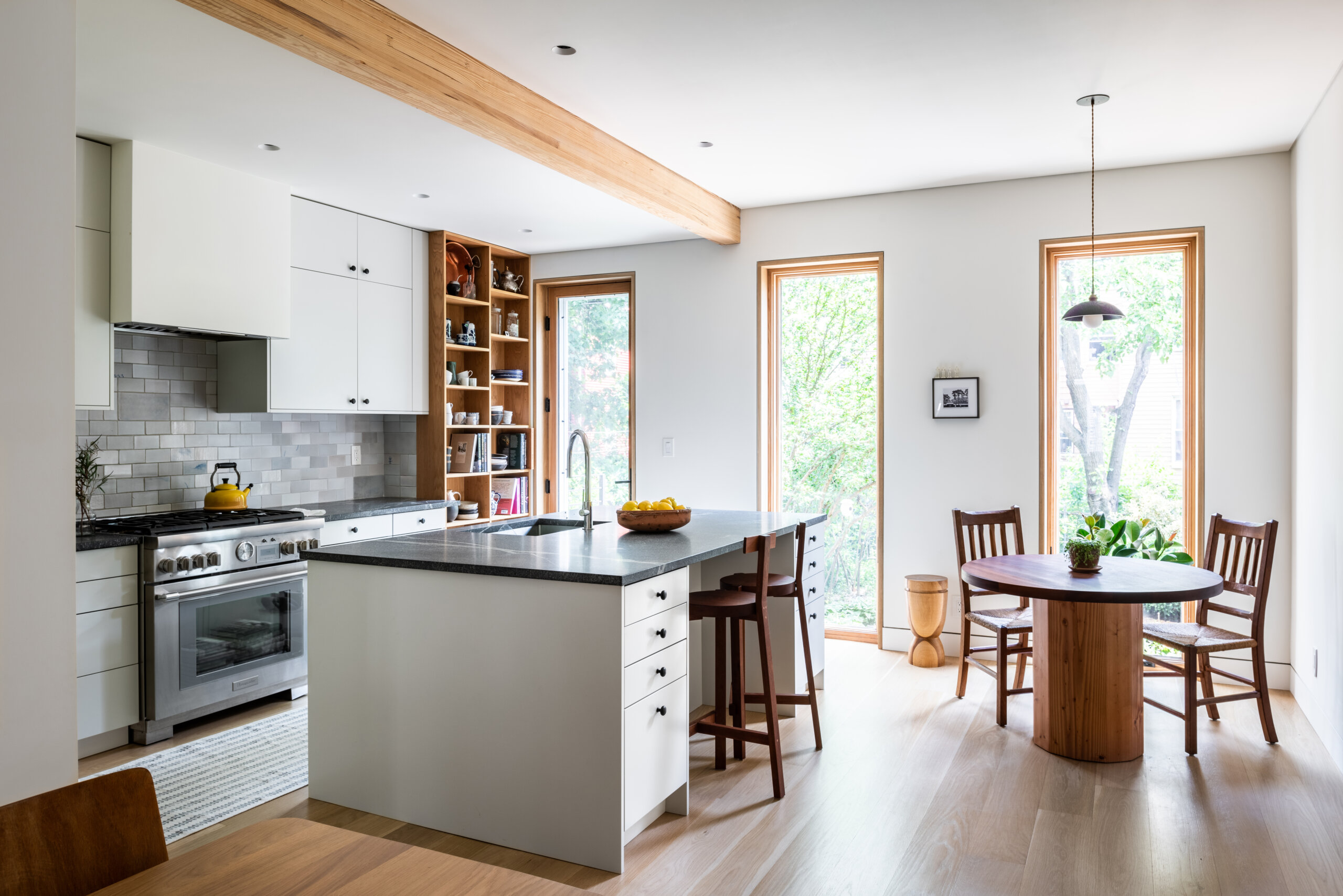
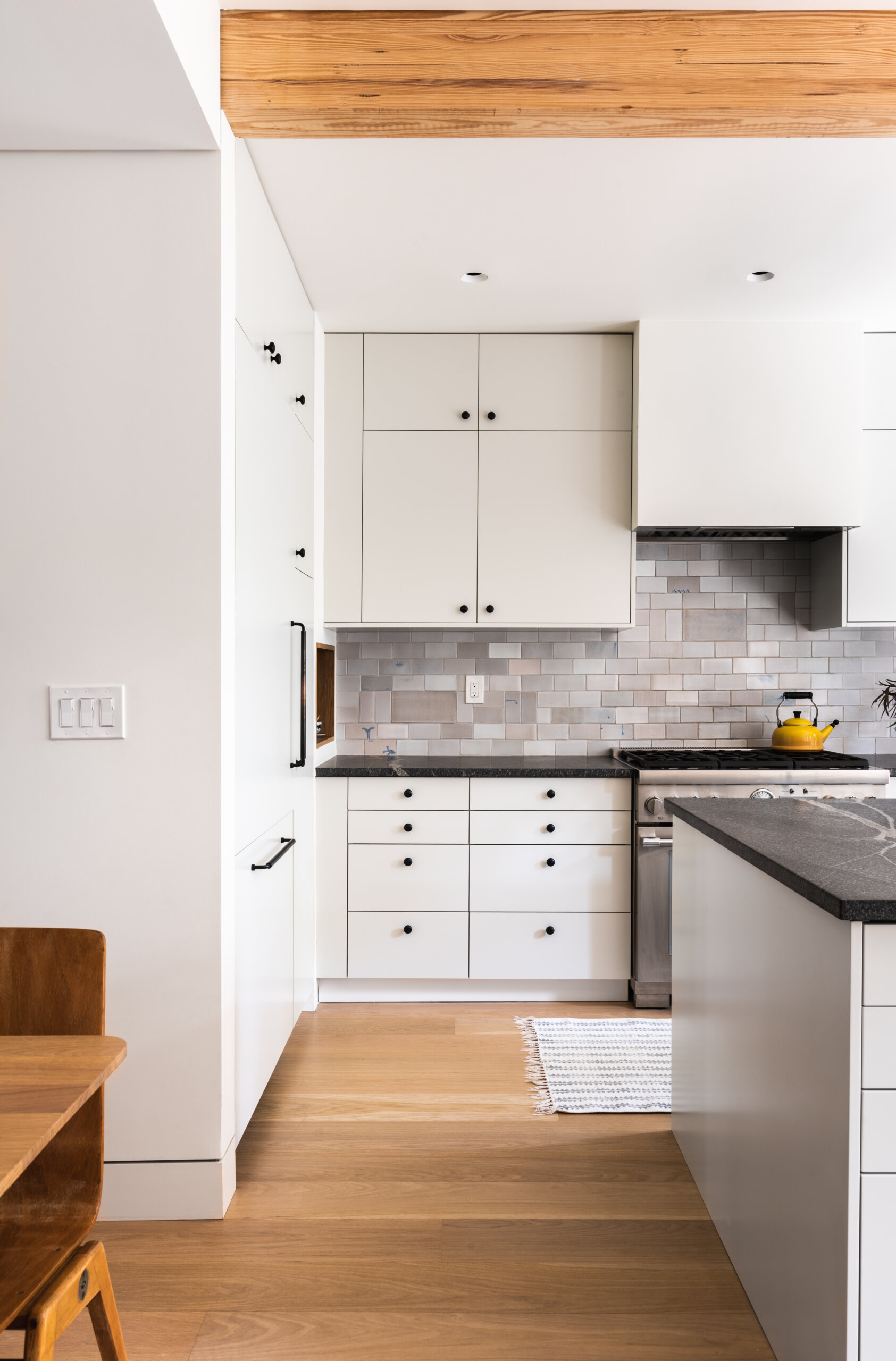
The architects removed a load-bearing wall at the rear of the main floor, and the space became an open kitchen in a simple palette of whites, grays, and natural wood. Where the wall was removed, they emphasized the soffit with a beam of Douglas fir glulam (glued laminated timber, an engineered wood product). “We spent more money than needed on that particular member,” Burr said, but the aesthetic was deemed worth it.
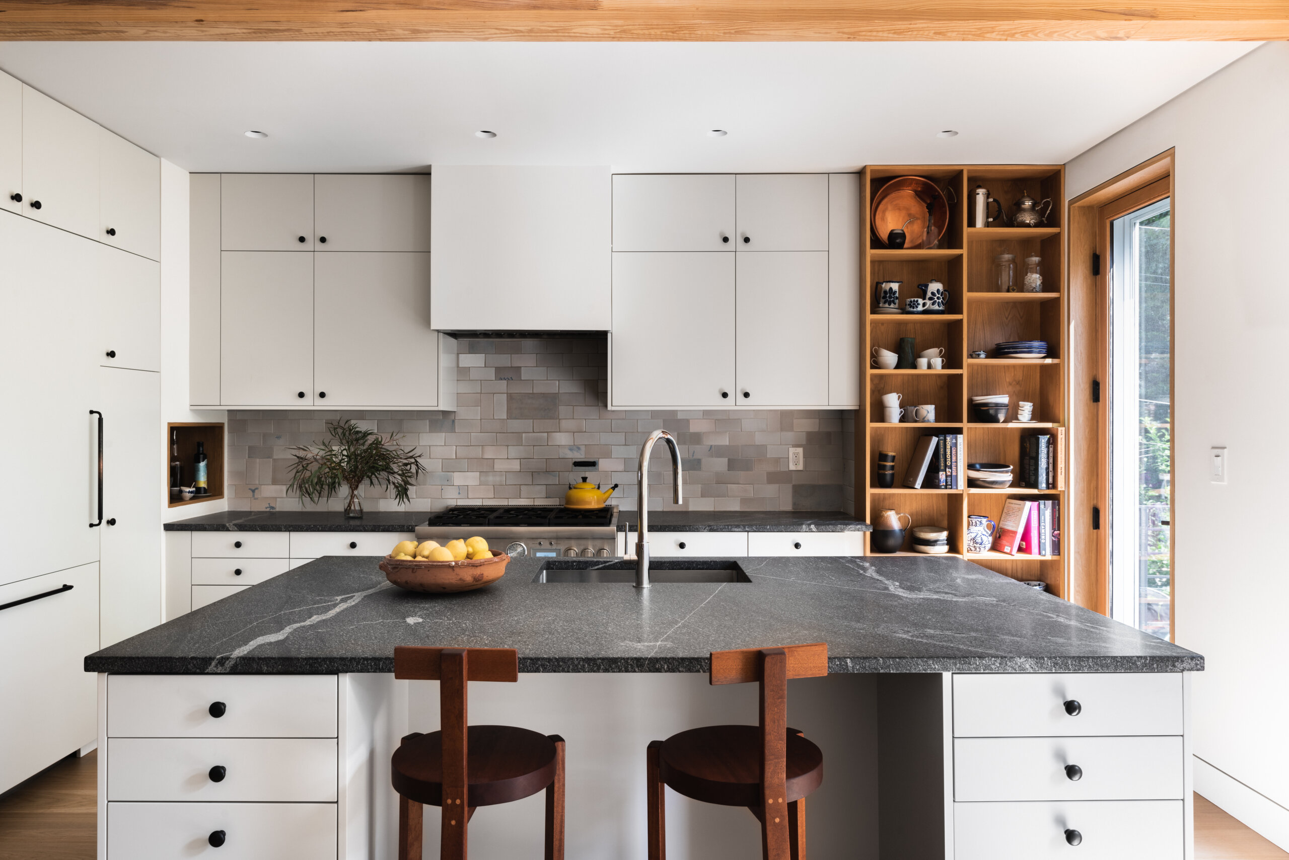
Vermont Plank flooring was topped with clear oil to retain its natural color. “The clients fell in love with tiles from BDDW and everything revolved around that,” Burr said of the kitchen design, which includes Reform cabinets with doors painted to complement the backsplash tiles, additional custom oak veneer millwork, and countertops from Atlantic Lava Stone.
The homeowner made the light fixture over the kitchen table, as well as the table itself and the counter stools.
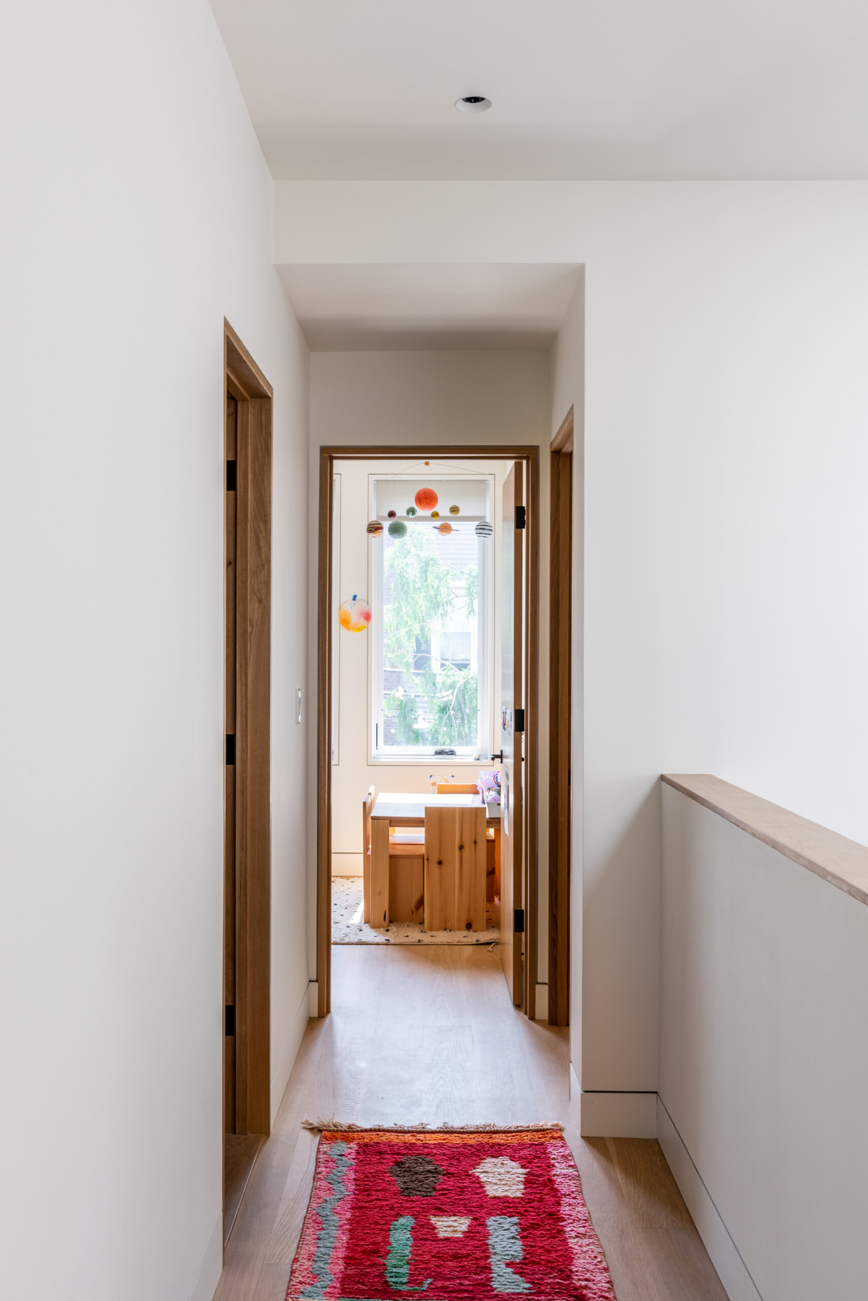
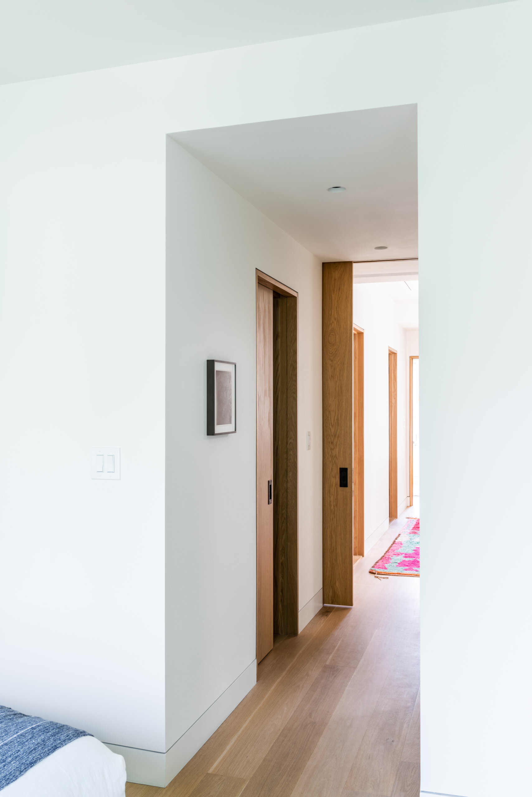
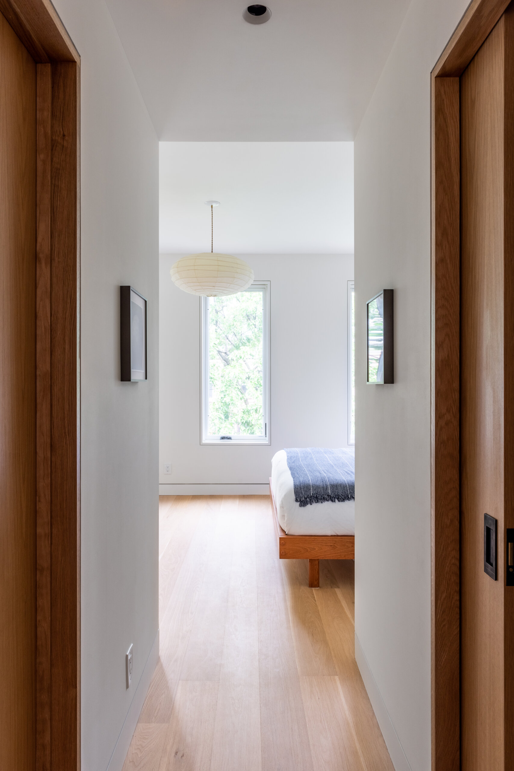
All the doors in the house are custom oak veneer, trimmed with white oak. A large pocket door leads into the primary suite. “You can dock it in its pocket and have a sight line all the way through to the kid’s room at the front,” Burr said.
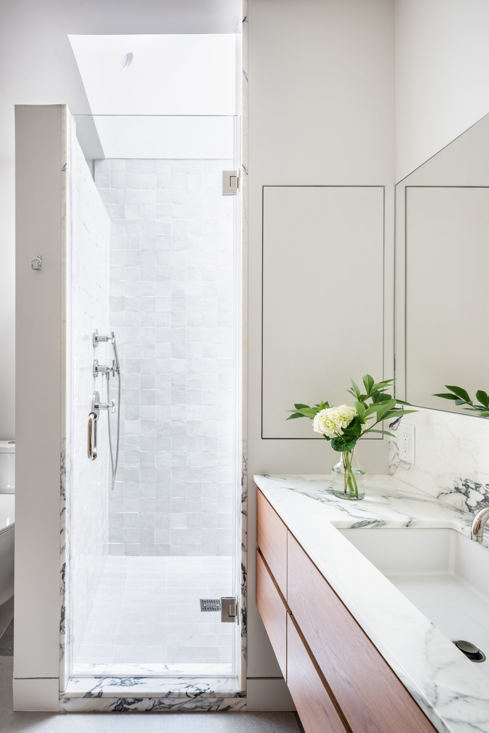
AlexAllen positioned the primary bath shower, lined with zellige tiles from Clé, underneath an existing skylight “for drama,” Burr said. “The skylight is quite small, but we angled its walls to get greater light coming in.”
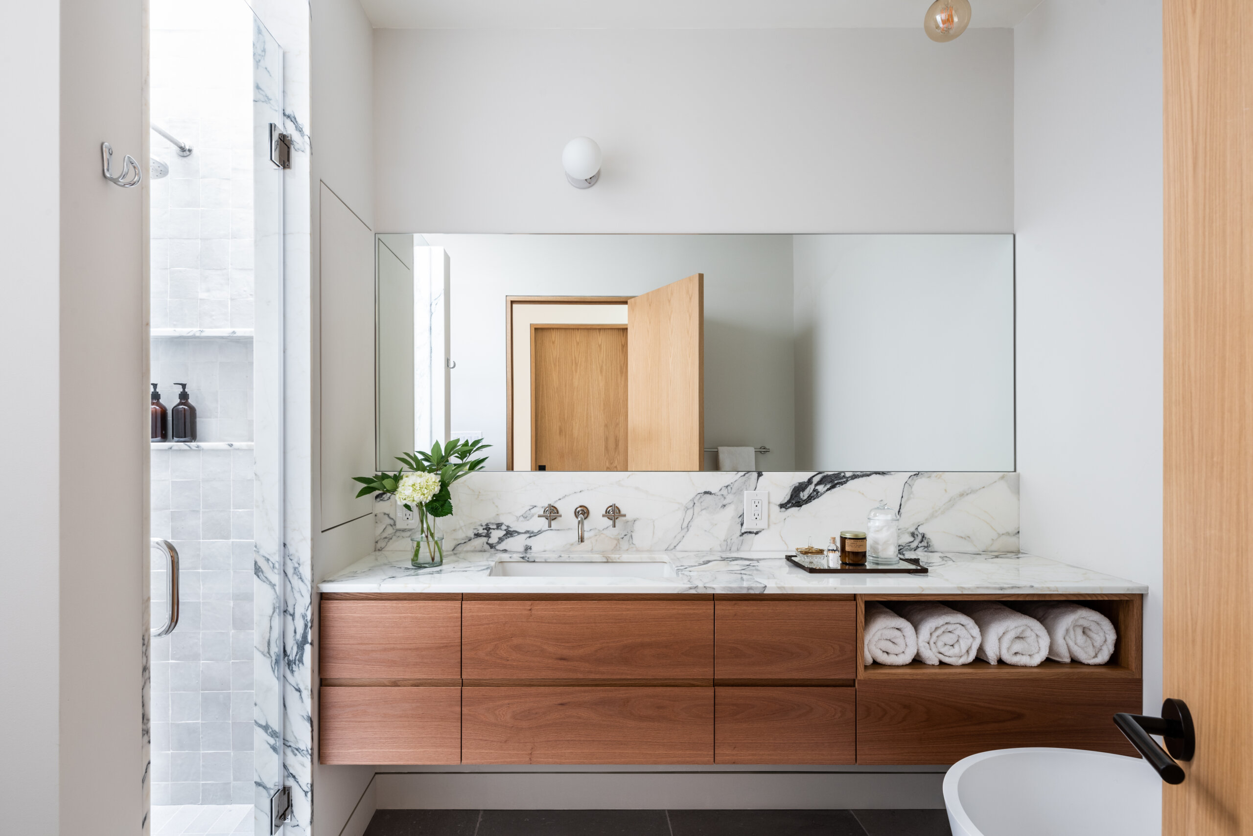
The long horizontal vanity is custom oak veneer, with countertop and trim of Arabescato marble.
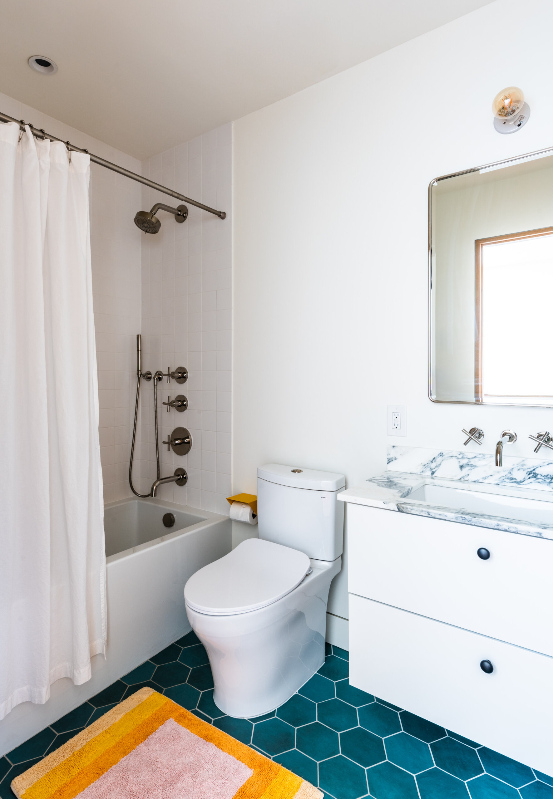
There’s a second full bath on the top floor, used by the homeowners’ little one.
[Photos by Alan Tansey]
The Insider is Brownstoner’s weekly in-depth look at a notable interior design/renovation project, by design journalist Cara Greenberg. Find it here every Thursday morning.
Related Stories
- The Insider: Fresh Decor, Cohesive Color Brightens a Family’s Newly Renovated Greenpoint Home
- The Insider: Williamsburg Townhouse Gut Restores Architectural Integrity, Brings in Light
- The Insider: Bed Stuy Gut Reno’d Row House With Four New Windows Leans Minimalist
Email tips@brownstoner.com with further comments, questions or tips. Follow Brownstoner on Twitter and Instagram, and like us on Facebook.




What's Your Take? Leave a Comment