The Insider: Ingenious Small Tweaks Banish Kiddie Clutter in Brooklyn Heights Condo
The architectural tweaking and redecorating of this Brooklyn Heights two-bedroom condo grew out of a complaint very common among parents of young children. “Kids’ stuff was taking over the whole apartment,” said Erin Fearins of Fearins & Welch, a full-service interior design firm established last year after a decade as a department within Brooklyn-based CWB Architects.

The architectural tweaking and redecorating of this Brooklyn Heights two-bedroom condo grew out of a complaint very common among parents of young children. “Kids’ stuff was taking over the whole apartment,” said Erin Fearins of Fearins | Welch, a full-service interior design firm established last year after a decade as a department within Brooklyn-based CWB Architects.
Two preschoolers shared the smaller of the bedrooms, from which “toys spilled out” into the open kitchen/dining/living space and even into the master bedroom. “We thought, ‘What if we switched rooms, and put the kids in the larger, more light-filled room, and made the master bedroom a cozy, luxe sanctuary?'”
That is what Fearins and her associates did, along with a few other changes to make the apartment work better for the young family. These included adding a new door on pivot hinges in the tight hallway outside the little ones’ new bedroom (seen in the floor plan below), where one of the homeowners has a small desk.
“The new door creates a nice separation between the working zone and the kids’ zone, so she can work at her desk in the evening when they are sleeping,” Fearins said.
The designers also added millwork under the window in the children’s room for additional storage and new built-in cabinetry in the dining area, and filled in a rather useless 10-inch overhang on the existing counter separating the kitchen from the dining area, creating a back for a new seating banquette.
Though the original master had an en suite bathroom, the family found they were using it to bathe their children at night anyway. There’s a second full bath right across the hall from the smaller bedroom.
When it came time to decorate, Fearins took cues from the husband’s Swedish heritage and the existing mid-century modern pieces the couple already owned, to produce a quirky, light-hearted look she terms “Scandi-Mod.”
Overall, “It was a case of doing a minimal amount of work for a maximum amount of change,” Fearins said. The meticulous re-design not only yielded a clutter-free apartment, it made it easy to keep things that way.
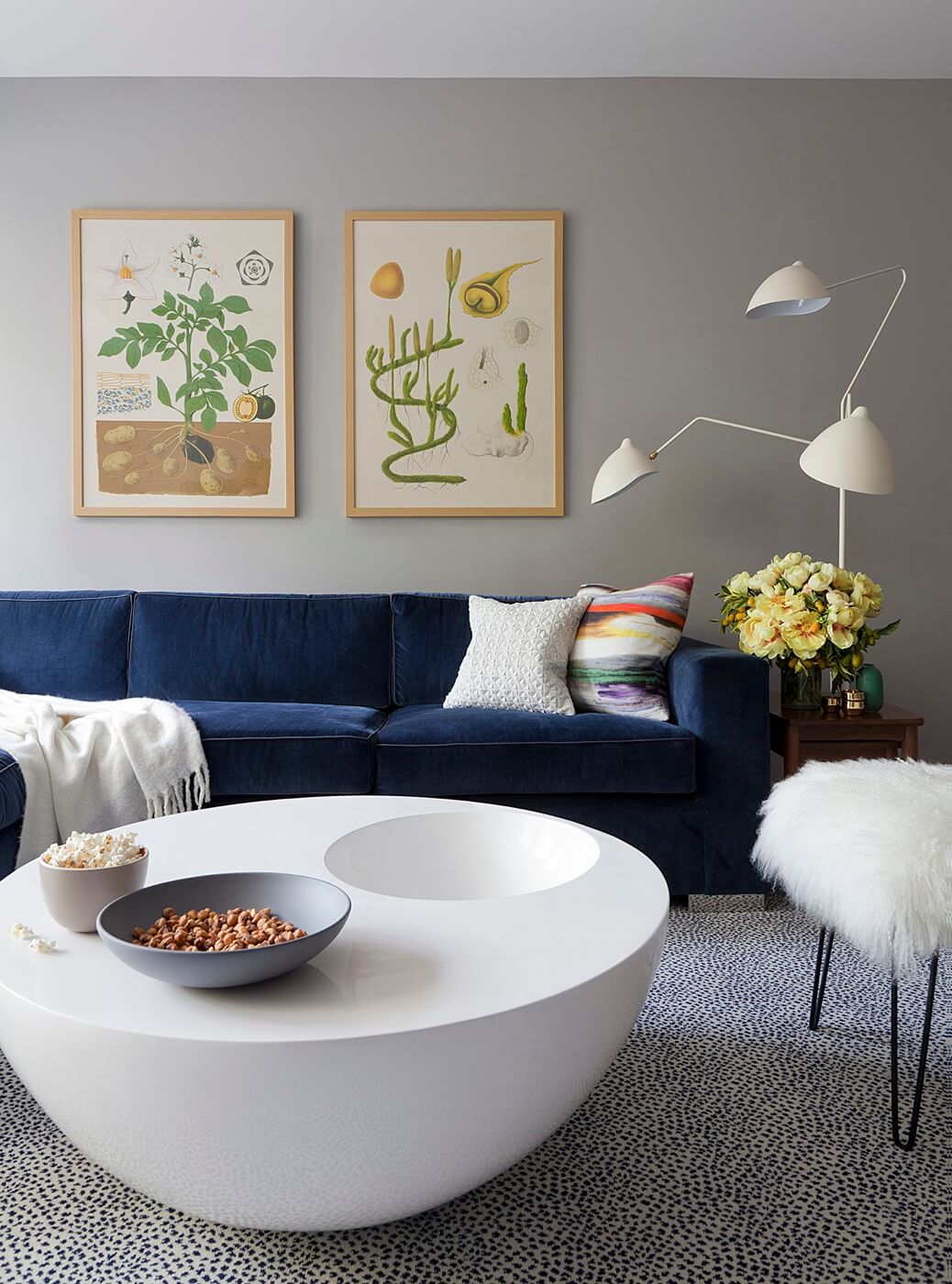
A quirky round coffee table from the Phillips Collection and a hairpin-legged stool found on Etsy were fun choices for the living area, along with speckled broadloom ‘Galaxy’ carpet from ABC Carpet and Home.
The living room sofa was custom-made by MTC and upholstered in blue velvet from Kravet. The standing lamp is from White on White.
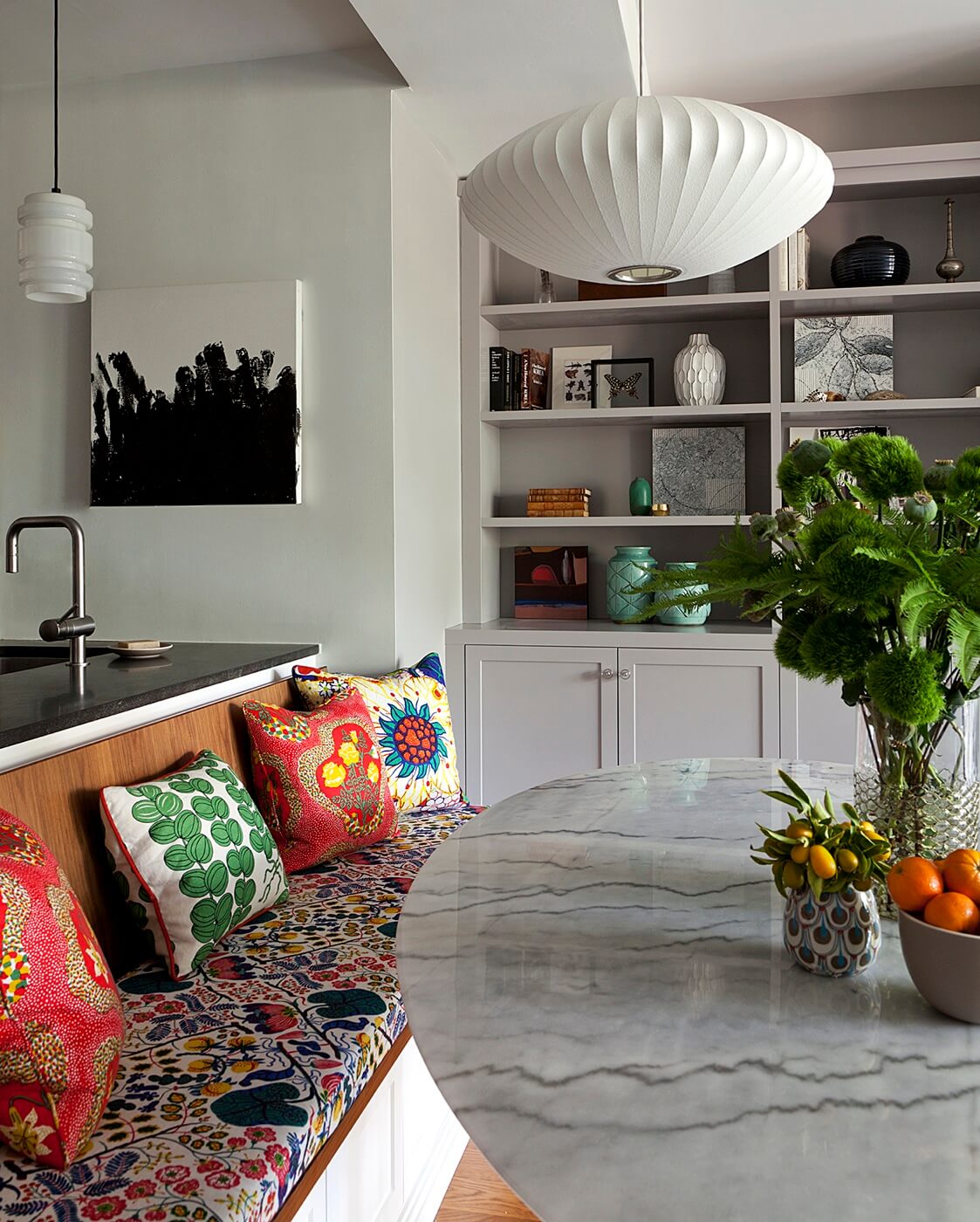
1930s Josef Frank prints from Just Scandinavian enliven the new seating banquette. The marble-top pedestal table is a 1950s design by Eero Saarinen for Knoll.
A George Nelson bubble lamp from Herman Miller hangs above it. The small white pendant lamp over the kitchen counter is from Niche Modern.
The new built-in cabinetry, with open and closed storage, as well all the other new millwork in the apartment, was made by Matt Freitag, a Brooklyn-based woodworker.
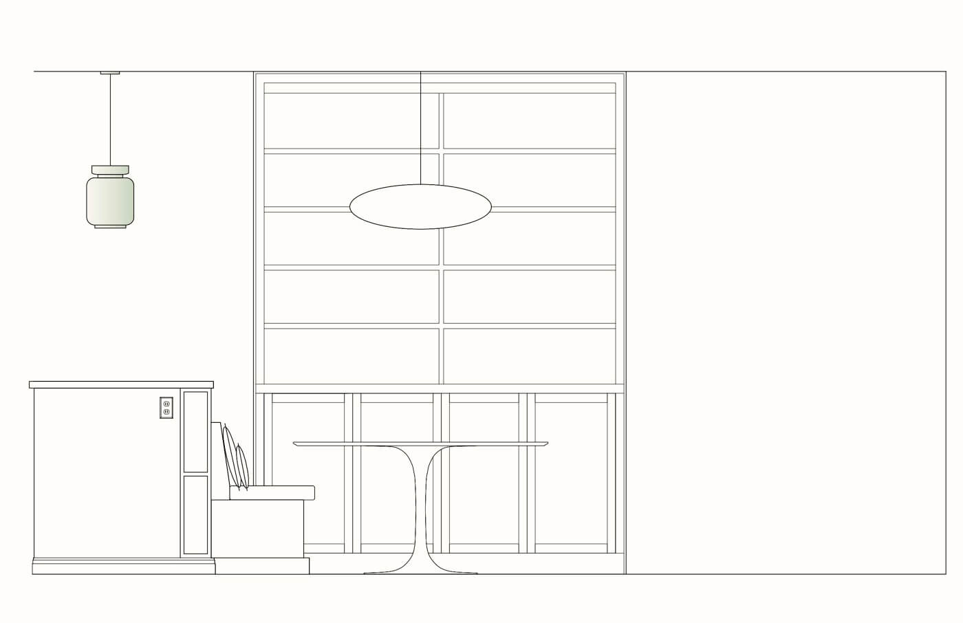
The rendering above shows how Fearins filled in a small overhang in the kitchen counter to create a back for a new seating banquette, and left it open on the side for cookbook storage.
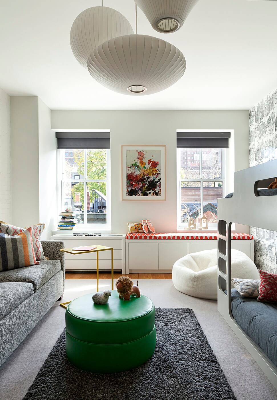
Fearins repurposed three Nelson bubble lamps the homeowners had, all in the children’s room.
Local furniture maker Matt Freitag crafted the stylish new bunk bed and provided new millwork under the window to increase storage and serve as a radiator cover.
A sleeper sofa from Duralee accommodates overnight babysitters. The ottoman came from Lee Industries and was upholstered in green vinyl; the bean bag chair from Auskin in white shearling.
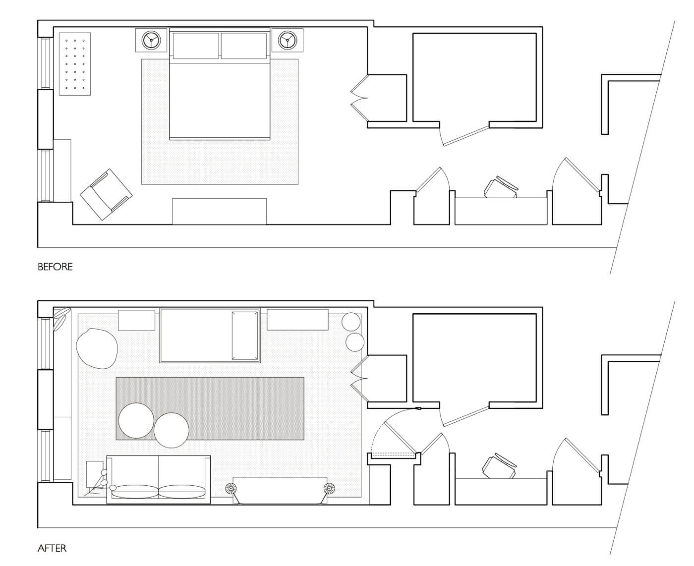
Using the larger of two bedrooms for the homeowners’ two children makes more efficient use of available space. Note the new pivot door on the plan above.
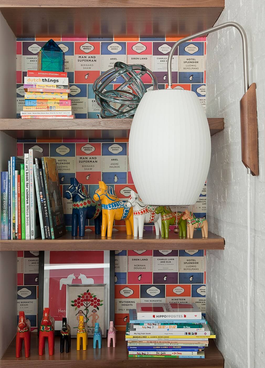
New bookshelves in an odd little corner of the children’s room, also shown on the plan above, are lined with Osborne & Little wallpaper.
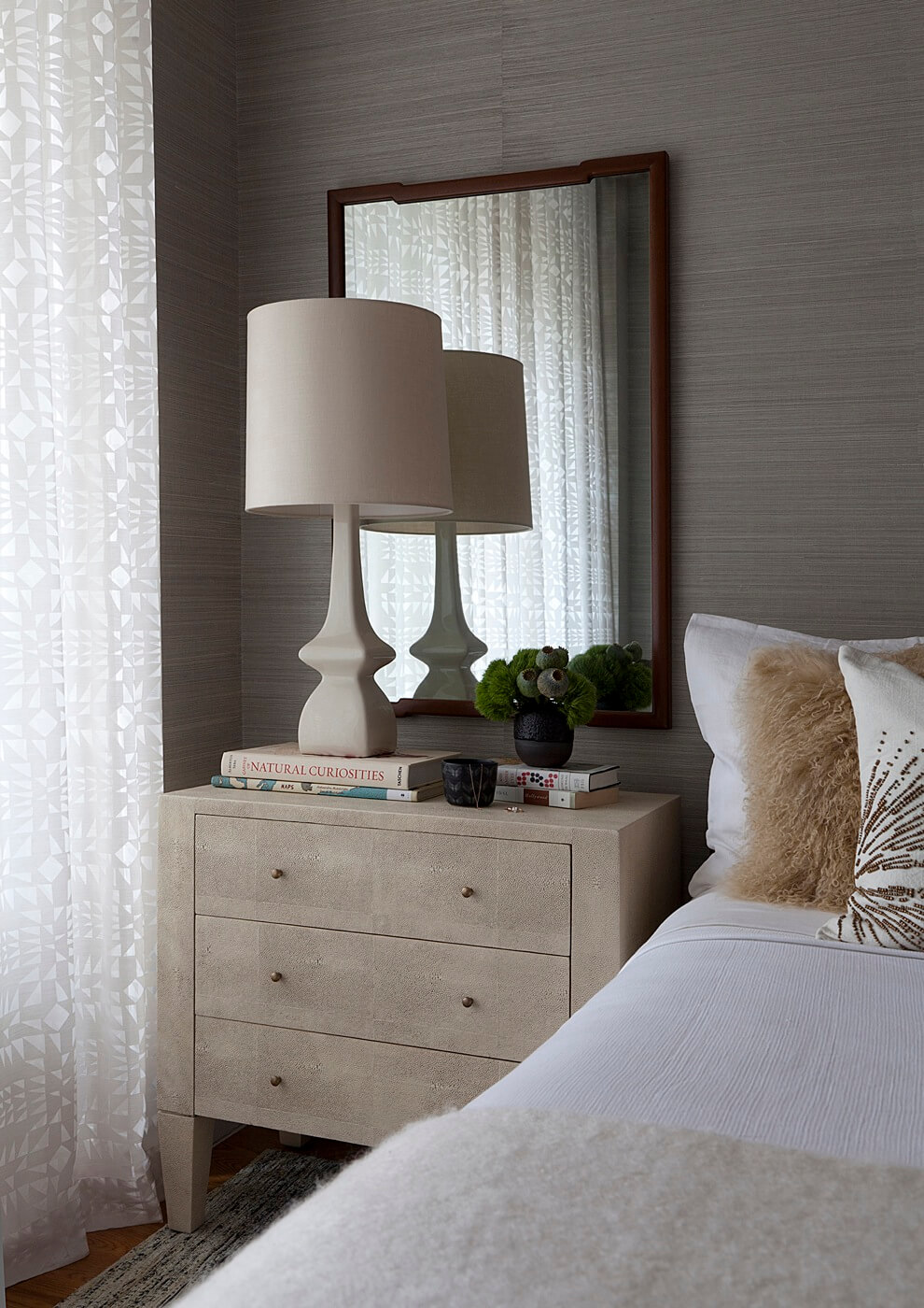
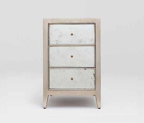
Now a restful sanctuary, the new master bedroom has walls covered in gray grasscloth, a faux-shagreen side table from Made Goods and a lamp from Robert Abbey.
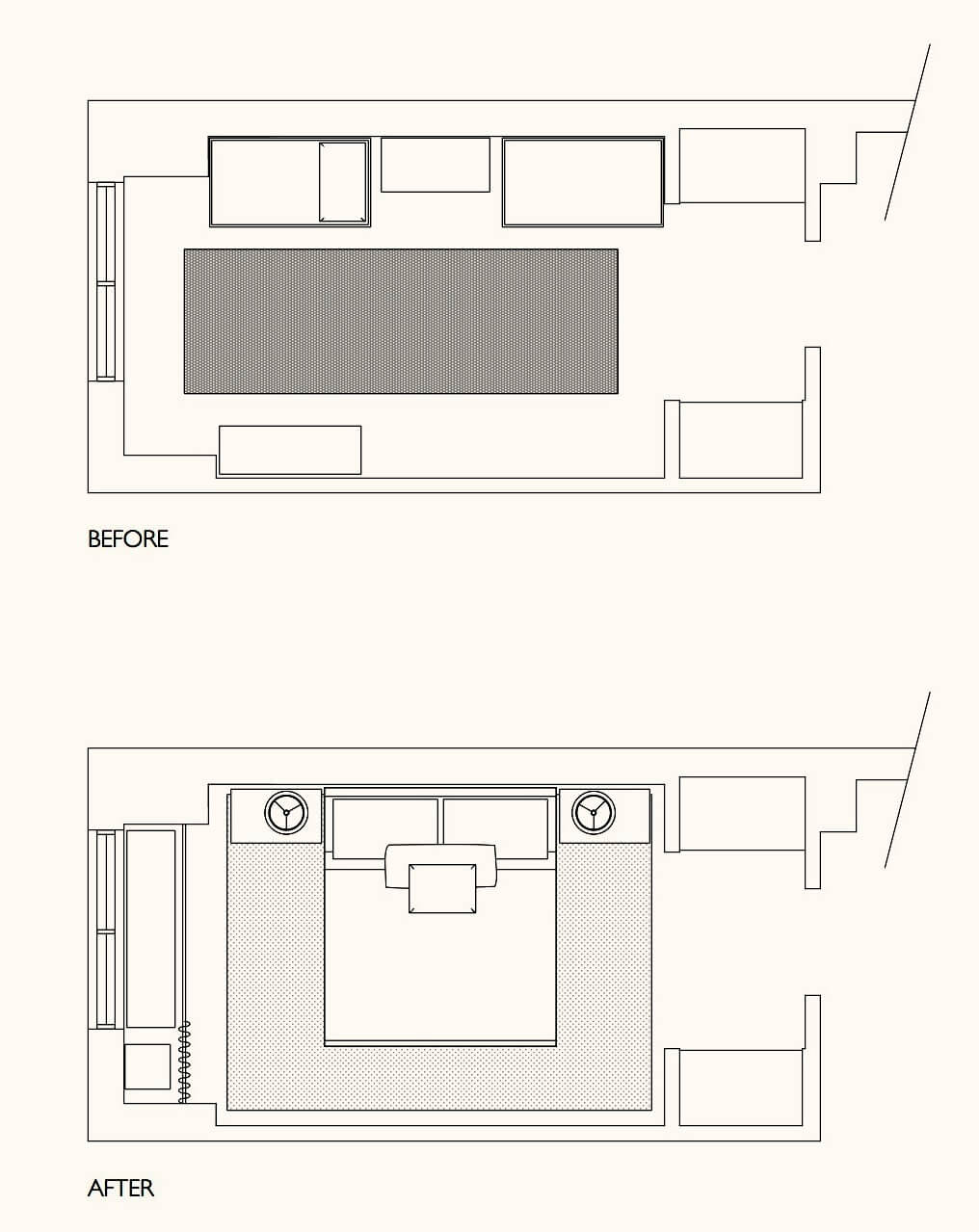
Minimal furnishings in the smallish master bedroom are really all that’s needed.
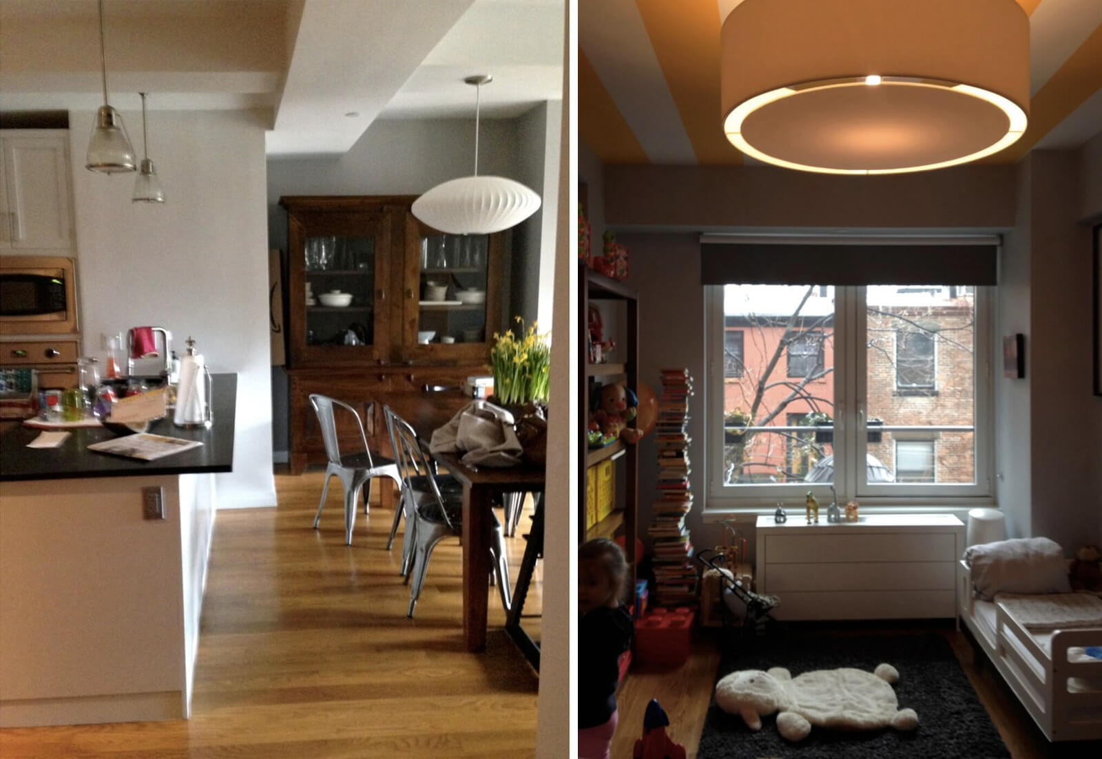
Above, the kids’ room and kitchen before the renovation.
[Photos by Rachael Stollar]
The Insider is Brownstoner’s in-depth look at a notable interior design/renovation project, by design journalist Cara Greenberg. Find it here Thursday mornings.
Got a project to propose for The Insider? Contact Cara at caramia447 [at] gmail [dot] com
Related Stories
The Insider: Designer Taps Into Feng Shui to Decorate Off-Kilter Parlor in Brooklyn Heights
The Insider: Hot Color Warms Up a Kid-Friendly Carroll Gardens Brownstone
The Insider: A Quick, Cost-Conscious Townhouse Reno in South Slope
Businesses Mentioned Above
Email tips@brownstoner.com with further comments, questions or tips. Follow Brownstoner on Twitter and Instagram, and like us on Facebook.










What's Your Take? Leave a Comment