Wondrous Beauty: Inside the Brooklyn Heights Home of Artist and Designer Kathryn Scott
Artist and designer Kathryn Scott conjures serene and elegant spaces in her own home and for clients through restraint and attention to detail.

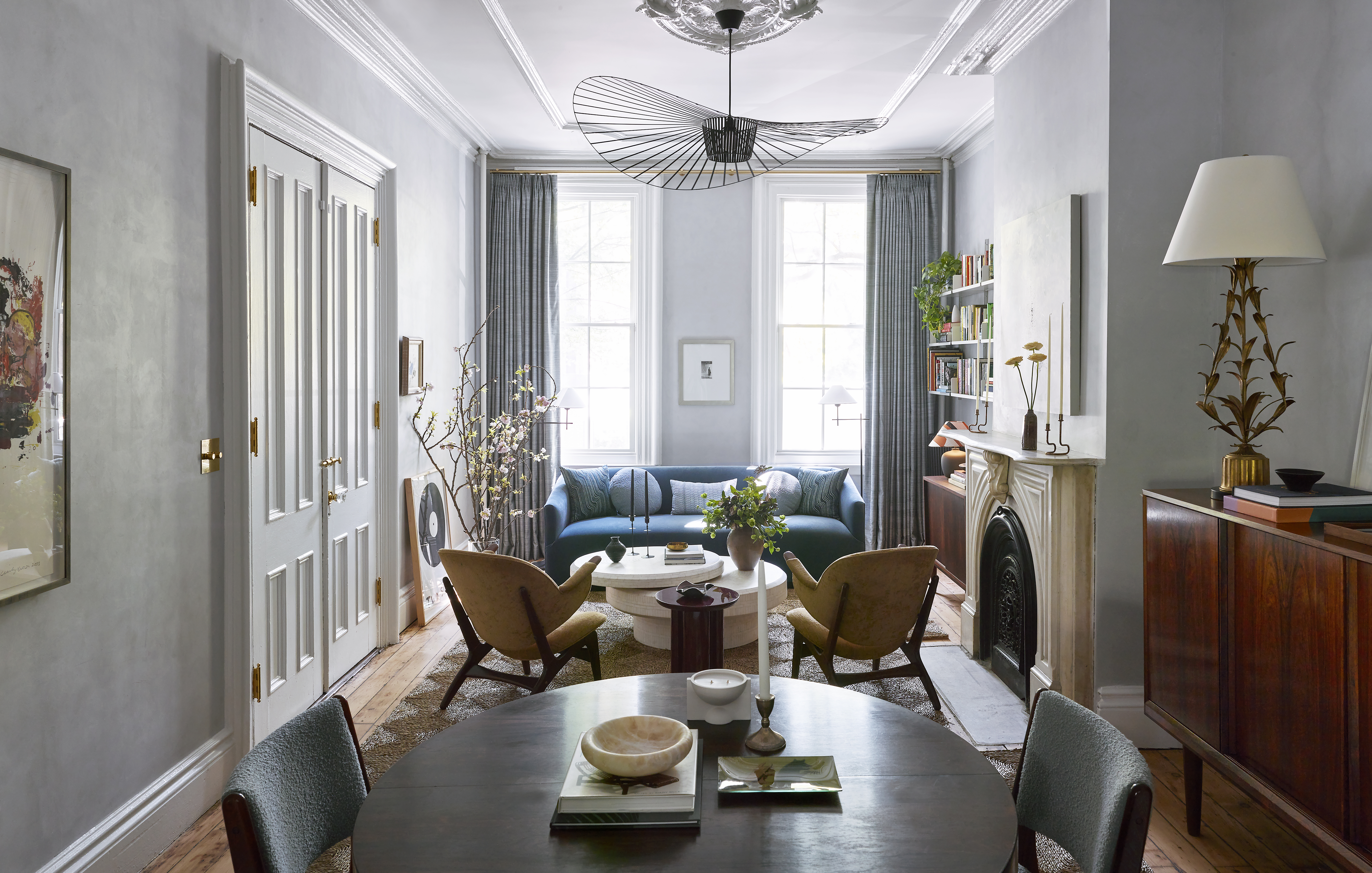
The credenza and coffee table were both custom made in China; the top of the latter is carved from one piece of white Chinese marble. The credenza is topped with old library lamps. ” I do have shades that go inside, but I actually like them better as skeletons,” Scott says. Photo by David A. Land
Kathryn Scott’s gracious Brooklyn Heights brownstone is not what most people think of when they imagine a “starter home.” But strictly speaking, it is. The home is five floors; Scott purchased the third and fourth as her first apartment, in 1986; years later, she bought the parlor and garden floors as a home for her mother; in 2006, she bought the top floor apartment. Upon her mother’s passing, Scott combined all but the top floor into a single home.
“This is not a restoration,” Scott explains. “It can’t be, because I didn’t have the whole house at that point, and once I did, I didn’t want to start over and turn it into a whole house. I tried to make it look coherent, so the style is respected, but it can’t be the same.” Scott is at peace with this. Perhaps it’s due to her work as a fine artist, which was her calling before she ventured into designing interiors and objects; true artists understand that process is as important as product.
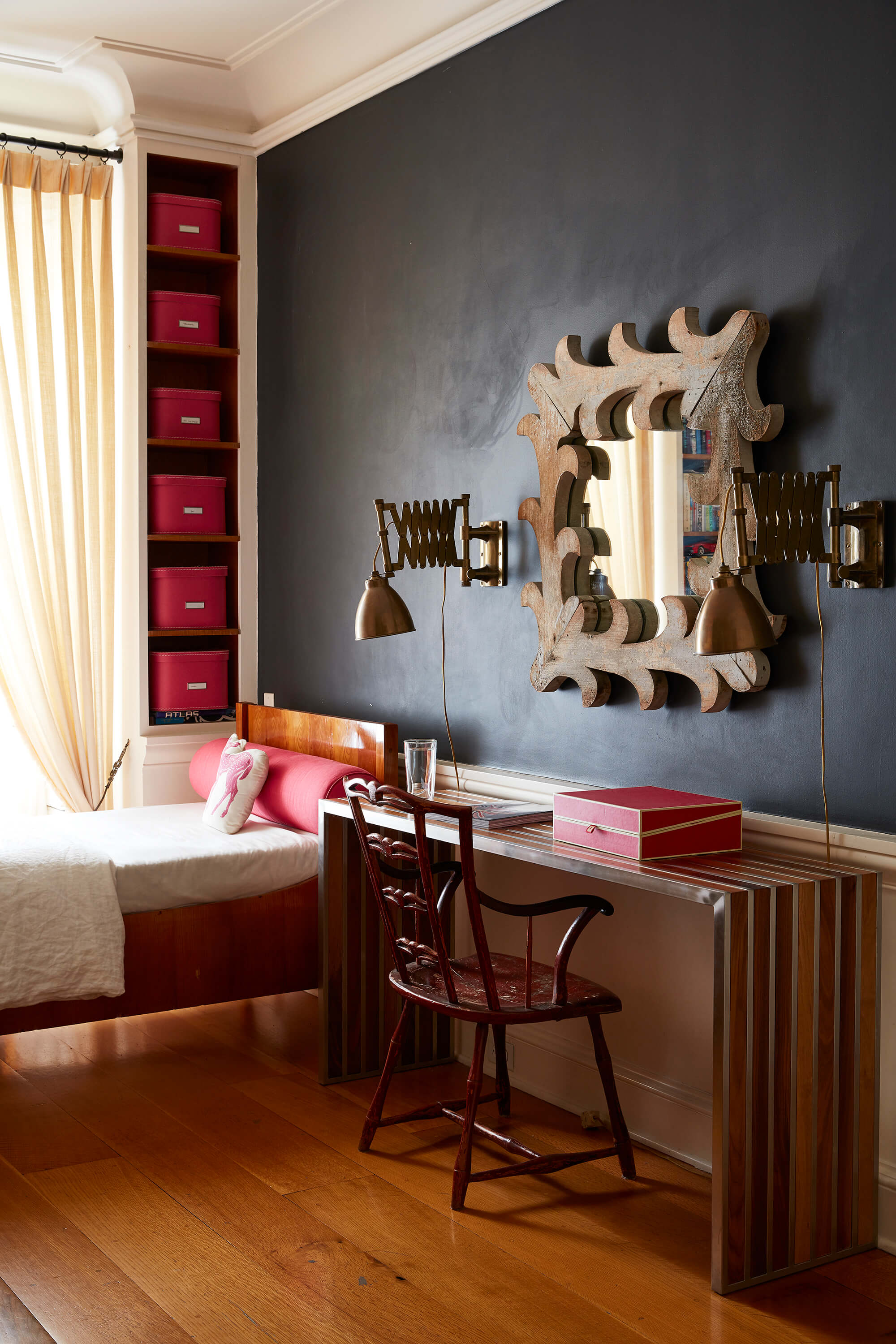
The floors that first caught Scott’s eye now house the family bedrooms and her studio’s office. That’s fitting because it was the site of a foundational education. After a stint at the storied design firm Vignelli and Associates, Scott had returned to her work as an artist when she started renovating. She found herself as transformed as the space.
“I became the designer, and I was doing interior architecture as well, I became the client and I became a construction worker,” she recalls. “I was on the job site every day for two years. I saw the result of every decision. If I decided something, I knew why it took so long, I knew why it cost more. I knew why this idea wasn’t a good one, I knew why that idea was a good one. I could see all sides.”
With this practical education and her own training as an artist, Scott went to work as a designer, crafting interiors, making custom furniture and creating a line of porcelain objects. In March, Rizzoli published her first book, “Creating Beauty: Interiors,” a survey of 10 residences.
It’s not altogether fair to call Scott self taught — she had undergraduate training that stressed creativity over technique, and later studied at the Art Students League where principles and rules were stressed — but however much she learned on the job site that she called home, her approach to design is more intuitive than codified.
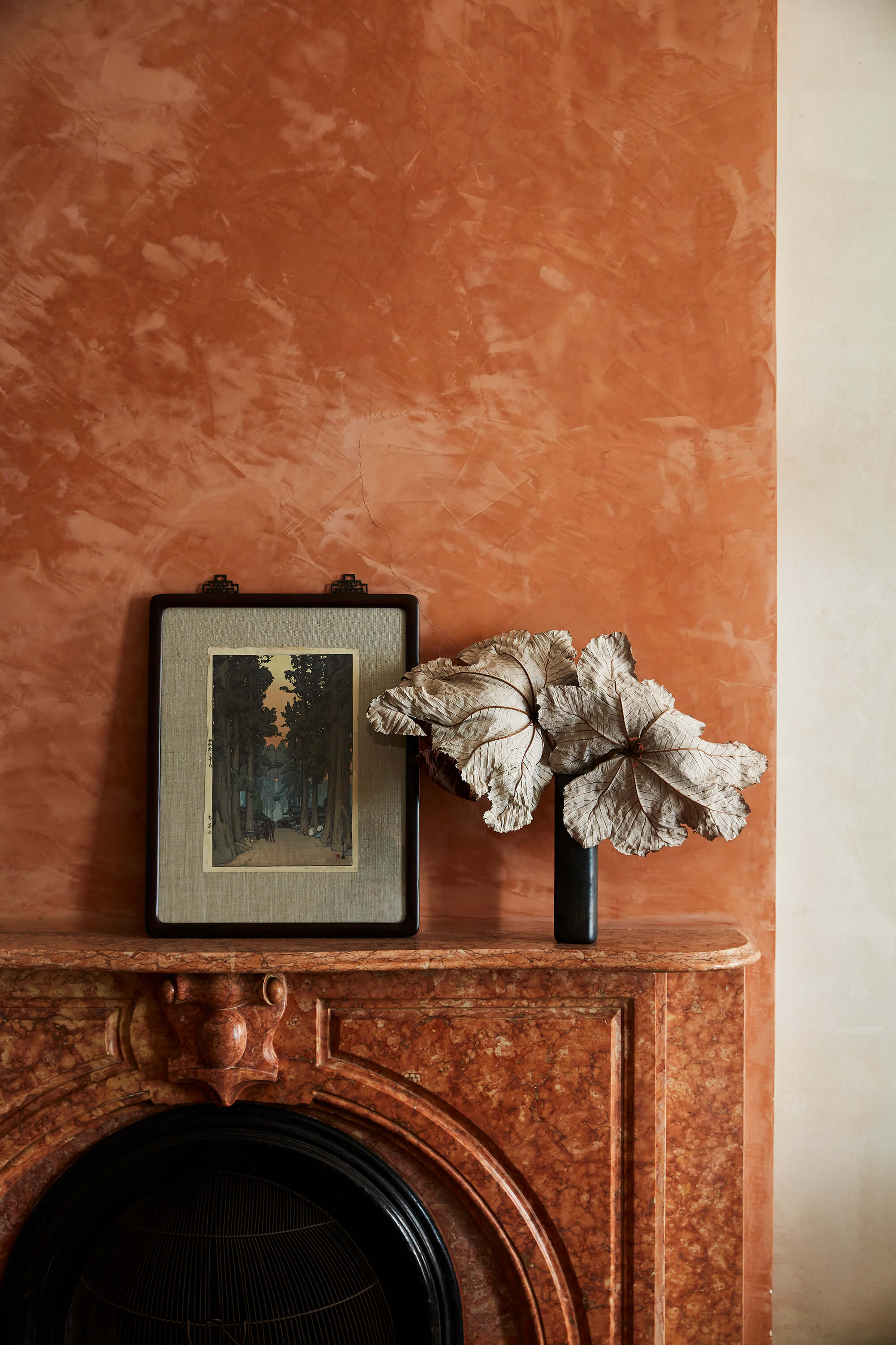
“I see things in cools and warms,” she explains. “I see more color in subtle differences. That’s a really different approach, that’s a painter’s approach.” You see that writ large throughout the house. The passing trends of the day — accent walls, statement wallpapers, contrasting textiles — are nowhere in evidence. But there’s an attention to color, and as you move between rooms, what seem at first minor variations in color and light prove to be dynamic and surprising.
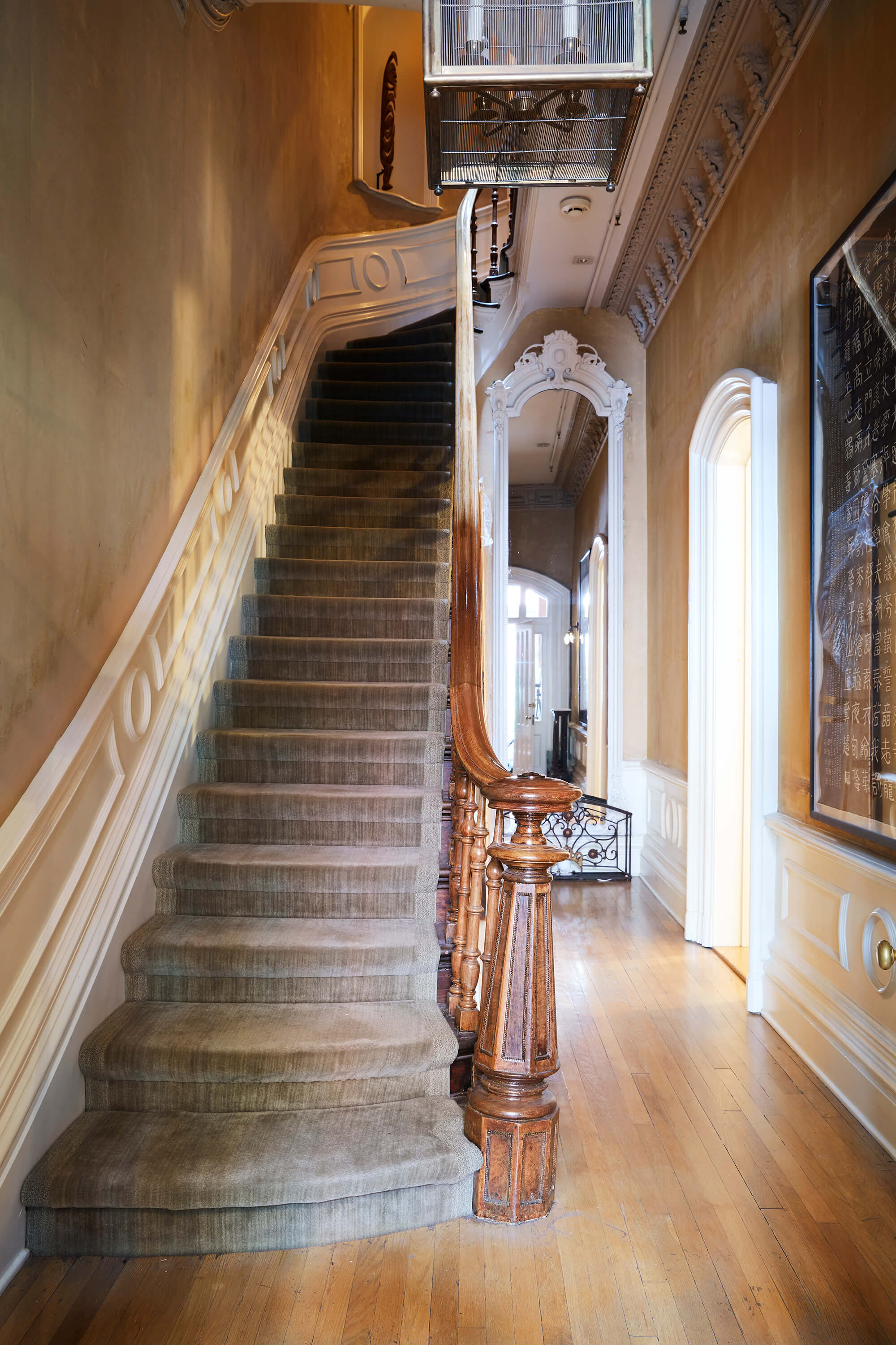
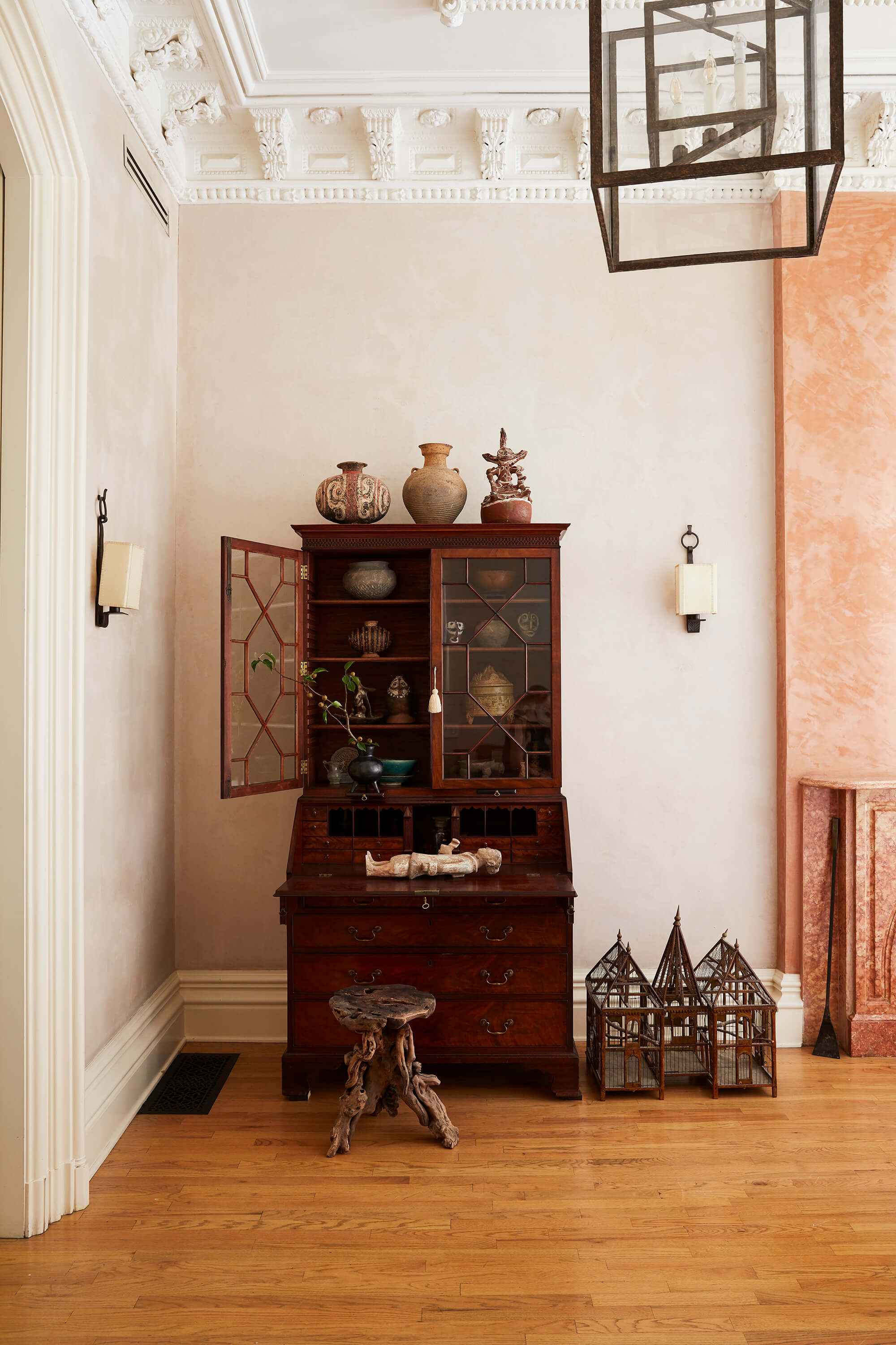
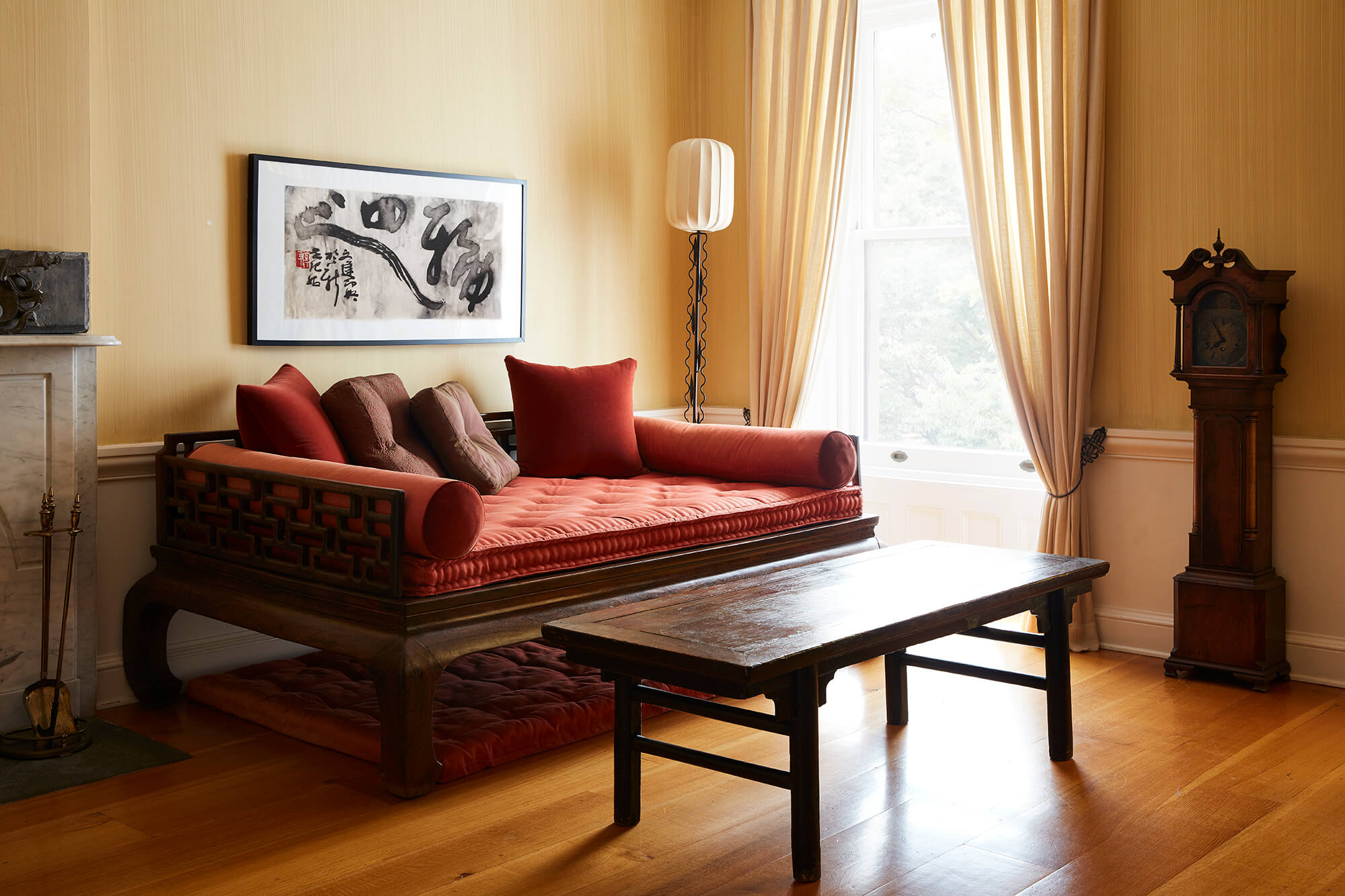
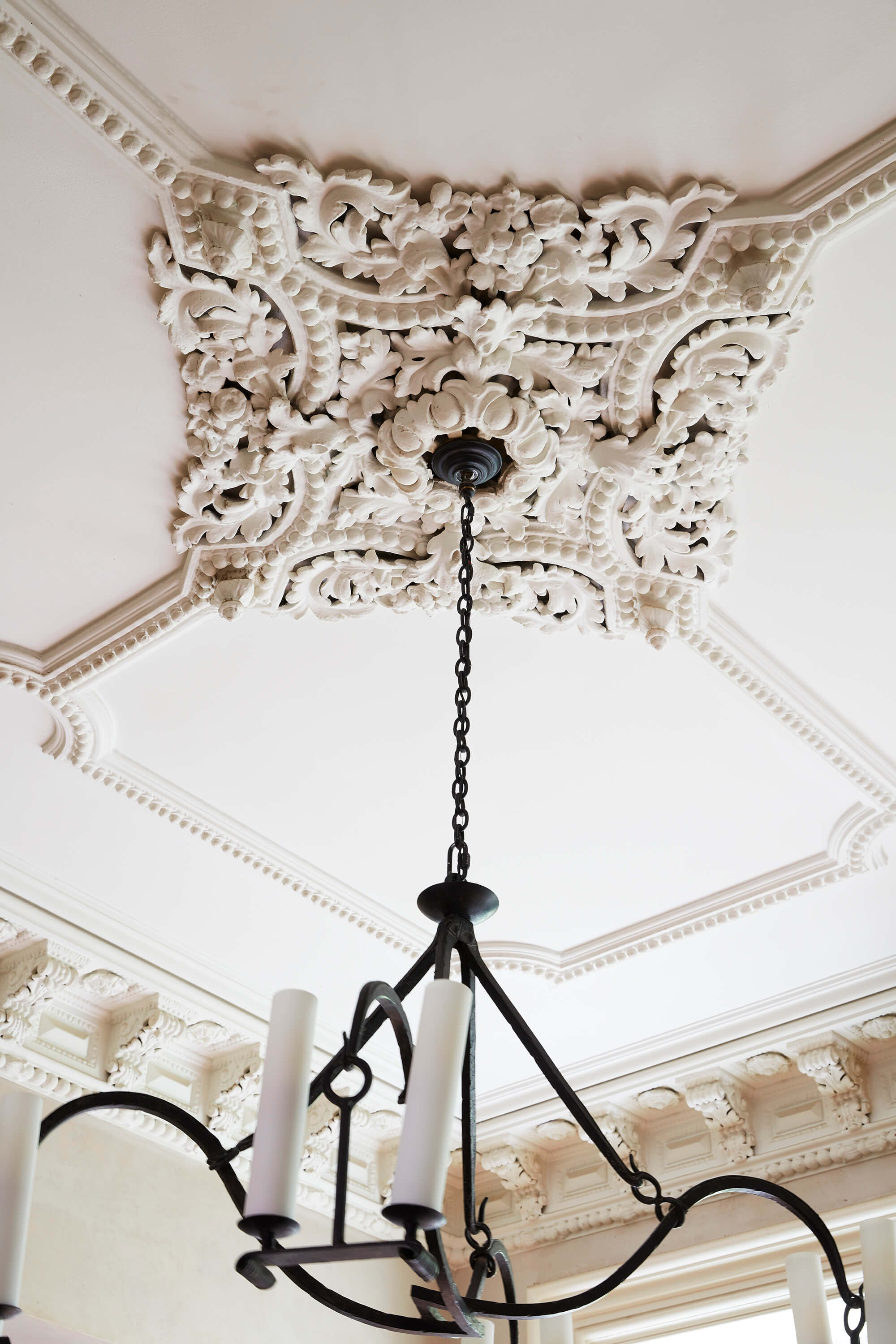
The goal isn’t minimalism; it’s what Scott terms austerity, in which she finds depth and beauty. It’s the result of two influences: a formative visit to Florence, where she fell in love with how simple colors can celebrate rich architecture, and the earthy creams and grays of historic Chinese interiors. This ethos is evident immediately upon entering the home. The stairwell bears the patina of the wallpaper paste, the furniture is simple and largely unadorned (but still inviting), the palette is restrained, leading the eye to the moldings along the ceiling.
Austerity can have a negative connotation, so perhaps the more appropriate word for the current incarnation of the home is restraint. It’s not minimalism, which connotes a chilly, mathematic sensibility; in Scott’s living room, you’ll find comfortable sofas and a coffee table upon which you might rest your stockinged feet. It’s not Shaker-inspired, with an interest in humble piety; upstairs, Scott has hung almost exuberant decorative touches, like a collection of antique Chinese caps or a feathered headdress that belonged to her mother. There’s something well worn and thoughtful about these rooms, with the overall effect being calming but not monastic.
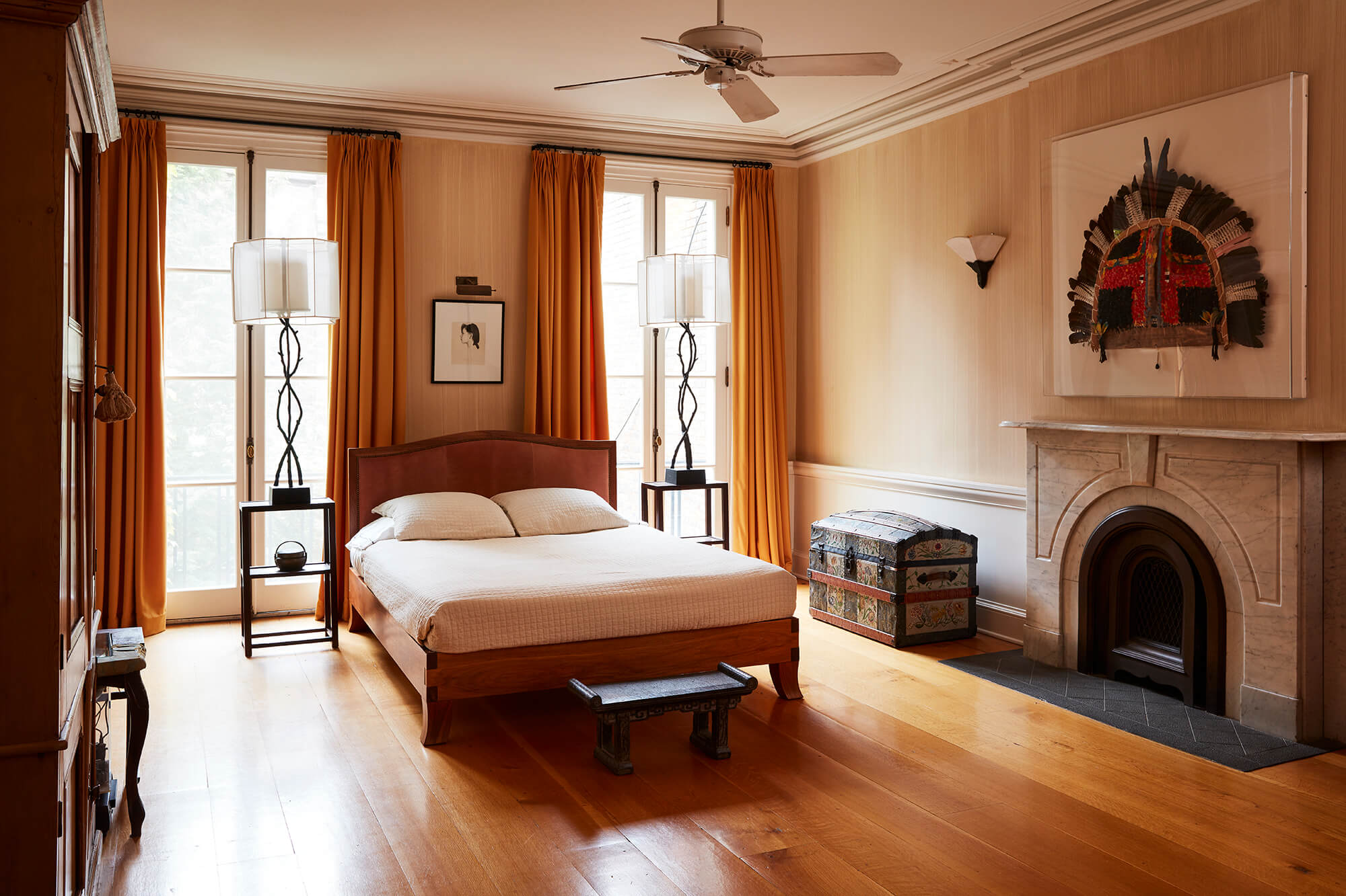
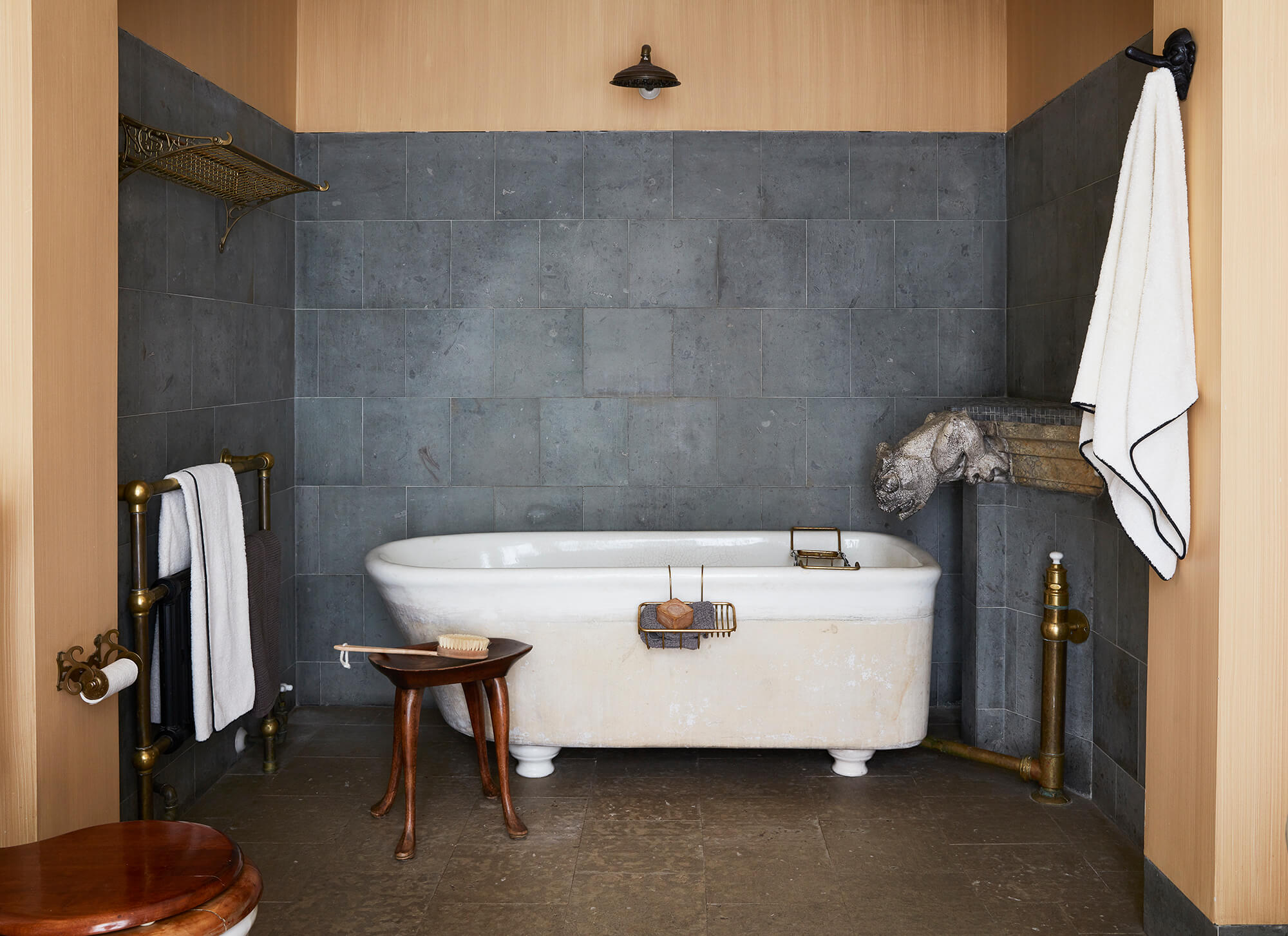
Maybe there’s an analogy to abstract art; confronted with the forms that were a revolution in modern art, your eye cannot but look into them for something. A similar effect pertains here: With the visual quietude, the eye looks more deeply. A sense of the human touch comes through, in the rough edges on the coffee table, the big old gargoyle that’s been refashioned as a bath spout. “When everything feels so exactly matched, it feels artificial to me,” says Scott. “Maybe I’m just responding to this machine made, mass-produced era that I don’t like. I want things to be touched by humans, to be imperfect.”
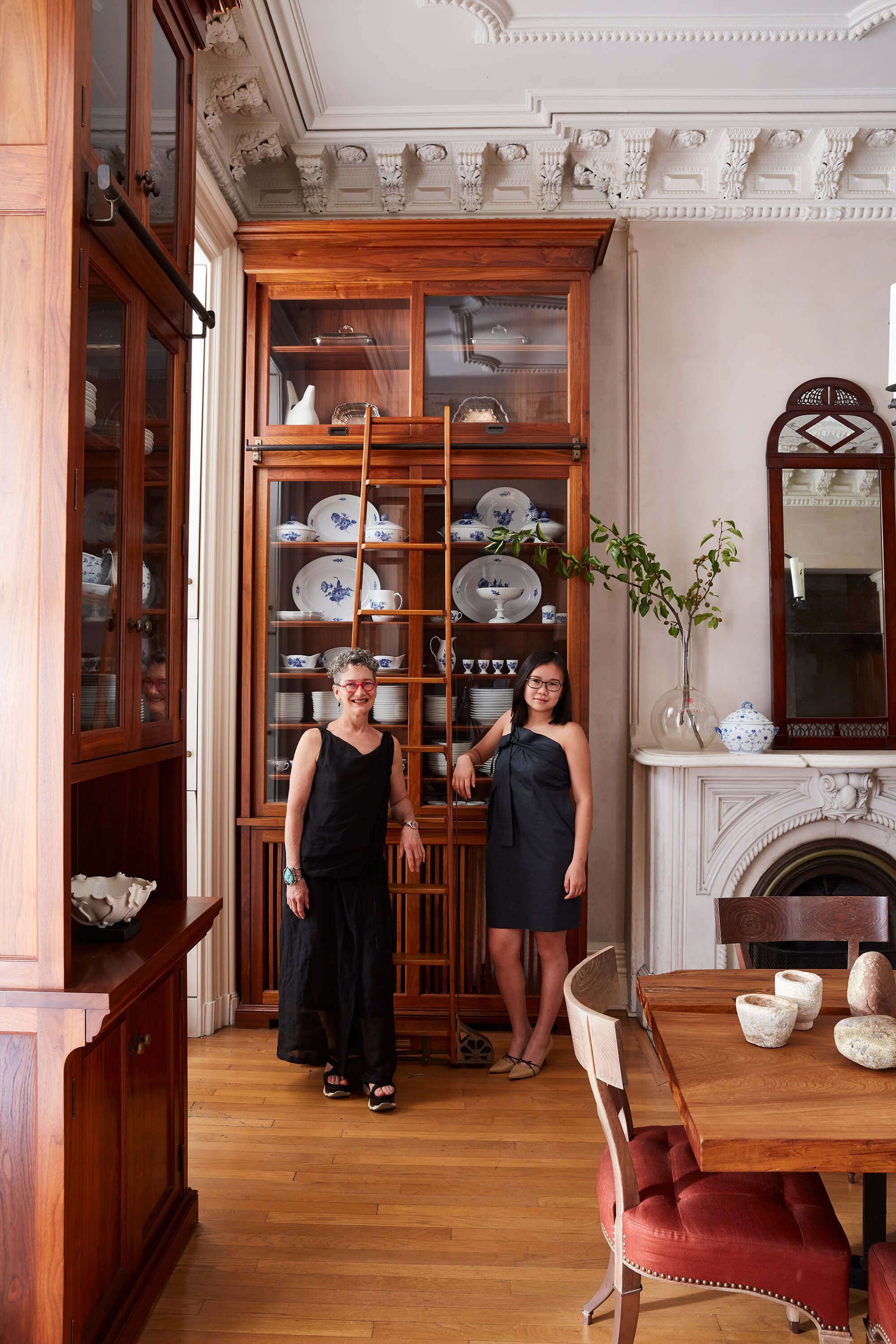
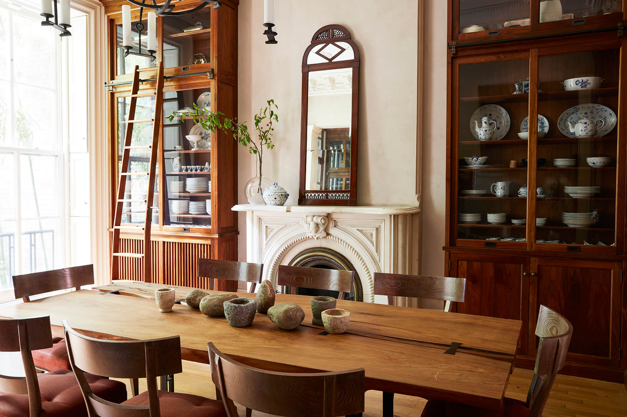
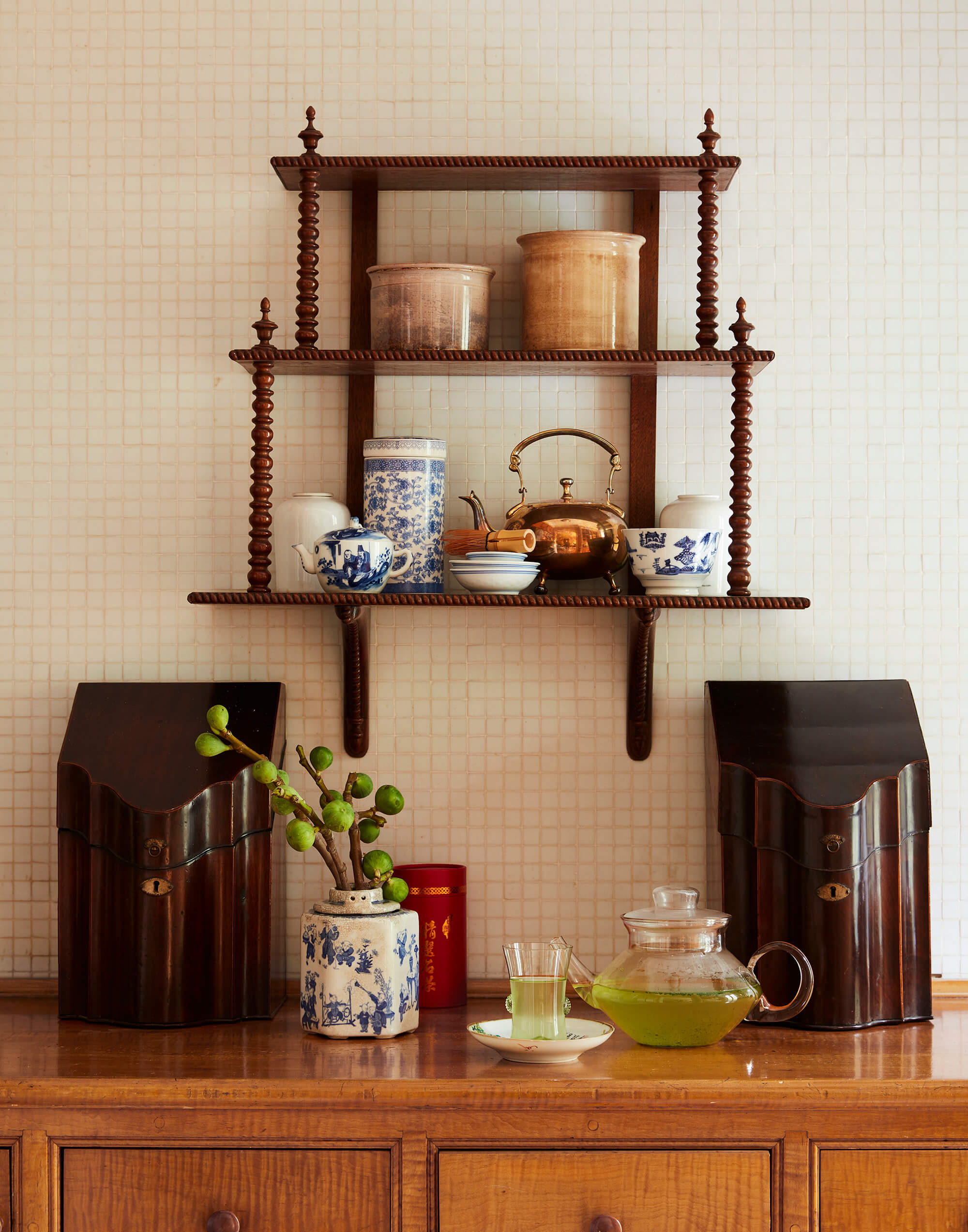
But there’s perfection too; how else to classify the millwork in the kitchen and dining room? In comparison to the other downstairs rooms, these spaces feel almost cluttered — they’re not, though, with all the china stored in orderly, pretty stacks. The shelving was inspired by Scott’s visits to the great homes of Newport, and though the craftsmanship is evident, so too is the perfection. Scott describes touring those Gilded Age summer cottages, ruler in hand; this is the takeaway. It’s subversive, in what should be a formal dining room — the Astors and the Vanderbilts wouldn’t have gone into a room that looked like this, because the inspiration was really the butlers’ pantries of those homes.
But in a contemporary context, the choice is warm, almost cheerful. That’s the abiding ethos, really, throughout the house: picking and choosing from throughout history and across the globe to build an idiosyncratic expression of warmth and cheer because, of course, those are not one-size-fits-all propositions. The period perfect 19th century home makes no sense for 21st century life. This house contains a washer and dryer, an elevator, and both a main staircase and the interstitial one added when the third and fourth floors were their own little unit, all impossible for the building’s original architect to have conjured.
For Scott, the house has been a professional endeavor, of course. “I’m really a bad salesperson and I don’t like to talk about myself,” she says. “I rely on the house to speak my words.” But it’s also personal; it’s home.
[Photos by David A. Land | Styling by Suzie Myers]
Editor’s note: A version of this story appeared in the Fall/Holiday 2018 issue of Brownstoner magazine.
Related Stories
- Designer Glenn Gissler’s Sophisticated Brooklyn Heights Duplex Is a Repository of Art and Antiques
- A Clinton Hill Brownstone Reflects a Young Family’s History and Values
- Striking Art and Playful Inventiveness Create Comfortable Clinton Hill Home
Email tips@brownstoner.com with further comments, questions or tips. Follow Brownstoner on Twitter and Instagram, and like us on Facebook.





What's Your Take? Leave a Comment