The Insider: Cool, Colorful Kensington Rowhouse Gets New Kitchen, Baths and Staircase on a Budget
Fresh and functional, colorful and cost-conscious…that’s the job Alexandra Barker, a LEED-certified architect and principal at the Downtown Brooklyn-based Barker Freeman Design Office, pulled off for a family of four in a three-story limestone townhouse built around 1900.

Fresh and functional, colorful and cost-conscious…that’s the job Alexandra Barker, a LEED-certified architect and principal at the Downtown Brooklyn-based Barker Freeman Design Office, pulled off for a family of four in a three-story limestone townhouse built around 1900.
The homeowners — she’s a graphic designer, he’s a TV producer — spent years planning and saving while living in about 1,000 square feet on a single floor of their building, with a tenant above and an unfinished basement below.
“They hired me to finish their basement so they could have a duplex,” explained Barker, who is also on the architecture faculty at Pratt Institute. “Everything on this job was extremely budget-oriented.”
On the home’s main floor, Barker added a completely new kitchen at the rear and designed a new sequence for the reconfigured hallway, which contains a new powder room and a bank of closets.
She linked it to the former basement level with a new white oak staircase that doubles as a bookcase. Downstairs, which is partway above ground with windows at front and back, Barker provided three new bedrooms and two new full baths.
Mostly white walls throughout the apartment are enlivened by splashes of bold color, including the green painted stairs and the creative use of inexpensive ceramic tiles.
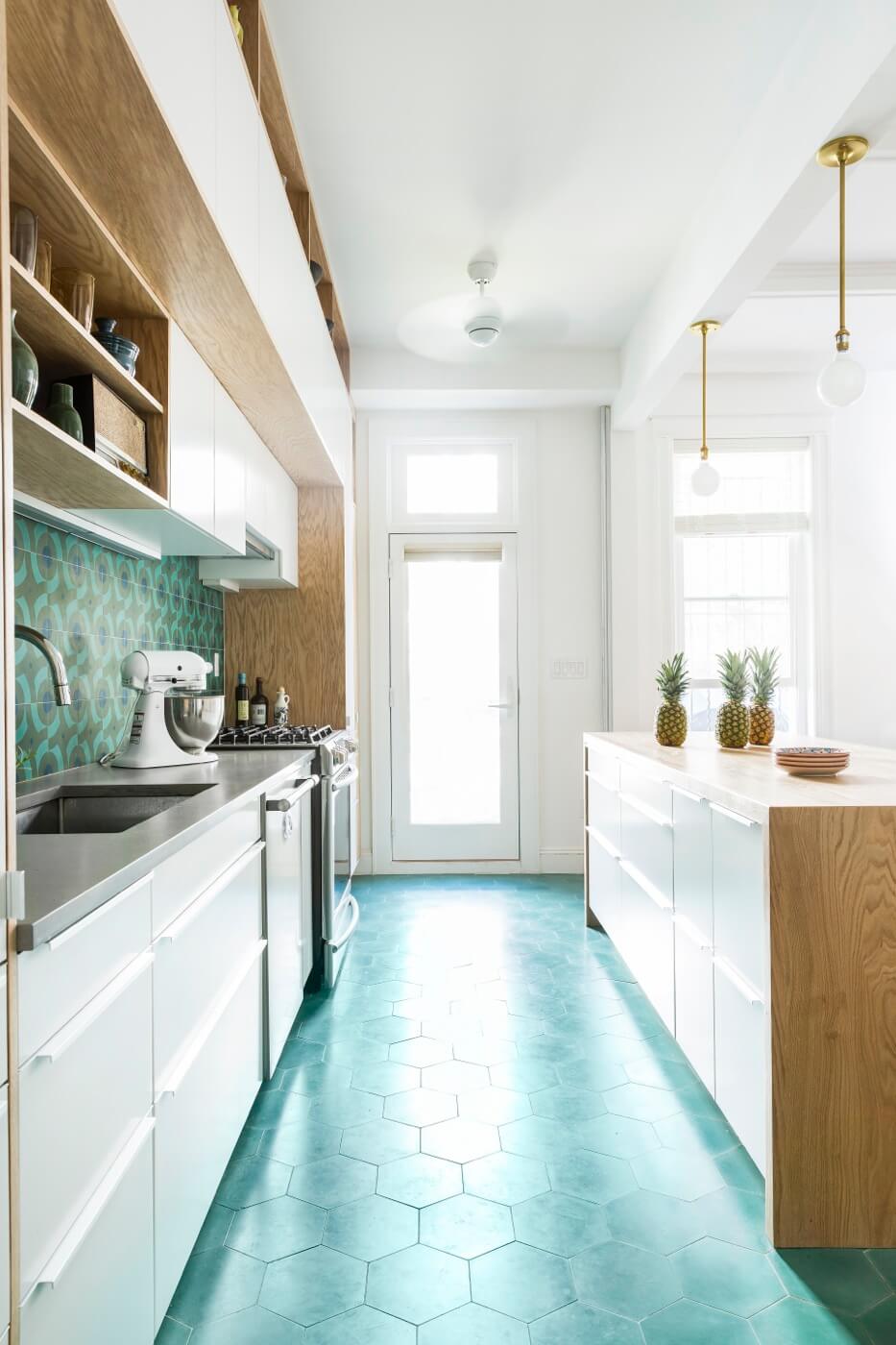
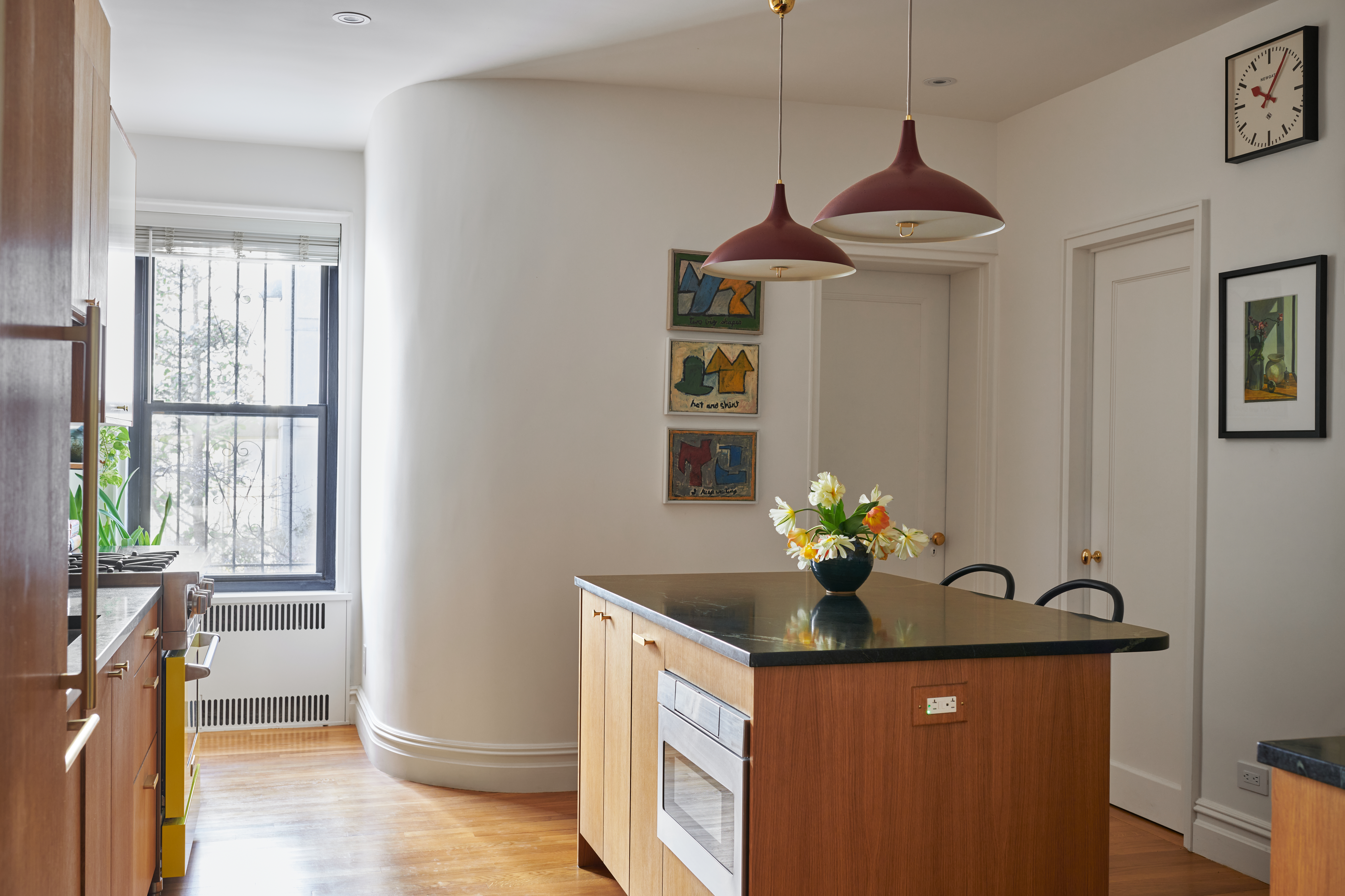
Most of the kitchen cabinetry is from IKEA. “We added other materials around the IKEA units to make it special,” Barker said, including white oak shelving above and to the side, and side panels that frame the two decks of cabinets. White oak also wraps the new center island, likewise made of IKEA units.
The general contractor, Mark Chan of PTL Renovation, put it all together on site.
Eight-inch hexagonal tile from Clé clads the floor. The patterned tile used as a backsplash came from there as well.
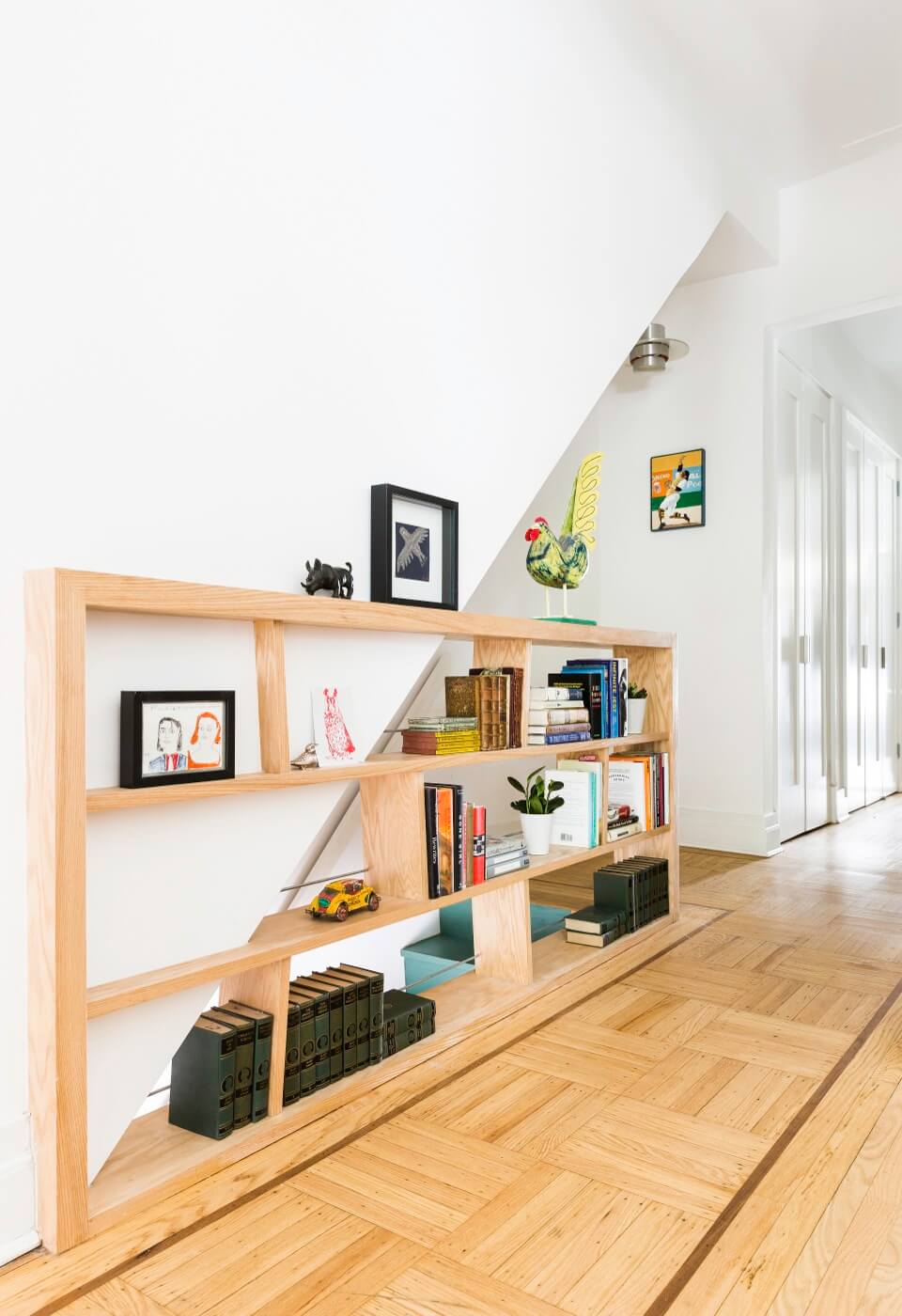
The white oak bookcase also serves as a stair rail on both the lower level and the upper.
Because they didn’t move a lot of walls, they were able to keep and refinish the original parquet floor.
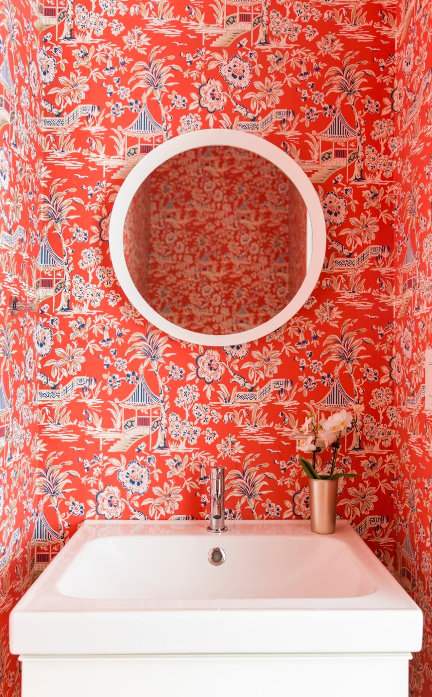
In the new main-floor powder room, red Chinoiserie wallpaper from York Wallcoverings adds excitement to a simple IKEA sink.
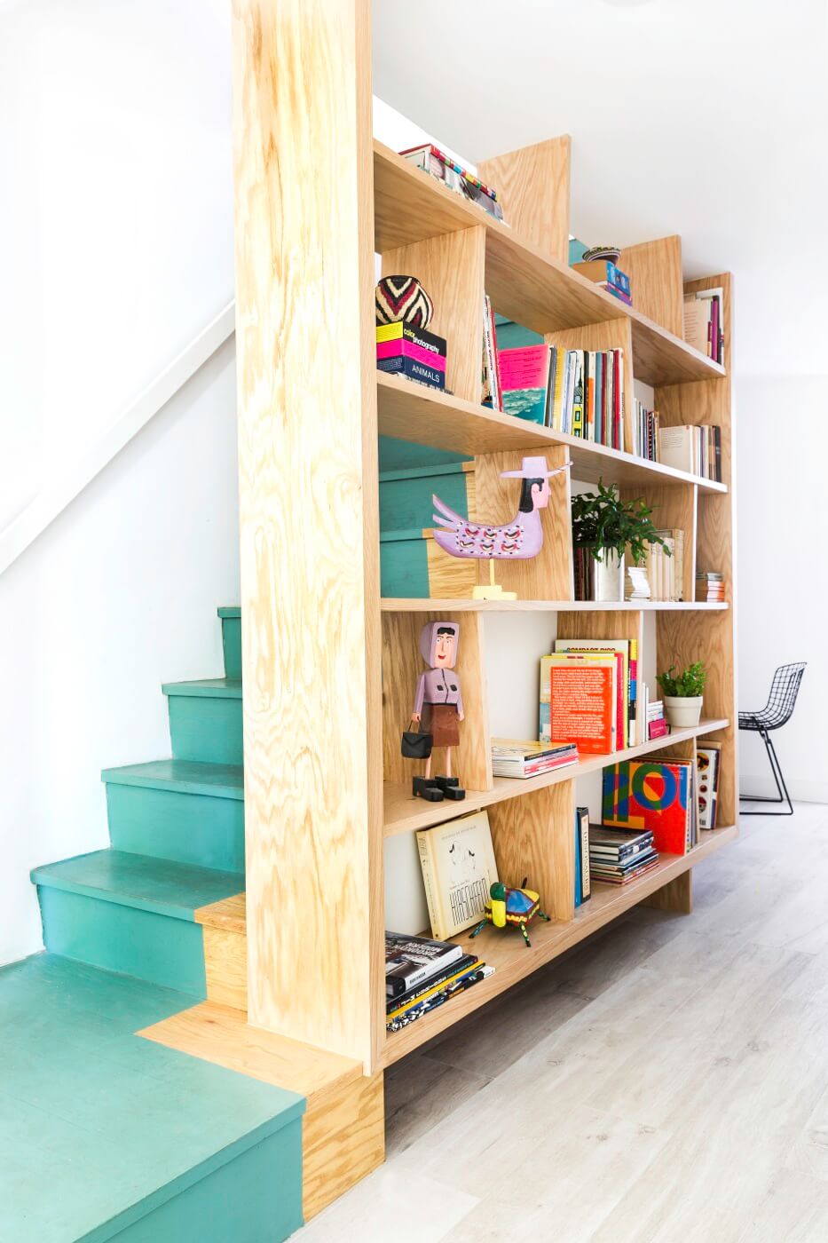
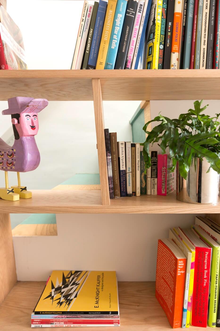
The new staircase, replacing a set of basic basement stairs, has a landing at the bottom. Painting the steps gave the suggestion of carpet without the expense.
Bookshelves were made of white oak veneer plywood, finished with a clear matte polyurethane. The dividers are slightly slanted rather than perfectly vertical, echoing the angle of the stair risers.
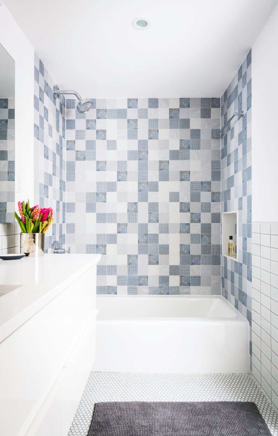
In the new master bath, a utilitarian IKEA sink and Kohler tub are set off by imaginative use of ceramic tile.
All tile is from Ann Sacks, including the square gray wall tiles set in a pattern designed by the homeowner, and the inexpensive penny tile on the floor.
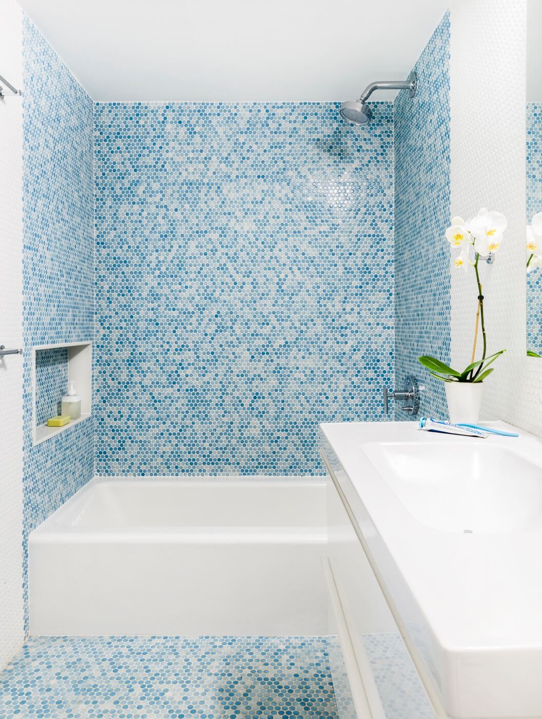
The kids’ bath also makes use of low-priced variegated blue and white penny tile from Ann Sacks, run all the way up to the ceiling and with scalloped edges showing on the side.
The sink and vanity are from IKEA, tub and faucets from Kohler.
[Photos by Lesley Unruh]
The Insider is Brownstoner’s weekly in-depth look at a notable interior design/renovation project, by design journalist Cara Greenberg. Find it here every Thursday morning.
Got a project to propose for The Insider? Contact Cara at caramia447 [at] gmail [dot] com.
Related Stories
The Insider: Narrow South Slope House Gets New Staircase, Extension and Lots of Light
The Insider: Revamping a Sunset Park Row House for a Clean, Modern Look
The Insider: A Quick, Cost-Conscious Townhouse Reno in South Slope
Businesses Mentioned Above
[blankslate_pages id=”d53a3761ae24fe, d562504deb7d01, d567300e7d9857, d57695ea18ec9c, d576960cbd3563, d5723b780e494c, d55916c5122146″ type=”card” show_photo=”true” utm_content=””][/blankslate_pages]
Email tips@brownstoner.com with further comments, questions or tips. Follow Brownstoner on Twitter and Instagram, and like us on Facebook.


What's Your Take? Leave a Comment