The Insider: "Three-Quarter" Reno in South Slope Tailors Already Updated House for Young Family
Barker Freeman Design Office shifted walls, upgraded finishes and brightened the color palette for the row house’s new owners.

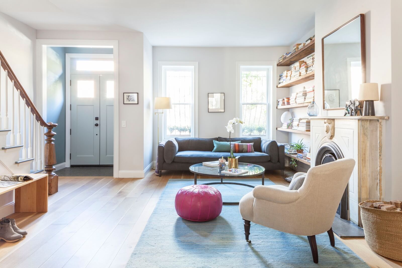
The two-story brick row house had been renovated by its previous owners with all new mechanicals, but its aesthetic did not appeal to the couple who subsequently bought it. So they brought in Downtown Brooklyn-based Barker Freeman Design Office to rethink and upgrade the interior finishes, brighten the color palette, and make a few functional changes to the layout as well.
“This was not a stripped-down gut, everything-gets-thrown out kind of job,” said principal architect Alexandra Barker. “It was more strategic — a three-quarter renovation.”
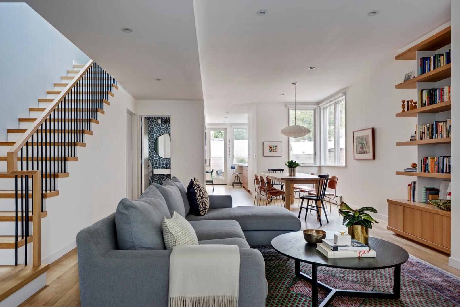
The big moves on the main level were taking down a dividing wall to eliminate a space-wasting hallway between the stair and the living/dining area, and creating an entry vestibule where there was none.
On the floor above, the architects added walls to create two separate bedrooms and a play area for the homeowners’ young twin sons.
In the kitchen, they kept the existing appliances and cabinets, replacing just the countertops, tile backsplash and cabinet hardware.
The existing flooring was dark and made the whole house feel that way, the architect said. They substituted new white oak flooring with an oil finish throughout, sourced from LV Wood.
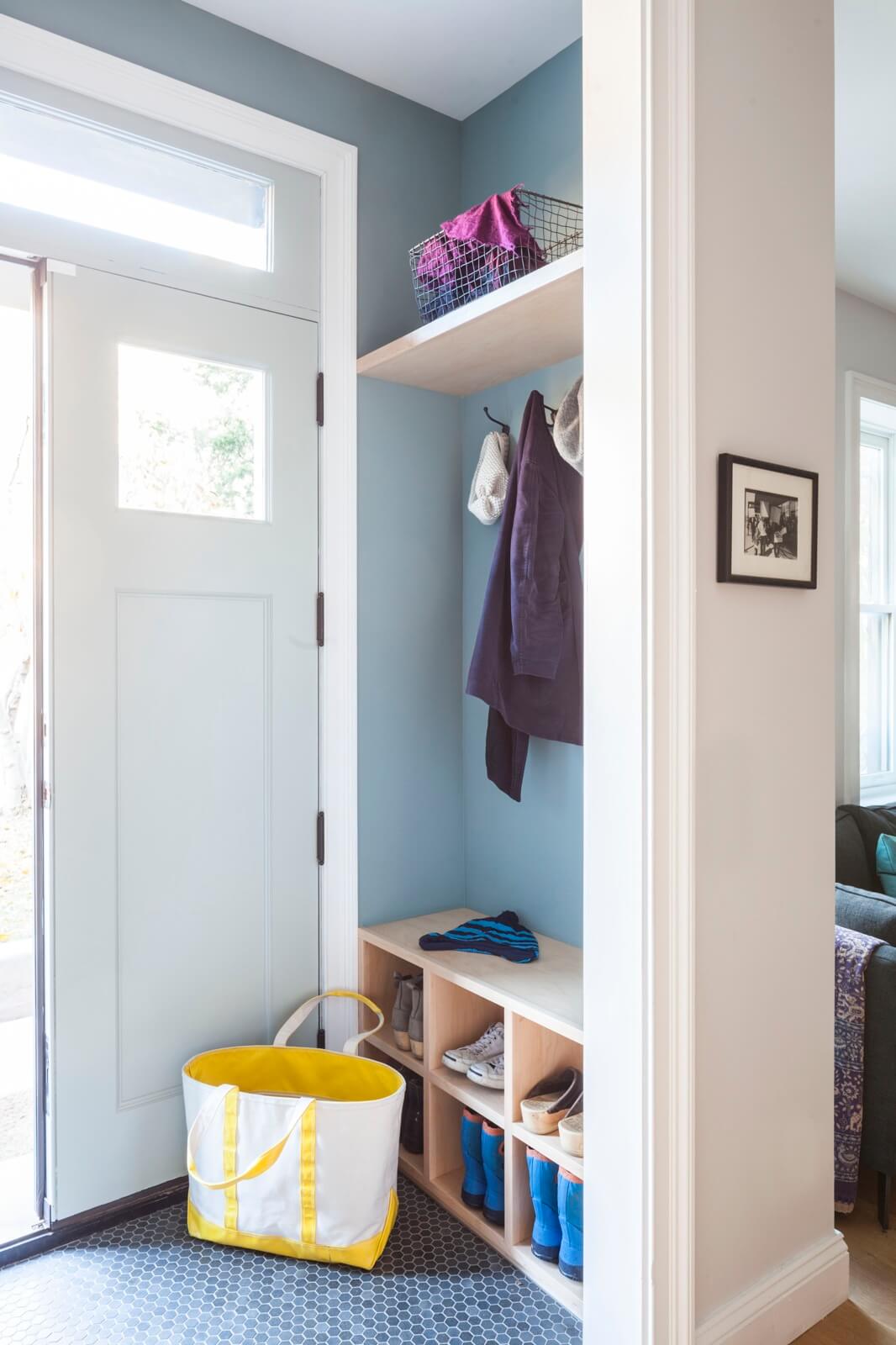
The house’s entry doors were replaced with new ones that have smaller glass panels for greater privacy.
The vestibule itself is new, with a hexagonal tile floor from Complete Tile. New millwork makes it a mini-mudroom.
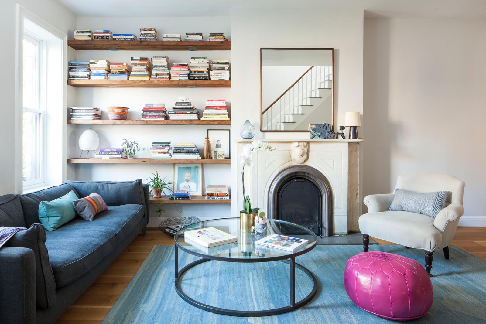
Furnishings belonging to the homeowners include a couch from Montauk Sofa and a coffee table from Cisco Home.
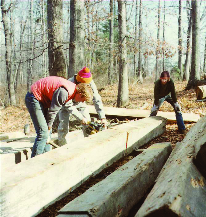
Simple new bookshelves of reclaimed wood from Mountain Lumber in Virginia fill the alcove to the left of the mantel.
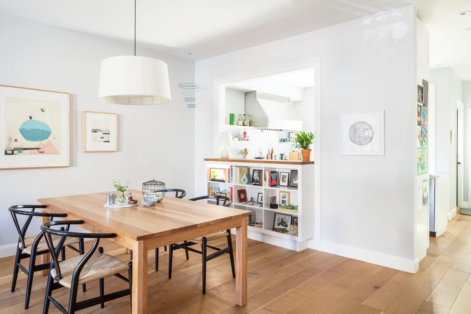
Built-in shelving under a new cut-out in the wall between the kitchen and dining area holds a fish tank and radio as well as books and photos.
A custom dining table from Pompanoosuc Mills is surrounded by Hans Wegner Wishbone chairs.
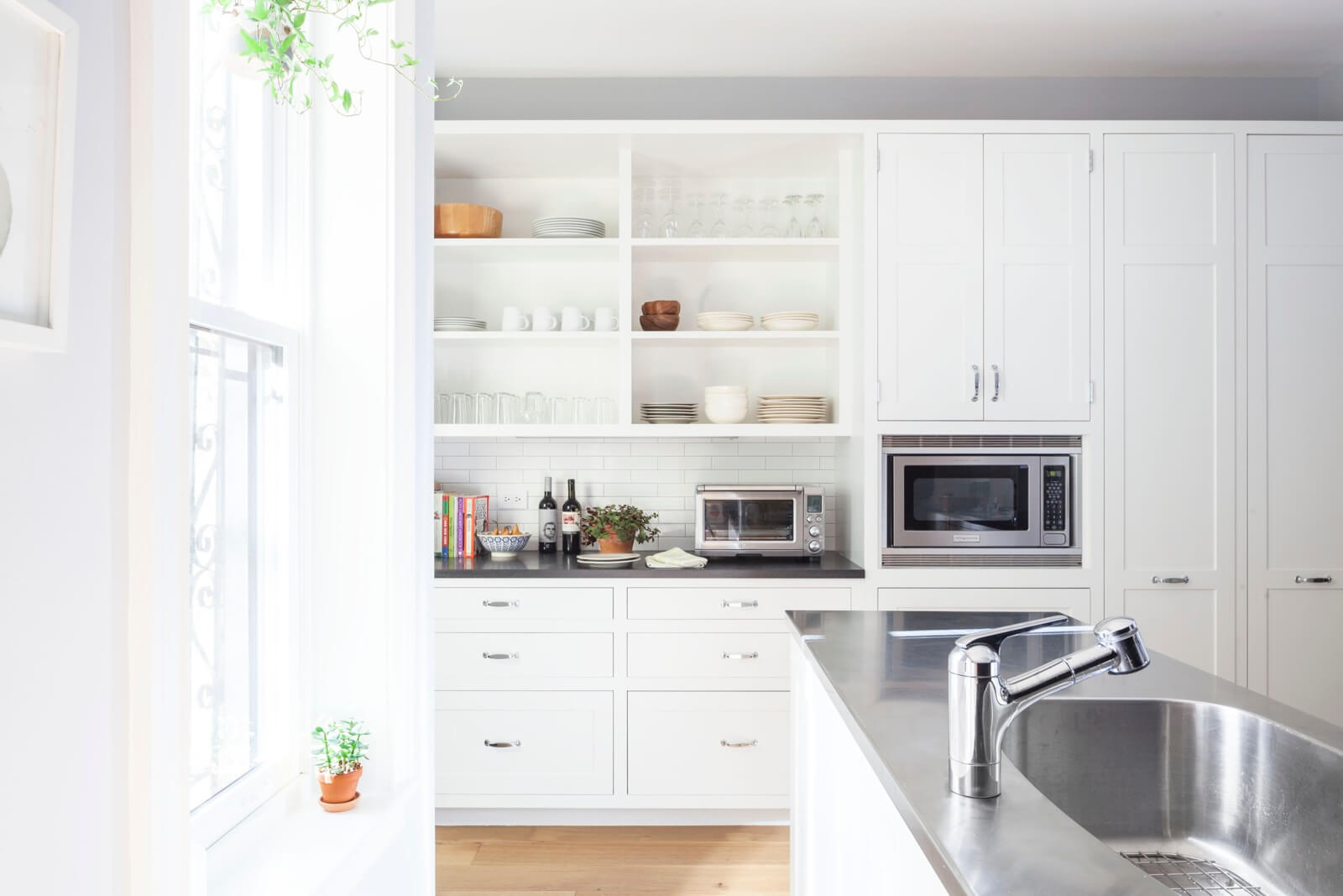
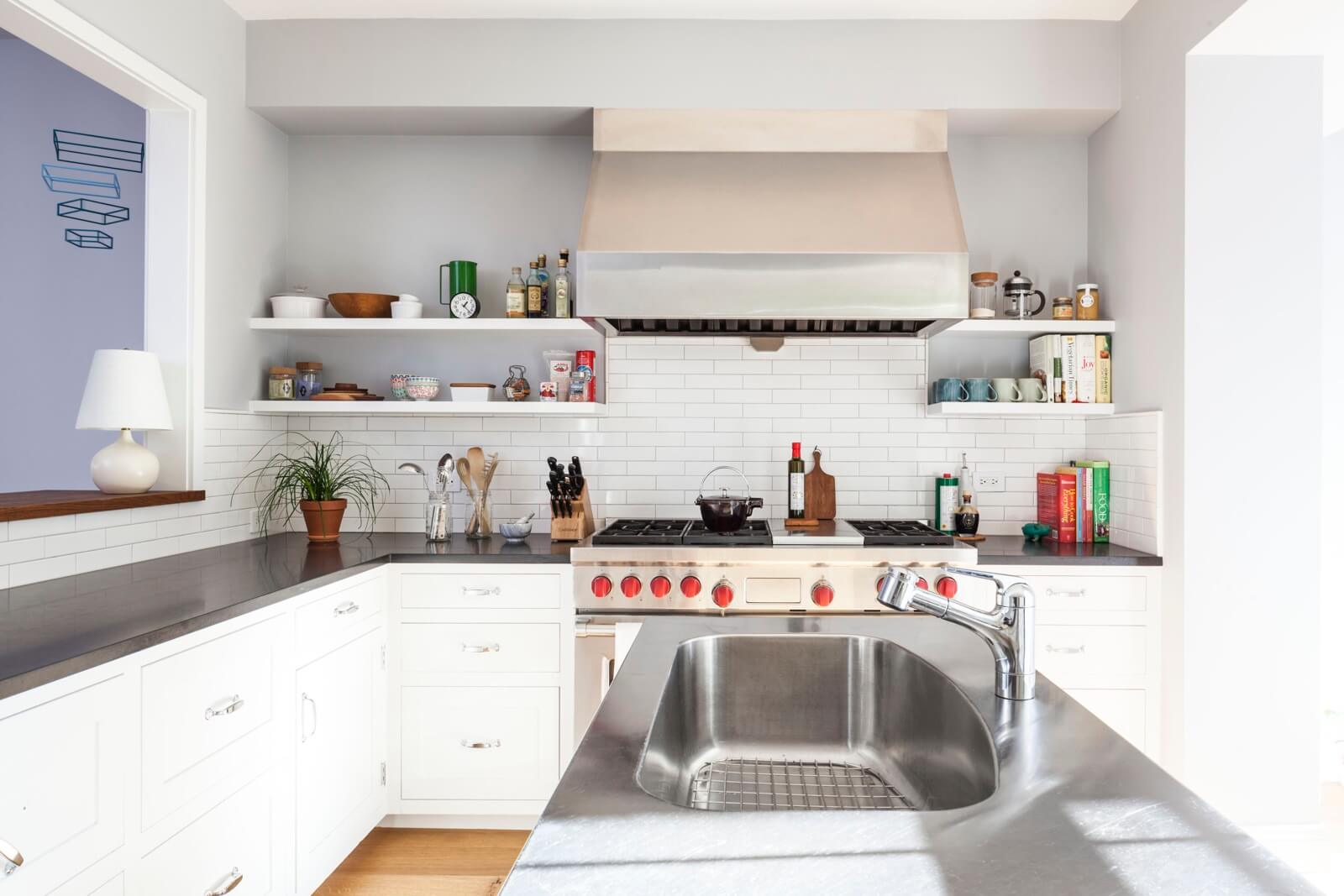
Barker Freeman upgraded the existing kitchen with black granite counters, a new tile backsplash and open shelving.
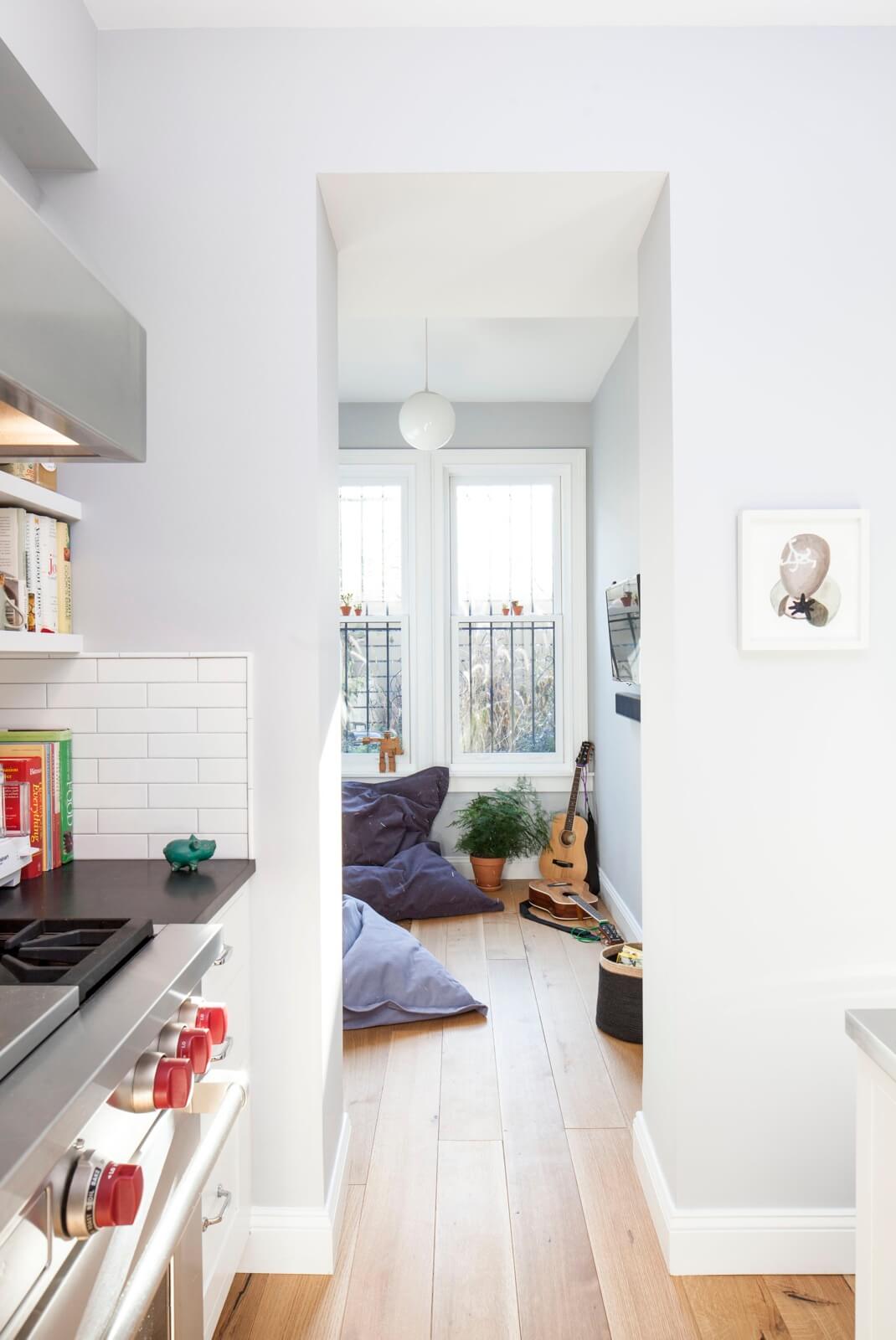
A casual family space with bean bag chairs makes use of an existing extension at the back of the house.
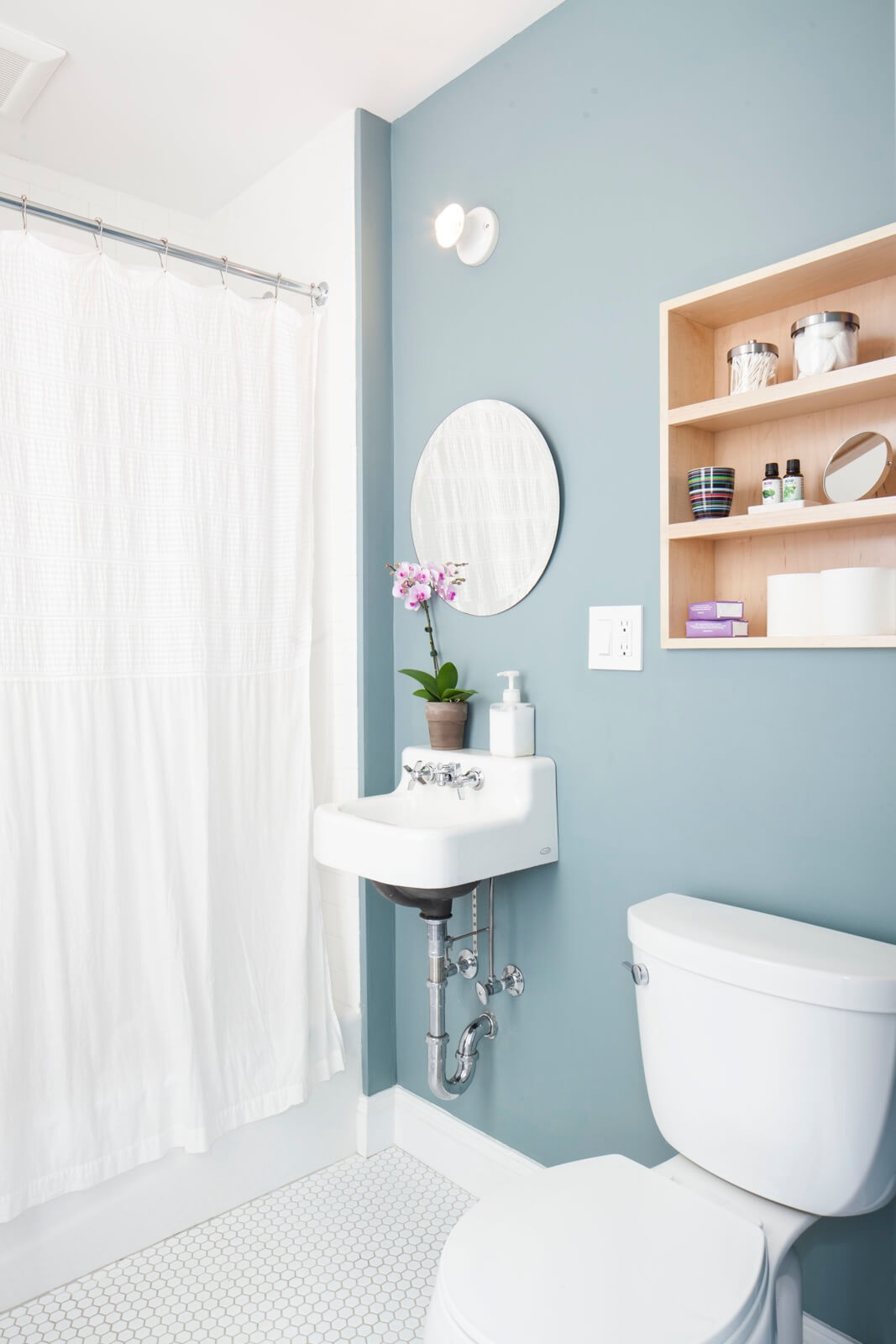
The first floor powder room has a new hex tile floor and a new recessed shelving unit inserted above the toilet.
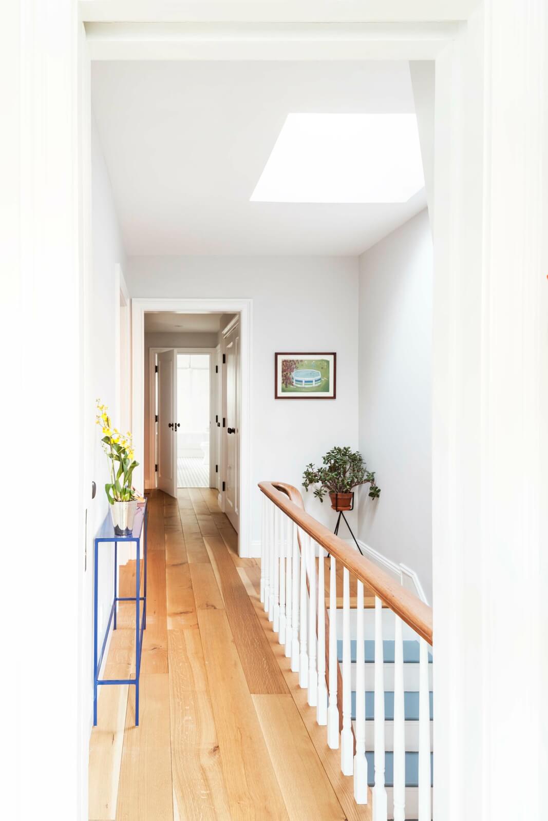
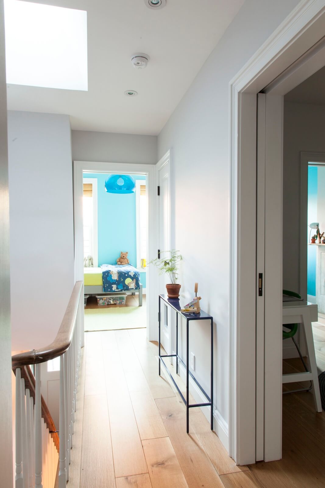
The staircase, with its balusters and handrail, are original to the house. The pale wood flooring is new.
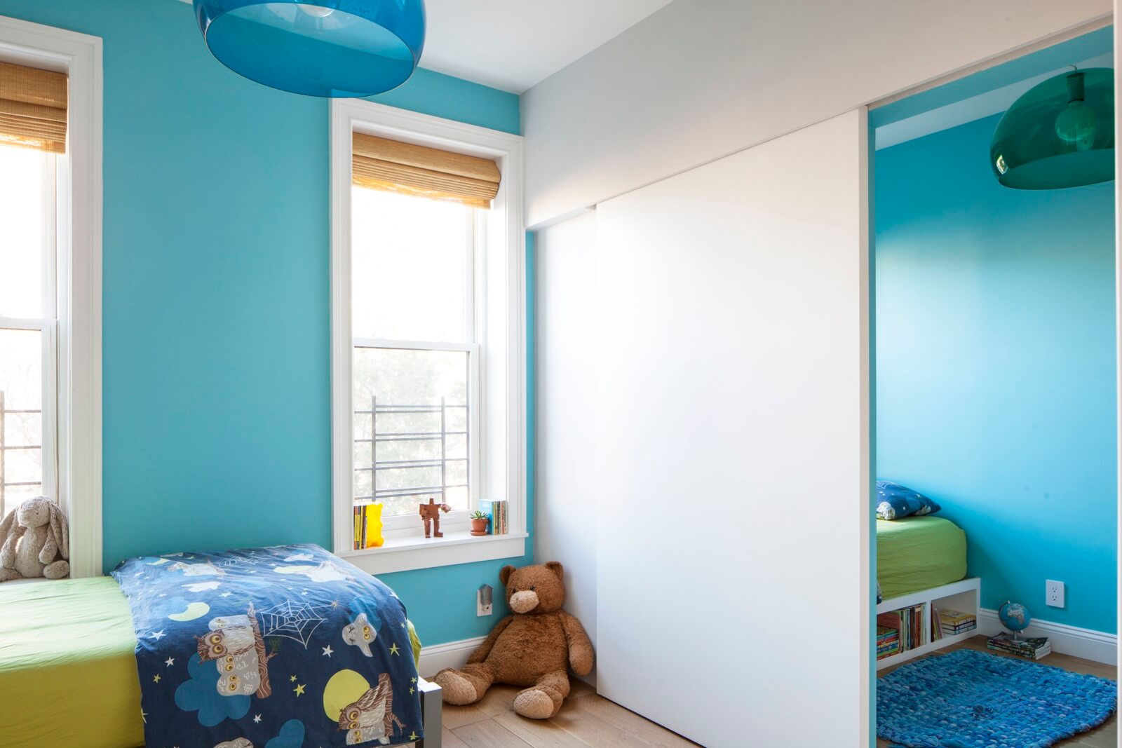
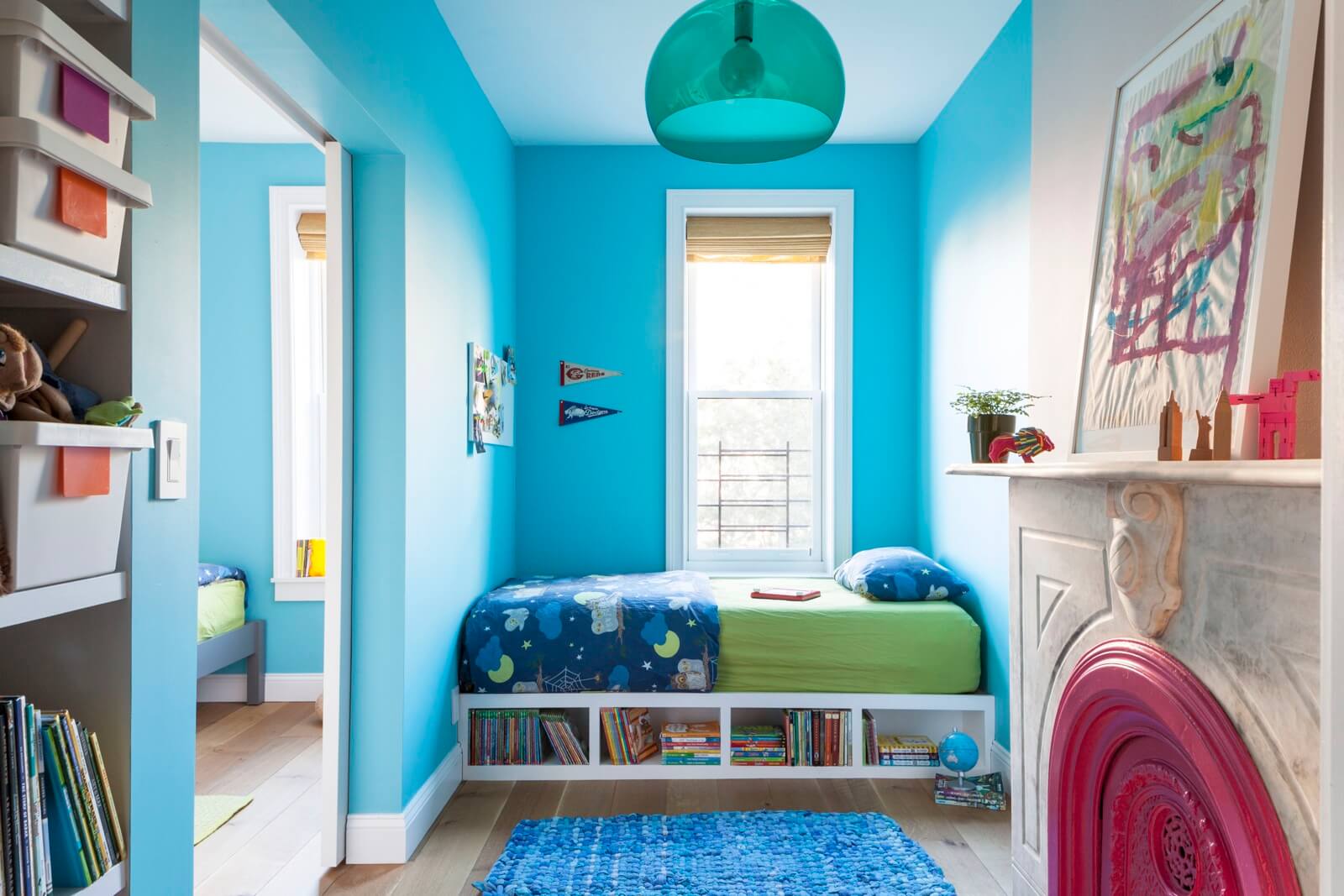
A new surface-mounted sliding door divides space at the front of the house into bedrooms for two boys, one squarish and the other long and narrow, but both roughly the same square footage.
The walls are painted Fairy Tale Blue by Benjamin Moore.
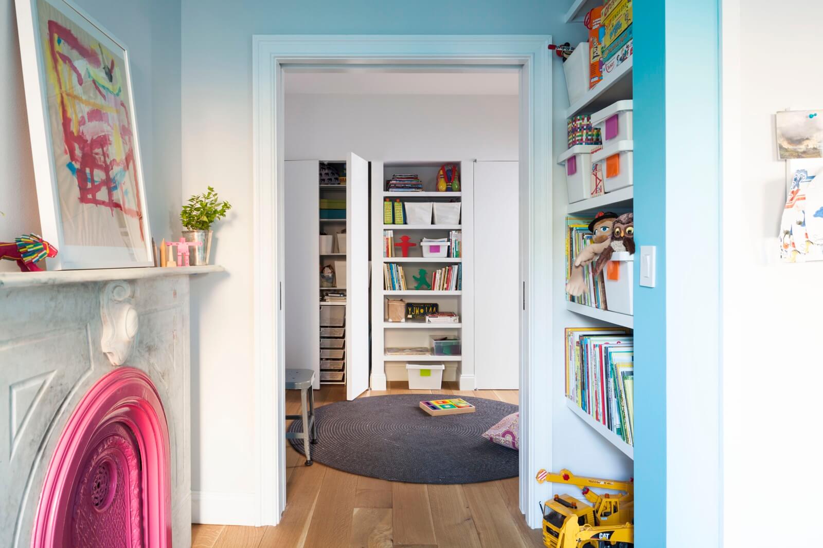
Shared play space and storage was incorporated into the boys’ suite.
[Photos by Lesley Unruh]
Check out the new ‘The Insider’ mini-site: brownstoner.com/the-insider
The Insider is Brownstoner’s weekly in-depth look at a notable interior design/renovation project, by design journalist Cara Greenberg. Find it here every Thursday morning. Got a project to propose for The Insider? Contact Cara at caramia447 [at] gmail [dot] com.
Related Stories
- The Insider: Brownstoner’s in-Depth Look at Notable Interior Design and Renovation Projects
- The Insider: Homeowner’s Love of Books Inspires Windsor Terrace Townhouse Makeover
- The Insider: Windsor Terrace Family Transforms Tired Kitchen with Open, Clean-Lined Design






What's Your Take? Leave a Comment