The Insider: Color Distinguishes Cost-Conscious Windsor Terrace Row House Redo
A wood-frame house occupied by feral cats required a deep gut on a tight budget to make it livable for a young family.

“Everything was replaced, except the joists,” said Alexandra Barker of Gowanus-based BFDO Architects of the interior of this century-old house, which had been overrun by feral cats before its new owners, a young family, took it on. “It’s probably one of the most extensive guts I’ve done.”
The house is a two-story wood-frame with a bay window in front and an existing extension on the main floor; only the newel posts, handrails and spindles on the staircase were salvageable.
All else is new here, including the treads and risers, the white oak floor, and every wall, door and piece of trim. All the windows were replaced as well.
It was all done on a “super-tight budget,” Barker said. The biggest splurges were the glass pocket doors with divided lights that close off the front room and the tiles in the kids’ bath.
Otherwise, the architect said, “They kept things pretty lean and decided to go for color as an inexpensive statement move. There are no white walls.” Except for the bathrooms, every wall was painted some variety of blue or pale gray.
One of the clients is from Denmark, and had some inherited pieces of vintage Danish modern that were incorporated into the décor.
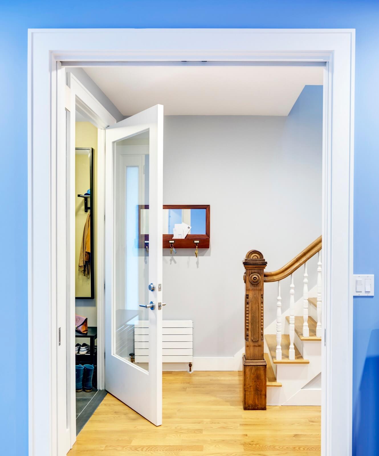
A wall-hugging Runtal radiator saves space in the front entry.
The carved newel post is original to the house.
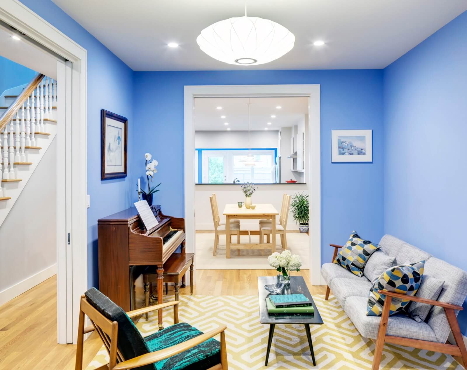
The periwinkle-blue front room, which doubles as living room and guest room, can be closed off by two new sets of pocket doors. (This also comes in handy at piano-practice time.)
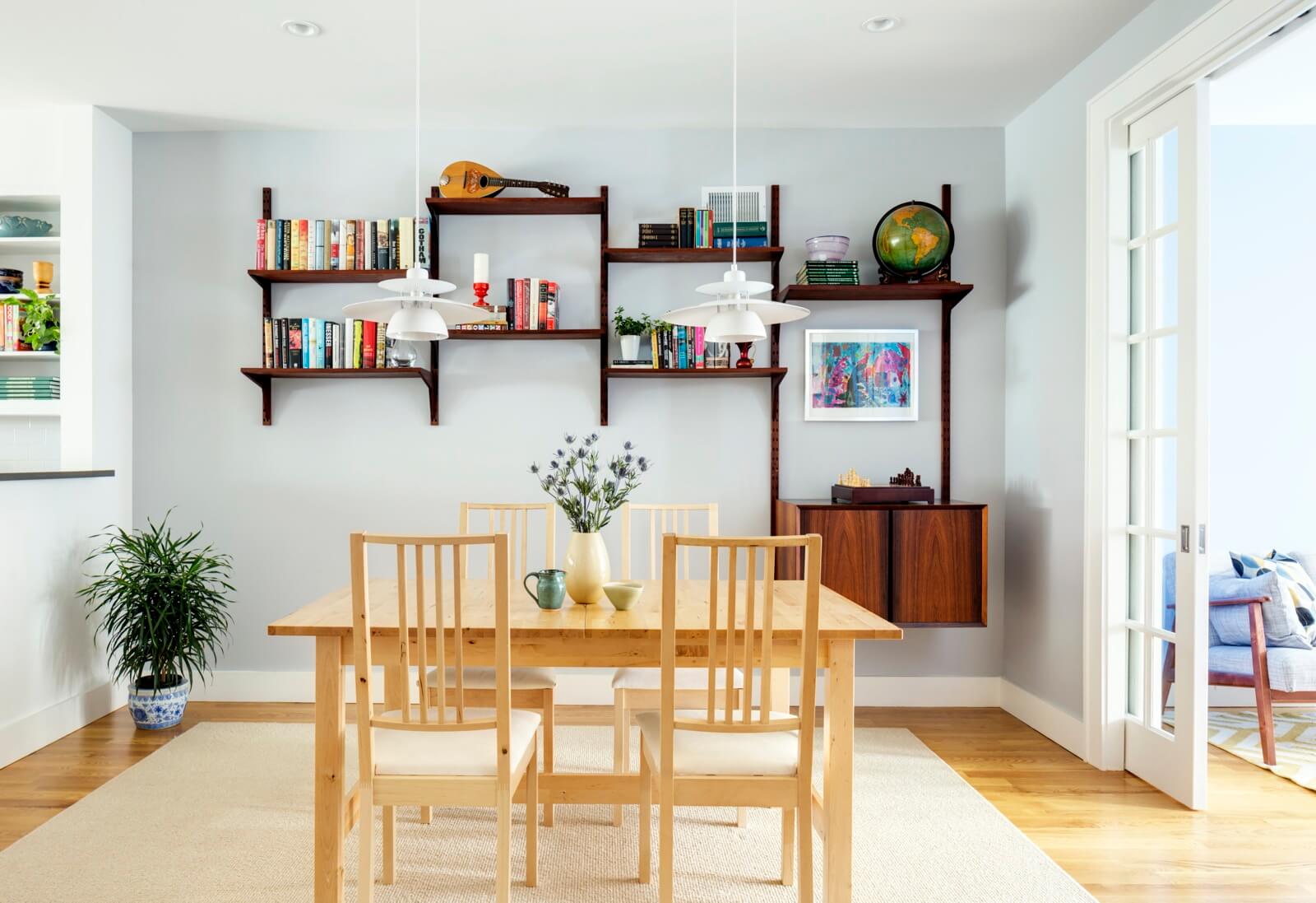
The dining room was organized around a Danish modern teak wall unit belonging to the homeowners.
The lighting fixtures, from Eglo, are an inexpensive rendition of a classic of Danish mid-century design.
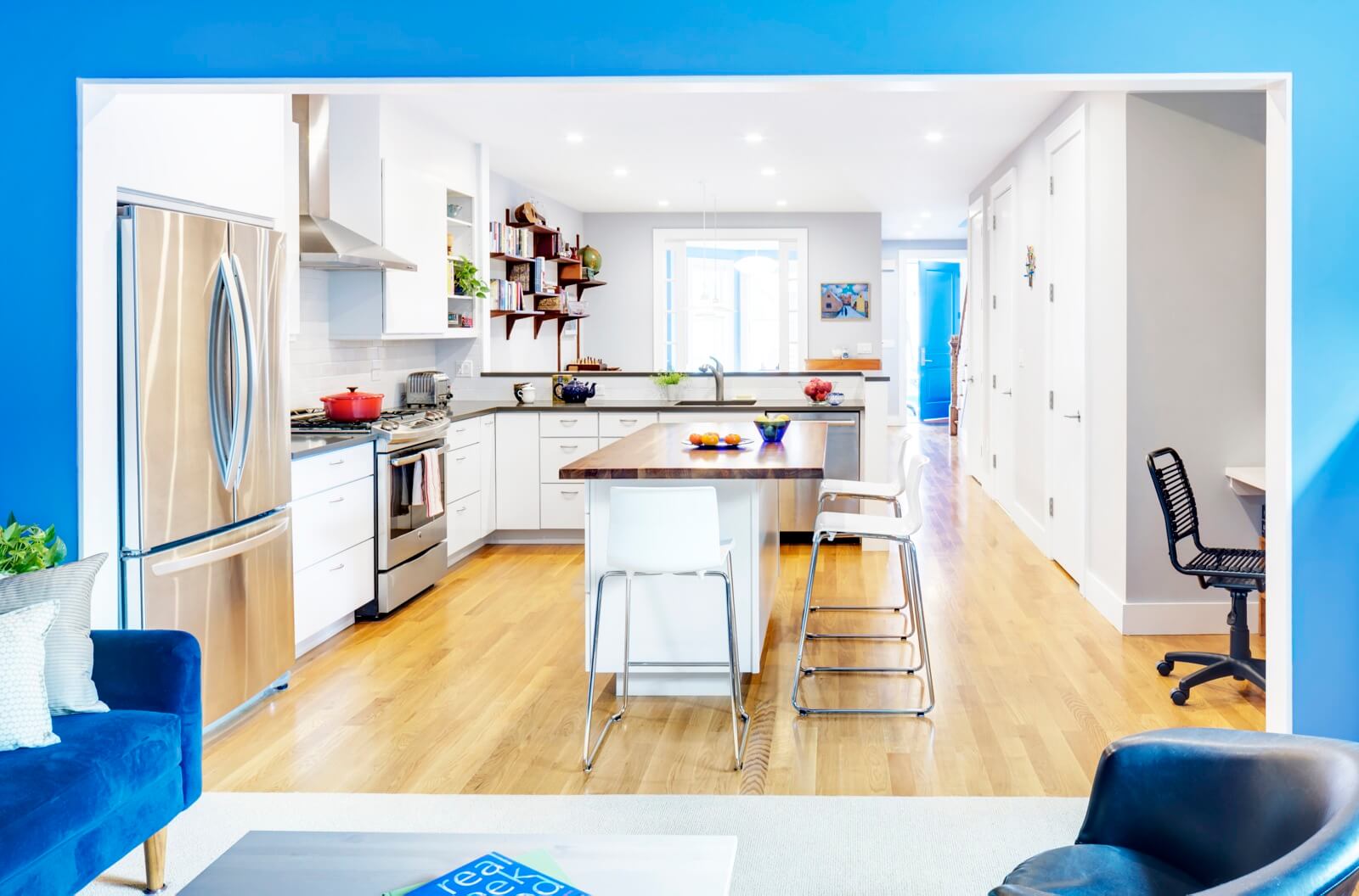
The kitchen cabinetry is from Home Depot, instead of the semi-custom kitchen Barker’s office typically does, with a Caesarstone countertop around the perimeter. The center island has a wood top.
The wall along the right includes a coat closet, a powder room and access to the cellar.
A small TV room with a blue velvet sofa is in an existing extension at the back of the house.
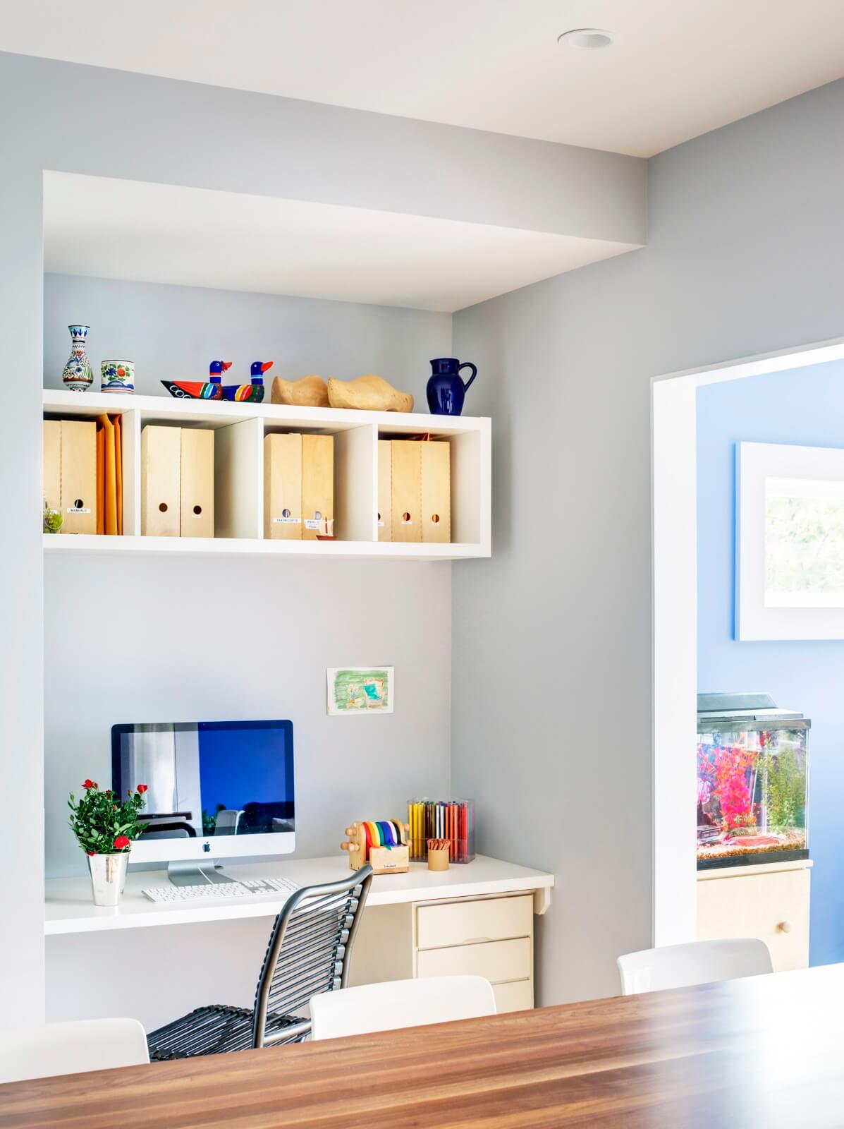
The architects tucked a dedicated work station into a corner of the kitchen.

Three bedrooms on the house’s upper level include this blue-and-green boy’s room.
All the window moldings in the house are square stock (as opposed to a more detailed profile), the sills exaggerated to become a useful shelf.
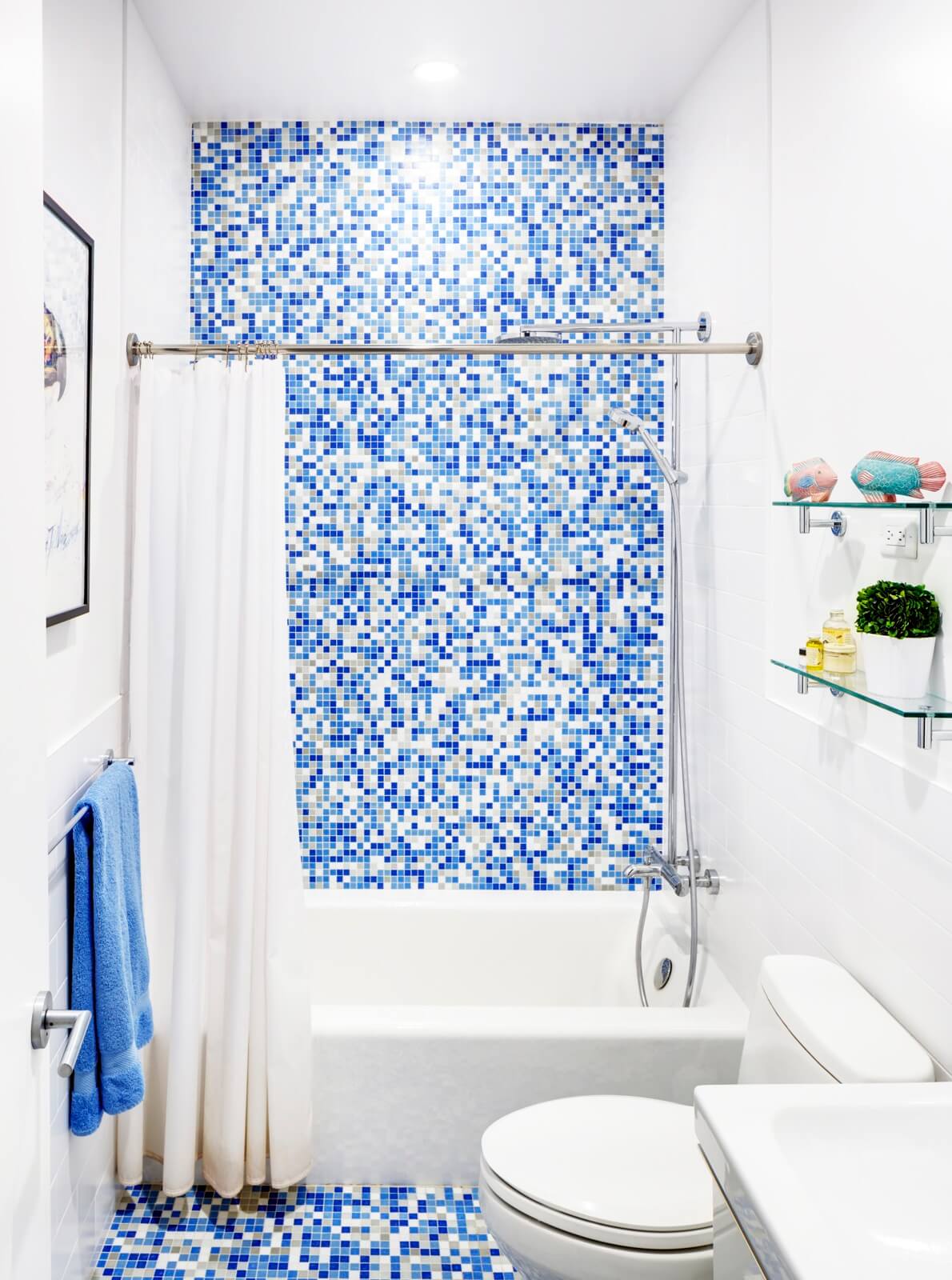
Bisazza mosaic tile enlivens the children’s bath.
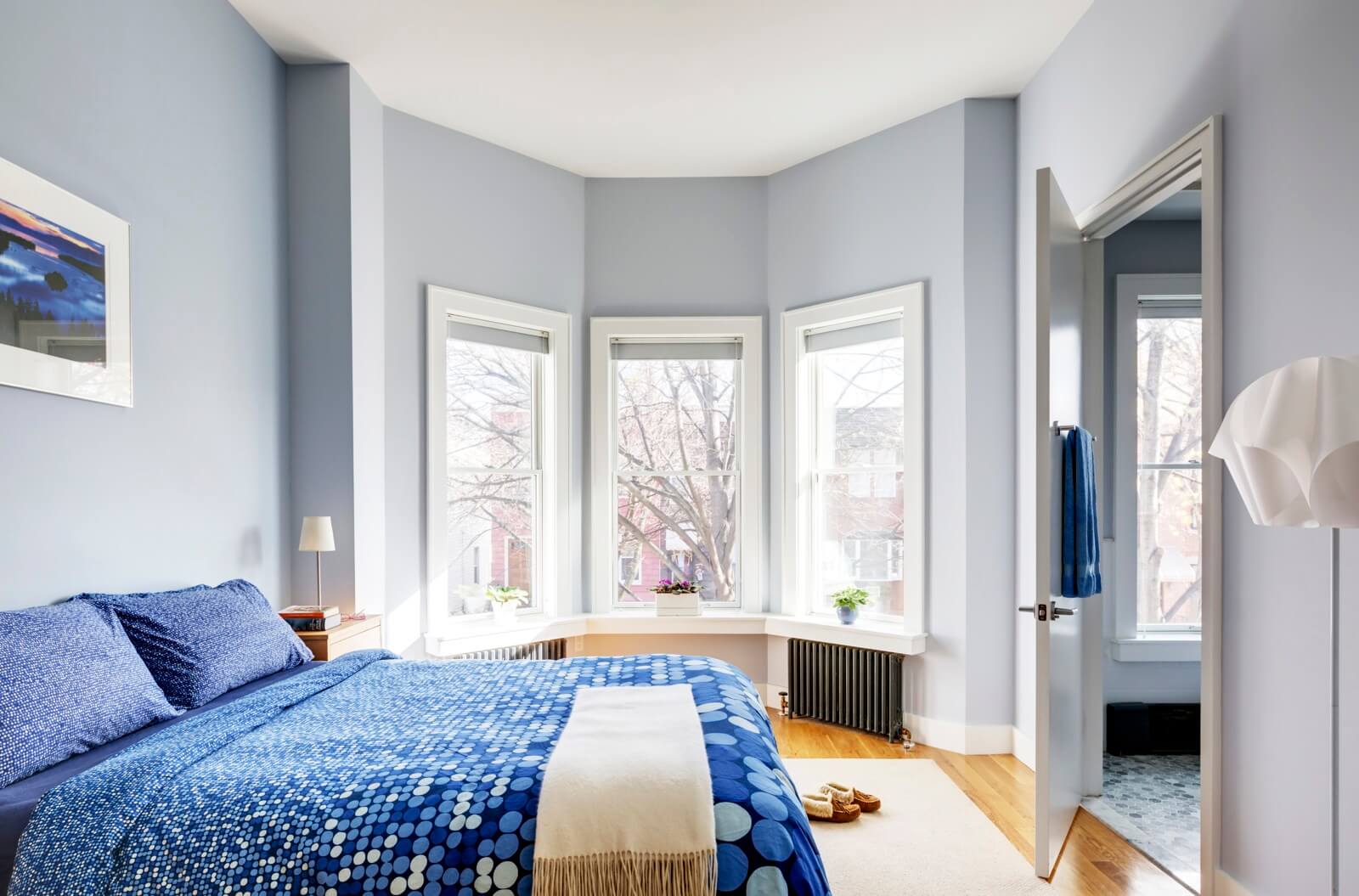
In the pale-gray master bedroom at the front the house, the architects removed a dropped ceiling to gain considerable height.
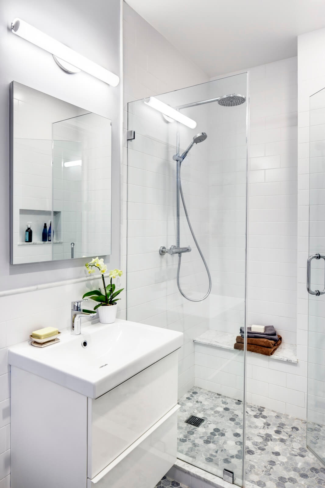
IKEA vanities in the bathrooms helped keep the budget in check.
[Photos by Francis Dzikowski]
Check out ‘The Insider’ mini-site: brownstoner.com/the-insider
The Insider is Brownstoner’s weekly in-depth look at a notable interior design/renovation project, by design journalist Cara Greenberg. Find it here every Thursday morning. Got a project to propose for The Insider? Contact Cara at caramia447 [at] gmail [dot] com.
Related Stories
- The Insider: Brownstoner’s in-Depth Look at Notable Interior Design and Renovation Projects
- The Insider: Superb Plasterwork Drives Design of Fort Greene Fixer Upper
- The Insider: Vivid Color, Generous Spaces Distinguish Windsor Terrace Row House Reno
Business Mentioned Above



What's Your Take? Leave a Comment