The Insider: Modern Design Principles Guide Gut Reno of Sunset Park Townhouse
A rundown row house with few details left to save becomes a bright, comfortable home for a family of five.

In cases where vintage details were long ago erased from Brooklyn row houses, thoroughly modern overhauls can make a great deal of sense. That was the case in this gut reno, where architect Ula Bochinska of Gowanus-based Bostudio Architecture took a rundown three-story house down to the studs and redesigned it inside and out.
Collaborating on the schematic layout with Canada-based architect Witek Wisniewski, like Bochinska a native of Poland and a graduate of Warsaw’s University of Technology architecture program, they laid out a duplex residence for a family with three young kids on the house’s main floor and the floor above. The lower level is set up as a separate apartment (presently used by the homeowners as guest accommodations, a home office and playroom).
From the original structure, which had been thoroughly stripped sometime in the mid-20th century, they were able to salvage just the stair railing and a skylight with colored glass. “Everything else is new,” said Bochinska, a New York State-licensed architect who came to the U.S. in 2002 and set up her business in 2010.
The cost-conscious design is unabashedly modern, inside and out, with gray fiber cement board cladding on the front and rear facades and interiors warmed by oak doors, floors and wood-trimmed casement windows.
The sleek streamlined kitchen has a bit of an industrial feel, with exposed brick and ductwork. IKEA supplied most of the cabinetry in the kitchen and master bath, configured in ways Bochinska thinks “could pass for custom.”
Bostudio approaches architectural design with the hope that the spaces they create will last for many years, if not generations. “We use a neutral palette of grays and whites, natural stone and wood, so the design is not going to date quickly,” Bochinska said. “And whenever we can, we keep old portions of the house to remind people of its history.”
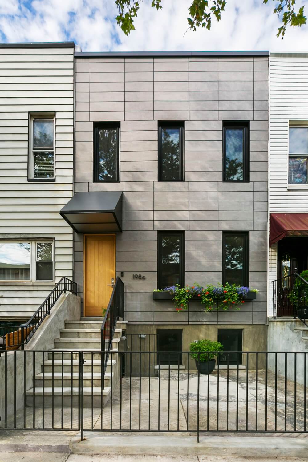
Equitone fiber cement panels were laid in an offset grid pattern on both front and rear façades. Marvin windows have black aluminum cladding on the outside, oak within.
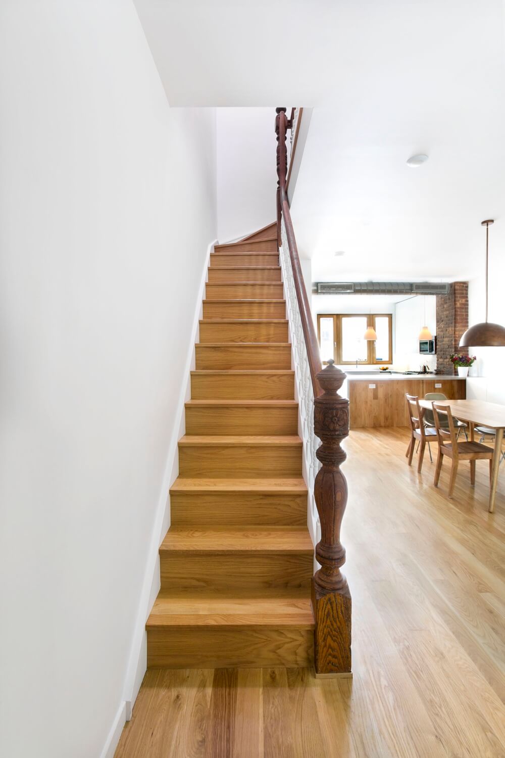
The staircase was rebuilt with white oak treads and risers, but the newels, railings and balusters were salvaged. The white oak flooring was extended up to clad the front of the U-shaped kitchen island.
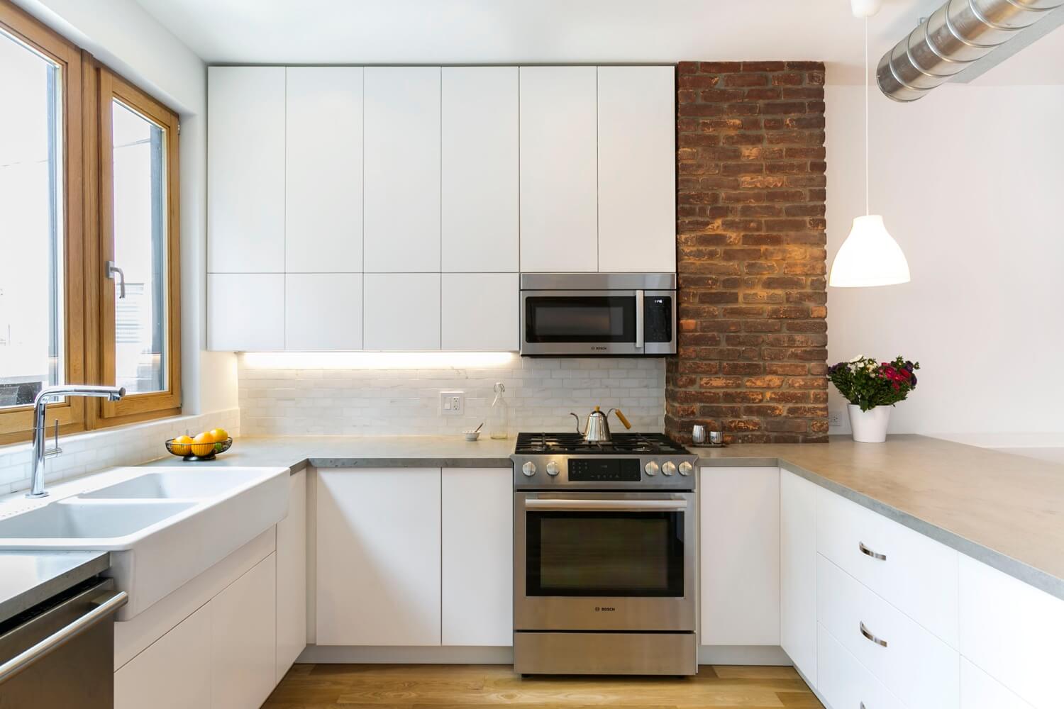
Exposed brick and a length of aluminum ductwork make for a more varied and interesting materials palette in the kitchen. The cabinetry, farmhouse sink and pendant lights above the counter came from IKEA.
The countertop is a man-made material that looks like concrete. The stove is from Bosch and the sink faucet from Riobel.
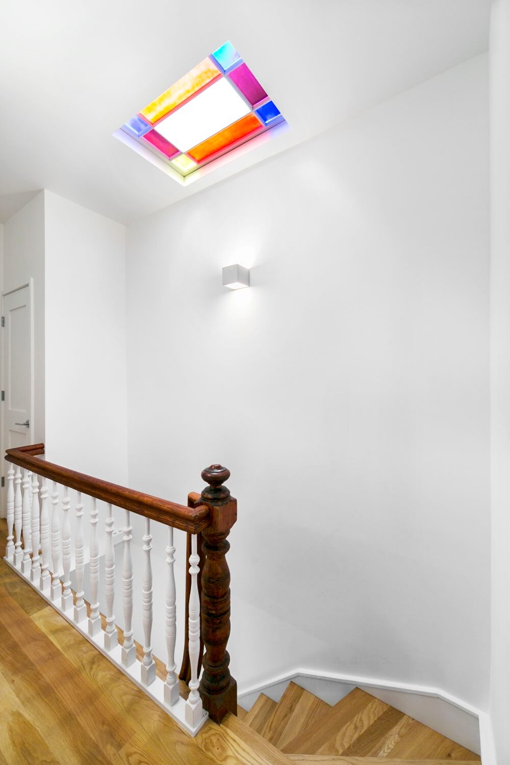
Remnants of the century-old house remain in the turned stair rail and the colored-glass skylight.
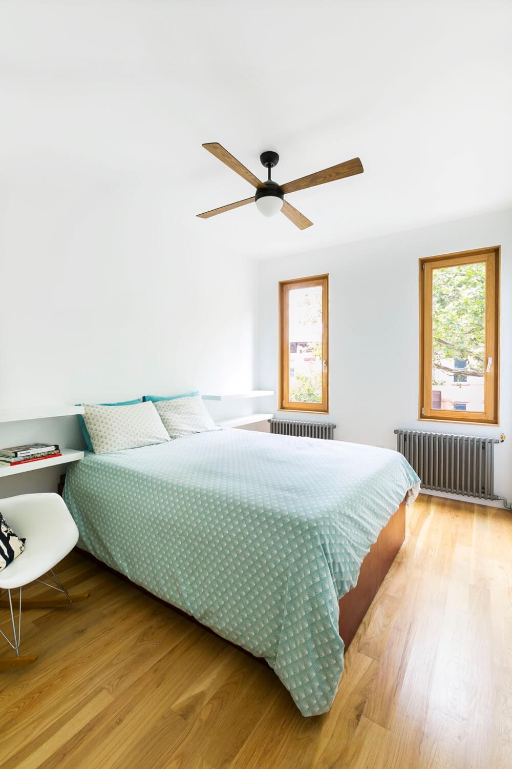
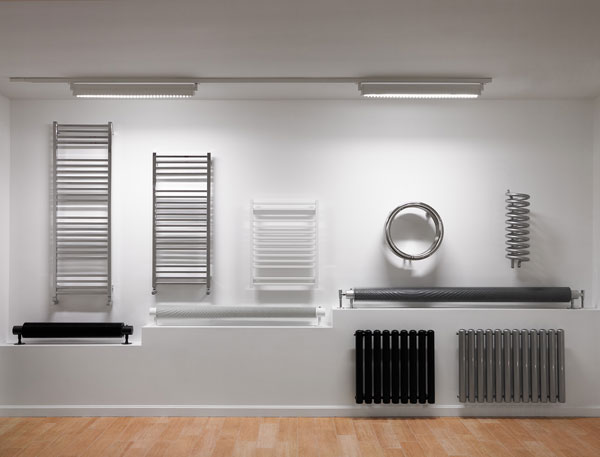
A wood-bladed ceiling fan from Restoration Hardware and wall-hugging radiators from Runtal serve as totems of good design as well as functional necessities in the master bedroom.
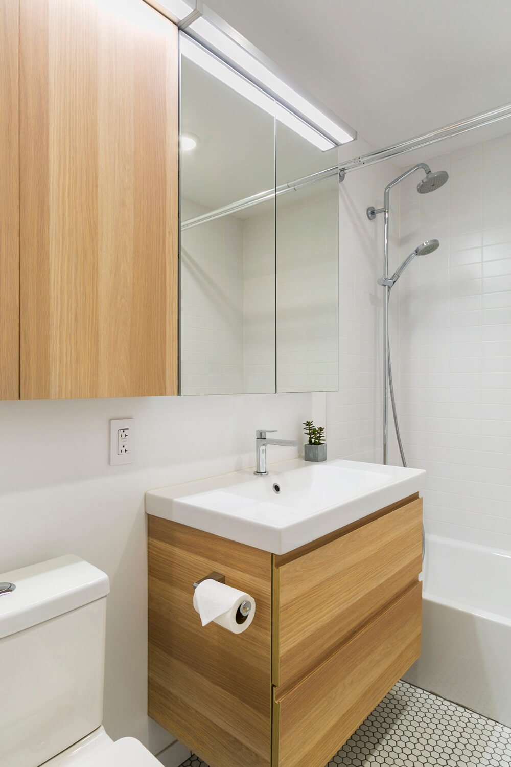
Simple materials well-used in the master bath include an IKEA vanity and cabinet and classic white hex tiles on the floor.
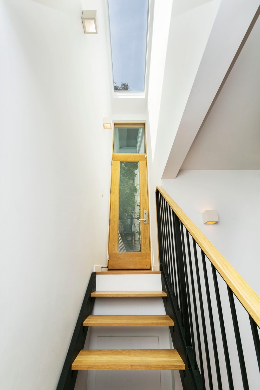
A straightforward stair from the lower level emerges in a bulkhead in the rear yard. The skylight brings extra light to the downstairs space.
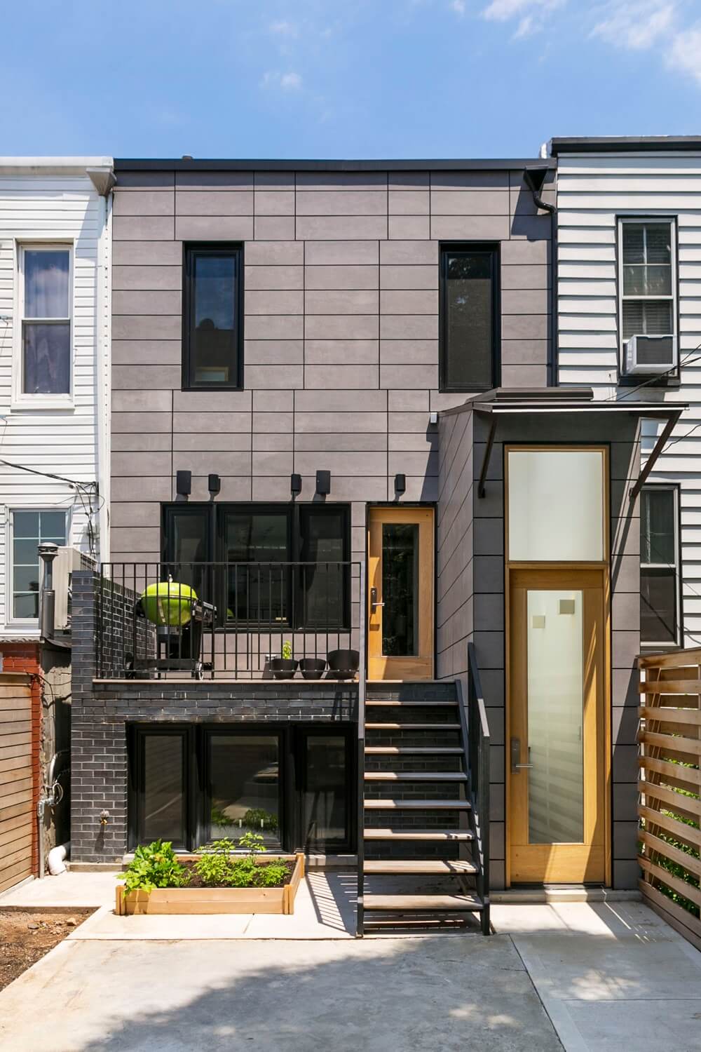
A bit of excavation enabled the creation of a high-ceilinged room in an extension at the rear of the lower level.
[Photos by Kate Glicksberg]
Check out the ‘The Insider’ mini-site: brownstoner.com/the-insider
The Insider is Brownstoner’s weekly in-depth look at a notable interior design/renovation project, by design journalist Cara Greenberg. Find it here every Thursday morning. Got a project to propose for The Insider? Contact Cara at caramia447 [at] gmail [dot] com.
Related Stories
- The Insider: Brownstoner’s in-Depth Look at Notable Interior Design and Renovation Projects
- The Insider: Revamping a Sunset Park Row House for a Clean, Modern Look
- The Insider: Architects Revamp Park Slope Two-Family for Future Flexibility






What's Your Take? Leave a Comment