The Insider: Brownstone Triplex Renovation in Boerum Hill Carves Space From Cellar, Extension
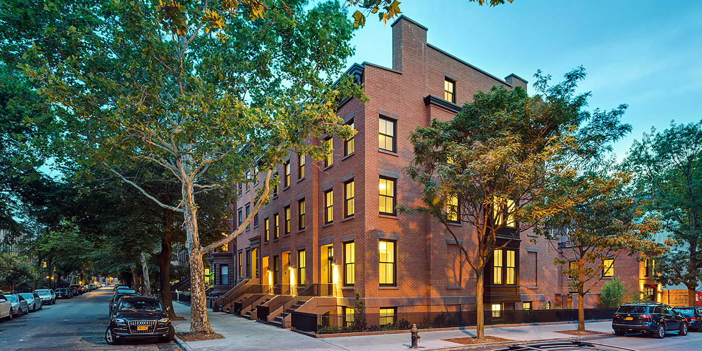
A new central staircase and a big bay window enhance light and add space to a family’s three-level brownstone apartment in Boerum Hill.

The owners of this four-story row house, which you can view in person on the Boerum Hill House Tour this Sunday, June 5, had been living in the building’s upper duplex with their two teenage sons. It was a tight fit, and when their downstairs tenants moved out, they decided to take over the lower half of the building instead.
They called upon Brooklyn’s CWB Architects to renovate and expand the downstairs apartment, which was already a bit bigger, with an 8-foot extension at the rear of the two lower floors, as well as having access to the cellar and the garden. “They’d been living like college kids and wanted to live more graciously,” said architect Brendan Coburn, founder of the Dumbo-based firm.
Now there’s a new central staircase connecting the apartment’s three levels. The large square stair opening “grabs light,” as Coburn put it, from two big south-facing windows in the front parlor. The light bounces down through the staircase’s open risers to the floor below, where there are three new bedrooms, and further still to a newly created “central zone” on the cellar floor, which serves as a family/TV room (there are mechanicals at front and back of the cellar level).
“The goal was to try to connect that cellar space more overtly to the floor above by stacking the stair and making it architecturally interesting. It worked better than I expected,” Coburn said. When you’re in that new cellar space, he added, “you don’t feel disconnected from the rest of the house.”
The architects also added a new bay window with an upholstered banquette overlooking the garden at the rear of the parlor floor.
The house’s heating system and other mechanicals were in good functional shape and required little tweaking.
They decided to forego central air conditioning in favor of wall-hung Mitsubishi room units, of which Coburn is a big fan. “The notion of central air is vanishing in place of these split systems, perfect for row houses when you don’t have space to run a duct system,” he said. “They’re expensive, but way cheaper to run.”
Most design decisions were made with cost in mind. “Budget was the primary driver of this job,” Coburn said.
The general contractor was Mark Chan of Flushing, Queens, who also built all the cabinetry on site.
Interior design is by Amy Courtney of Fearins & Welch, an arm of the CWB office.
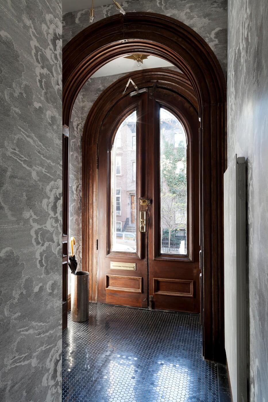
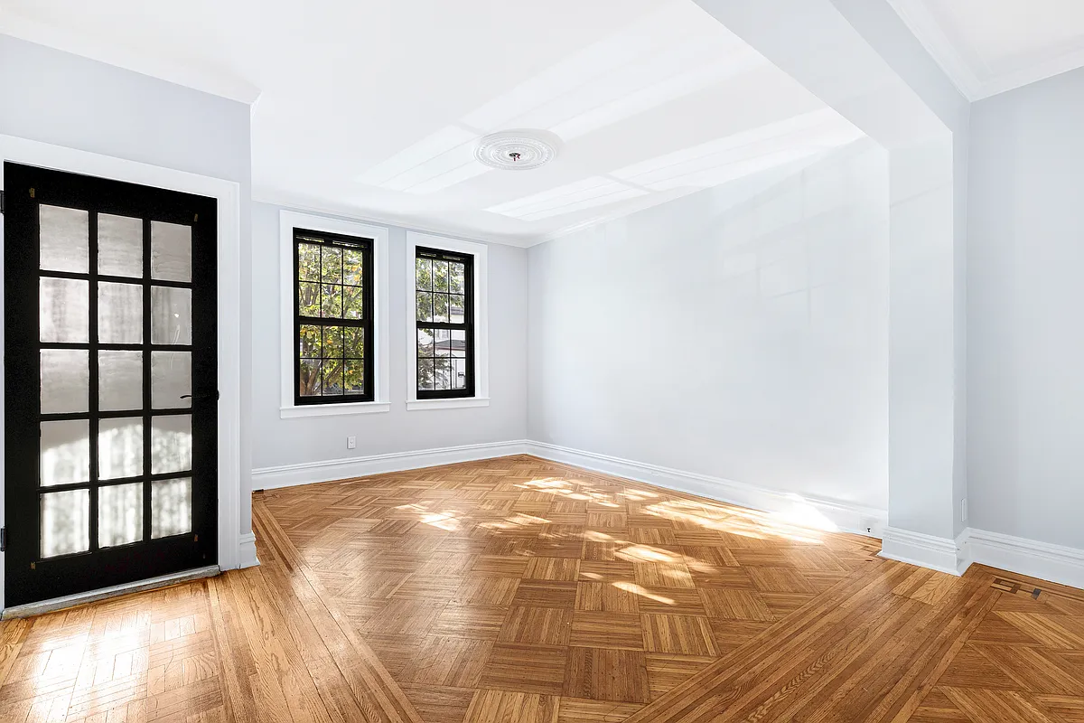
The original arched doorways were stripped and cleaned up. The inner door was moved a bit “to come up with a way to get the tenants upstairs,” Coburn said.
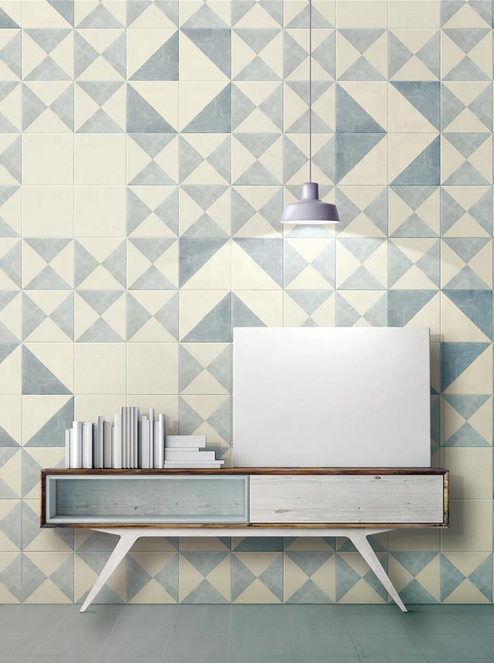
The cloud wallpaper is Fornasetti from Cole and Sons, the floor tile Marquina Hex from Nemo Tile.
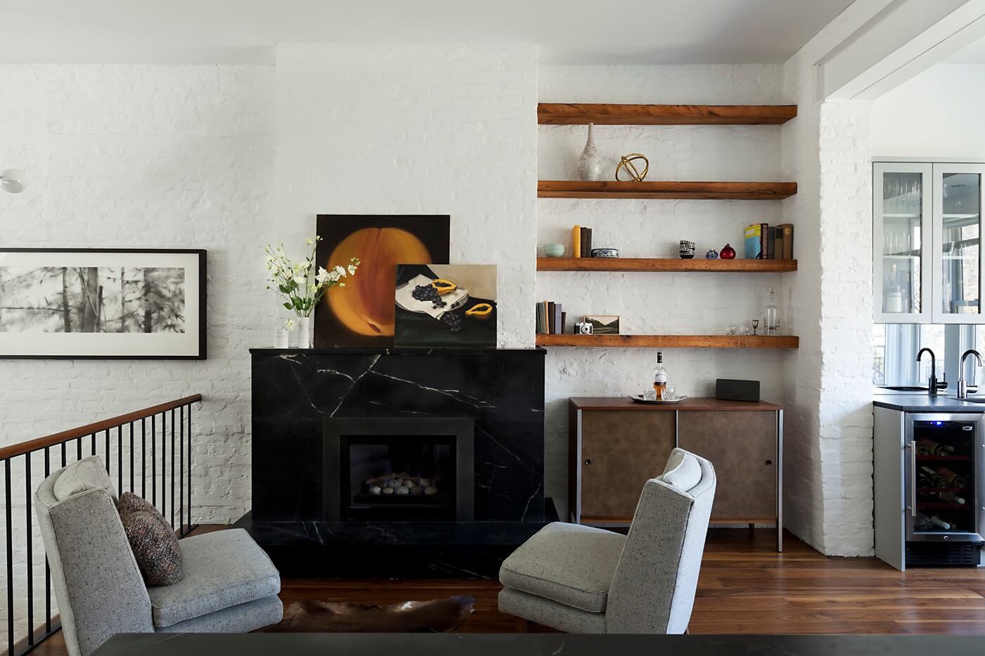
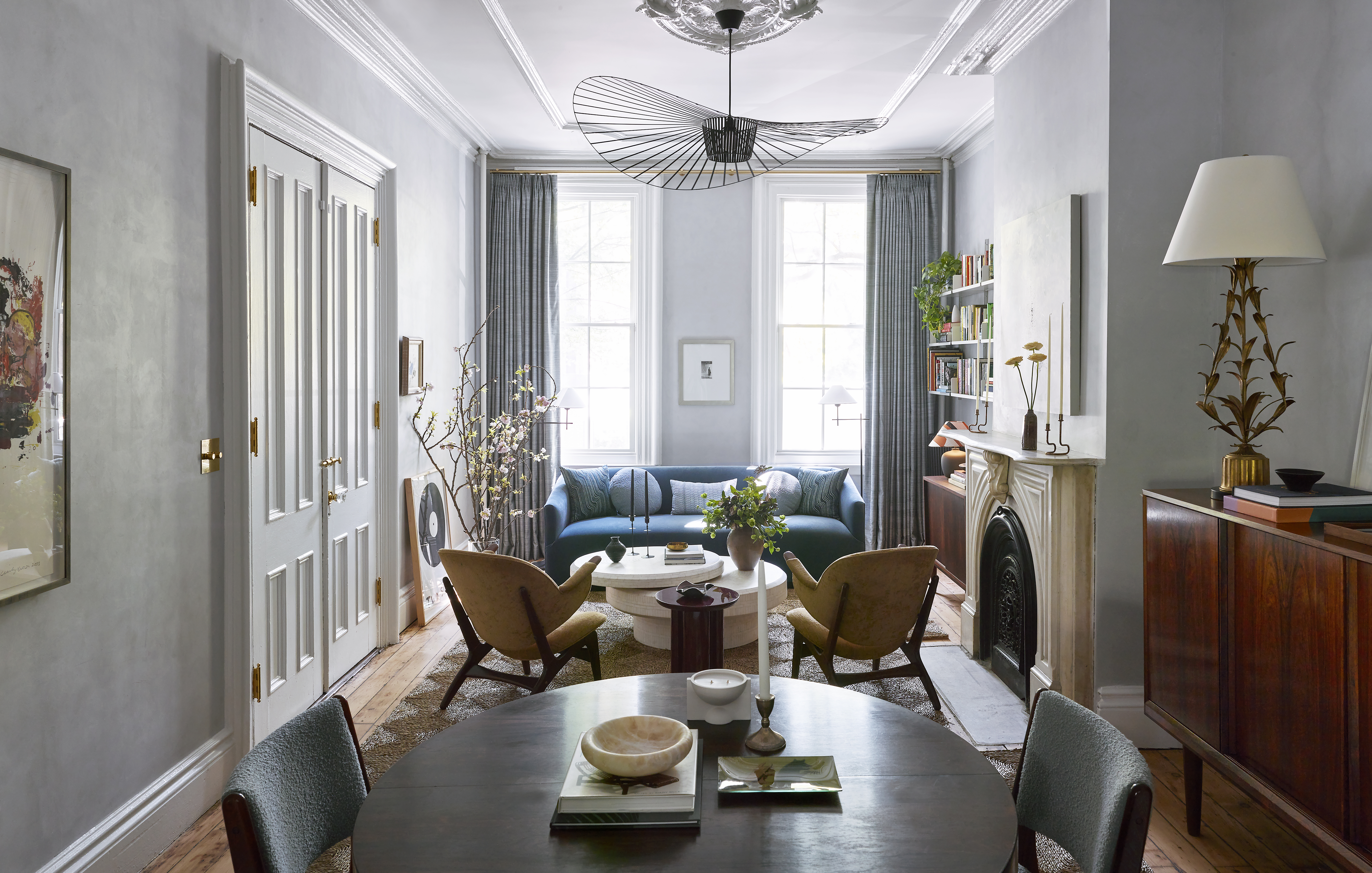
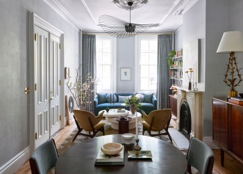
A screen-like walnut room divider (top photo) in the living space at the front of the parlor floor is “a device to define the corner of the living room,” the architect said.
Its integrated cabinet matches the bookshelves, the handrail on the stair and the new walnut flooring throughout. “We try to keep to as few materials as possible in a smaller project, so it’s coherent and not too visually noisy,” Coburn said.
New black marble mantels made of Baroqua soapstone from M. Teixeira surround two working fireplaces on the parlor floor.
Beams salvaged from the house were made into open bookshelves.
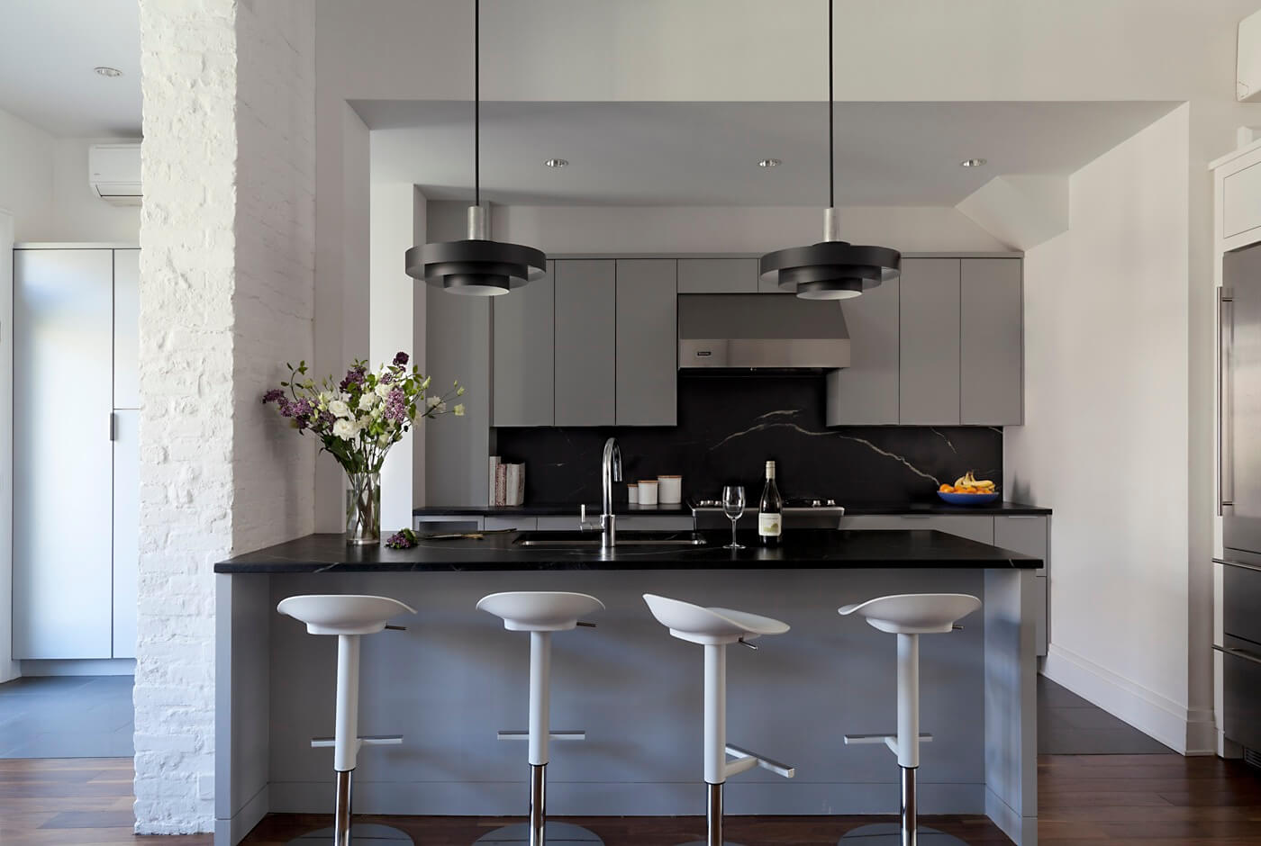
Contractor Mark Chan built the kitchen cabinets out of plywood painted Benjamin Moore Coventry Gray.
The counter stools are from IKEA. A wall-hung Mitsubishi A/C unit is (barely) visible on the wall to the far left.
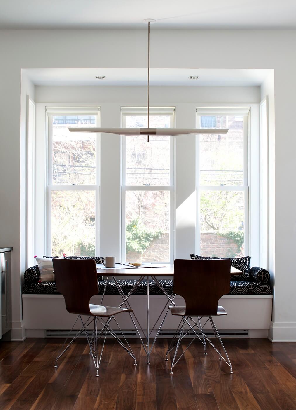
The dining area was conceived so that the table can be easily moved out to accommodate a larger group.
A sleek David Weeks light fixture hangs above.
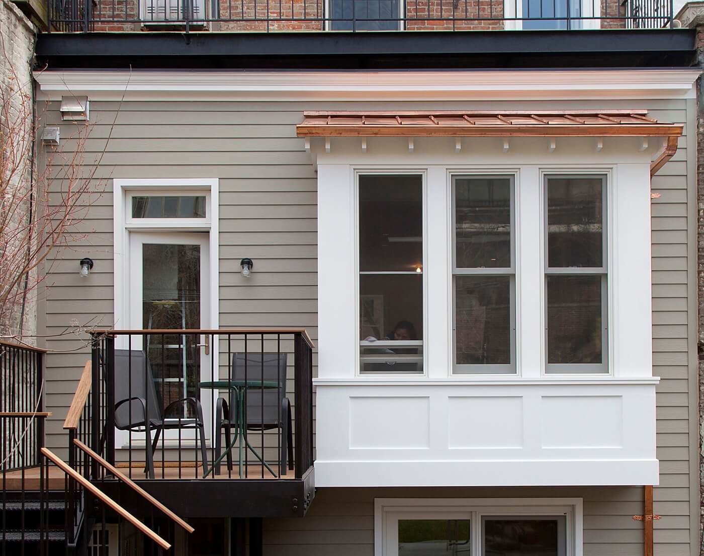
A tiny deck to the side of the new bay window leads immediately down to the garden.
“Our general approach is that if it’s a north-facing garden, get down as quickly as possible,” Coburn said. “The deck will be in shadow all the time, but if you get down to the back of the yard, it’s nice and sunny.”
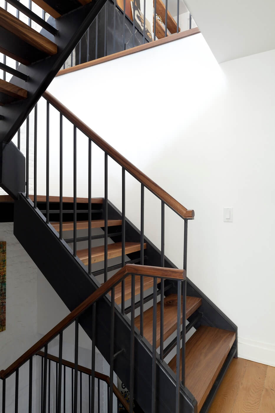
The brand-new stair opening in the middle of the apartment houses a new steel stair structure with walnut treads. A rod adds safety to the open risers.
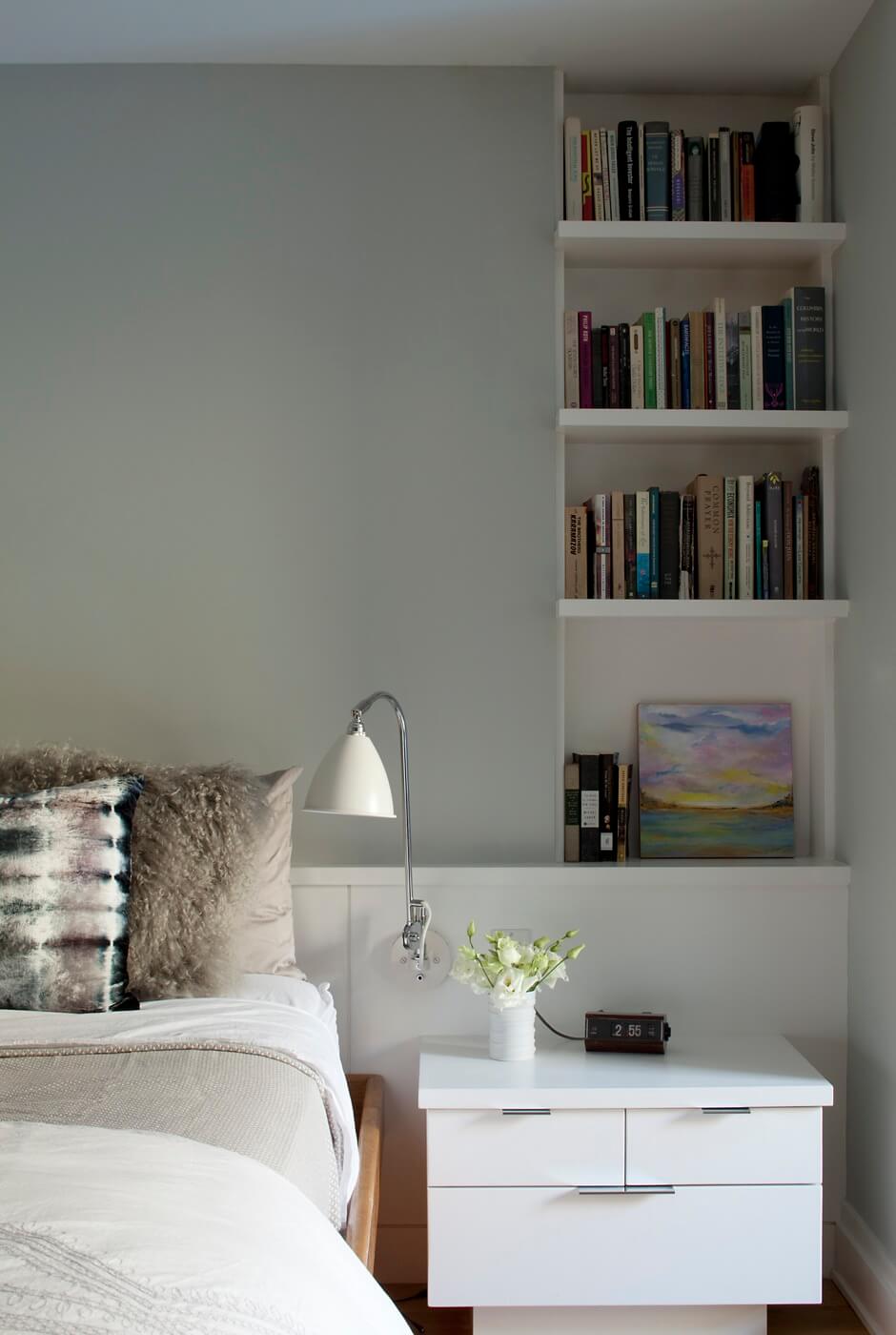
There are three bedrooms on the garden level. The master has sliding doors to the backyard.
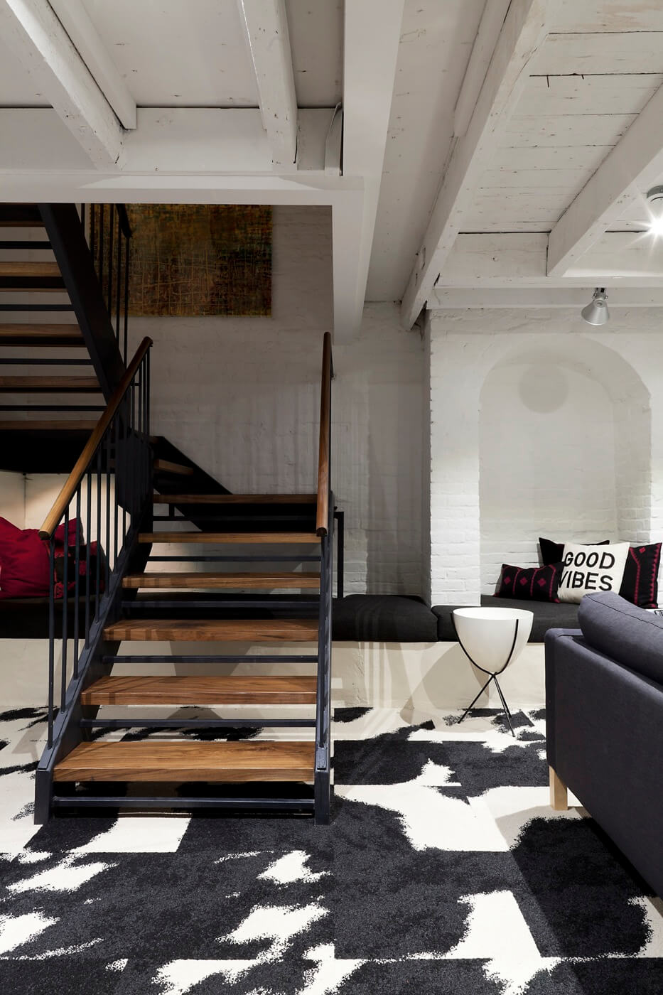
The family room in the cellar is appealingly rustic, with its exposed beam ceiling and structural brick arch.
The floor in this area was excavated 18 inches to add ceiling height. The original 3-foot-deep concrete ledge running around the perimeter of the cellar was left in place and cushioned for seating.
Animal-print carpet tiles are from FLOR.
[Photos by Rachael Stollar]
The Insider is Brownstoner’s weekly in-depth look at a notable interior design/renovation project, by design journalist Cara Greenberg. Find it here every Thursday.
Got a project to propose for The Insider? Contact Cara at caramia447 [at] gmail [dot] com.
Related Stories
The Insider: Williamsburgh Townhouse Gutted and Rebuilt as Open, Loft-Like Home
The Insider: Workstead Architects Create Ultra-Custom Cabinetwork in Boerum Hill
The Insider: Architects Built New Home Within Old House in Boerum Hill
Businesses Mentioned Above
Email tips@brownstoner.com with further comments, questions or tips. Follow Brownstoner on Twitter and Instagram, and like us on Facebook.









What's Your Take? Leave a Comment