The Insider: Narrow Greenpoint Row House Triples in Size But Keeps the Curb Appeal
A century-old, 800-square-foot row house becomes a spacious family home, masterminded by Revamp Interior Design of NYC.

The success of this project — from design to renovation to staging — can be measured by one salient fact. “They put the house on the market and got multiple offers within the first two weeks,” said Cece Stelljes, who, along with her partner Danielle Fennoy of the Manhattan-based company Revamp Interior Design, orchestrated the whole undertaking for developer Yuval Berger.
Berger bought the 800-square-foot, two-story brick structure, just 12 feet wide and 33 deep, “knowing there was potential to expand back and up,” Stelljes said.
Stelljes and Fennoy, who met as grad students in interior design at Pratt Institute and have designed restaurants, offices and numerous residences since joining forces in 2010, did all the design planning, both exterior and interior.
Working with Radek Kurek of Rad Design & Architecture as the architect of record, the maximum allowable square footage was determined to be 2,300 square feet, allowing the building to nearly triple in size. This was accomplished by adding a floor on top and elongating the building’s footprint by about 25 feet on all three levels.
Preserving historic character was a priority. “It’s not a landmarked building or street, but when you have a property with a brick facade and old wood beams, we like to preserve that character and not turn it into a flat-walled box,” Stelljes said.
Among the major design moves in the gut reno was the creation of a long straight stair from the ground floor to the second. It shifts on the second floor to what Stelljes calls a “scissor stair,” in two segments that allow for storage, laundry and other auxiliary space in between.
A huge arched window on the top floor, overlooking a park, is a grand gesture both on the outside of the building and within the master bedroom.
Staging the house for sale was a key part of Revamp’s services. They procured many of the furnishings, rugs, lighting and accessories through WorkOf, which represents more than 160 independent designers and fabricators, many based in Brooklyn.
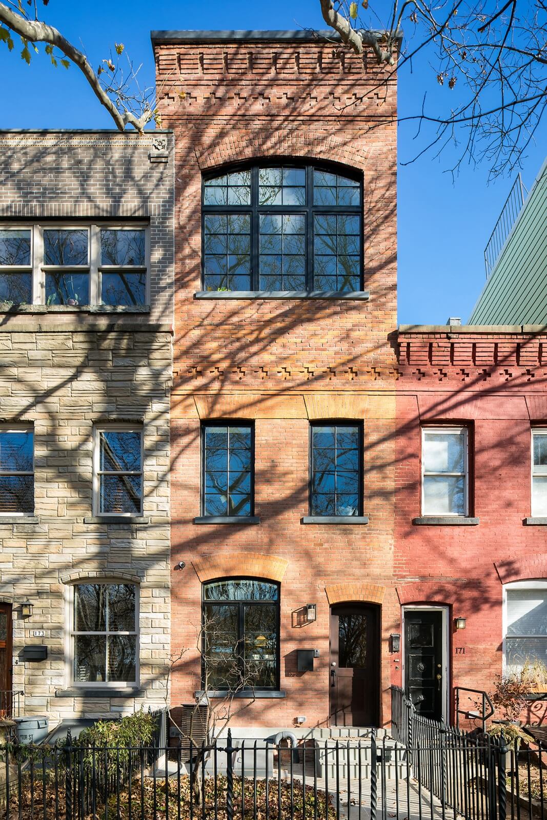
Before the renovation, the house was a twin of the red brick building to its right.
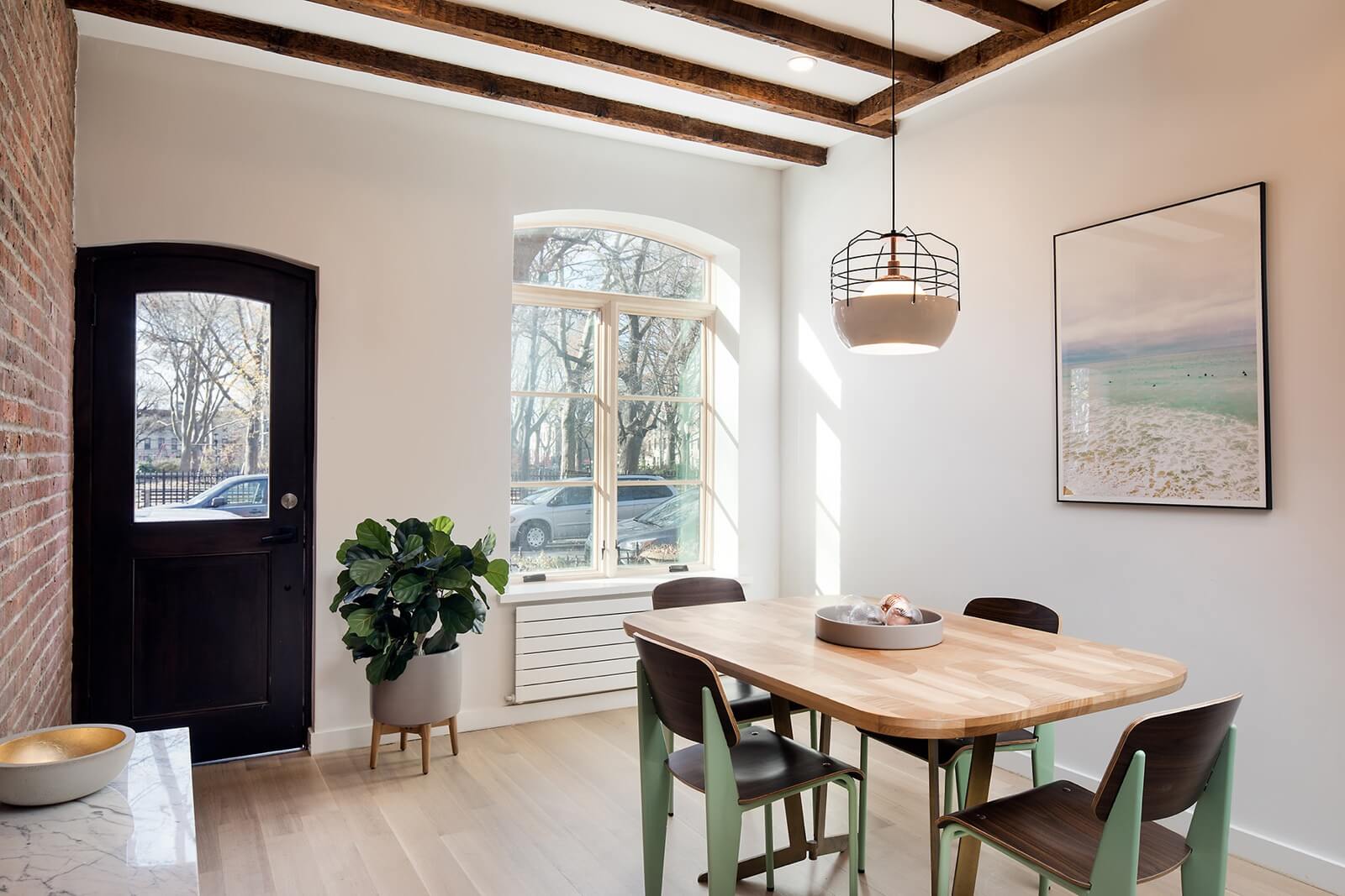
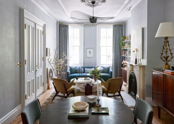
By eschewing a mudroom or coat closet near the front entry, Revamp gained space for a bright dining room the full width of the interior. The ceiling beams are original to the house.
The dining table, by Brooklyn maker Token, is surrounded by Jean Prouvé-designed dining chairs. The pendant light is from Roll & Hill.
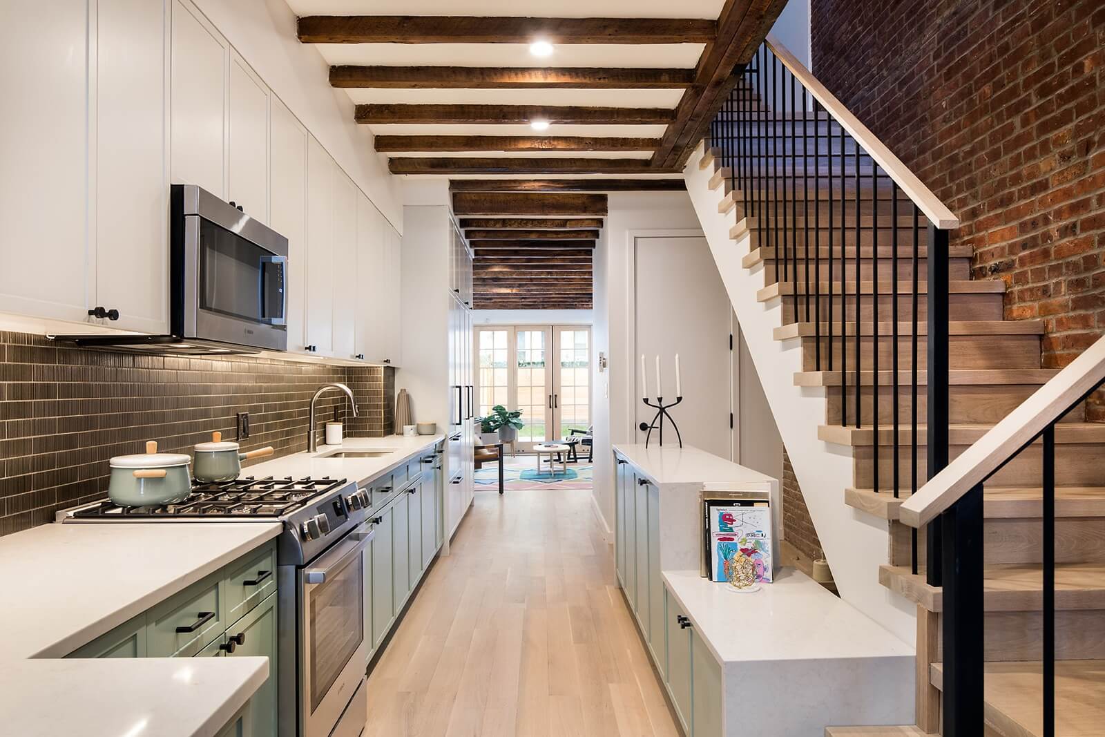
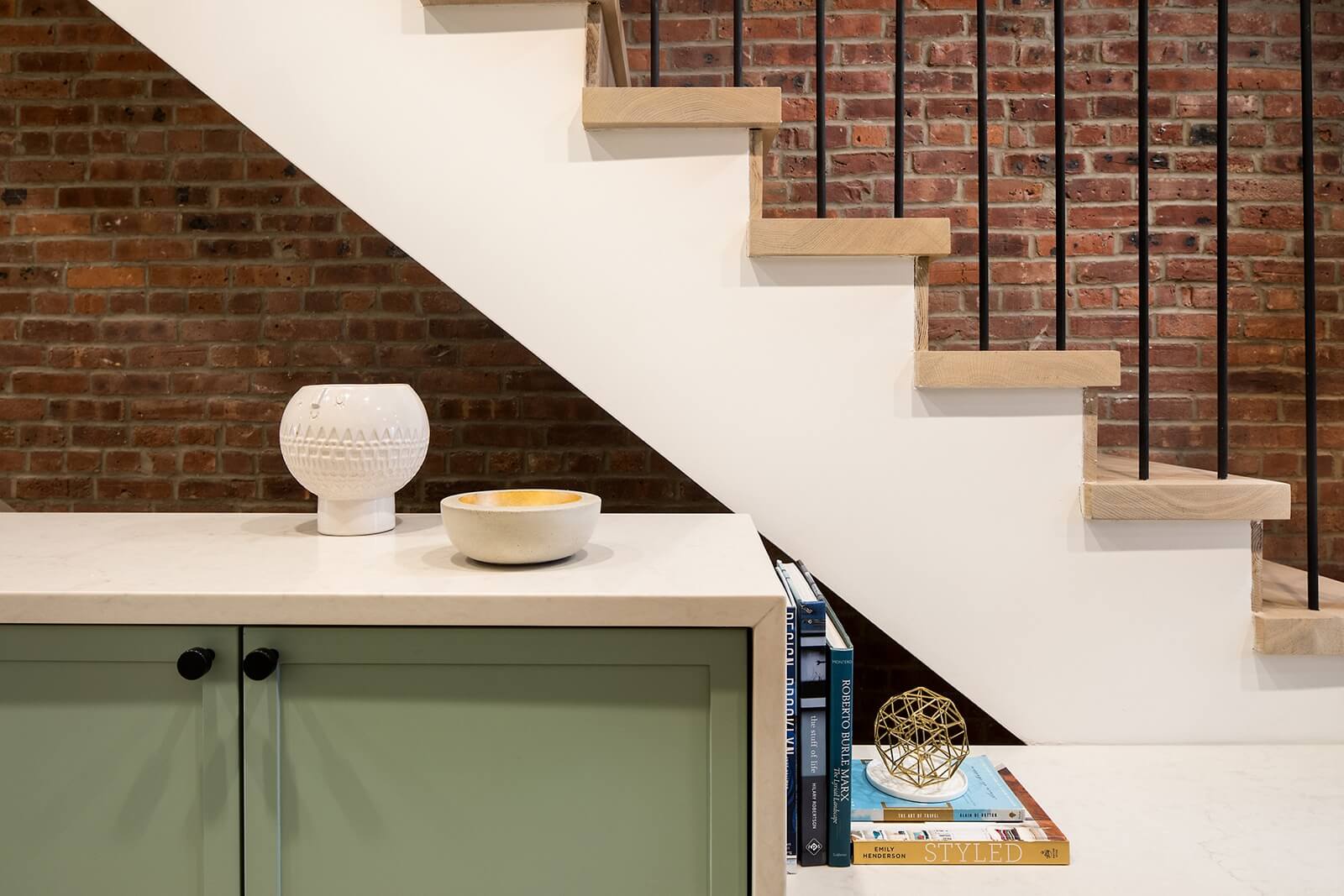
The long galley kitchen in the middle of the first floor “essentially doubles as circulation from the front to the back of the house,” Stelljes said. The tall built-in storage includes a coat closet.
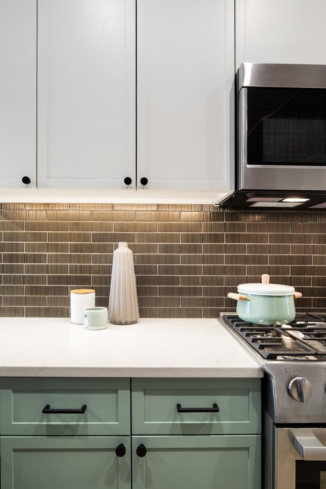
Though built on spec, the kitchen is anything but generic, with white and green-painted custom cabinetry and a bronze glazed ceramic backsplash.
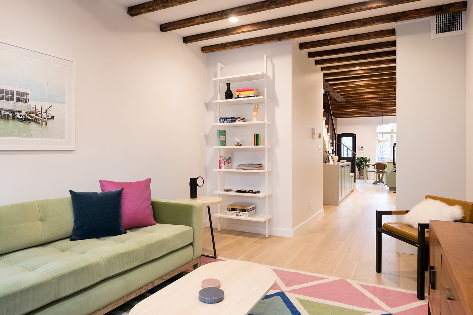
In the ground-floor living area, which is in the newly extended portion of the house, the ceiling beams are not structural. They are original to the building, however, repurposed from elsewhere in the house.
A velvet sofa from Desiron, a rug from Greenpoint’s Aelfie and coffee and side tables by Volk (in Red Hook) were among the items procured through WorkOf.
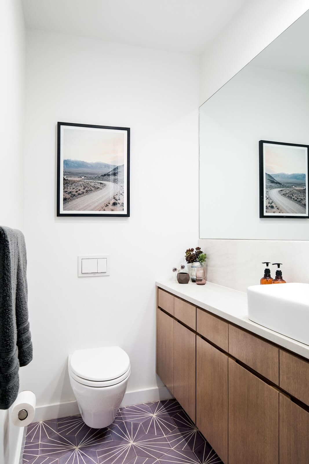
Lilac-colored cement tile distinguishes the ground floor powder room.
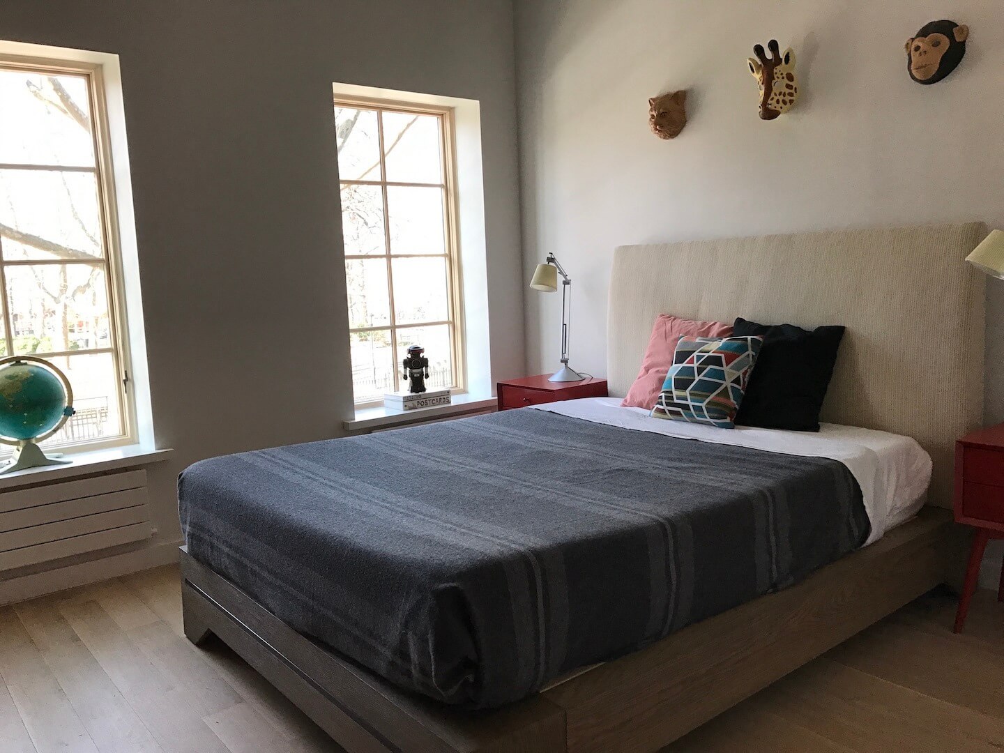
Furnishings in a guest bedroom include Artemide lamps and Kartell side tables.
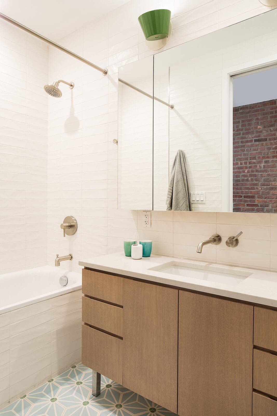
Two bedrooms on the second floor share a bathroom with a cement tile floor and custom vanity.
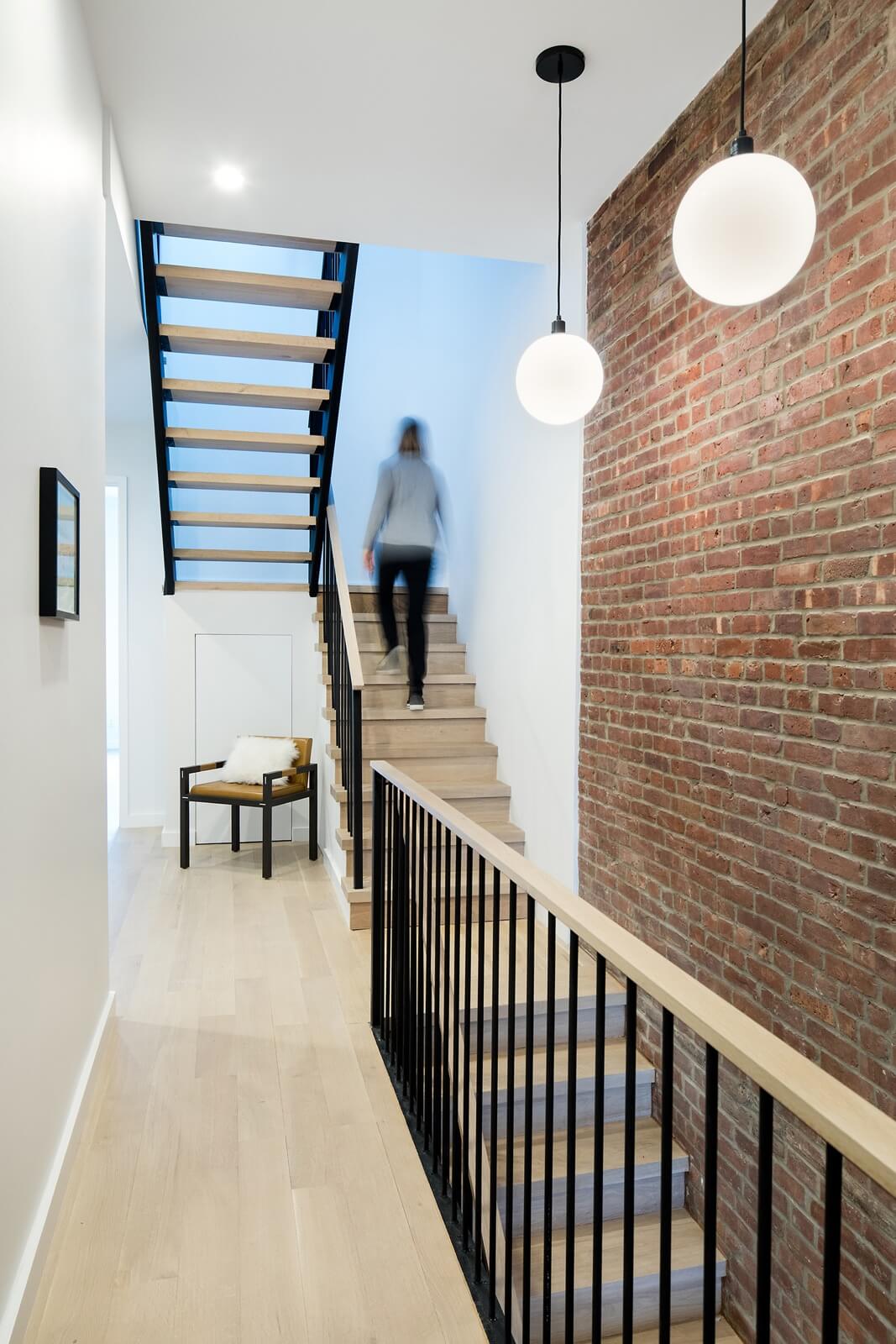
The staircase splits on the second floor, creating flexible space on the landing as well as storage opportunities beneath the stairs.
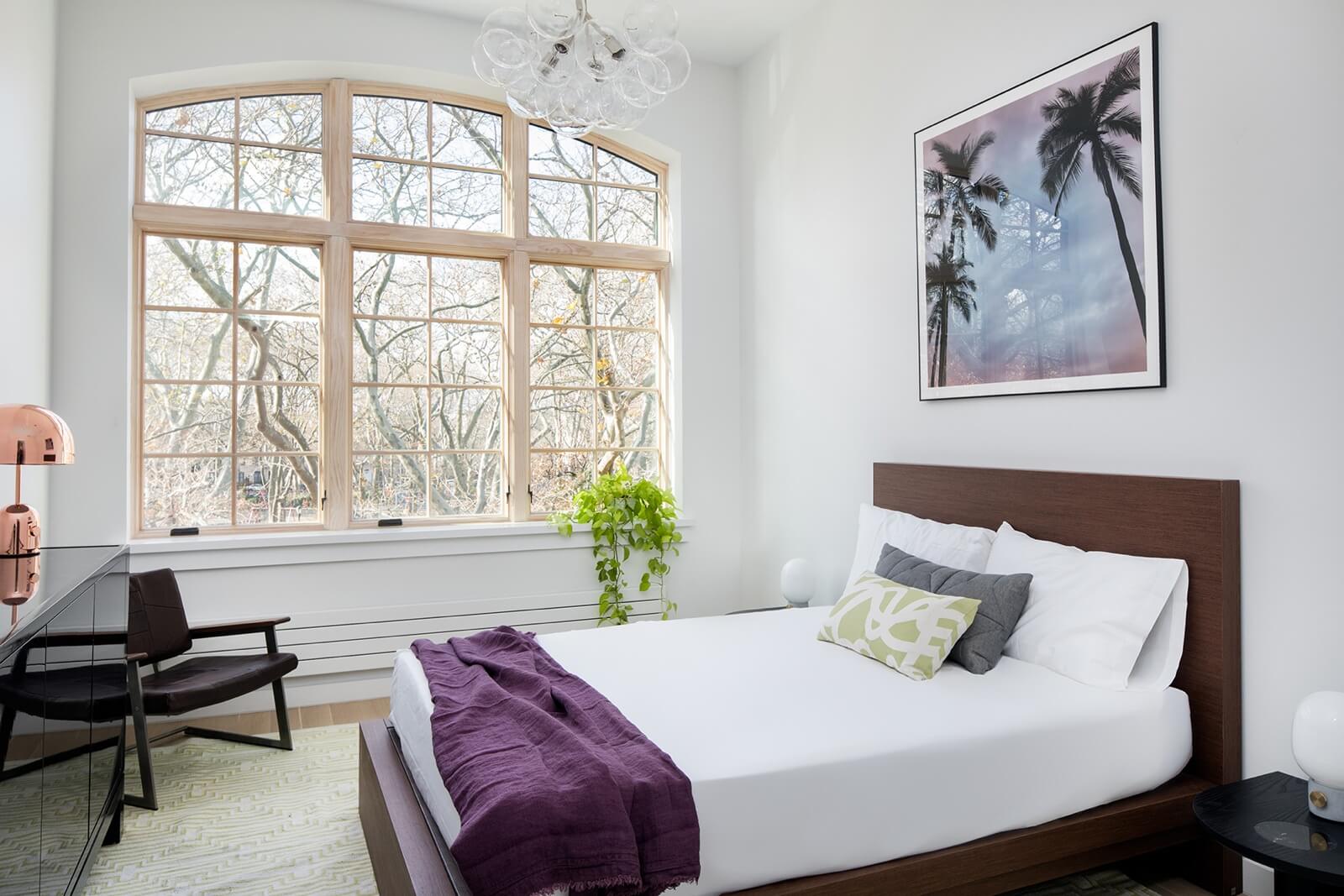
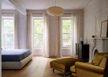
The master bedroom’s exceptional window overlooks McGolrick Park. Furnishings include pieces from Desiron, Aelfie and Volk, obtained through WorkOf.
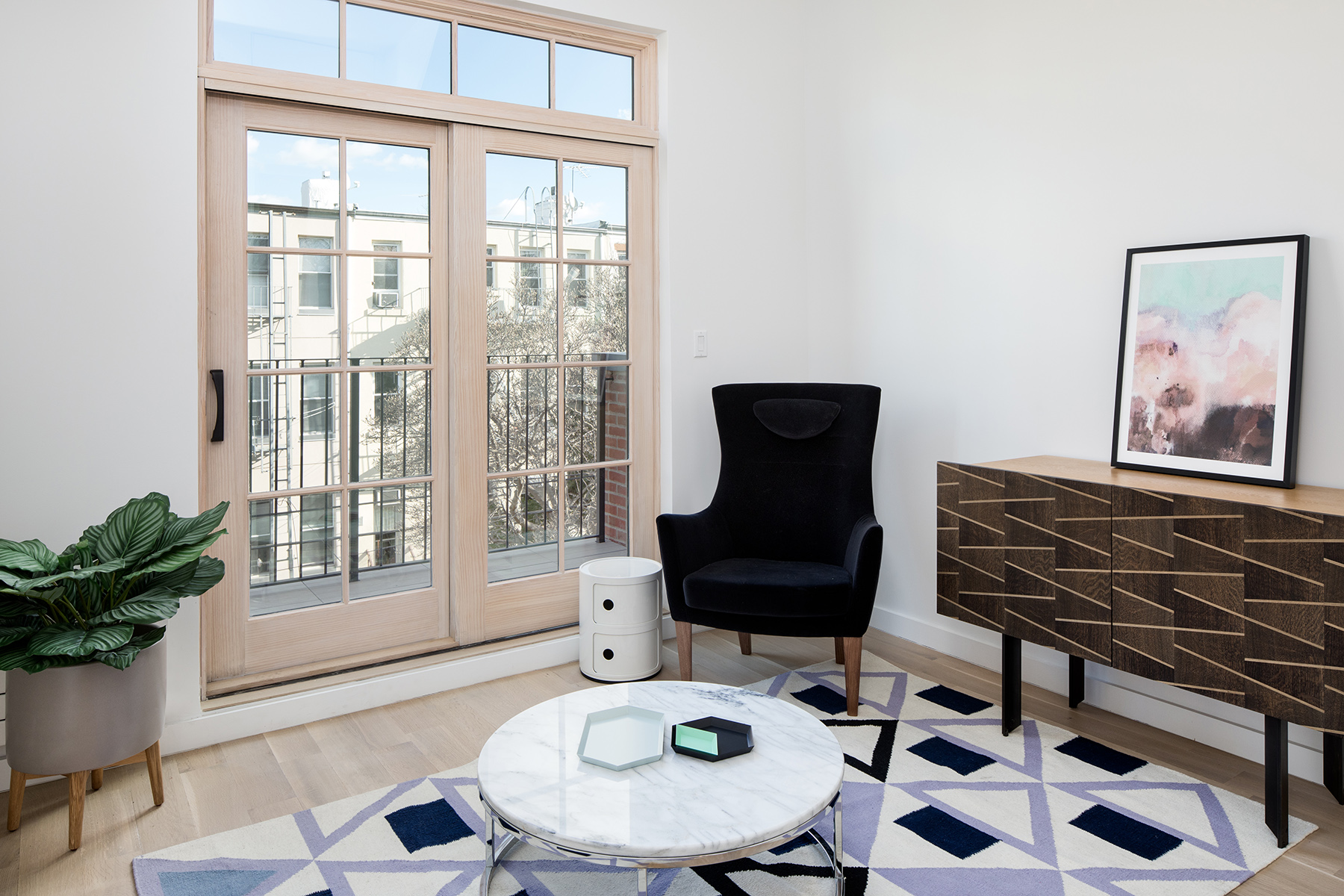
A study on the top floor at the rear of the house is also furnished with pieces from Token and Volk and a rug from Aelfie, all represented by WorkOf.
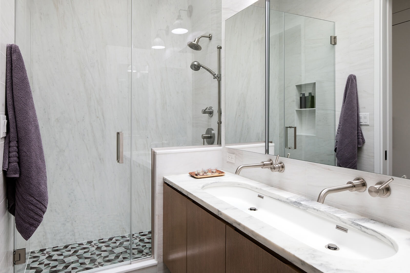
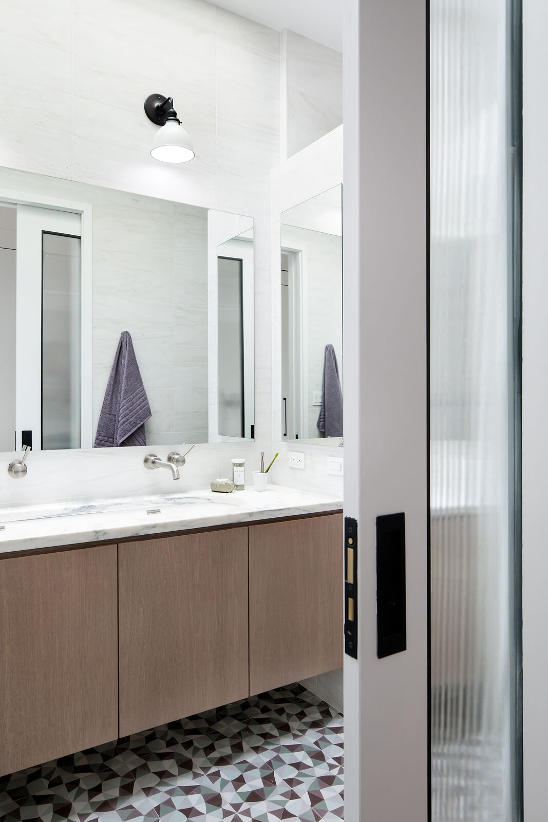
Cement tile flooring by Laura Gottwald clads the floor of the skylit master bath. The shower is marble-lined.
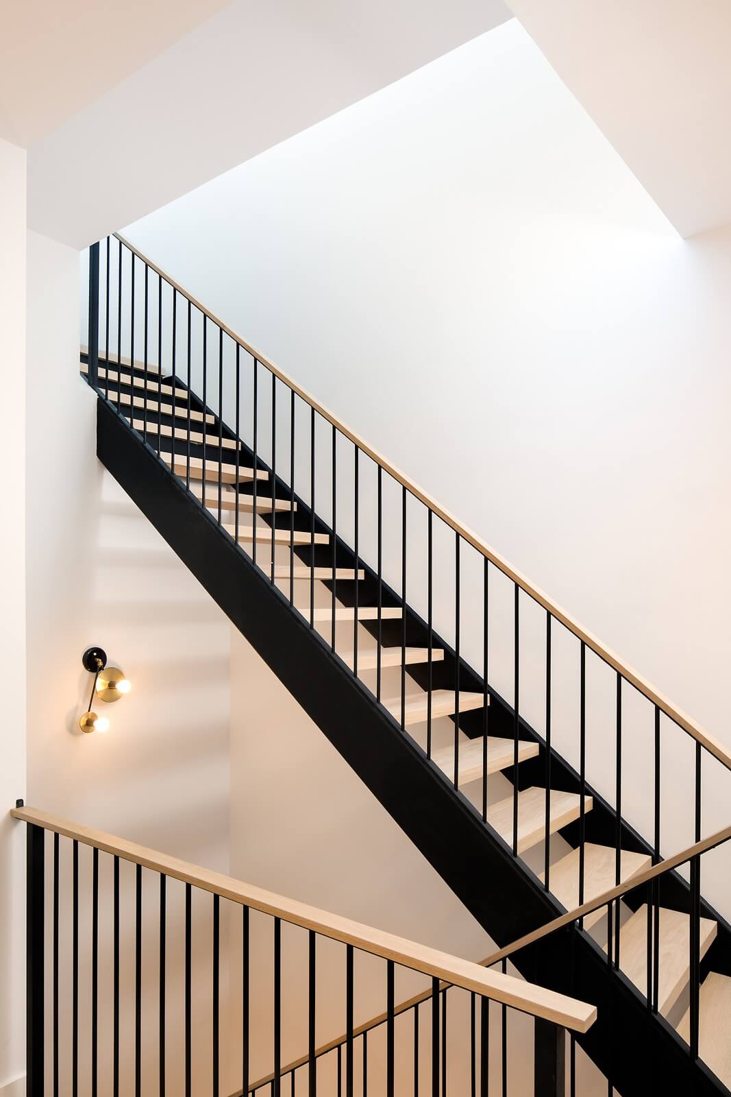
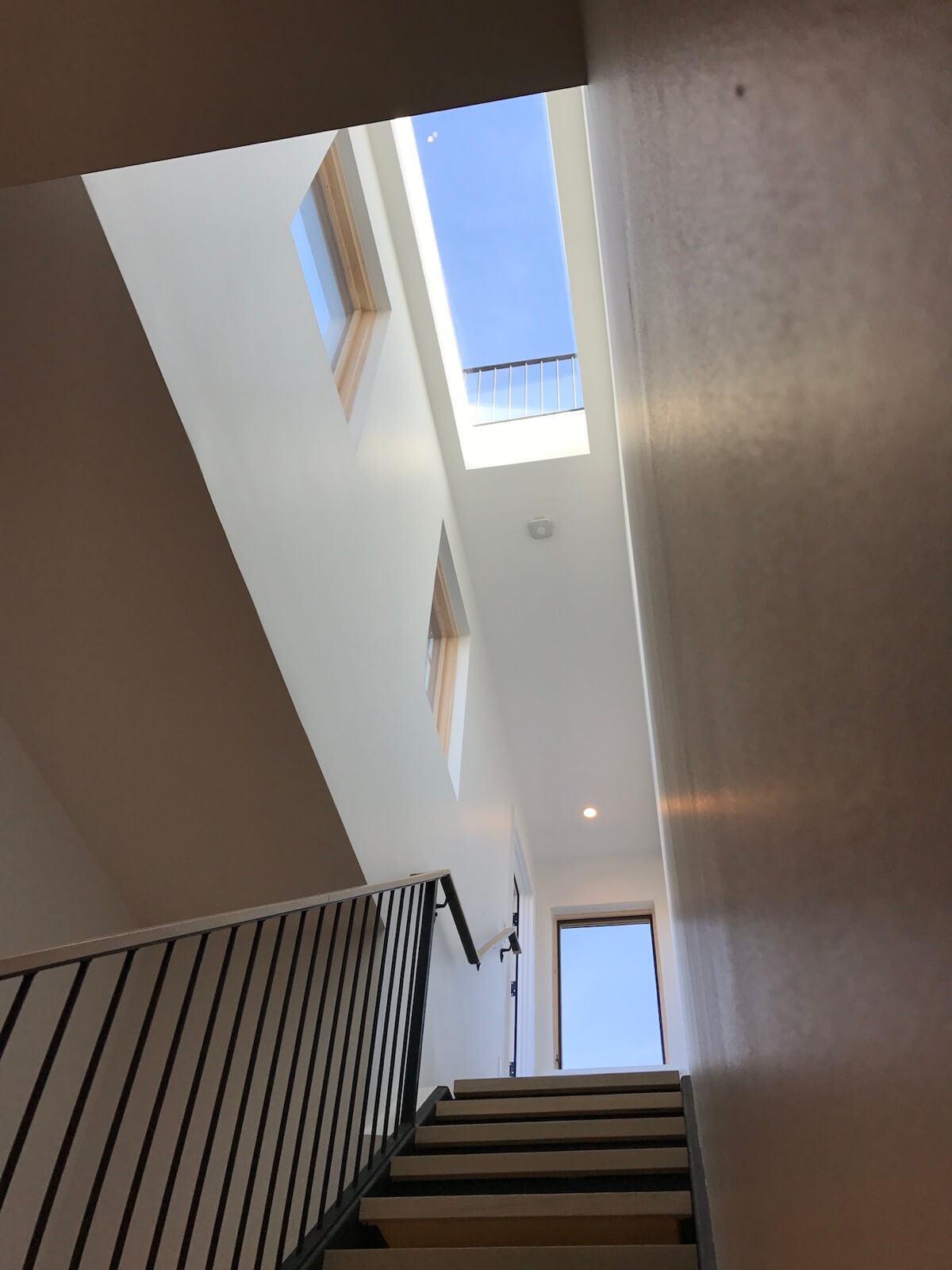
Multiple windows maximize natural light coming into the stairwell and down through the building.
[Photos by Travis Mark]
Check out ‘The Insider’ mini-site: brownstoner.com/the-insider
The Insider is Brownstoner’s weekly in-depth look at a notable interior design/renovation project, by design journalist Cara Greenberg. Find it here every Thursday morning. Got a project to propose for The Insider? Contact Cara at caramia447 [at] gmail [dot] com.
Related Stories
- The Insider: Brownstoner’s in-Depth Look at Notable Interior Design and Renovation Projects
- The Insider: Landmarked Greenpoint Row House Gains Cornice, Loses Asbestos and Flooding
- The Insider: Stylish Greenpoint Gut Reno Joins Modern with Rustic
Business Mentioned Above






What's Your Take? Leave a Comment