The Insider: Walking the Line Between Fresh and Traditional in a New Brooklyn Heights Apartment
Designer Kathryn Scott took an “architecturally chaotic” apartment and gave it a big dose of style, organization and function.

“There were some positive features and some weird challenges,” said Brooklyn Heights-based interior designer Kathryn Scott about the three-bedroom unit her clients had just purchased in a newly constructed five-story building.
On the plus side, it was 4,000 square feet, bright and open, with beautiful wood floors and a kitchen and baths that needed no work at all. But the other rooms were devoid of detail and “architecturally chaotic,” Scott said — until she rectified matters and gave the apartment a big dose of style and function.
The transformed space, now with a wealth of carefully considered detail and furnishings that walk the line between contemporary and traditional, is one of several Brooklyn residences featured in Creating Beauty, a new coffee table book of Scott’s work, just published by Rizzoli. The lavish monograph also includes some of Scott’s Manhattan and Hudson Valley projects.
Before her ministrations, “none of the windows were on the same plane, all the doors were different heights, and there were sprinkler heads where you would put drapery hardware,” Scott said.
She added custom plaster crown molding throughout and unified the door heights, adjusting their casings. That went a long way toward making the space feel more organized.
Scott also addressed functional issues, including office space for the husband, who works at home part-time and needs three computer screens, but didn’t want to be “stuck in a closet,” the designer said. She conceived a 32-inch-deep arched ‘cabinet’ with a work surface between the living and dining rooms, with custom walnut doors on both sides. The computers and their cables can be tucked completely out of sight and the work surface used as a buffet for entertaining.
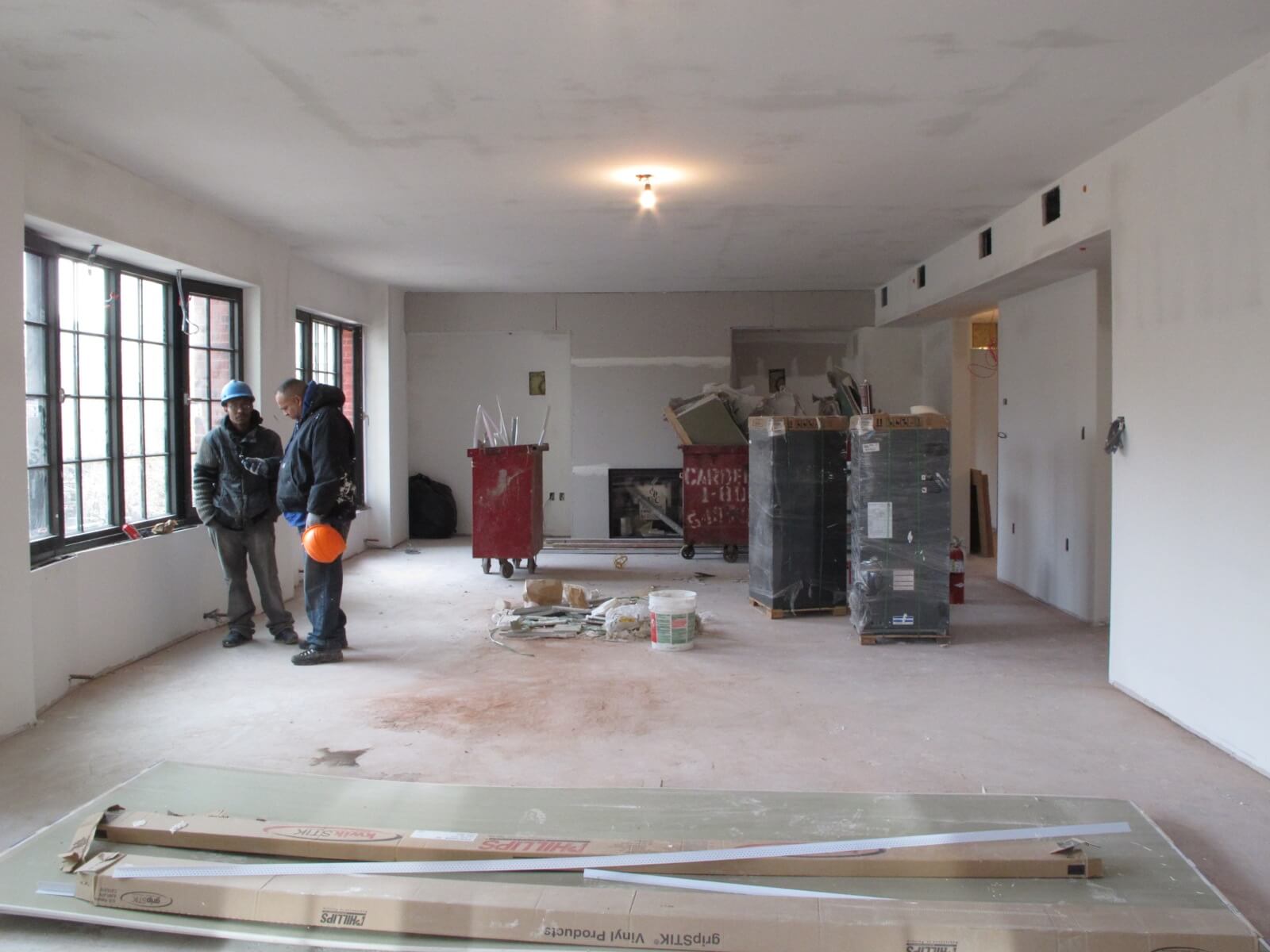
The new-construction unit had great light from large windows but was utterly lacking in detail.
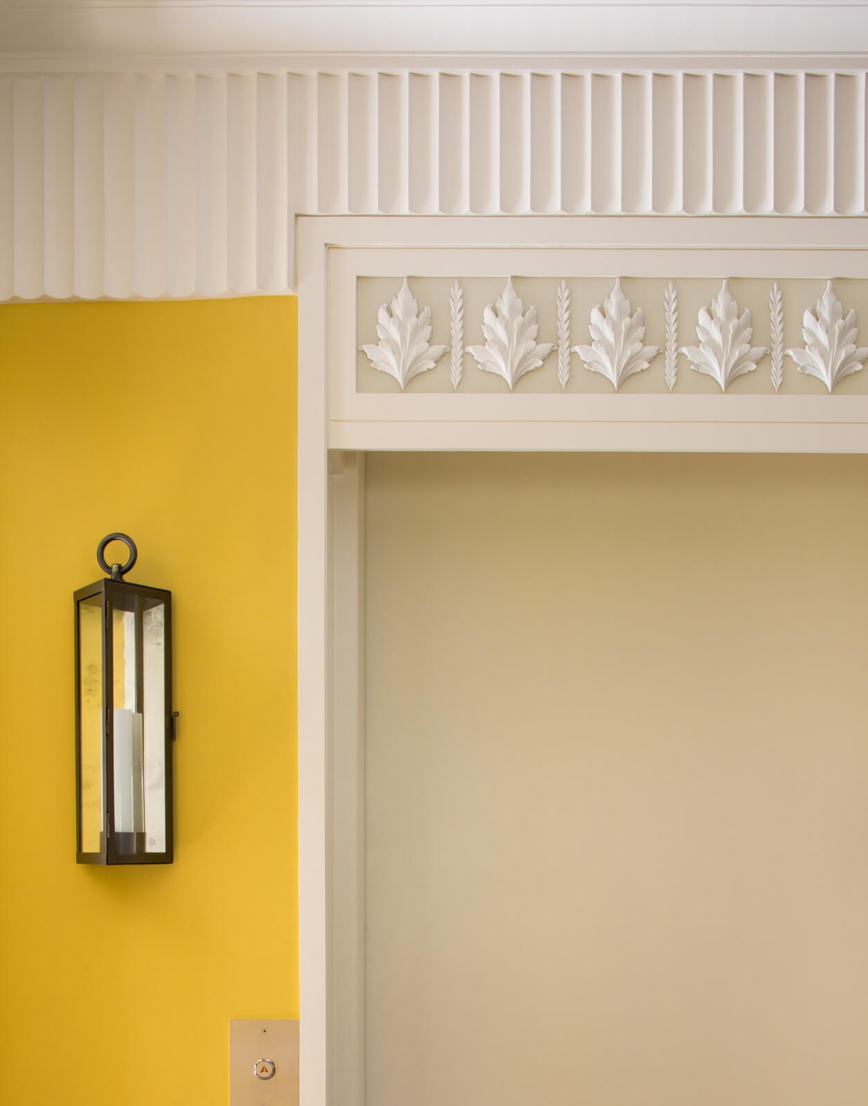
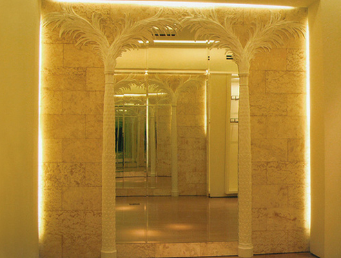
The bright yellow entry foyer (painted Showtime by Benjamin Moore) is a vivid departure from the mostly neutral decor.
The scalloped plaster molding and other custom moldings throughout the space are the work of Architectural Sculpture and Restoration (ASRNY).
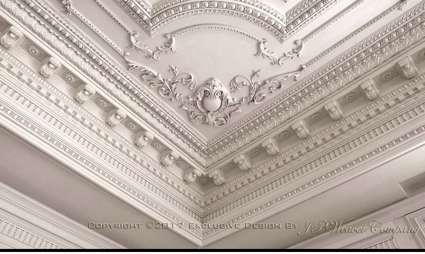
Elaborate trim above the elevator door is a composite of decorative elements bought as individual pieces and mounted on top of iridescent glass by JP Weaver.
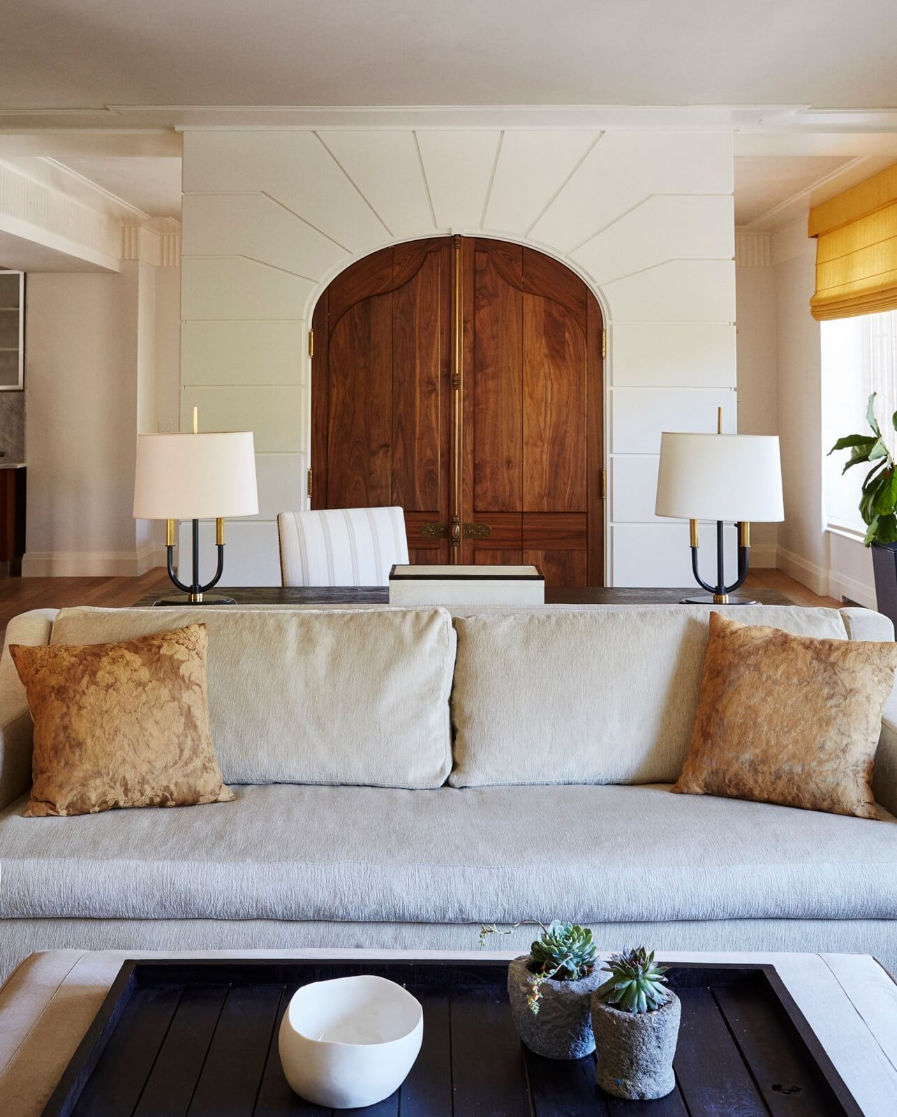
The custom sofa from Cisco Brothers is covered in outdoor fabric from Holly Hunt so as to be kid- and dog-friendly.
The pair of lamps came from Visual Comfort.
The arched cabinet’s walnut doors fold back like shutters. “You can open them all the way and see through from living room to dining room,” and vice versa, Scott said.
On the sides of the cabinet, whose fronts are reminiscent of an arc de triomphe, there’s built-in storage for files and dishes.
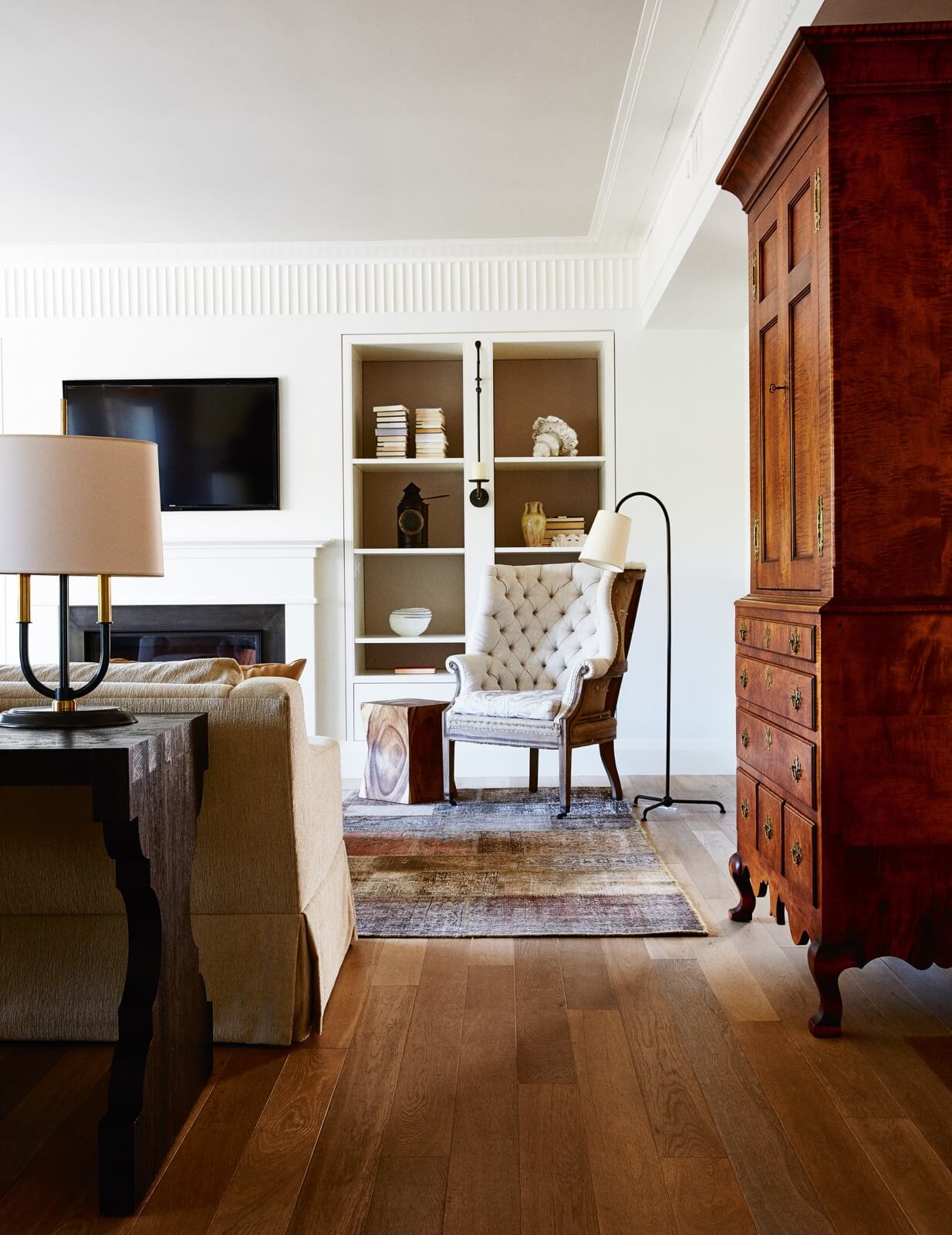
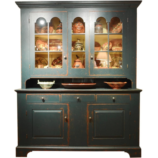
A reproduction Americana linen press of tiger maple from David T. Smith holds a copier and office supplies.
The tufted wing chair from Restoration Hardware was given a custom damask cushion to dress it up a bit.
The clients wanted décor that was “a little more traditional, but still fresh,” Scott said. “We used Americana as a reference, without being 100 percent literal.”
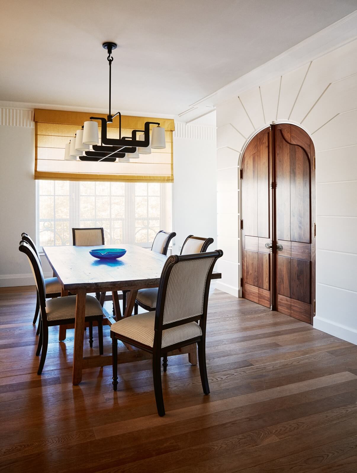
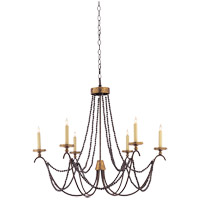
Chairs from Artistic Frame surround a dining table from ClubCu. The chandelier came from Dessin Fournir.
Yellow Roman shades carry the color of the entry throughout the apartment.
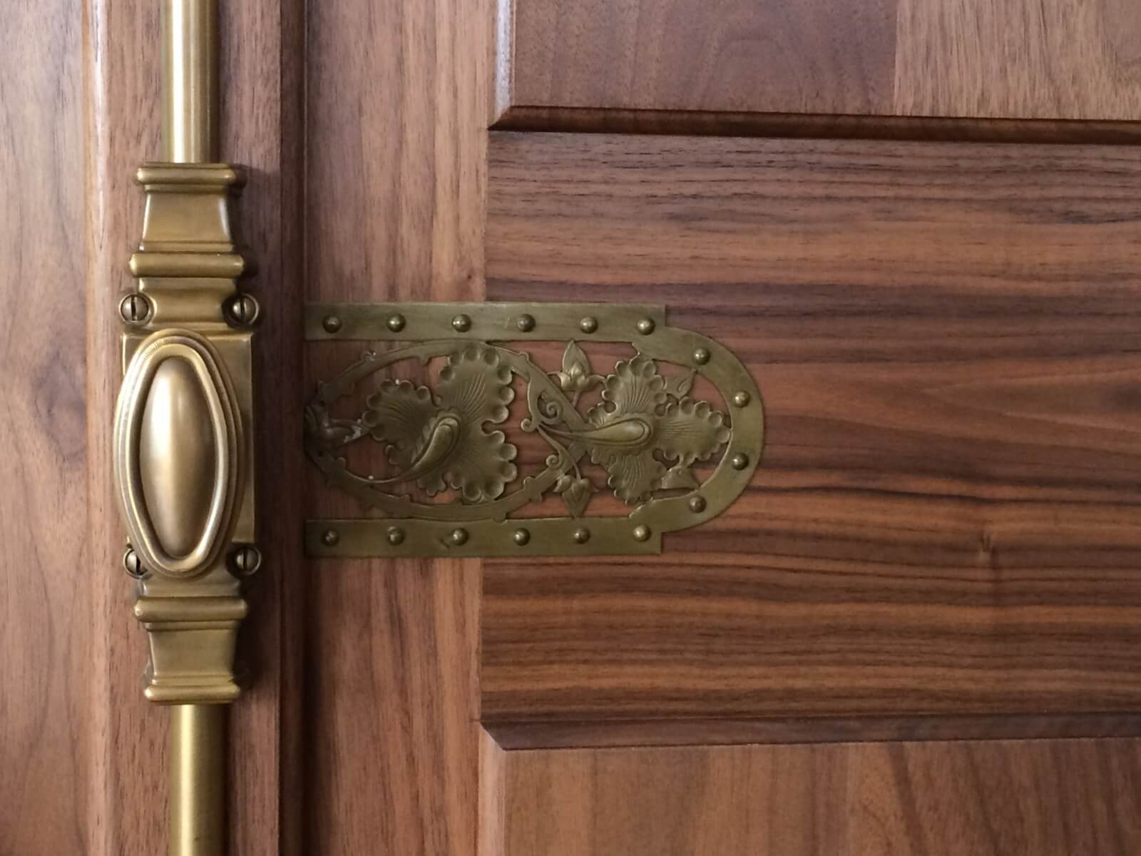
Scott found the decorative hardware in a flea market 20 years ago and was delighted to have finally found a use for it. “Hardware is the jewelry of a home,” she said. “You want something that has personality.”
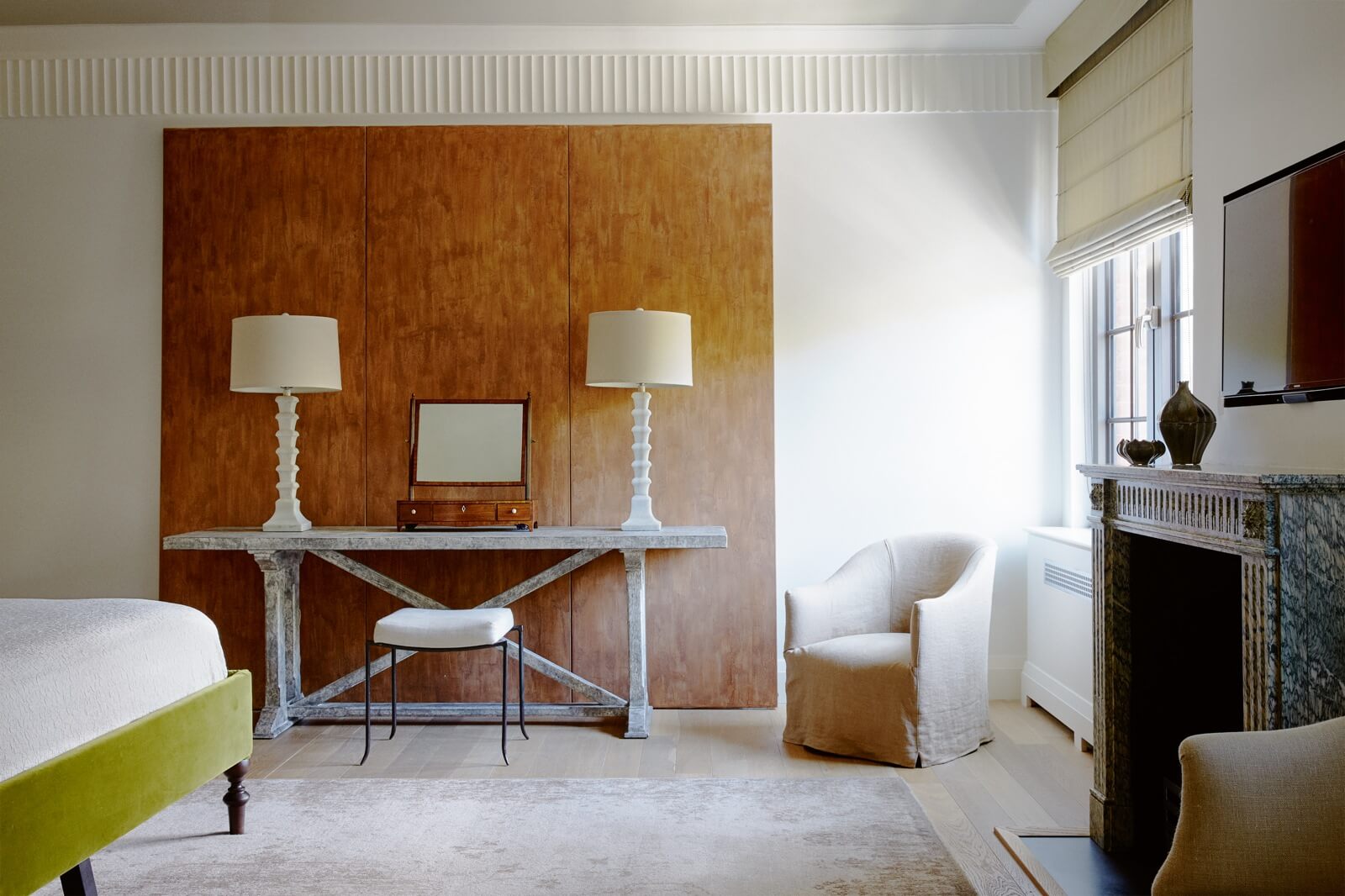
In the master bedroom, a three-part painting by Li Zuming dominates a wall with its earthy terra color. “We wanted to let the furniture be a simple silhouette” against it, Scott said. That includes a dressing table of reclaimed wood from CFC and lamps from Visual Comfort.
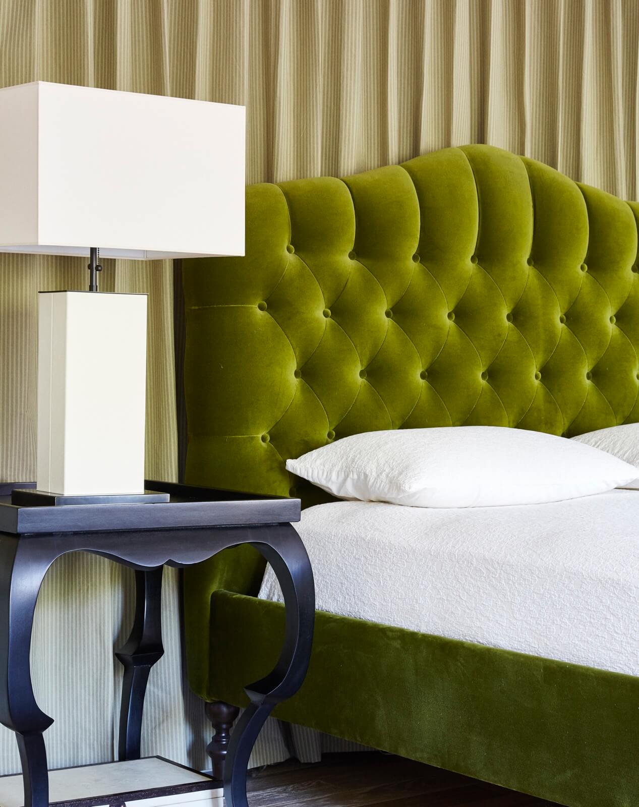
The Cisco Brothers bed, upholstered in grass green velvet from Holly Hunt, is another strong color statement.
An antique marble mantelpiece in the style of Louis XV replaced the existing generic one.
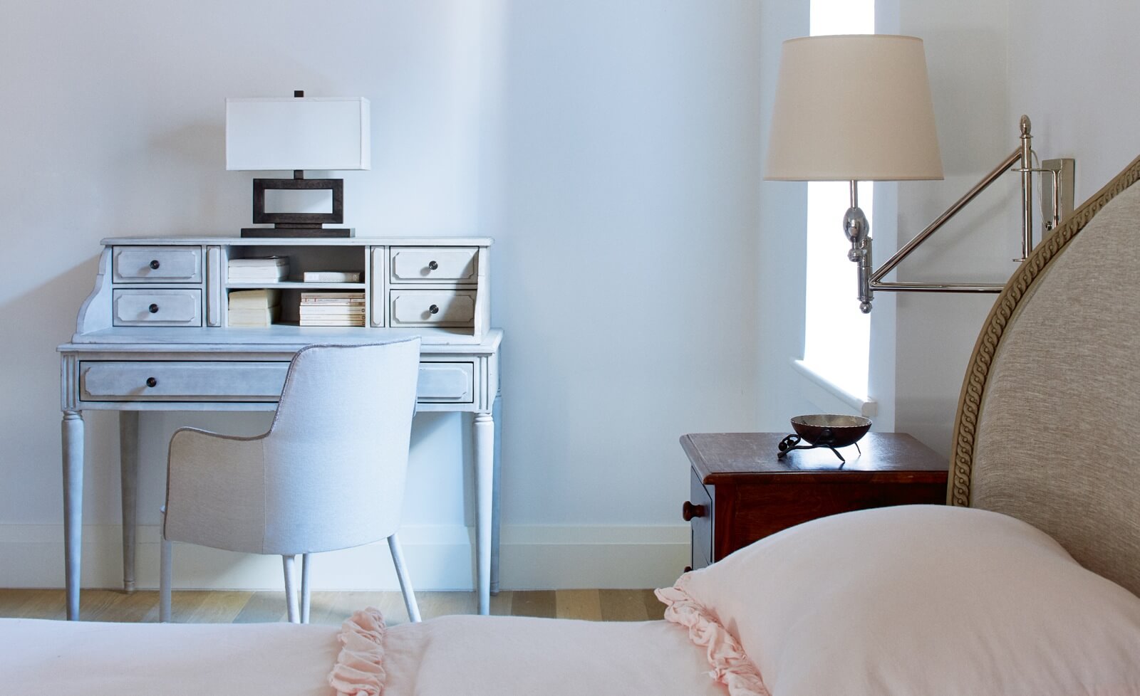
A bed and desk from Restoration Hardware furnish the teenage daughter’s room.
[Photos by William Abranowicz, except “before” photos and hardware detail]
Check out ‘The Insider’ mini-site: brownstoner.com/the-insider
The Insider is Brownstoner’s weekly in-depth look at a notable interior design/renovation project, by design journalist Cara Greenberg. Find it here every Thursday morning. Got a project to propose for The Insider? Contact Cara at caramia447 [at] gmail [dot] com.
Related Stories
- The Insider: Brownstoner’s In-Depth Look at Notable Renovation and Design Projects
- The Insider: Toning Down an Ornate Park Slope Townhouse
- The Insider: Painstaking Reno Polishes a Brooklyn Heights Jewel





What's Your Take? Leave a Comment