The Insider: Architects Brighten Park Slope Co-op for California Family
NV/design.architecture tweaked the details of a long, narrow and dark Park Slope apartment to make it more livable and functional.

Check out the new ‘The insider’ mini-site: brownstoner.com/the-insider
Relocating from Southern California, the new owners of this 1,500-square-foot space in a five-unit Victorian building found the long, narrow hall and dark woodwork a tad oppressive, to say the least. “They were used to light, airy, sunny spaces and it was almost unbearable for them to be in this apartment,” recalled architect Brenda Nelson, a partner with Tom van den Bout in Manhattan-based NV/design.architecture.
The apartment’s dimensions presented an obvious challenge. It’s 70 feet long and 22 feet wide, minus space for the common stair and two light wells that provide light to the three small bedrooms. “We wanted to turn the front and back of the apartment, where the sun comes, into places where everybody would spend most of their time,” Nelson said.
The architects stole inches wherever they could, reducing the size of interior walls that had once contained pocket doors, and removing extraneous doors, built-ins and partitions. They stripped the front and rear thirds of the long hall down to the studs, salvaging woodwork and wainscoting to reuse in the living room.
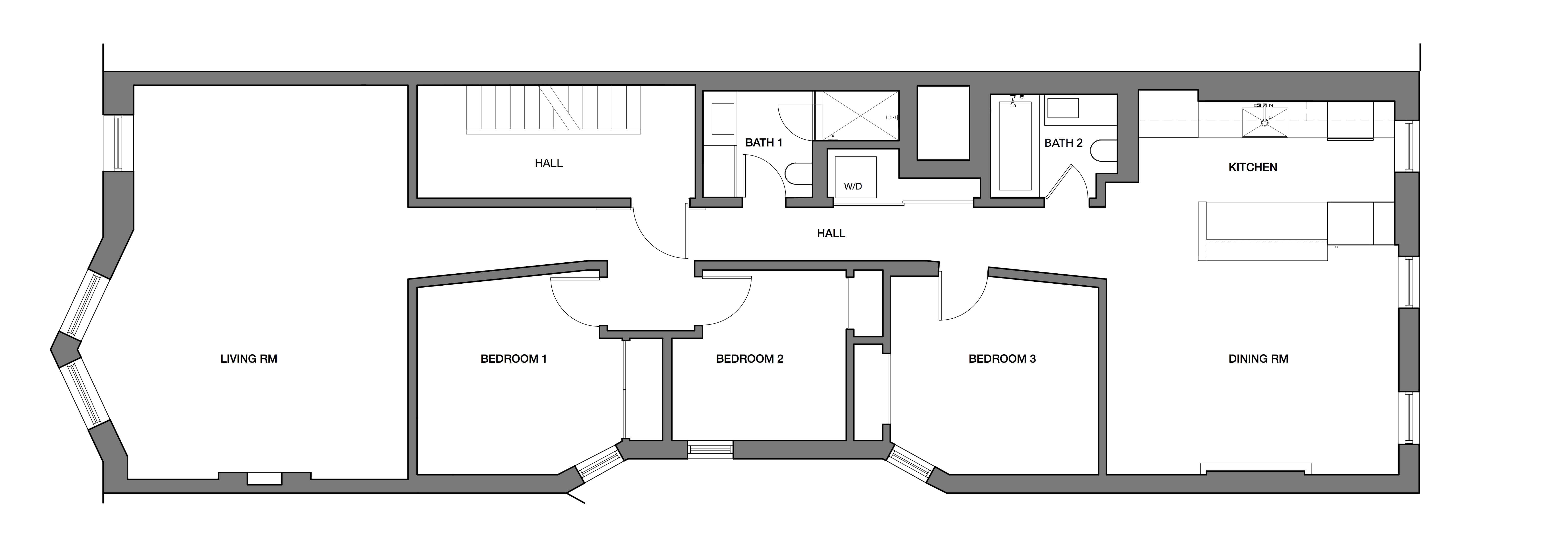
In an ingenious move, they canted the hall walls slightly at either end, “so the light draws you down the corridor,” Nelson said, “instead of feeling like it’s closing in on you.”
NV/da also managed to add a second bath and laundry off the main hall, carving out space for it from a large windowless storage space, and created a vestibule opposite the apartment’s front door for a more gracious entry into the home.
Kelly Construction was the general contractor.
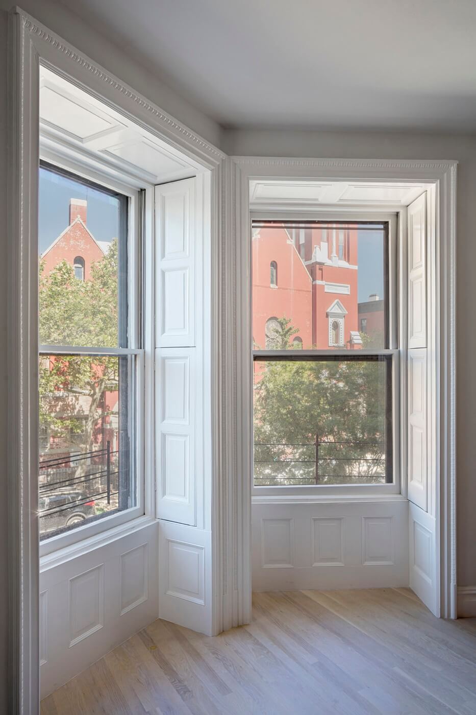
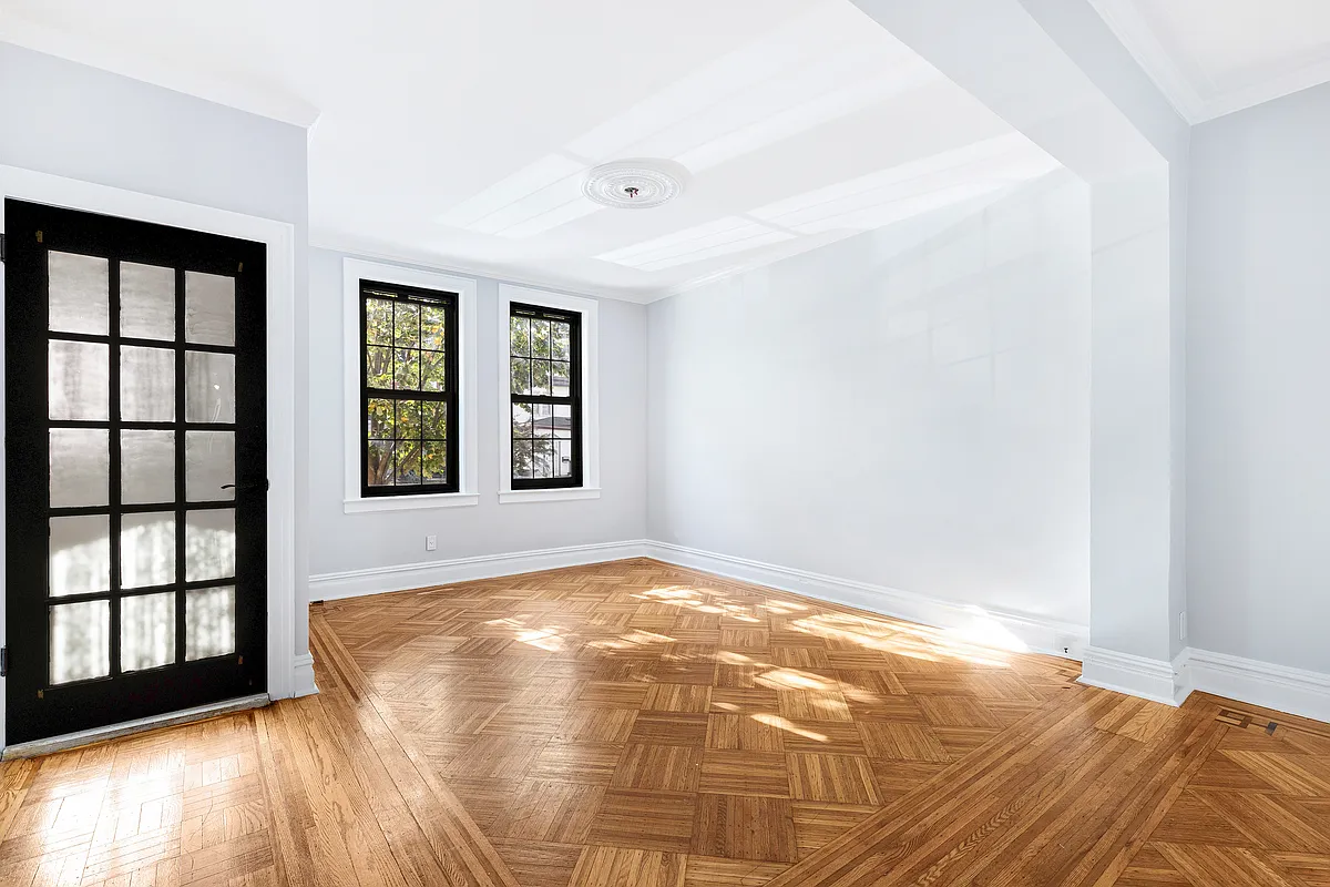
Original moldings and shutters in the living room were “mostly all there,” Nelson said.
New oak flooring was laid in the common areas. In the bedrooms, the architects kept the original floors.
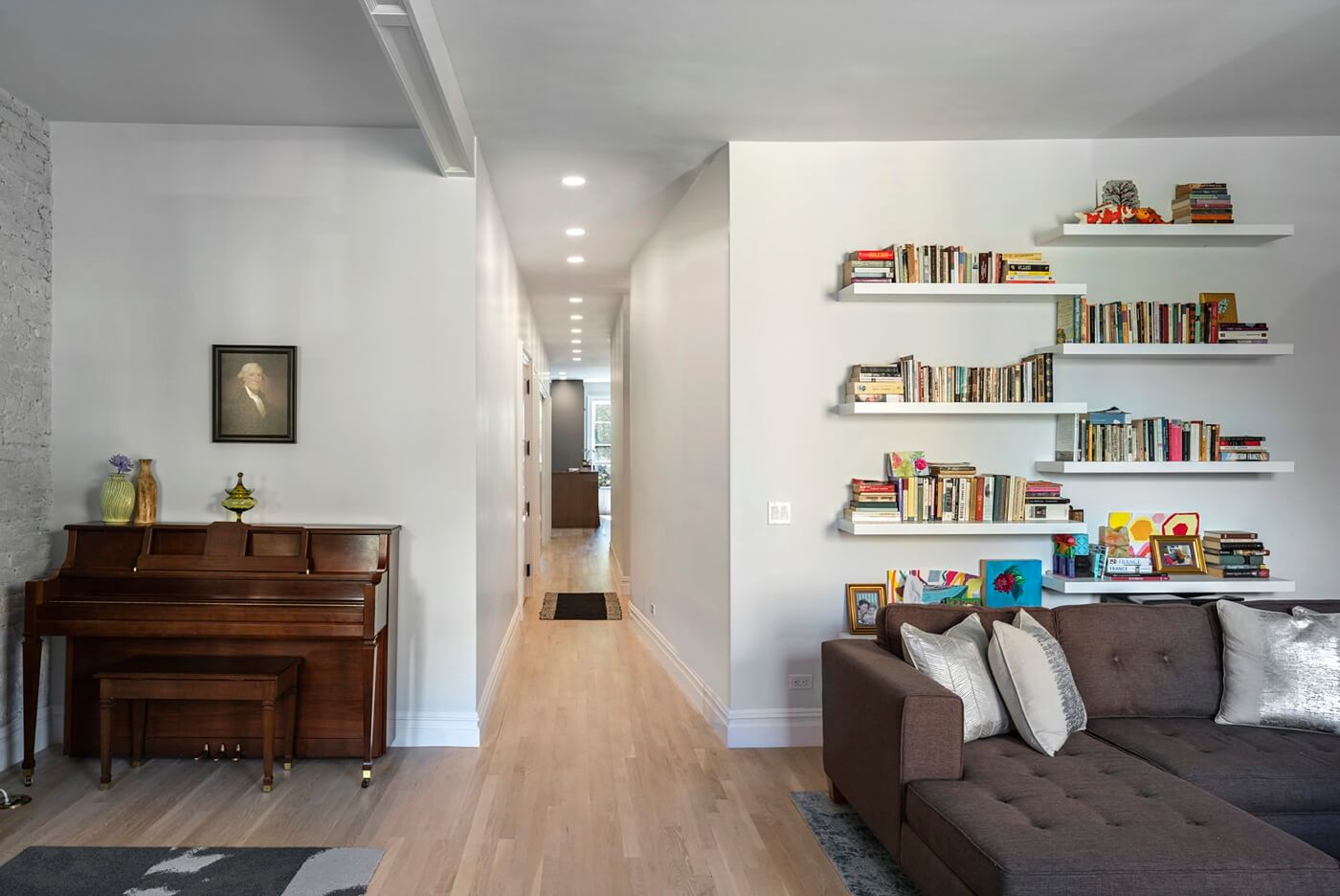
The newly canted, well-lit hall, runs nearly 40 feet from the living room at the front of the apartment to the kitchen at the rear.
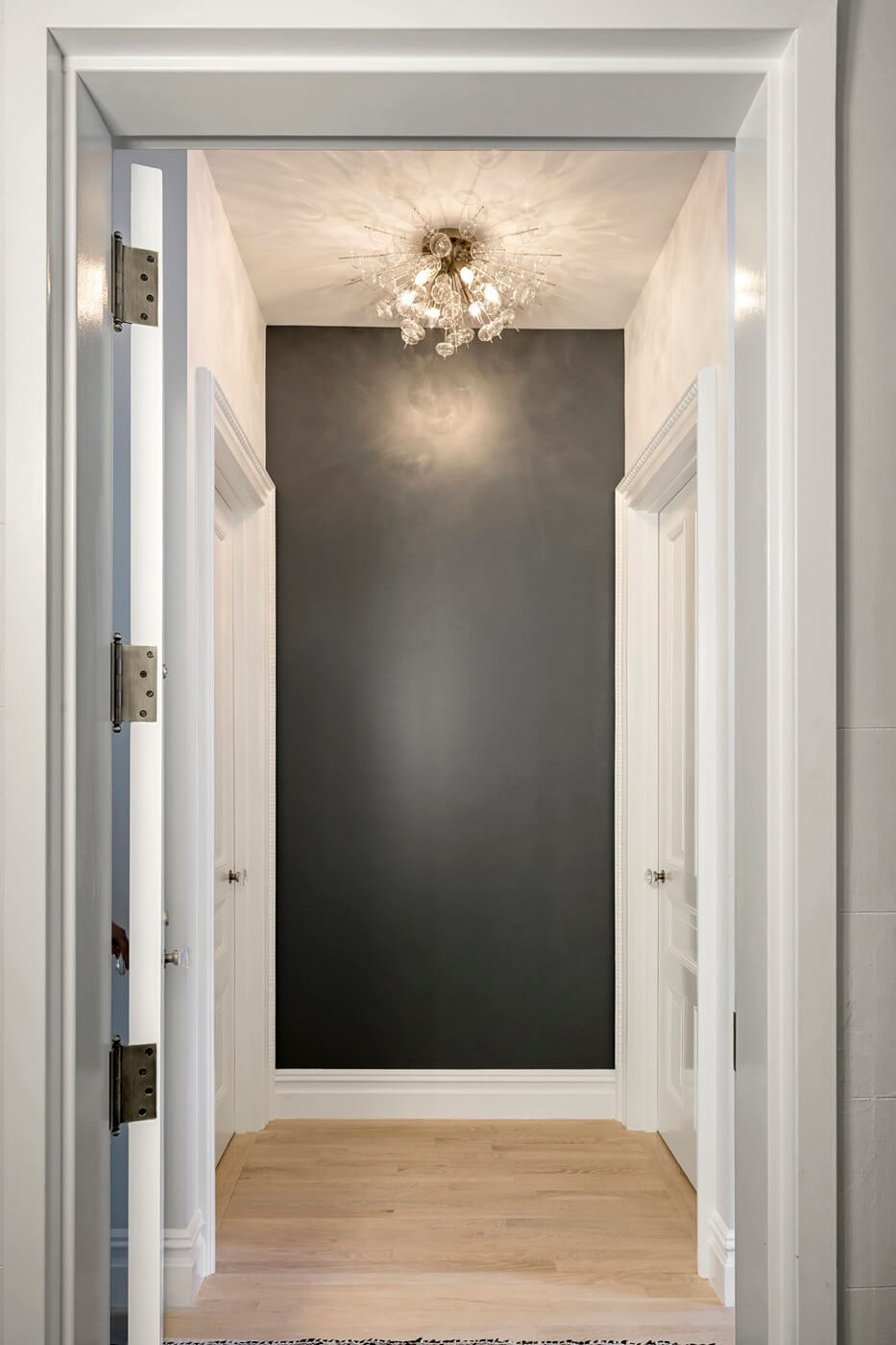
The new vestibule opposite the front door between the children’s bedrooms does double duty as an occasional play area. “The apartment needed a sense of entry,” Nelson said.
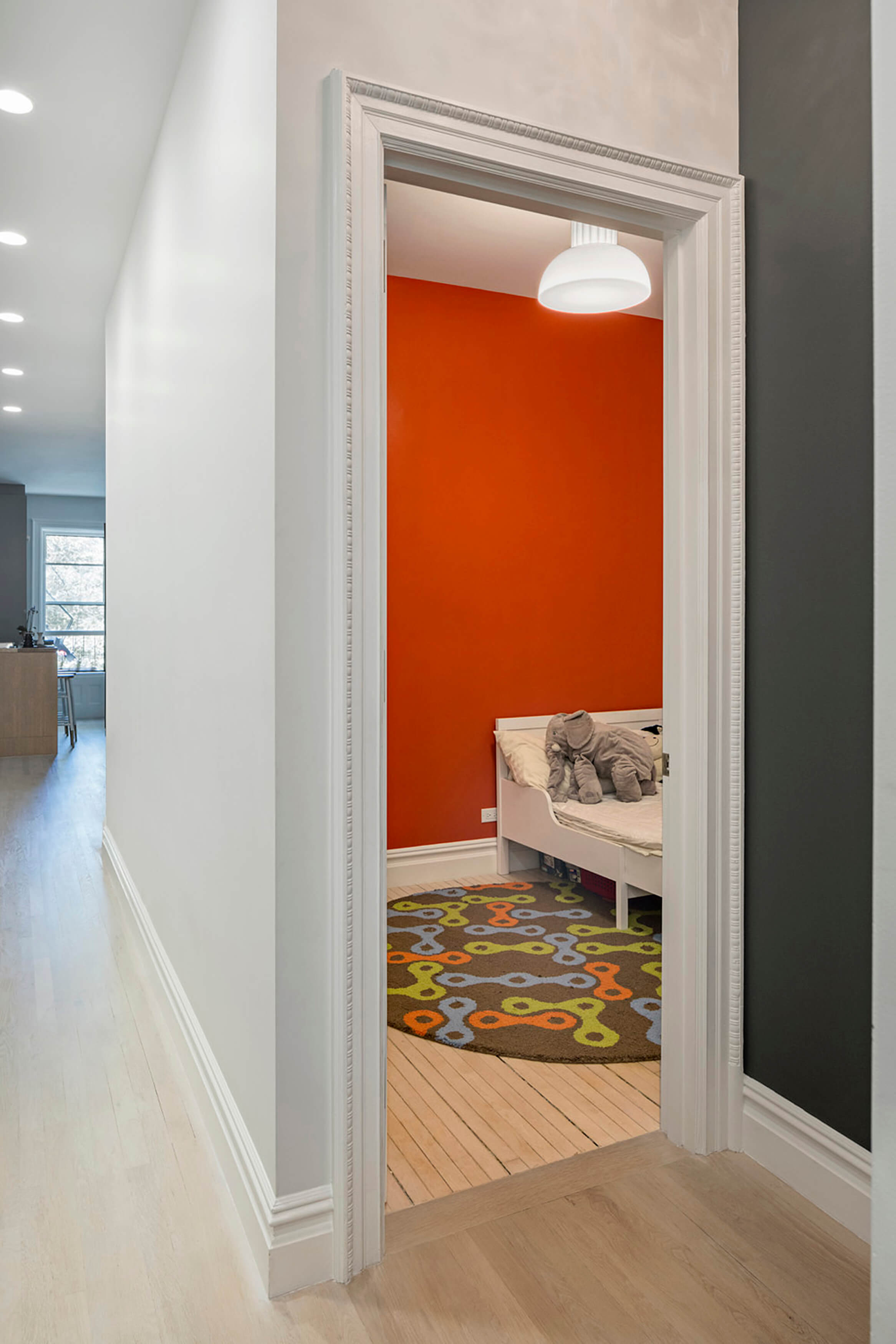
A glimpse into one of the children’s rooms shows the original wood floor there. New oak flooring was laid in the common areas.
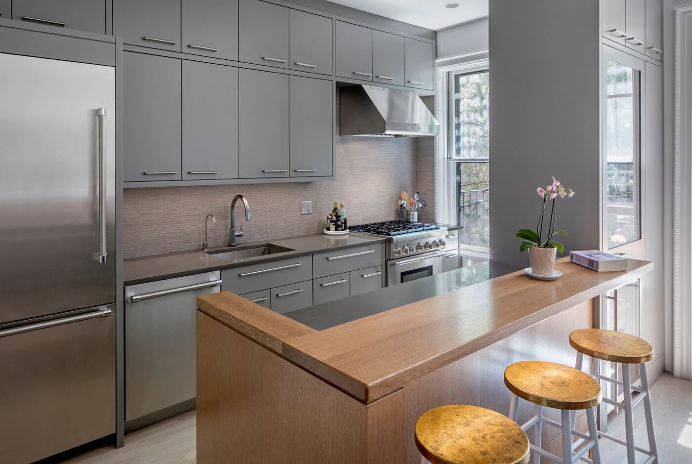
The all-new kitchen at the rear of the apartment is kitted out with custom cabinetry of painted wood, made by Ideal Design Custom Woodworking, along with engineered stone countertops and a backsplash of porcelain tile from Nemo Tile.
Appliances came from Thermador and Miele.
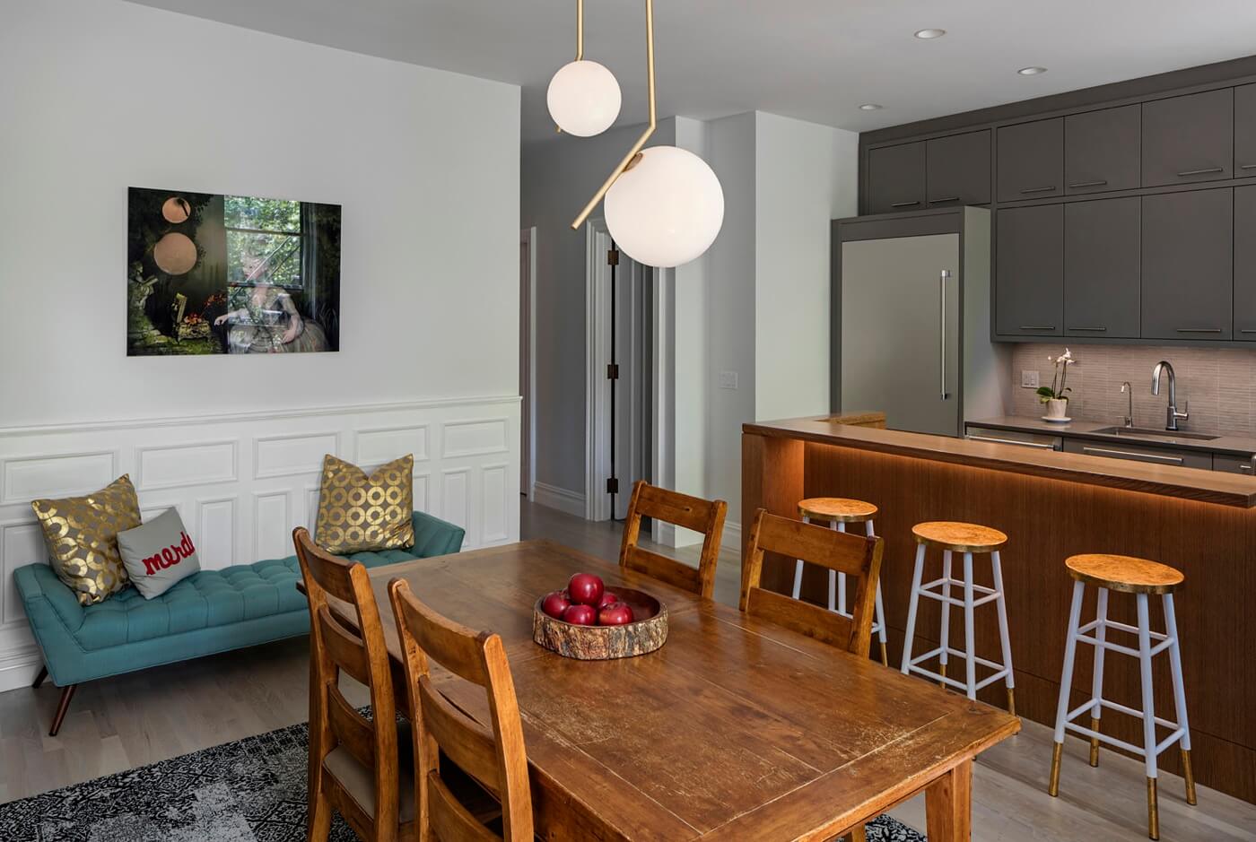
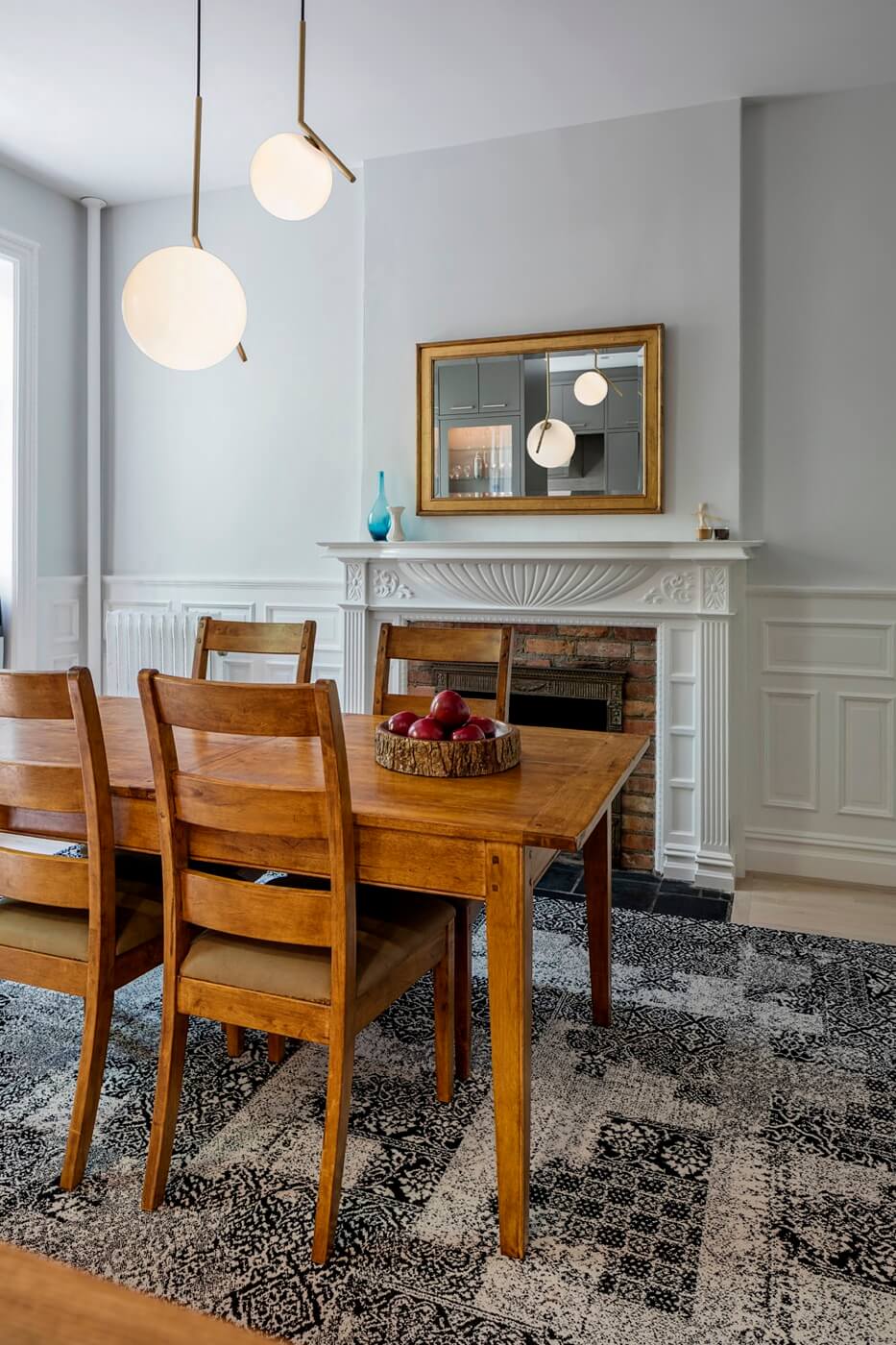
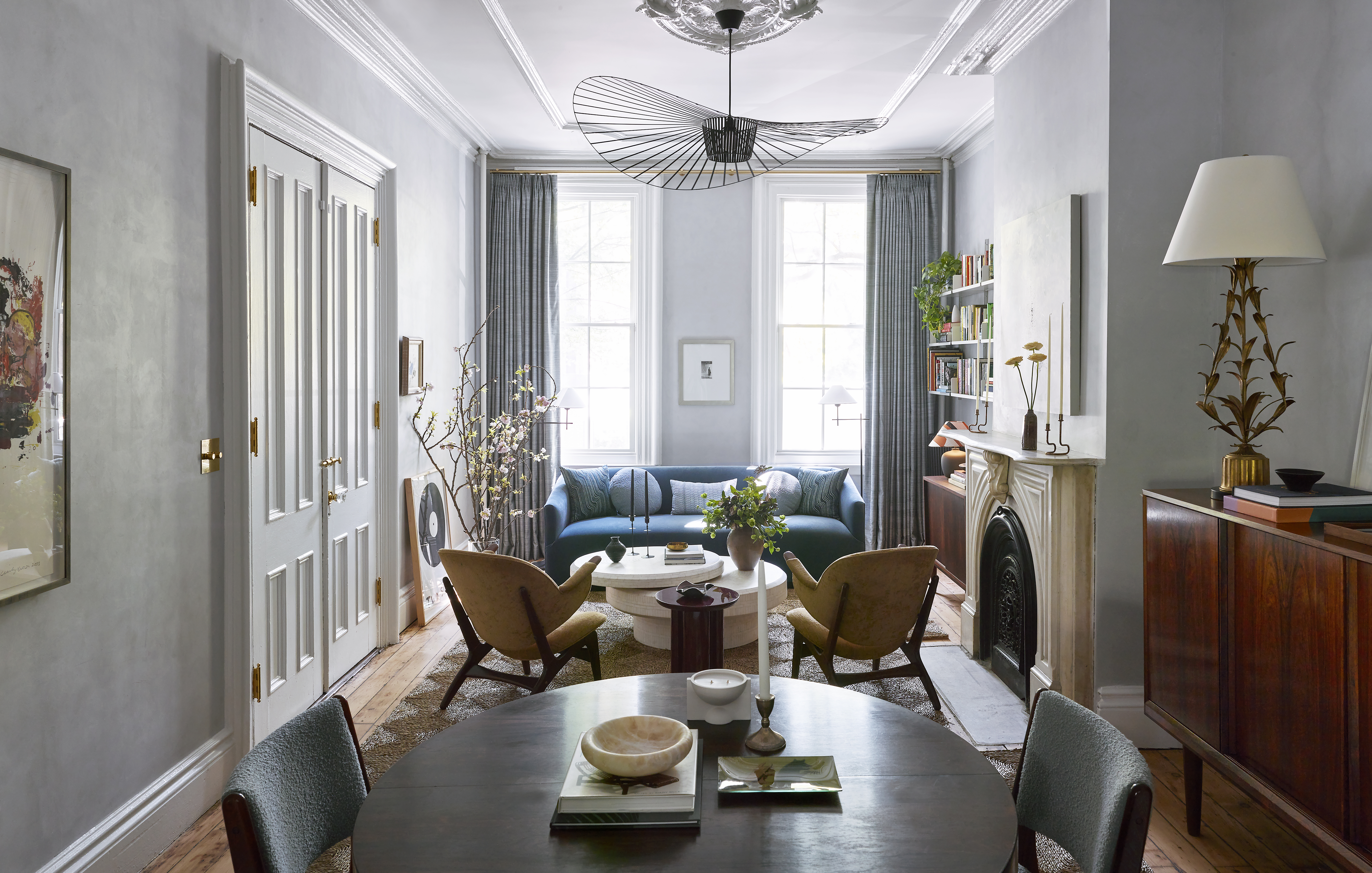
The original mantel and wainscoting in the dining room, originally dark wood, were painted white.
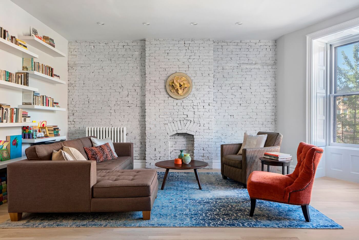
The architects and homeowners together decide to remove the crown molding here as well as in the living room, where they whitewashed an exposed brick wall (photo at top).
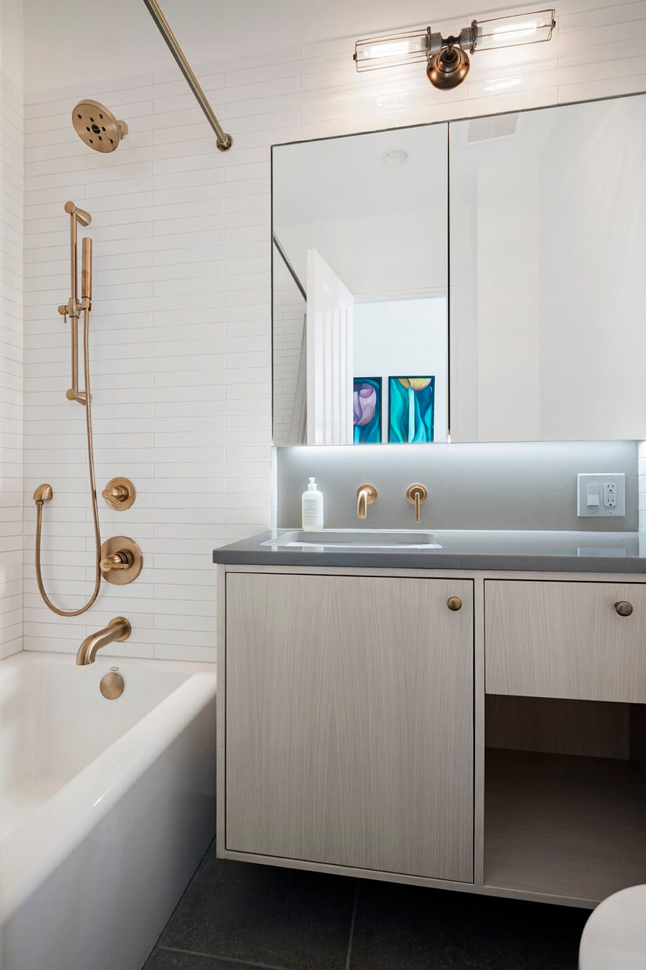
Tubs and sinks from Kohler, lighting from Restoration Hardware and brass plumbing fittings from Delta outfit the new bathroom.
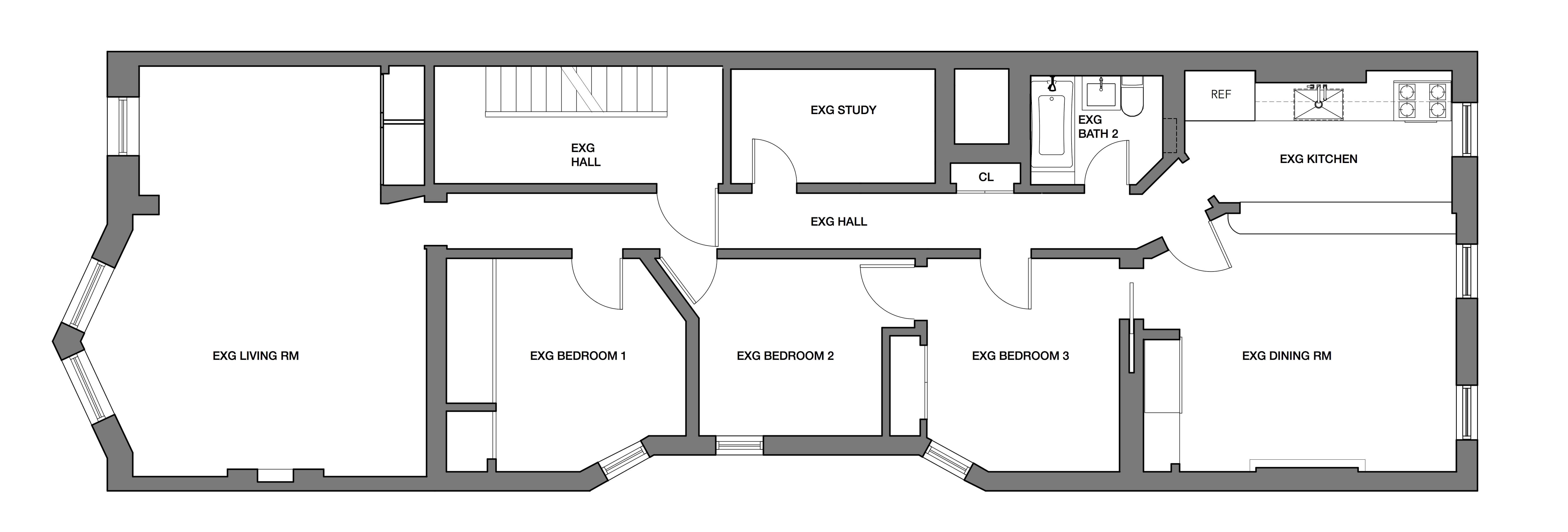
Note the long straight hallway in the “before” plan, above, and the way the hallway walls have been angled to make the passage less confining in the current plan, below.
NV/da rethought the three existing bedrooms, making them more functional by closing off the connecting door between two of them and using the space gained for a new closet.
A windowless area previously used for storage was turned into a second bath.
See below for what came before.
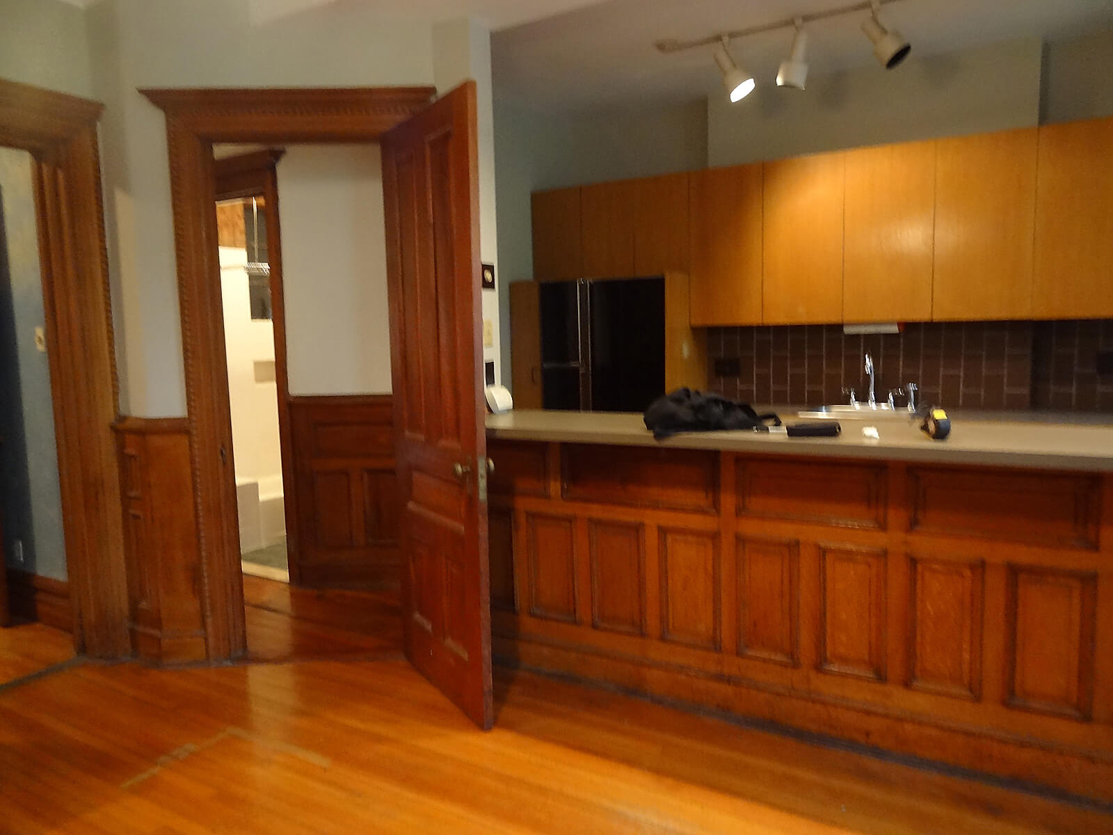
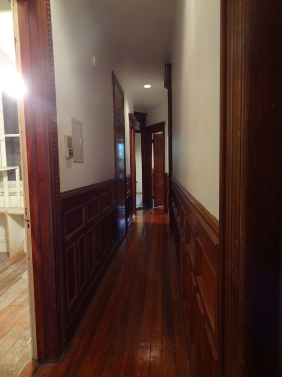
[“After” photos by Gustav Hoiland of Flagship Photo]
The Insider is Brownstoner’s weekly in-depth look at a notable interior design/renovation project, by design journalist Cara Greenberg. Find it here every Thursday morning.
Got a project to propose for The Insider? Contact Cara at caramia447 [at] gmail [dot] com.
Related Stories
The Insider: Designer Gives Vintage Park Slope Apartment Some “Down Home Cozy” Charm
The Insider: Young Designer Decorates First Apartment from Scratch for Park Slope Couple
The Insider: New Detail and Furnishings Transform Bare Vanilla Apartment in Brooklyn Heights







What's Your Take? Leave a Comment