The Insider: Architect Reconfigures Art-Filled Park Slope Townhouse With Fresh, Unfussy Style
Brooklyn’s Barker Freeman Design Office rethought a Park Slope townhouse for the homeowners, expanding their living space from two floors to three.

After a decade of living in a lower duplex with two rental units above, these homeowners decided it was time to take over more of their townhouse. So they called on architect Alexandra Barker of Gowanus-based Barker Freeman Design Office to create a triplex for their family of four, plus a garden rental.
The couple had been using the garden floor as their main living space, with bedrooms on the parlor floor, which made the renovation that much more of a challenge, not least because the kitchen needed to be relocated. “It was a lot of work, reconfiguring those levels,” Barker said.
She kept expenses down by leaving the bathrooms where they were, for the most part. “We were judicious and didn’t move plumbing around radically,” she said.
Still, plenty of walls were moved or removed. The entry vestibule was enlarged, and two windows on the rear wall were joined to become a door leading to a new deck created by expanding an existing fire escape.
The charming scalloped moldings around many of the doors and windows were patched where they couldn’t be entirely salvaged. Painting them a deep color, Dior Gray by Benjamin Moore, helped disguise any discrepancy between old and new wood, Barker said.
White walls and new pale oak floors set off the spare modern furnishings, with the homeowners’ extensive collection of contemporary art supplying much of the color.
PTL Renovation Inc. was the general contractor.
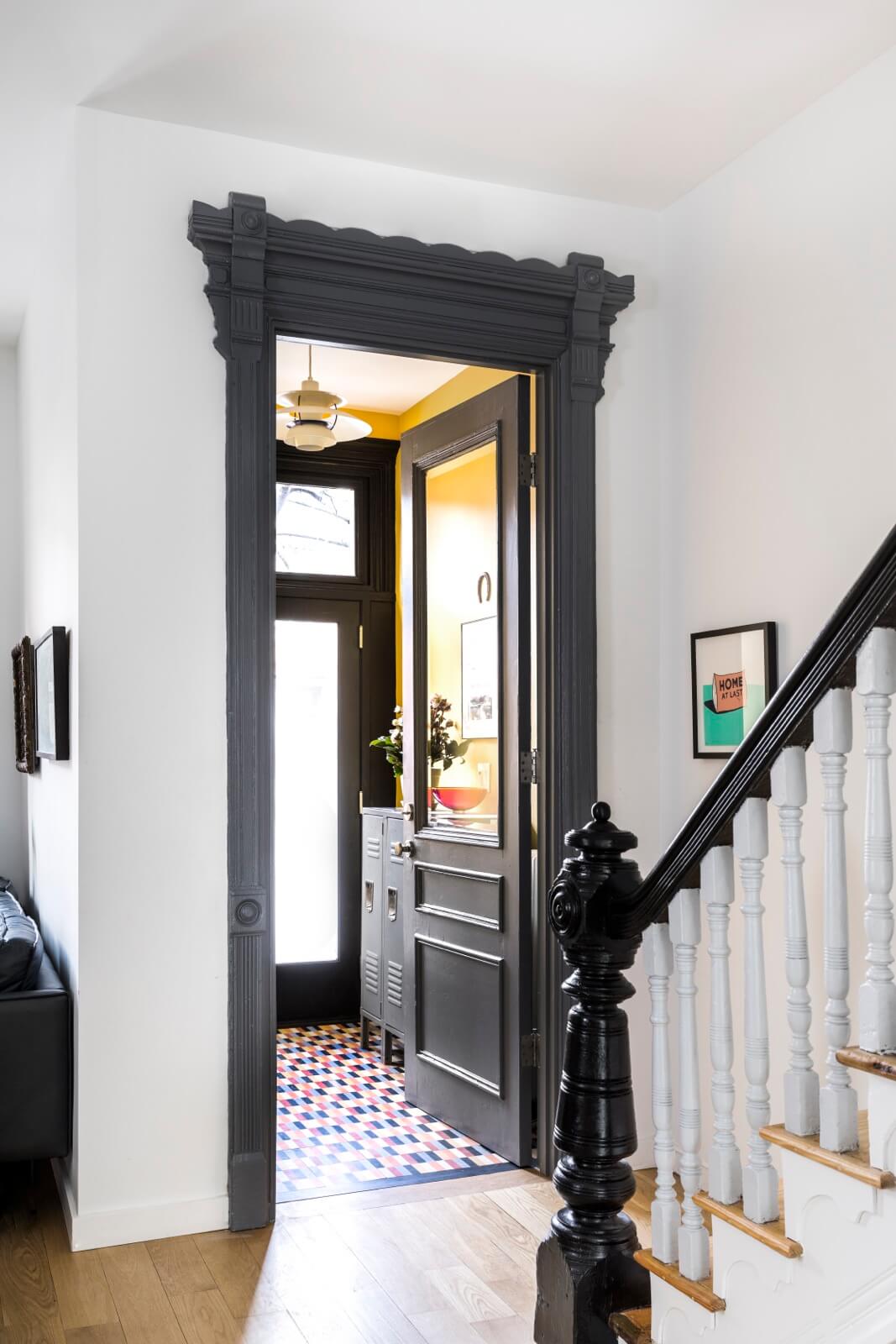
Enlarging the vestibule meant moving the door and the molding around it.
Bright yellow walls (Benjamin Moore’s Hannah Banana) provide a jolt of welcoming color.
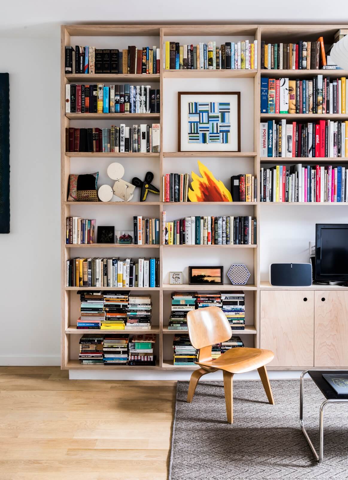
A long wall of shelving in the front living area, custom crafted of Baltic birch plywood, incorporates books, art and a television.
Visible artworks include a framed blue-and-white parquet collage by Larry Krone, a red-and-yellow flame sculpture by Ragnar Kjartansson, a white geometric mouse by Claes Oldenburg and a black scissor sculpture by John Martin.
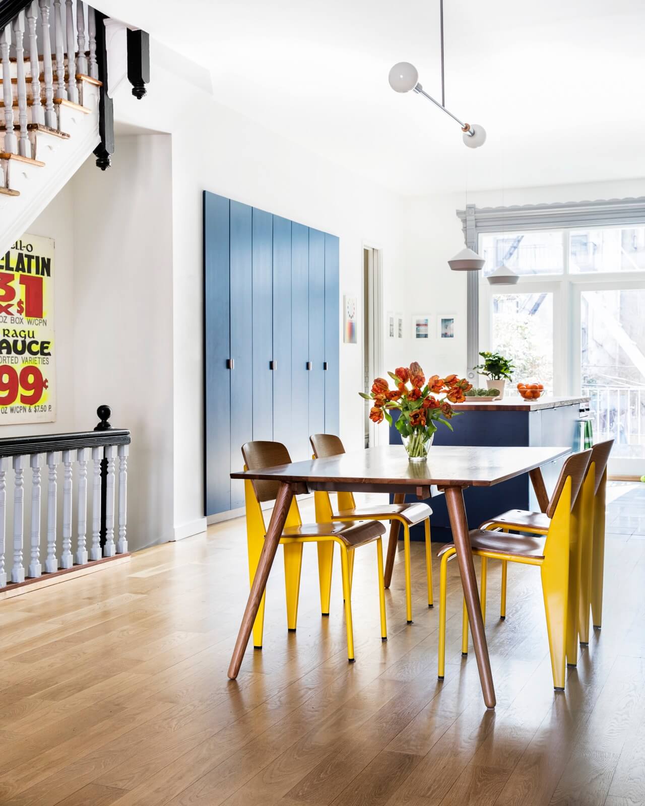
A generous wall of pantry cabinets is set into an alcove under the stairs. Like the lower cabinets in the kitchen opposite, their interiors are IKEA boxes, upgraded with custom doors made by the general contractor.
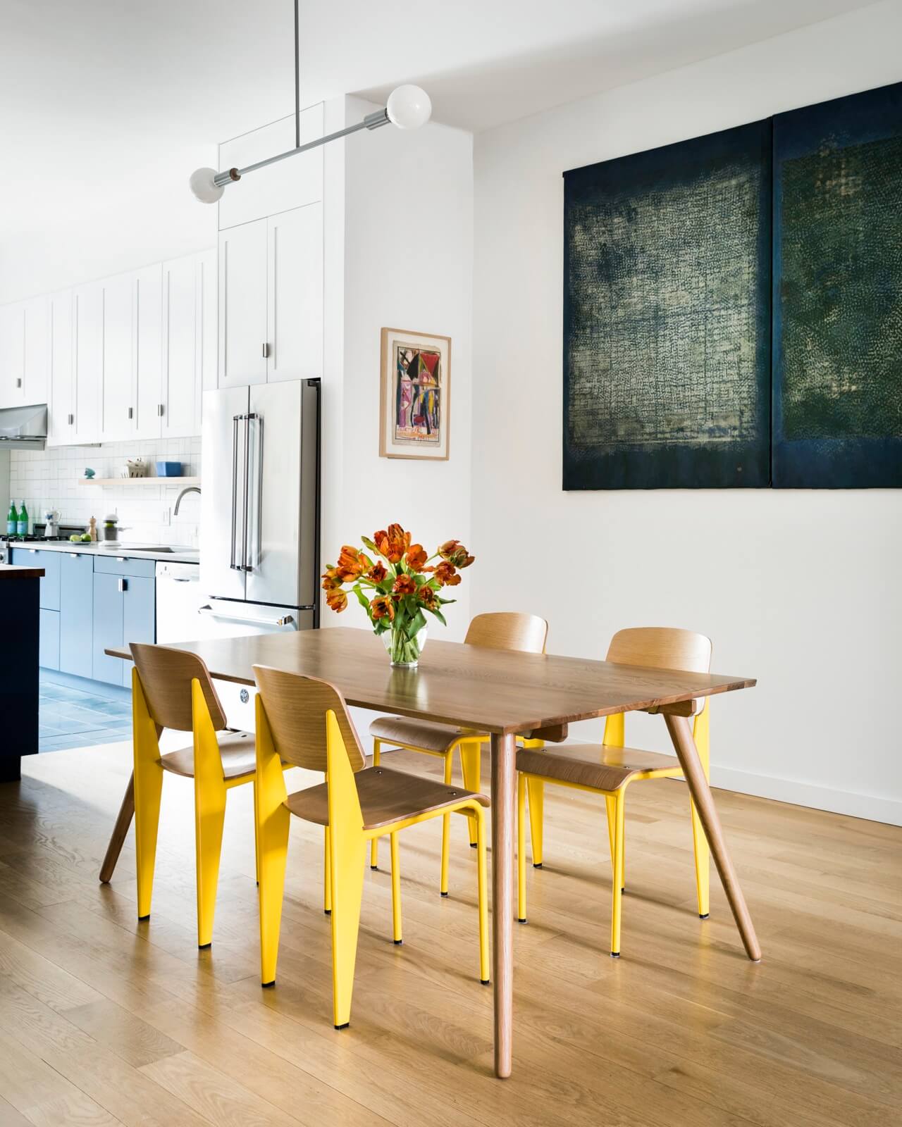
Replicas of Jean Prouvé’s classic Standard chair of 1934 from Industry West surround an extendable oak dining table from Article.
The Barbell light came from Y Lighting. The large rubber painting is by Jack Drummer, the smaller abstract painting by Leslie Laskey.
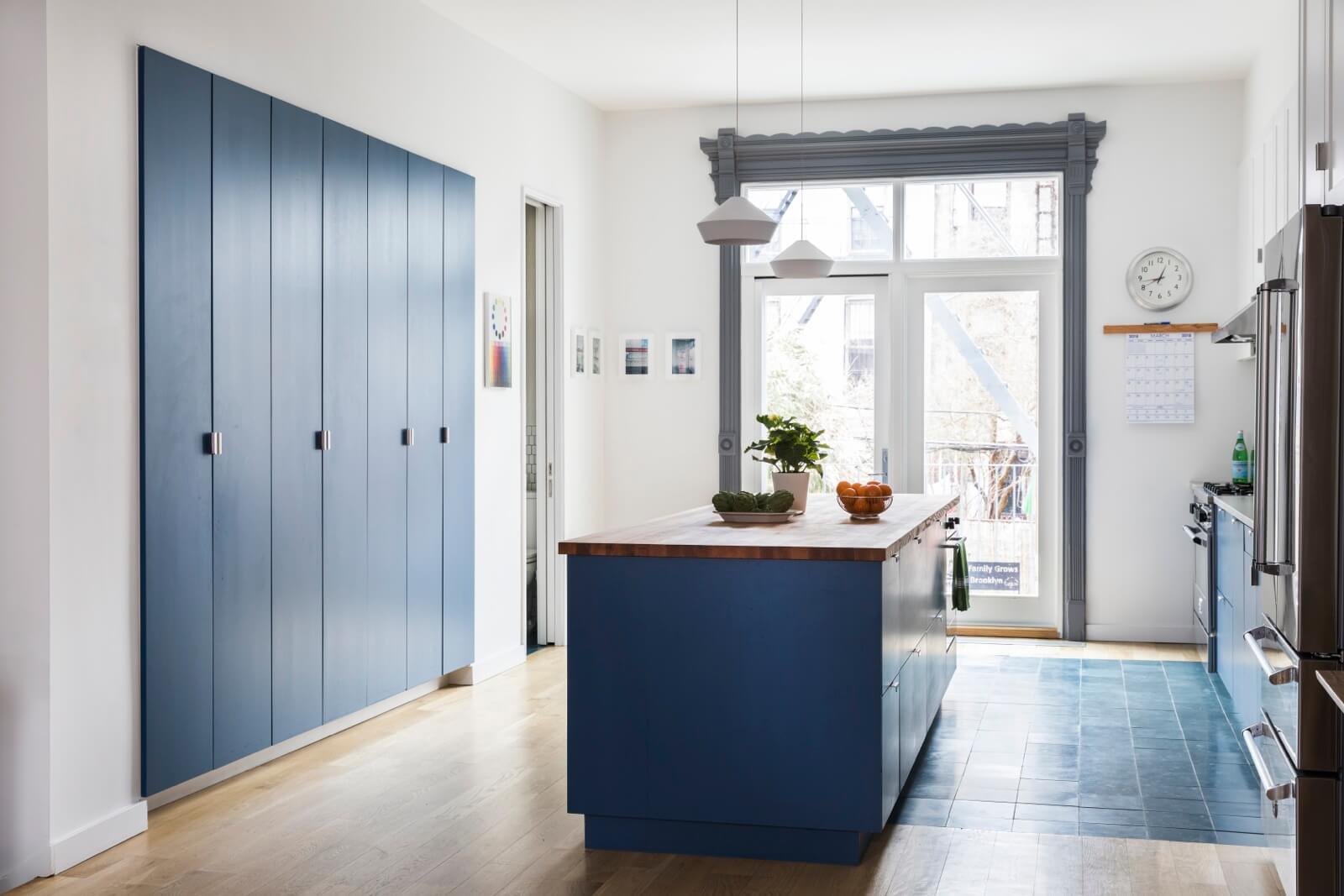
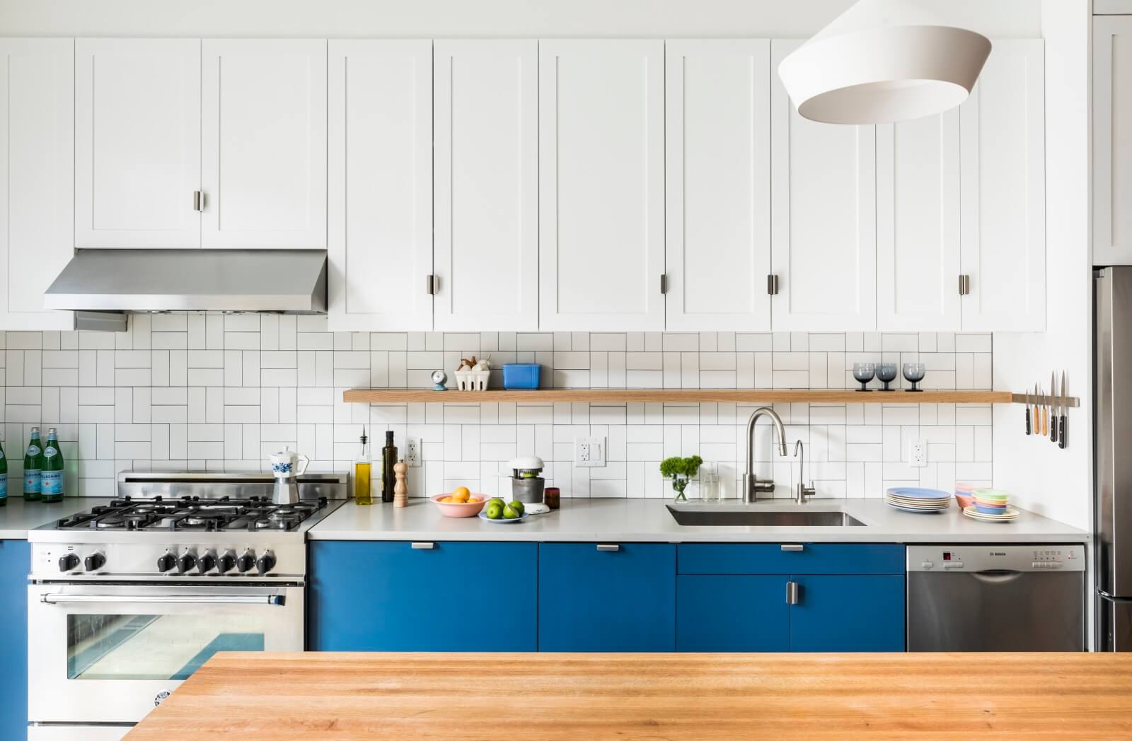
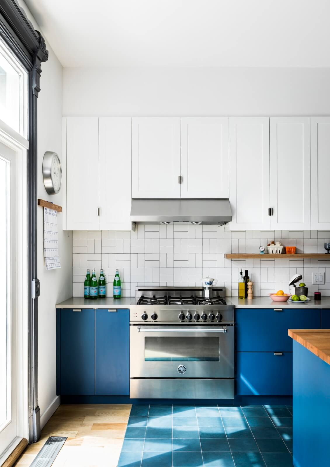
Once they’d decided on a blue center island, “We decided to keep going with it, on the lowers and down onto the floor,” Barker said.
The floor tile is from Clé, the backsplash made of square-edged subway tiles from Ann Sacks set in a basketweave pattern.
The white Brummel pendants above the island came from Lightology.
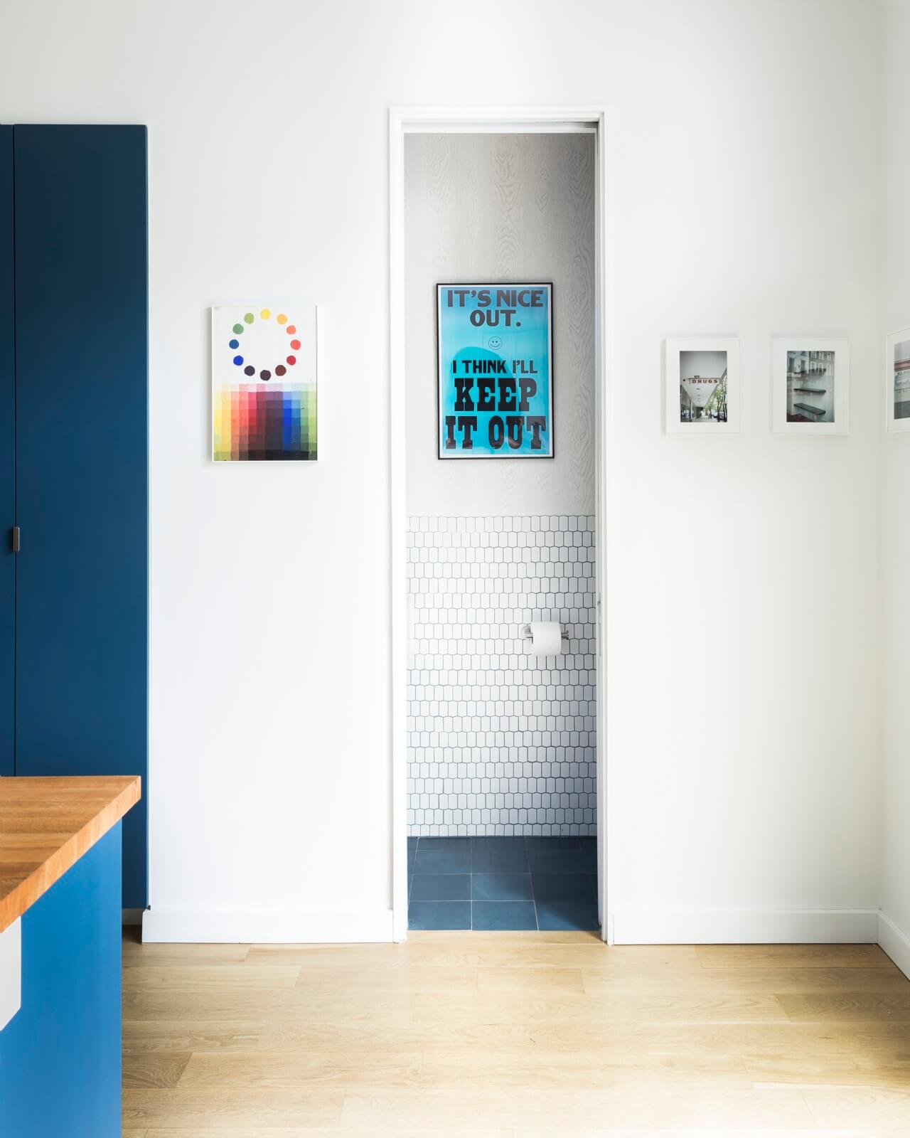
The comical blue art poster in the parlor-floor powder room is by George Horner.
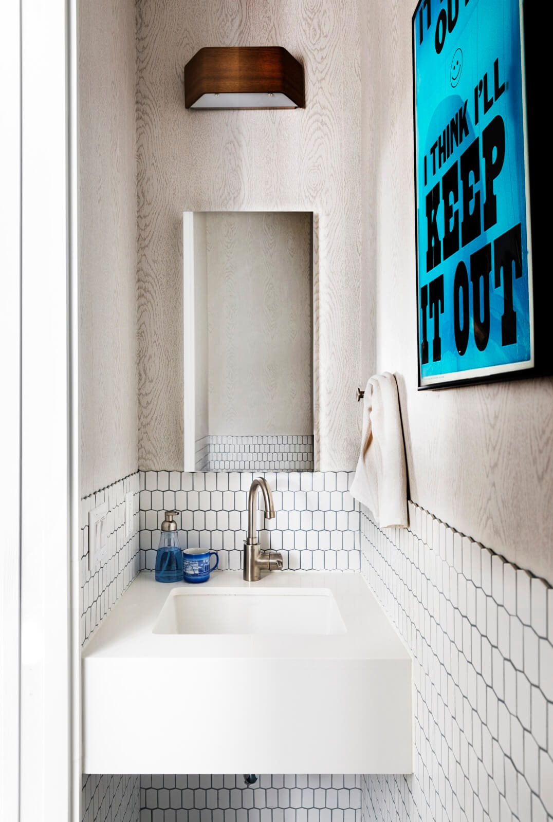
Wood-grain wallpaper by Cole & Son, compressed hex tile from Ann Sacks grouted with navy, a custom Caeserstone sink and an Asgard wall light from Lightology make something interesting of the tiny powder room.
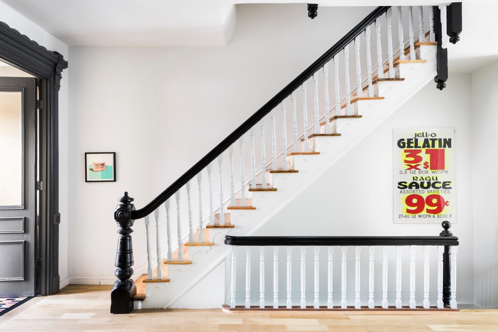
What looks like a vintage supermarket poster is actually an artwork by Jan Henderikse. A small print by Stephen Powers hangs near the door.
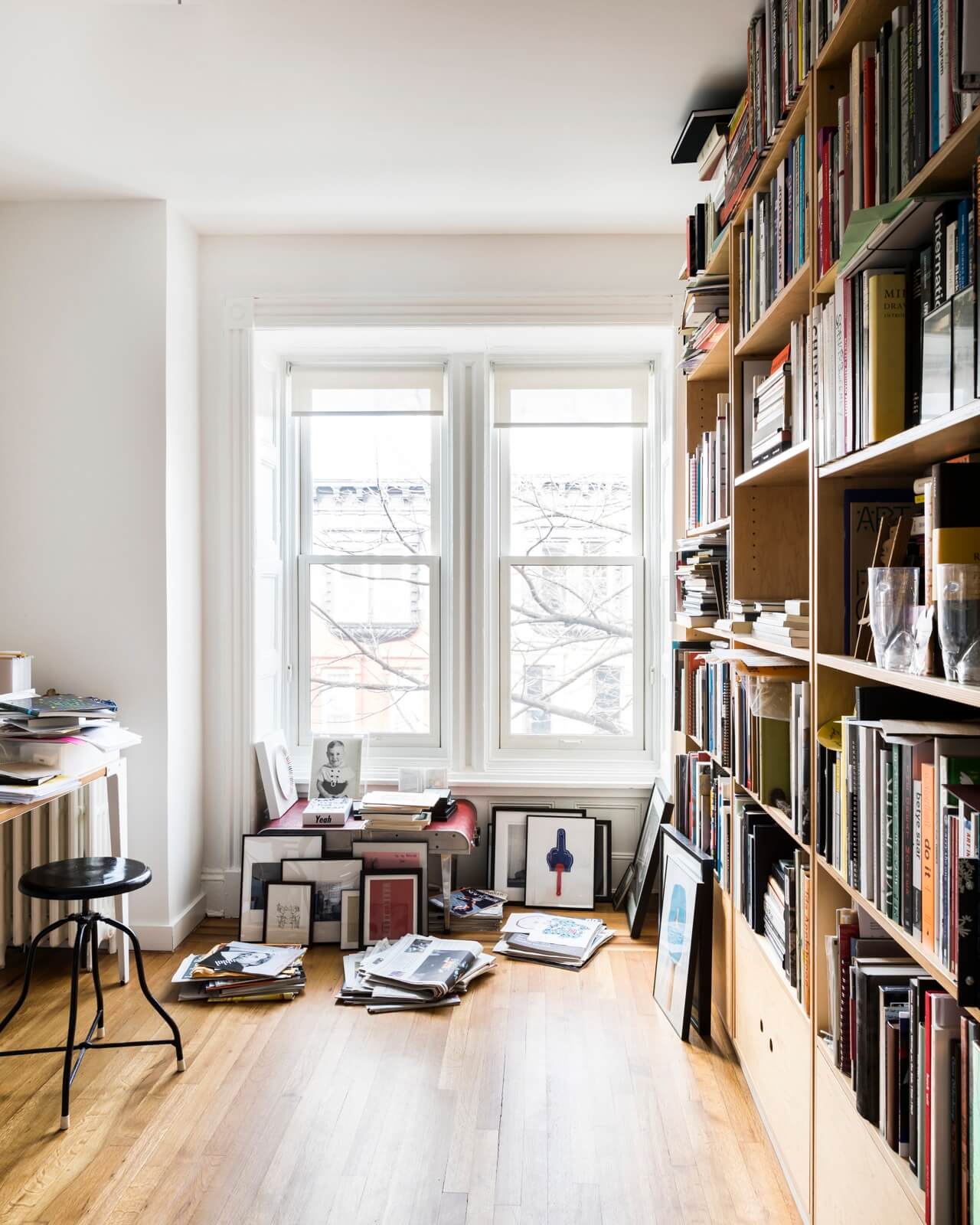
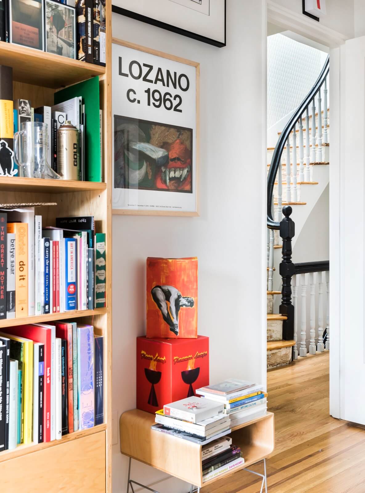
The artwork in the study includes an orange paper sculpture with an image of a diving man by Alex Da Corte.
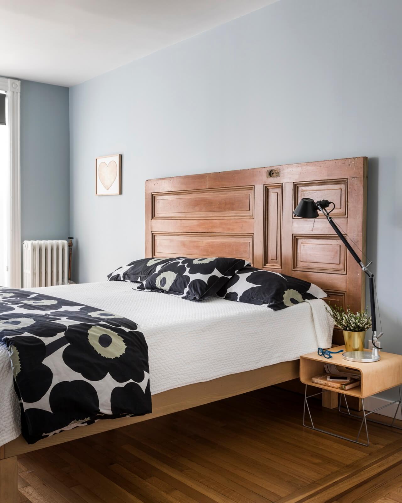
A giant door from the parlor floor was repurposed as a headboard in the master bedroom. The heart-shaped artwork is by Larry Krone.
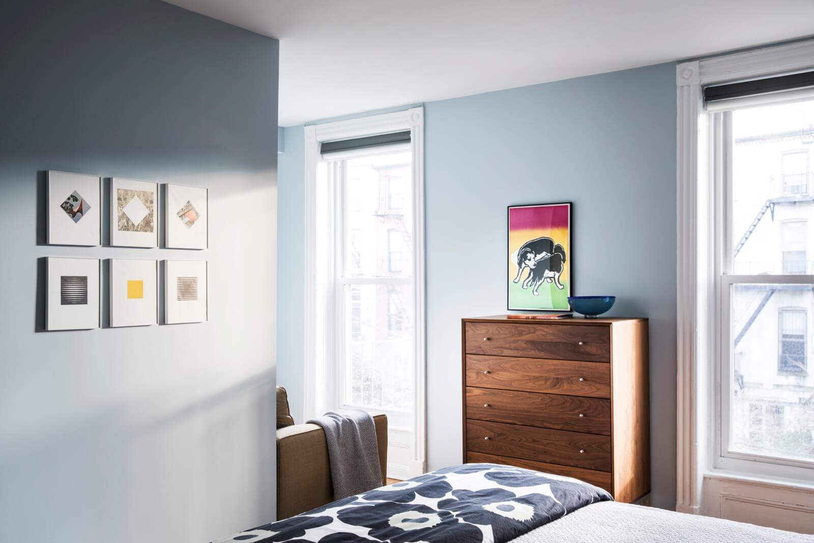
The architect chose to expand the master with a windowed reading nook, rather than incorporate that space and window into the adjacent master bath.
The suite of six framed works in the foreground is by Carol Bove, the piece above the dresser by George Horner.
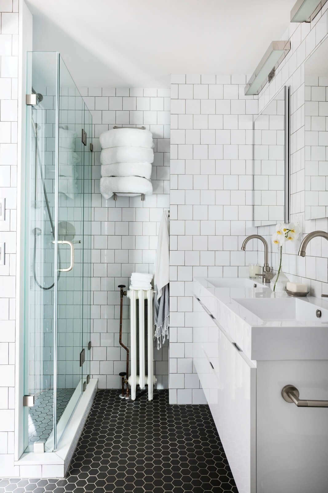
Classic Tile supplied the matte black hex tile for the floor of the master bath, along with glossy white hex for the shower floor and glossy white squares for the walls.
The Bliss double vanity came from Wayfair, the Grohe faucets in sink and shower from Faucet Direct.
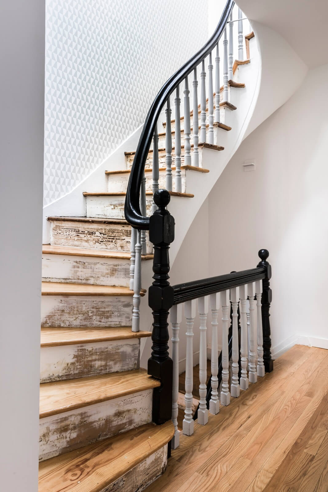
The clients liked the unfinished look of the stair risers so they were left as is. Paper from Wallpaper Direct lines the stair hall.
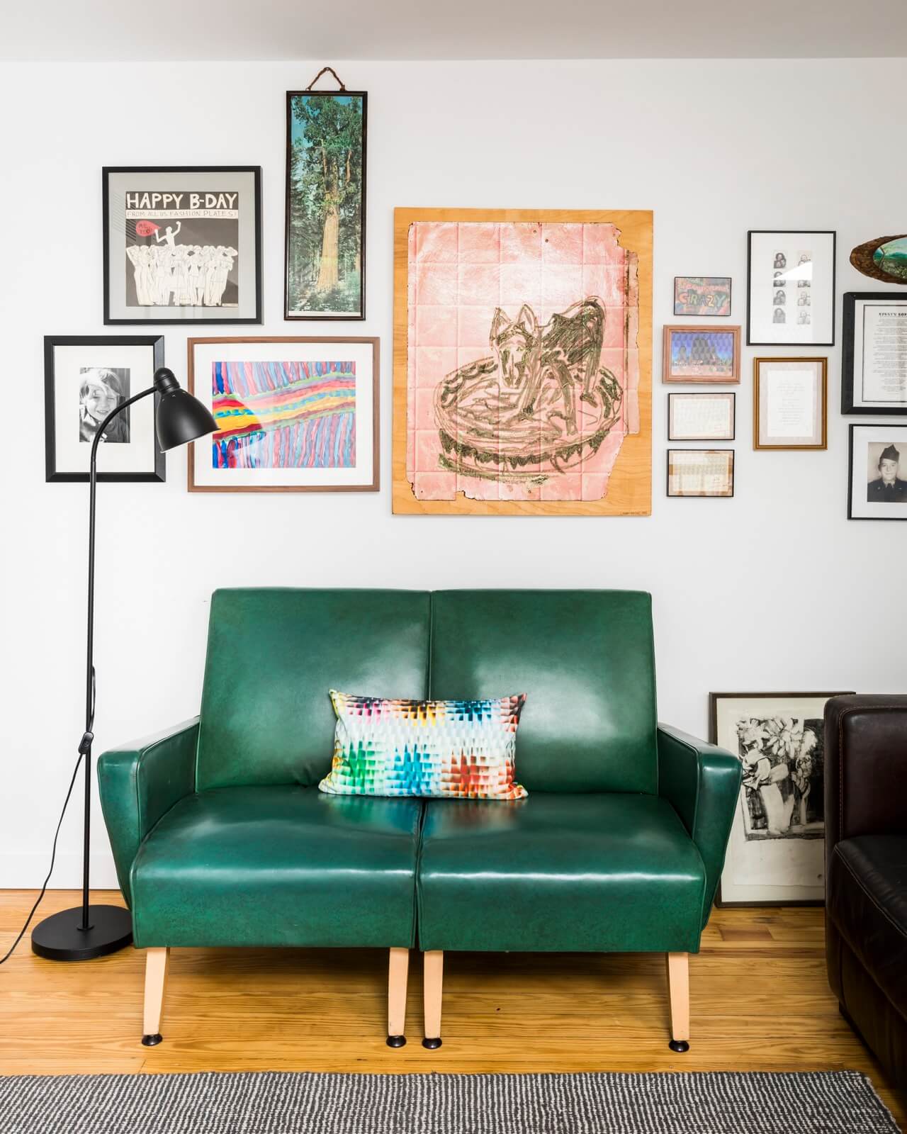
Above a settee on the top floor landing, a grouping of art includes an orange painting of a dog in a wading pool by Larry Krone.
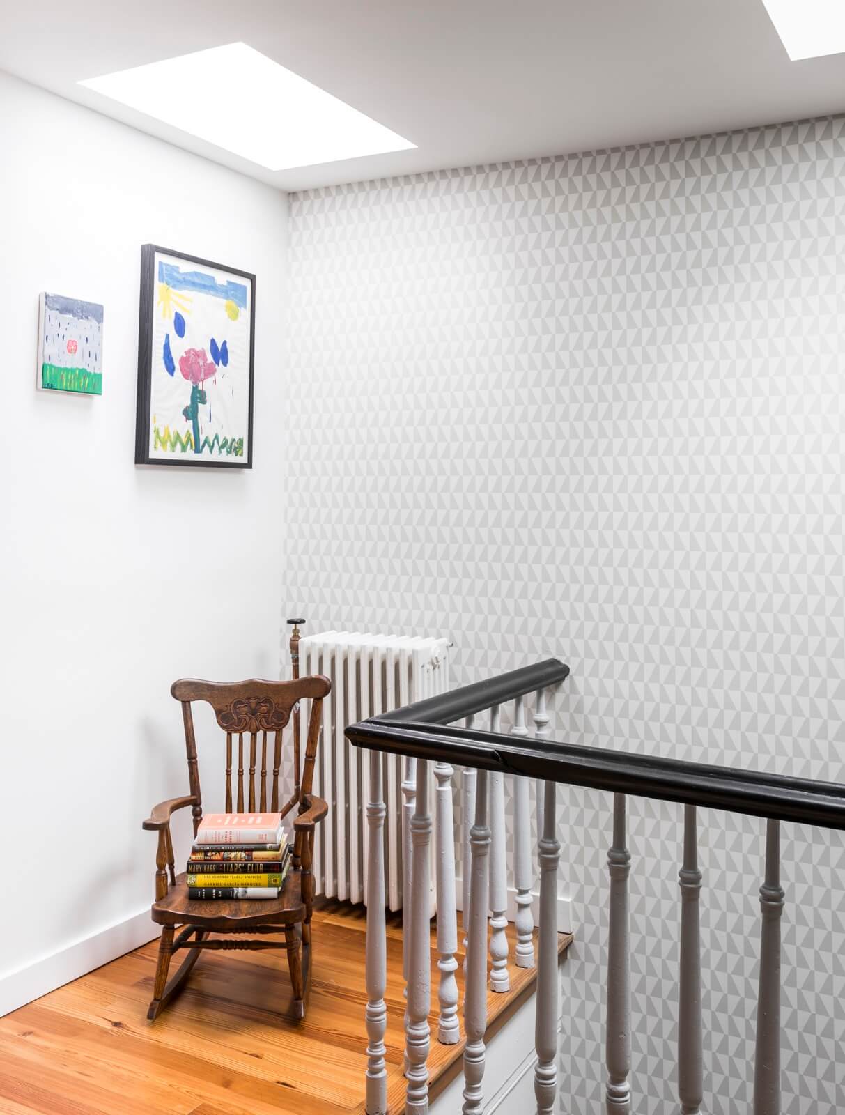
The large, skylit top floor landing is “the kids’ hang-out space,” the architect said. The artwork here is by the homeowners’ daughter.
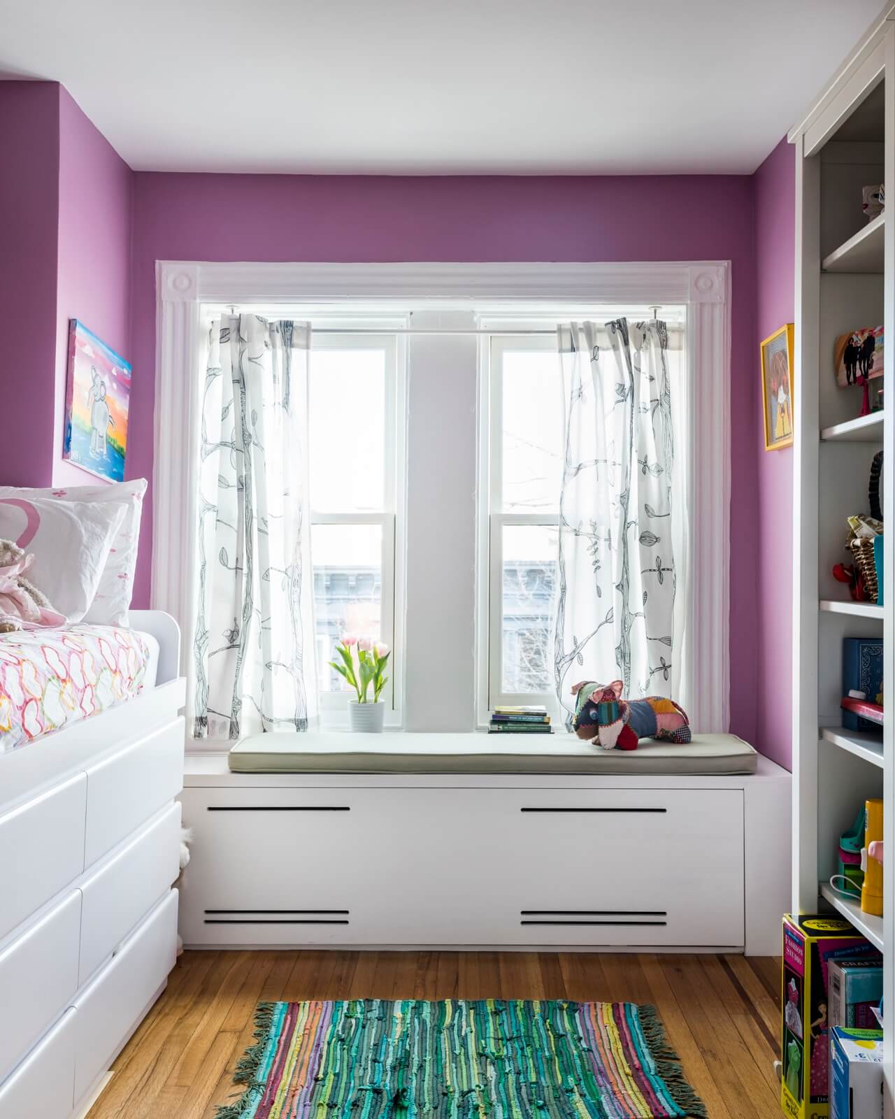
The lilac wall color and built-in window seat are standouts in the daughter’s bedroom.
[Photos by Lesley Unruh]
Check out ‘The Insider’ mini-site: brownstoner.com/the-insider
The Insider is Brownstoner’s weekly in-depth look at a notable interior design/renovation project, by design journalist Cara Greenberg. Find it here every Thursday morning. Got a project to propose for The Insider? Contact Cara at caramia447 [at] gmail [dot] com.
Related Stories
- The Insider: Brownstoner’s In-Depth Look at Notable Renovation and Design Projects
- The Insider: Homeowners’ Love of Books Inspires Windsor Terrace Town House Makeover
- The Insider: Vivid Color and Generous Spaces Distinguish Windsor Terrace Row House Reno






What's Your Take? Leave a Comment