The Insider: Designer Conjures Style in Cobble Hill Rental With Ingenious, Inexpensive Ideas
The work included complete overhauls of the apartment’s bathroom and kitchen, which hadn’t been touched since the 1960s.

In six years as an associate at Gensler, the behemoth global architecture firm where he developed concepts and strategies for major corporate clients, and five more years designing residences for private clients at some of Manhattan’s toniest addresses, interior designer Raphael Paul DiTommaso worked with budgets that knew no limit.
But in his own white-on-white home of ten years, a 1,100-square-foot railroad-style rental apartment on the second floor of a classic brownstone, everything was done “very inexpensively,” he said, and the watchword is IKEA.
DiTommaso, who currently works as a freelance creative director for design firms and real estate companies, did 100 percent of the work on the apartment himself, which he gradually upgraded with the help, he said, of “about 6,000 YouTube videos” (and the approval of his landlord).
The work included complete overhauls of the apartment’s bathroom and kitchen, which hadn’t been touched since the 1960s, as well as cosmetic improvements, from plastering over acoustical tile ceilings to covering deteriorated walls with fake-brick MDF paneling, painted over with sand-enhanced white paint to convincingly emulate real exposed brick.
There is a goodly amount of vintage detail in the spacious apartment, originally a three-room flat that had two rear additions over the years — one now a dining room, and the other a study with windows on three sides. DiTommaso augmented the vintage elements, which include two marble mantels, parquet floors, tin ceilings, four-panel 19th century doors and later French doors with transoms, with additional moldings on ceilings and walls.
When it came to furnishing and decorating, DiTommaso said, “I can’t think of anything I spent more than $60 on.” Numerous pieces were found on the street, including a heavy steamer trunk “that I sat on until my brother came to help me carry it.” Gifts from family and clients, including a (knockoff) Mies van der Rohe chaise in the study and Marcel Breuer’s caned Cesca dining chairs, elevate the look.
Among the many styling tricks are LED strip lights fastened with double-sided tape to the rear edges of open shelves, and a hand-me-down sofa upholstered with cut-up IKEA drapes, IKEA Gurli throws and Velcro tape. What looks like an old Hudson River School painting in a gilded frame over the kitchen sink is actually a gessoed-over poster bought for $30 at Brooklyn’s Big Reuse (formerly Build it Green).
DiTommaso grew up in Carroll Gardens and Cobble Hill and earned his Interior Design degree at the School of Visual Arts. His parents are Italian and he speaks the language fluently. So it’s not surprising that he used an Italian word to express the guiding principle of his décor: sprezzatura, an art history term for “studied informality,” he said. “Everything’s a little bit classical, but feels modern and casual.”
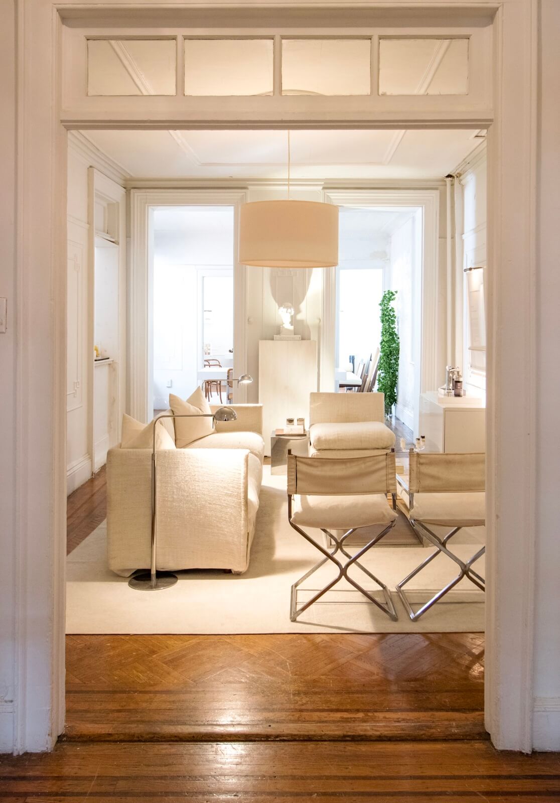
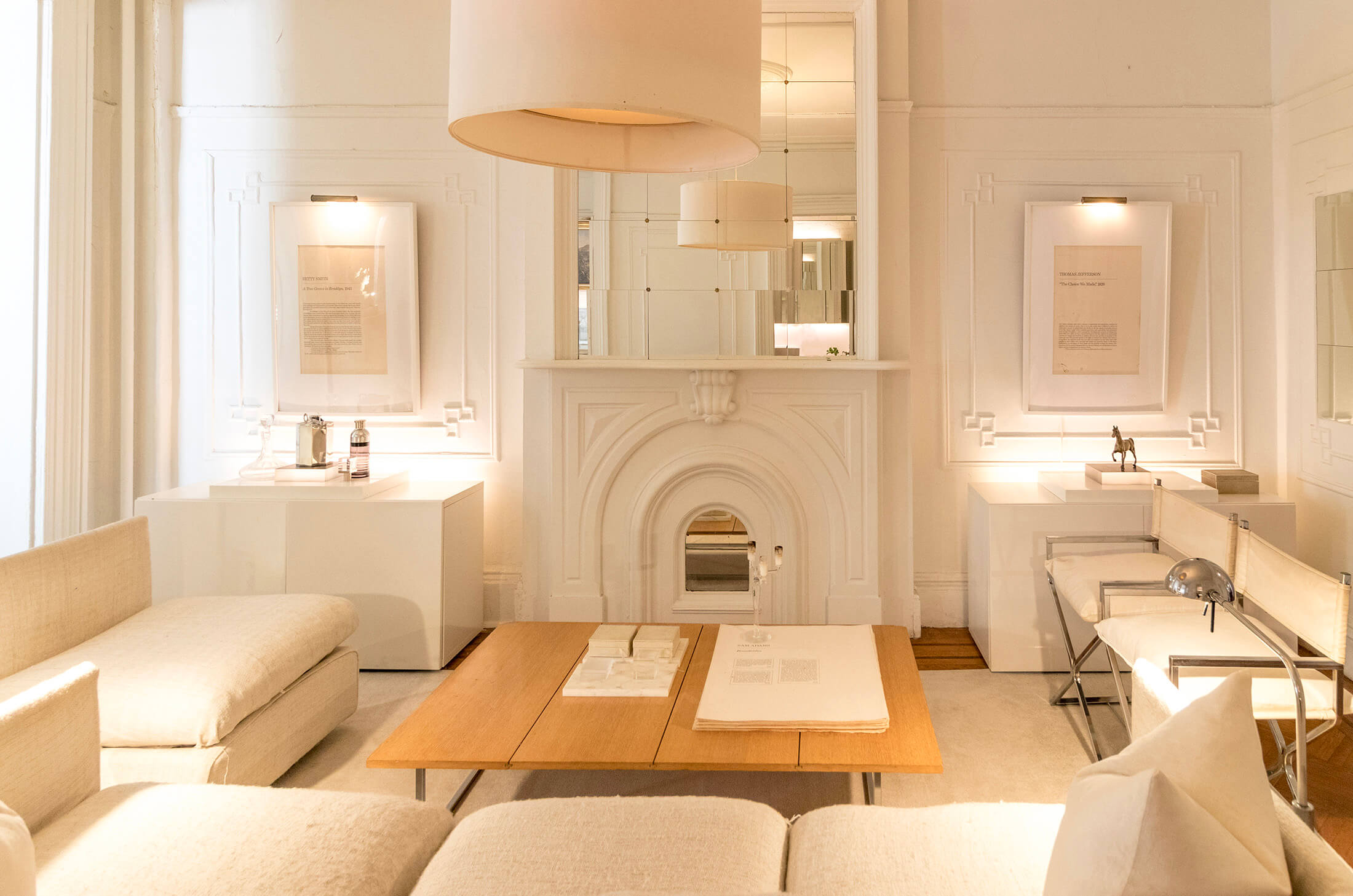
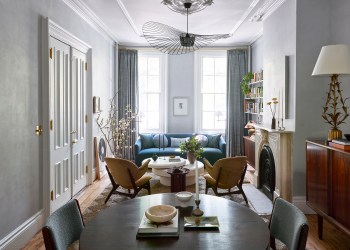
The windowless central room, used as the main living space, would be dark but for the all-white scheme, lighting from various sources, and use of IKEA mirrored tiles over the mantel.
The chrome directors chairs were $40 at a local antique store. DiTommaso fashioned the coffee table out of oak panels left over from a Rockefeller Center law firm project he worked on.
In frames above two Besta cabinets from IKEA are large lithographs left behind in DiTommaso’s parents’ Canal Street loft in the 1970s — one an Abraham Lincoln speech, the other an excerpt from Betty Smith’s “A Tree Grows in Brooklyn.”
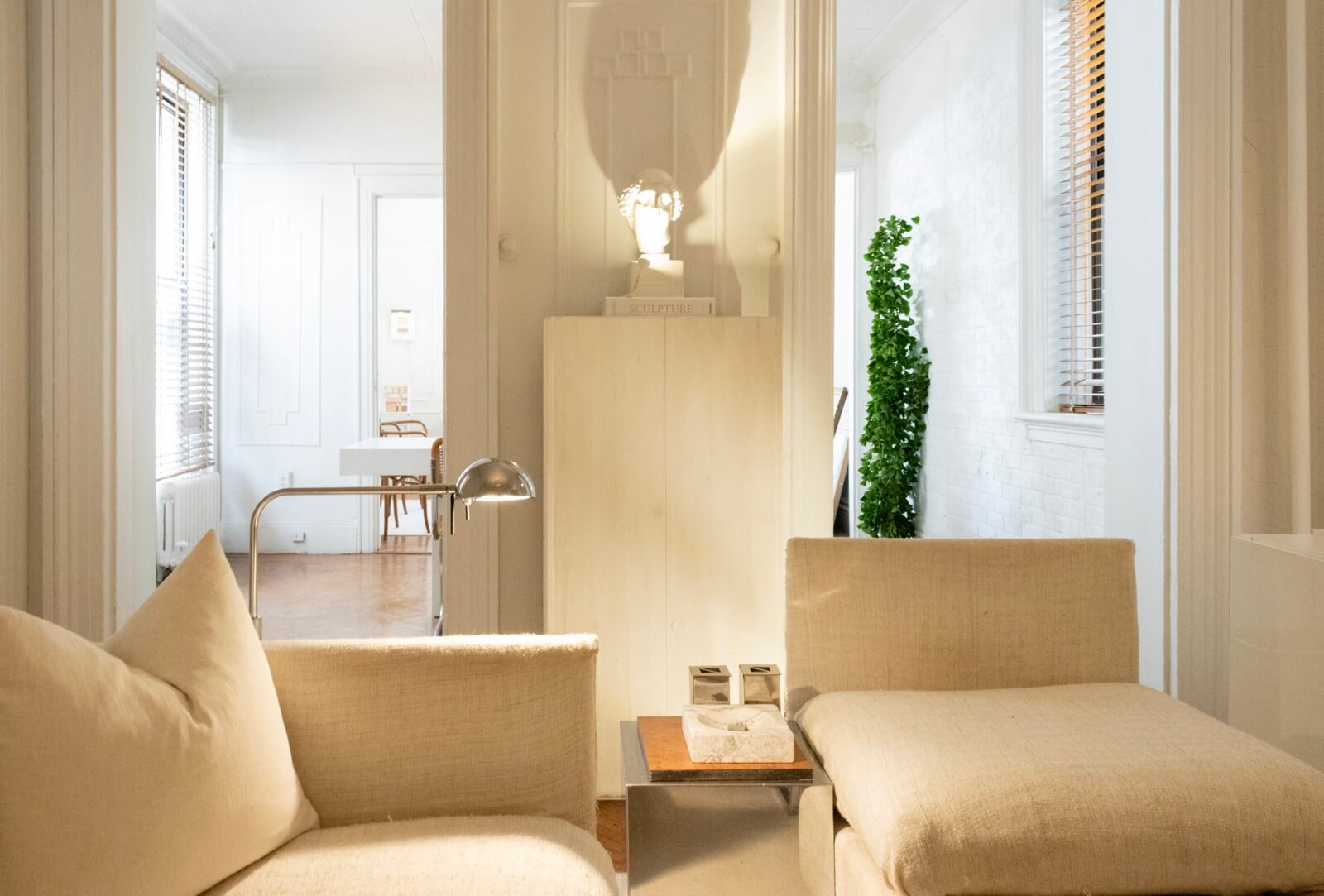
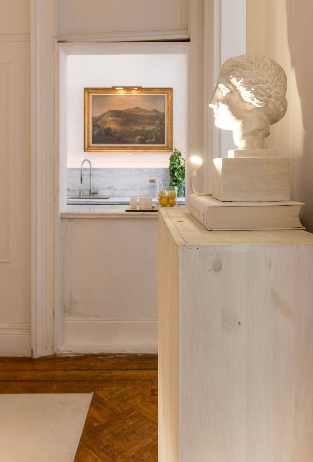
Other cabinetry throughout the house was made by DiTommaso out of plywood and whitewashed. The bust (originally from Restoration Hardware) was discarded by a client.
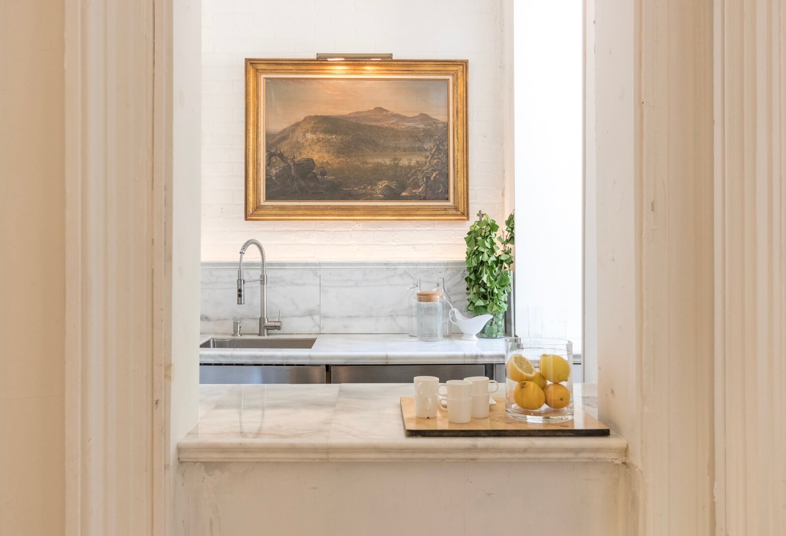
DiTommaso opened up an existing framed doorway that had been covered over to house a fridge and created a pass-through to the galley kitchen. The kitchen is entered via a door from the adjacent dining room.
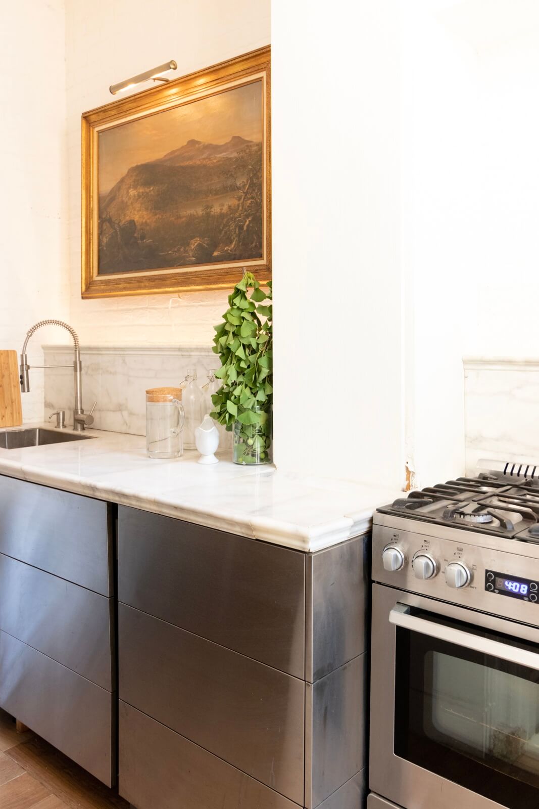
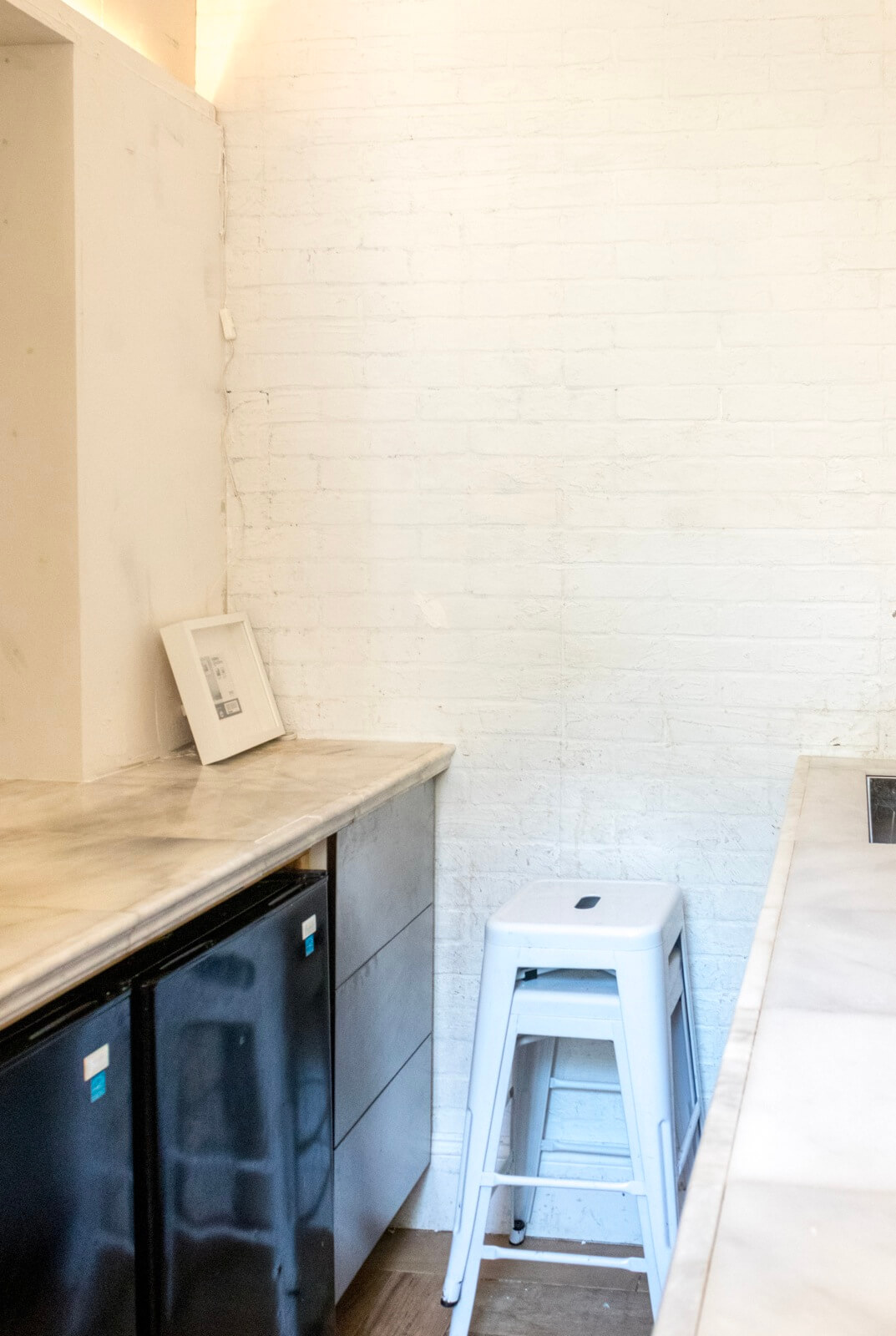
DiTommaso gutted the kitchen, removing a dropped ceiling and three layers of wallpaper.
The stainless steel cabinets are from IKEA, and the counters are made of Carrara floor tile found on sale at Lowes.
The walls are covered with four by six-inch sheets of textured fake-brick particle board painted with a mix of joint compound and sand. “What makes the walls really look textured is the uplighting behind the backsplash, where I located all the outlets to conceal them,” he said.
Except for a Bosch dishwasher, the appliances were budget-friendly. DiTommaso used two half-fridges to allow for extra counter space and the pass-through to the living room.
Total cost for the kitchen: about $4,000.
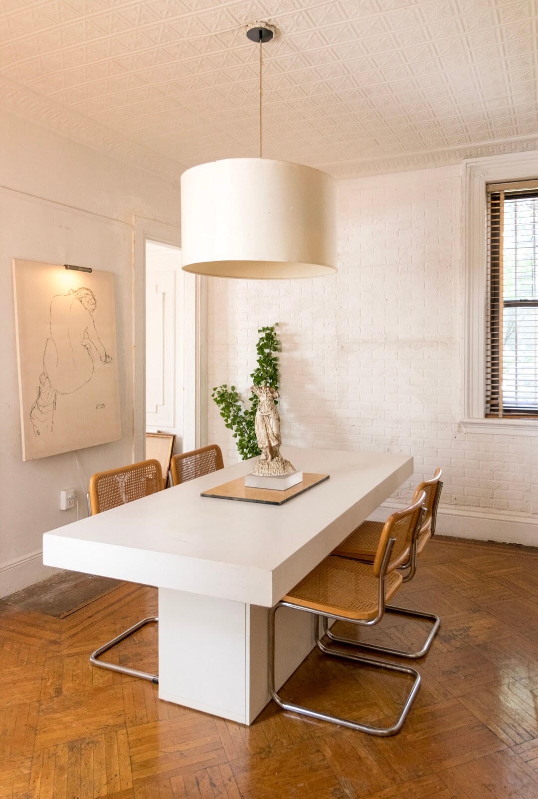
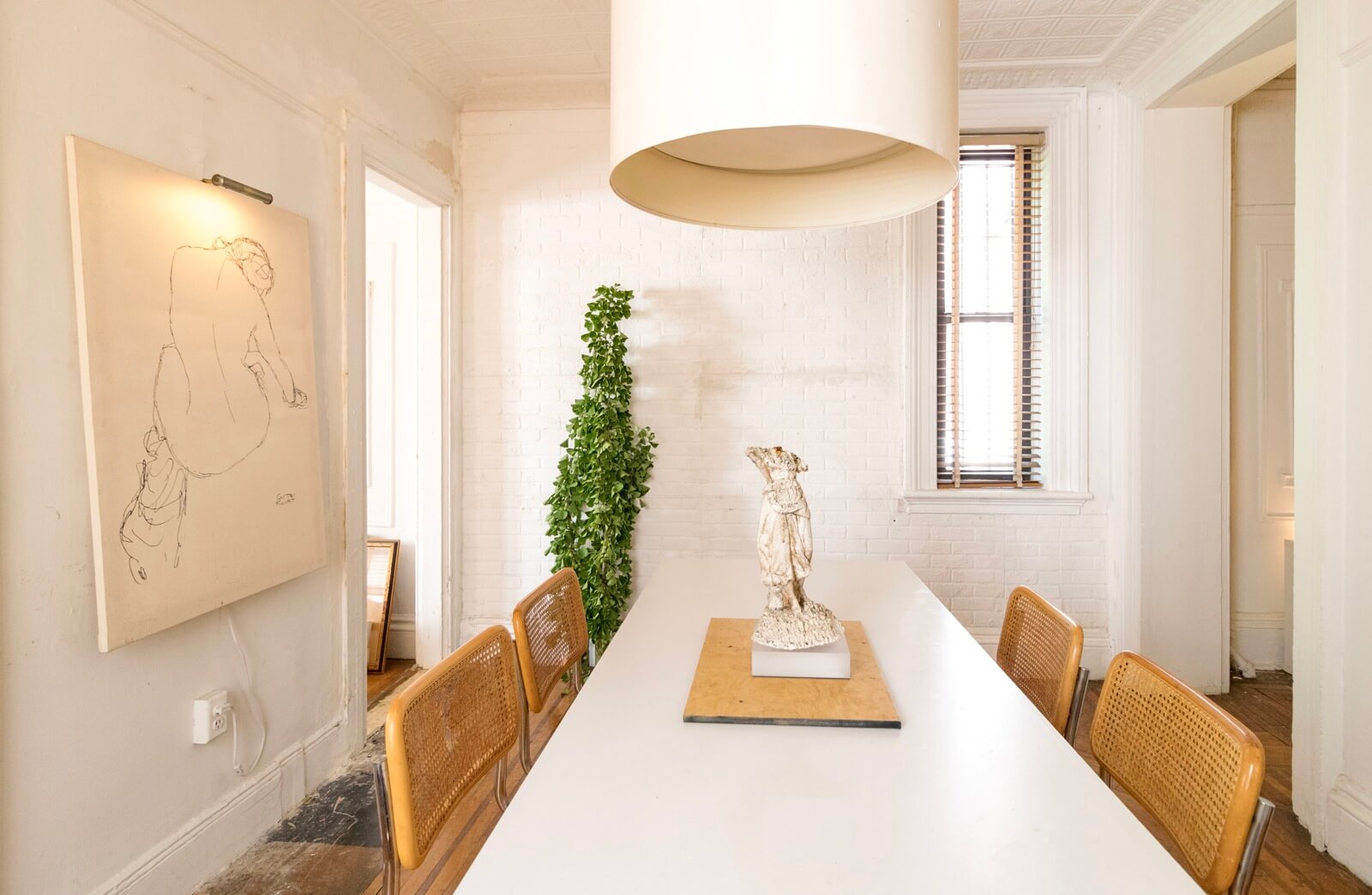
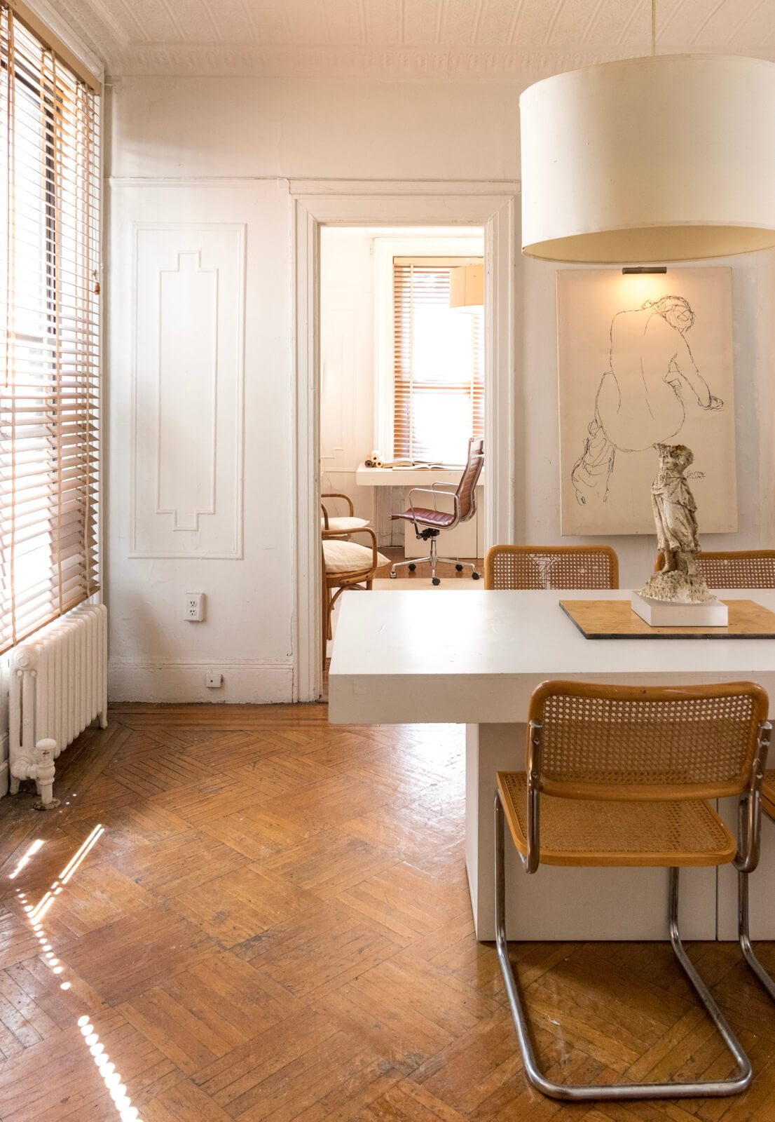
The dining room and study, toward the rear of the apartment, are located in adjacent extensions that were added on to the building at different times.
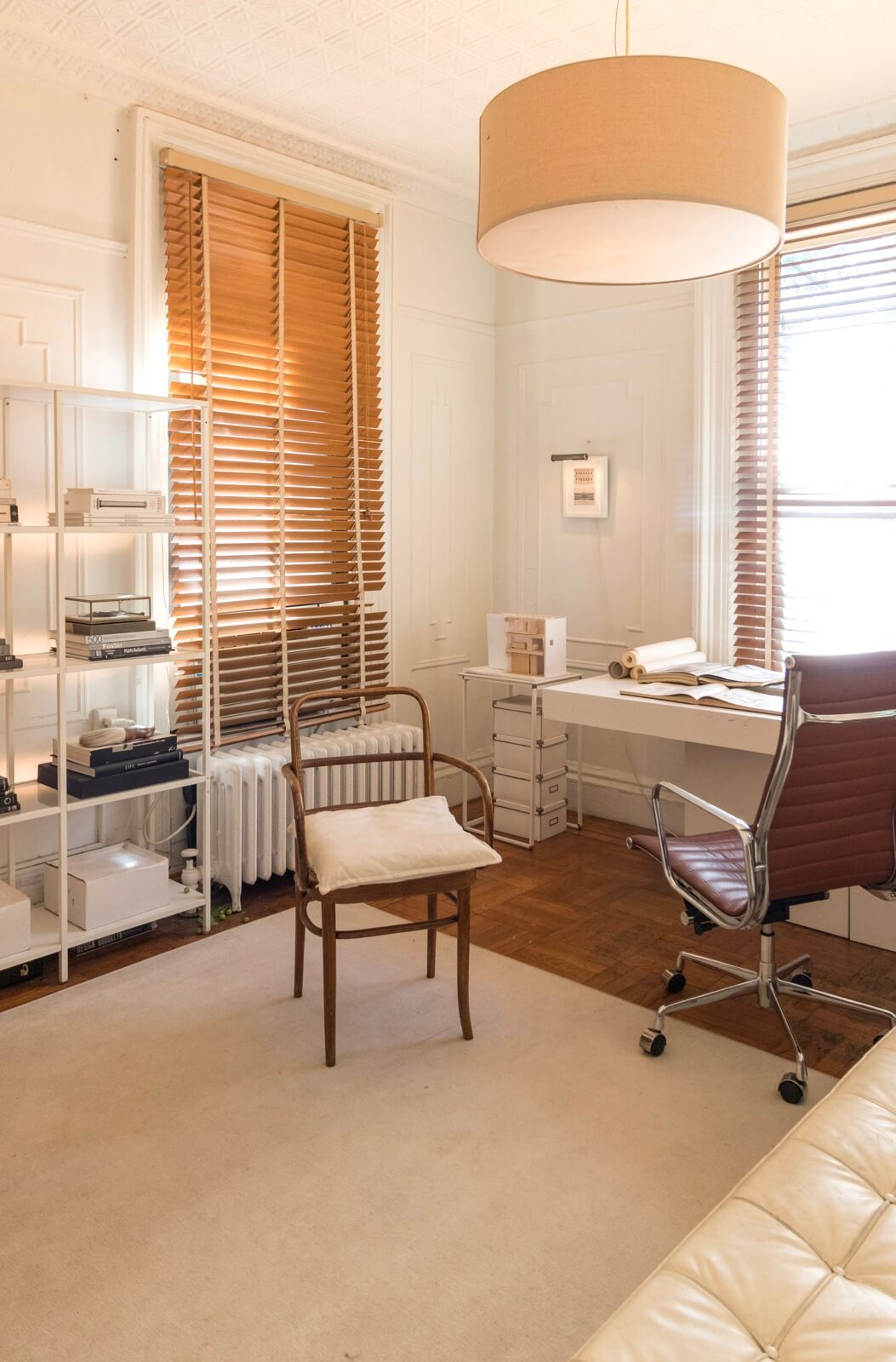
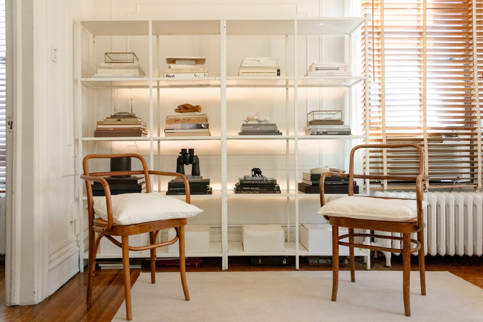
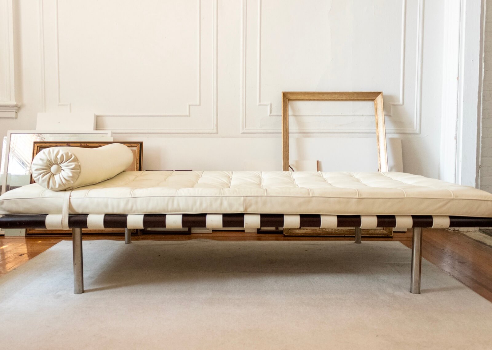
Furnishings in the study are all IKEA, found or gifted. The original moldings stand out along a mostly bare wall.
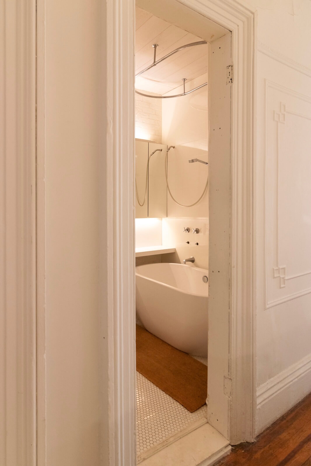
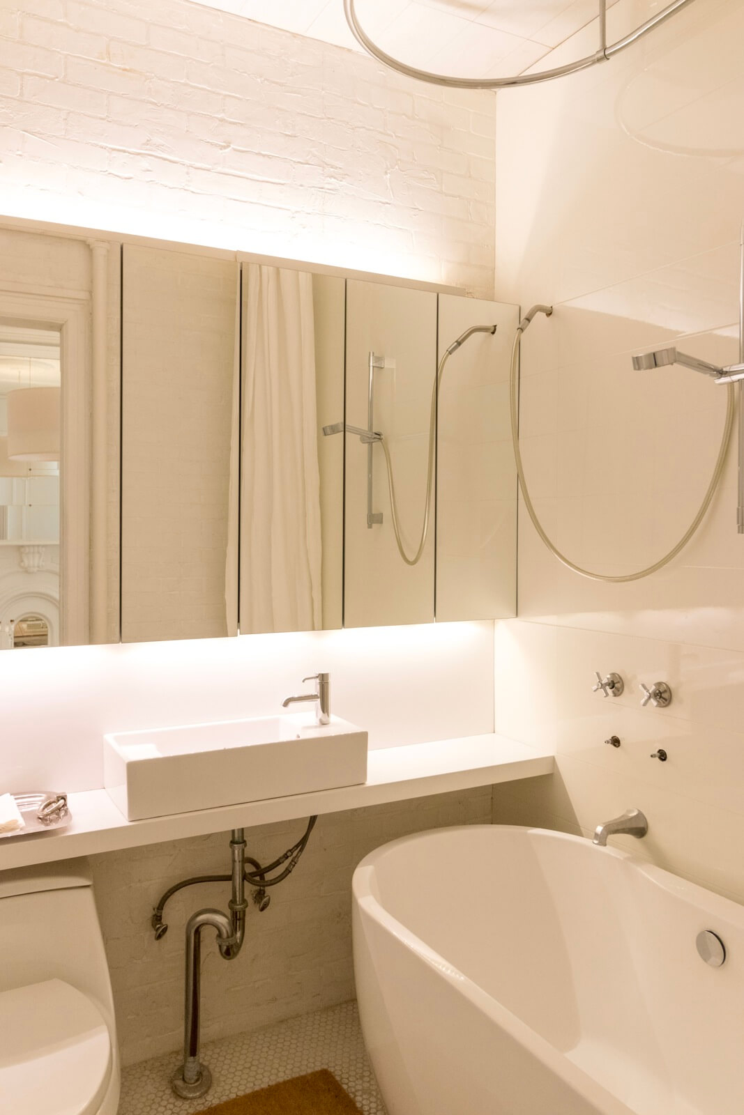
“The bathroom demo’d itself on top of me one day while I was in the shower,” DiTommaso said, precipitating its immediate renovation.
The walls are pre-finished laminate floor planks and the ersatz exposed brick, the floors a simple hex tile. The counter and backsplash are remnant pieces of Caesarstone, with a $100 vessel sink from IKEA and mirrored cabinets from the same source.
The real expense was the freestanding tub, about $1,300 from Signature Hardware. “Given the bathroom is off the living room, I wanted it to feel less like a loo and more like a glossy little box. I flipped the swing of the door so that if the door is open a crack, all you see is the handsome tub.”
Total materials cost: about $6,000. Labor cost: $0.
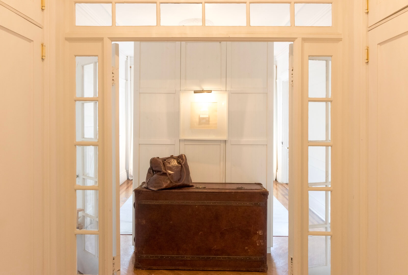
A pass-through central space framed by French doors on either side already contained roomy closets when DiTommaso took over the apartment a decade ago.
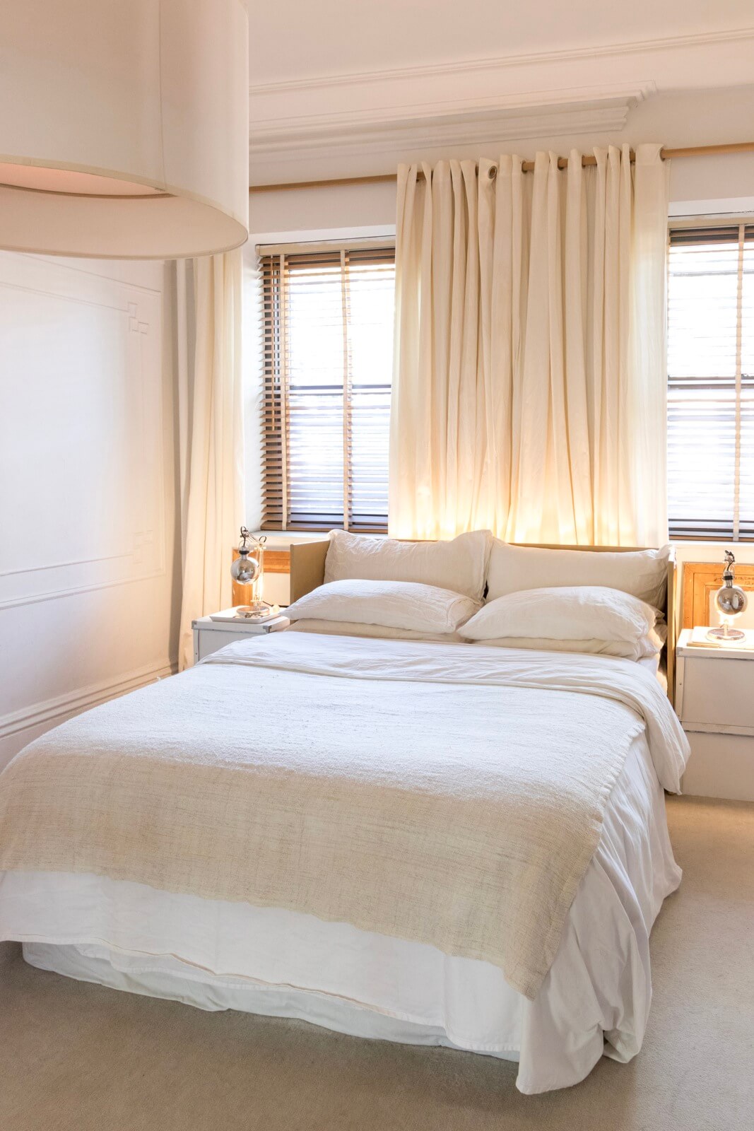
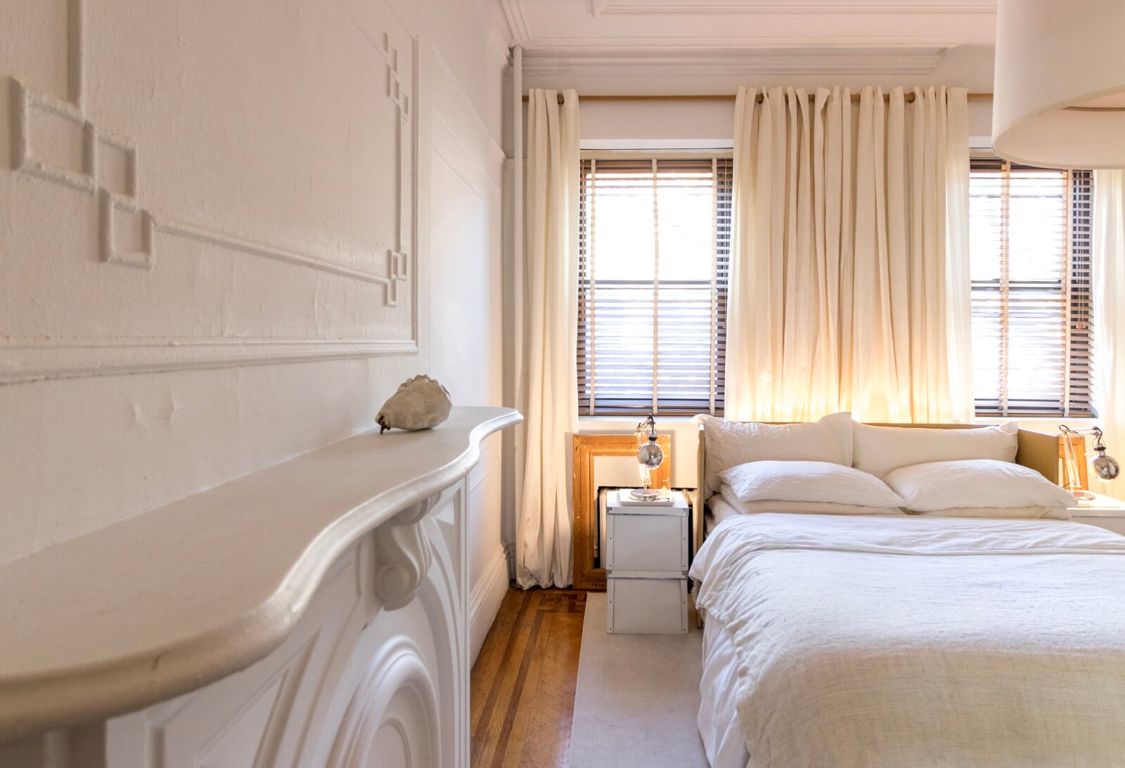
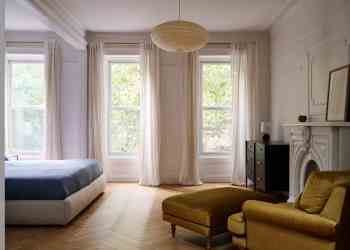
In the bedroom, located at the front of the building, the white scheme prevails. “I’ve tried color, but it’s not me,” the designer said.
Drum shades throughout the apartment are from IKEA, as are the drapes, bedding, nightstands and lamps.
[Photos by Susan De Vries]
Check out ‘The Insider’ mini-site: brownstoner.com/the-insider
The Insider is Brownstoner’s weekly in-depth look at a notable interior design/renovation project, by design journalist Cara Greenberg. Find it here every Thursday morning.
Got a project to propose for The Insider? Contact Cara at caramia447 [at] gmail [dot] com.
Related Stories
- The Insider: Brownstoner’s In-Depth Look at Notable Renovation and Design Projects
- The Insider: Ridgewood Rowhouse Reno Highlights Cheap and Cheerful Furnishings
- The Insider: Park Slope Railroad Apartment Delivers Serene Vibe, Farmhouse Kitchen




What's Your Take? Leave a Comment