The Insider: Central Stair, Bold Black Paint Distinguish Renovated Clinton Hill Townhouse
The architects behind this Clinton Hill row house planned a careful reno that repurposed or replicated the house’s considerable original detail.

Sarah Hill’s definition of sustainable design takes it back to basics. “We try to make forever homes that are welcoming and timeless and that the homeowners will not feel the need to change,” said Hill, an interior designer who partners with her husband, architect Jim Hill (an active contributor to the Brownstoner Forum on all things code-related), in the small Manhattan-based firm Urban Pioneering Architecture.
This neglected mid-19th century row house, owned by a design-savvy couple — he is an antique lighting dealer, she a design and real estate blogger — had seen many of what Hill called “ad hoc renovations” in decades past, including the replacement of a typical straight-run stair along a party wall with a grander switchback staircase midway through the building, as well as the removal of the front stoop.
Urban Pioneering, with Brooklyn-based general contractor CNS Construction, put back the stoop and, among other things, created a new entryway, with a vestibule, foyer and closet; removed a secondary stair in a narrow two-story rear extension and converted that space to a sun-filled reading nook; replaced all the windows, plumbing and electrical; and installed two-and-a-half new baths.
They also gut-renovated the garden level as a rental unit. The owner triplex above was a near-gut, Hill said, “but done with precision, mindful of keeping as much original detail as we could.”
The house’s showpiece is the black-painted central stair, which has Corinthian-style columns on each landing. The stair ascends from the middle parlor, which served as the house’s main entry hall after the stoop was removed.
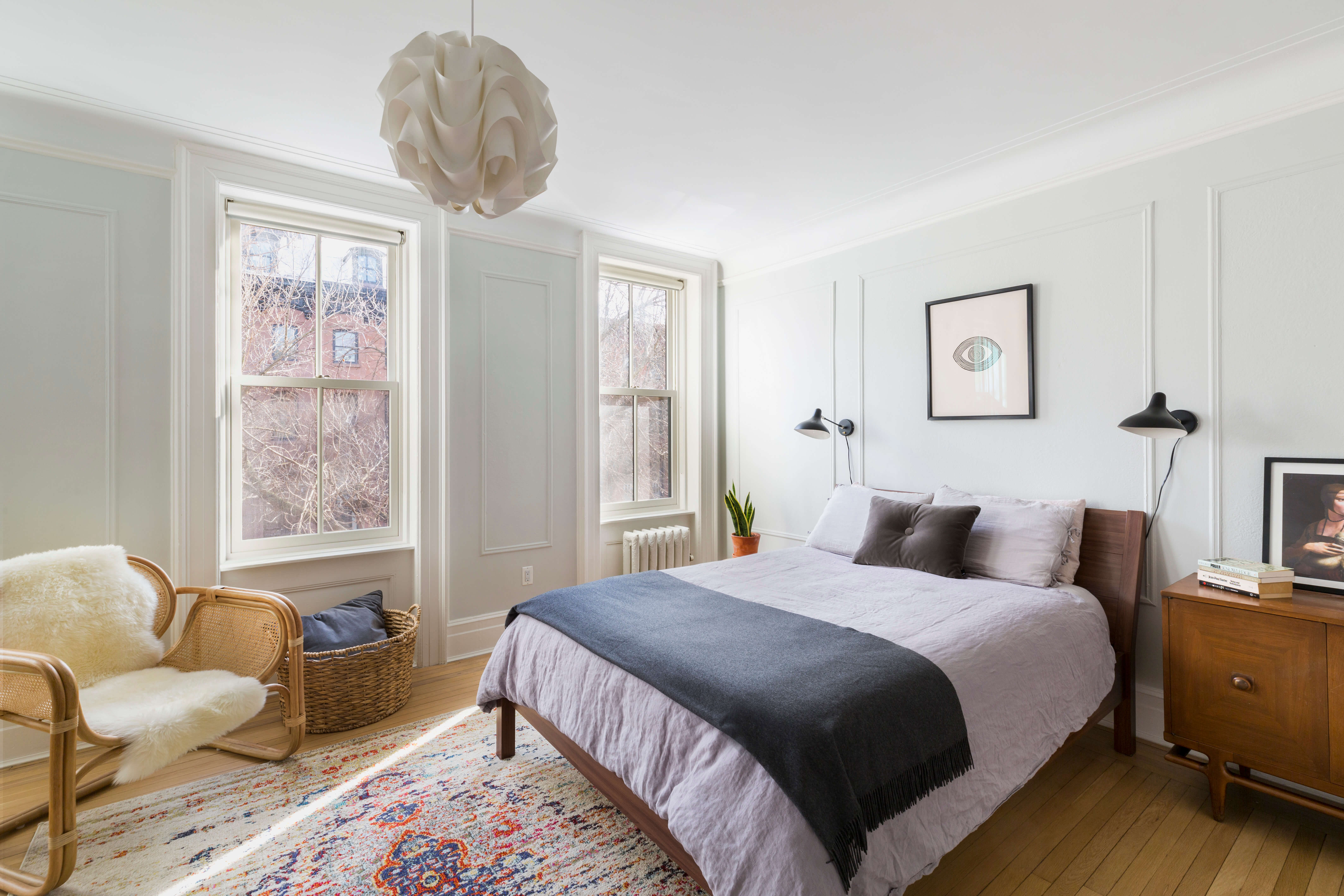
Except for two inviting new baths, the top two floors remained largely intact, with a master suite and home office on the second floor and a self-contained guest suite with kitchenette on the third.
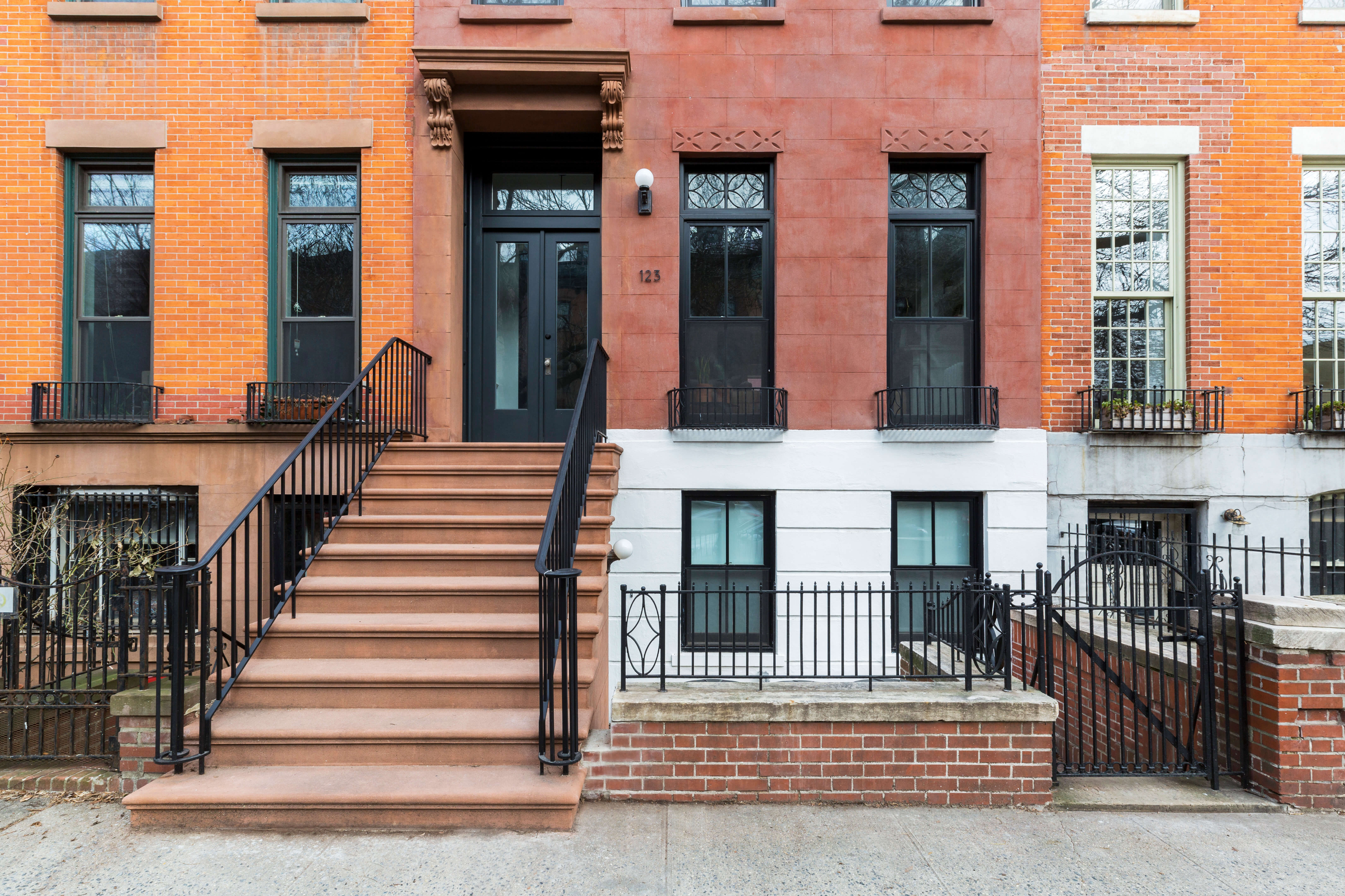
Urban Pioneering restored a stoop that had been removed during an early 20th century “modernization” craze.
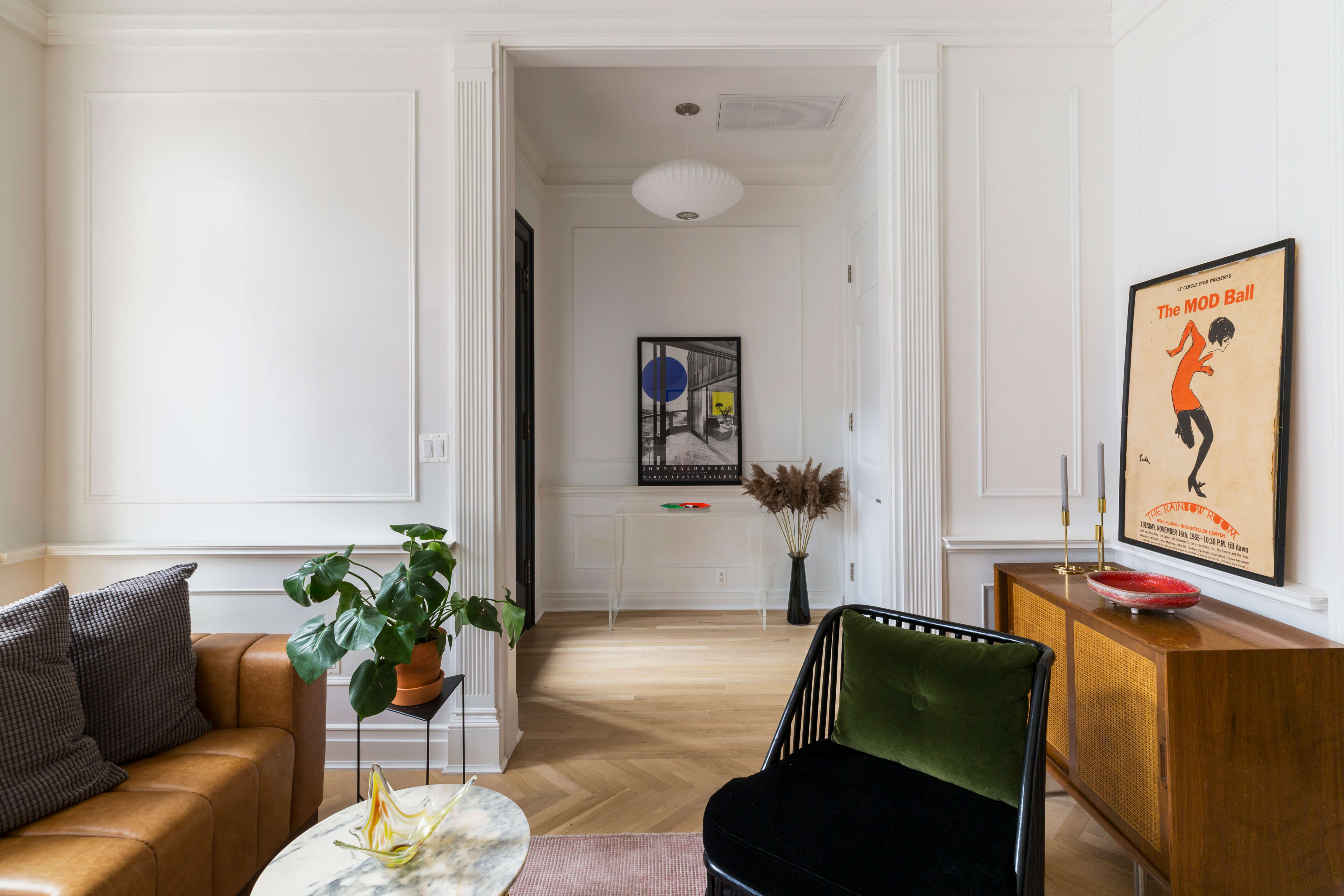
Millwork in the new front entry, which contains a vestibule, foyer and closet, was carefully selected to match existing original trim in the front room and elsewhere. “We worked hard to make it look seamless,” Hill said.
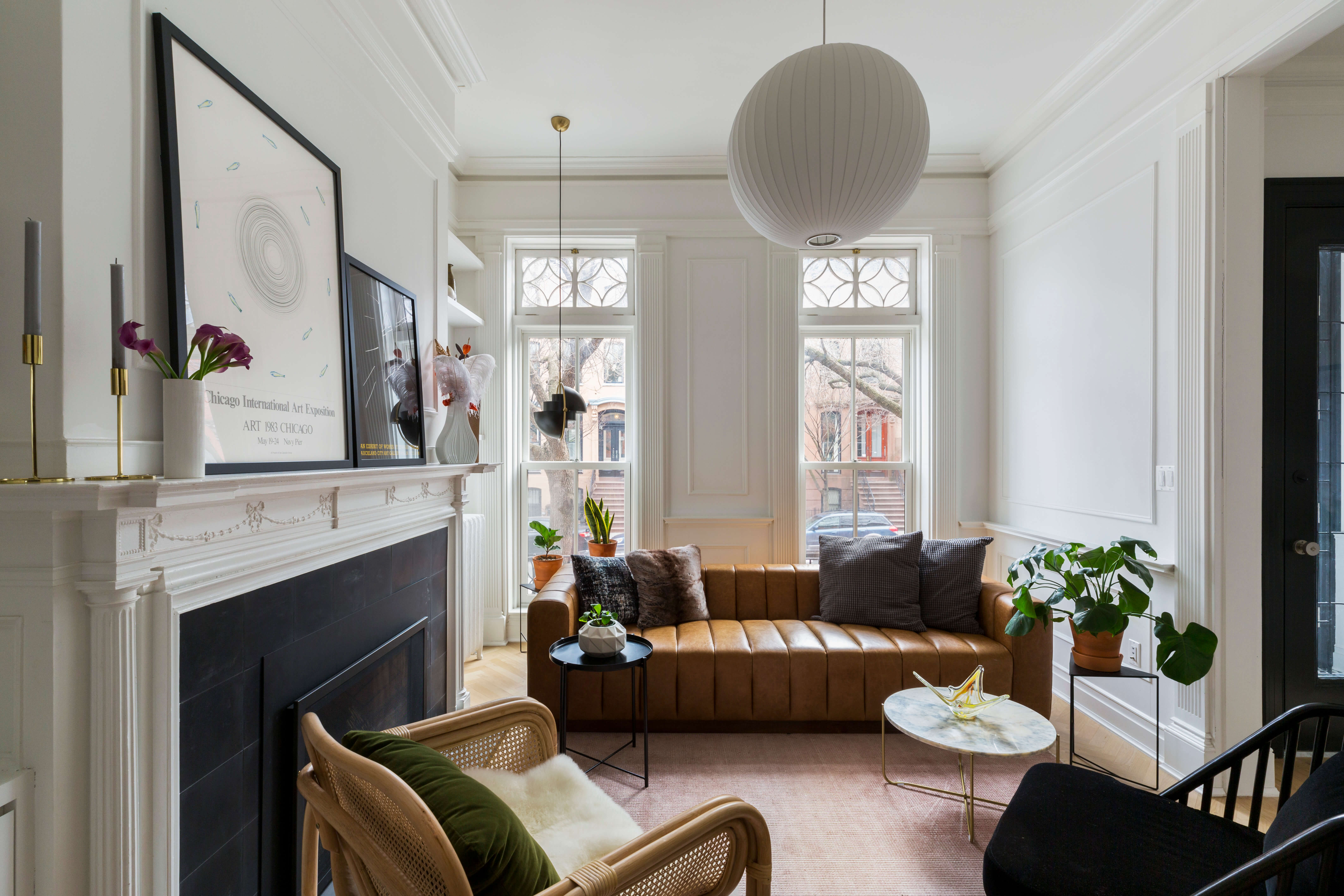
Windows were replaced throughout the house, except for the decorative transoms in the front parlor.
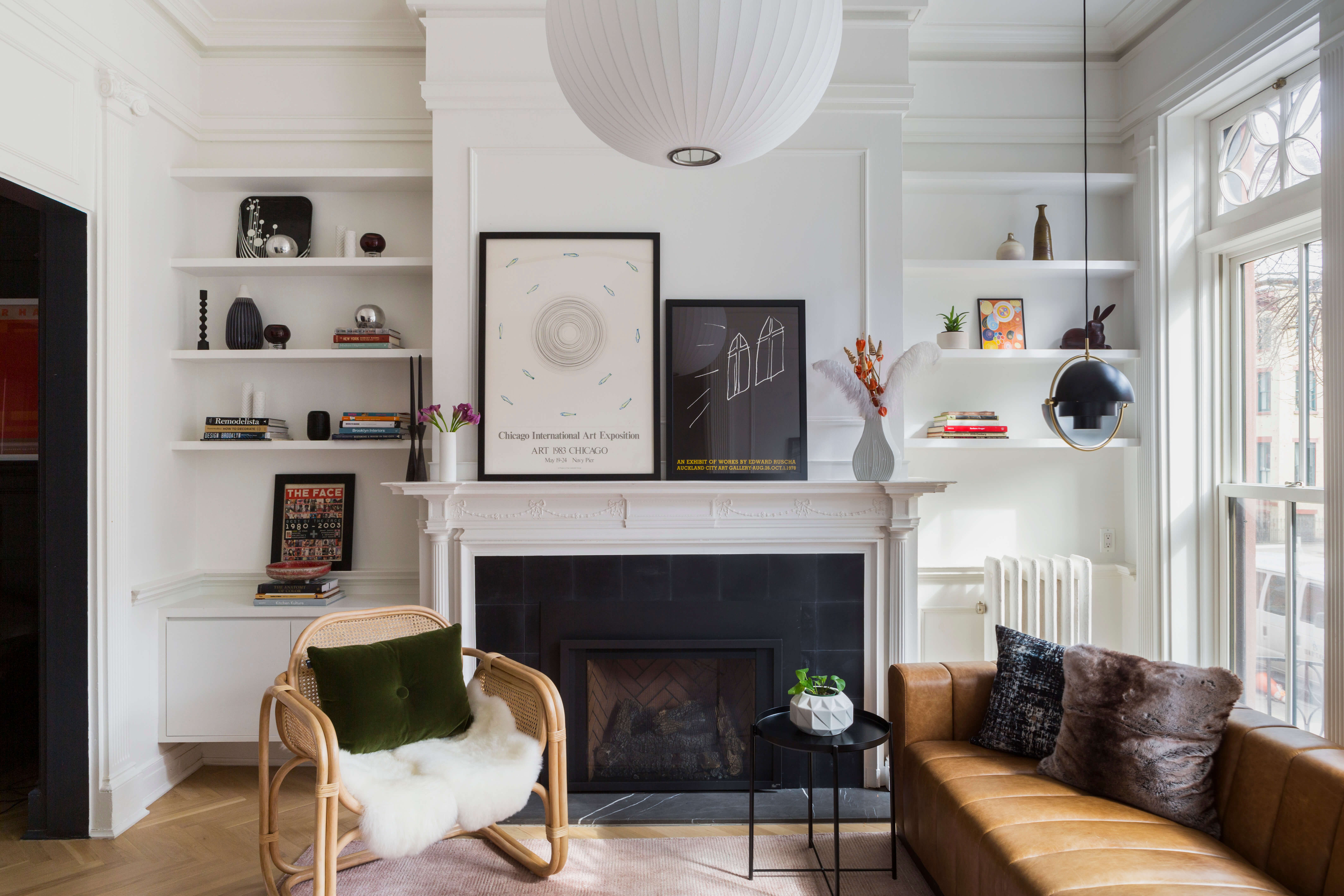
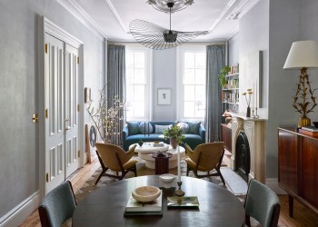
The house was furnished in spare modern fashion by the homeowners.
A new concrete tile surround sits beneath the original wood mantelpiece. The open bookcases on either side are new.
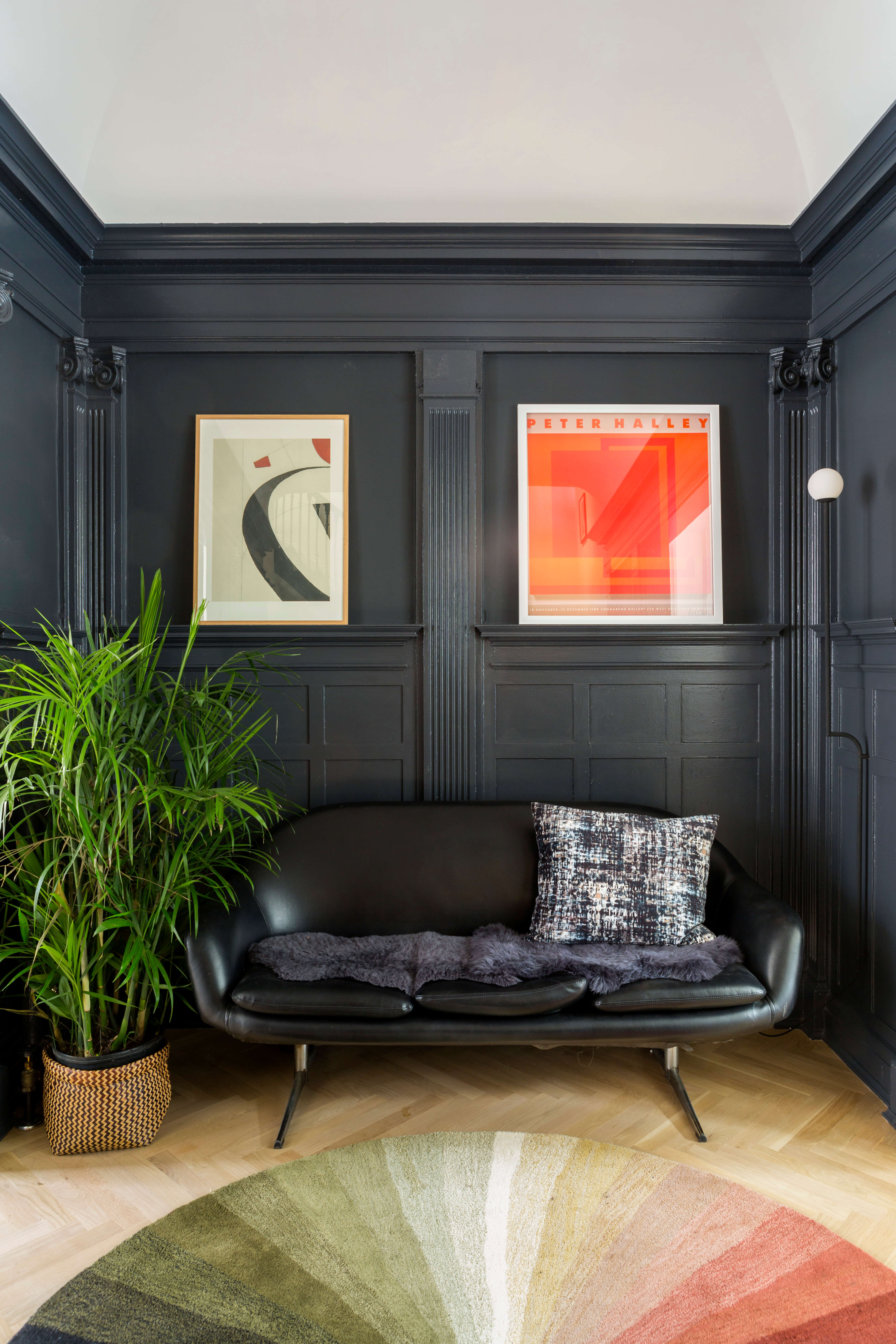
The middle parlor, with its panels, pilasters and hefty molding, was painted several shades of black to highlight the woodwork and contrast with the white vaulted ceiling above.
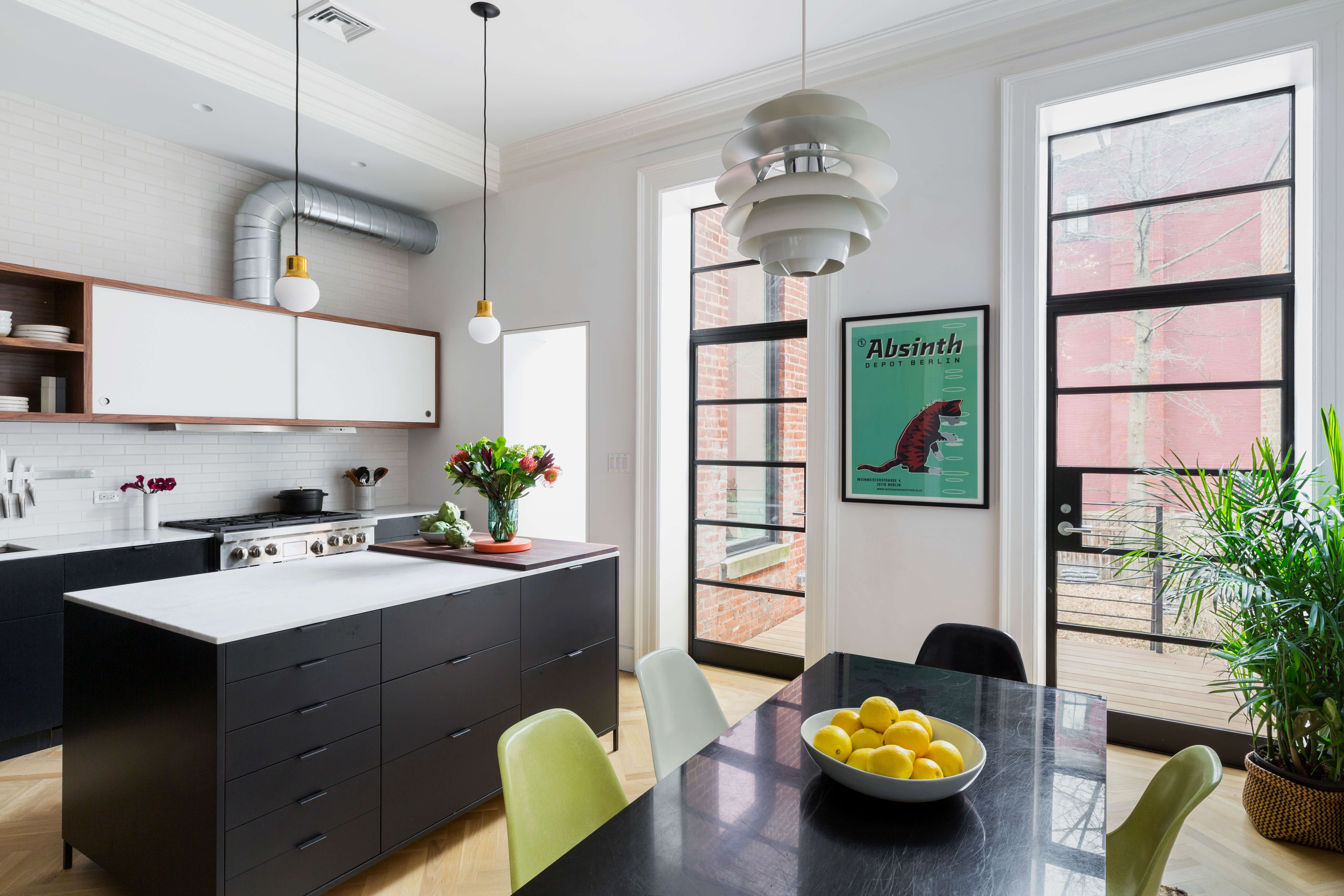
Urban Pioneering enlarged the house’s rear window openings and inserted new steel and glass doors leading to a new deck.
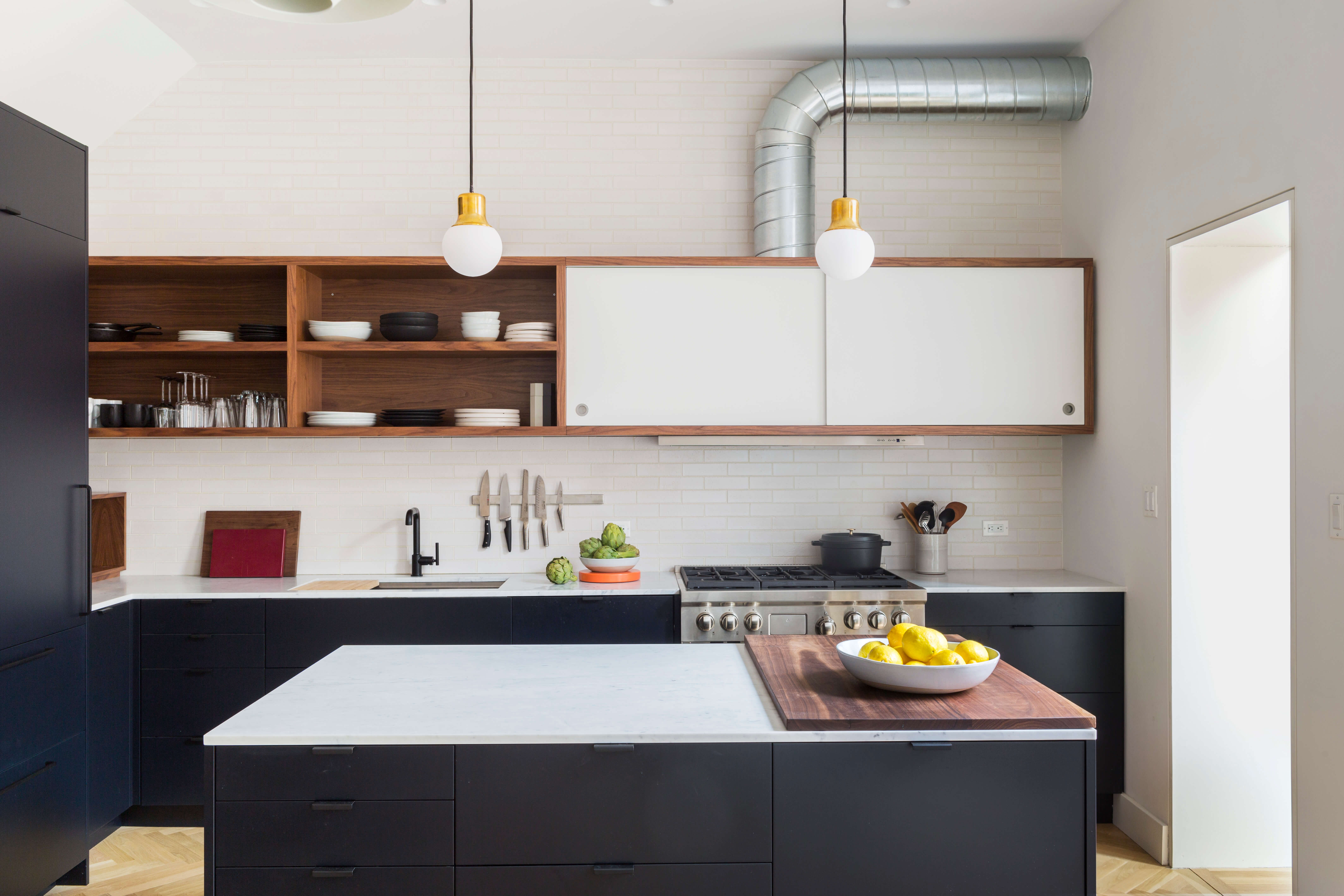
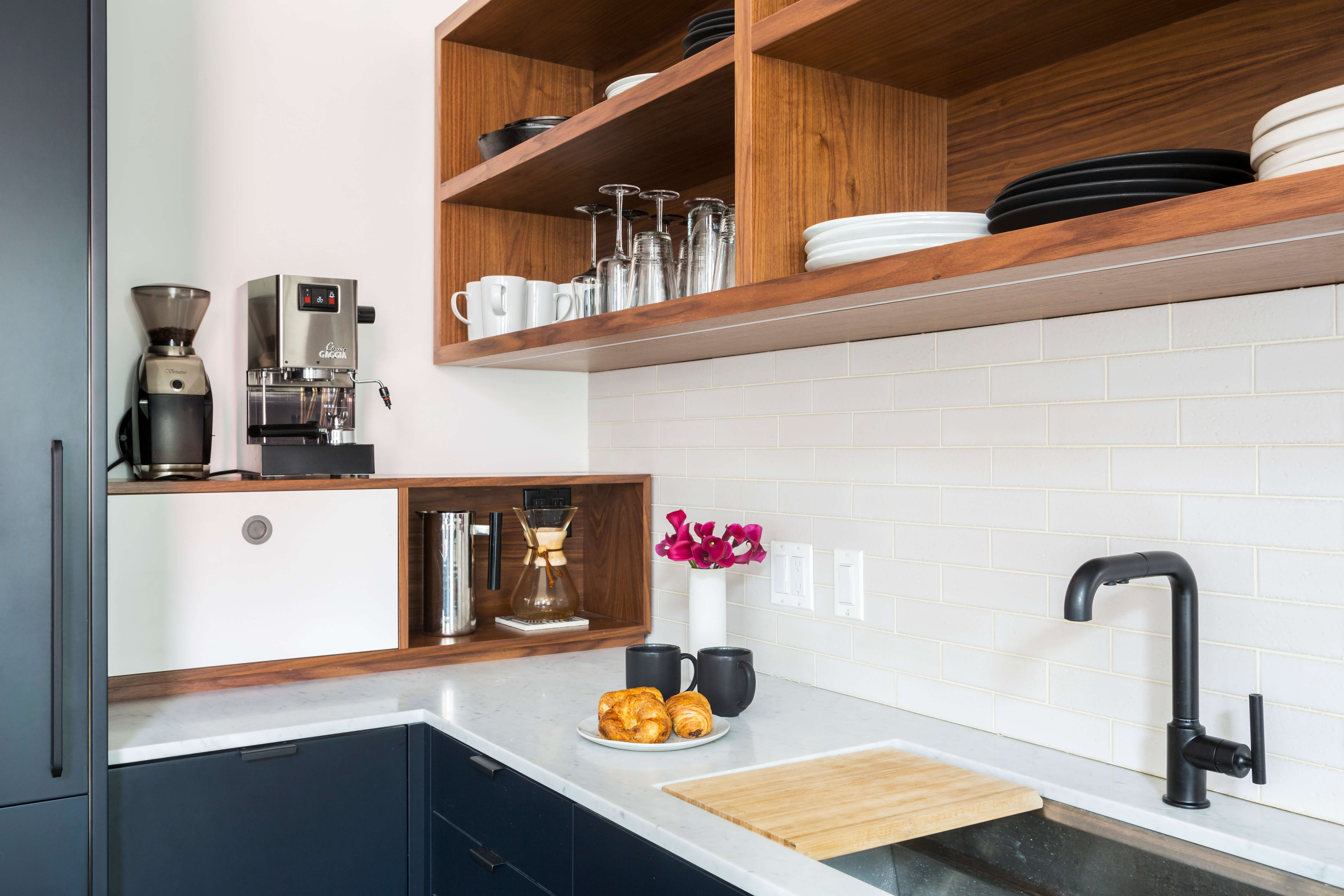
An outside consultant, the Manhattan-based architect Alex Scott Porter, designed the kitchen to a layout by Urban Pioneering. Its cabinetry is comprised mostly of IKEA boxes with custom fronts.
MW Construction of Brooklyn made and installed the custom kitchen components, including the uppers and the countertop element.
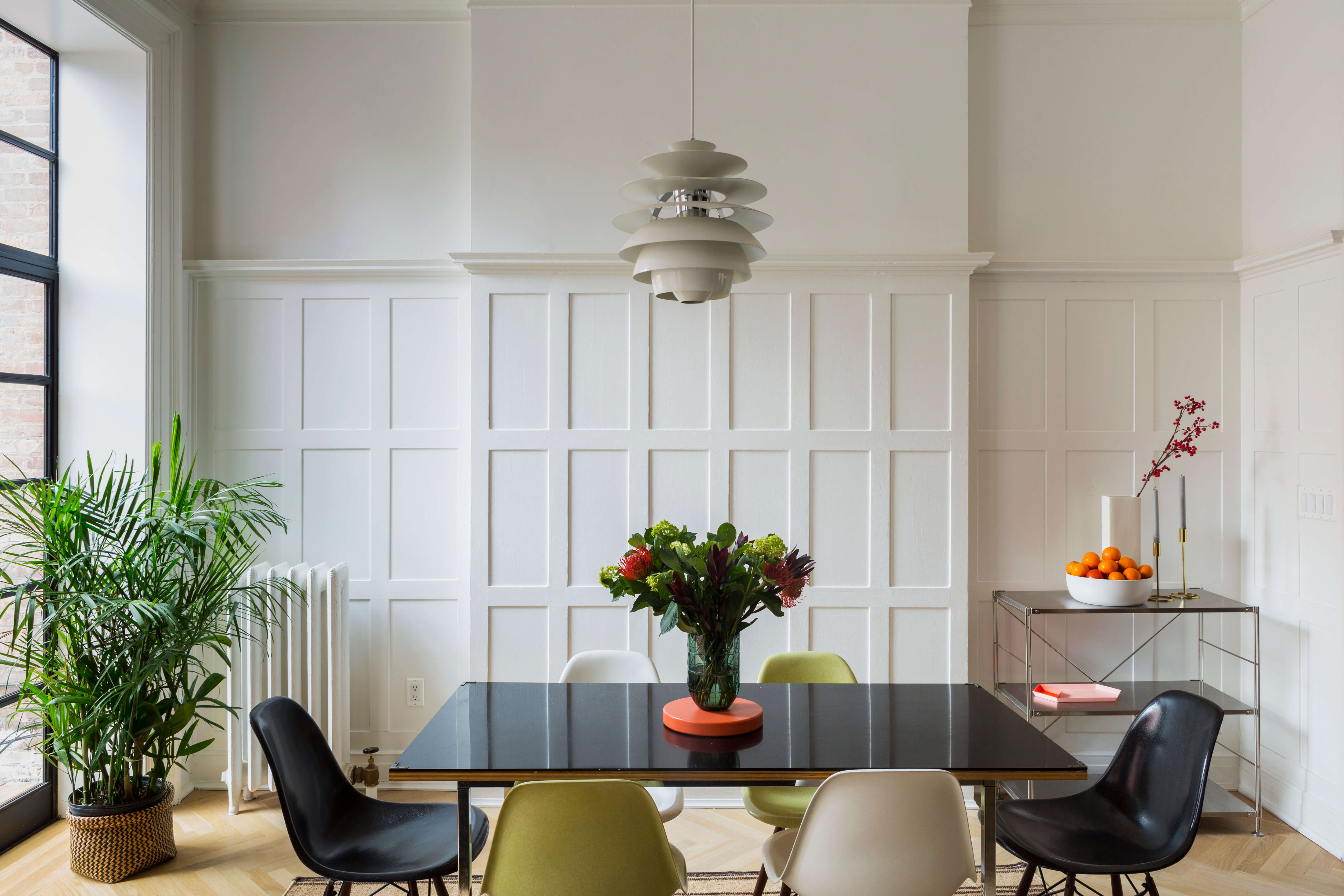
White-painted wall paneling in the dining area gives the room a completely different ambiance from the dusky space next door.
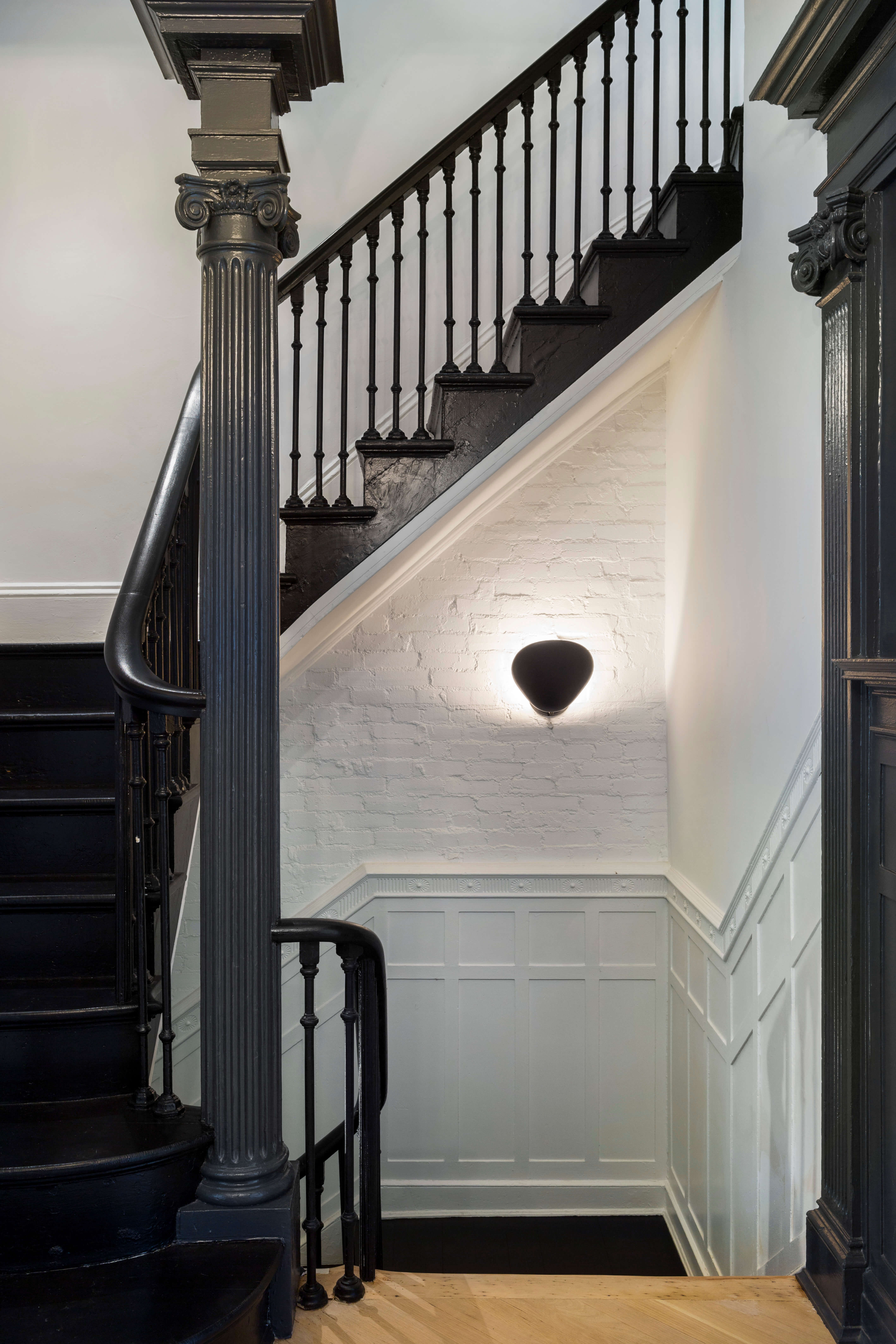
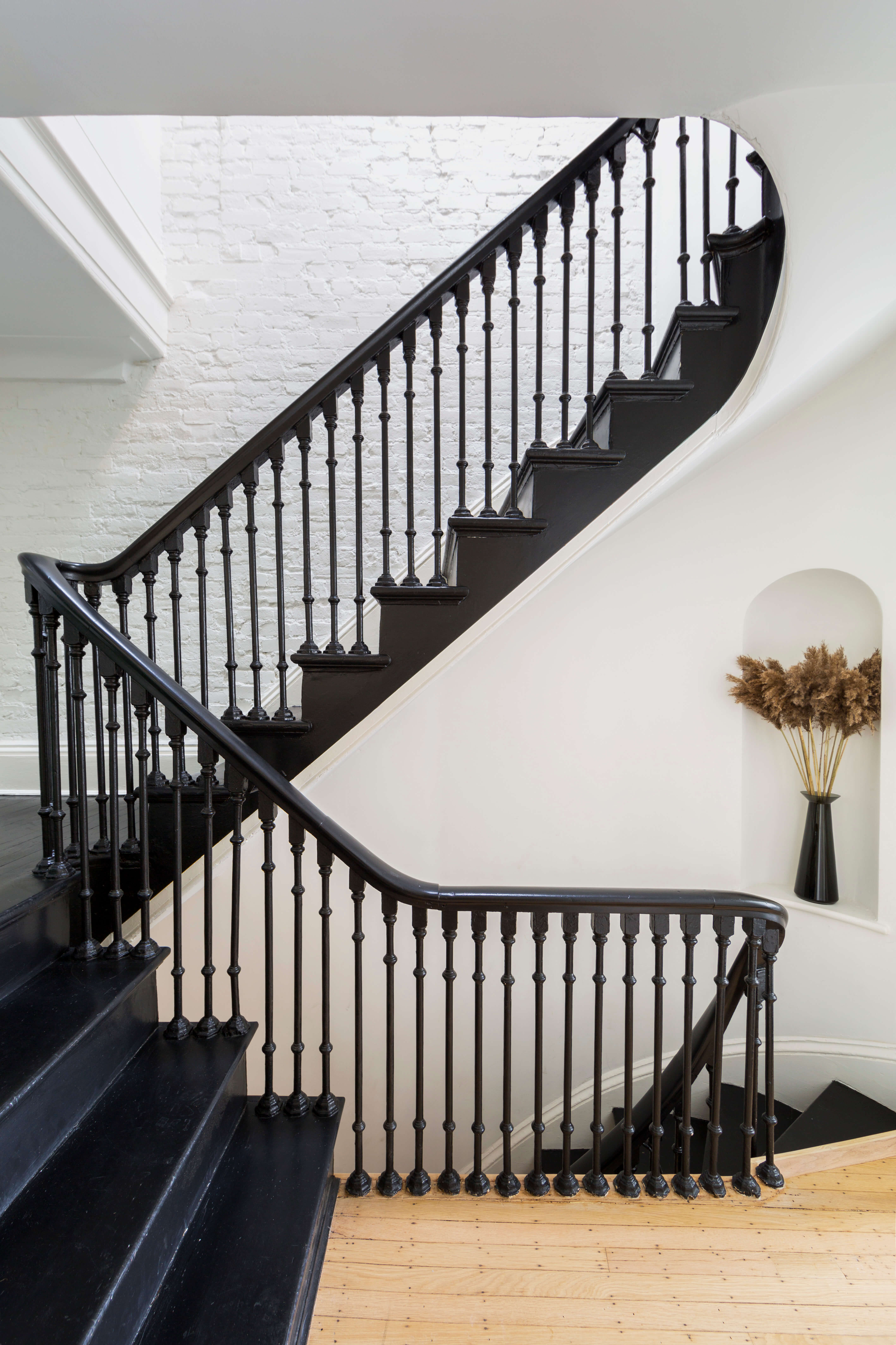
Farrow & Ball’s Pitch Black was used on the stair railings, balusters, treads and risers, for reasons that were “partly aesthetics and partly budget,” Hill said. The paint treatment eliminated the need to strip and refinish the large staircase.
Existing exposed brick in the stairwell was painted white.
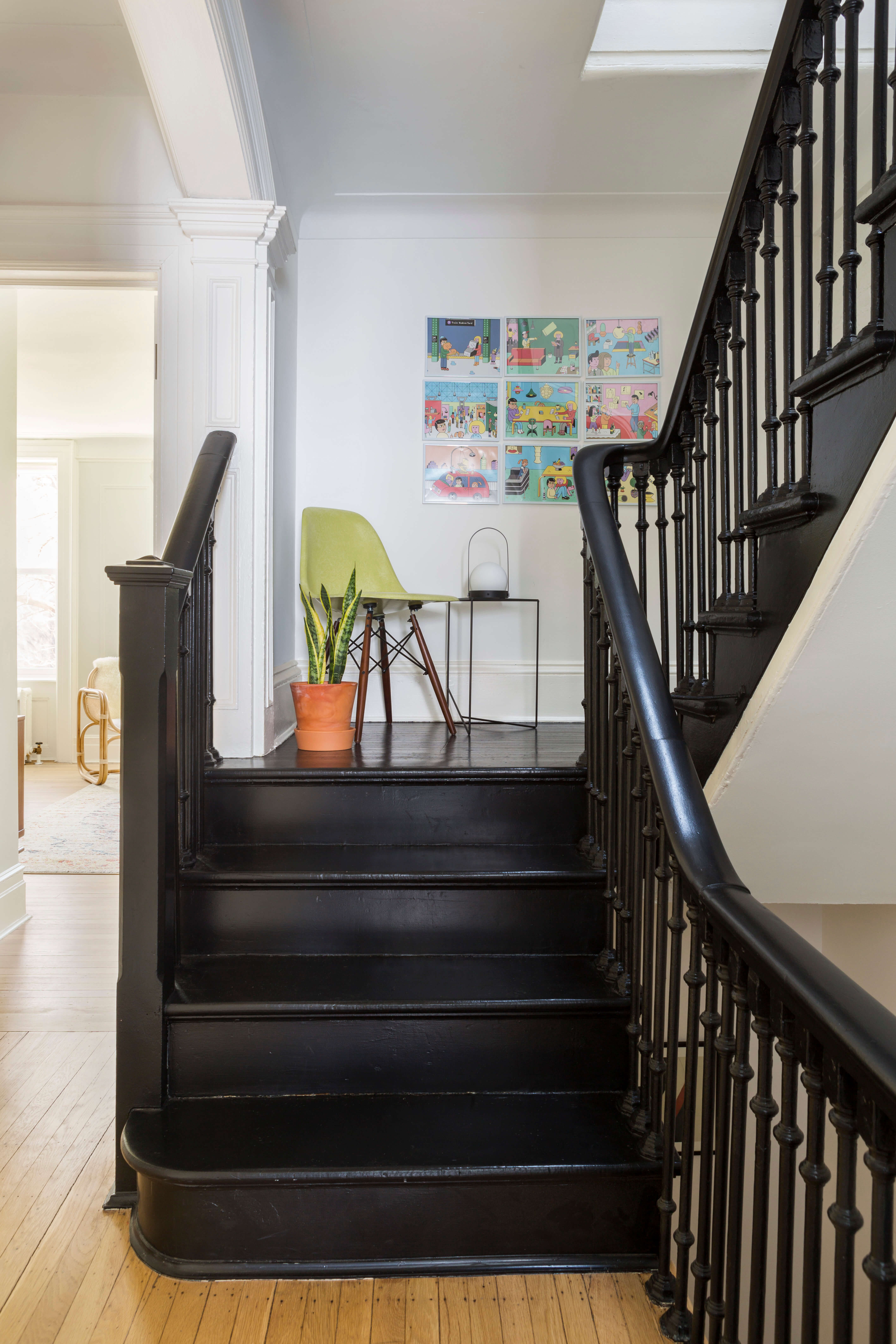
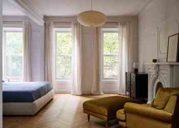
Original narrow strip floors on the house’s two upper levels were retained and refinished.
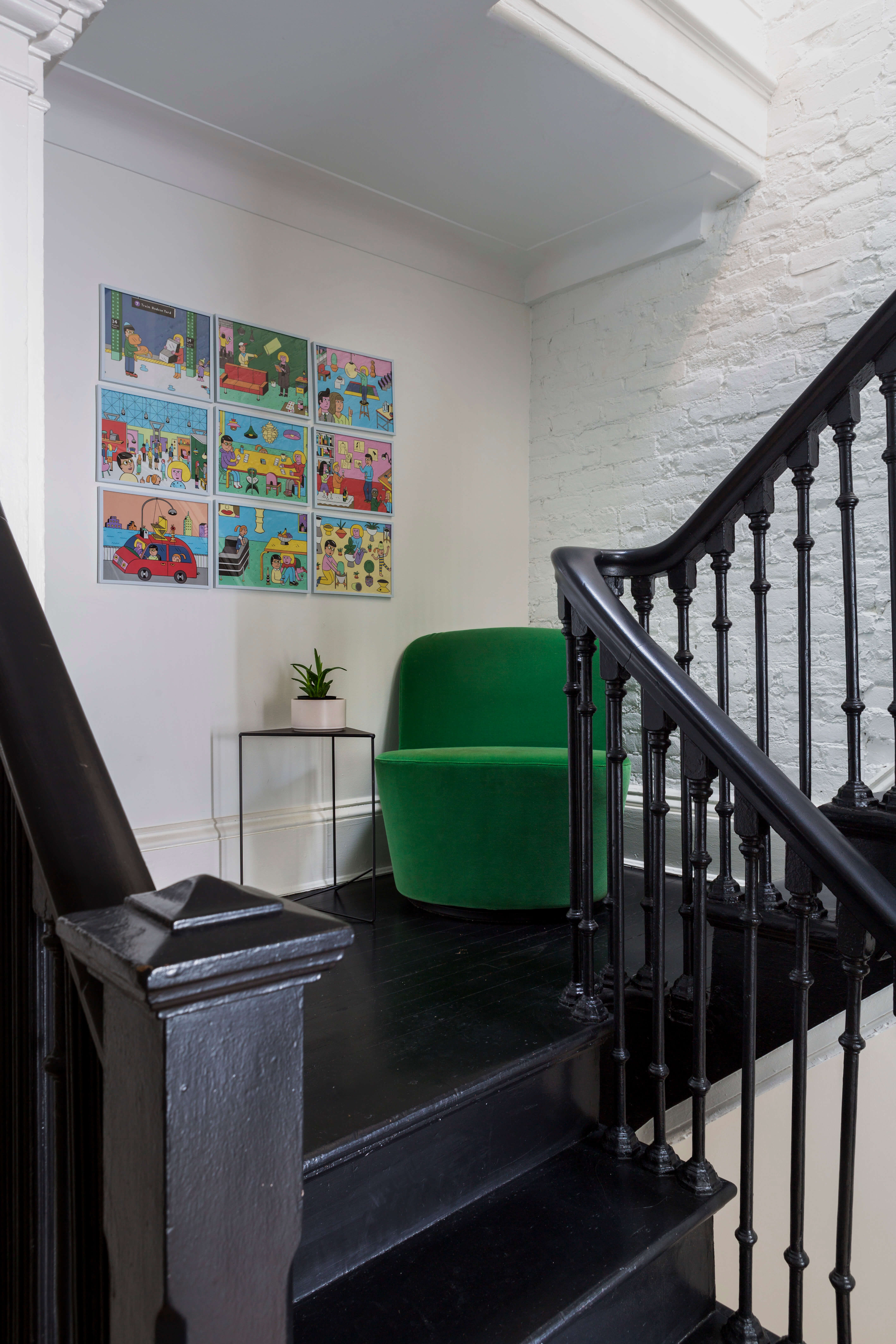
The switchback design of the stair, which requires a 180-degree turn midway through each flight, has spacious landings big enough for a perch.
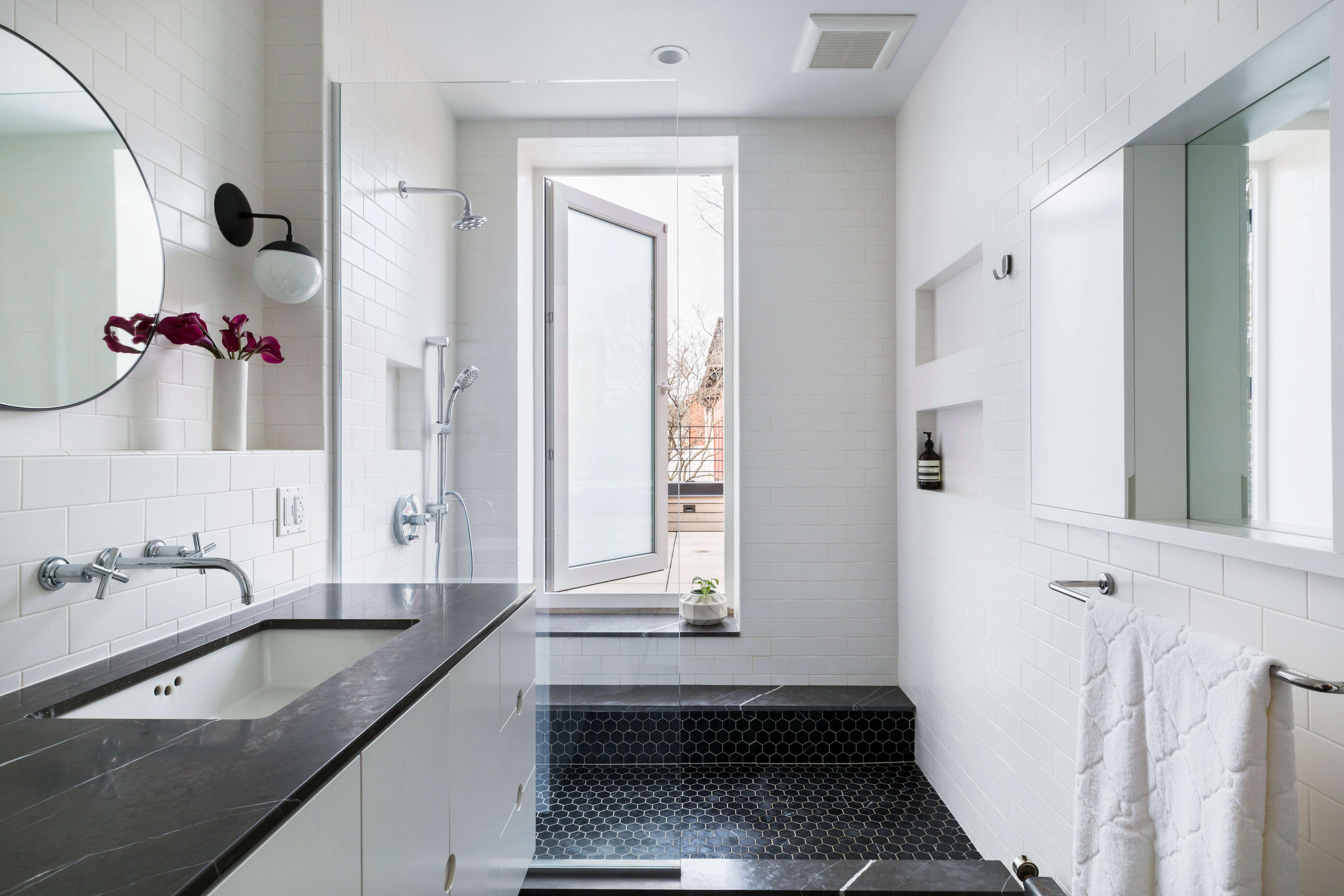
The second-floor master bath opens onto a terrace on top of the extension (yes, you have to step through the shower to get there).
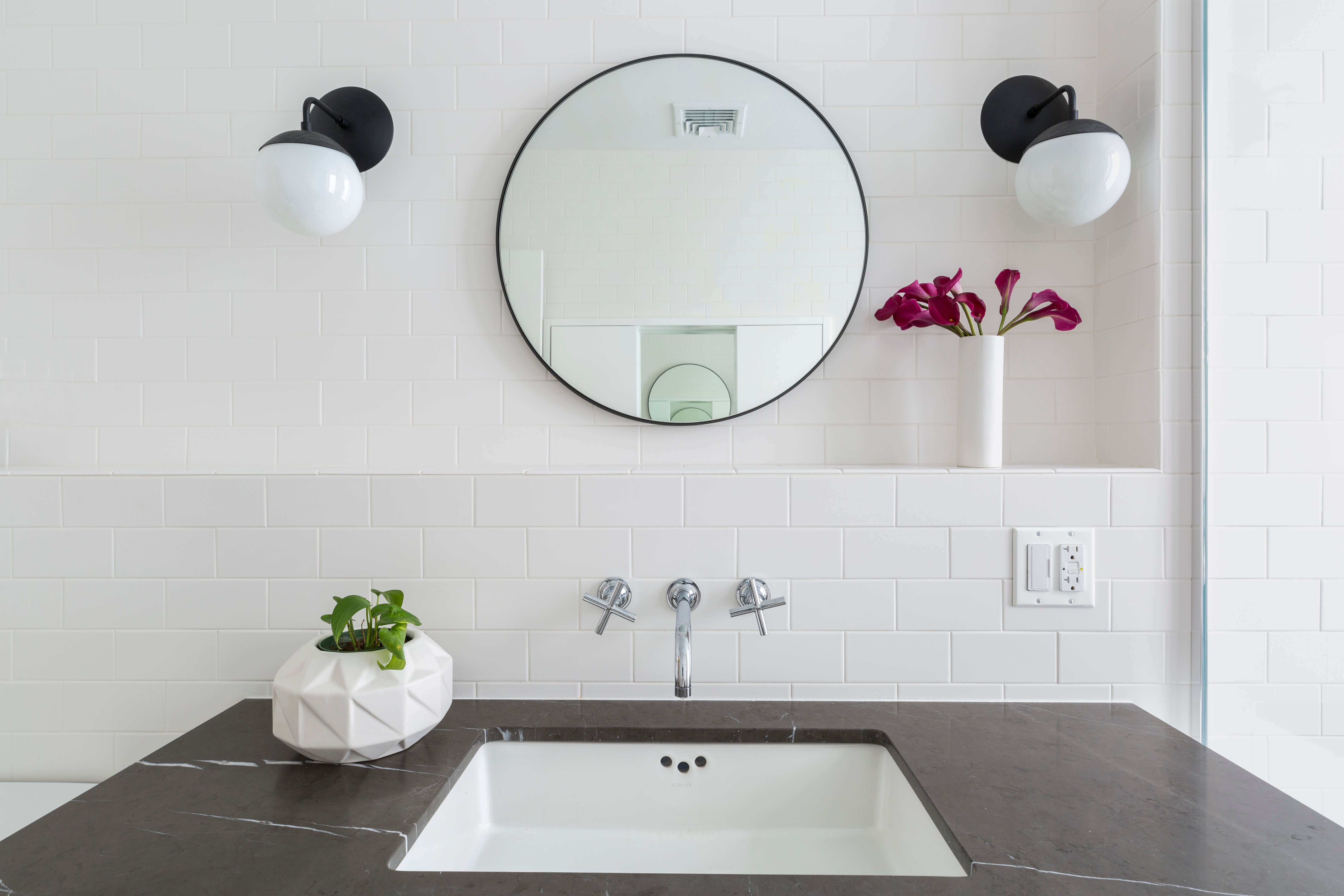
The simple but classy scheme utilizes black marble against white subway tile. The vanity is custom.
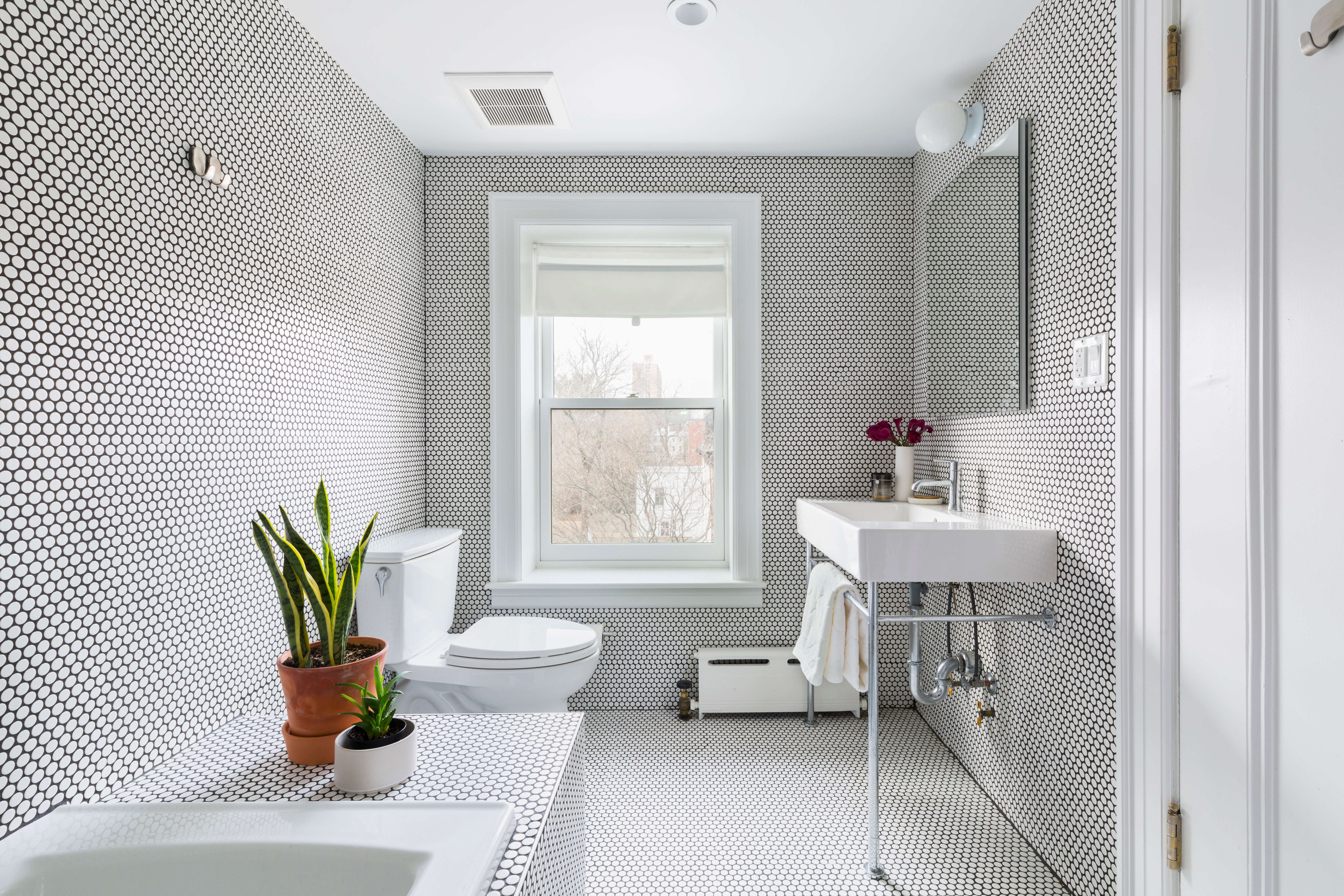
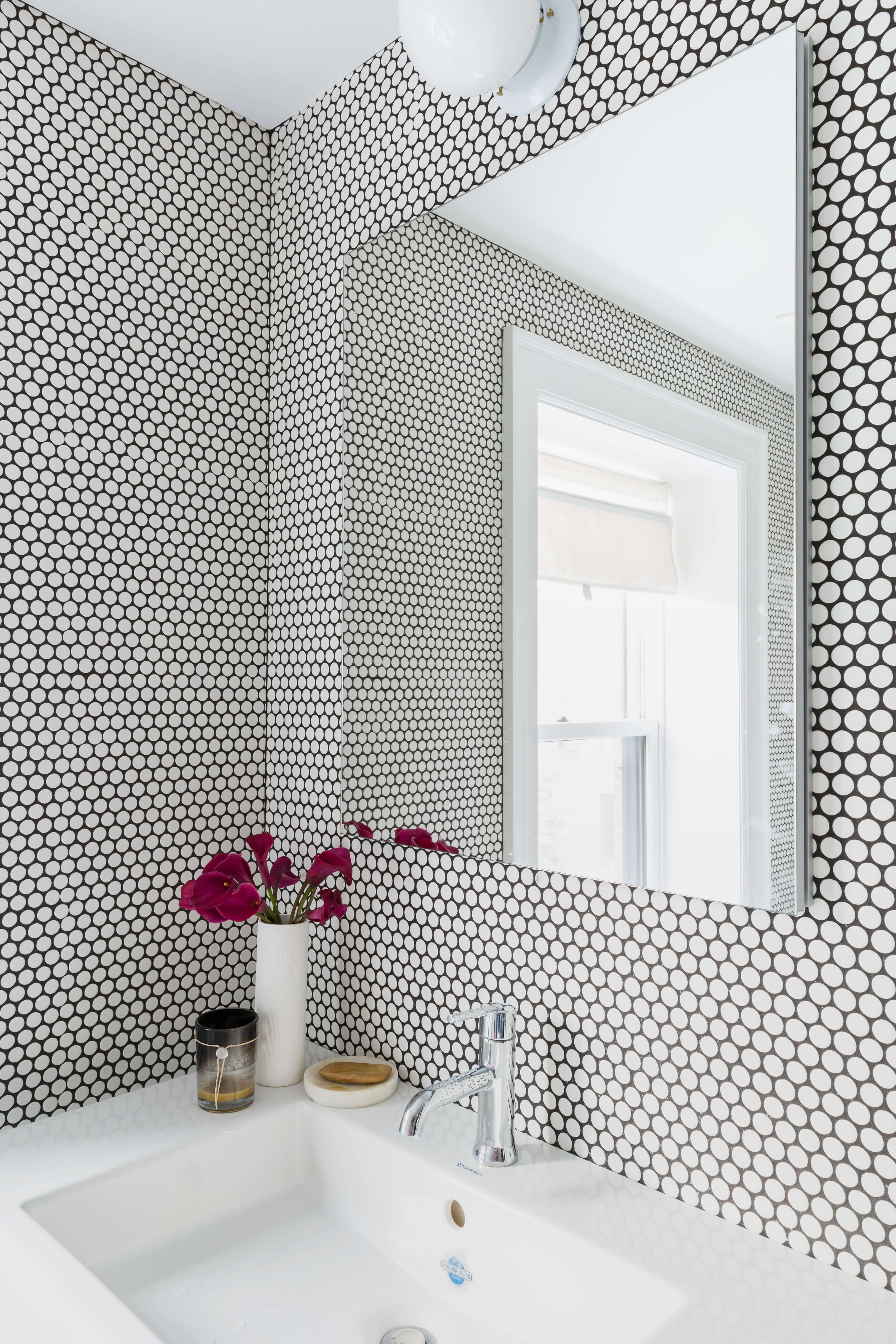
Penny tiles with black grout clad the walls and floor of the top floor bath. The pedestal sink on chrome legs came from Duravit.
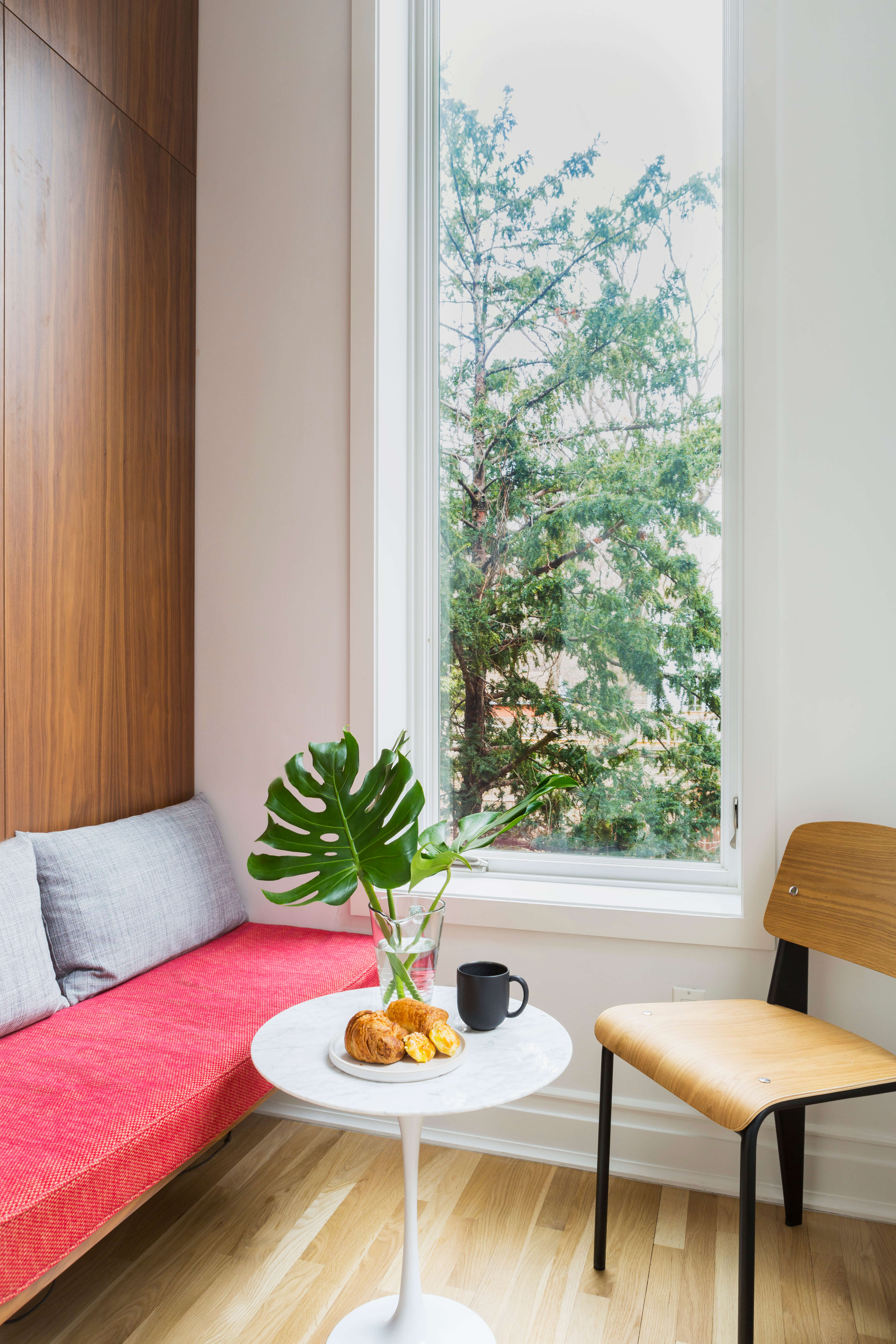
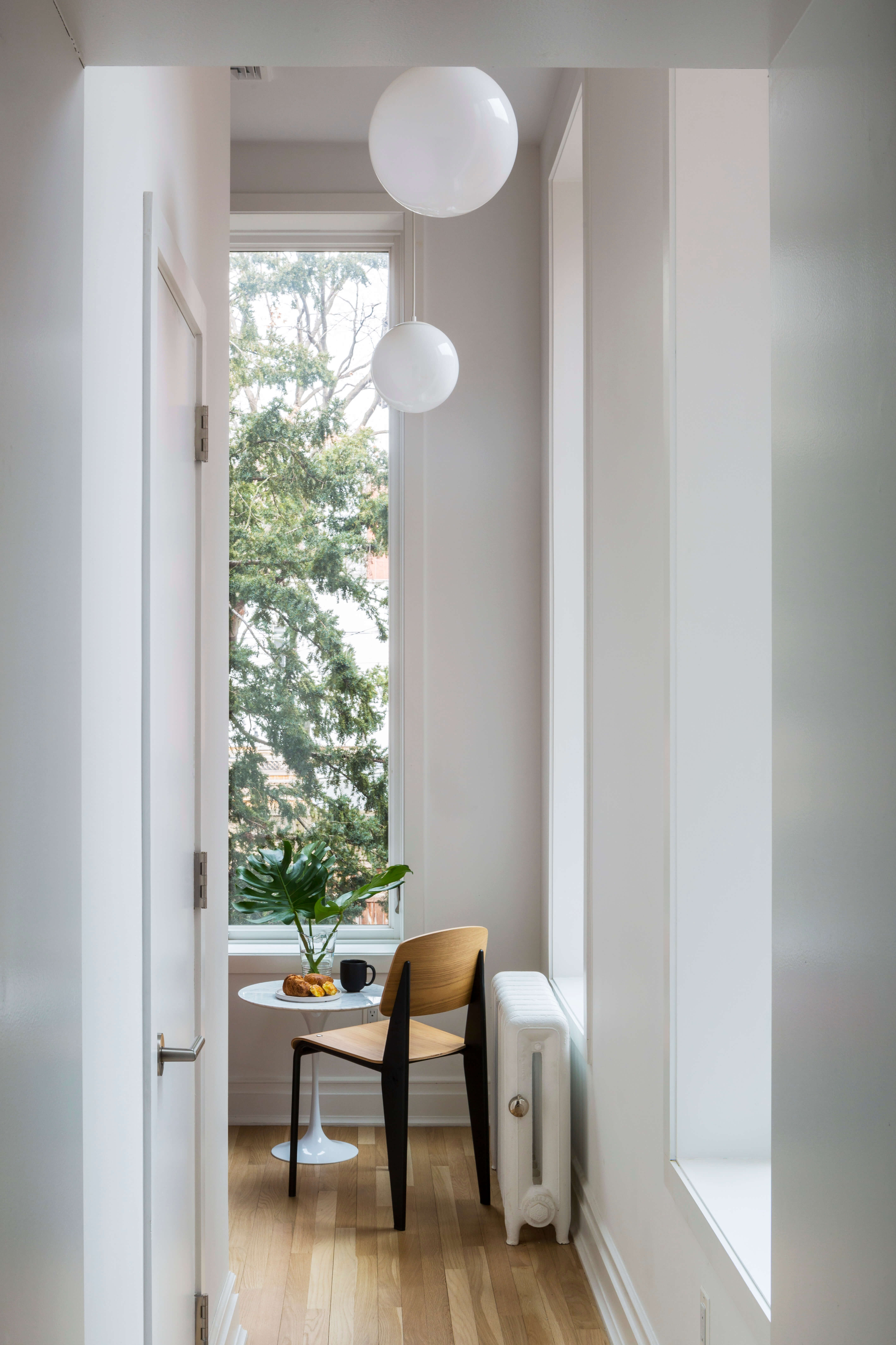
The homeowners use the narrow room with very tall ceilings (11 or so feet) in the repurposed rear extension for reading, laptop work and morning coffee.
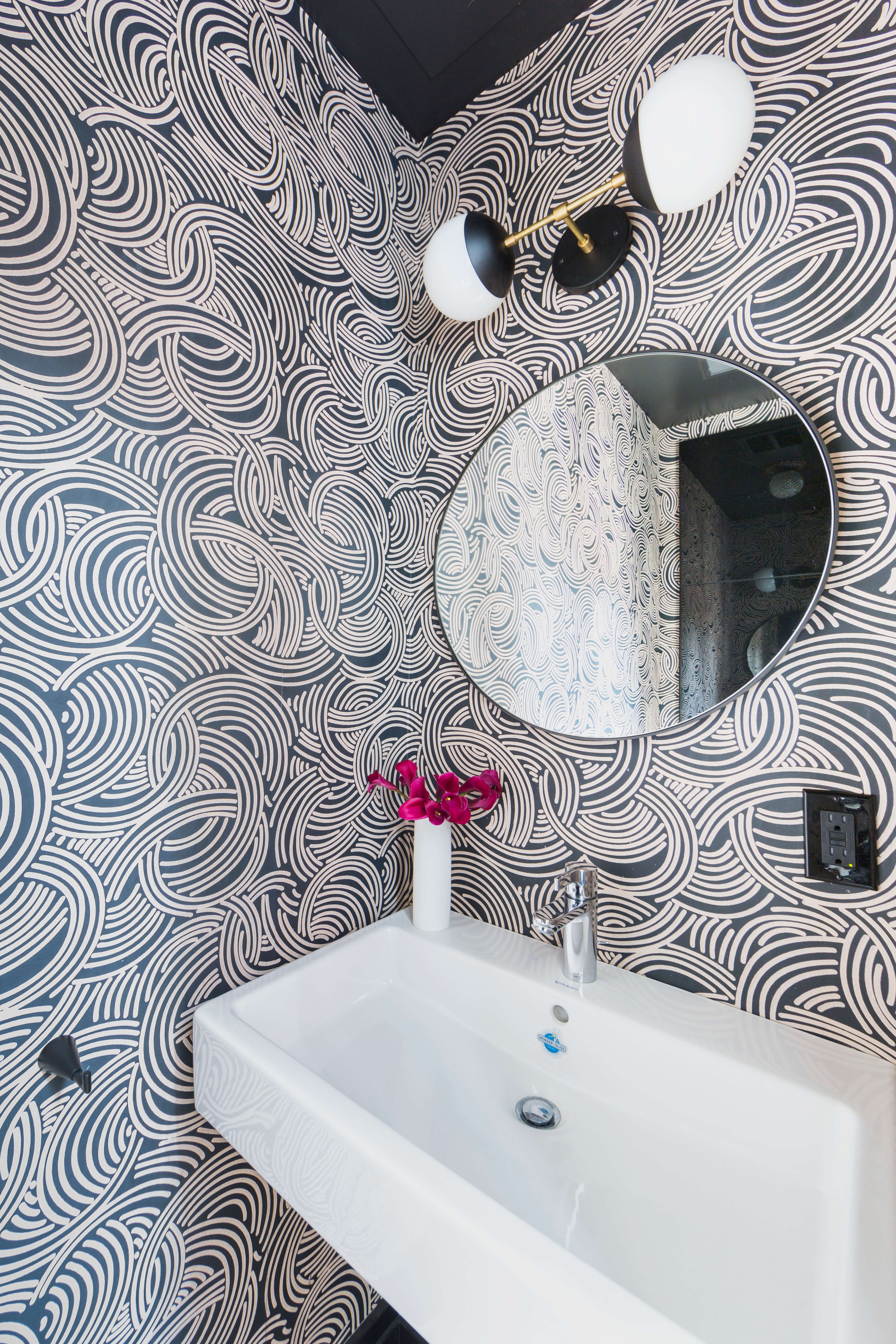
The Hills managed to squeeze a tiny powder room into the extension.
Hand-screened wallpaper with an Op-Art feel came from Farrow & Ball.
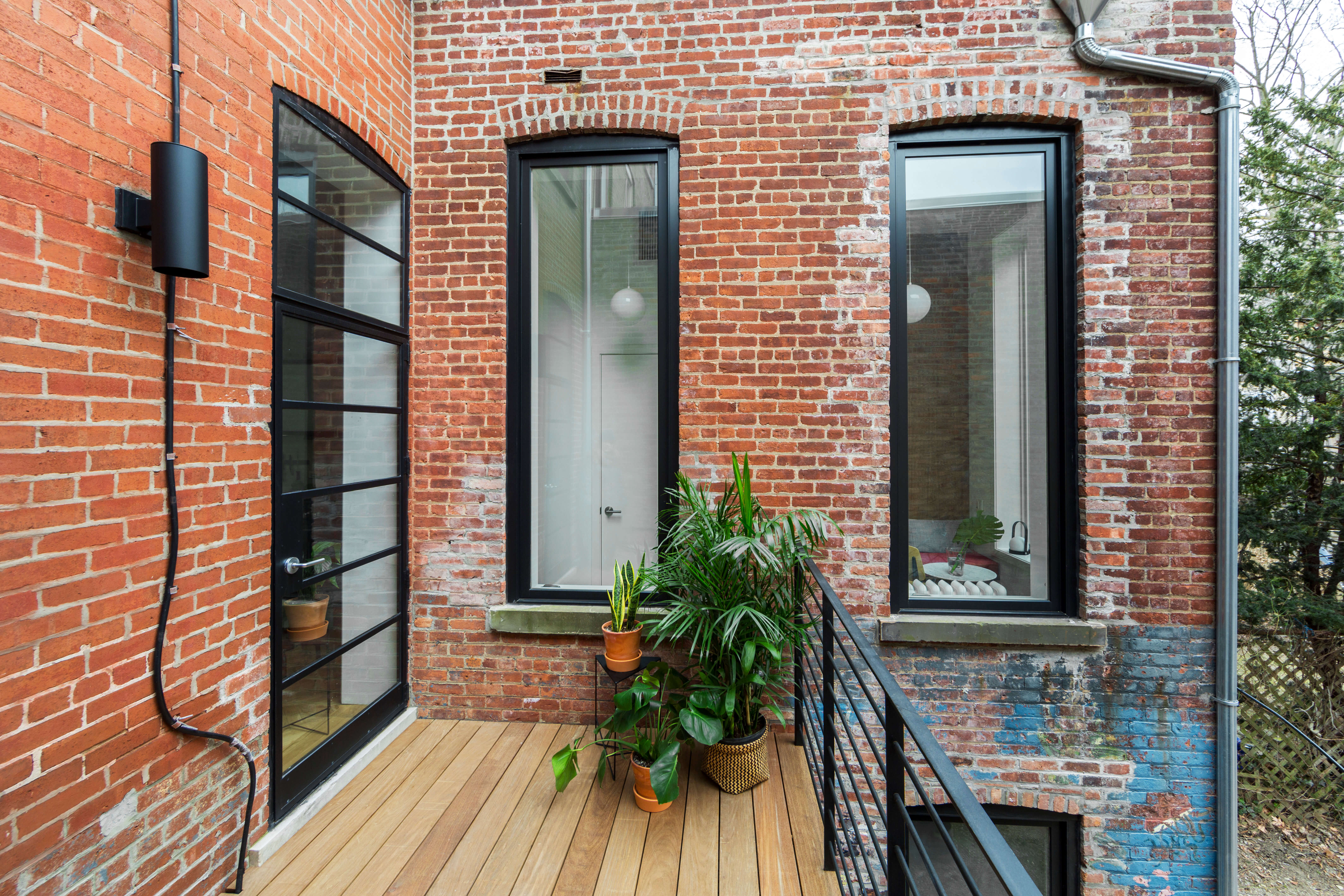
The windows openings in the brick extension were lengthened to maximize light.
The new deck is cedar, with a steel rail.
[Photos by Kate Glicksberg]
Check out ‘The Insider’ mini-site: brownstoner.com/the-insider
The Insider is Brownstoner’s weekly in-depth look at a notable interior design/renovation project, by design journalist Cara Greenberg. Find it here every Thursday morning.
Got a project to propose for The Insider? Contact Cara at caramia447 [at] gmail [dot] com.
Related Stories
- The Insider: Brownstoner’s In-Depth Look at Notable Renovation and Design Projects
- The Insider: Modern Decor Turns Narrow Clinton Hill House into Chic Family Home
- The Insider: Modern Duplex Arises from Gut Reno of Carroll Gardens Structural Nightmare





What's Your Take? Leave a Comment