The Insider: Brooklyn Designers Stylishly Revamp a Martha's Vineyard Farmhouse, Sans Cliché
A six-hour drive is a small price to pay when the destination is a vintage farmhouse on Martha’s Vineyard, done up casually but stylishly by a pair of Brooklyn-based designers.

Happy New Year, all! Got a project to propose for The Insider? Contact author Cara Greenberg at caramia447 [at] gmail [dot] com.
Why is it that modern furnishings look so right with the shiplap walls and beamed ceilings of this 19th century farmhouse, once a village post office? Keren and Thomas Richter, the husband-and-wife team behind White Arrow, a Brooklyn-based design studio, pulled it off by honoring the building’s history: retaining original walls and doors wherever possible, making new millwork simple and classic, and freshening things up with a combination of vintage and modern furniture, distinctive lighting and contemporary artwork.
The island dwelling off Cape Cod, Mass., belongs to a Brooklyn couple whose fond childhood memories led them to buy a retreat six hours away by car and ferry from their primary residence. “They can both work remotely and go up for long stretches,” Keren Richter said. “It’s not a weekend home, but a second home.”
When White Arrow came into the picture, the new homeowners already had plans drawn up by Martha’s Vineyard-based architecture firm Sullivan & Associates and had gone through a stringent local approval process. “They don’t want McMansions there,” Richter said.
Lacking was all the design details. Working both as interior designers and general contractor, White Arrow created a new kitchen and baths; chose flooring, moldings and other materials; moved “a wall or two” and made some needed structural fixes.
“We wanted it to feel like a refreshing, modern, quintessentially beach-y retreat,” Richter said, “but not a cliché version of that,” with nautical accessories and seashells everywhere. Using rich textures and bold colors, including a lot of blue to reflect the watery surroundings, they created a space as sophisticated as a city apartment with the casual, relaxed atmosphere of a vacation retreat.
The architects planned a reconfiguration of rooms, splicing in a new mudroom, changing the location of the original kitchen and adding a whole new master suite and home office onto the lower level of the vintage structure, accessed via a long, brand new hallway. Two guest rooms and a bath on the upper floor remain.
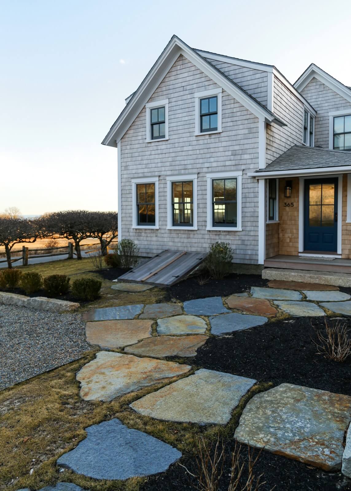
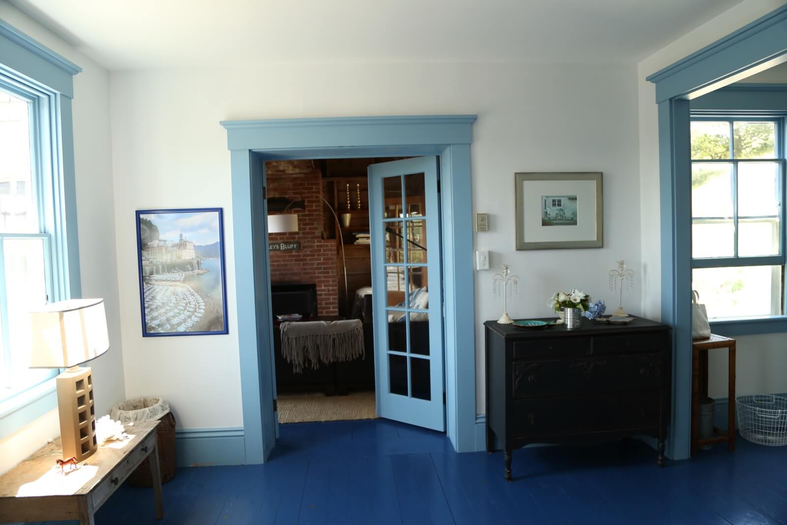
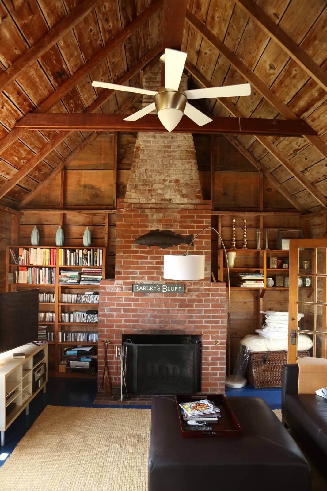
To the left of the front door as you face the house is the original 19th century post office, now an uninsulated, seasonal sitting room with a fireplace.
“The house has a rambling way,” Richter said of the structure, which grew in all directions as it was added on to over the years.
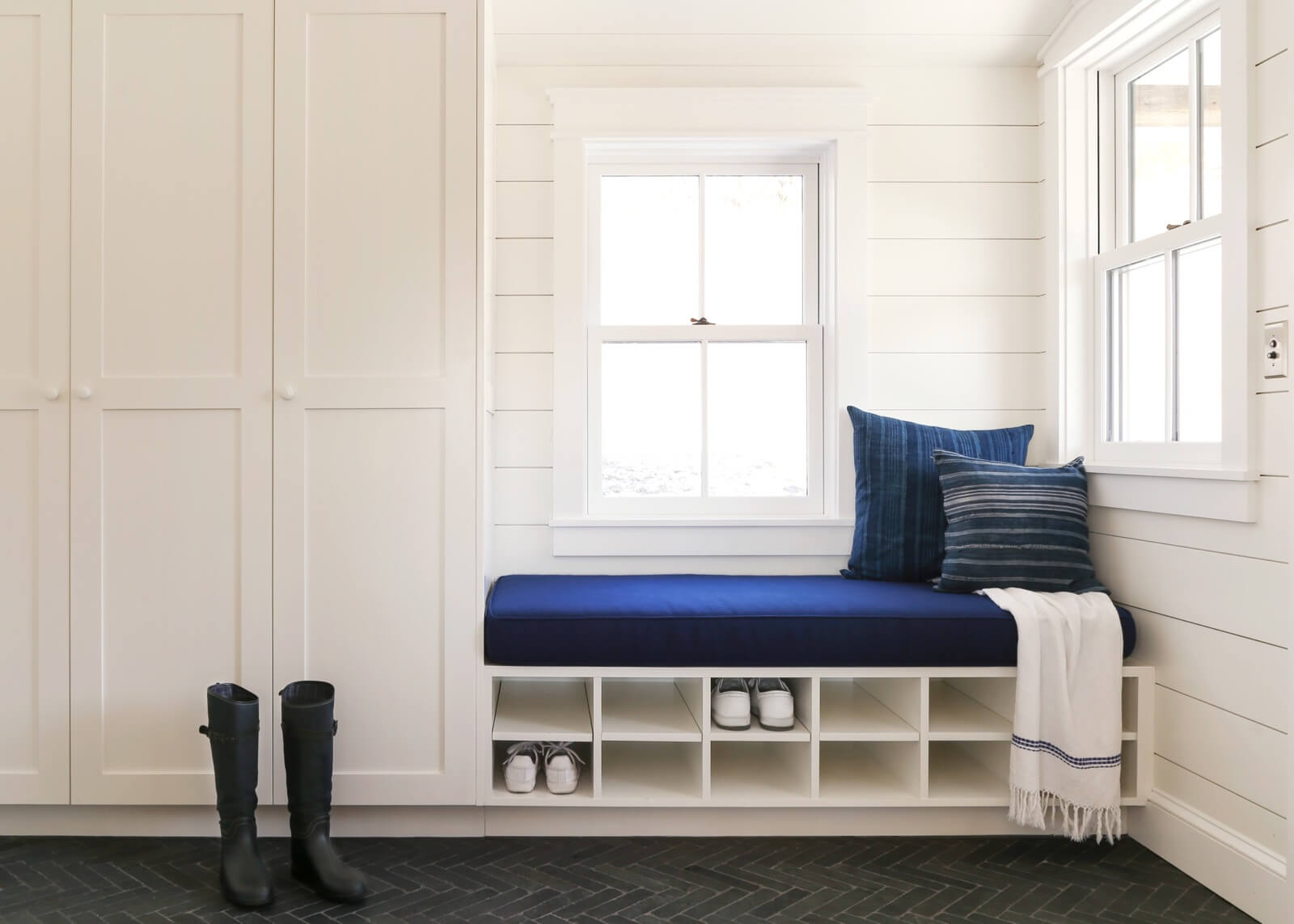
White Arrow designed clean-lined storage for the mudroom at the entry, enough of it so that the space remains free of beach gear and other clutter.
The floor is composed of small slate tiles laid in a herringbone pattern.
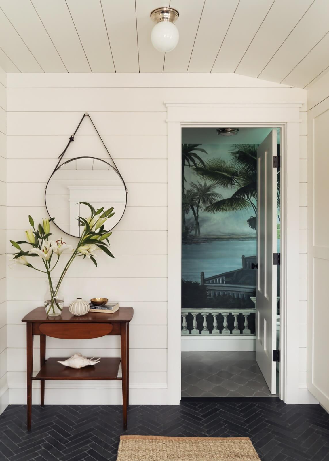
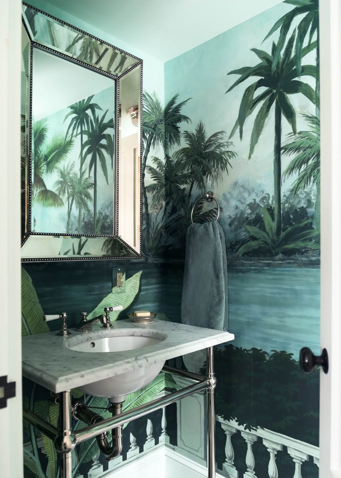
The powder room off the mudroom is a “transporting jewel box moment,” Keren Richter said, wrapped in Ananbo mural wallpaper from France.
Bath fixtures throughout the house are from Waterworks, including the marble and nickel sink.

The old village post office is now a sitting room. “We left it uninsulated so you can see the original cladding,” Richter said.
Modernist classics include two chrome and leather Wassily chairs by Marcel Breuer and a coffee table by master mid-century woodworker George Nakashima.

A Moroccan Toureg rug, indigo sofa by Stephen Kenn for Simon Miller, and a coffee table from Mark Tuckey kit out the living room.
The staircase, original to the house, leads to the second floor guest rooms.

The bar niche in the living room was “a happy accident,” Richter said, created when the designers found some extra space.
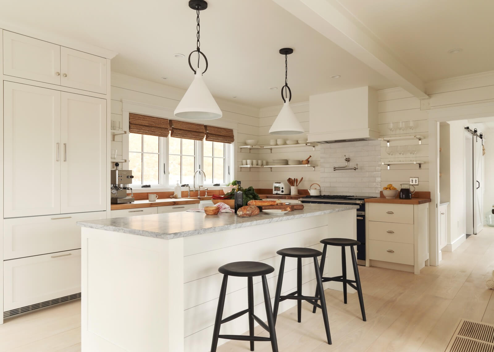
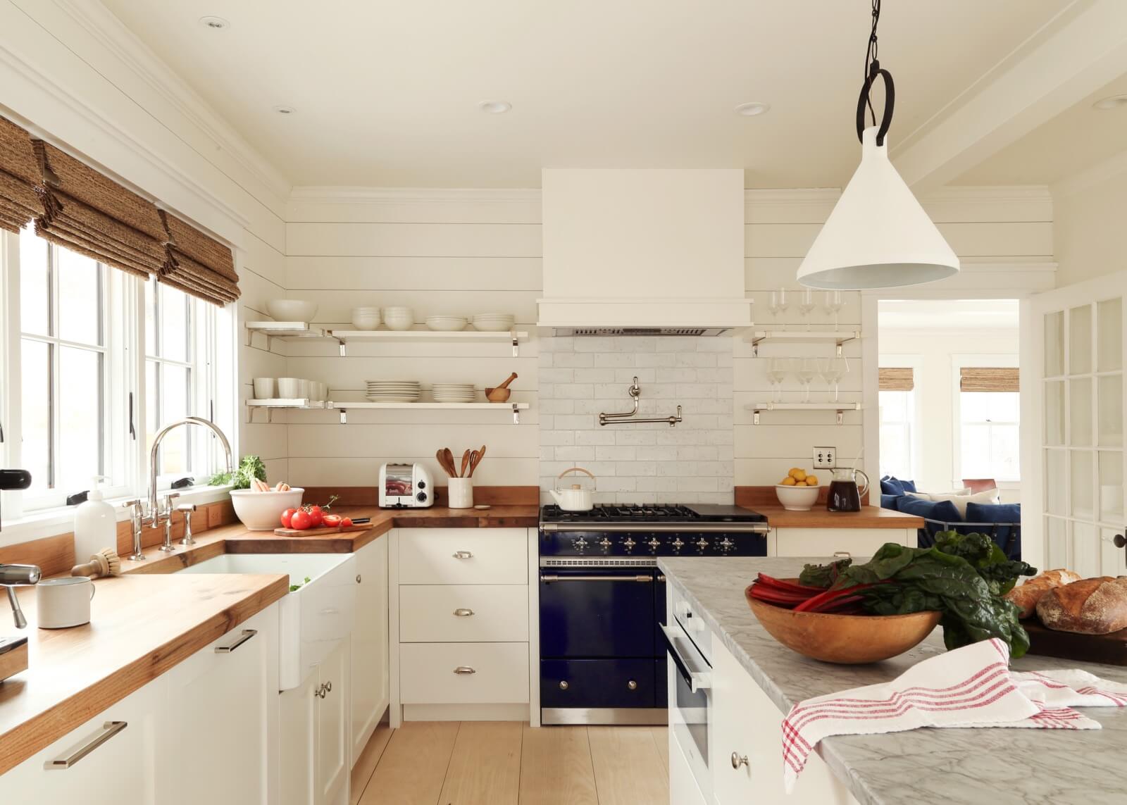
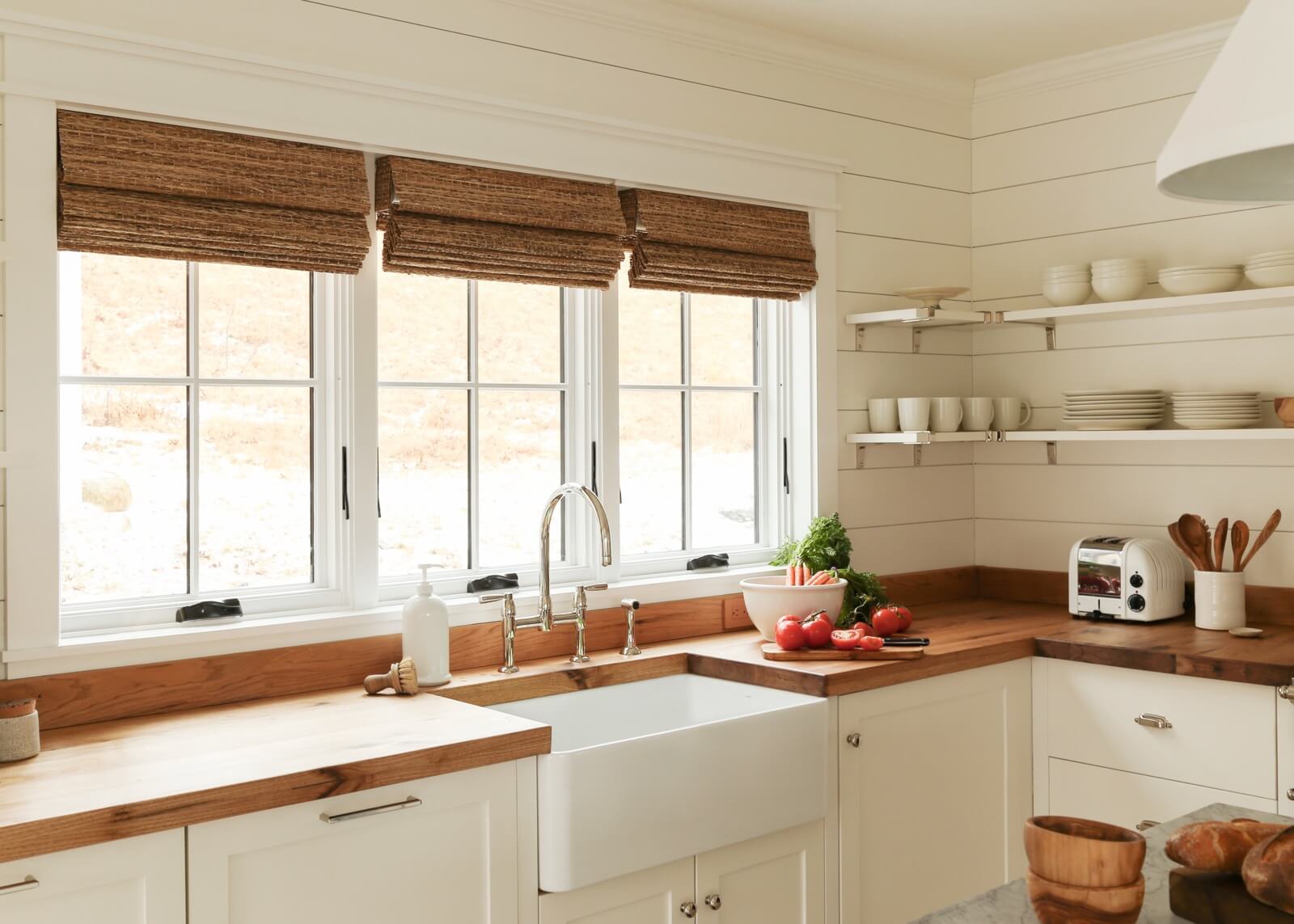
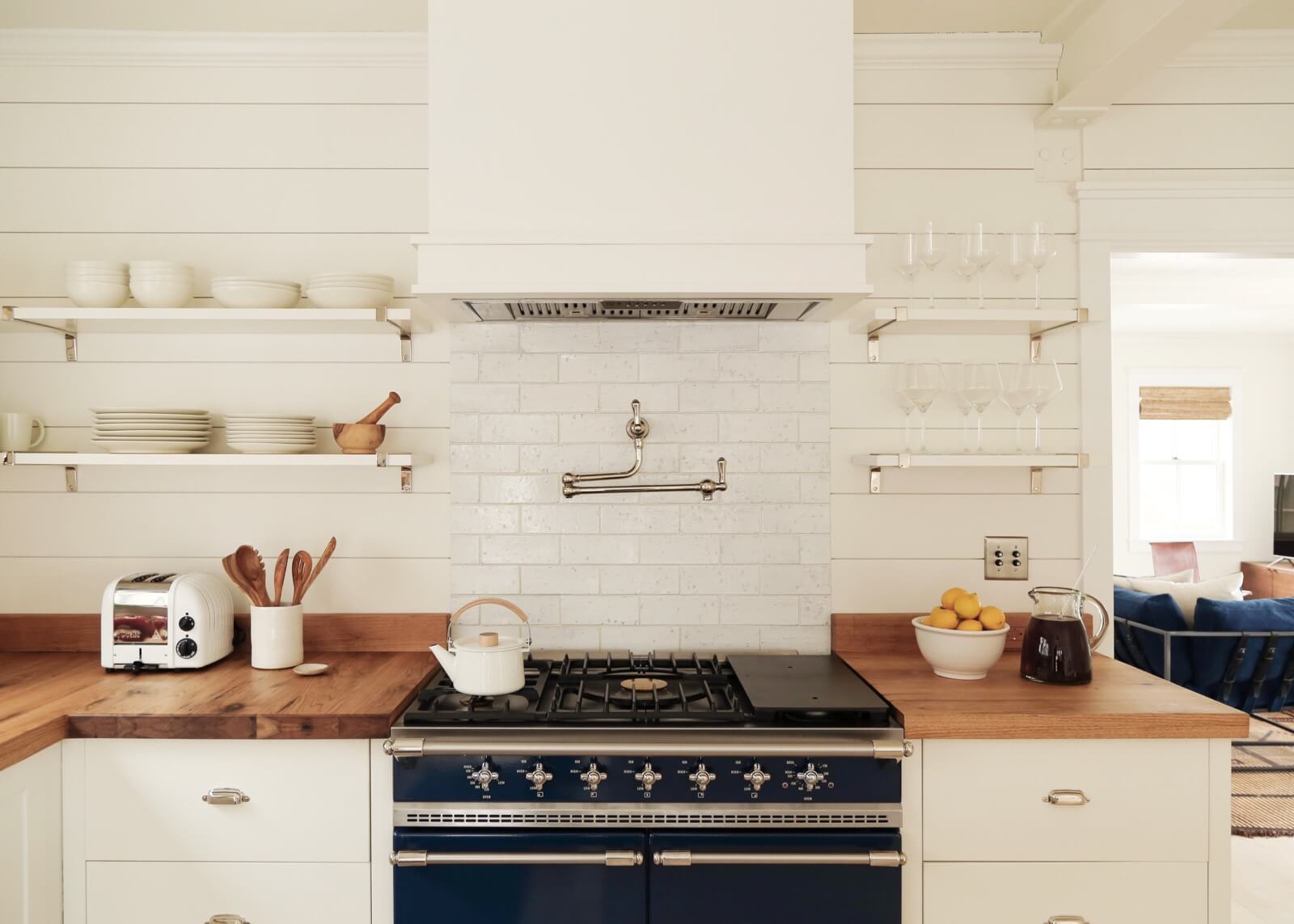
Semi-custom base cabinetry of painted wood was fitted with butternut countertops along the kitchen’s perimeter.
Pendant lights from Visual Comfort hang over the center island, which has a marble top.
The Lacanche stove makes a dark blue statement.
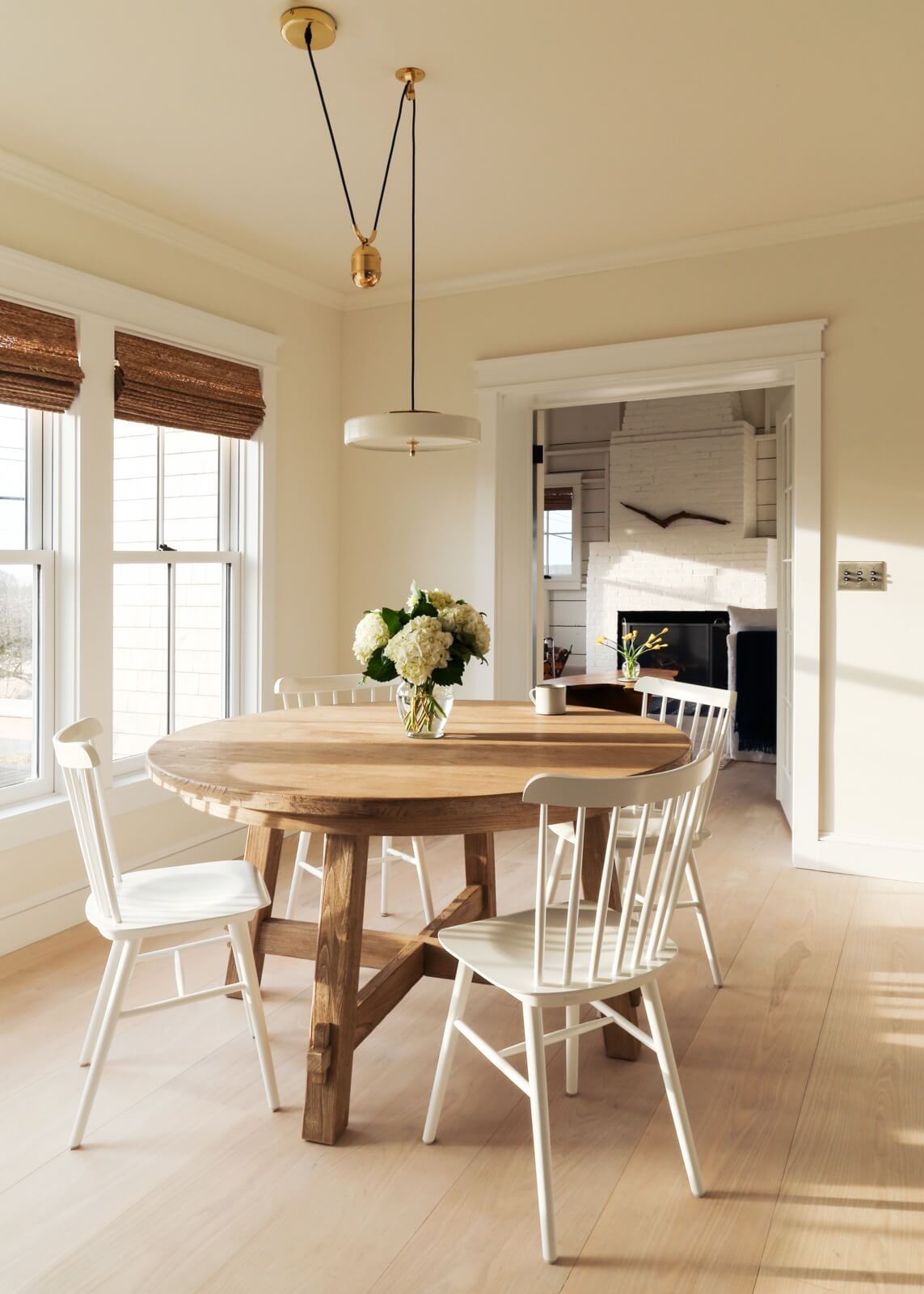
Simple dining room furnishings include a round table from Pottery Barn, extendable with a leaf, and Windsor chairs from Design Within Reach.

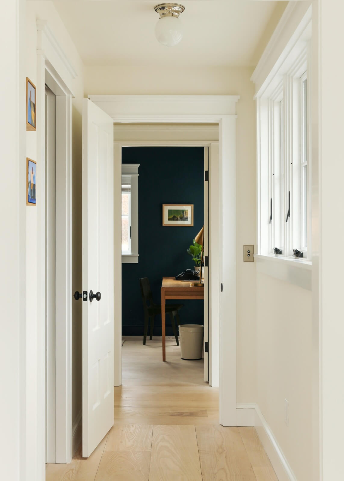
The new hallway leading to the home office and master suite is clad in wide-plank ash flooring, like much of the rest of the house.
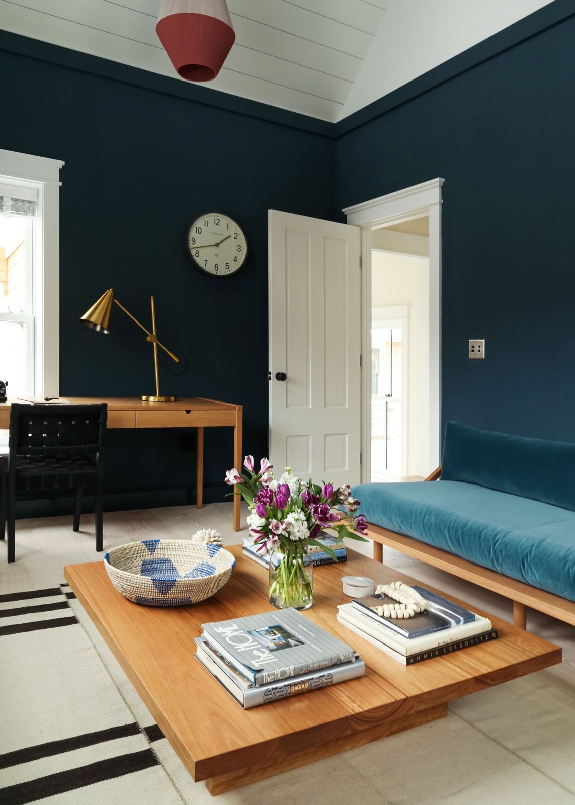
The home office, painted dark blue, has an extra-long custom desk for two. It doubles as a media room, with a flat-screen TV tucked out of sight.
The sofa and coffee table were sourced from Australian company Popp and Scott.
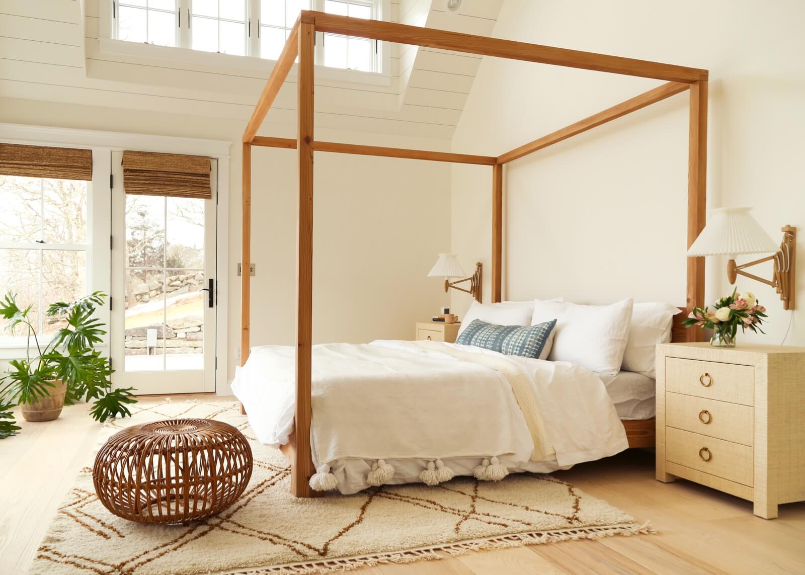
The new-construction double-height master bedroom centers on a canopy bed from Australian company Mark Tuckey.
Outside the room is one of several decks, this one with a hot tub.
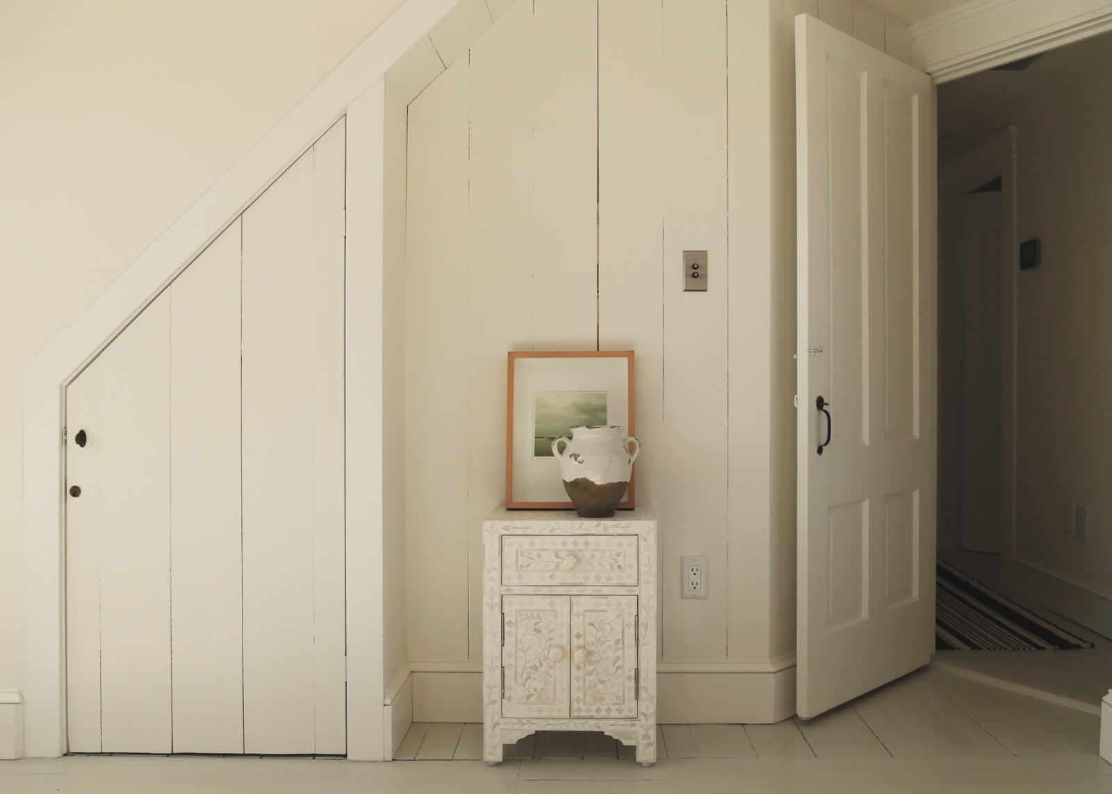
Parts of the house retained their original wall paneling and antique doors, including this angled one under a staircase. All this area needed was white paint.
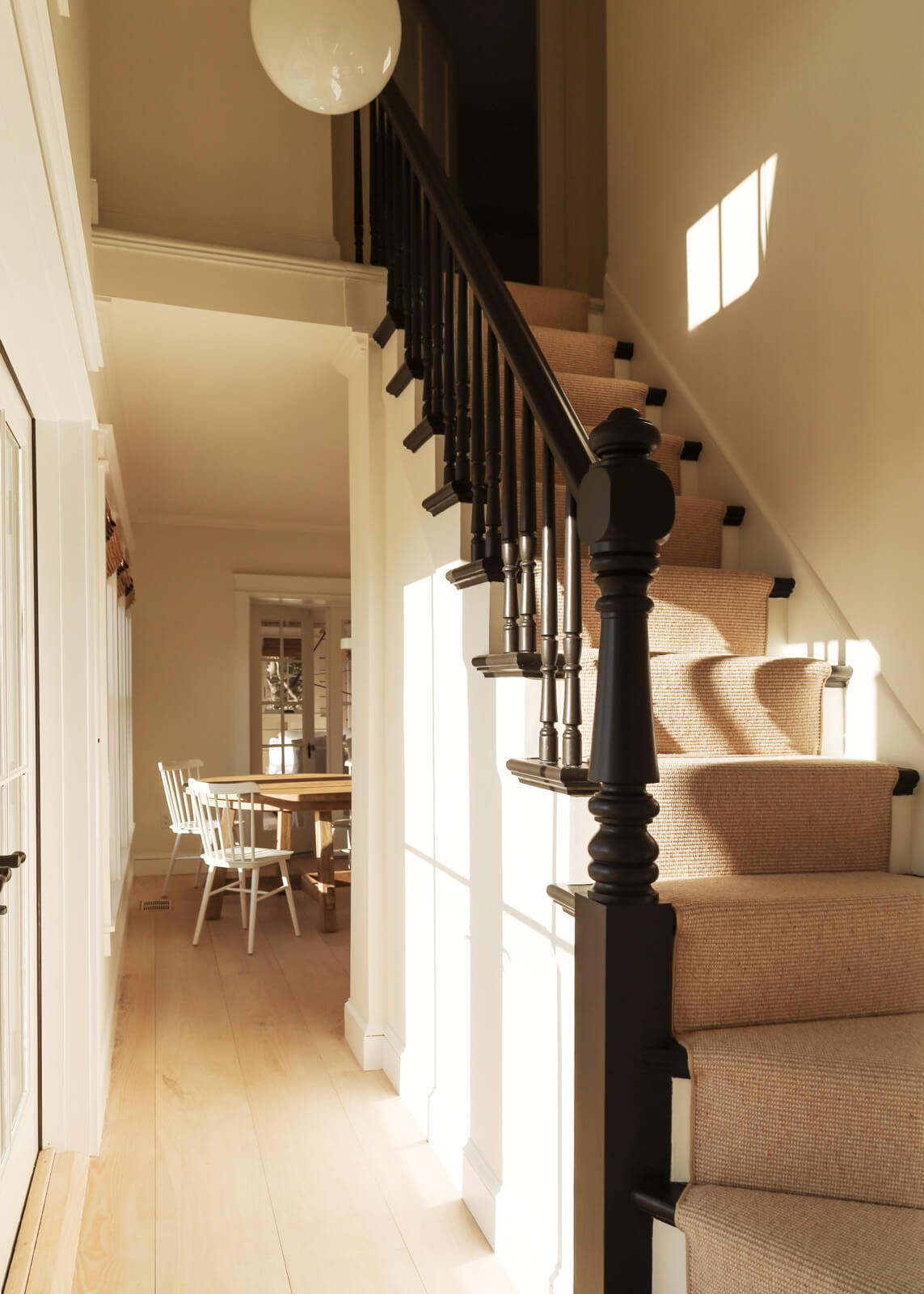
The house’s original stair, with a new sisal runner, leads to two guest rooms and a bath.
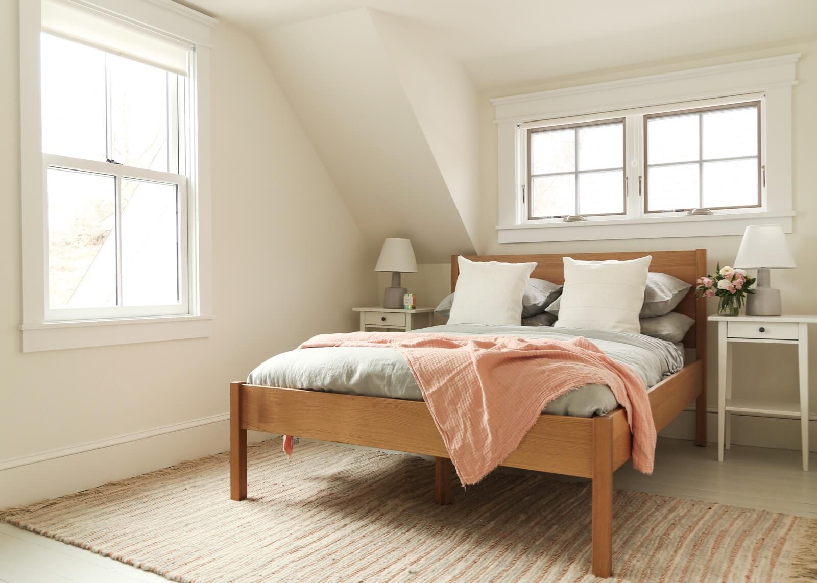
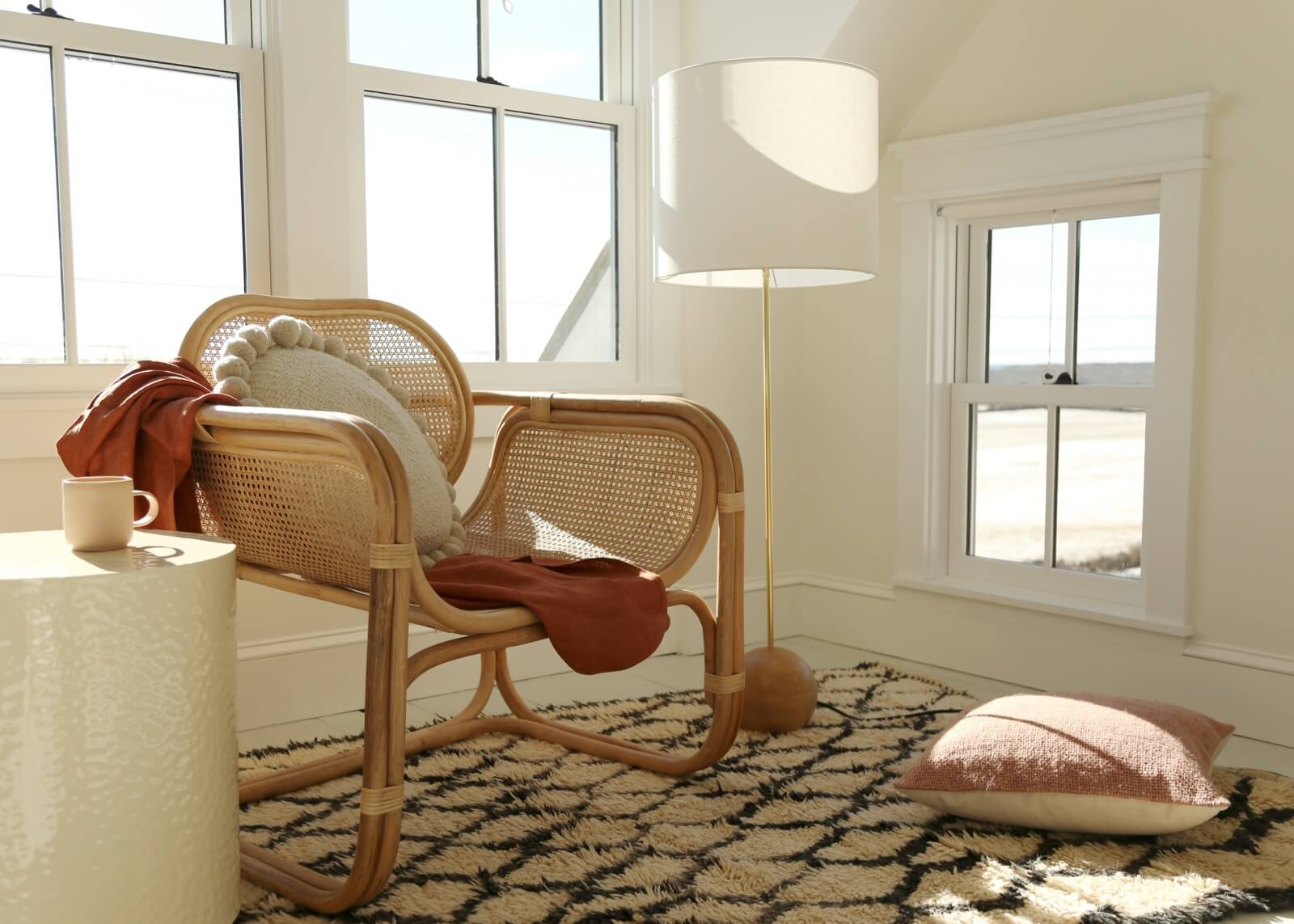
Both guest rooms have expansive farmland and ocean views.
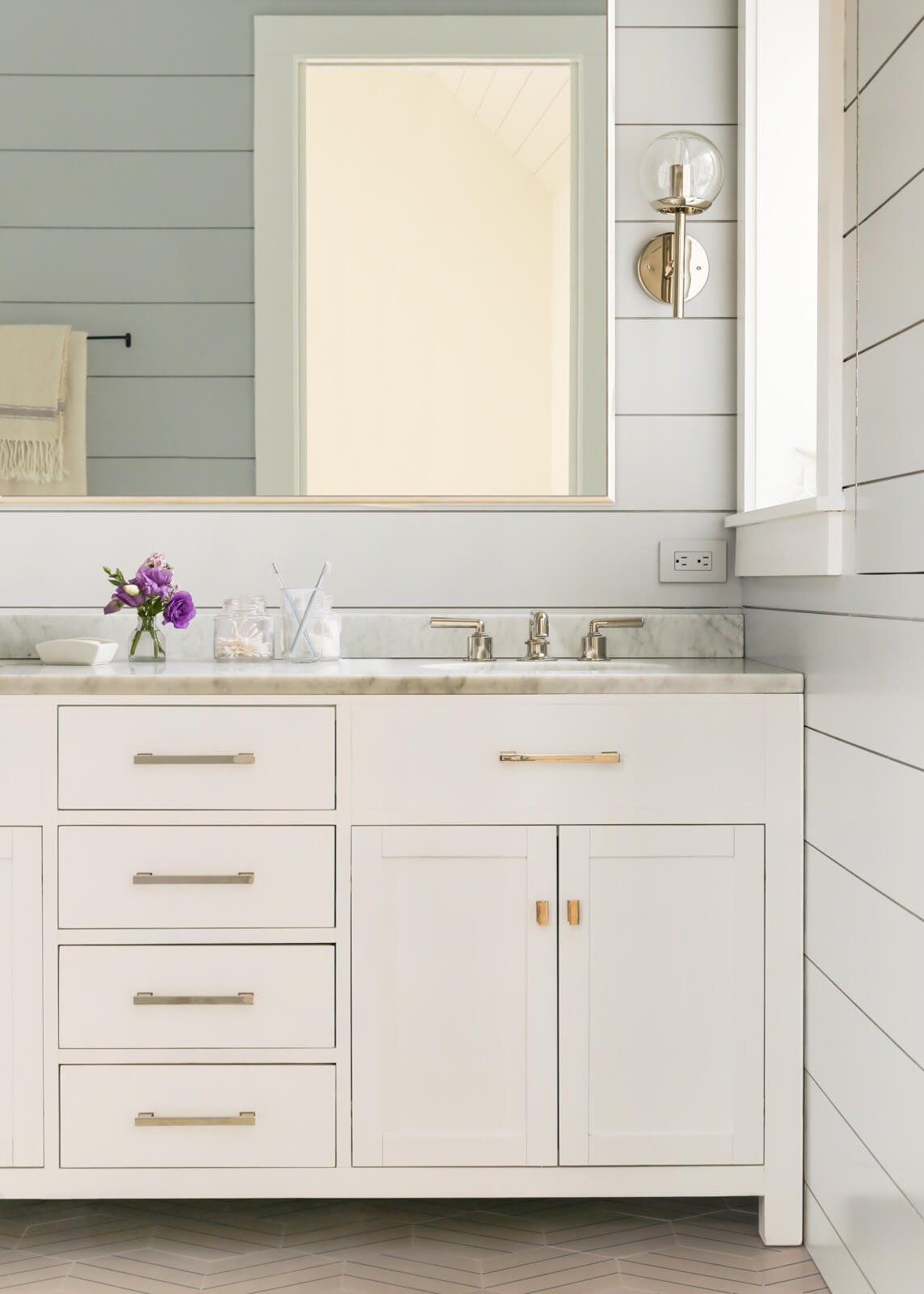
The designers economized in the master bath with a Restoration Hardware vanity rather than a custom one.
Cement floors tiles came from Popham, faucets from Waterworks. “We wanted it to feel simple, clean and spa-like,” Richter said.
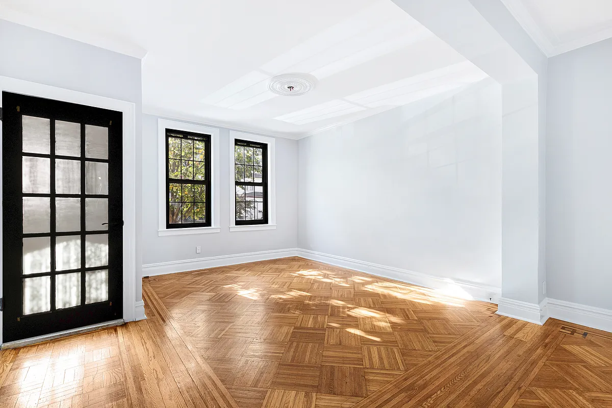
Before photos (below) show the house prior to the deployment of white paint.
[Photos by White Arrow / Thomas Richter]
The Insider is Brownstoner’s weekly in-depth look at a notable interior design/renovation project, by design journalist Cara Greenberg. Find it here every Thursday morning.
Related Stories
- The Insider: Brownstoner’s in-Depth Look at Notable Interior Design and Renovation Projects
- The Insider: Style Upgrade in Crown Heights Brings Developer Finishes Up a Few Notches
- The Insider: Architectural Salvage and Modern Furnishings Transform Williamsburg Loft
- The Insider: Moody Blues, Creative Sourcing Refresh Ridgewood Row House




What's Your Take? Leave a Comment