The Insider: Layout Tweaks, All-New Decor Bring Creative Flair to South Slope Row House
When interior designer Crystal Sinclair’s clients purchased a three-story Brooklyn row house a few years back, it had already undergone a major renovation, including new steel and glass rear walls on the garden and parlor levels.

Photo by Claire Esparros
When interior designer Crystal Sinclair’s clients purchased a three-story Brooklyn row house a few years back, it had already undergone a major renovation, including new steel and glass rear walls on the garden and parlor levels. Then the homeowners found themselves having to live in another part of the country for a while, and rented out the South Slope house. When the time finally came for them to move in, they decided to start from scratch with furnishings and decor.
Enter Sinclair of Crystal Sinclair Designs, who made some changes to the layout, adding new storage and redoing two baths. Then she decorated the place with her usual creative touches, making use of dark-paint highlights and helping assemble quirky collections, including breadboards and green glass vessels, as focal points.
The space had some good things going for it, including a beamed ceiling and gas fireplace on the garden floor, which contains the entry, kitchen, dining area and main living space, and intact window moldings and nice wood floors on the parlor level, which became a more formal sitting room/work space in front and a master suite with a new bath at the rear. (There are children’s bedrooms on the top floor.)
“I was going for something a little bohemian, a little Mediterranean, both modern and a throwback to the period of the space itself,” the designer said. Her client “had input but was very open minded. She gave feedback and molded things to fit her family. She didn’t just give me carte blanche. If she said no to something, I went back to the drawing board.”
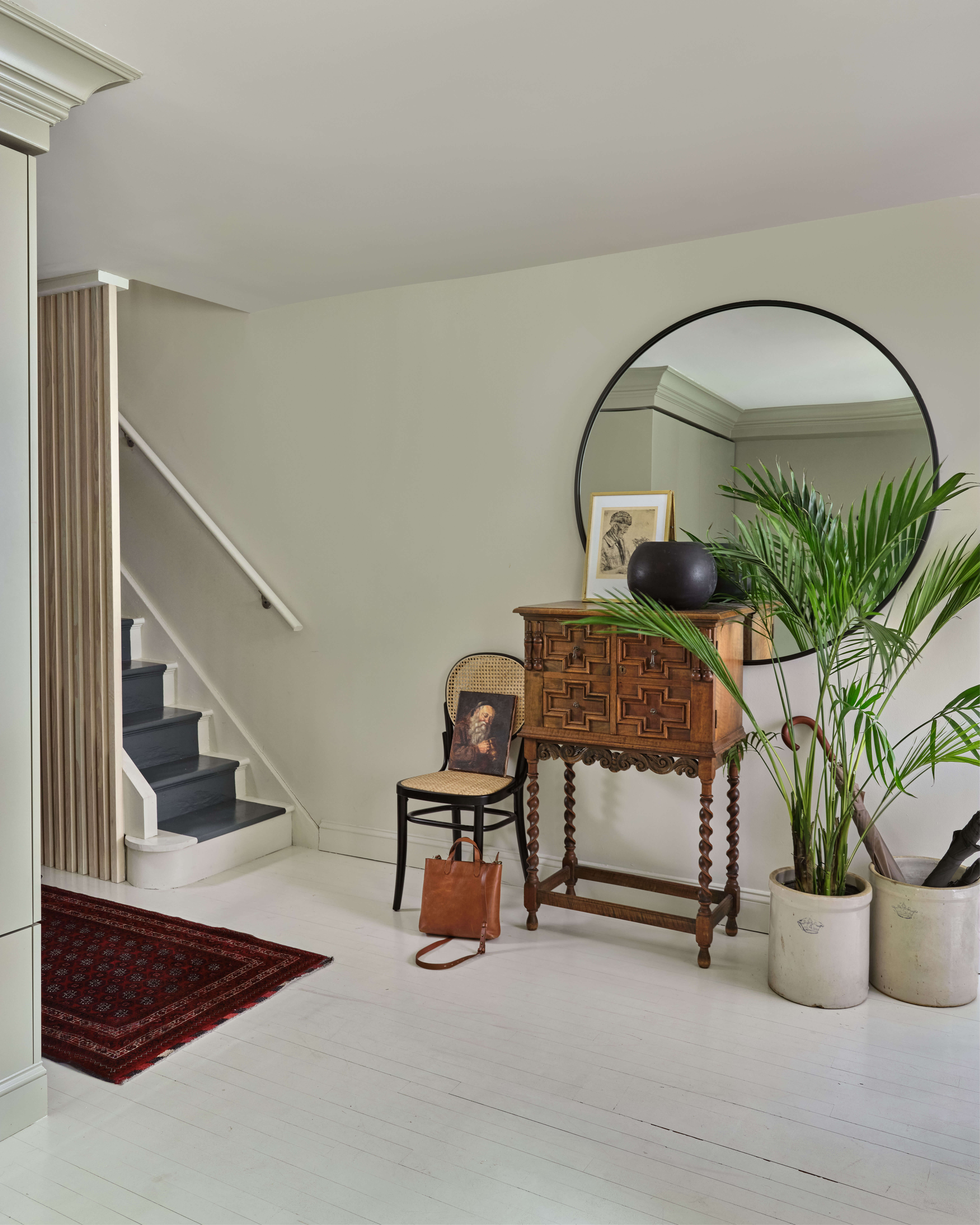
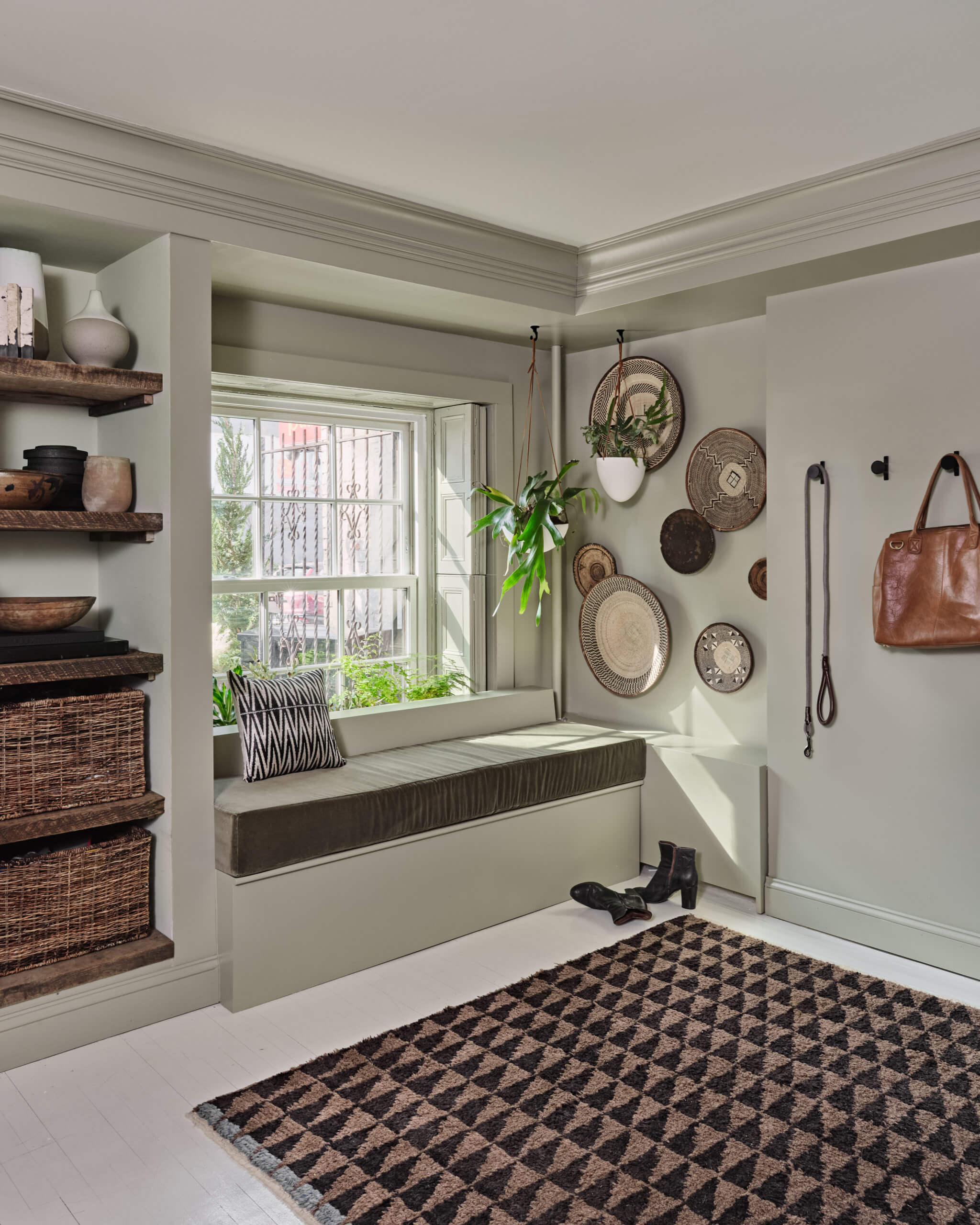
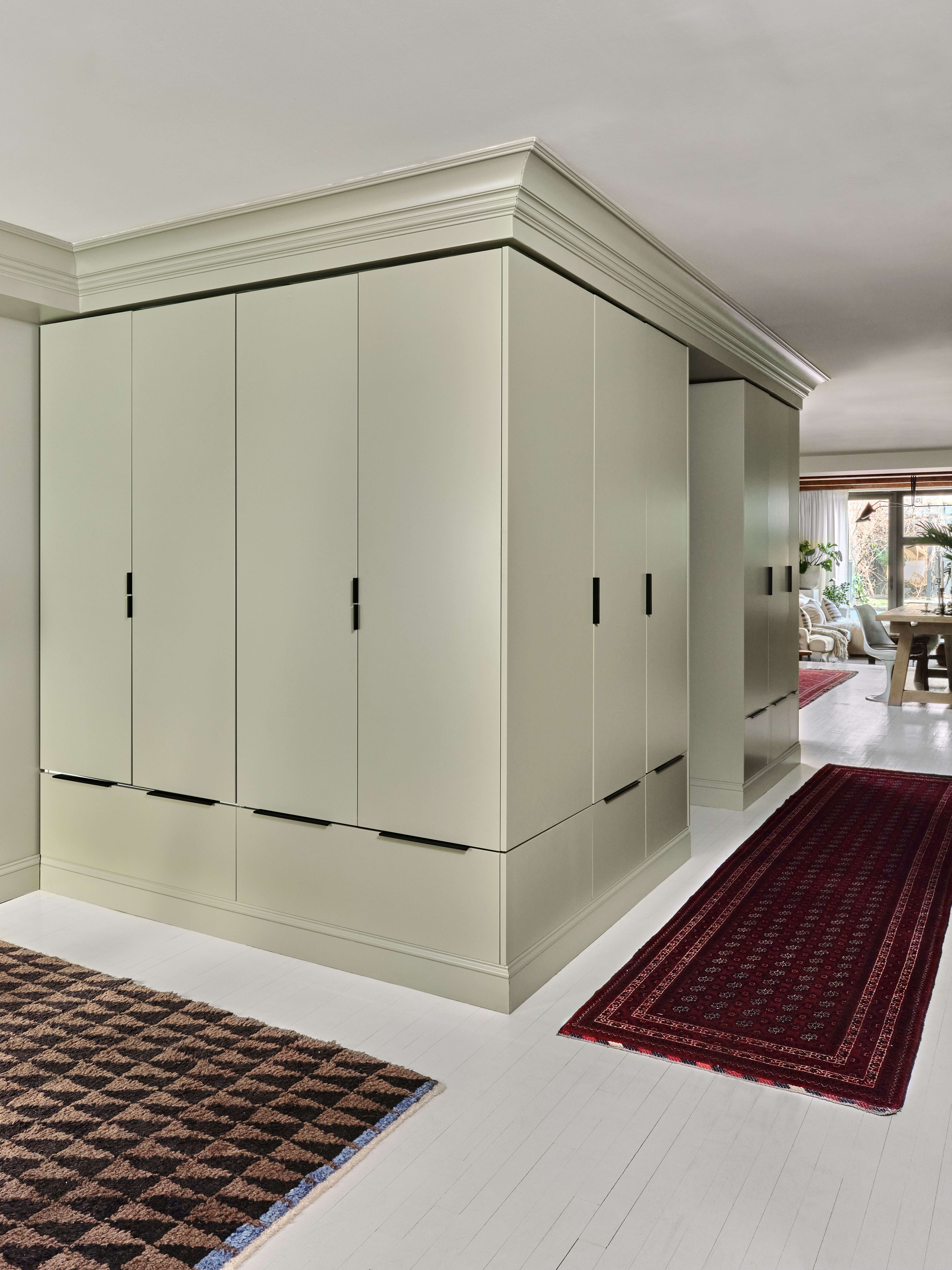
Sinclair removed a wall to open up the house’s garden-level entry and added a new bank of closets across from the stairs.
White painted floors, a petite antique cabinet from Finch in Hudson, N.Y., and a large round mirror keep the space open and light. The staircase leading up sports a dark-painted stripe in lieu of carpet.
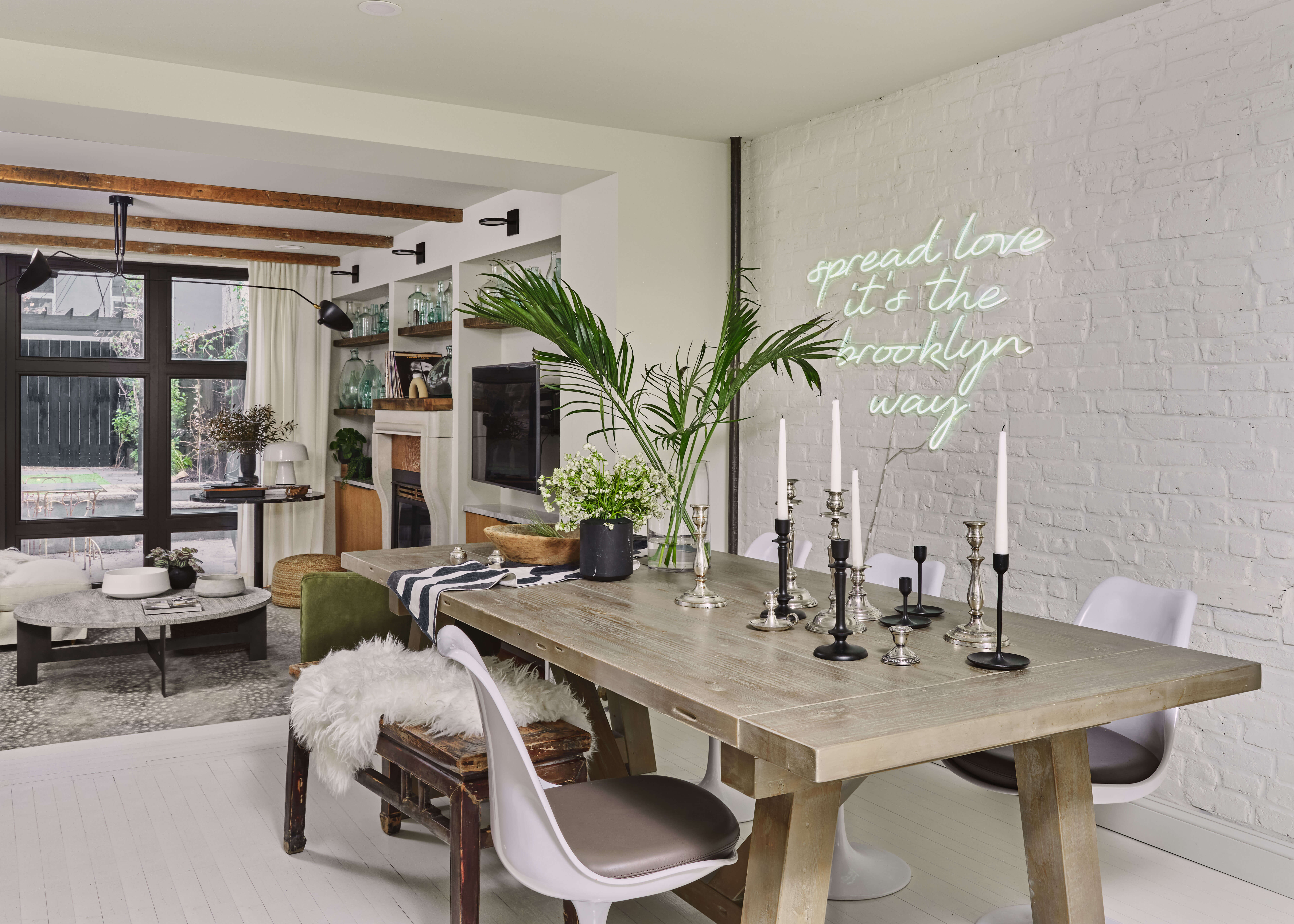
Exposed brick in the dining area, painted November Rain by Benjamin Moore, was adorned with a custom-made neon sign expressing the couple’s joy at being back in Brooklyn, where the husband grew up.
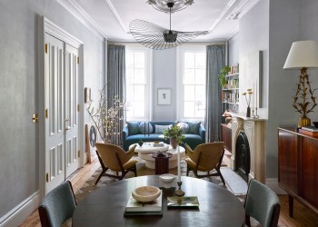
A vintage bench and repro mid-century Tulip chairs surround a modern wood table bearing an assortment of candlesticks.
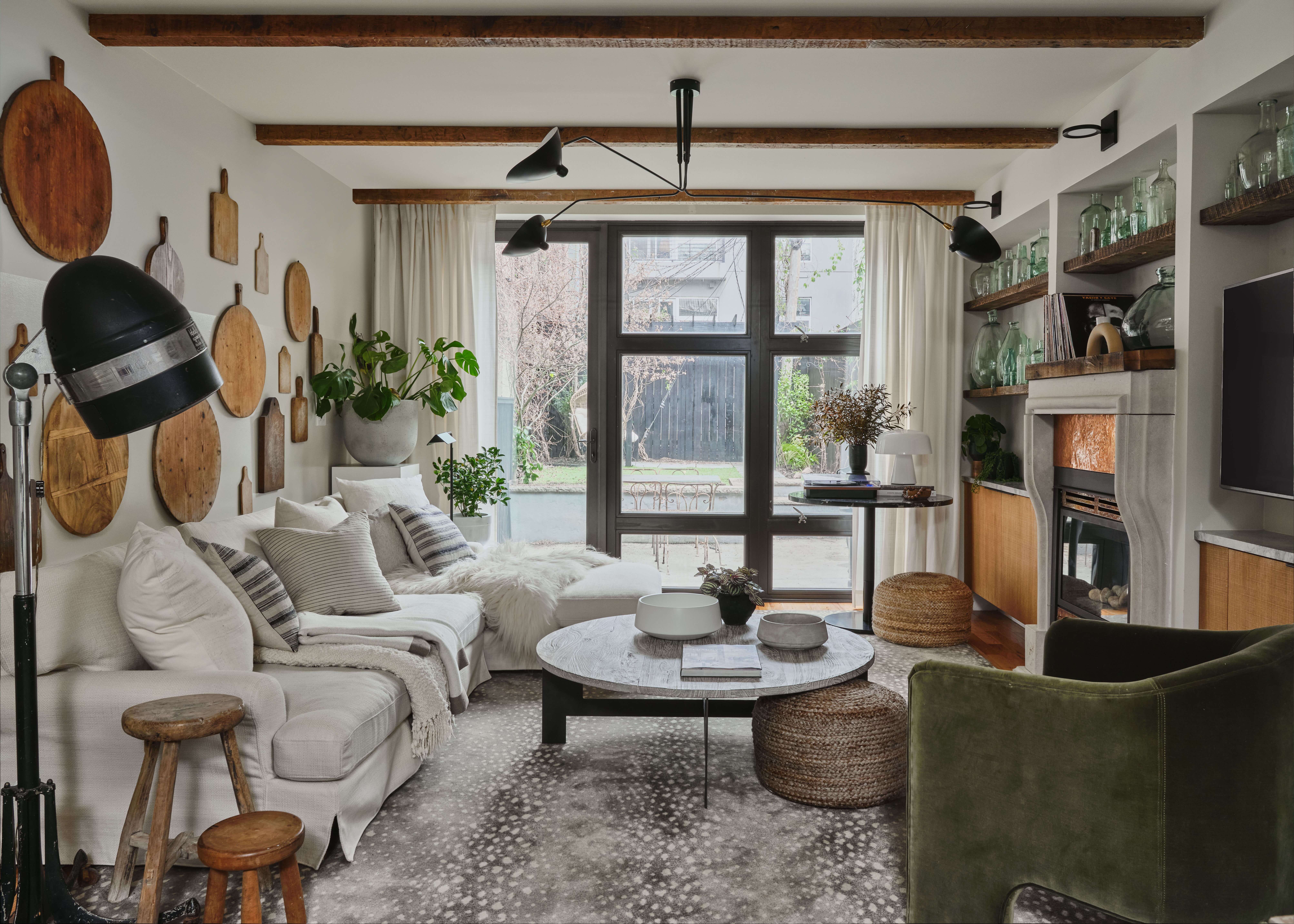
Existing beamed ceilings lend warmth to the garden-level living space, which was enhanced with a graphic collection of breadboards on one side of the room and an array of green glass vessels on the other.
The furnishings, which include a sofa from Interior Define, a Stark rug, a coffee table and olive-green velvet armchair from Anthropolgie, and a small round table from West Elm, are brand new, with kid-friendly upholstery. “The whole living room was in place and I wasn’t sure what to do with the wall behind the sofa,” Sinclair said. “I felt it needed something unique, more than just a framed print, and one day I thought of breadboards.” Sinclair shopped vintage stores in Texas and everywhere else she traveled on business during the course of the project. “My client does take them off the wall and use them, which I love.”
Sinclair removed a stone top from the existing gas fireplace and replaced it with a wood one.
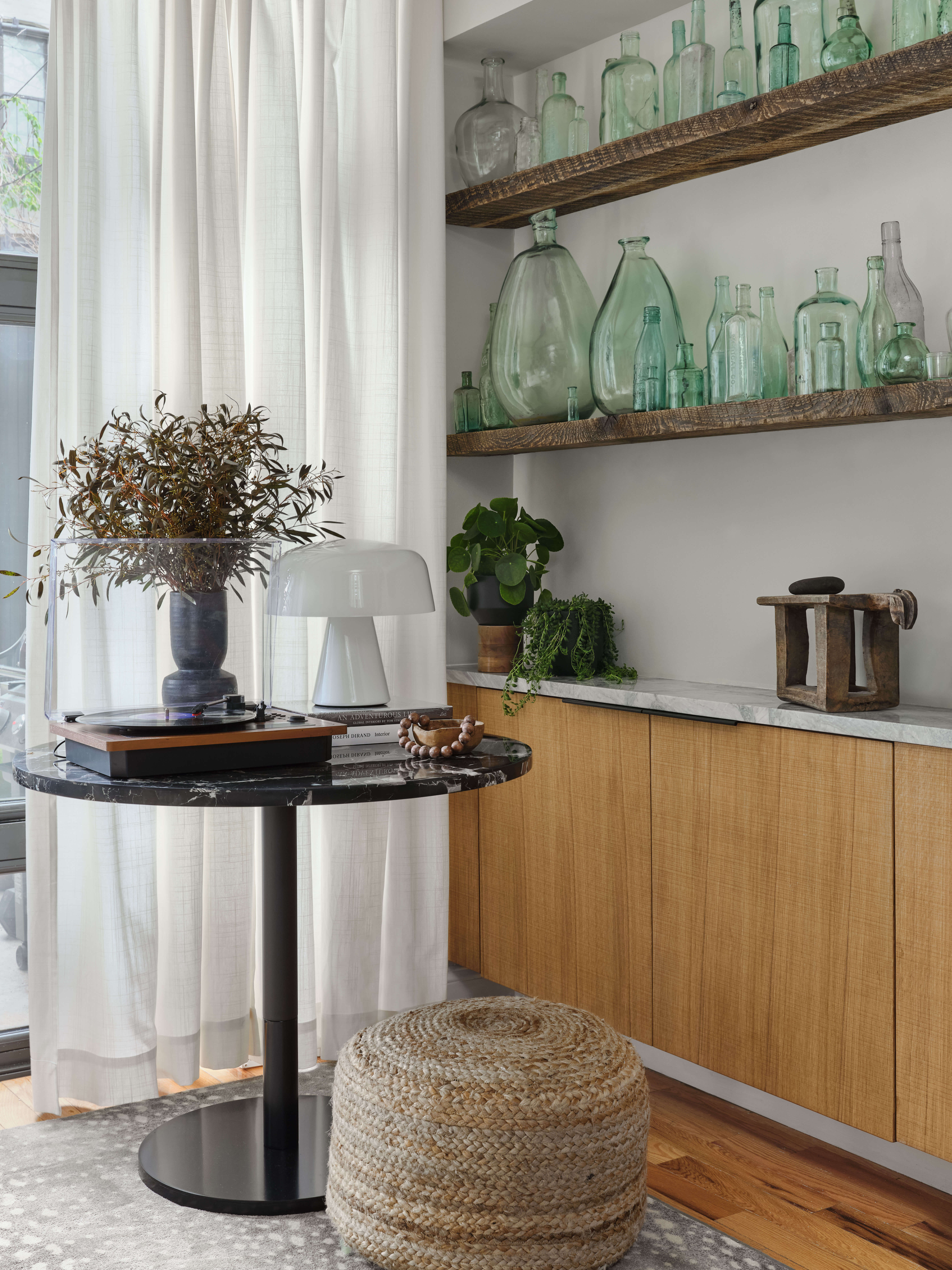
The warm wood of the breadboards contrasts with the cool tones of the glass, found on Etsy and in upstate antique shops.
New shallow wood consoles on either side of the fireplace — IKEA boxes with fronts by Reform — hold games and CDs.
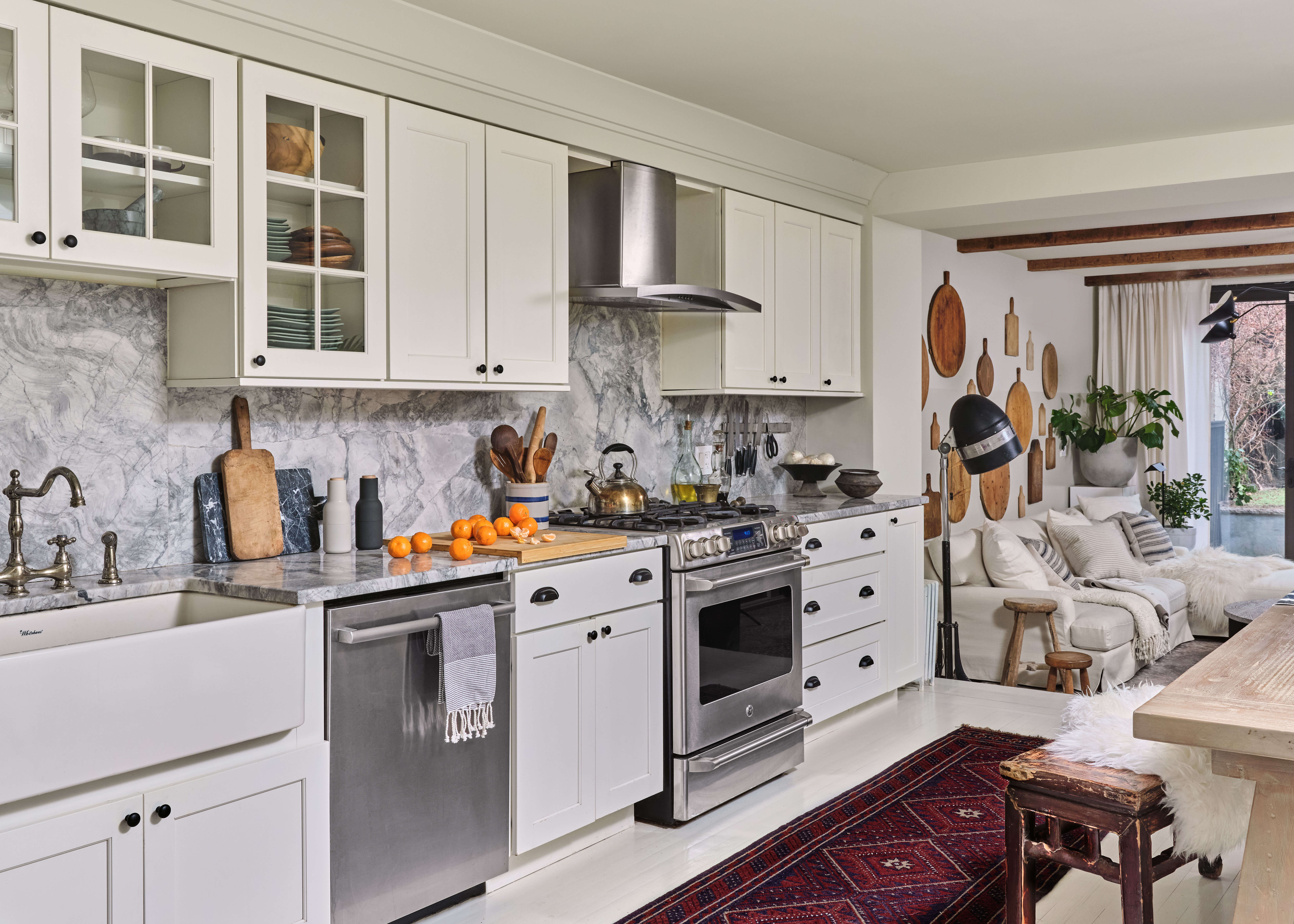
The fridge and some cabinets were moved to free up the dining room and create an L-shaped kitchen instead of one occupying two walls.
The kitchen floor is raised, making the adjacent living space even cozier.
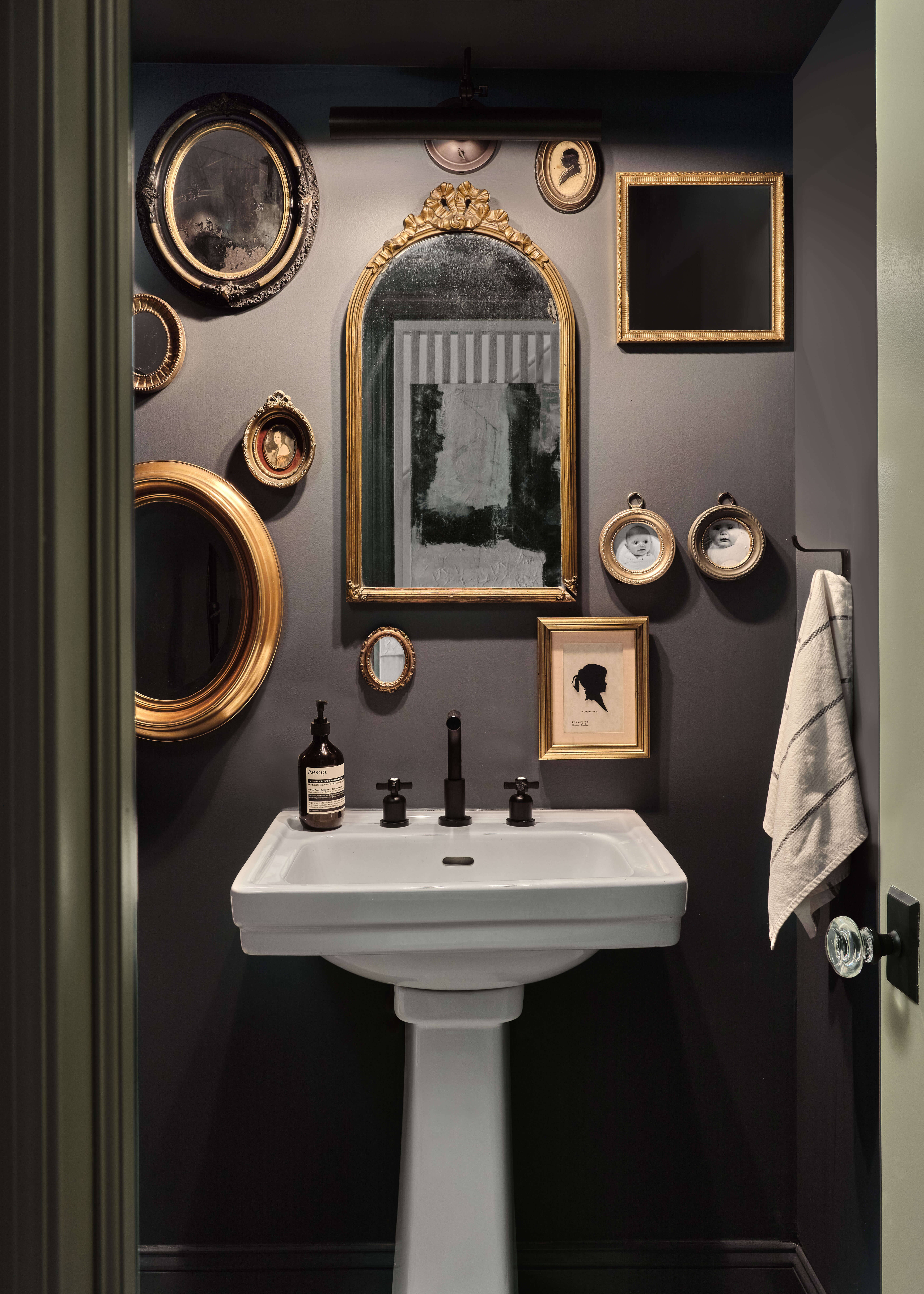
Sinclair expanded the garden-level powder room and painted it dark to set off the white pedestal sink. A grouping of pictures and mirrors — many personal effects, newly framed — distinguish the space.
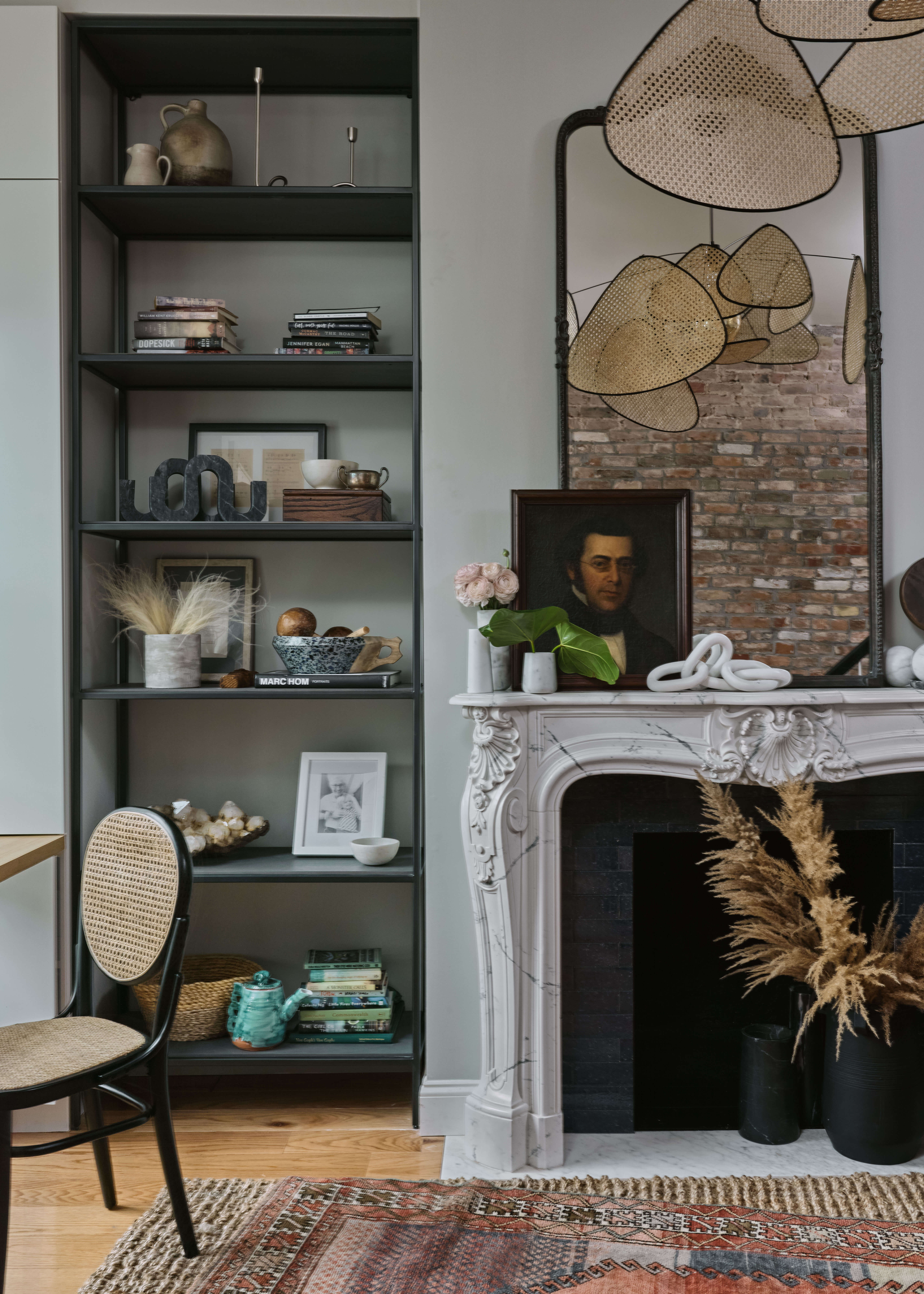
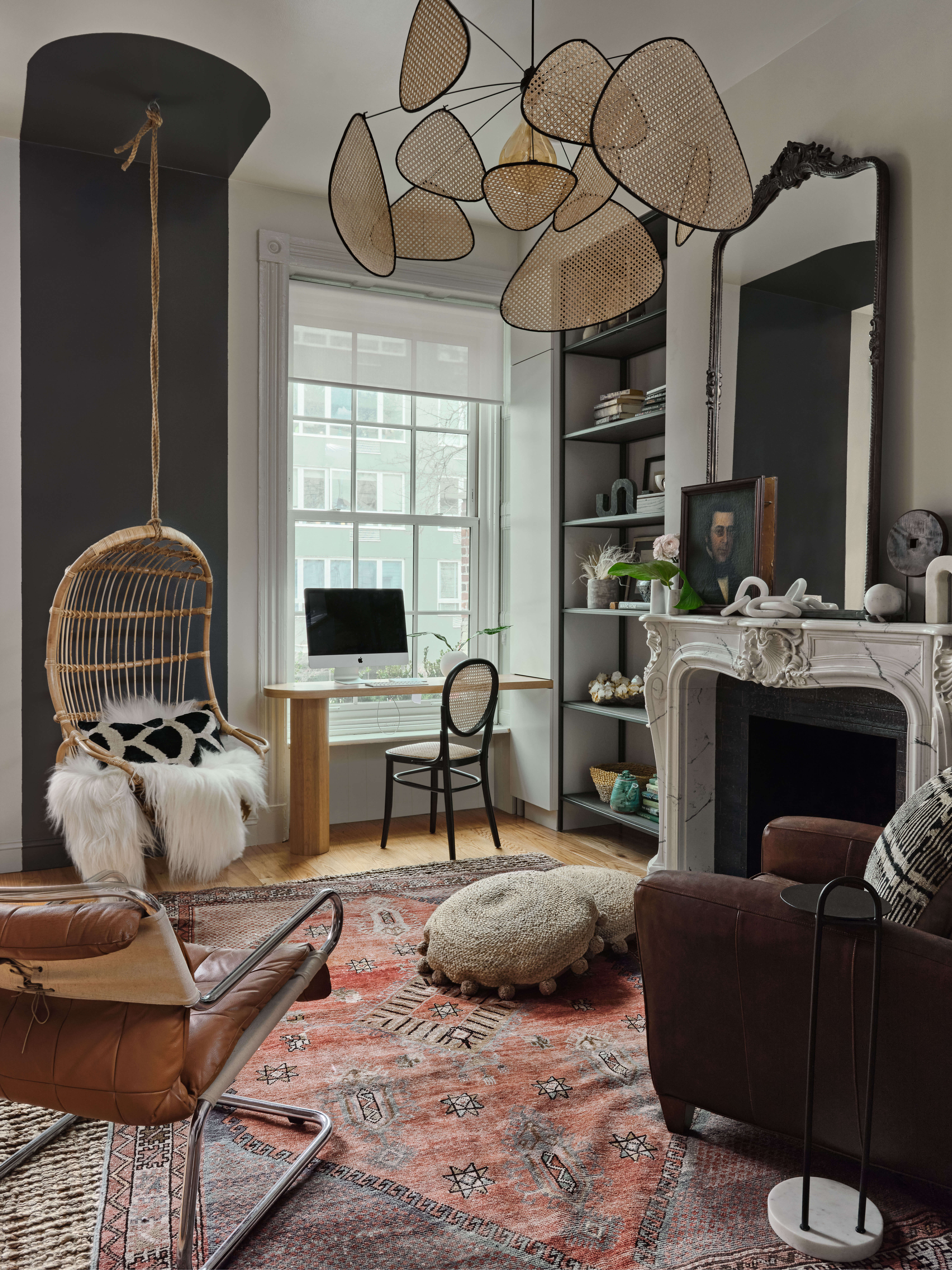
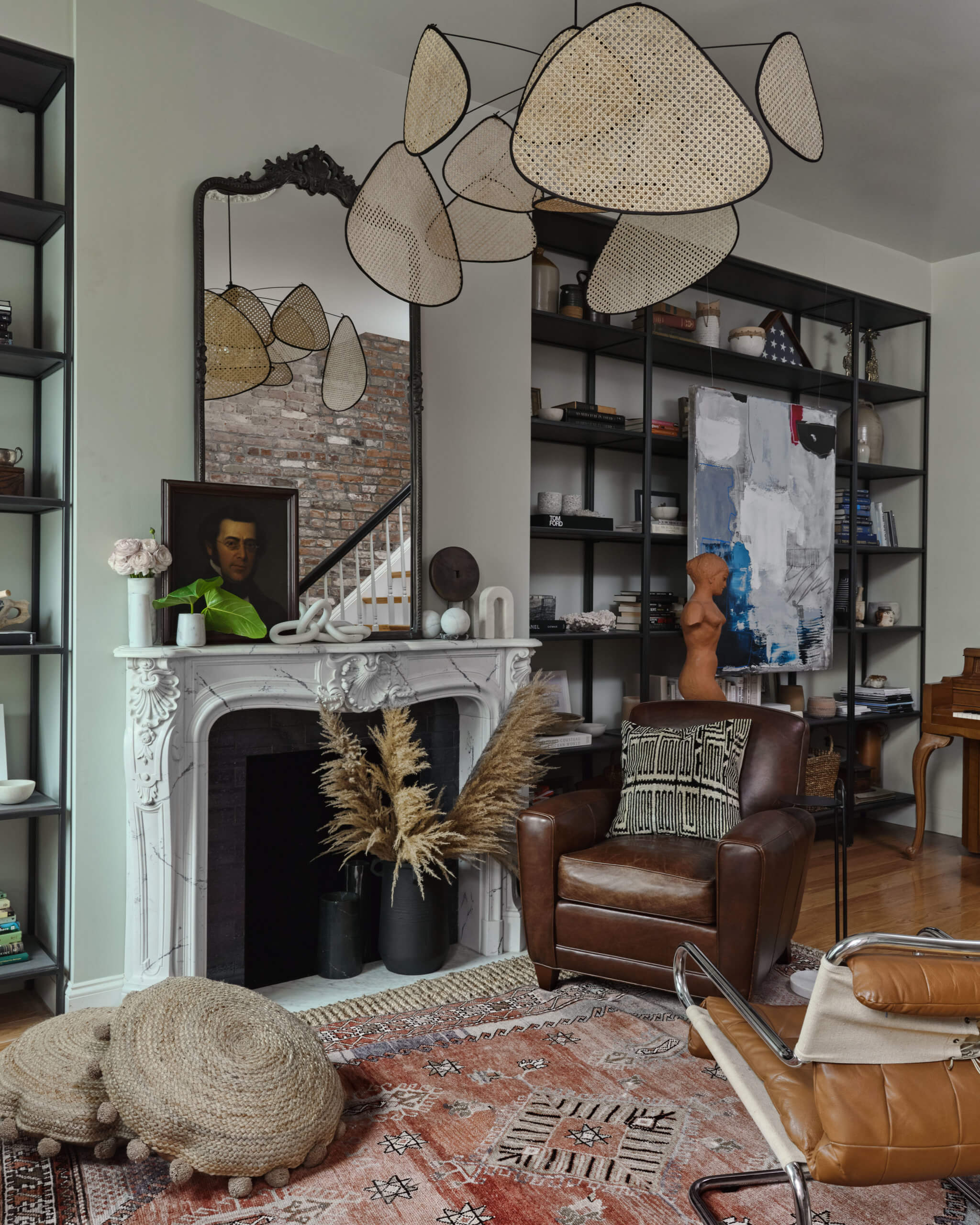
The front parlor “is meant to be a work space and lounge — a place to hang out without television, where the kids can play while their parents do desk work,” Sinclair said.
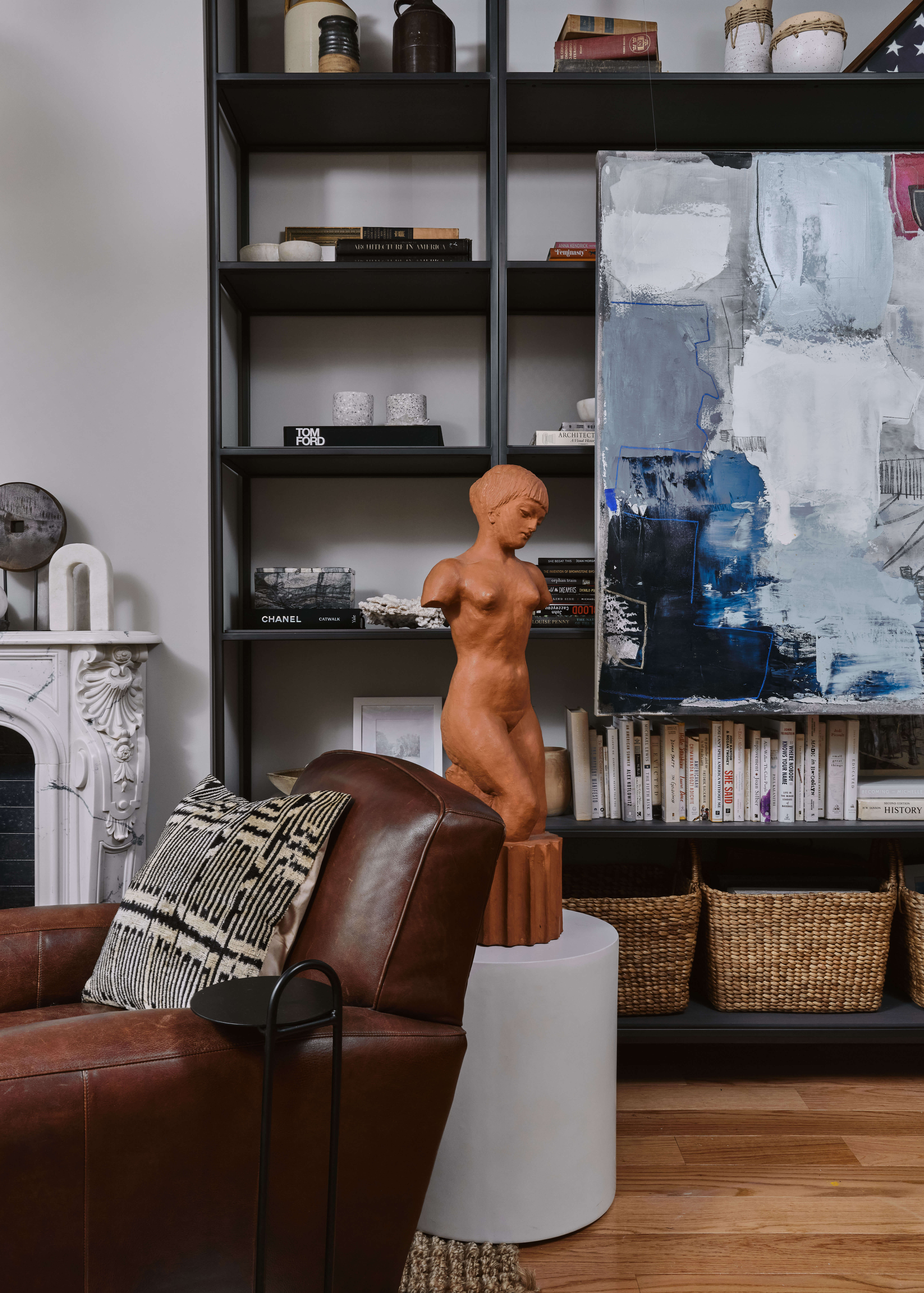
Sinclair bumped out the wall for a decorative trompe l’oeil mantel and fit metal shelves by Desiron into the niches on either side.
A dark stripe between the windows emphasizes a rattan hanging chair the homeowners brought with them from their previous residence. The caned chandelier is new from Market Set; the leather chairs were sourced from Chairish and the vintage rug from Etsy.
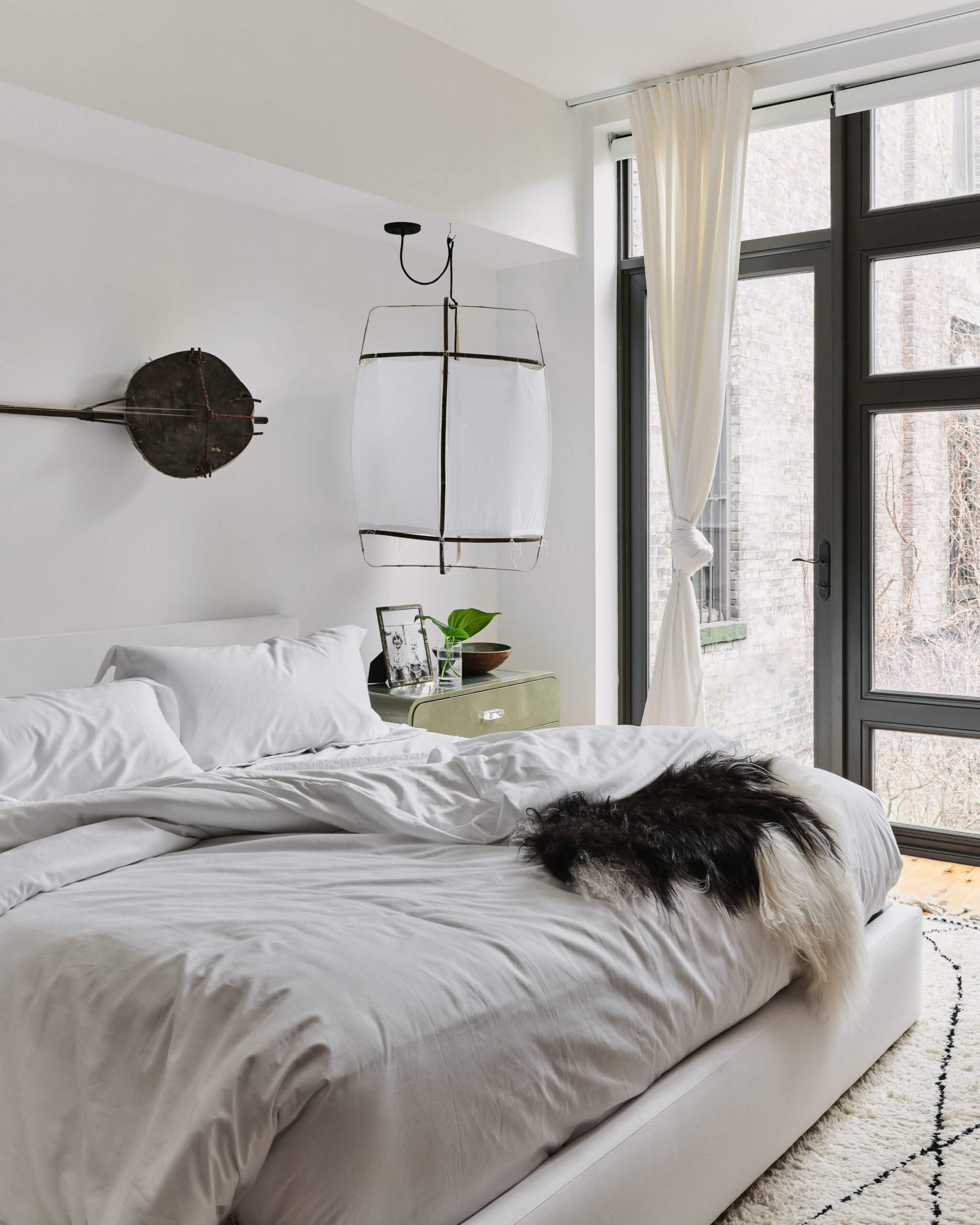
The primary bedroom’s decor began with a pair green nightstands from Chairish and fabric lamps with what Sinclair called a “tropical getaway feel.” She added: “They’re oversized, which creates a more intimate space.” The homeowners brought back the vintage guitar above the bed from their honeymoon.
The mirror against the exposed brick wall slides to access a closet.
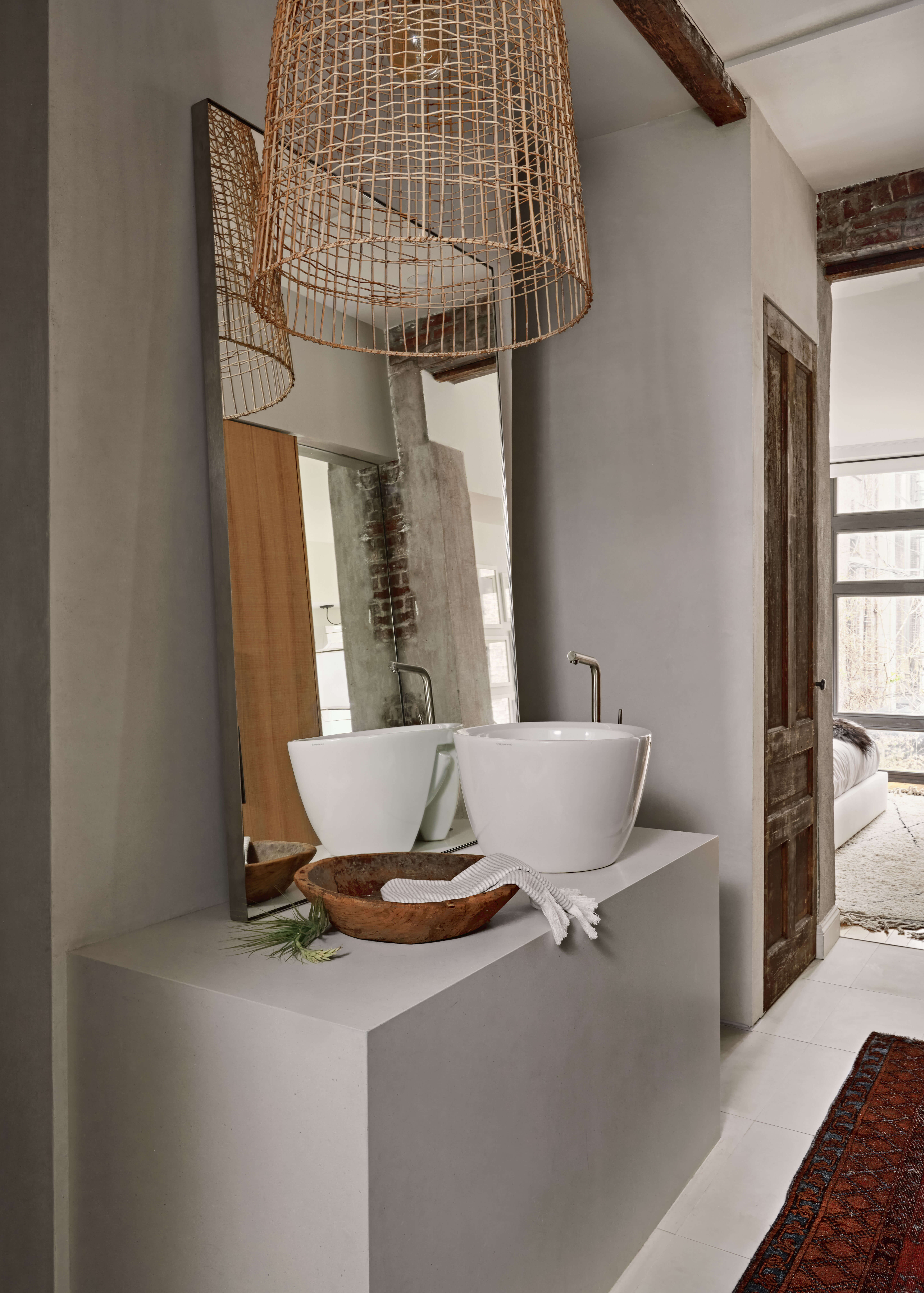
The adjacent bathroom was reconfigured and outfitted with a vessel sink and casually propped mirror. There’s a new linen closet behind a salvaged wood door.
[Photos by Claire Esparros]
The Insider is Brownstoner’s weekly in-depth look at a noteworthy interior design/renovation project, by design journalist Cara Greenberg. Find it here every Thursday morning.
Related Stories
- The Insider: Brownstoner’s In-Depth Look at Notable Renovation and Design Projects
- The Insider: Boerum Hill Parlor Floor Impresses with Chic Decor from Online Sources
- The Insider: River View Duplex Condo Gets Glamorous Design Treatment
Got a project to propose for The Insider? Please contact Cara at caramia447 [at] gmail [dot] com
Email tips@brownstoner.com with further comments, questions or tips. Follow Brownstoner on Twitter and Instagram, and like us on Facebook.







What's Your Take? Leave a Comment