The Insider: Reimagined Layout Improves Flow of Long Park Slope Prewar for Young Family
Before the comprehensive renovation of this 81-foot-long apartment, one could easily have gotten 10,000 steps a day just walking back and forth from the kitchen at one end to the living room at the other.

Photo by Ines Leong
Before the comprehensive renovation of this 81-foot-long apartment, one could easily have gotten 10,000 steps a day just walking back and forth down the lengthy hallway connecting the kitchen at one end with the living room at the other.
When a couple with young children went to contract on the apartment and called architect Luki Anderson’s Brooklyn-based firm, Studio Officina, to discuss plans for updating it, they had already given some thought to improving the layout and come up with a concept.
Anderson agreed it was a solid, feasible idea: switching the location of the kitchen at the rear with the largest of three bedrooms at the front of the apartment. She upended the floor plan, creating an open kitchen/living room at the bay-windowed end of the apartment, overlooking the street, and a new primary bedroom and bath at the rear, overlooking the block’s back gardens.
“Opening up what was the primary bedroom makes the apartment feel a bit shorter, and the light from the living space is captured” for the kitchen area, the architect said.
Working in the vintage building was no picnic. “There was no plumbing at the front of the building, but neighbors had risers, so we ran piping along the floor, all the way from the back, furring out the walls” to accommodate it, Anderson said. She also created a soffit for venting the kitchen through the bedrooms to the back of the building.
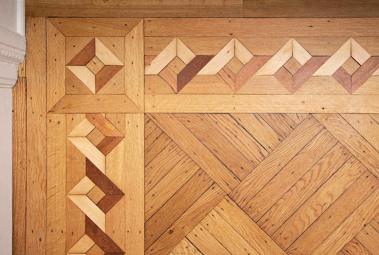
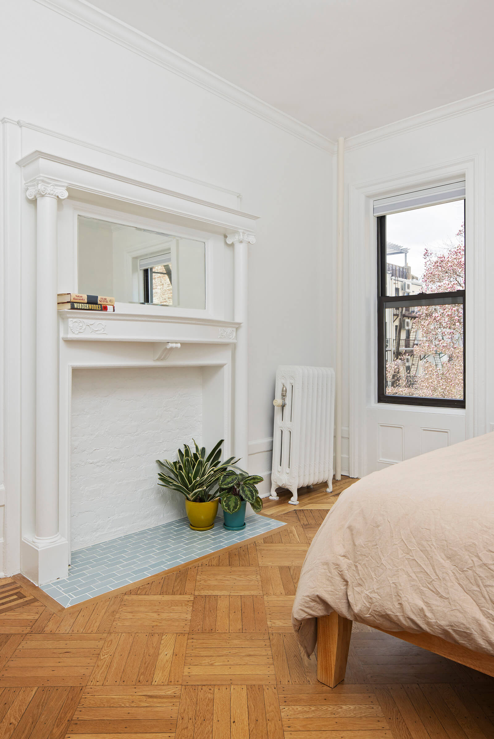
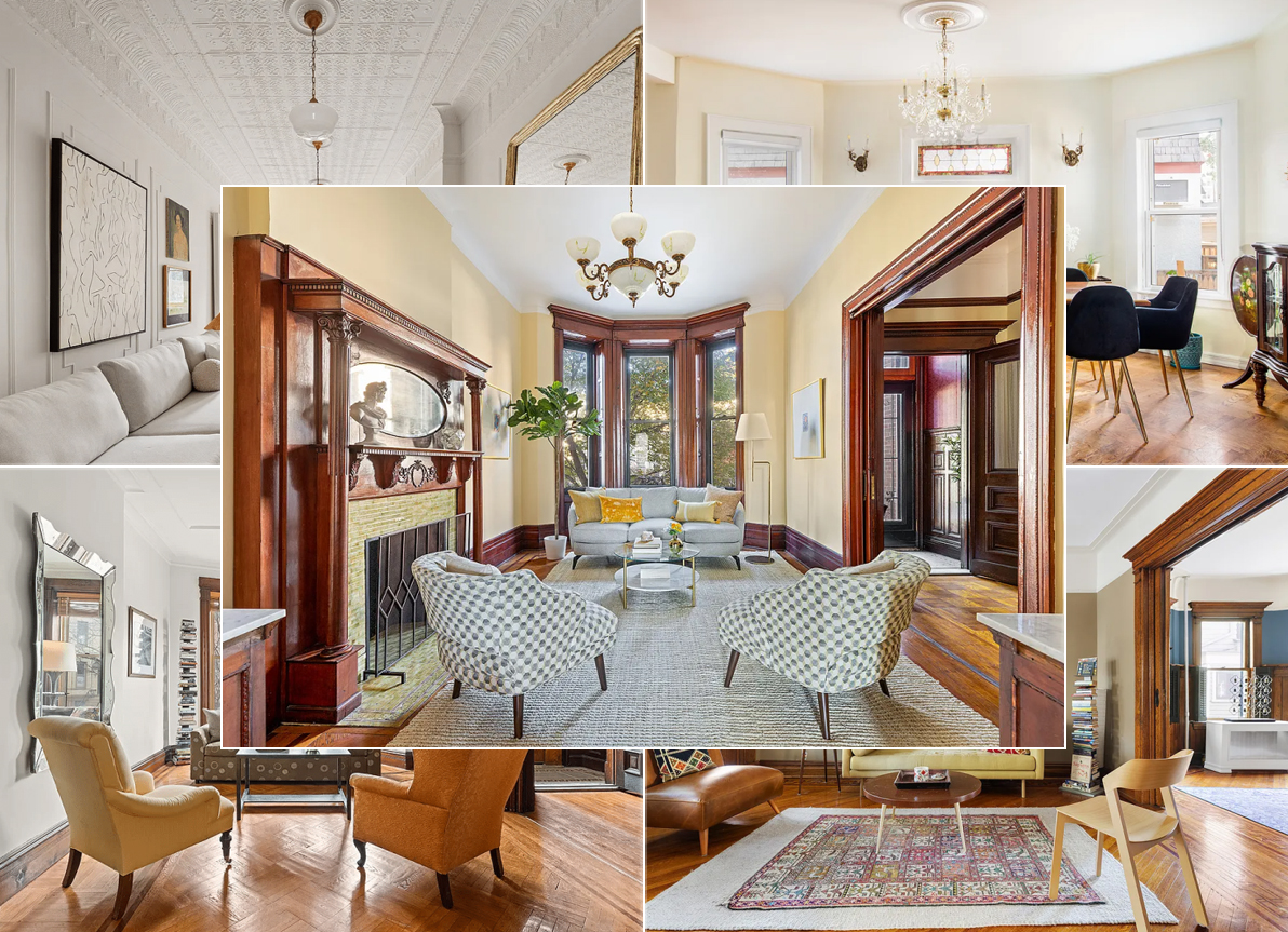
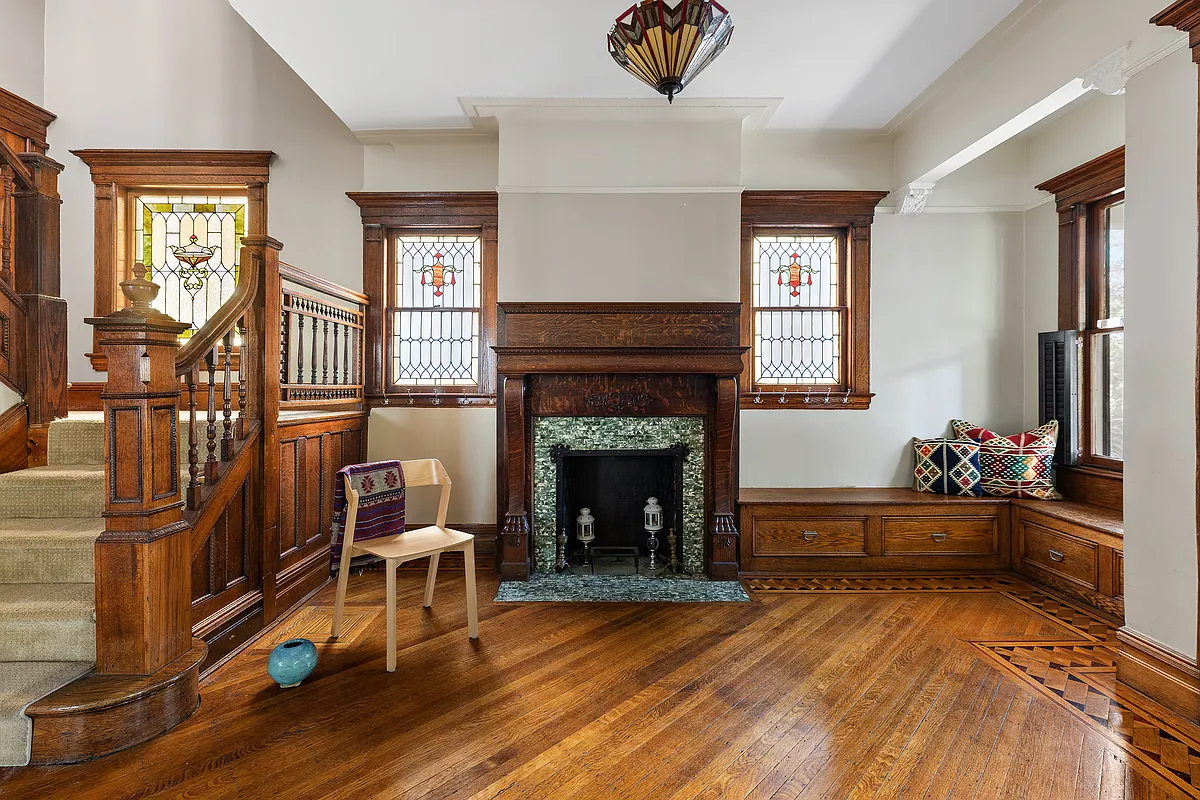
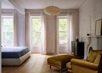
With the mechanicals sorted, focus turned to aesthetics. The apartment had a lot of nice historic elements, including parquet floors, window and base trim, original panel doors, a wall mirror (top photo) and a decorative mantel, all salvageable. “For the modern insertions, we chose materials that would either emphasize the original details, or sit alongside them in a quiet but considered way.”
The GC was Diker A+V Contracting.
The new floor plan trades awkwardness for greater utility and better flow.
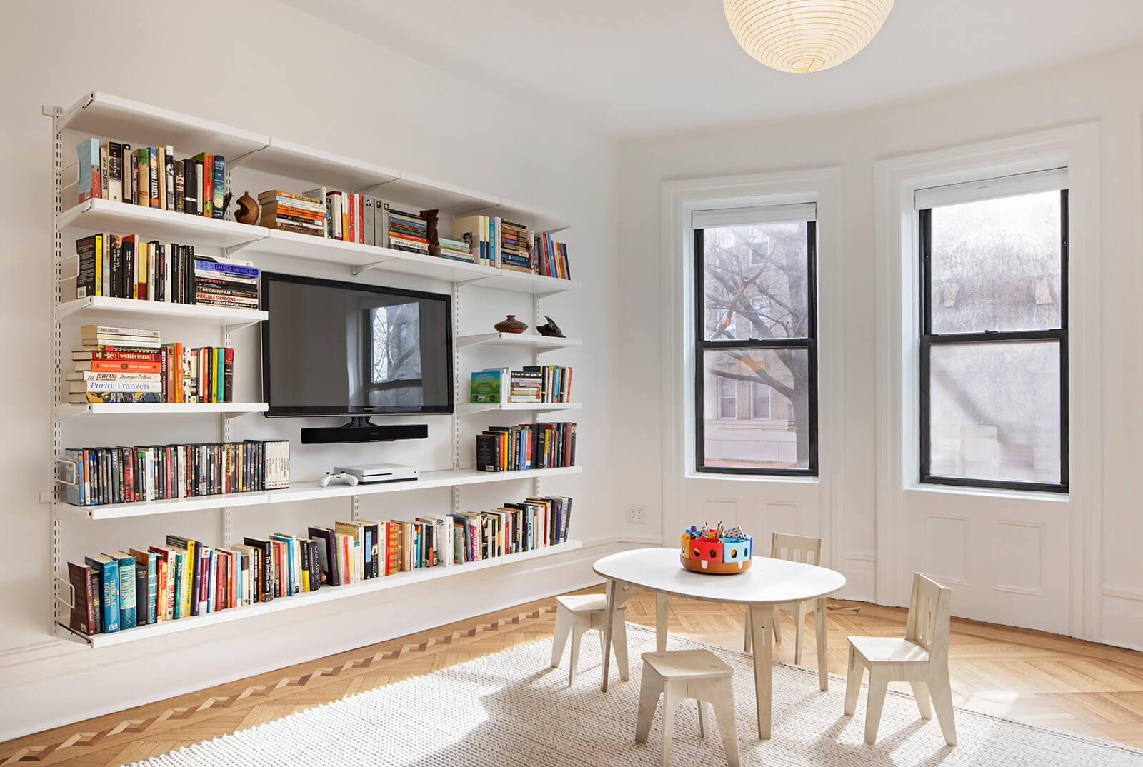
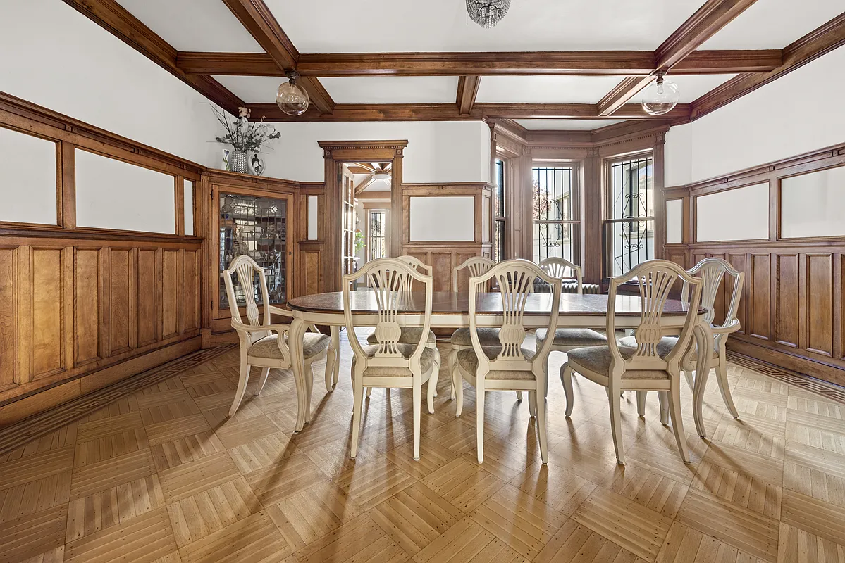
One of the apartment’s charms was its existing parquet. “The wood floor was pretty amazing, and we were able to do one more sanding,” Anderson said. “We had to do a tiny bit of patching, but not much.”
Original window moldings and baseboards were retained throughout.
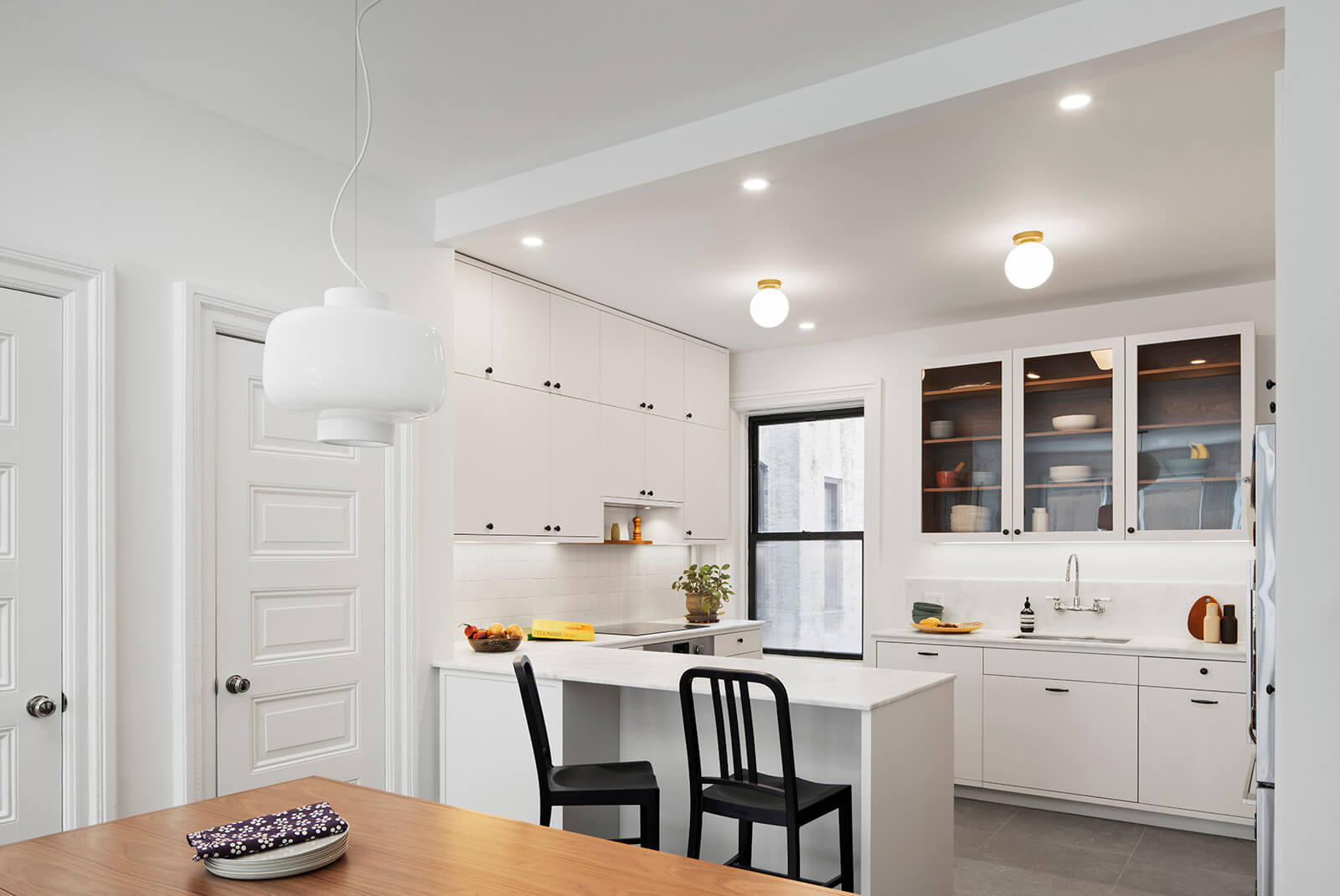
Two original coat closets with their vintage panel doors remained in place.
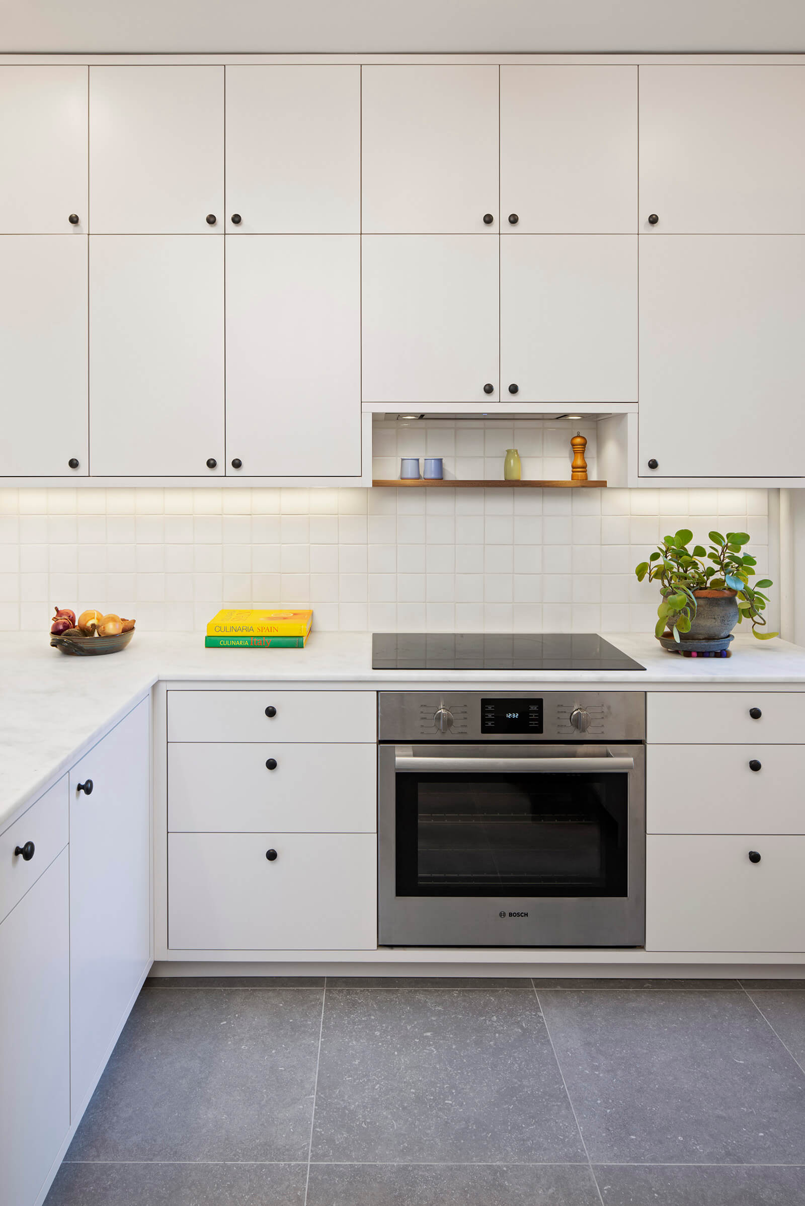
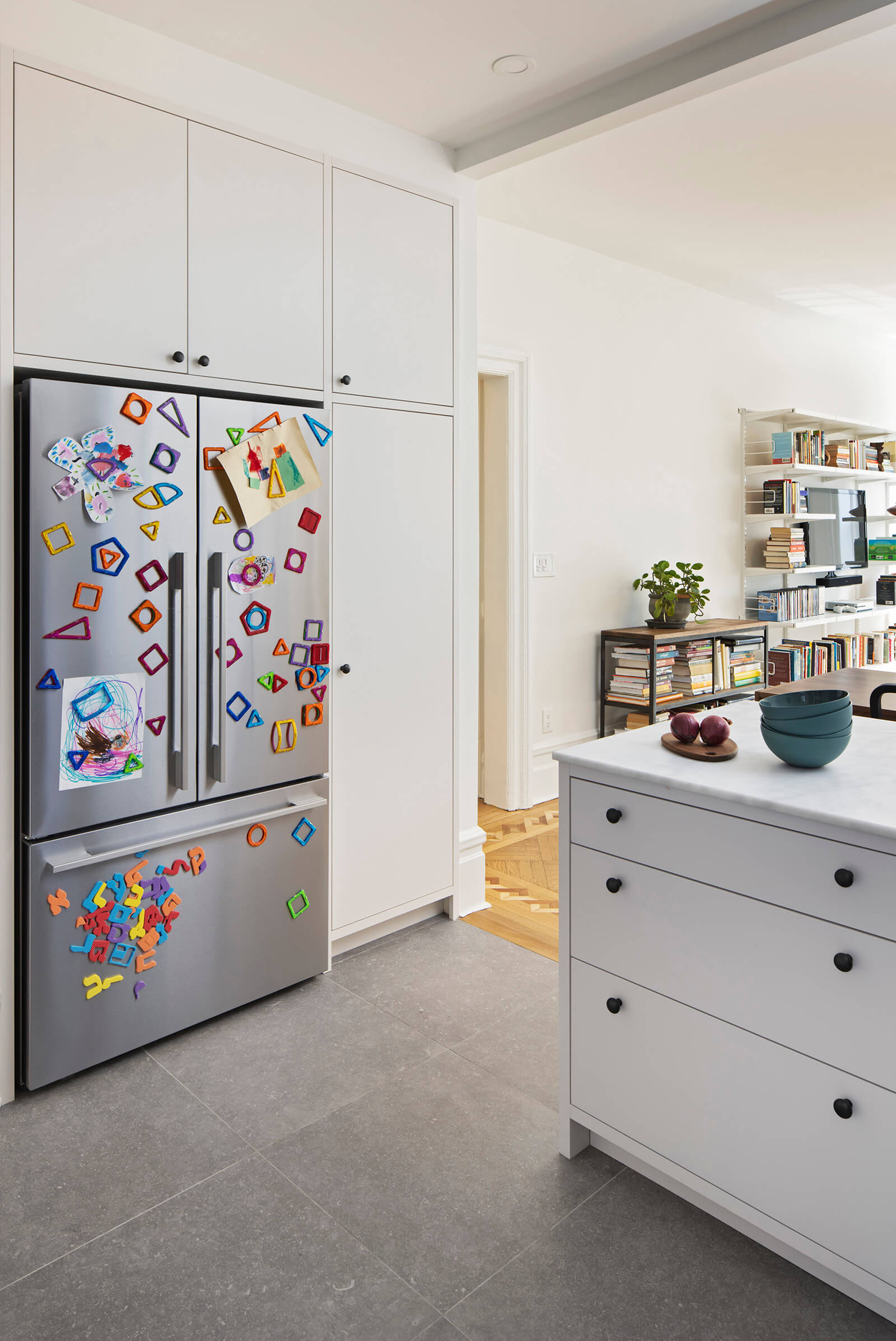
Anderson used a large-format porcelain tile from Stone Source, Unique Blue, for the kitchen floor.
The new kitchen has a U-shaped layout, with an island linking it with the adjacent dining area.
Floor to ceiling cabinetry by Jon Besch Custom, a local maker, was shop-sprayed with an off-white lacquer. Soft white and gray countertops of Calacatta Michelangelo marble were sourced from BAS Stone, a woman-owned supplier Anderson called “the best stone selection in New York City.”
The mantel in the primary bedroom got a new hearth of pale blue tile.
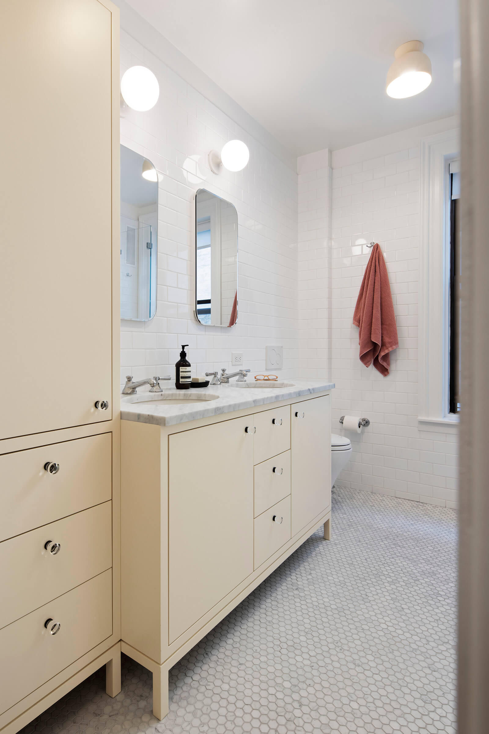
The primary bath is completely new, with a classic palette of white subway tile and marble hex flooring. The custom vanity and linen closet, also by Besch, were designed to feel like furniture and painted a warm pale rose.
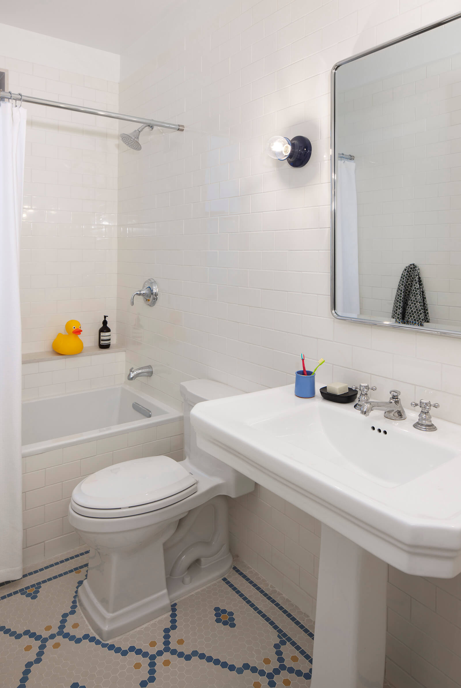
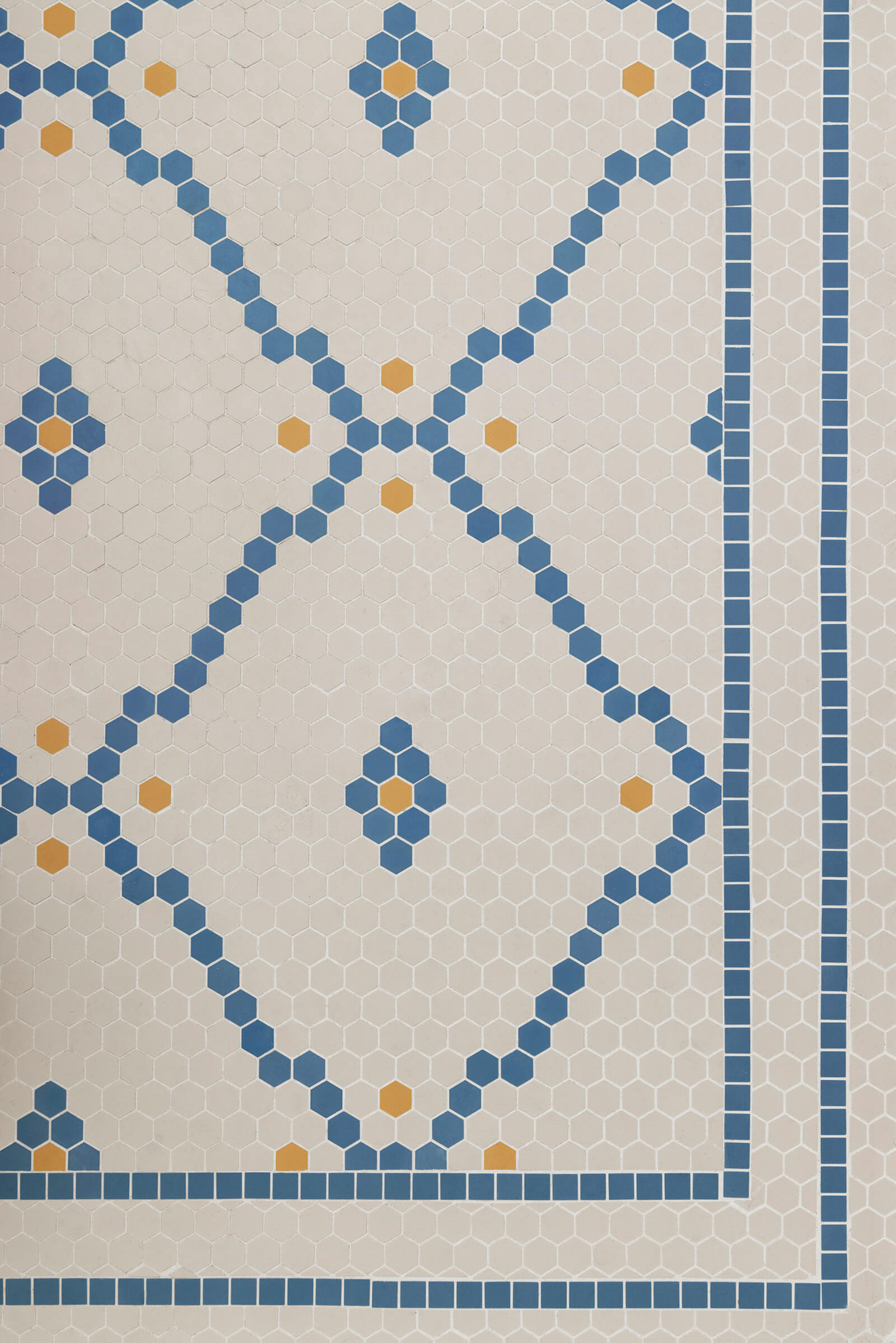
The original bathroom was redone in its entirety, with a floor mosaic from Heritage Tiles that alludes to the existing vintage tile in the building’s public hall.
[Photos by Ines Leong]
Related Stories
- The Insider: Brownstoner’s in-Depth Look at Notable Interior Design and Renovation Projects
- The Insider: Tight Budget on Crown Heights Townhouse Reno Calls for Clever Workarounds
- The Insider: Low-Cost Reno Turns Park Slope Railroad Apartment into Sweet Family Home
Got a project to propose for The Insider? Please contact Cara at caramia447 [at] gmail [dot] com
Email tips@brownstoner.com with further comments, questions or tips. Follow Brownstoner on Twitter and Instagram, and like us on Facebook.




What's Your Take? Leave a Comment