The Insider: Architects Expand Narrow Park Slope Townhouse With Kitchen Extension, Flowing Layout
A narrow Park Slope house that hadn’t been touched in decades required a full-on gut, including structural repairs and a major upgrade of mechanical systems, to create a home for a small family.

Photo by Julian Wass
The main challenge could not have been more obvious to Anshu Bangia of Carroll Gardens-based Bangia Agostinho Architecture and her clients, a Manhattan couple, when they first laid eyes on the three-story, 14-foot-wide row house. “It was super narrow, with dropped ceilings that made it seem even smaller and hallways that were like two feet wide. We were rubbing our elbows” on the walls, Bangia recalled.
The Park Slope house hadn’t been touched in decades and there was a lot of water damage, especially on the top floor. It required a full-on gut, including structural repairs and a major upgrade of mechanical systems. Still, Bangia’s clients were able to visualize the place as a perfect home for their small family.
“We did an extension to get all the program in,” said Bangia, with a shipshape new kitchen at the rear of the parlor floor.
On the parlor level, the floor plan is enfilade, with openings lined up so there’s a continuous view from one end of the house to the other. “They wanted to open things up, but they wanted rooms,” Bangia said of her clients. “Not a Tribeca loft.”
A hallway wall was removed and the space incorporated into the living room (top photo), with just a wee bit of wall left toward the front of the building to define an entry foyer.
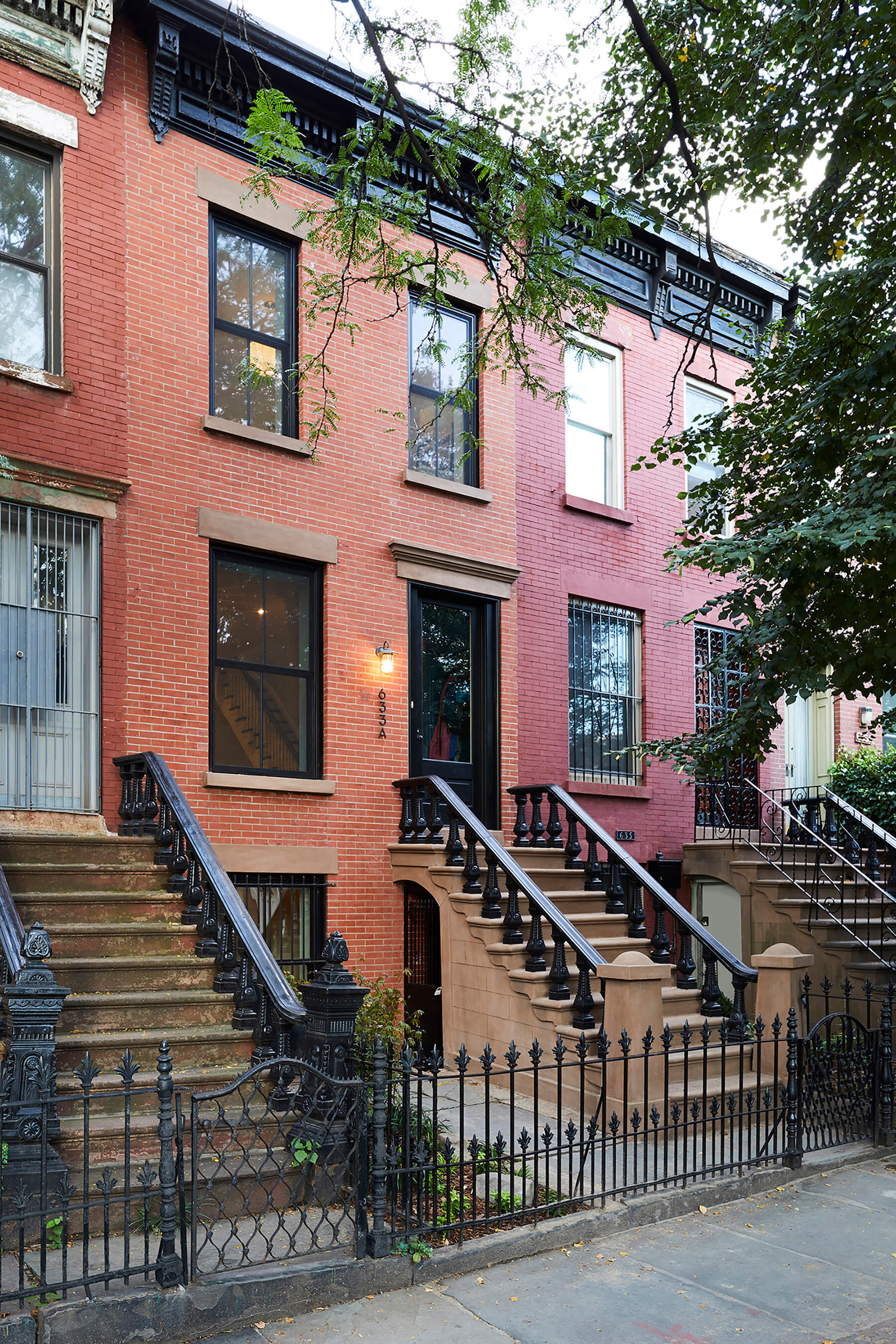
Exterior restoration, including repointing brick and painting the wood cornice, was part of the project. New two-over-two windows replaced aluminum ones.
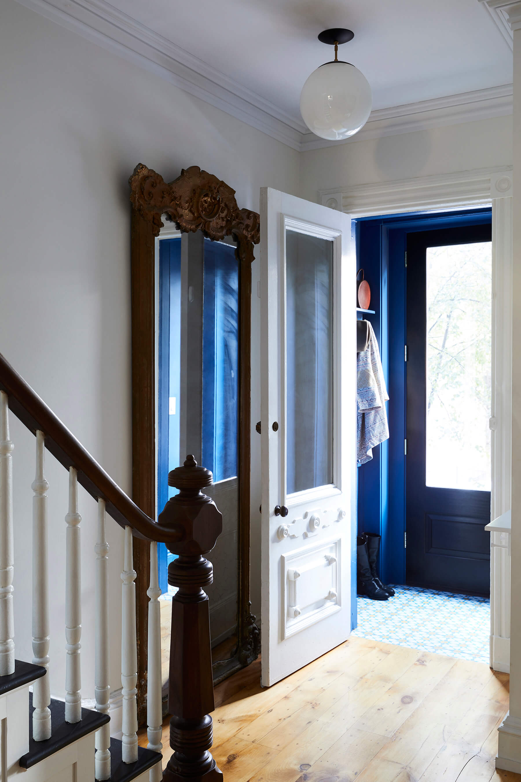
The entry vestibule is enveloped in a vivid blue by Benjamin Moore called New York State of Mind. Snowbank pattern cement tiles from Mosaic House clad the floor in the vestibule.
The inner entry doors are original to the house; the freestanding mirror was left by previous owners.
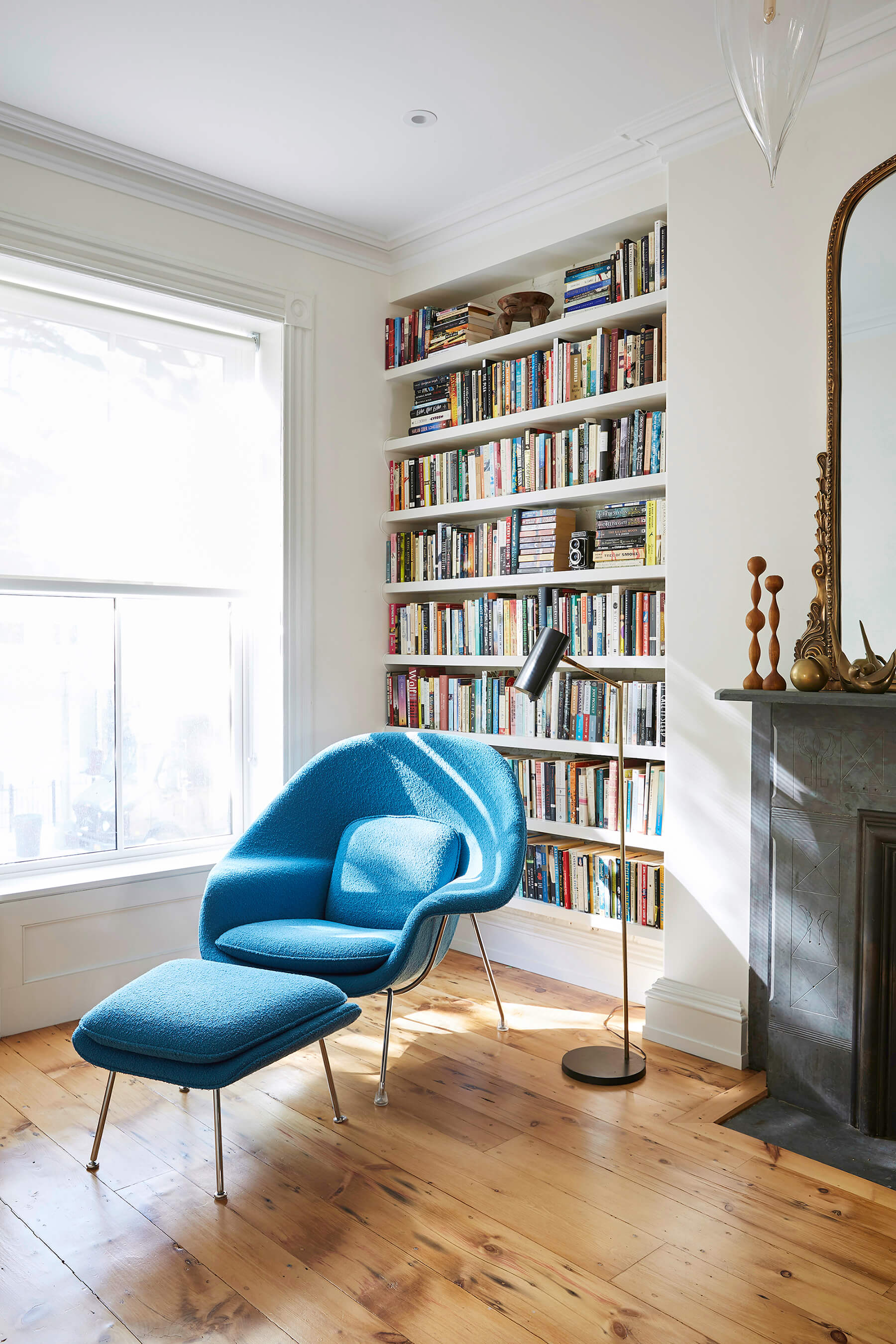
The gleaming wide-plank floors are an artful mix of replaned original subfloor, discovered after thin existing parquet was removed, and old pumpkin pine flooring. “We were able to source just enough to make it work,” Bangia said.
An Eero Saarinen Womb chair in the reading nook at the front of the house picks up on the blue of the entry vestibule. Photo: Julian Wass
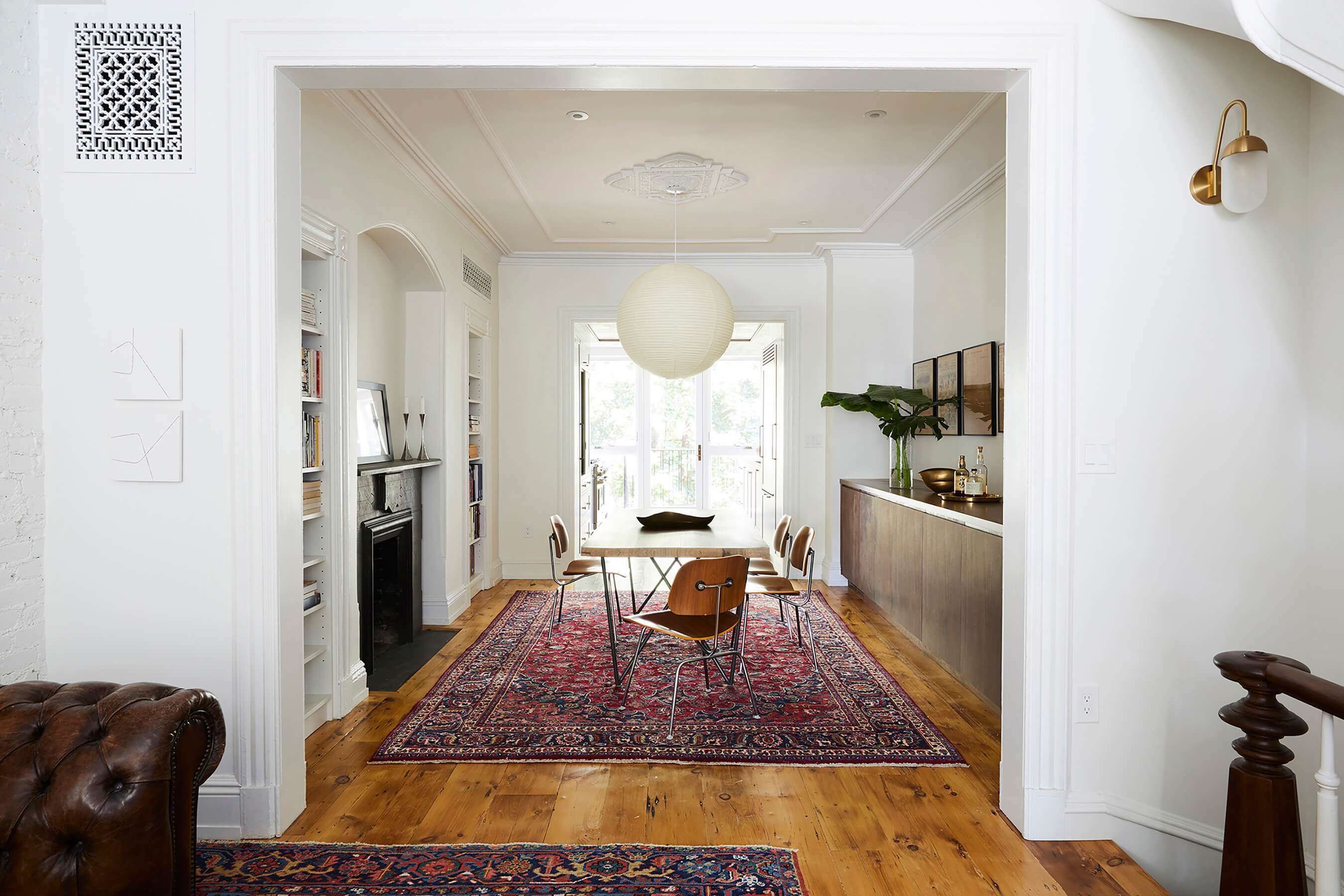
The opening from living room to dining room was enlarged for a greater sense of flow and to host very large holiday gatherings, with multiple tables forming a long communal setting.
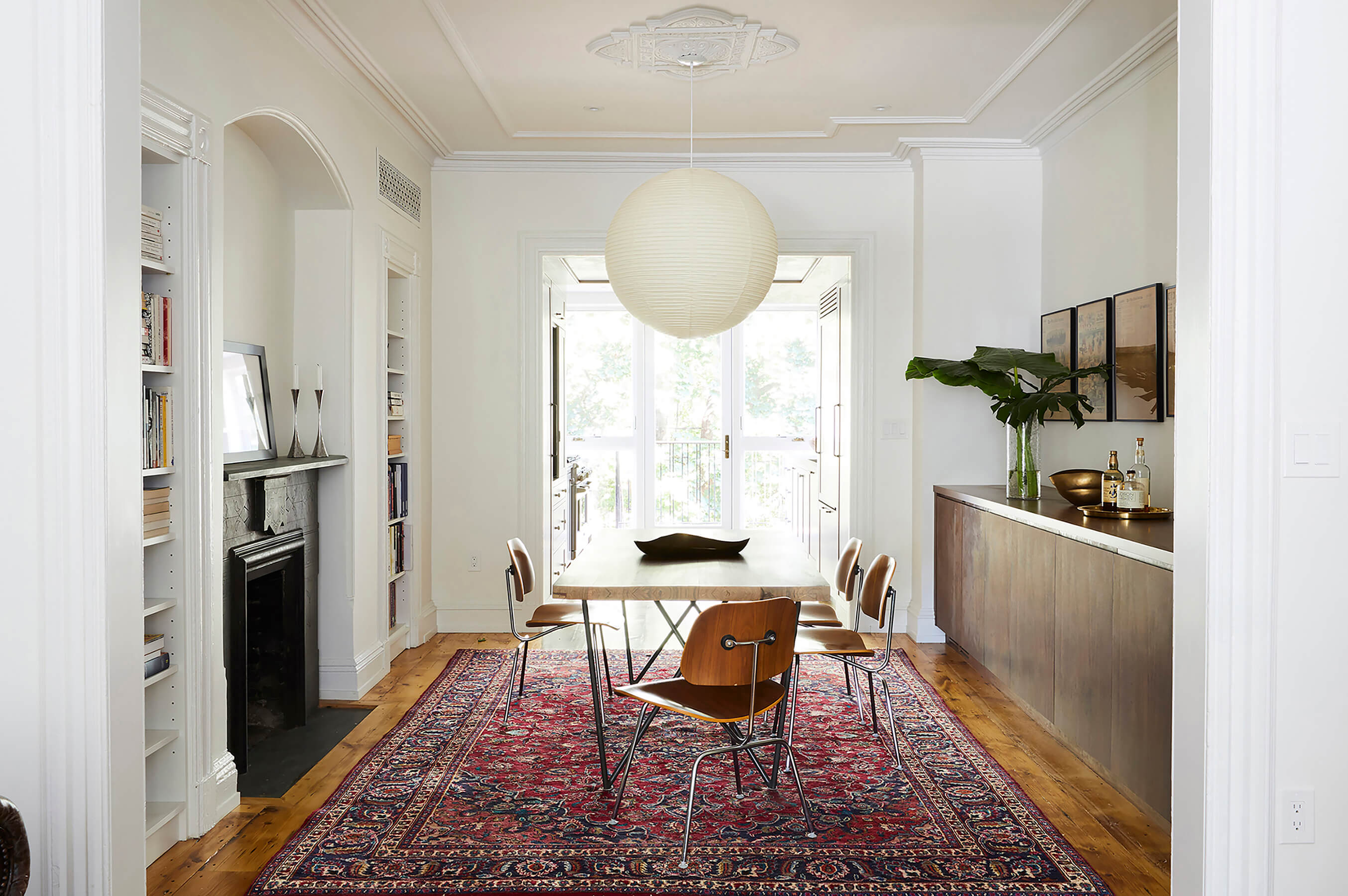
There was a fair amount of salvageable trim; more was replicated as needed. The dining room’s ceiling moldings and medallion were carefully saved during construction, then repaired and reinstalled.
The original slate mantels had been painted; they were stripped and restored.
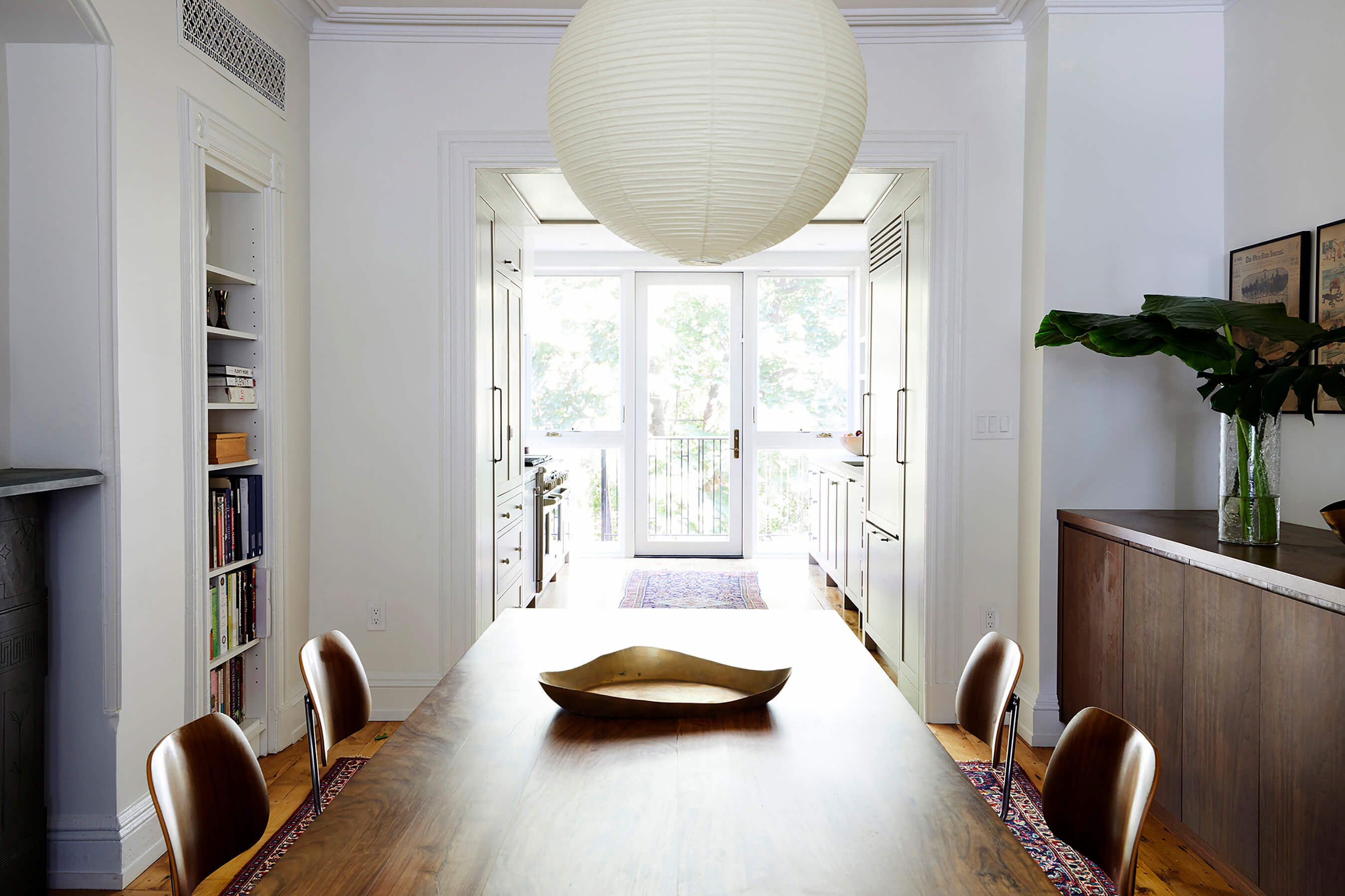
Existing closets flanking the arched alcove were transformed into open bookshelves. A custom walnut credenza runs the length of the dining room, concealing an under-counter wine cooler and storage for glassware.
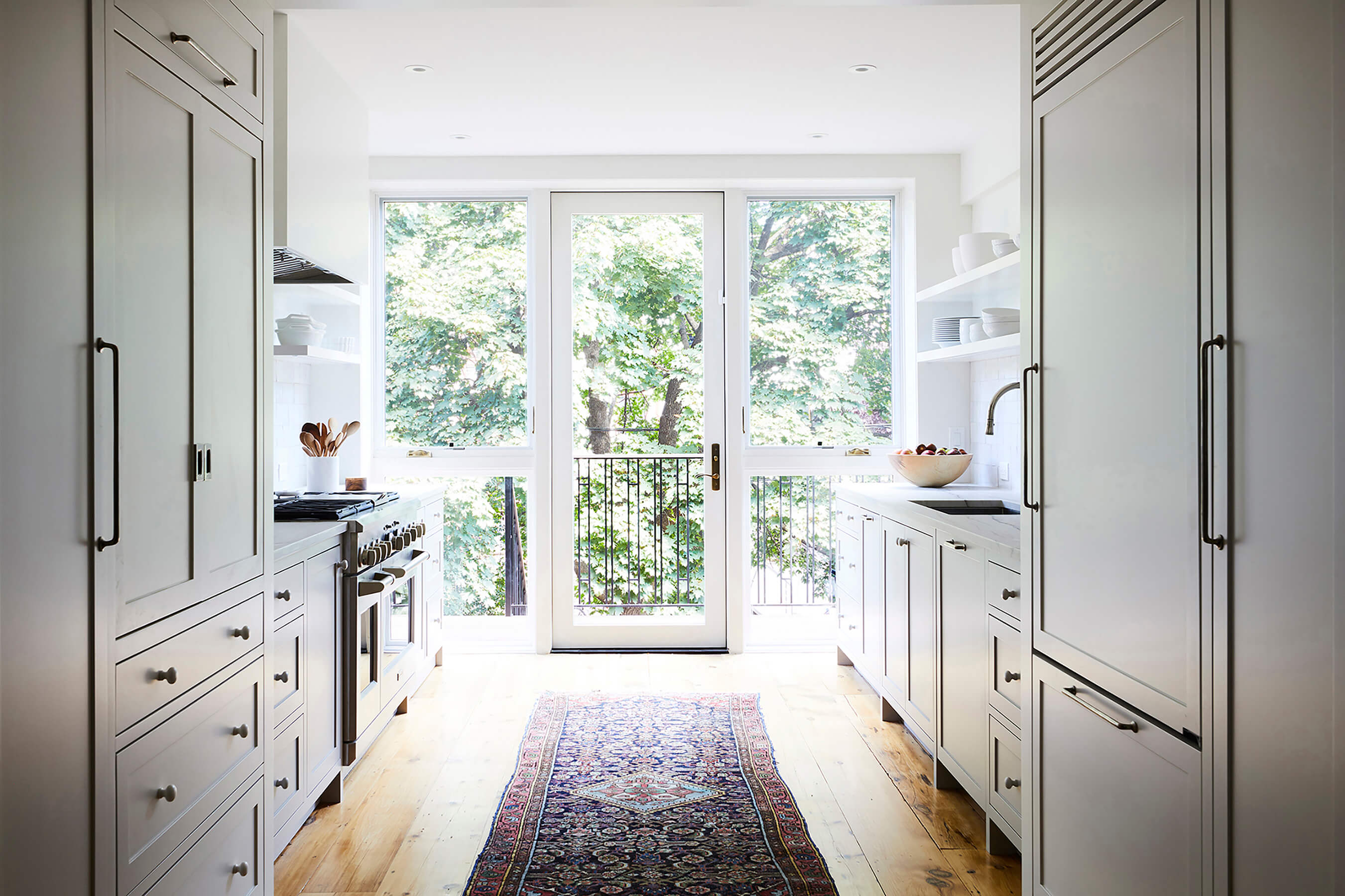
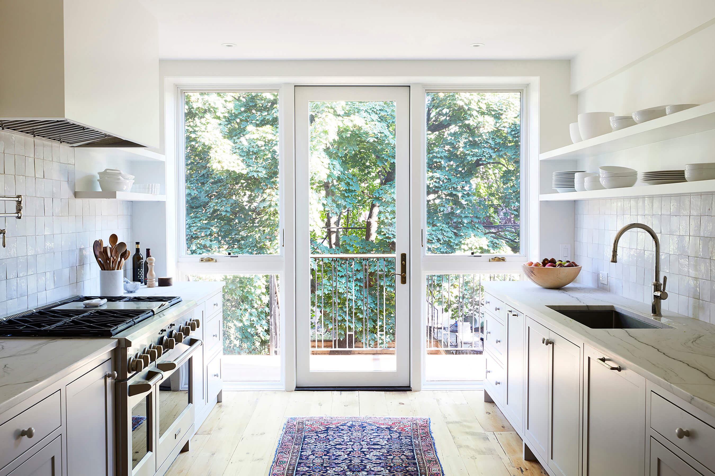
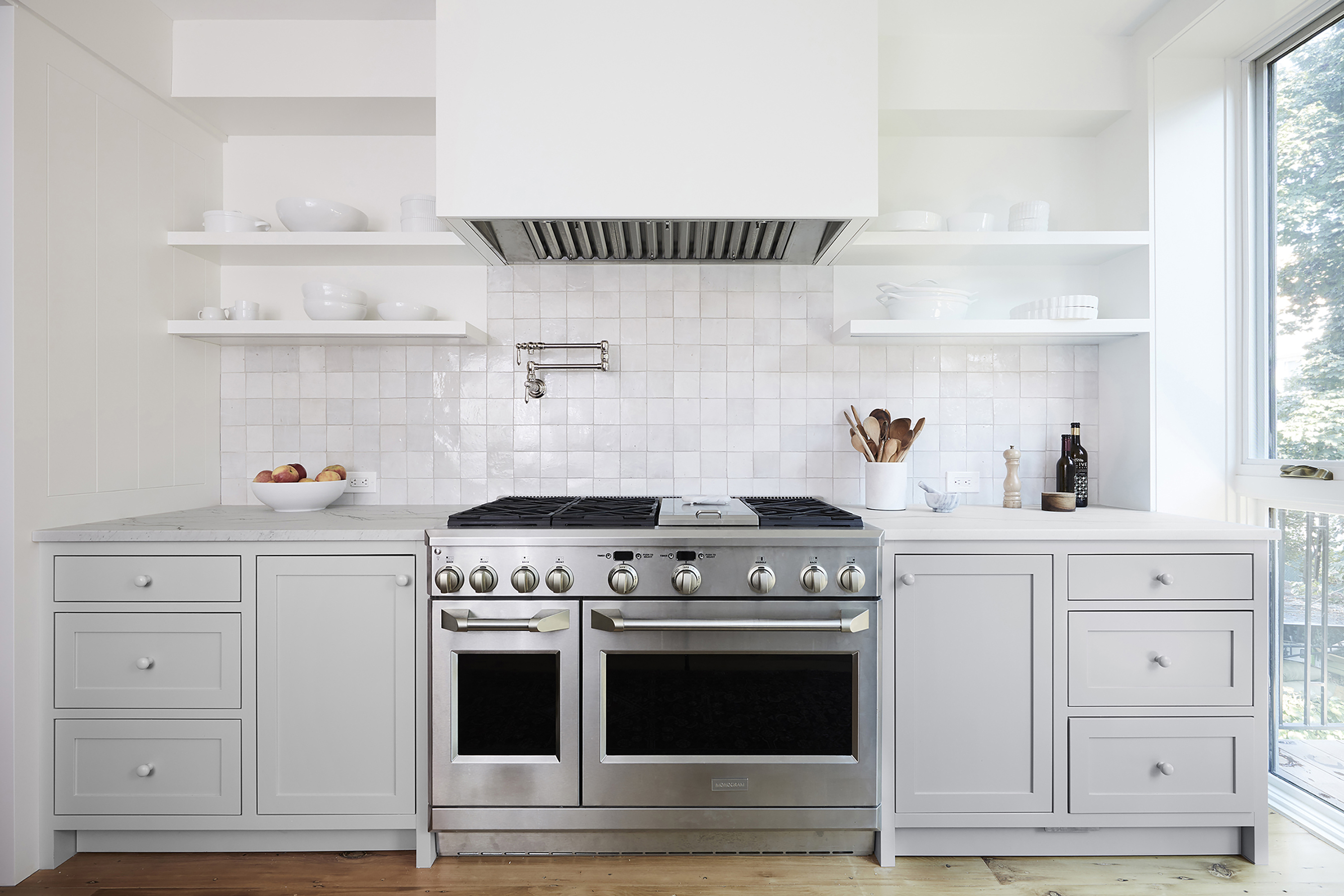
To keep the kitchen in the new extension as open as possible, Bangia Agostinho located the refrigerator and pantry storage in a “portal” between the dining room and kitchen, and eliminated upper cabinets, which would have created a closed-in feeling. They decided to forgo an island for a clear pass-through to the leafy backyard.
A door in the new window wall opens onto a deck just wide enough for a small table and chairs.
The kitchen millwork is custom, with shop-sprayed lacquer. Quartzite counters from SMC Stone surround a 48-inch-wide Wolf range, with weathered white backsplash tiles from Clé.
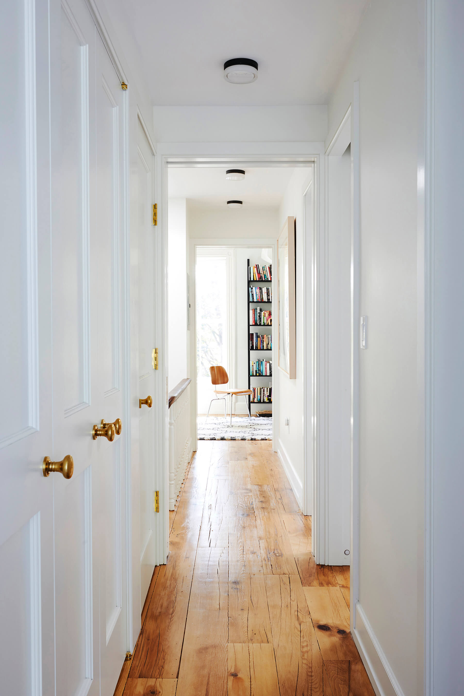
The second floor includes two bedrooms and a large shared bath, with a bank of closets lining the hall. The main bedroom at the rear is cordoned off by a pocket door.
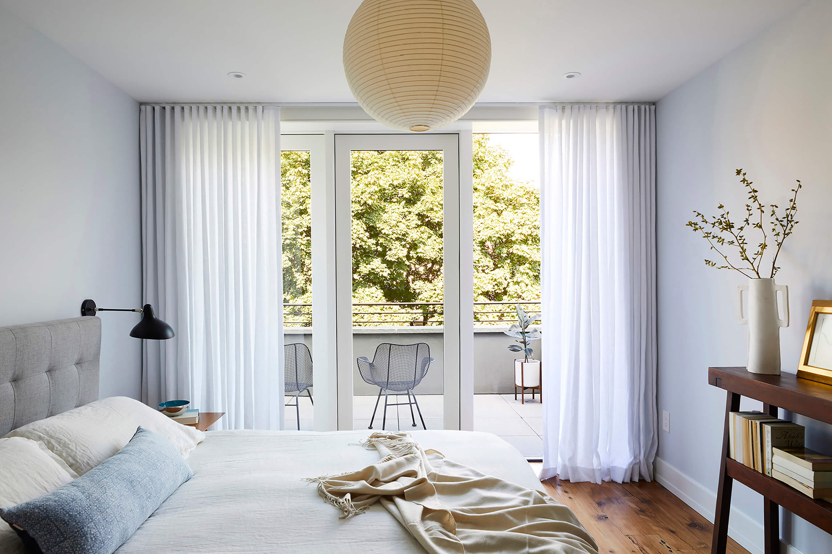
The primary bedroom benefits from a terrace on top of the new kitchen extension.
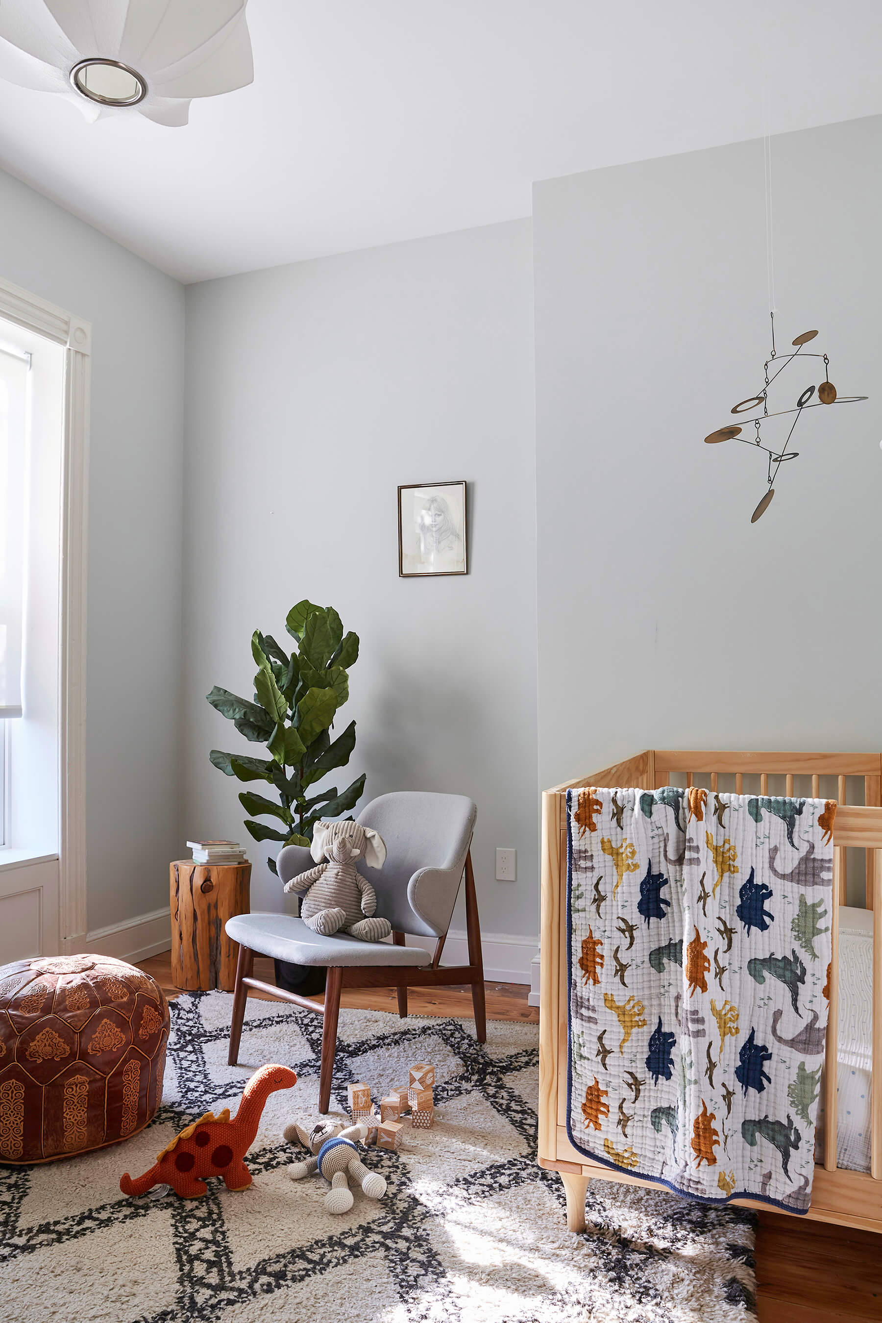
Photo: Julian Wass
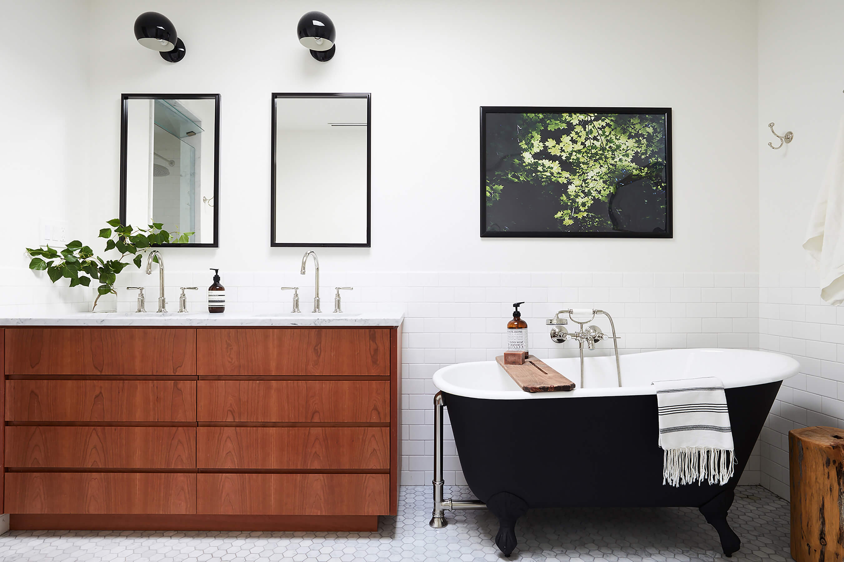
Natural light floods the spa-like bath via an operable skylight above the freestanding cast iron tub. Under-floor radiant heating warms the space.
[Photos by Nicole Franzen, except as noted]
The Insider is Brownstoner’s weekly in-depth look at a notable interior design/renovation project, by design journalist Cara Greenberg. Find it here every Thursday morning.
Got a project to propose for The Insider? Please contact Cara at caramia447 [at] gmail [dot] com
Related Stories
- The Insider: Brownstoner’s in-Depth Look at Notable Interior Design and Renovation Projects
- The Insider: Fort Greene Condo Upgrades Stand Out for High-End Materials, Polished Design
- The Insider: Cohesive Design, Upscale Materials Distinguish Renovated Carroll Gardens Home
Email tips@brownstoner.com with further comments, questions or tips. Follow Brownstoner on Twitter and Instagram, and like us on Facebook.




What's Your Take? Leave a Comment