The Insider: Moody Color, Pattern Meld Victorian and Modern in Park Slope
Rethinking an incongruous developer kitchen was the key to fusing Victorian and modern design throughout an impressively detailed late 19th century townhouse.

Photo by Regan Wood
Got a project to propose for The Insider? Contact Cara at caramia447 [at] gmail [dot] com
Maybe it’s no coincidence that at the same time builder John McClellan and interior designer Allison McClellan started the renovation of a 19th century brownstone filled with enviable detail, they also started watching Downton Abbey. Indeed, the spectacular kitchen they designed and built for their clients at the rear of the house’s parlor floor, with its custom millwork, Victorian-style tile, and gleaming brass hardware, has the warmth and charm of those in grand old English country houses, but with modern utility and more glam.
John has had a contracting business since 2009; Allison launched her interior design firm about a decade ago, after studying at the New York School of Interior Design. But it was only fairly recently that the long-married pair joined forces professionally as Clayton and Lee, a full-service design-build firm based in New York City (Clayton and Lee are old family names). “Things would come up, as they do, and I would ask Allison’s opinion, and she would ask mine on construction,” John said. “We realized how easy and enjoyable, and good for our clients, it would be to provide services as one.”
“We’re very good at pushing each other creatively,” noted Allison. They did just that in the creation of the atmospheric kitchen, which was only part of their brief. Clayton and Lee also redid three baths in their entirety, also with Victorian ambience, enveloped a downstairs guest room in bold floral wall covering, painted the entire building, and replaced door hardware throughout. Other spaces will follow in years to come.
Though the house was overall in good shape, with original moldings largely intact and a salvageable wood floor, the existing kitchen was a stylistic absurdity — in John’s words, “Ikea-style, white, glossy, slick-looking, very developer. It was a kitchen for a condo building in Midtown. It didn’t match the rest of the house.” (See the shocking before photo at the bottom of this post if you don’t believe him.)
The homeowners, new to the house, gave Clayton and Lee free rein, except on a couple of items. They were adamant about having a dual gas and electric range (one was sourced from Fisher & Paykel) and, crucially, they requested dark paint in the kitchen. “I was imagining the kitchen light and bright and open,” said Allison, “because that’s what most people want. But they said, ‘We like dark!'” That was fine with her. “I’d been dying to do something like this.”
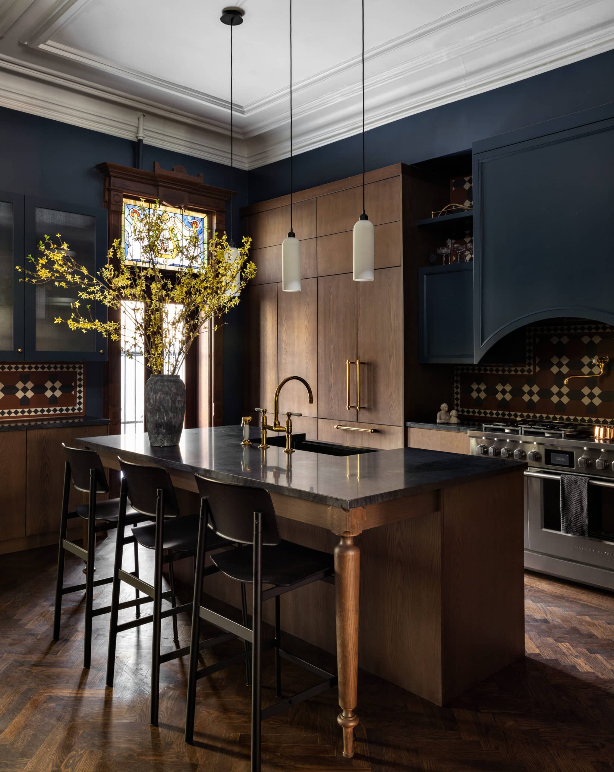
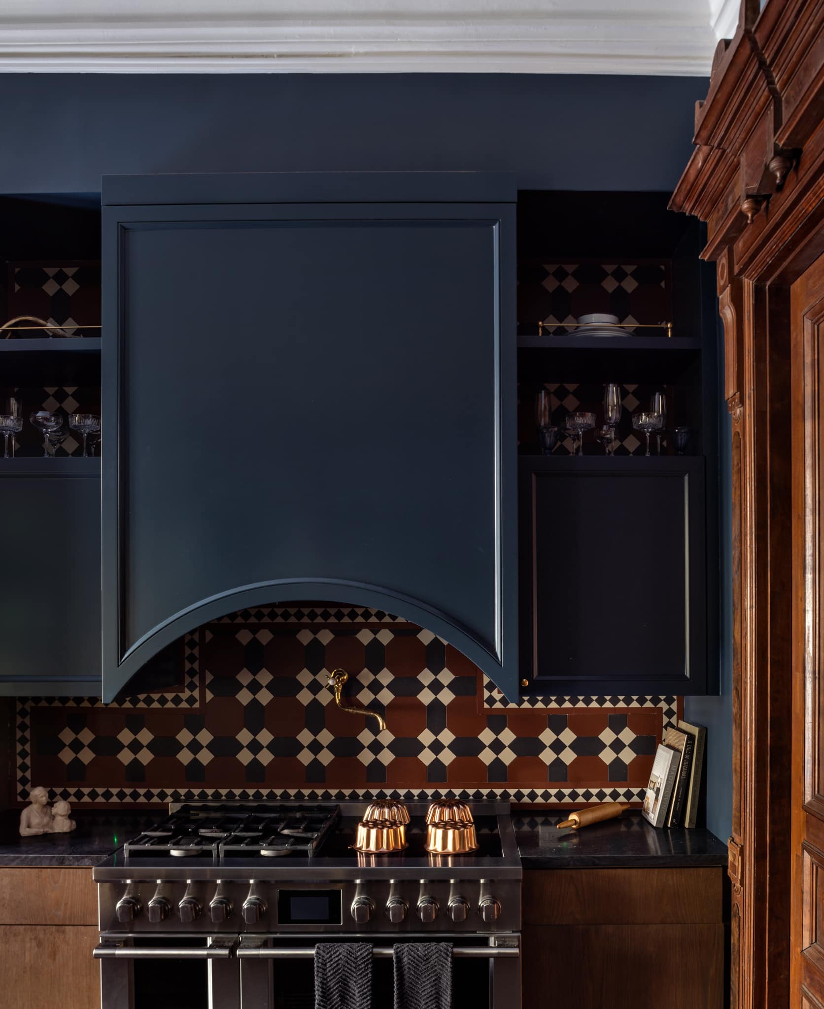
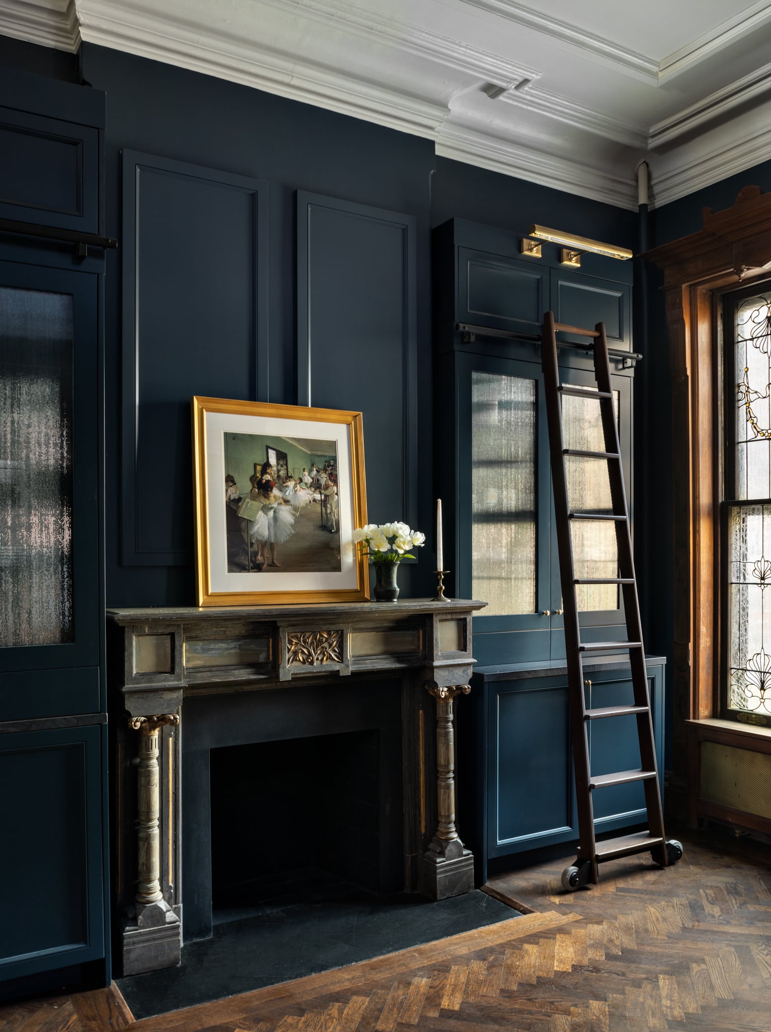
The kitchen design was challenging, John said, largely because of its level of existing historic detail. “We changed a lot, while meticulously protecting the remaining stained glass, moldings, etcetera.” For Allison, the trickiest part was balancing the era in which the house was built with the demands of the present day. “I could have stayed within this whole Victorian style, but I wanted it to be more layered,” she said. “It’s 2024, and everything needed to have modern ease. I didn’t want it to feel like a movie set, so I mixed it up.” Hence the sleek wood cabinetry on the appliance wall, juxtaposed with the vintage style of the deep blue woodwork elsewhere, all designed and built by Clayton and Lee.
Allison gave special consideration to the units on either side of the existing wood mantel, which was formerly blank space. She accommodated the extraordinary stained glass window in the corner of the room by creating cabinets of two different depths. “I didn’t want to block any portion of the original moldings,” she said. For that reason, the cabinet to the left of the mantel is deep enough to hold china and crystal; the one to the right of the mantel only a few inches deep. “It’s the most upscale spice rack ever.”
The unique finish on the mantelpiece is its original condition. “It’s just as we found it,” John said. “We didn’t have to do anything.” Clayton and Lee also chose not to refinish the original moldings around the windows, which bore a deep rusty-red stain. The strong paint color on walls and cabinetry, Prussian Blue from the British company House of Hackney, resulted from experimentation with a huge number of samples, Allison said. “I can’t tell you how many, but we got there.” For the countertops, she chose Brilliant Black honed quartz.
As for the distinctive arched stove hood and the patterned encaustic tile Allison envisioned in a “moment in the middle of the night,” it’s almost impossible to imagine the room without them. The tile is new, handmade in Europe with the same processes and machinery used back in Queen Victoria’s day.
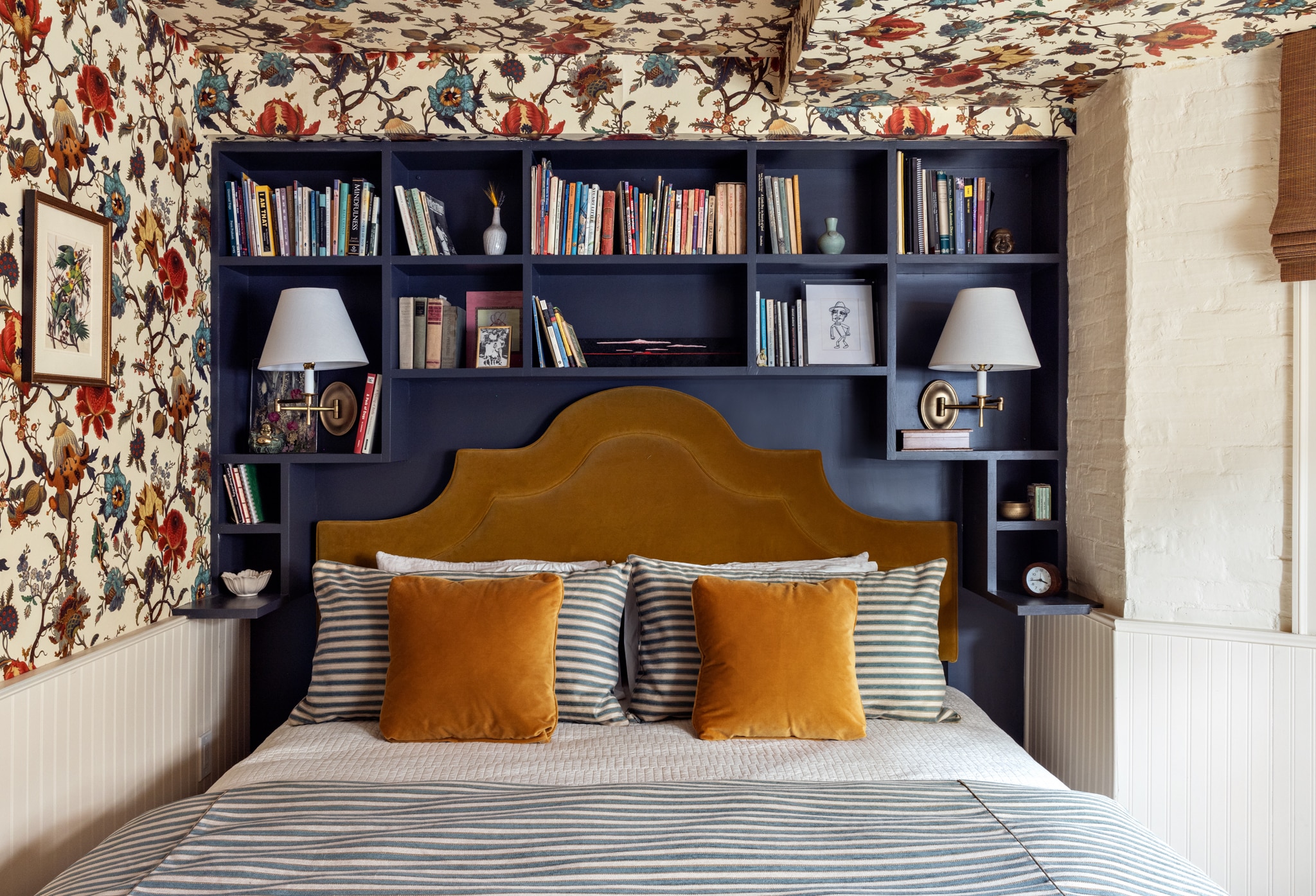
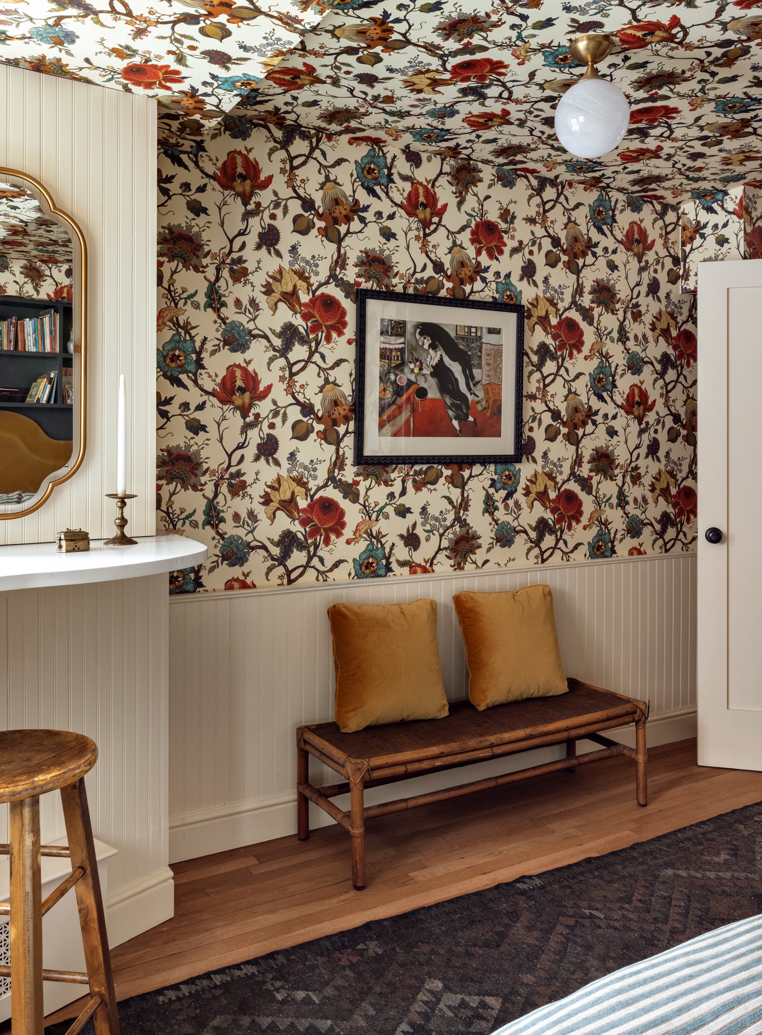
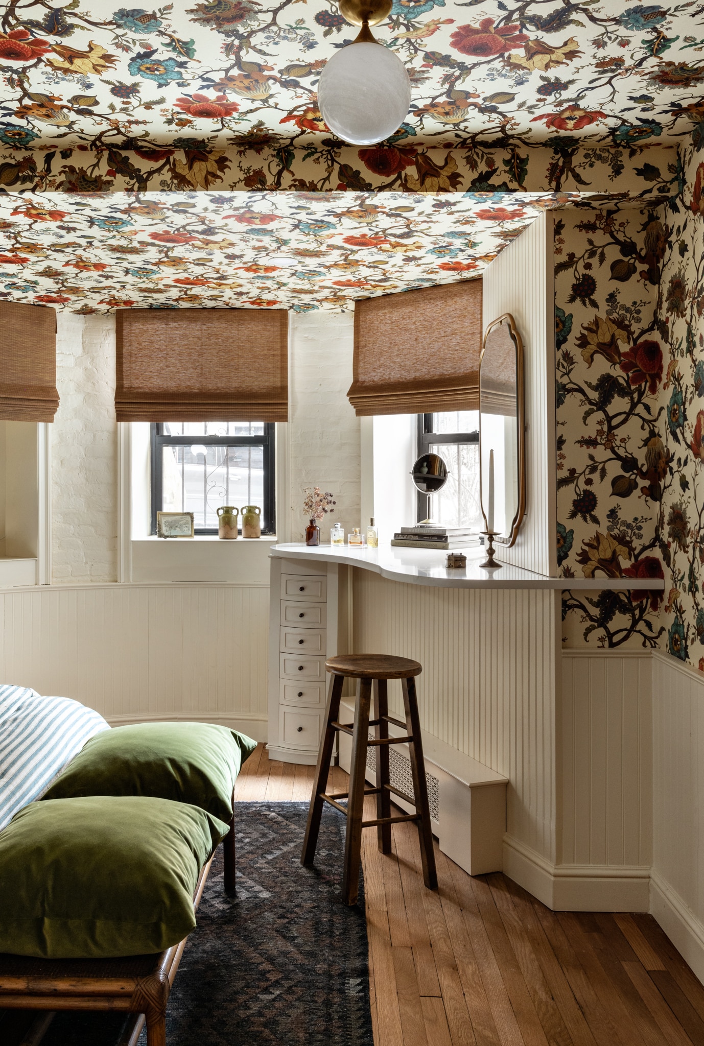
A small guest room on the garden floor was papered in its entirety, including the ceiling beams, with Artemis wallpaper from House of Hackney. “I believe when a room is small, you have to cover every square inch to give it the illusion of depth. Put big furniture in the space,” Allison advised. “Do it big.”
Clayton and Lee painted the exposed brick and added shelves behind the bed and a custom millwork vanity. Allison designed the velvet-upholstered headboard and even the duvet cover. “I wanted to create a room you would feel comforted and enclosed in,” she said.
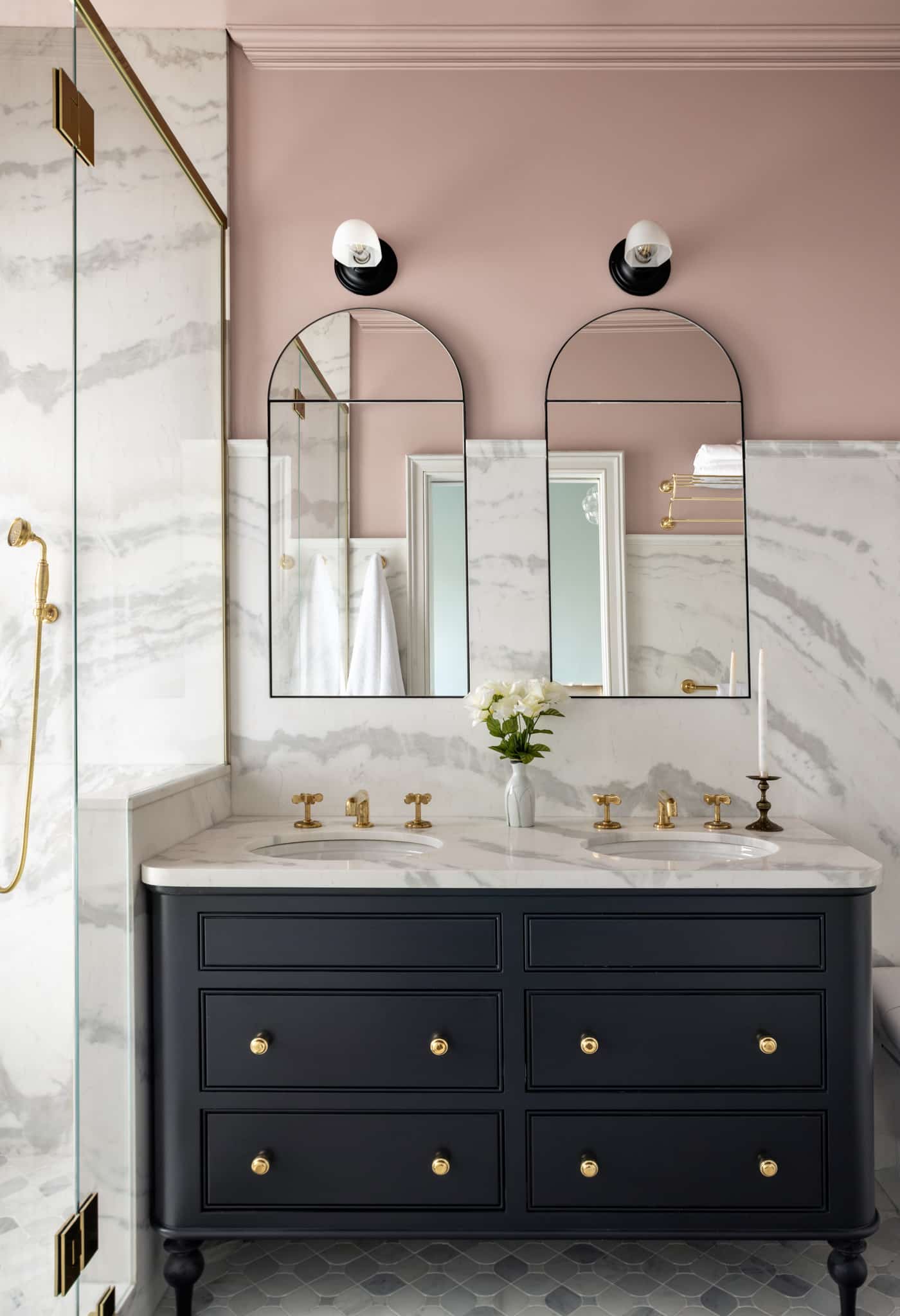
The three baths Clayton and Lee renovated all required “a lot of updating behind the walls,” John said, including venting where there had been none and all-new plumbing.
The walls of the primary bath are clad in Calacatta Dolomiti marble with a sequenced wave pattern. There’s a custom vanity designed by Allison. Medicine cabinets recessed into the marble exemplify the attention to detail in the entire project.

An existing tub in another of the bathrooms was repurposed and reglazed; the blue and white patterned field tile is from Ann Sacks’ Savoy Prints line.
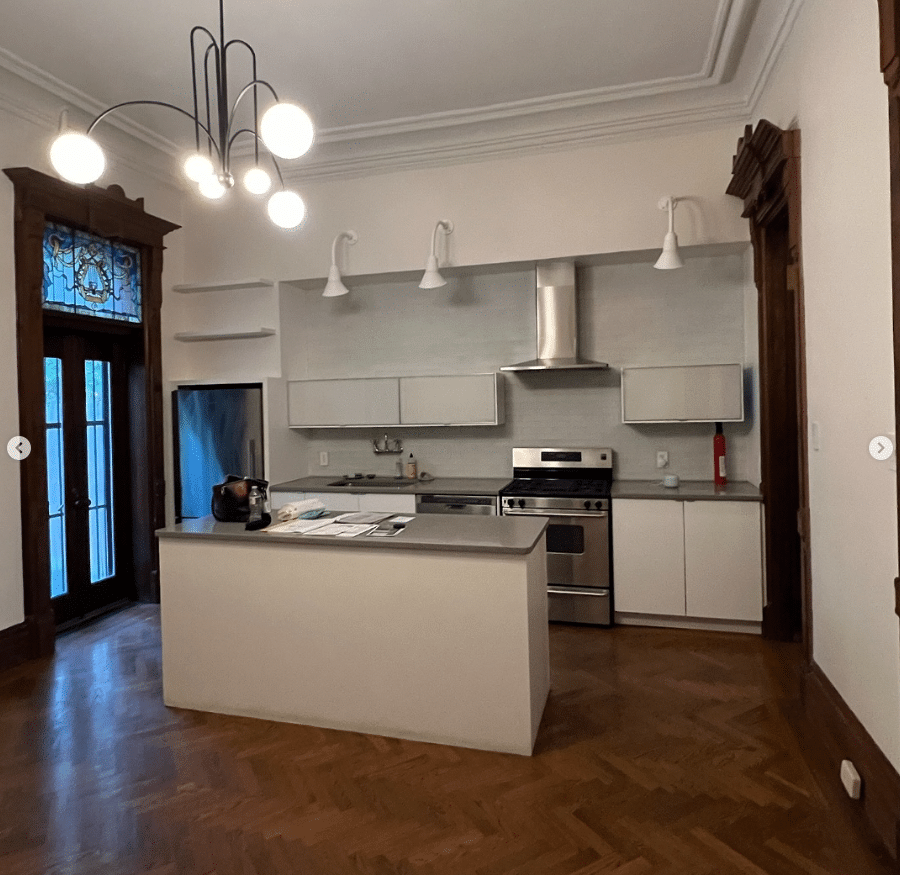
Kitchen before, above. Prior to Clayton and Lee’s ministrations, the kitchen was utterly mismatched to the house’s original architecture.
[Photos by Regan Wood]
The Insider is Brownstoner’s weekly in-depth look at a notable interior design/renovation project, by design journalist Cara Greenberg. Find it here every Thursday morning.
Related Stories
- The Insider: Park Slope Townhouse Redo Adds Custom Aquarium, Rooftop Sauna
- The Insider: Park Slope Reno Yields Airy, Clutter-Free Apartment
- The Insider: Long-Awaited Reno Freshens Park Slope Home for Book- and Game-Loving Family
Email tips@brownstoner.com with further comments, questions or tips. Follow Brownstoner on Twitter and Instagram, and like us on Facebook.



What's Your Take? Leave a Comment