The Insider: New Curving Staircase Meets Intricate Plasterwork in Park Slope Triplex Reno
When a young family discovered twins were on the way, they enlisted the help of a design/build firm to rethink their Park Slope multi-family townhouse.

Photo by Matthew Rauch
Got a project to propose for The Insider? Contact Cara at caramia447 [at] gmail [dot] com
A couple in need of more space fast approached Rauch Architecture, a Chelsea-based design/build firm whose portfolio includes townhouse and loft renovations as well as ground-up projects, for help.
They had been living on not quite a floor-and-a-half of a multi-family brownstone with their young son, sharing the garden level, where their kitchen and living space were located, with a boiler room, and using the rear half of the parlor floor, which retained spectacular vintage plasterwork, as sleeping quarters.
The couple found out they were having twins around the time tenants on the floor above the parlor level decided to move out. The building, though a rental, had long been owned by the parents of one member of the couple, and Rauch’s clients were able to take over an extra floor.
“We decided to make a vertical townhouse, relocating all the bedrooms to the new third floor, with a primary suite at the rear and two kids’ rooms in front,” said Matthew Rauch, founder and principal architect at Rauch Architecture. The parlor would become the main living space, as befits its extravagant detail. For budgetary reasons, the kitchen remained on the garden level and received a few cosmetic upgrades.
The main challenge was designing a new interior stair in keeping with the magnificent plasterwork, while working around existing plumbing risers so as not to disturb building systems for other residents, and making sure the existing plaster did not sustain damage. It did not. The architects even managed to preserve most of the original parquet floor.
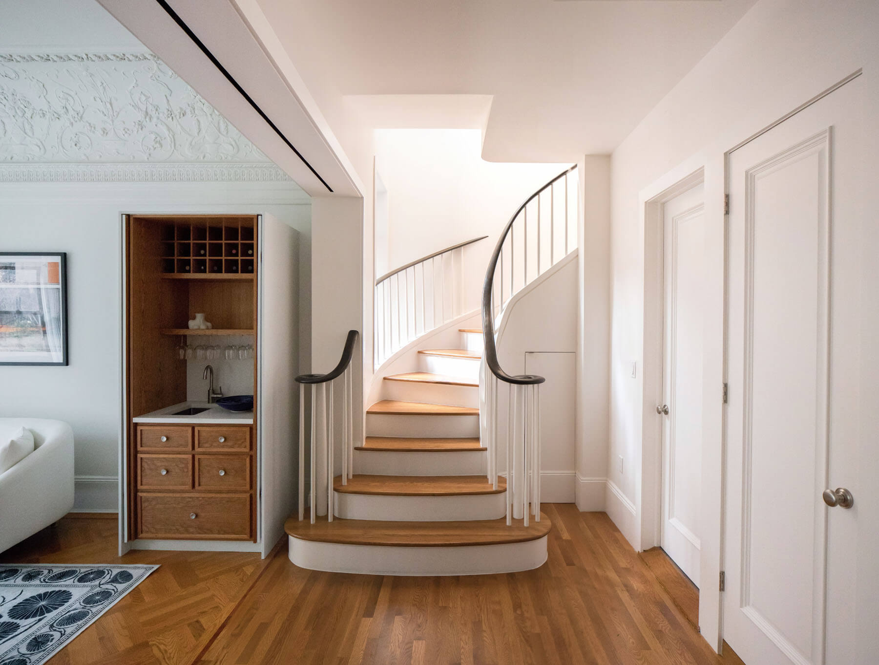
Rauch Architecture designed a gracefully curving stair with sculpted handrails to connect the parlor to the new bedroom floor. “We didn’t want it to feel like something added later, but like something that belonged there,” Rauch said.
Because of the unique situation, working in the new stair was “almost like Jenga blocks,” Rauch said. “We had to curve it in a way that kept our clients’ parlor floor bathroom intact.” Ditto for an adjacent bath belonging to the studio apartment at the front of the parlor floor. “It was definitely a puzzle.”
Next to the new stair, the architects took the opportunity to tuck in a convenient wet bar.
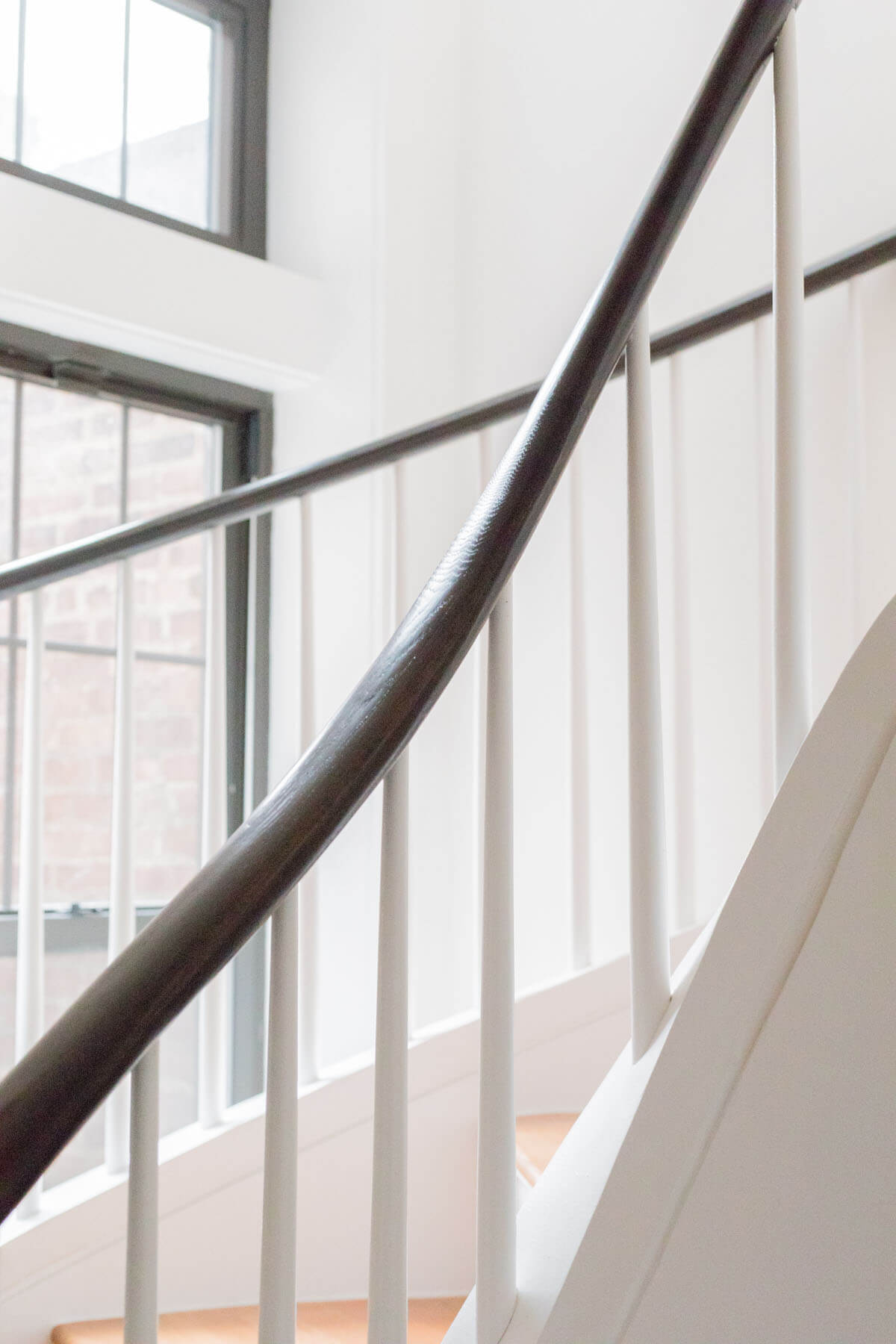
Because the house’s rear parlor is in an extension a few feet short of the full width of the property, Rauch was able to incorporate existing windows into the stairwell.
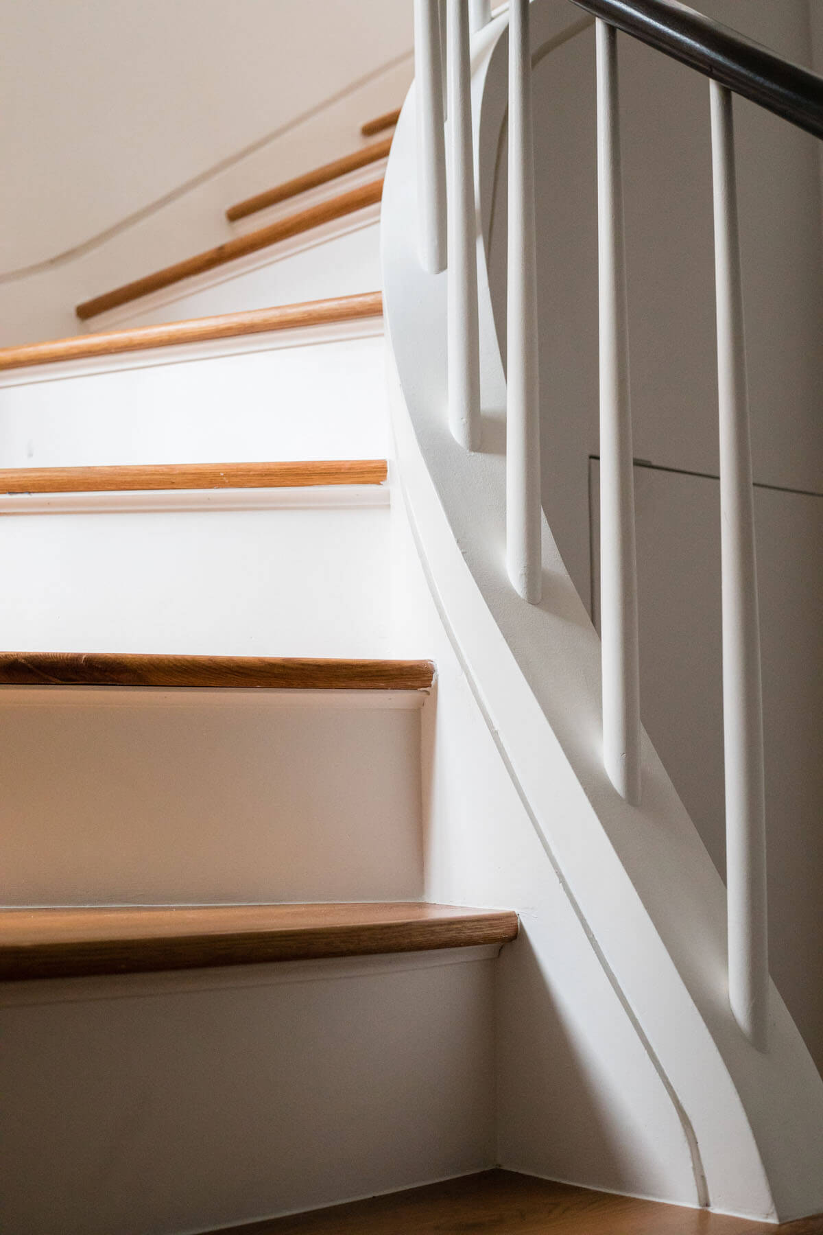
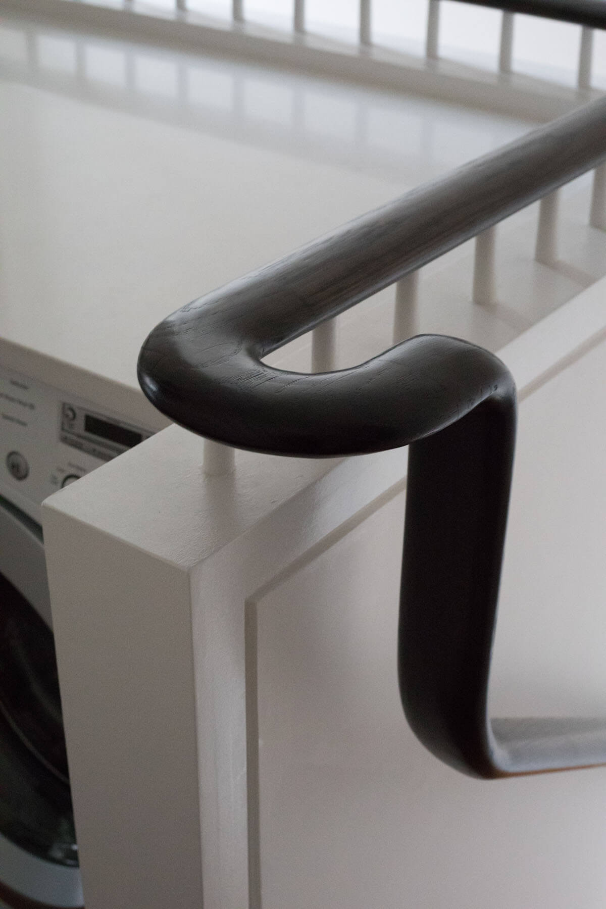
The new stair was built on site, using Lauan bending plywood to create the curve, plus “a lot of Bondo,” a car repair paste, and a great deal of sanding. They picked an oval profile for the new stair rail. “It felt contemporary and classic at the same time,” the architect said.
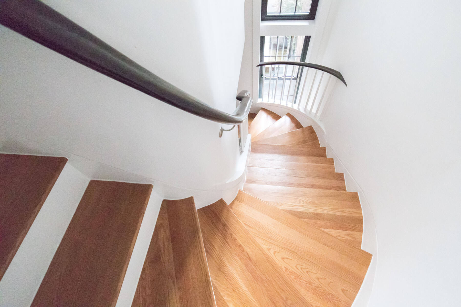
A wood reveal all along the sheetrock prevents scuffing and “exaggerataes the geometry,” Rauch said. Treads are red oak, stained to match existing flooring.
At the top of the stairs is a landing with a view of the double-height stairwell. It became a ‘laundry loft,’ with a washer-dryer beneath a stone countertop.
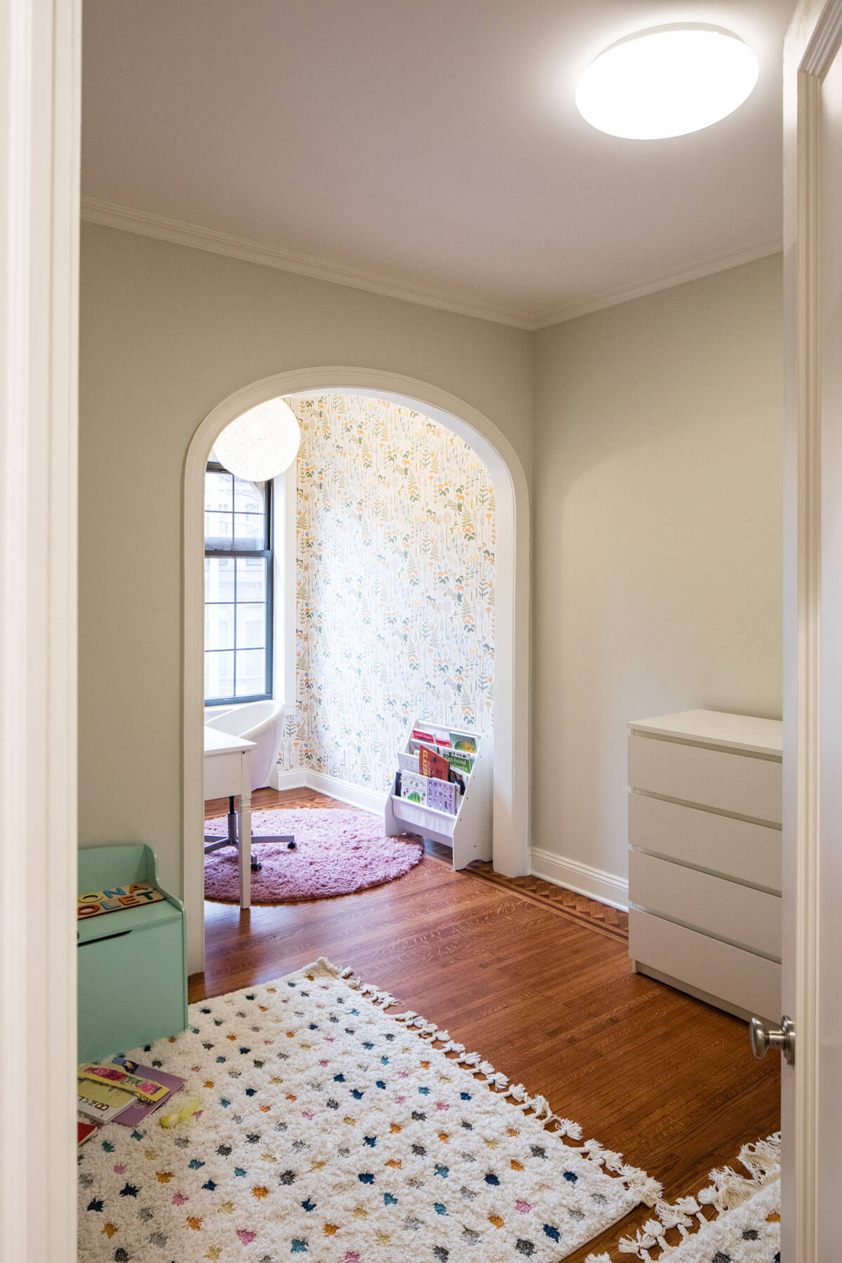
A new bedroom for the infant twins features an arched opening into a shared play space (now being used as a home office) next to the window.
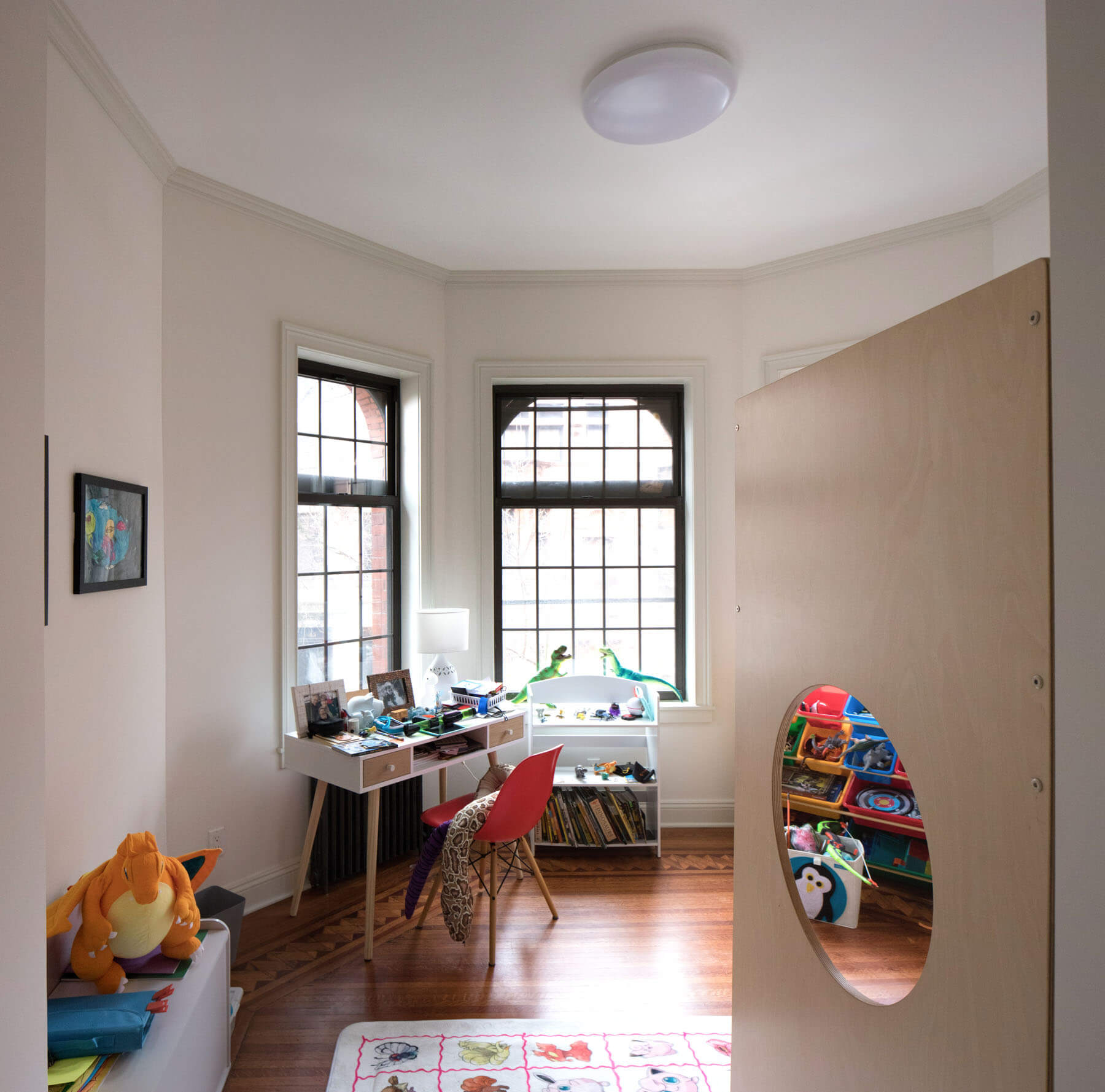
The older son’s room was already special by virtue of its multi-paned angled windows. A plywood piece from Casa Kids incorporates a bunk bed, play area and desk.
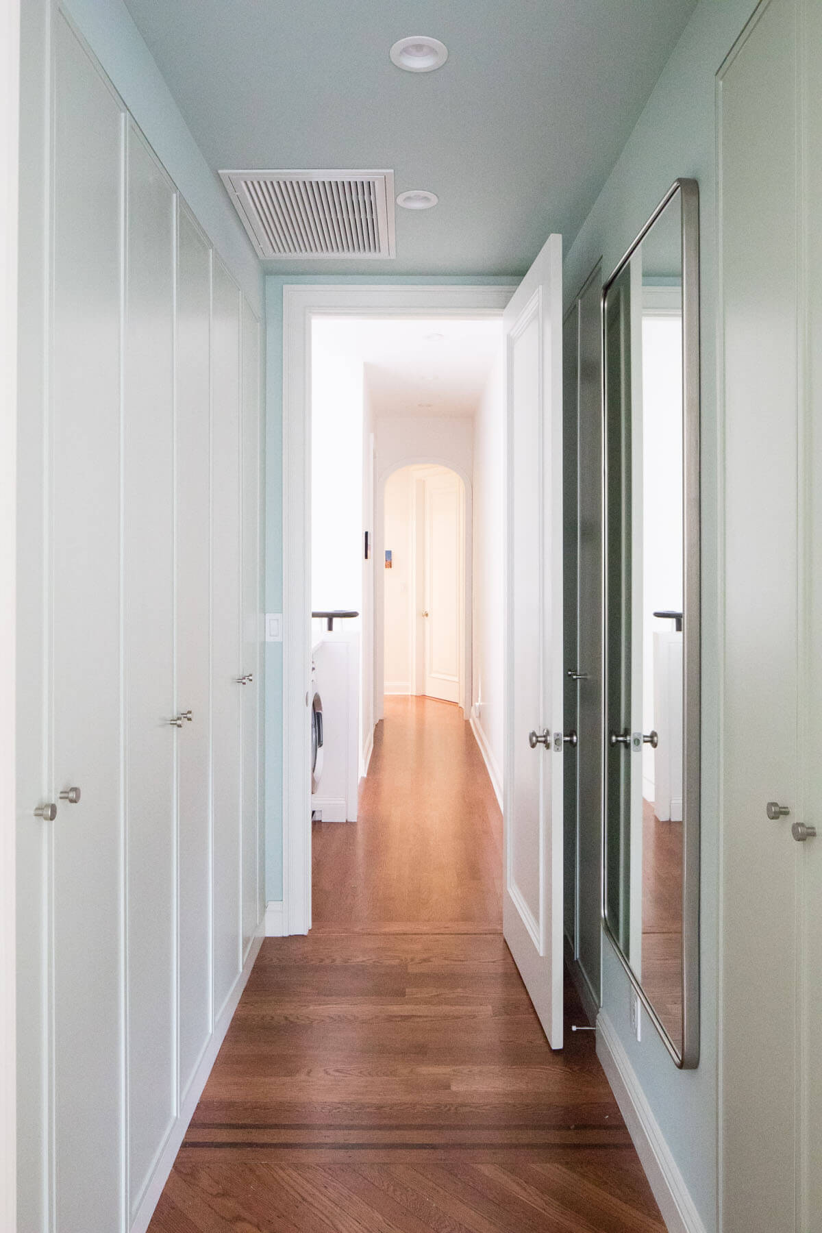
Near the end of the narrow hall separating the children’s rooms from the new primary suite, Rauch added an arch “to make it a space rather than a never-ending hallway.”
A bank of closets made from IKEA boxes with custom doors maximizes storage and gives the parents a little more privacy. The architects took pains to retain what they could of the original decorative floor border in that area.
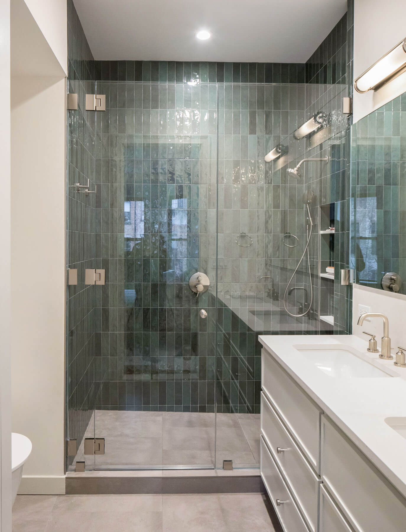
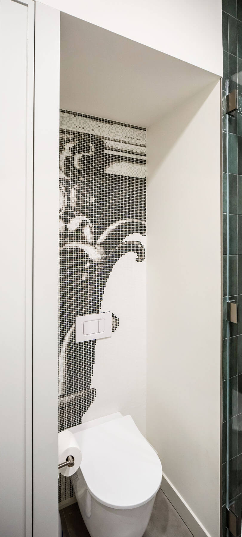
Rauch Architecture hid plumbing for the all-new primary bath alongside the new stair. They kept the design “pretty simple,” Rauch said, except for splurging on a special mosaic tile treatment from Bisazza in the WC area, a pattern based on the same Corinthian columns found in the original plasterwork below.
[Photos by Matthew Rauch]
The Insider is Brownstoner’s weekly in-depth look at a notable interior design/renovation project, by design journalist Cara Greenberg. Find it here every Thursday morning.
Related Stories
- The Insider: Gut Renovation Elegantly Resolves Challenges of Angular Park Slope Prewar
- The Insider: New Kitchen, Baths, Decor Add Modern Glamour to Park Slope Limestone
- The Insider: Creative Details, Extra-Special Baths Distinguish Park Slope Rowhouse Renovation
Email tips@brownstoner.com with further comments, questions or tips. Follow Brownstoner on Twitter and Instagram, and like us on Facebook.





What's Your Take? Leave a Comment