The Insider: Spectacular Curved Windows on Rear Facade Upgrade Park Slope Neo-Fed Inside and Out
Remarkable windows and a rebuilt rear extension, along with an all-new kitchen, were the most significant architectural changes, but not the only ones.

Photo by David Mitchell
Got a project to propose for The Insider? Contact Cara at caramia447 [at] gmail [dot] com
At 5,000-plus square feet and chock full of intact detail, the circa-1910 Neo-Federal brick row house was grand to begin with.
Its main drawback? The kitchen’s placement in a rear extension, closed off from the rest of the house. “Once upon a time, when the household had a staff, the kitchen was in the basement,” said architect and founding partner Brendan Coburn of The Brooklyn Studio (formerly known as CWB Architects). Later, a butler’s pantry in a rear extension off the first floor was converted to “an insanely narrow, tight galley kitchen,” Coburn said. The new homeowners, a young family of four, “wanted the same thing most people want these days: a kitchen everybody can hang out in.”
The Dumbo-based firm masterminded an intervention, moving the kitchen to the middle of the house and planning dining space at the rear. Then came a bold stroke: the architects put forward the idea of creating a dining room with a curved bay window inspired by streamlined trains like the fabled 20th Century Limited, in service from 1902 through the 1960s. “It would be like being in a dining car, with a connection to the garden, where you could linger for a long time,” Coburn said. “And we didn’t increase the footprint of the extension one bit.”
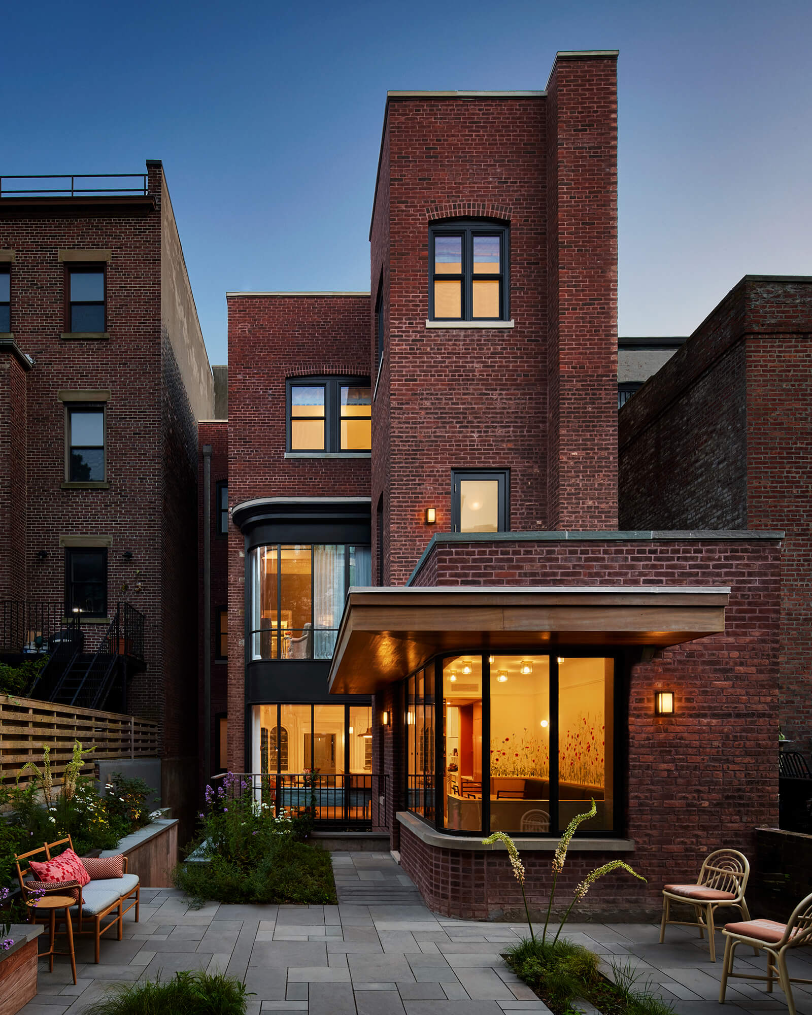
The clients loved the concept. “Once we had the curved window image in mind, we decided to extend it,” Coburn said, ditching another, existing multi-paned bay window on the rear of the house and replacing it with a curvilinear, three-story-tall glass bay.
The remarkable windows and the rebuilt rear extension, along with an all-new kitchen, were the most significant architectural changes, but not the only ones. Though the house was in generally outstanding shape, The Brooklyn Studio still had to replace compromised framing on the two upper floors, make structural repairs to the grand staircase, and redo existing skylights, among other things.
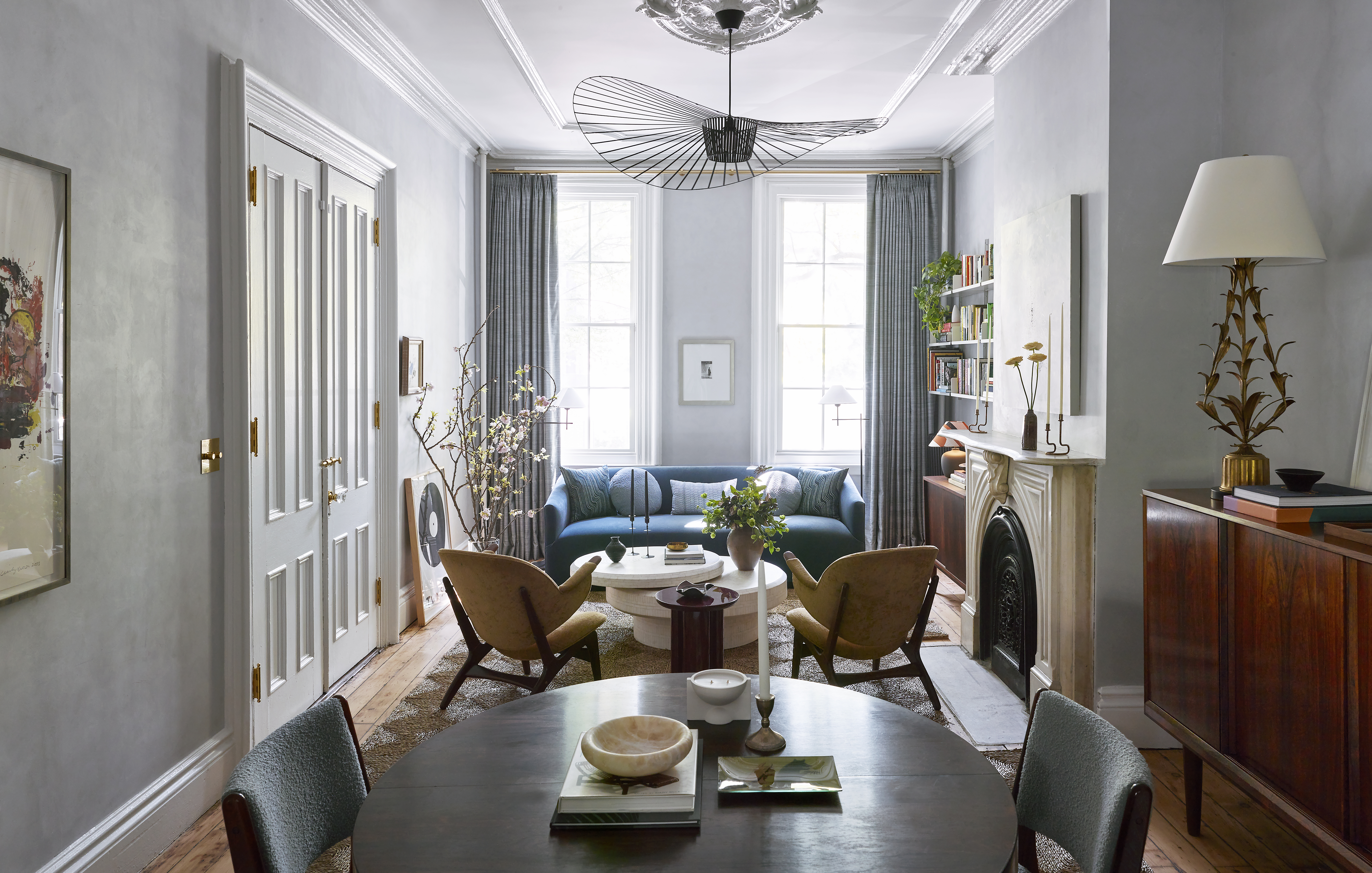
Brooklyn–based design firm Jesse Parris-Lamb decorated the house with its trademark sensitivity to color and pattern, bringing in a range of elegant custom furnishings and antiques.
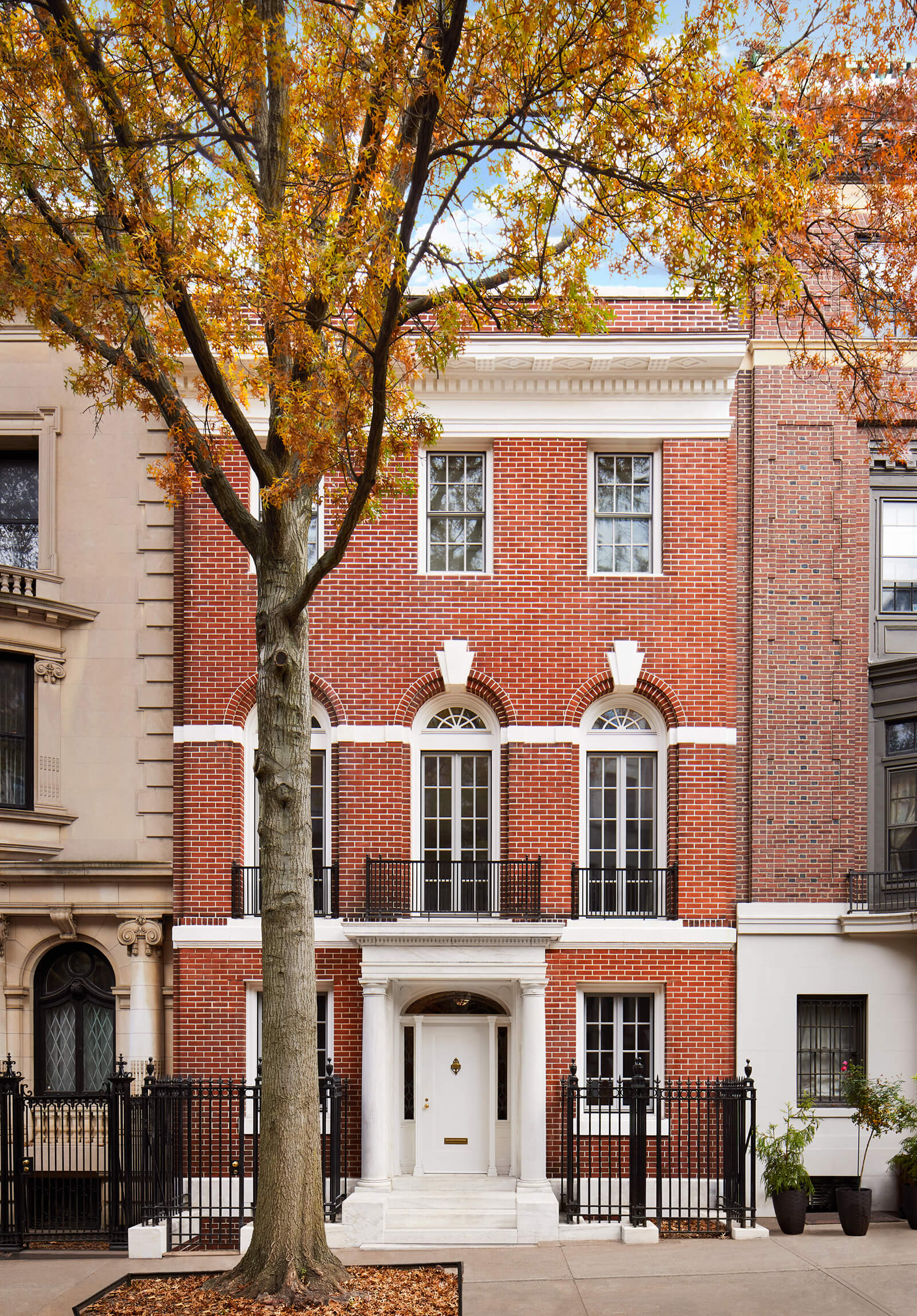
The early 20th century row house has “a Renaissance palazzo layout,” Coburn said. The new kitchen and dining room are on the first floor. “The second floor is what would be called the piano noble, with higher ceilings,” where the living room is located. Bedrooms are on the floor above.
The Brooklyn Studio restored the stone stoop and vestibule, repointed the brick, refurbished the ironwork, restored the wood cornice and installed modern steel windows in the original openings. They also replaced the roof and updated two existing skylights.

The entry door leads to a wide center hall. There’s a home office on one side, a new mud room with space for bicycles on the other.
Jesse Parris-Lamb selected the green floor tile and designed the painted ceiling.
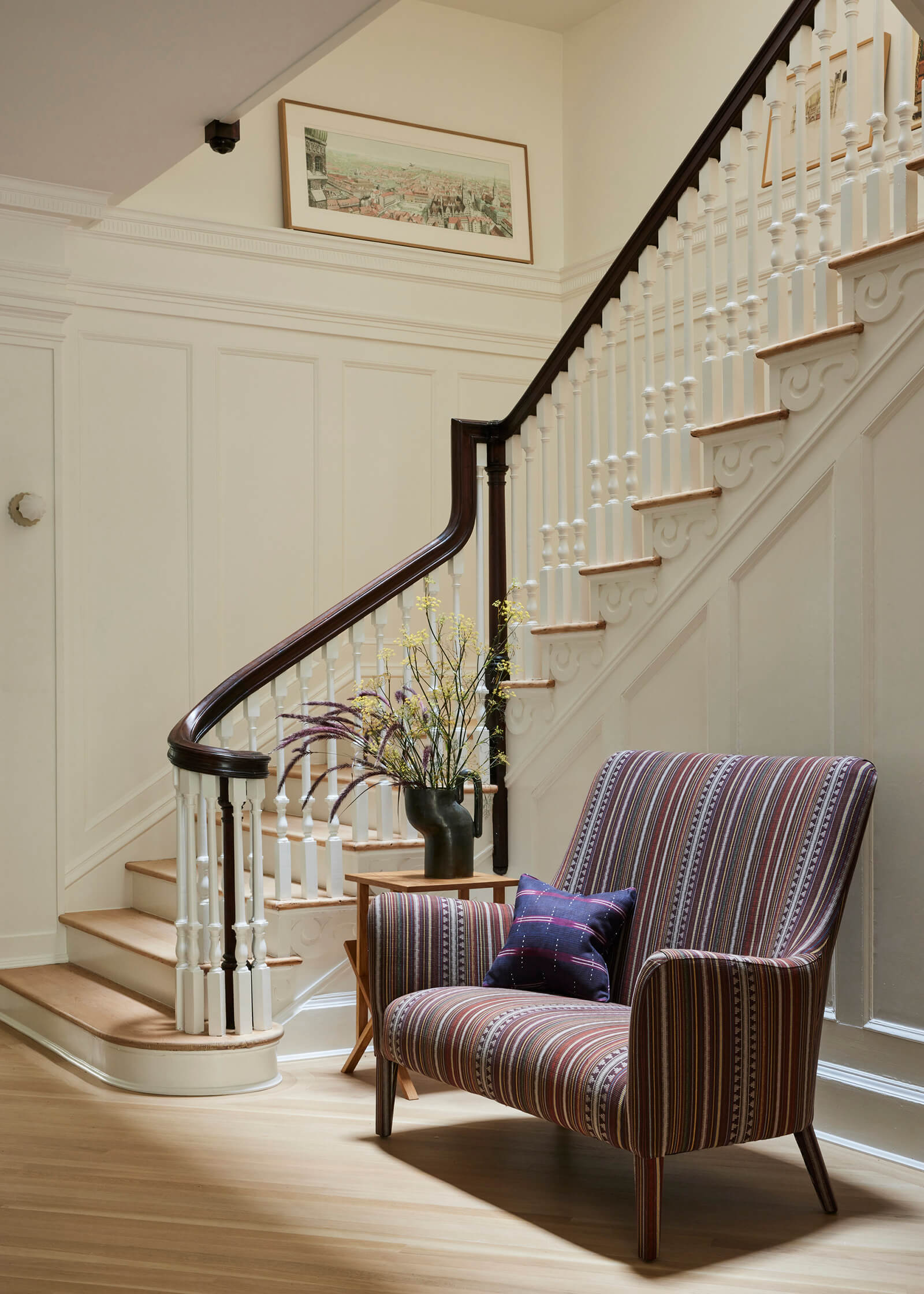
The woodwork along the winding stair was among many millwork upgrades made in various locations throughout the house. New white oak floors were laid on the diagonal.
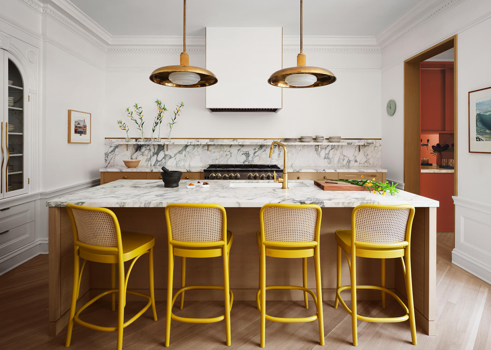
The Brooklyn Studio’s design for the new kitchen includes a highly figured marble backsplash as a focal point. The lime-washed stove hood has brass edges that pick up the sink hardware, shelf brackets and pendant light fixtures.
The original arched china cabinet remains. To the right, a rust-colored pantry serves as a passageway to the dining room.
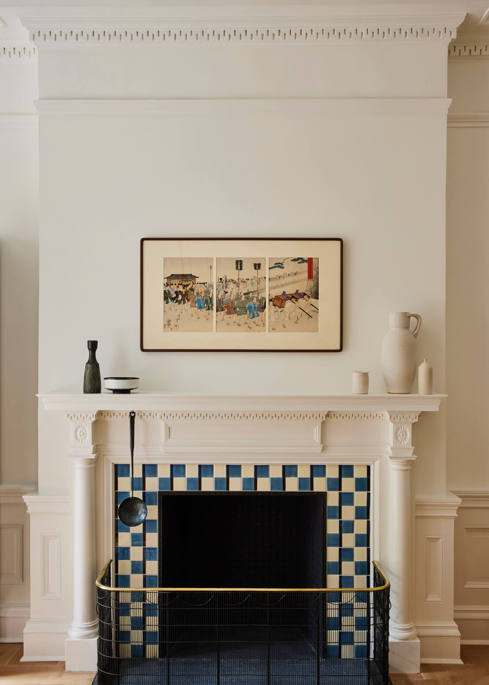
Opposite the kitchen island, a fireplace with original dentil molding was enlivened with blue and white checkerboard tiles.
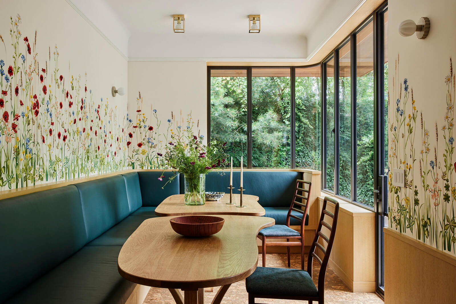
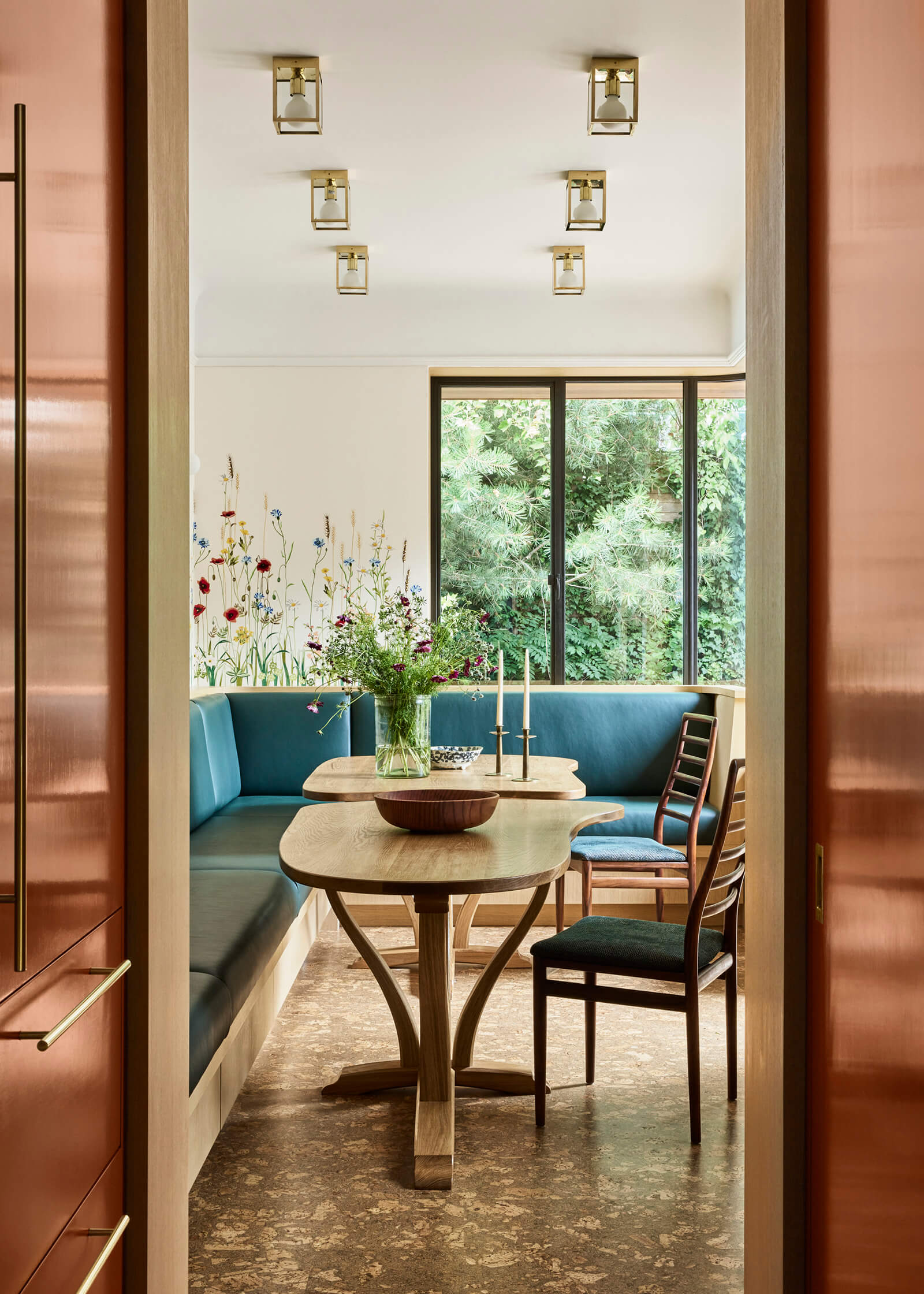
Custom silk wallpaper adorned with wildflowers, chosen by Jesse Parris-Lamb, brings nature right into the light-flooded dining room.
The Brooklyn Studio created the banquette and two uniquely shaped custom tables that can be used together or apart.
The clients themselves specified the cork floor.
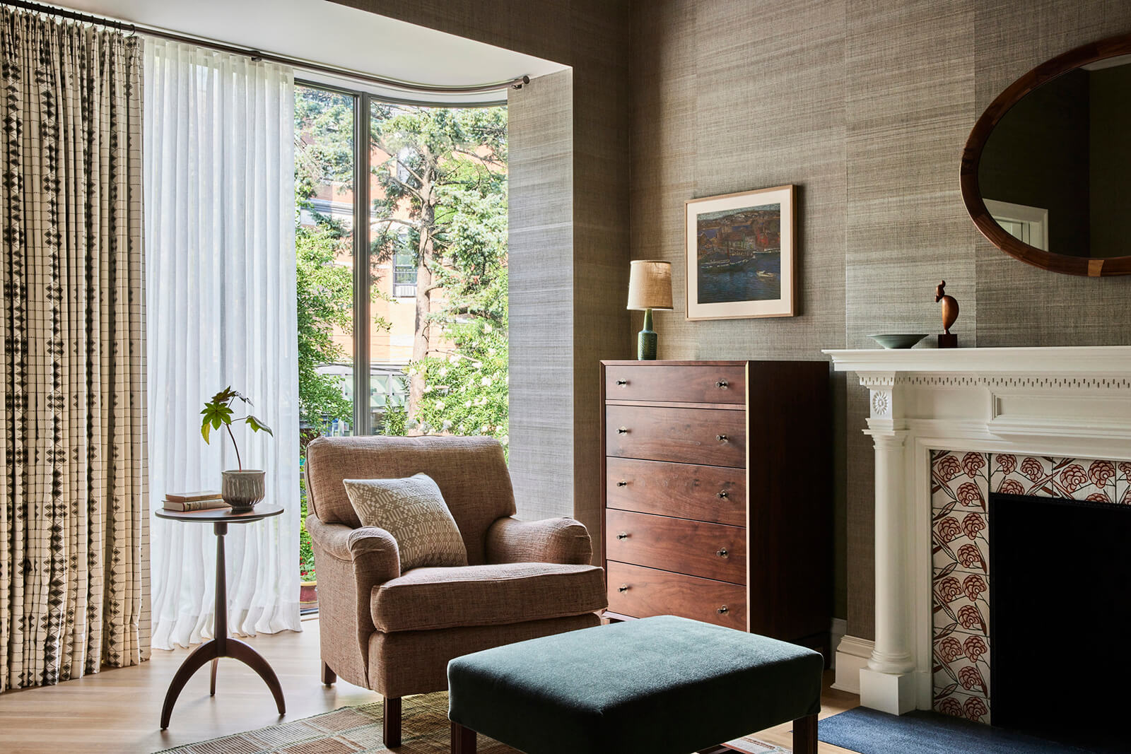
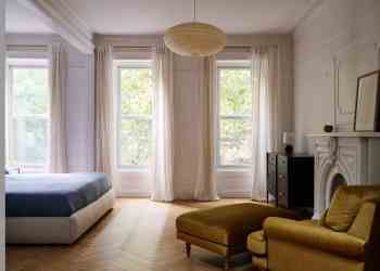
Jesse Parris-Lamb’s furnishings tend to be a subtle hybrid of traditional and modern, with varied textures throughout.
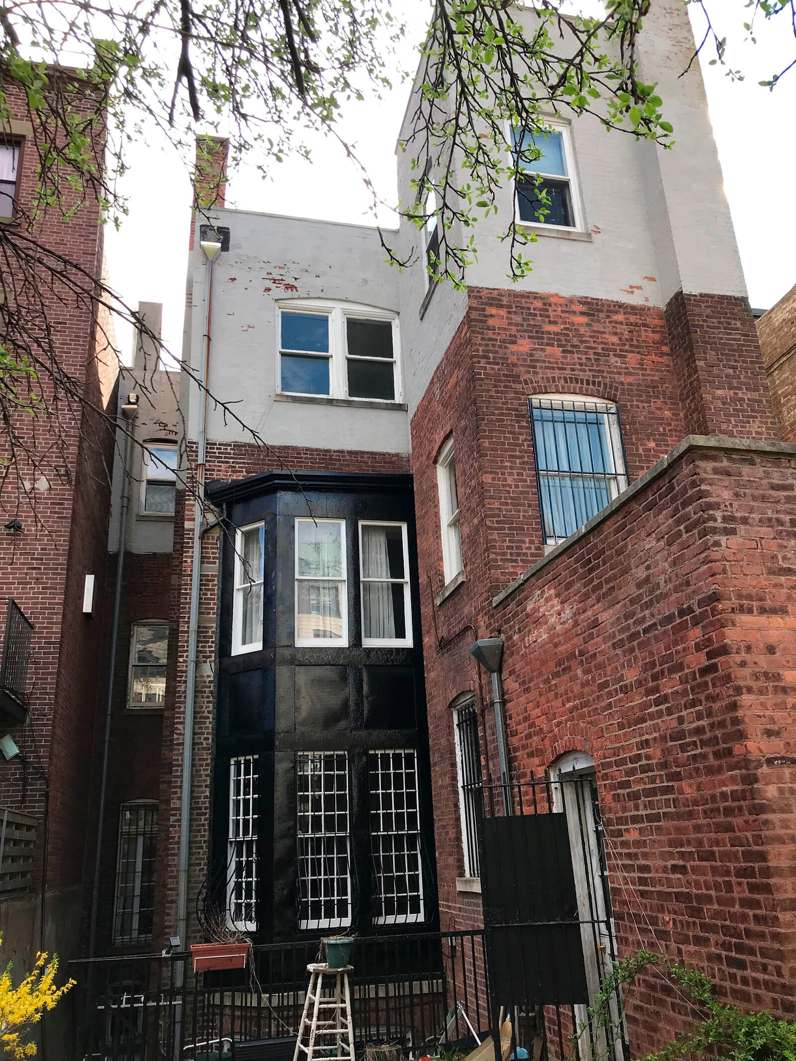
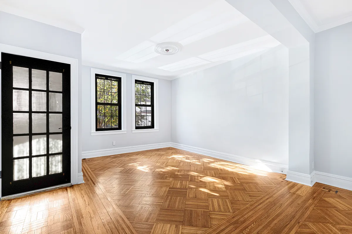
A “before” photo of the rear facade illuminates the extent of the architectural upgrade.
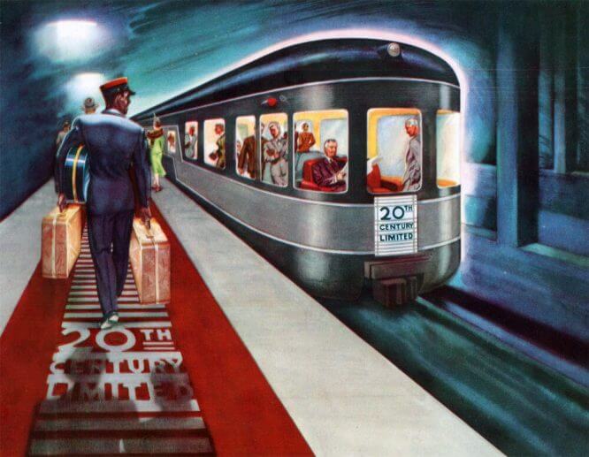
This image served as inspiration for the design of the new windows.
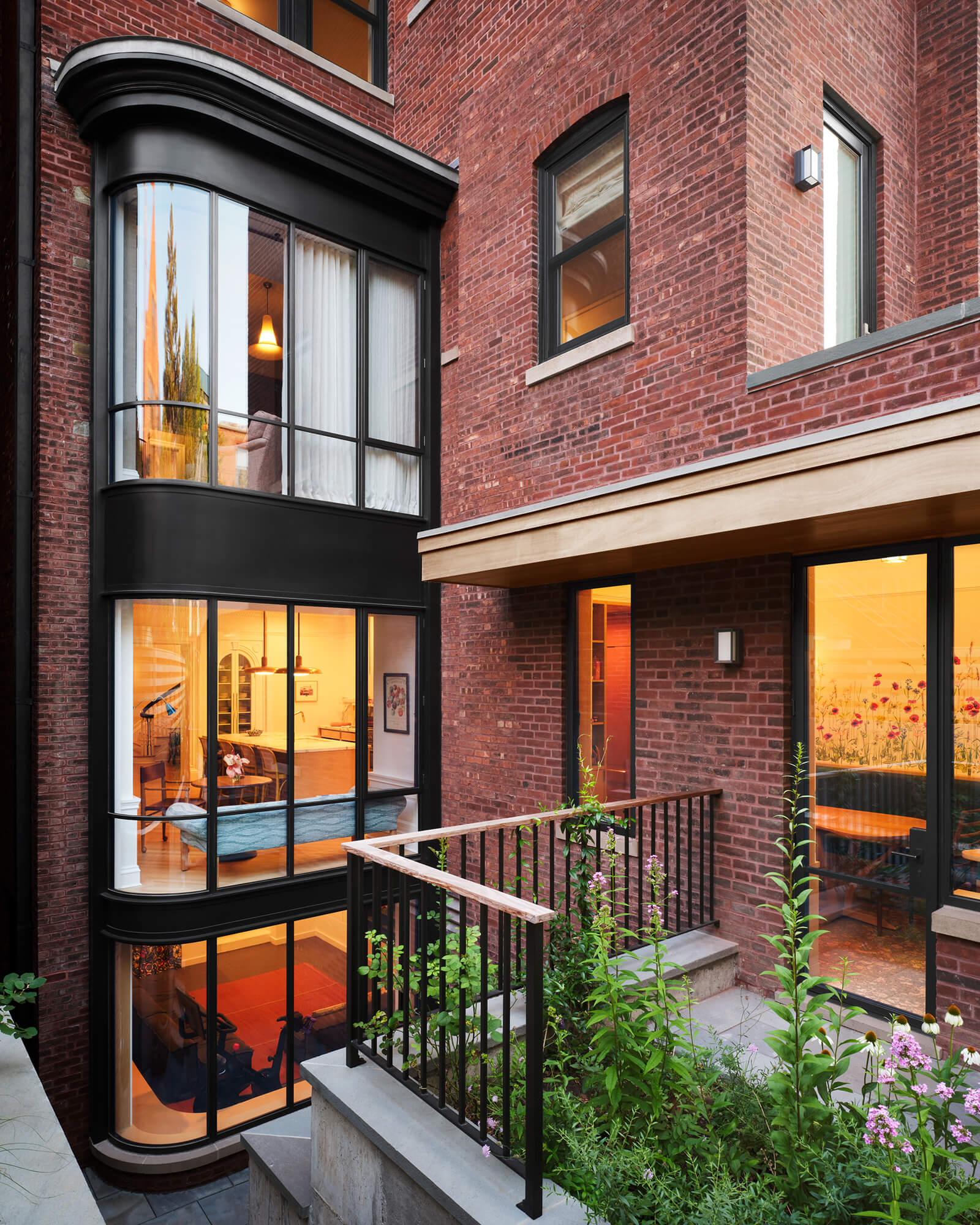
The new three-story bay window brings the rear of the house into line with the architectural quality of the well-built front facade.
Alive Structures, a Brooklyn-based landscaping company, orchestrated the design and plantings of the backyard.
[Exterior photos by David Mitchell; interior photos by Nicole Franzen]
Related Stories
- The Insider: Brownstoner’s in-Depth Look at Notable Interior Design and Renovation Projects
- The Insider: Cobble Hill Italianate Regains Original Polish in Painstaking High-End Reno
- The Insider: Brooklyn Limestone Stunner Gets Top-Notch Revamp
The Insider is Brownstoner’s weekly in-depth look at a notable renovation and/or interior design project by design journalist Cara Greenberg. Find it here every Thursday morning.
Email tips@brownstoner.com with further comments, questions or tips. Follow Brownstoner on Twitter and Instagram, and like us on Facebook.




What's Your Take? Leave a Comment