The Insider: Deft Design Brightens Park Slope Brownstone With Ornate Woodwork
Sarah Jacoby, a Long Island City-based architect whose practice has included many detail-laden brownstones, took several tacks to brighten up the house while retaining as much intact woodwork as was practicable.

Photo by Ty Cole
Got a project to propose for The Insider? Contact Cara at caramia447 [at] gmail [dot] com
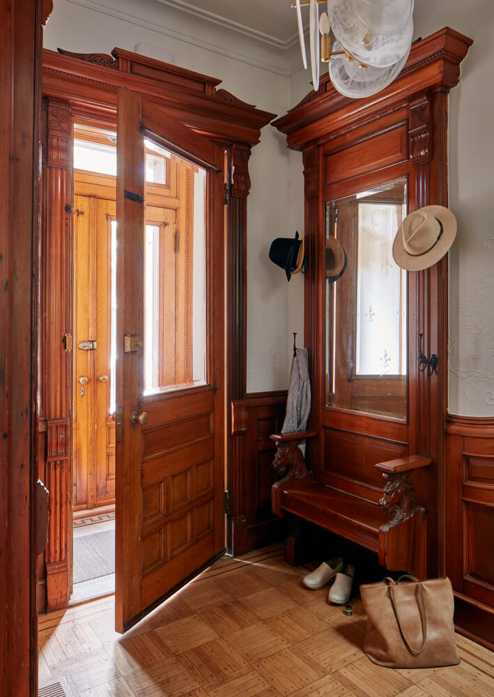
When people who are used to living in modern buildings walk into a vintage row house, said architect Sarah Jacoby, “Their first reaction is often, ‘Oh my god, it’s so dark!'” That was the case with her clients, a couple with small children, who, even after purchasing a three-story brownstone in the South Slope, were “ambivalent” at best about its lode of dark Victorian woodwork. That included an ornately detailed entry hall with fretwork, a mirror and a bench with carved horses’ heads, and an elaborate staircase, all of which her clients felt “unsure of at first.”
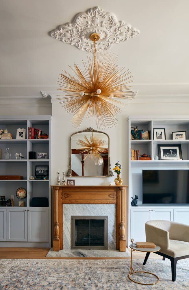
Jacoby, a Long Island City-based architect whose practice has included many detail-laden brownstones, took several tacks to brighten up the house while retaining as much intact woodwork as was practicable. Instead of removing or painting the front parlor’s woodwork, Jacoby convinced her clients to strip the window trim and fireplace of their very dark stain instead. “That helped a lot,” she said.
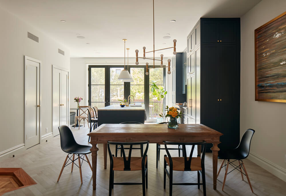
Of course, opening up the back wall and inserting an expanse of glass there, in the new kitchen, “made a world of difference.” Jacoby also widened the opening between the front and rear halves of the parlor floor and removed part of the hallway wall. These interventions allowed the natural light that poured through the new glass wall to penetrate the entire parlor floor.
The decision to radically modernize the back half of the parlor level was made easier by the fact that the situation there was as dreadful as the front half was marvelous. “There was a whole warren back there” Jacoby said — three rooms plus a bathroom, “with walls in weird places.”
Out it all came, while in the front parlor and entry hall, and on the staircase, every bit of existing original woodwork was saved. “We just buffed it all, basically,” the architect said.
The clients had come in entertaining the possibility of a gut renovation, but with a brand new kitchen and bathrooms, amplification of brightness throughout, and personalizing the house with contemporary light fixtures and vibrant wallpaper and paint, the architect addressed the homeowners’ interest in contemporary design — and by salvaging doors, flooring, and other elements, saved them money, too.
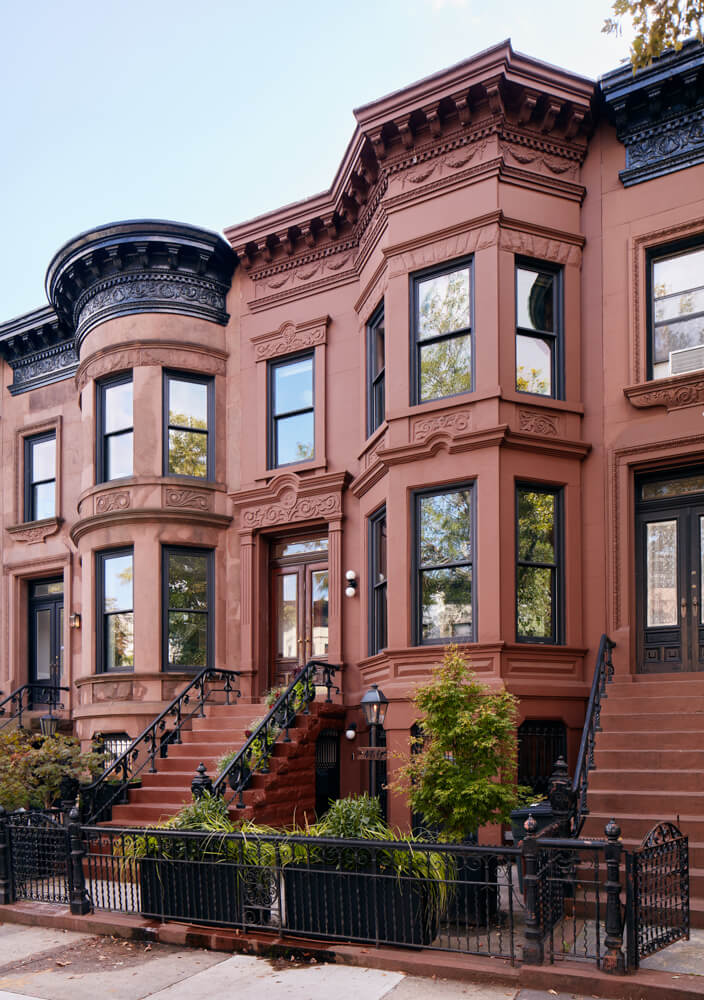
“The exterior didn’t need anything,” Jacoby said. “Those blocks right off the park tend to be in really great condition.”
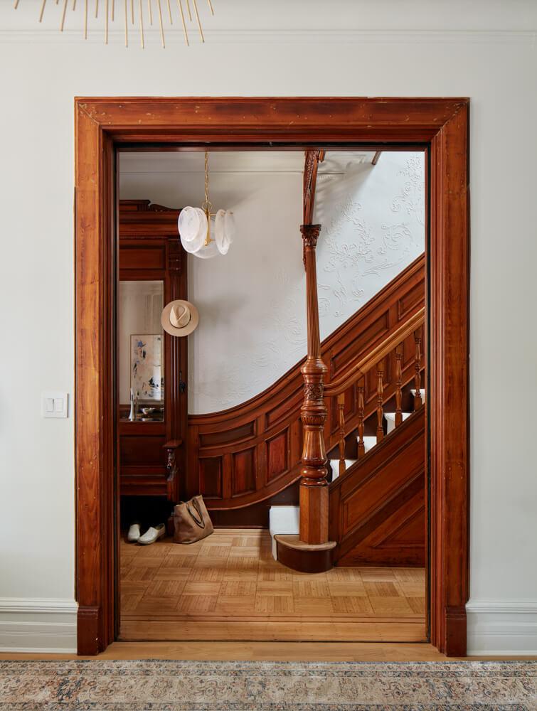
The wealth of original woodwork in the front entry remains intact. A chandelier from Aerin, with a frame of glass plates suspended from a long chain, announces contemporary design elements within.
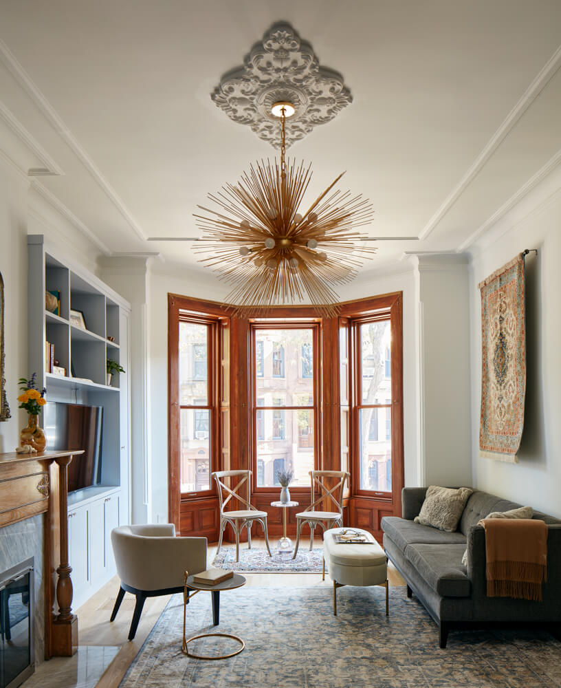
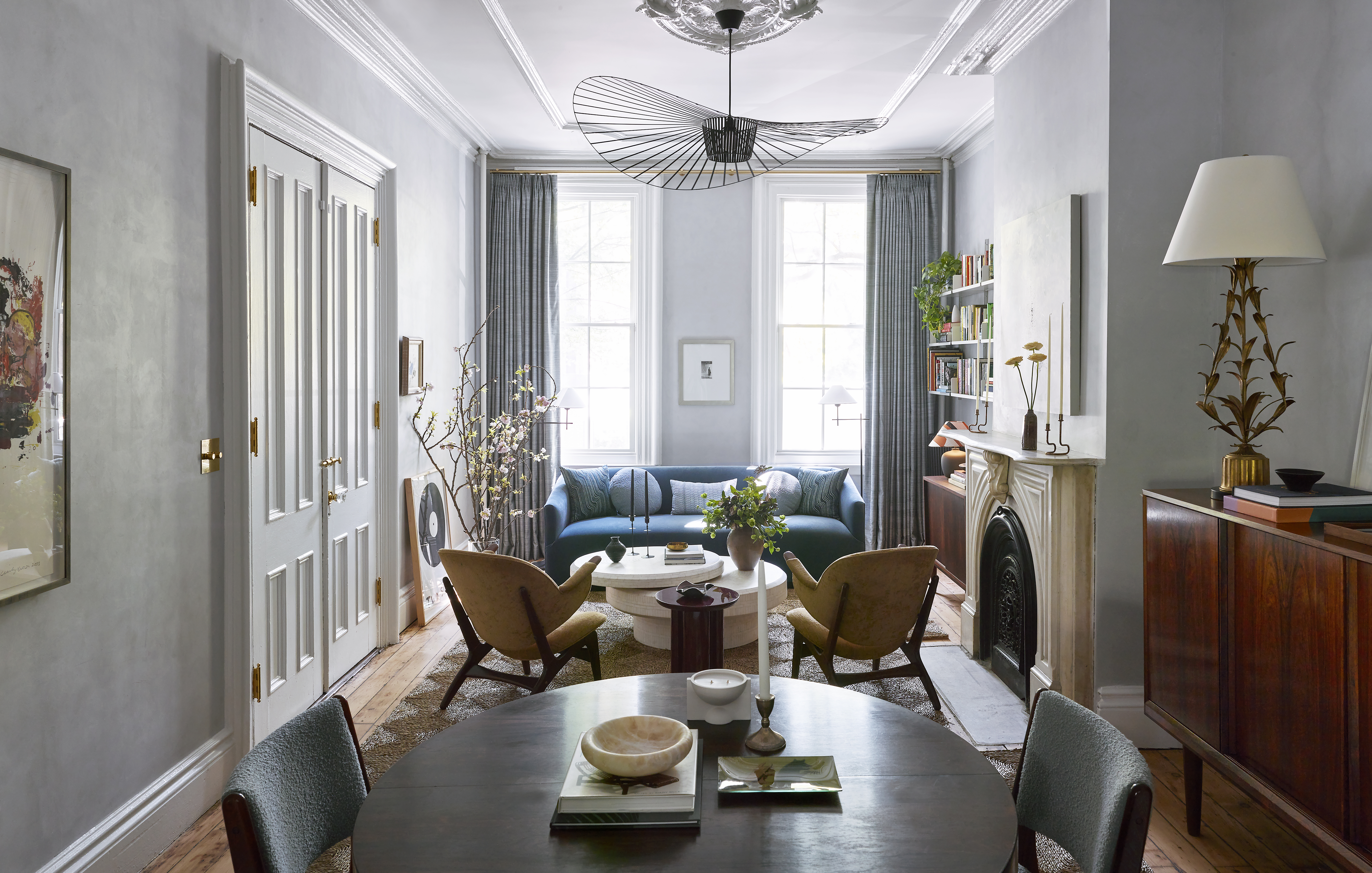
Jacoby designed built-ins on either side of the living room fireplace, leaving “breathing room” at the top so as not to interfere with the cove molding. The original fireplace has a new insert and hearthstone of Calcutta Manhattan marble from ABC Stone. A Strada light fixture by Kelly Wearstler makes a definite statement.
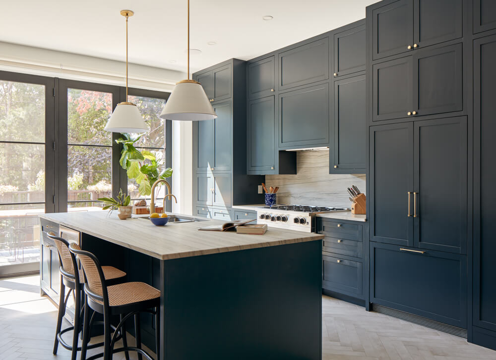
Custom wood cabinetry with brass hardware from Rejuvenation was built on site by Brooklyn’s Design Tech Construction and painted Farrow & Ball’s Railing.
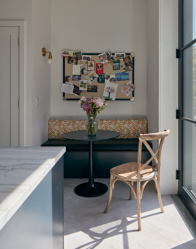
Nina cone pendants from Rejuvenation illuminate the center island, made of Macauba marble from European Marble & Granite. The floor is comprised of matte tiles from Nemo laid in a herringbone pattern.
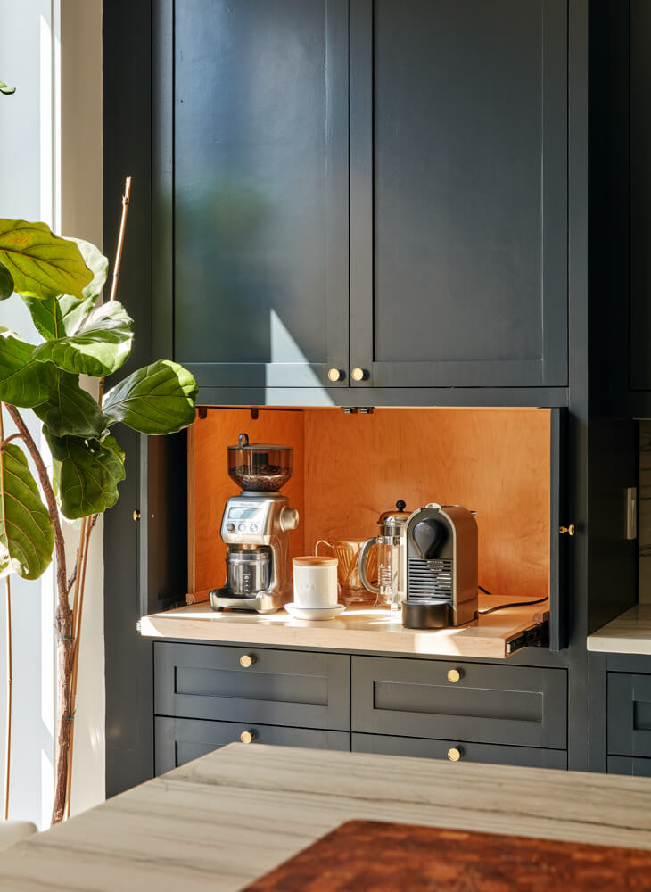
The maple-lined coffee station is beautiful enough to be left open.
The new sliding glass door leads to a patio for entertaining and grilling.
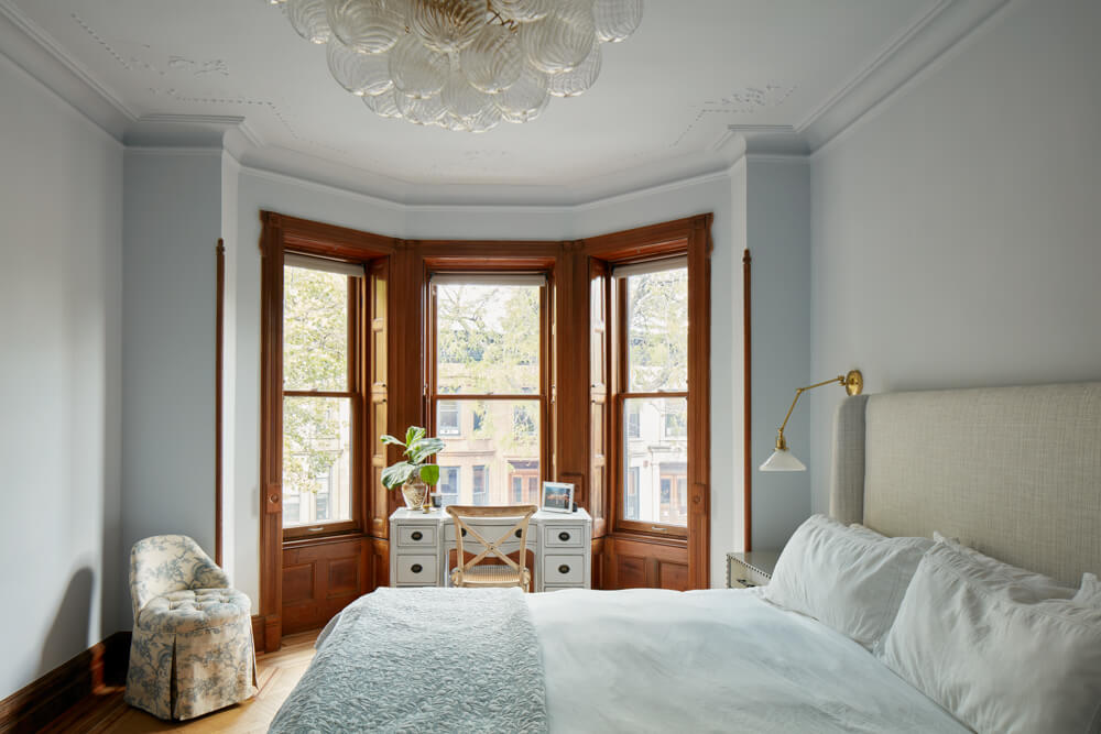
There are three bedrooms and two new baths on the second floor. The primary bedroom has another carefully chosen lighting fixture, the handcrafted Talia chandelier from Julie Neill Designs of New Orleans.
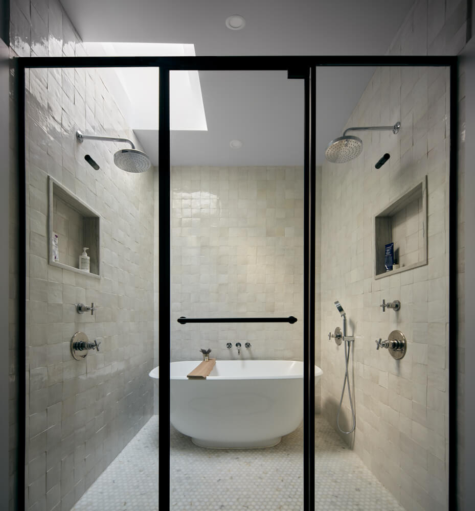
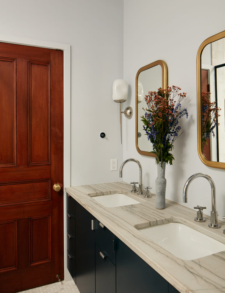
The skylit primary bathroom has a freestanding Perlato tub in a luxurious tiled wet zone behind glass doors and a marble double vanity. Plumbing fixtures were sourced from Newport Brass; the sconces are from Arteriors.
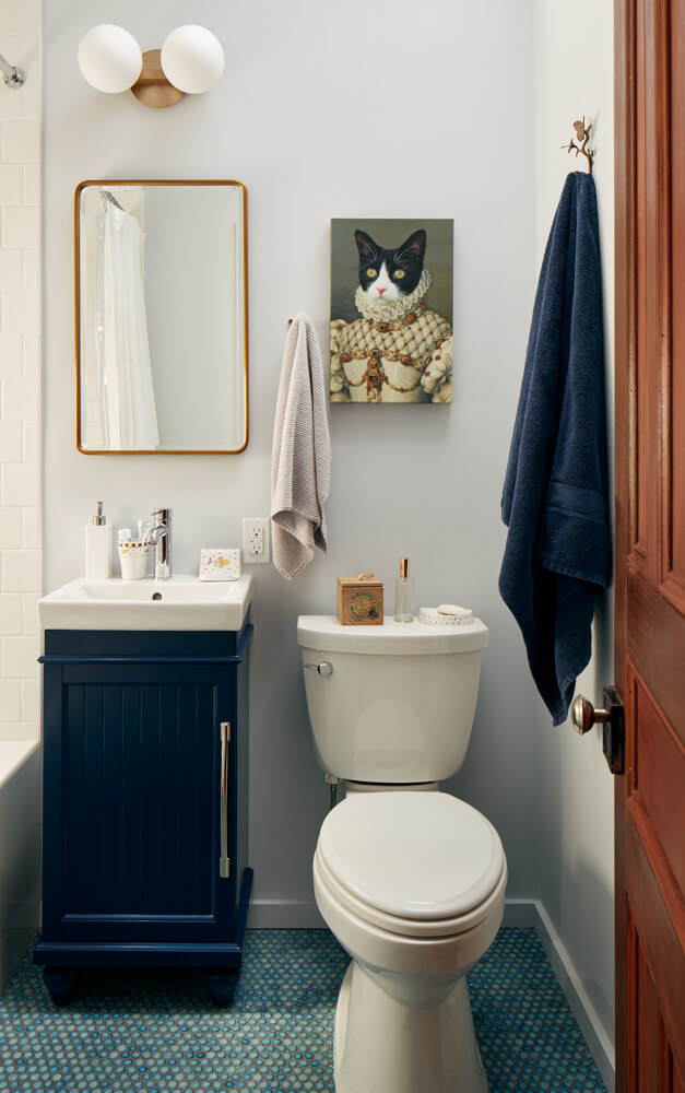
Jacoby utilized the existing layout in the children’s bath to economize on plumbing.
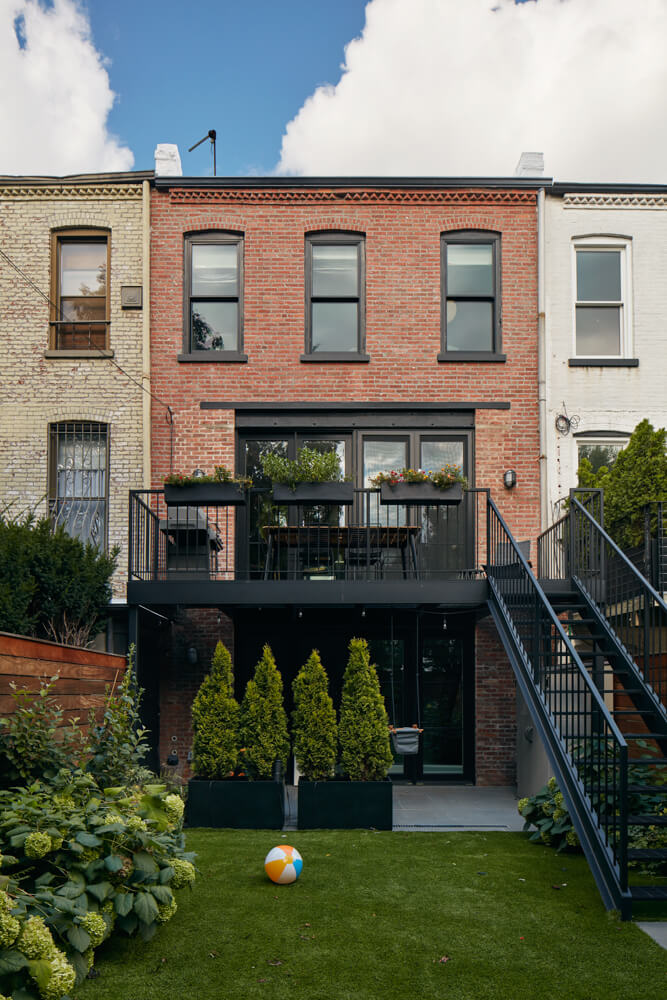
Caked-on stucco was painstakingly chipped off the house’s rear facade.
[Photos by Ty Cole]
The Insider is Brownstoner’s weekly in-depth look at a notable interior design/renovation project, by design journalist Cara Greenberg. Find it here every Thursday morning.
Related Stories
- The Insider: Brownstoner’s in-Depth Look at Notable Interior Design and Renovation Projects
- The Insider: New Kitchen with Retro Vibe Enlivens Park Slope Condo for Family on a Budget
- The Insider: Budget-Conscious Couple Turn Flatbush Row House into Bright Family Home
- The Insider: Smart, Strategic Crown Heights Townhouse Reno Keeps Budget Top of Mind






What's Your Take? Leave a Comment