Pattern Play: Creative Family of Four Makes Warm and Colorful Home in Central Brooklyn
Color and print enliven a circa-1900 home where novelist Rumaan Alam, photographer David A. Land and their sons, Simon, 8, and Xavier, 5, live, work and play.

People love to make dire pronouncements to soon-to-be parents. They’re usually some version of you’ll never sleep again but one I remember particularly well came from a visitor to our home taking in all the bric-a-brac and declaring that, obviously, we’d soon childproof and redecorate ourselves toward respectable, parental blandness.
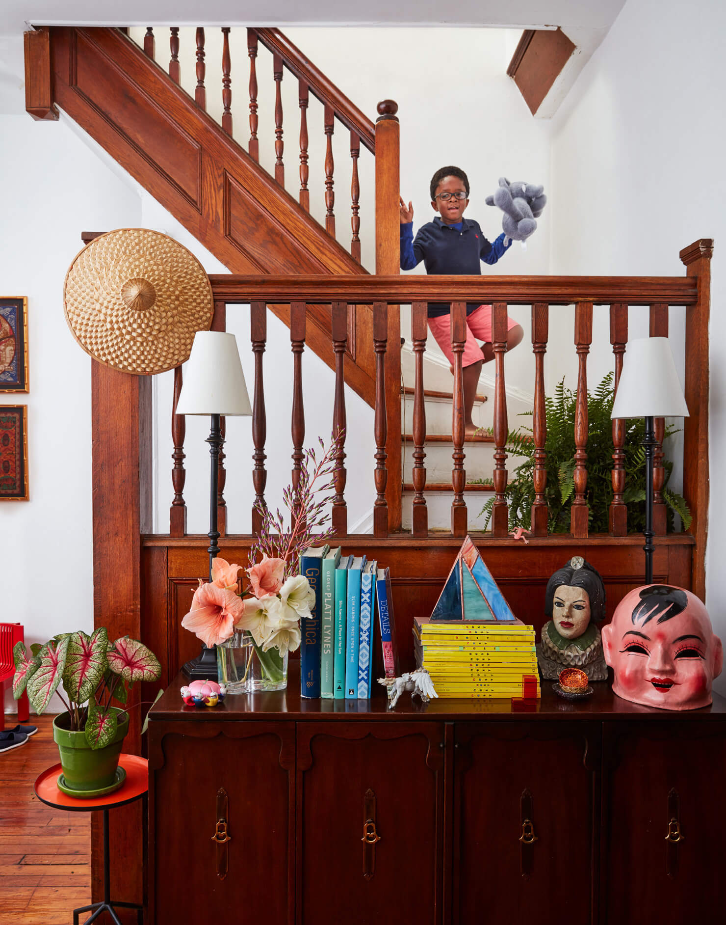
I’m happy to report that’s nonsense (so is the stuff about never sleeping again; you adapt!). Yes, when my husband David and I became parents, in 2009, and again in 2012, many things changed. We slept less, we missed most of American pop culture, we stopped buying the Sunday newspaper. But we remained ourselves, and our home remained a reflection of those selves. Parenthood changed our life, but it didn’t change our style.
We rent a charming brick house in a quiet neighborhood in central Brooklyn. Because the house is where we both live and work, and because parenthood entails a lot of time spent at home, we’ve tried to make it truly ours. We are tenants, so the process of adapting the house to suit our lives has been mostly via decoration rather than renovation, but we’ve learned that even if construction isn’t an option, you can accomplish a lot via the cosmetic.
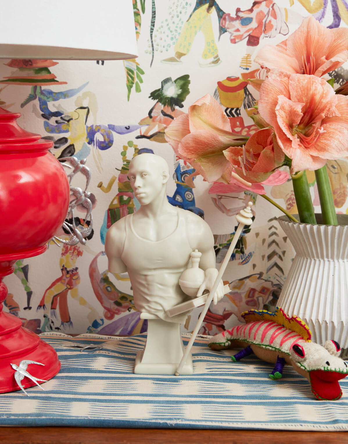
Our moving expenses consumed most of our budget, but I think that’s for the best; we spent a year in the house before we made any kind of change beyond fresh paint. But that period helped clarify what it was we wanted from our living space. We knew we wanted color, to help brighten up all the wood. We wanted lots of pattern, because those are forgiving when 50 percent of the household is prone to spilling or spitting up. And we wanted to showcase the art and other things we’ve collected over the years even if they were unwieldy, or odd, or didn’t complement one another.
David is a photographer who specializes in interiors; he travels the country visiting flawless residences where every last detail has been carefully thought through by talented and experienced designers. I’m a writer and though I focus now on writing fiction, before this I wrote for magazines, most often about interior design. Our trades have given both of us an understanding of and respect for the work of design professionals. We accept that there are rules of good design, but in our home, we weren’t that interested in following them.
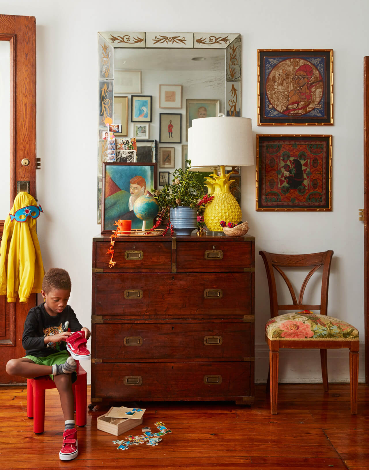
Our front door leads right into the living room, so we wanted that space to announce its intentions immediately — we wanted it to be clear what kind of house this is. The palette is sort of rooted in the primary colors — the yellow of the coffee table and the pineapple lamp, the red of the rug and the upholstery, and smaller touches of blue — but we weren’t rigorous about sticking to only a few hues. The effect of all that color is a happy one; it’s a room (and hopefully a home) that doesn’t take itself too seriously, a space where the adults can have cocktails while the kids play.

The gallery wall (once quite fashionable, now less so, I think) was the ideal solution for us, a way to share our collection and disguise the unsightly television screen. With art and everything else, we collect pretty broadly, and each piece here and throughout the house has a fond memory attached, from the factory portrait of Lenin (a souvenir from the Republic of Georgia) to the animal paintings on scrap tin, made as decorations for rickshaws (a souvenir from Bangladesh) to the Matthew Barney-designed menu from the now-shuttered restaurant Chanterelle.
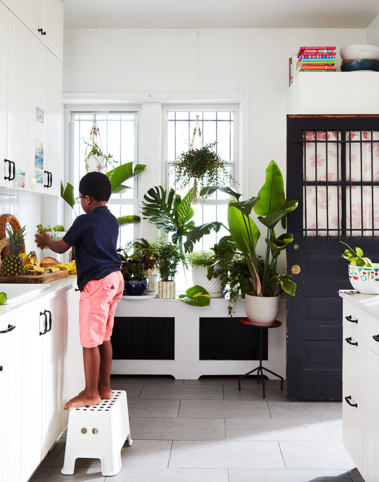
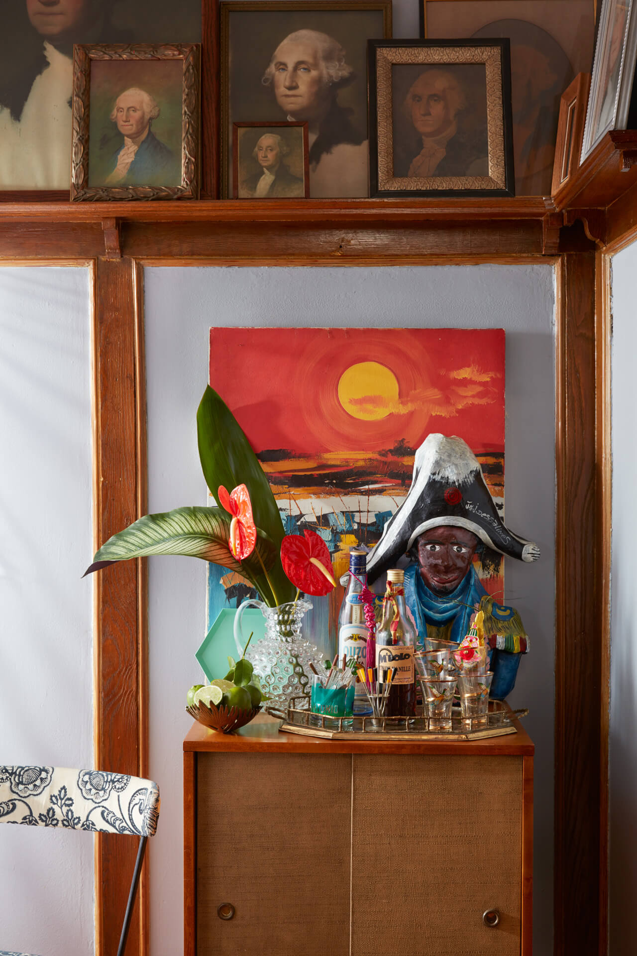
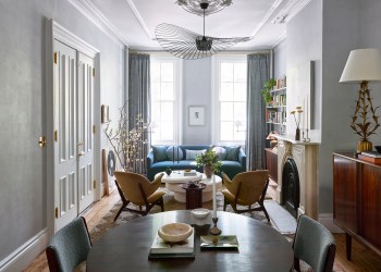
I spend a lot of time in the kitchen (the one room in the house we did renovate, thanks to IKEA and our landlord) and the rest of the family spends a lot of time in the dining room adjacent; it’s where we eat, do homework and art projects, read books, and play Legos. Here the art — a collection of interpretations of Gilbert Stuart’s famous portrait of George Washington — helps the formal room feel a little less serious (the pink dining table and the many toys underfoot help too).
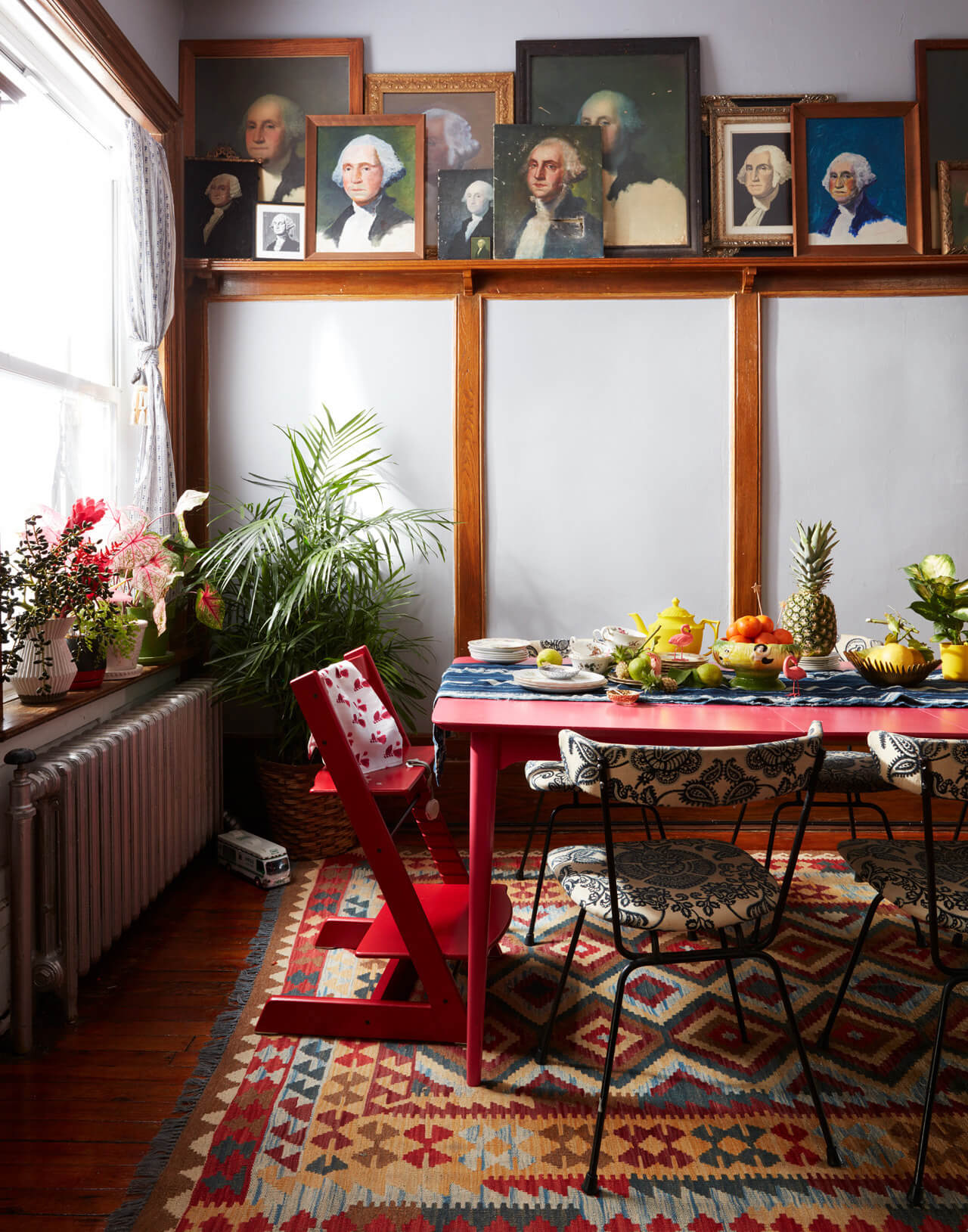
Yes, there’s a lot of color and a lot of clashing, but we think the rooms still achieve a certain harmony. In the dining room, the upholstered armchair (one of many pieces David inherited from his paternal grandfather; the matching settee is in our bedroom) may not coordinate with the blue lacquered wardrobe (where we store toys) but who cares?
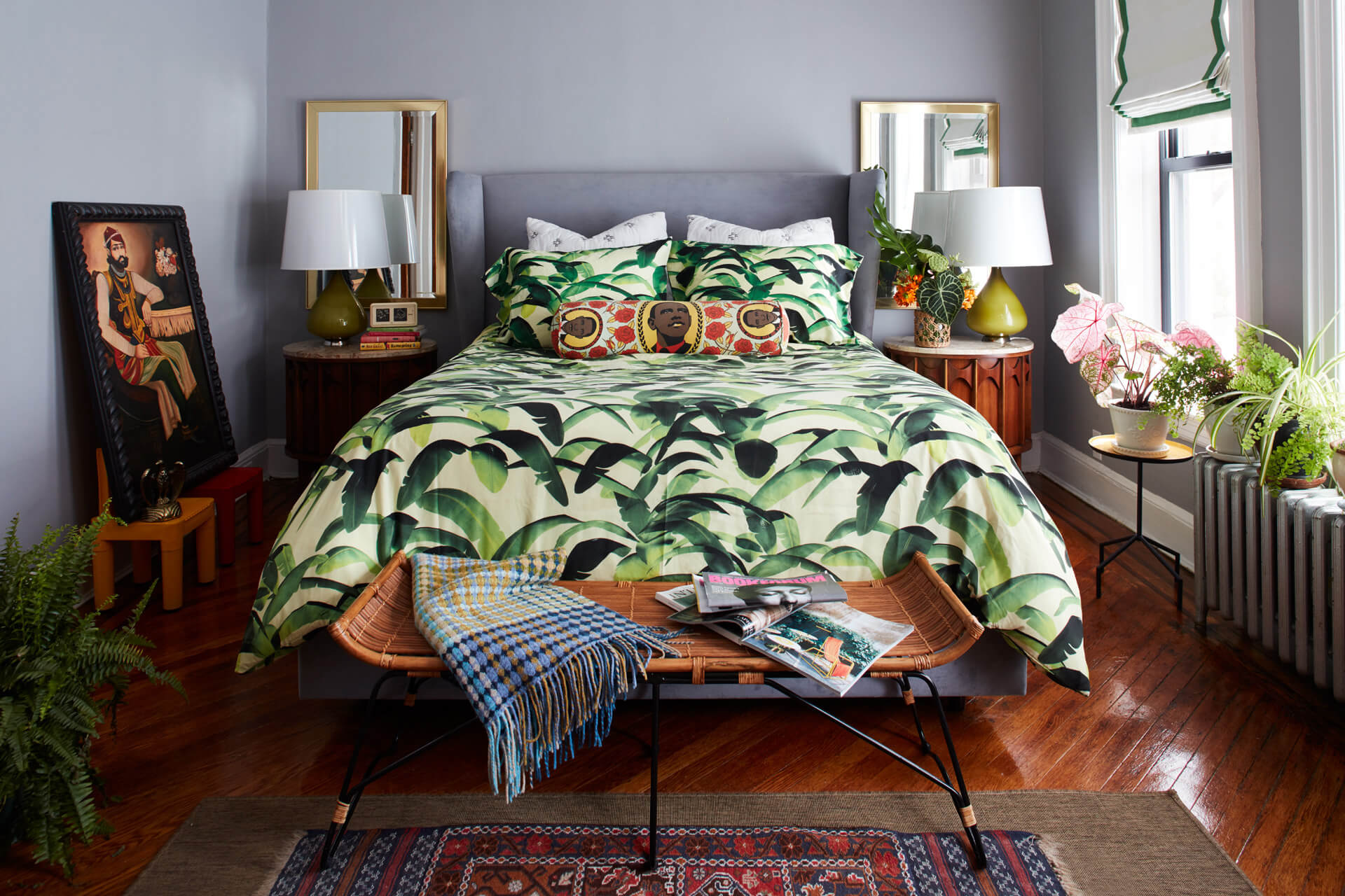
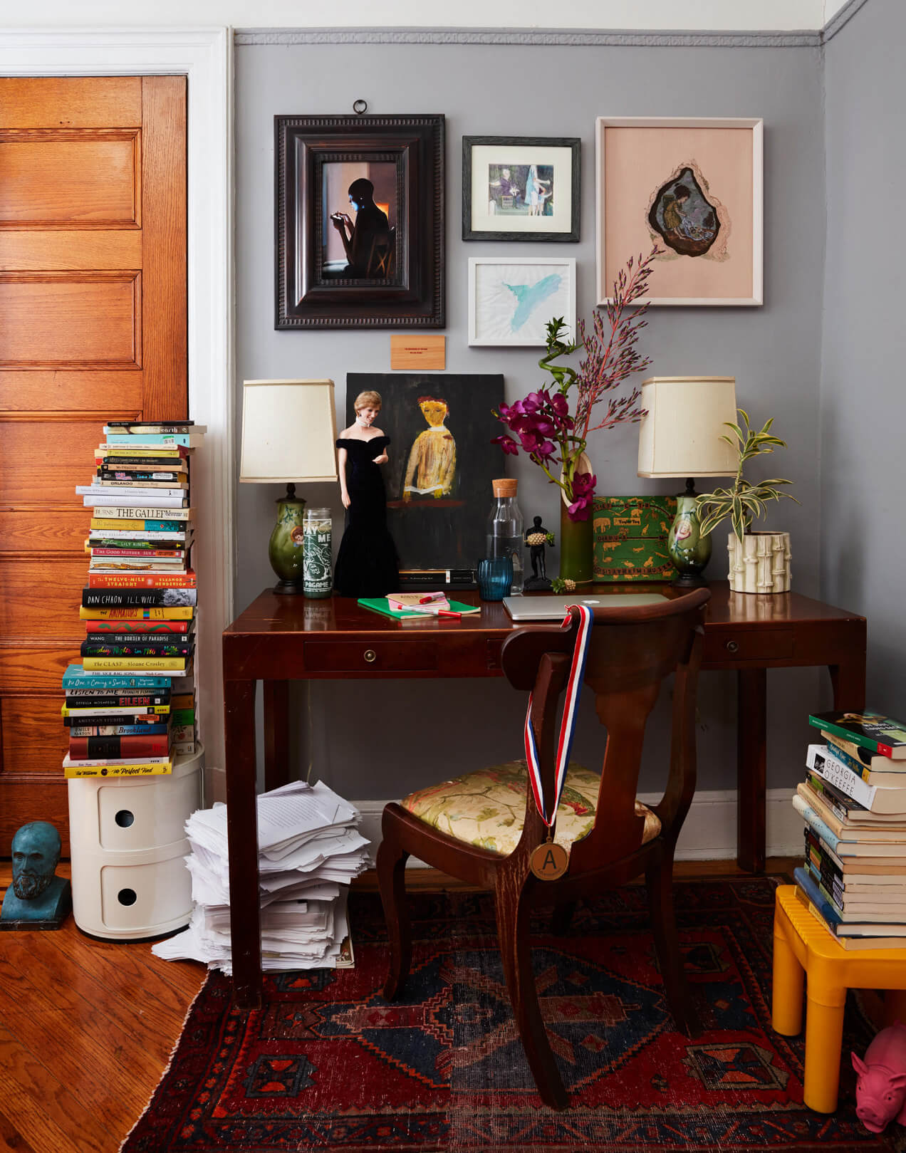
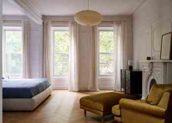
The upstairs rooms where we sleep are less exuberant than the downstairs ones where we live. We wanted the master bedroom to feel quiet and understated; it’s a cliché but we chose a velvet upholstered bed and soft linens like you’d find in a chic hotel. The boys share a pretty small bedroom, but we still used big statements like the yellow dresser and the colorful wallpaper. My office is also small (and doubles as the dressing room) but despite the modest square footage we hung a vibrant wallpaper and lots of art; I find it soothing to be surrounded by beautiful things when I’m working.
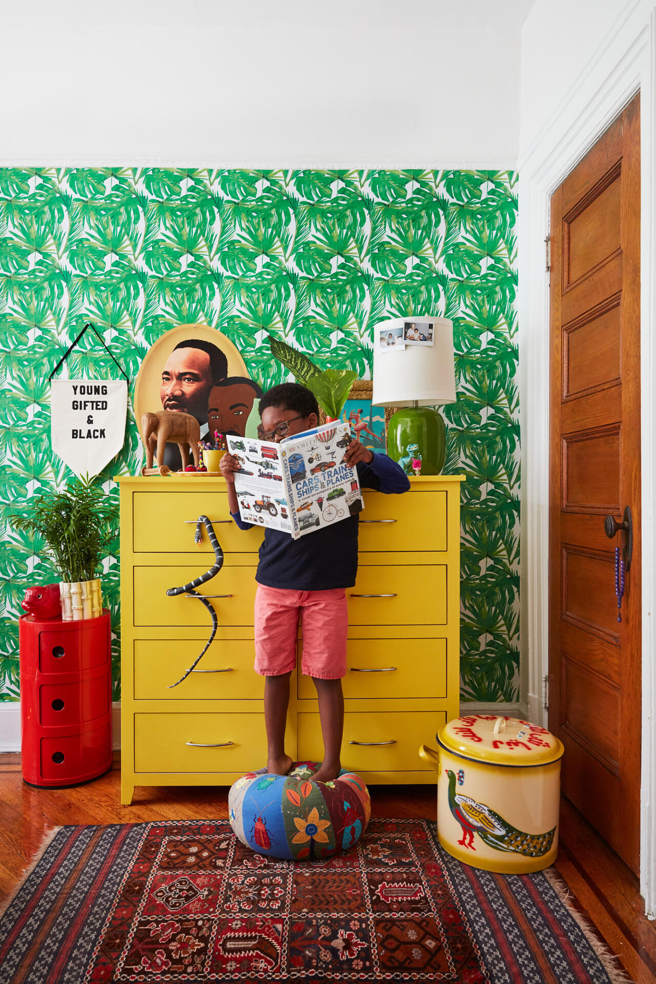
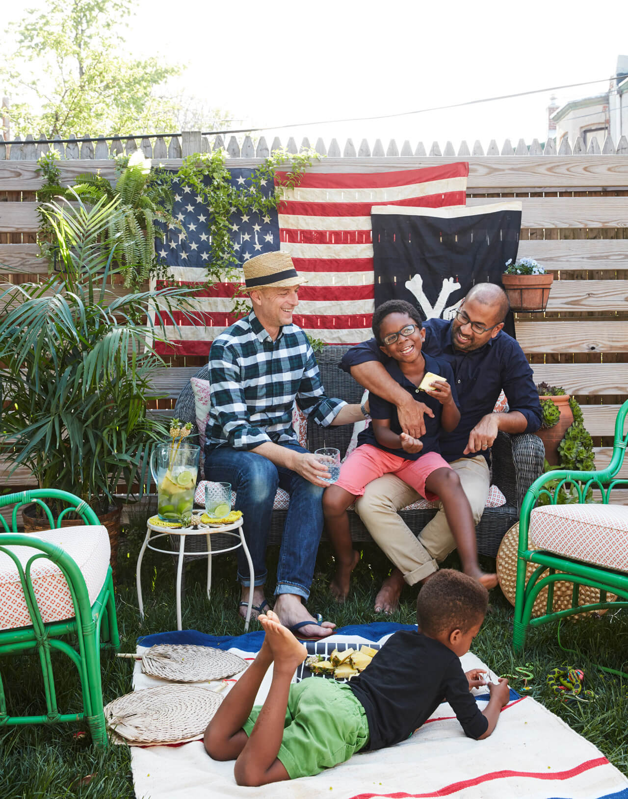
That’s actually a fair way to sum up our whole approach to design. David and I share the belief that the things we live with need to meet only one criterion: that we love them. Instead of worrying about baby proofing or making things kid friendly, our priority is making a house that’s fun and colorful and for all of us, parents and kids. Yes, our home contains a lot of mixing and not much matching, but we wouldn’t have it any other way.
[Photos by David A. Land | Styling by Jerrie Joy]
Editor’s note: A version of this story appeared in the Spring/Summer 2017 debut issue of Brownstoner magazine. To inquire about advertising opportunities for the Fall/Holiday issue, click here.
Related Stories
- Danish Design Company Reform Hacks Ikea With World Famous Architects
- Brownstoner Magazine Is Here!
- An Artist Reveals a Brownstone Time Capsule With an Extravaganza of Detail in Prospect Heights
Email tips@brownstoner.com with further comments, questions or tips. Follow Brownstoner on Twitter and Instagram, and like us on Facebook.





What's Your Take? Leave a Comment