The Insider: Three Cousins Rethink Row House Living With Communal Reno in Prospect Heights
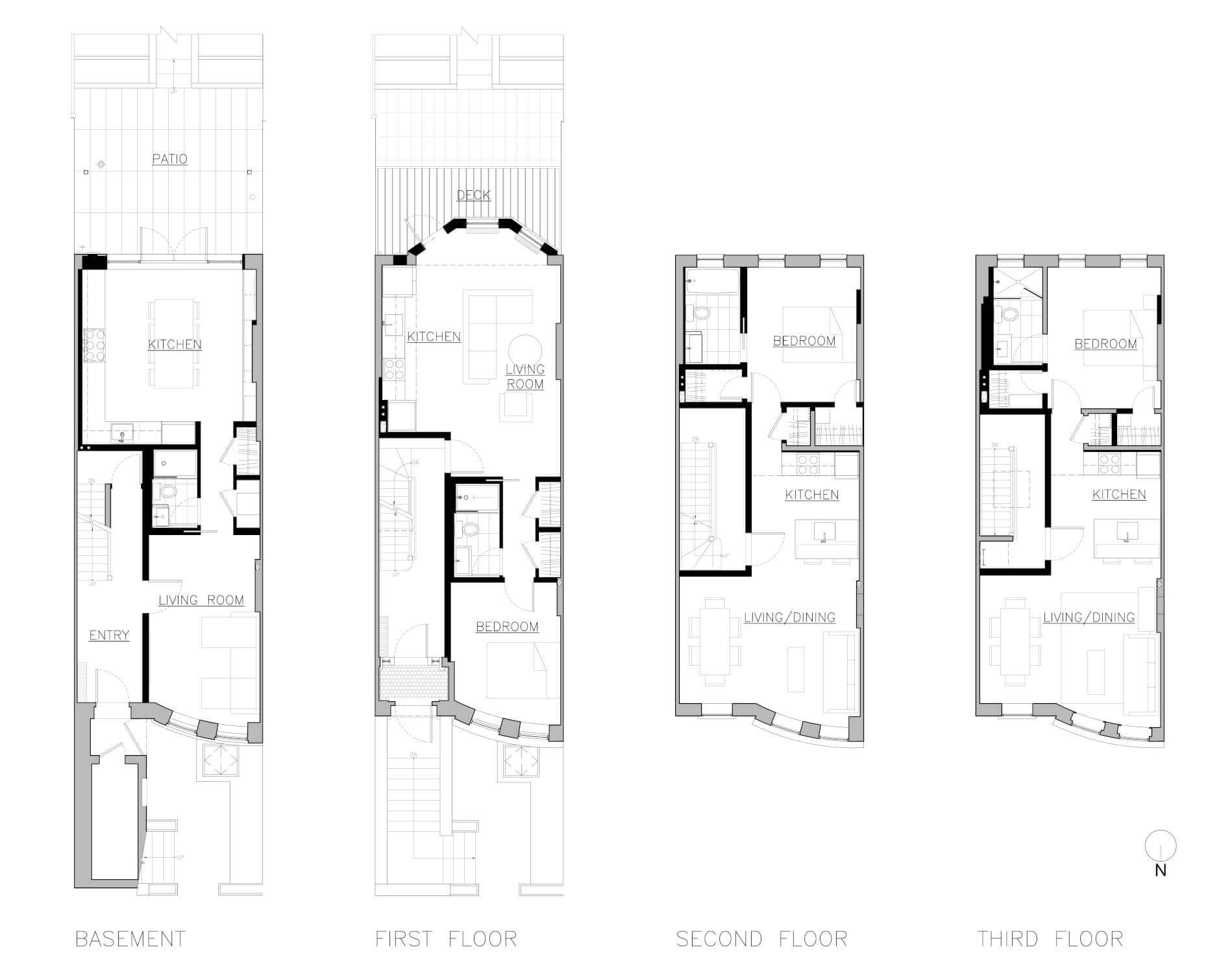
Each planned to take one floor of the four-story building, with the garden level to become a communal kitchen and gathering space.

Photo by Jason Schmidt
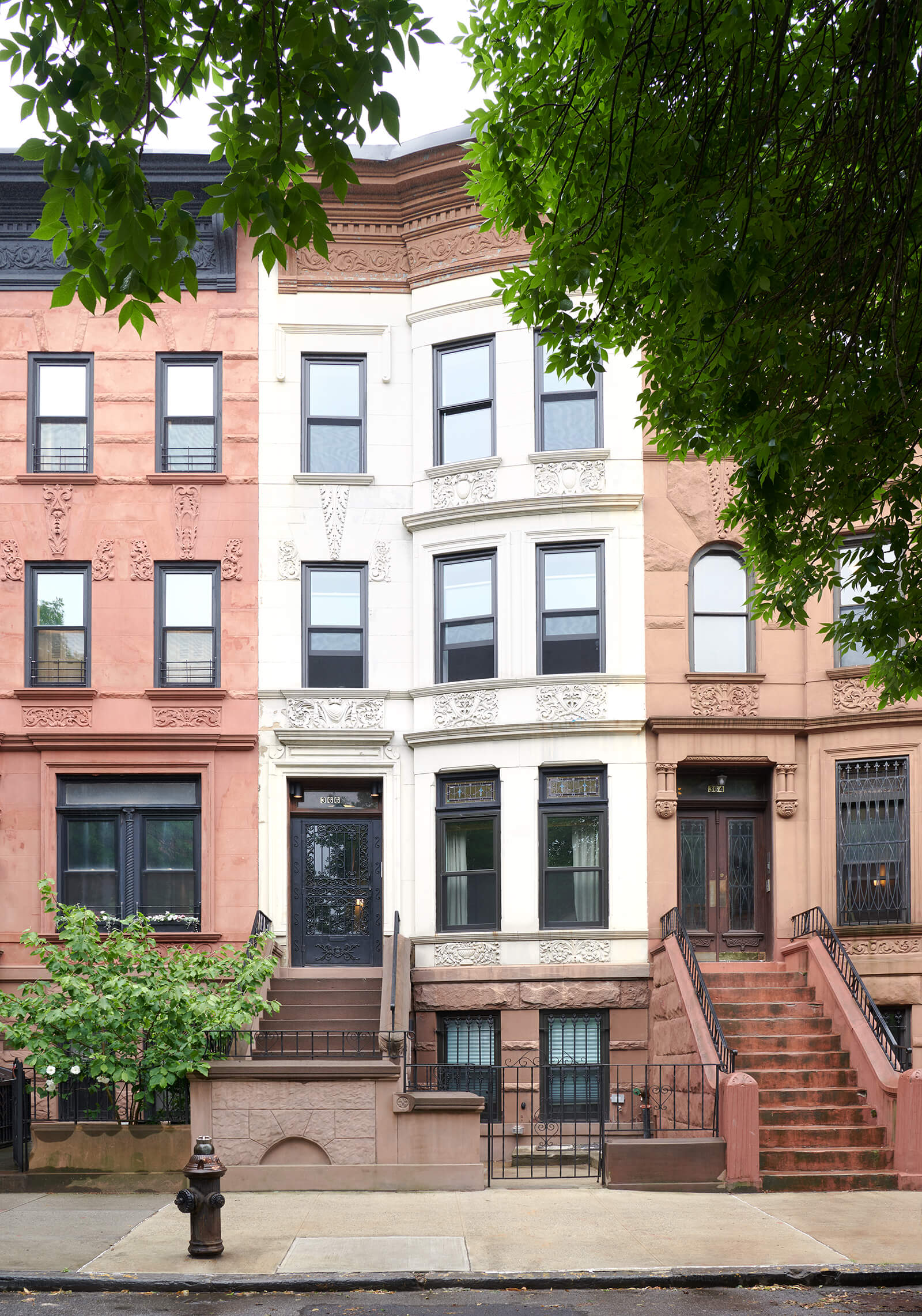
Three cousins, all around age 30 — two American brothers and their first cousin, an Italian woman now settled in Brooklyn — went in on the purchase of an early 20th century row house badly in need of renovation. Each planned to take one floor of the four-story building, with the garden level to become a communal kitchen and gathering space.
To gut-renovate the structure and create a design for the sharing scheme, the trio called on Dumbo-based Delson or Sherman Architects, a 10-person firm with projects throughout New York City and beyond.
“The building was in pretty bad shape, but not falling apart,” said Jeff Sherman, who co-founded the busy firm 23 years ago with Perla Delson, project lead on this renovation. “It was more like a tenement than a grand brownstone. It had gone through layers of bad renovations, been divided up into units and had no ornament remaining.”
The building was well suited to the concept because the difference in desirability between the units was “pretty slight,” he said. Each floor had high ceilings and an original half-bay window in front. “Everyone was so amenable about who got which,” Sherman said. “They were the most easygoing clients ever.”
The full-on gut that followed included structural and mechanical upgrades and created three discrete one-bedroom apartments, each with its own small kitchen.
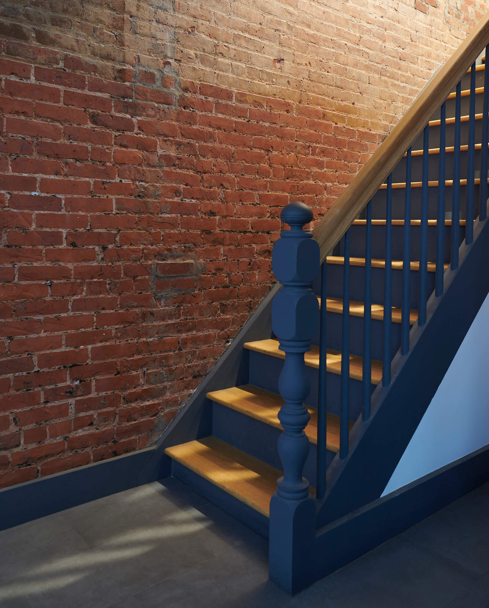
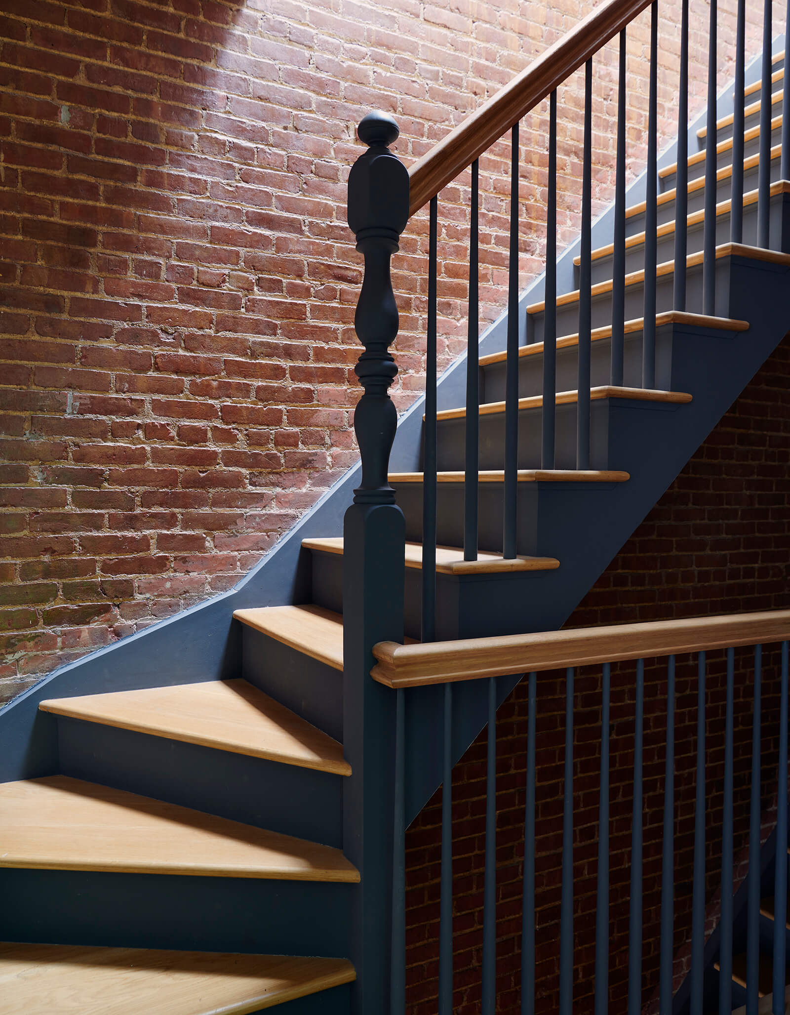
“Materials recur throughout the building to unify the design,” said Delson. “We exposed brick in the stairwell so it runs from top to bottom. The dark gray paint on the stair balusters and newels is repeated on the brick wall of the top floor apartment.”
Cost was a consideration. The cousins decided to forego central air and chose narrow plank flooring for the apartments, splurging on wide oak planks only on the garden level. The three apartments, which might have been cookie-cutter, are not that way at all. “We approached the apartments very differently to adapt to the needs, tastes and priorities of each person,” Sherman said. “Each had their own likes and dislikes.”
It made sense in the parlor floor apartment, for instance, which has a bay window and a new deck at the rear, to put the living room and an open kitchen in the back half of the apartment. In the other two, a compact kitchen sits in the center of the space. “Putting the kitchen in the middle versus the back dramatically changes things,” Sherman said.
“We initially discussed designing apartments with matching finishes, since having the contractor purchase materials in bulk typically results in less waste and some cost savings,” Delson said. “But it soon became clear that each of the three owners had their own taste, so we made recommendations for materials and finishes that reflected their individual goals, while maintaining some common materials, like the absolute black granite counters used in most kitchens.”
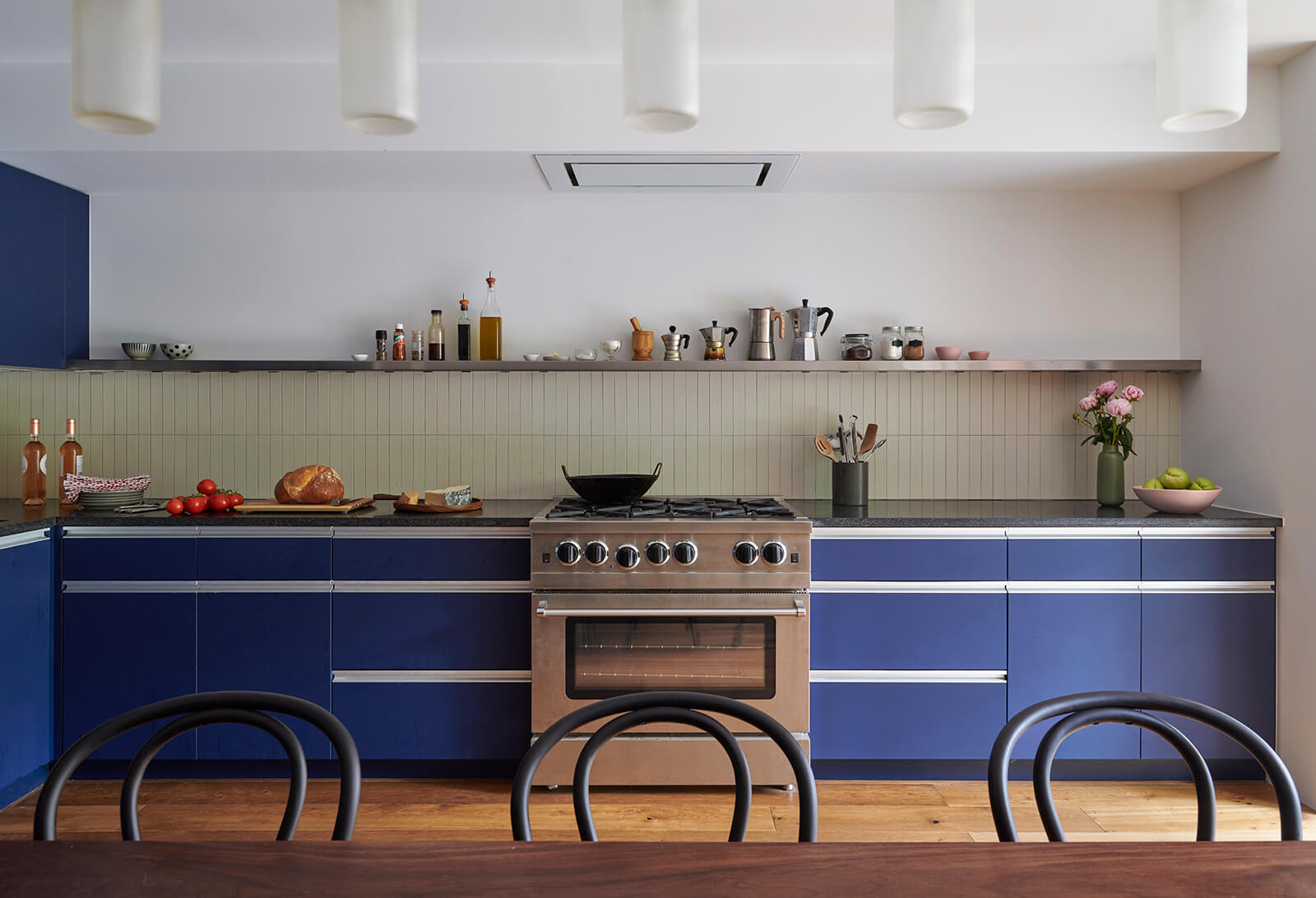
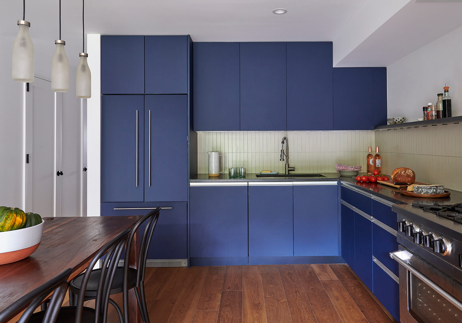
The gang comes together often in the large eat-in kitchen at the garden level, which was designed for multiple cooks, with entertaining and epic meals in mind.
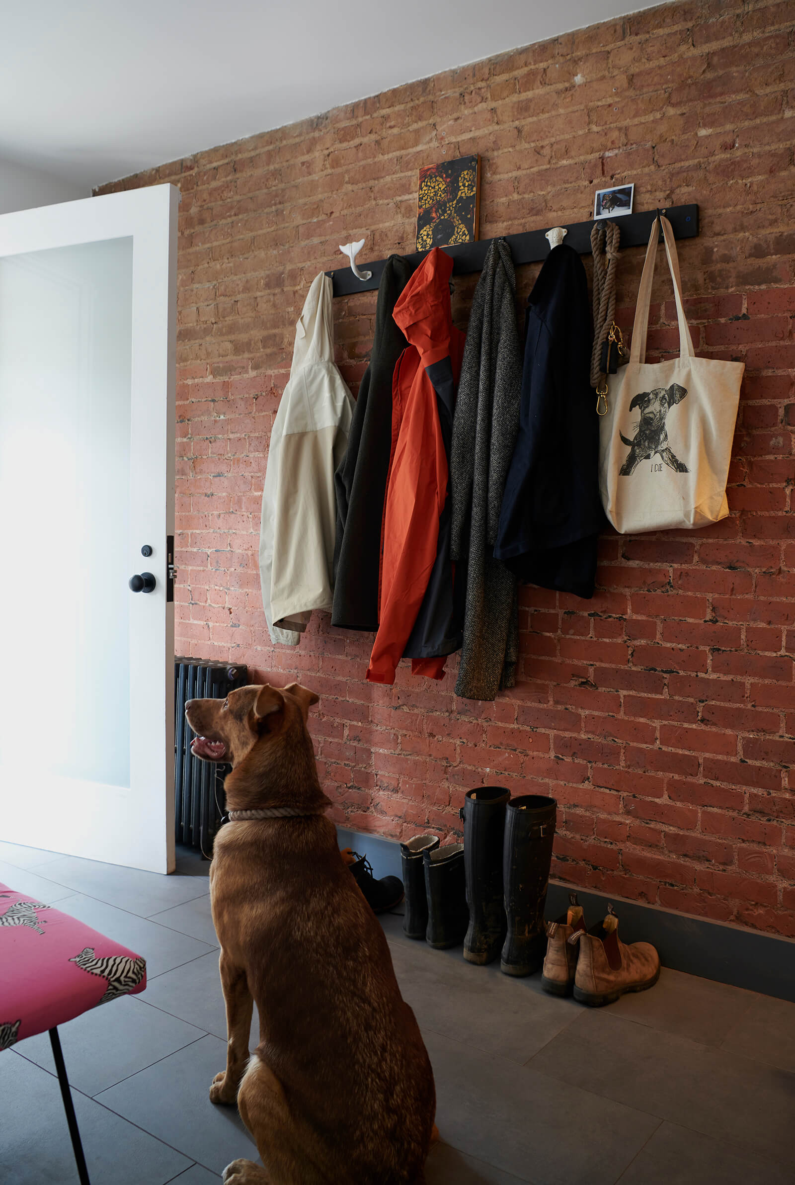
The dog owned by one brother has the run of the common space on the garden level.
Exposed brick going up to the top floor has a subtle matte finish. The staircase was rebuilt with traditional newels and balusters and new oak treads.
Durable cabinets of Fenix laminate by Rehau have a matte blue finish and stainless steel accents. Absolute black granite counters and backsplash of warm white Heath tile, vertically stacked, make for a welcoming space. The range is from Blue Star.
The dining table was custom designed and fabricated by the father of the two men.
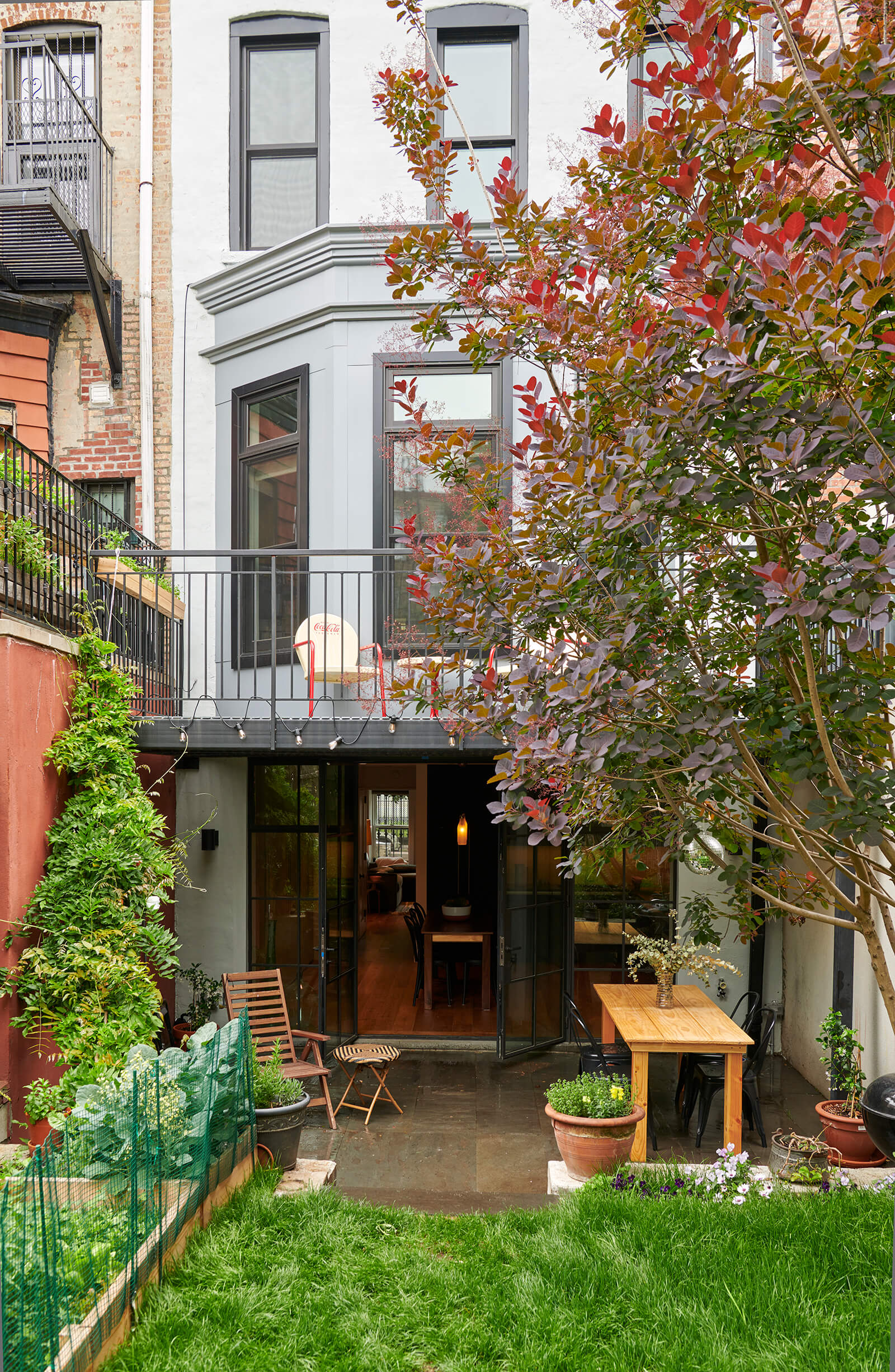
The kitchen opens to the garden through a wall of steel and glass doors (top photo) leading to a bluestone patio.
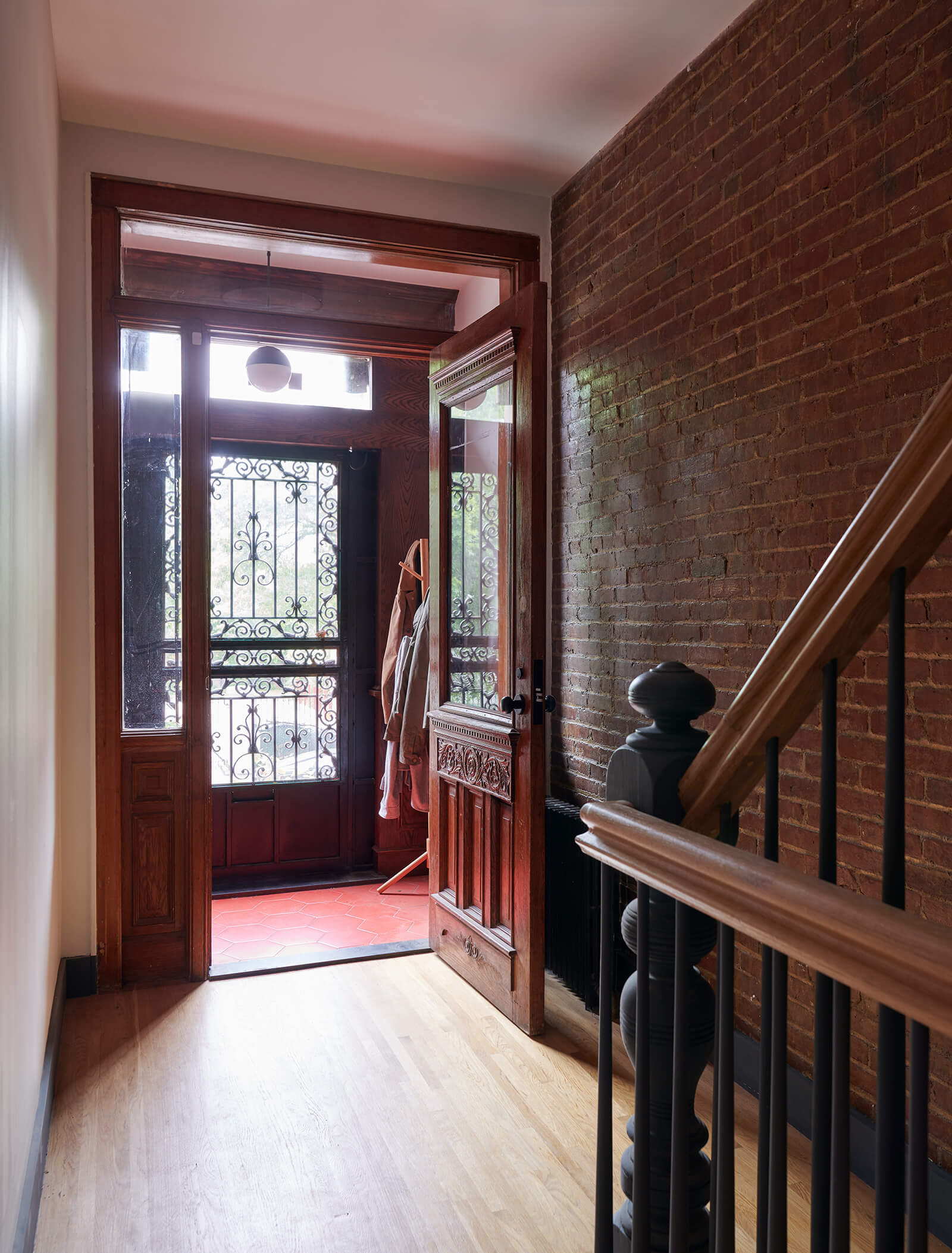
The house’s original entry and vestibule doors were entirely salvageable.
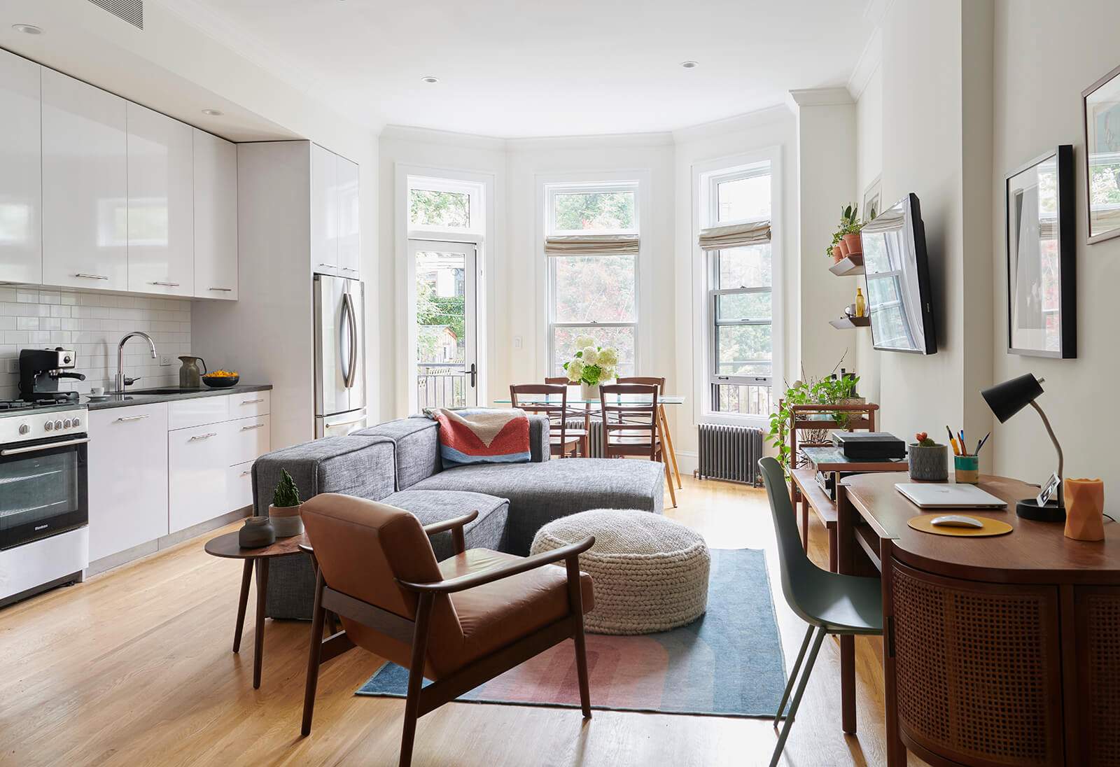
Transom windows on the parlor floor had been hidden under sheetrock and a dropped ceiling.
Crisp white cabinets in the open kitchen keep the focus on the rebuilt bay window.
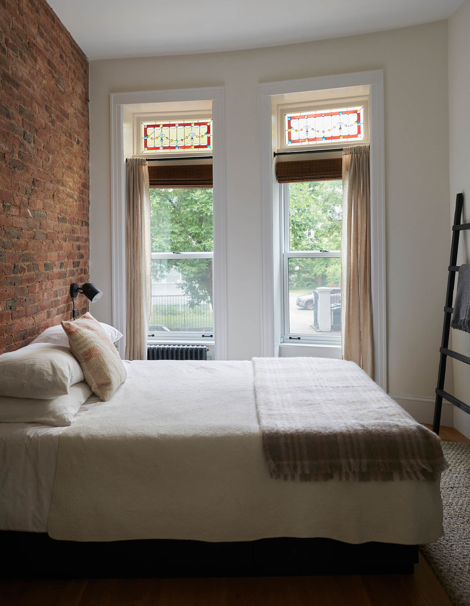
Original stained glass in the bedroom at the front of the parlor floor was revealed during the renovation.
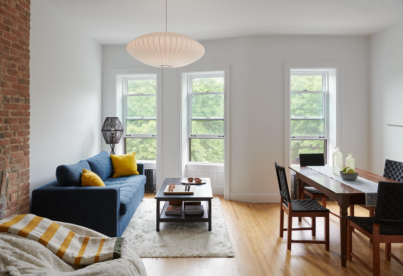
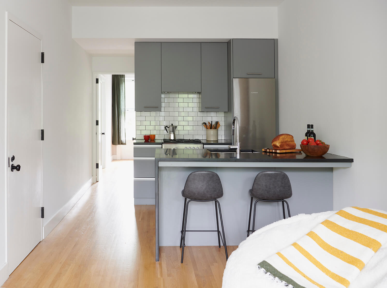
The owner of the middle apartment, a chess player, chose a tailored look for the kitchen, with traditional subway tiles, black granite countertops and gray cabinetry.
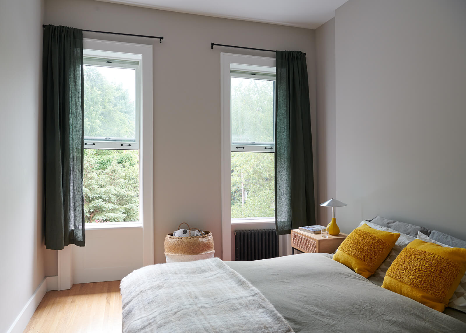
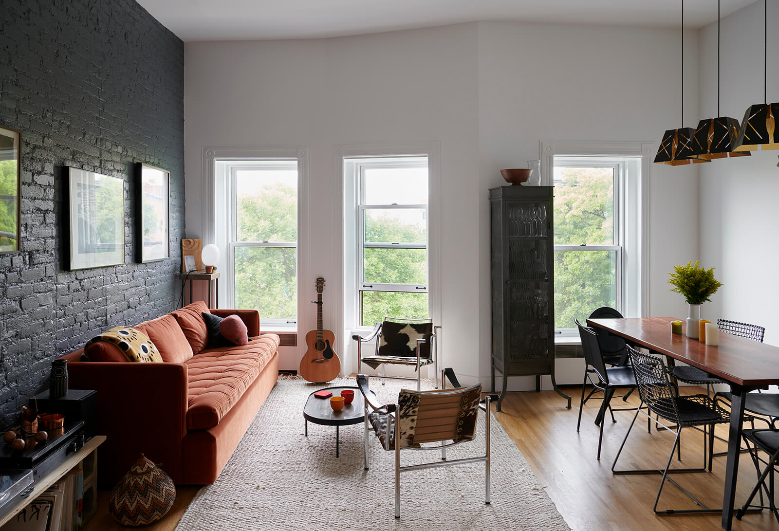
In the top floor apartment, said Delson, “We reclaimed height by removing dropped ceilings and exposing the slope of the roof.”
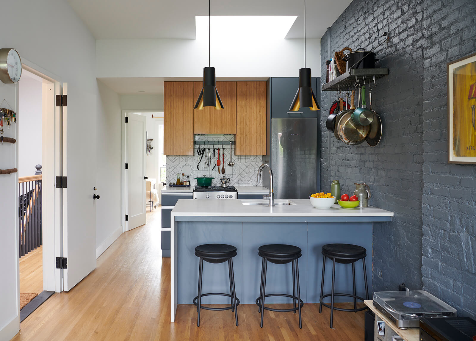
The occupant of the top floor went for painted brick, bamboo cabinets and funky lighting fixtures.
A monitor skylight in the kitchen pops up and has glass on the south-facing side. “It lets in winter light and blocks summer heat,” Delson said. A fan in the monitor exhausts air on the hottest days.
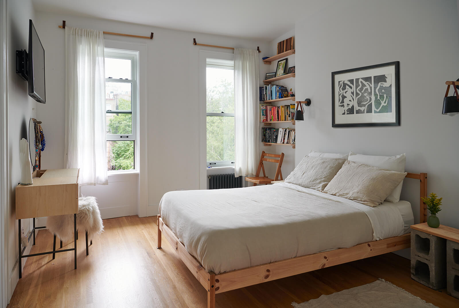
The owner of the top floor apartment added special touches, like wood dowel and leather curtain rods.
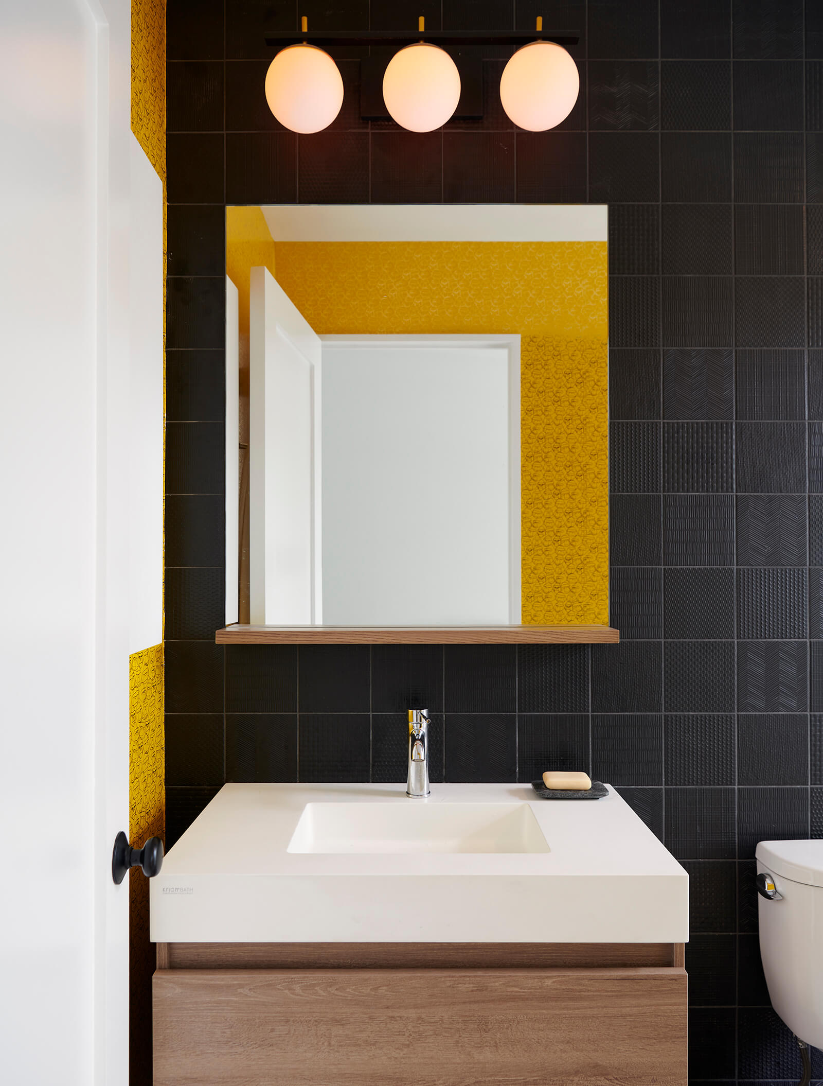
Each bathroom in the house was treated uniquely, with varying finishes and fixtures.
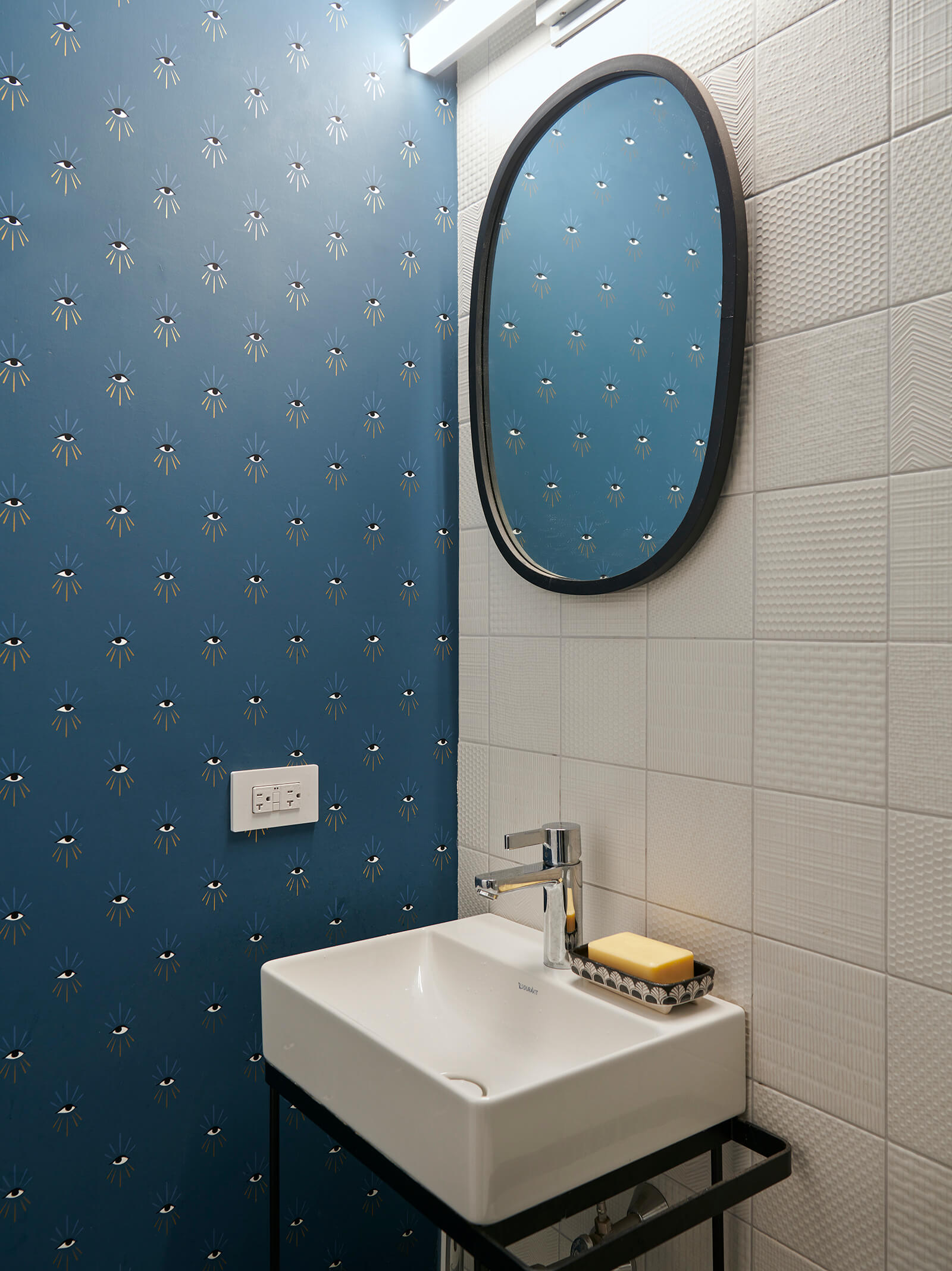
The room at the front of the garden level, used as a TV/hangout/guest room, has a new full bath.
A new slatted deck lets light pass to the garden floor. The owner of the top floor apartment took on the task of clearing the overgrown yard, bringing in new soil and planting herbs and veggies.
[Photos by Jason Schmidt]
Related Stories
- The Insider: Brownstoner’s in-Depth Look at Notable Interior Design and Renovation Projects
- The Insider: Top to Bottom Reno Casts Park Slope One-Family in a Glamorous New Light
- The Insider: Architects Burnish Park Slope Row House with Incredible Woodwork
The Insider is Brownstoner’s weekly in-depth look at a notable renovation and/or interior design project by design journalist Cara Greenberg. Find it here every Thursday morning.
Email tips@brownstoner.com with further comments, questions or tips. Follow Brownstoner on Twitter and Instagram, and like us on Facebook.







What's Your Take? Leave a Comment