The Insider: Serene, Airy Space Emerges from Full-on Reno of Prospect Heights Prewar
Original parquet and good light drew homeowners to a prewar apartment whose mechanicals and wet rooms got a thorough overhaul.

Photo by Kate Sears
Got a project to propose for The Insider? Contact Cara at caramia447 [at] gmail [dot] com
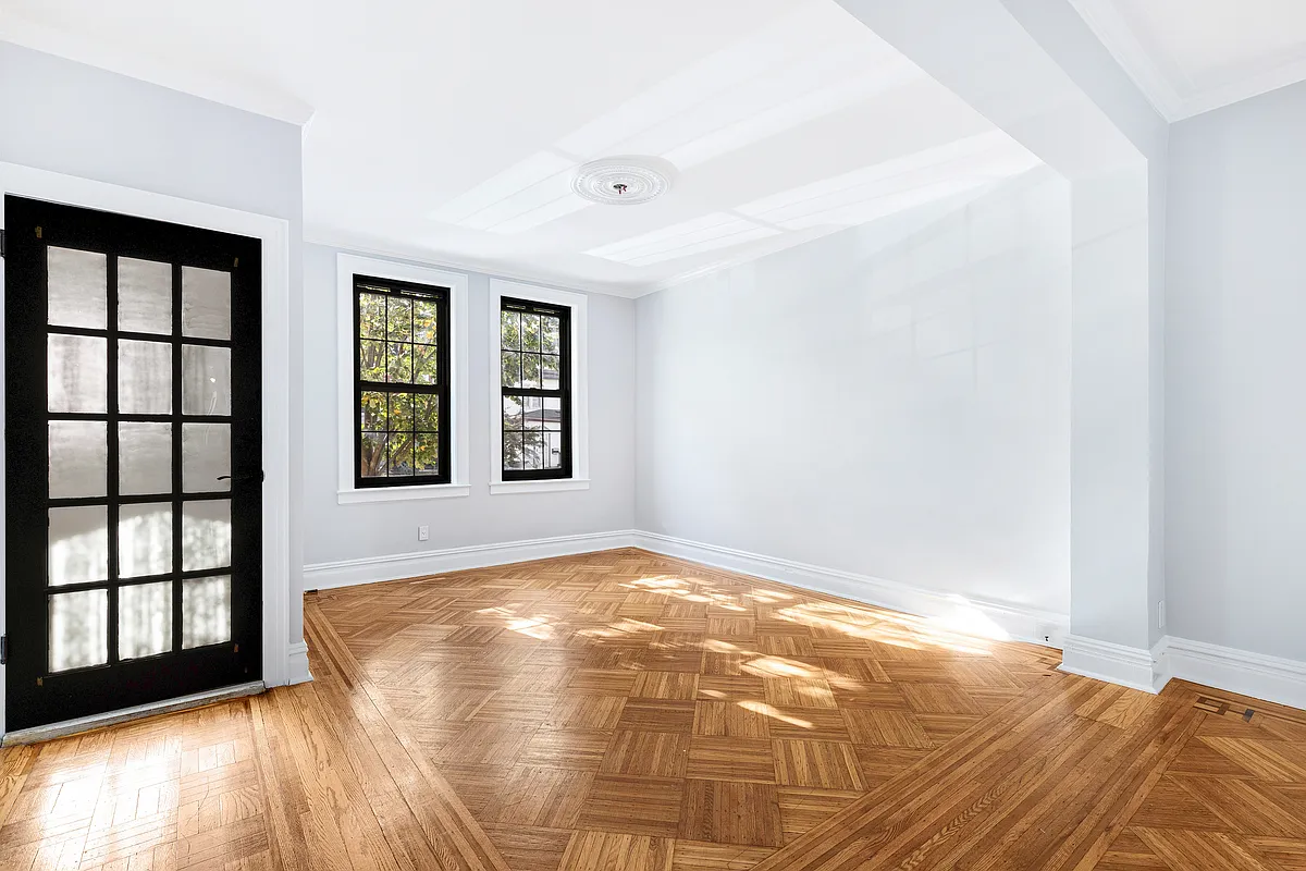
On the plus side, the prewar apartment near Grand Army Plaza had a ton of beautiful, natural light, along with some desirable vintage features like ceiling beams and hardwood floors. There was one drawback: It needed a full-on upgrade.
The new owners of the three-bedroom, two-bath unit, a young professional couple, were looking for what architect Jess Hinshaw called “clean, calm space.” To carry out the renovation and mastermind the interior design, they contacted Boerum Hill-based Shapeless Studio, cofounded by Hinshaw and fellow architect Andrea Fisk. Their biggest moves: shifting the kitchen from a tight spot at the apartment entry further into the center of the space, and completely overhauling the two existing baths while keeping them in the same general location. Addressing years of water damage to joists in the bathroom areas and replacing “pretty much all the electrical and plumbing” were also part of the project.
Most walls are painted soft Dove White by Benjamin Moore. The kitchen has a chiaroscuro palette, with emphasis on natural materials like terra-cotta tile and soapstone countertops, while the main bath is awash in color — a taupe and mauve scheme that is something of a Shapeless Studio signature. “It always finds its way in,” Hinshaw said. “It’s a color that feels good to be in.”
The homeowners chucked all their old furniture and kitted out the apartment from scratch with a modern, minimalist bent, incorporating a variety of artwork. They did much of the sourcing themselves, purchasing several pieces by Bicyclette, a woodworking studio in Maine, and Hay, a Danish maker available through Design Within Reach. Shapeless Studio led the way on the thoughtful lighting choices throughout.
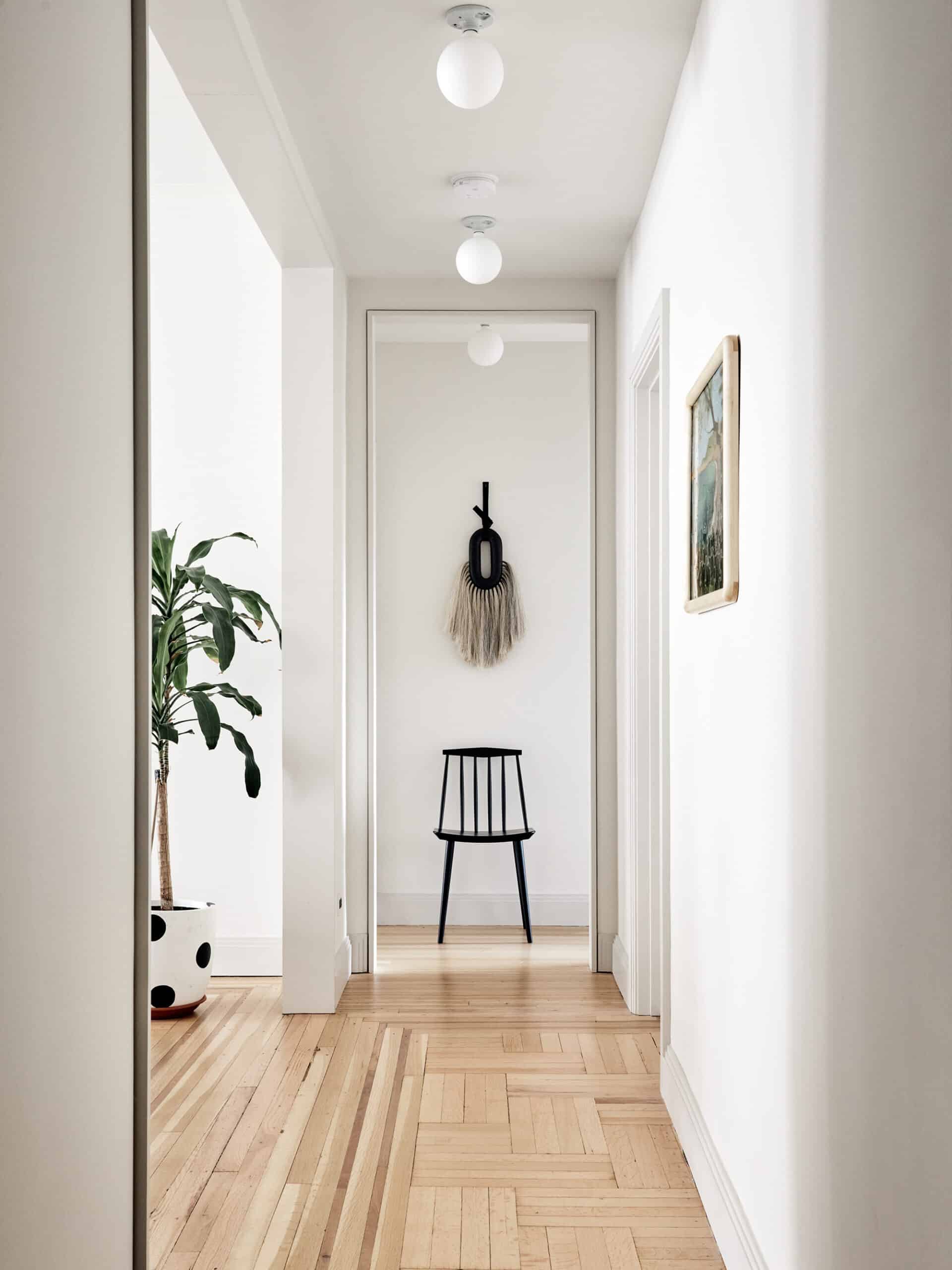
The apartment’s entry hall sets a clean, uncluttered tone. “We wanted to create a blank slate and tried to be very minimal and cost effective with lighting,” Hinshaw said. Hence the choice of simple porcelain sockets with energy-efficient LED bulbs from Tala.

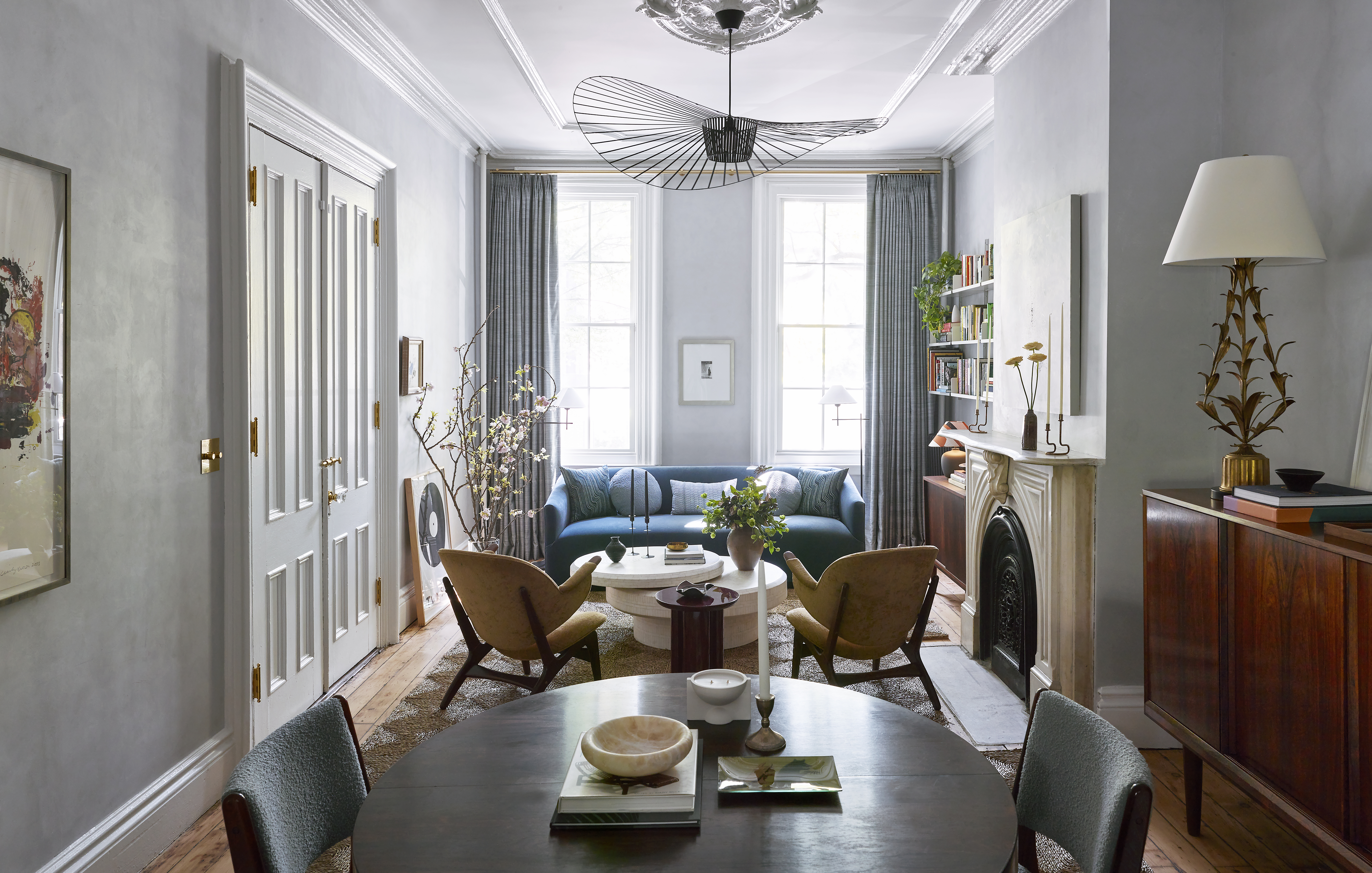
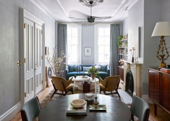
Windsor-style dining chairs from Hay, classic and functional, encircle a round table of solid American hardwood with a hand-rubbed finish from Bicyclette.
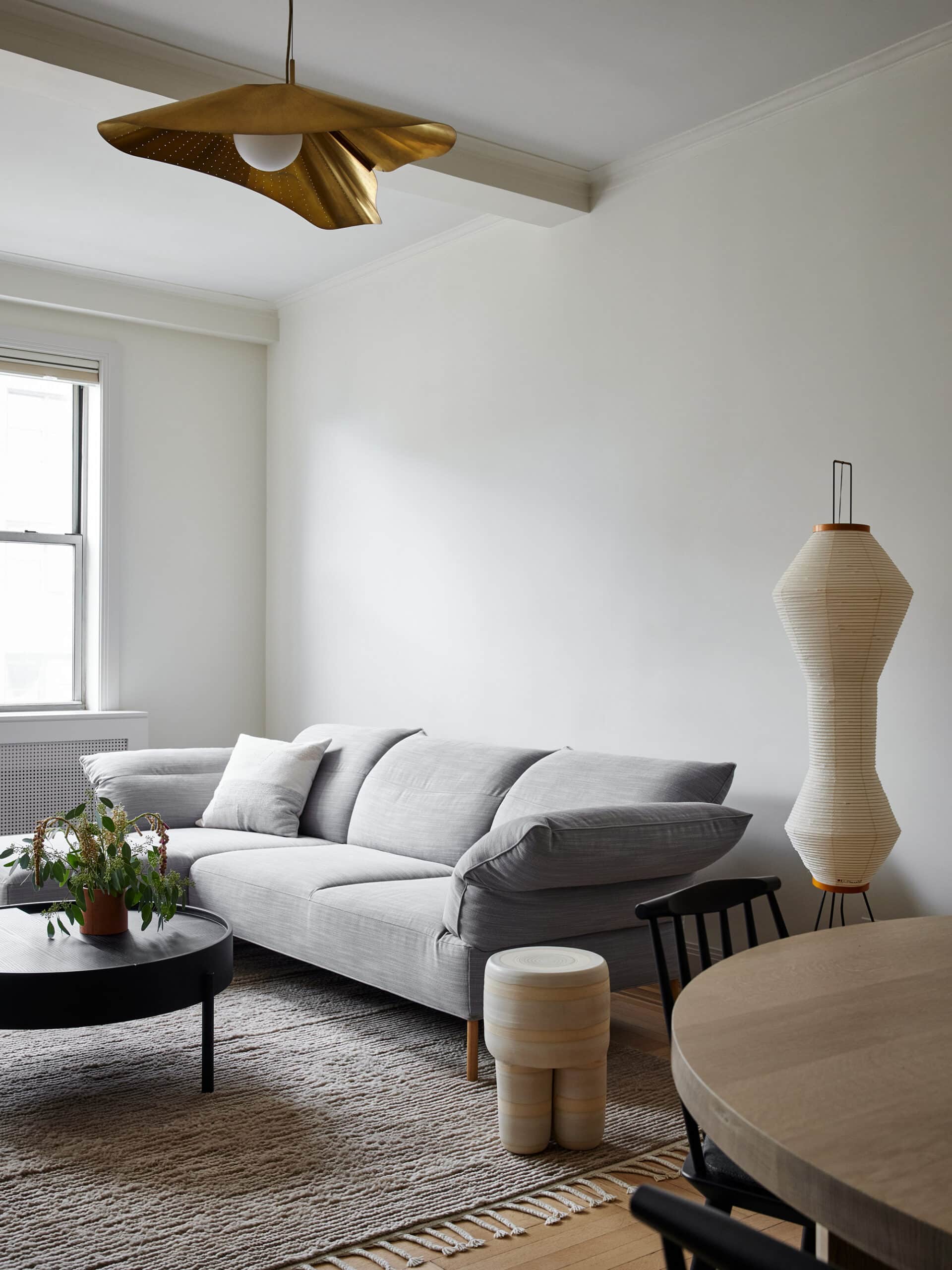
Ceiling beams in the living room remained, along with original flooring, sanded and refinished.
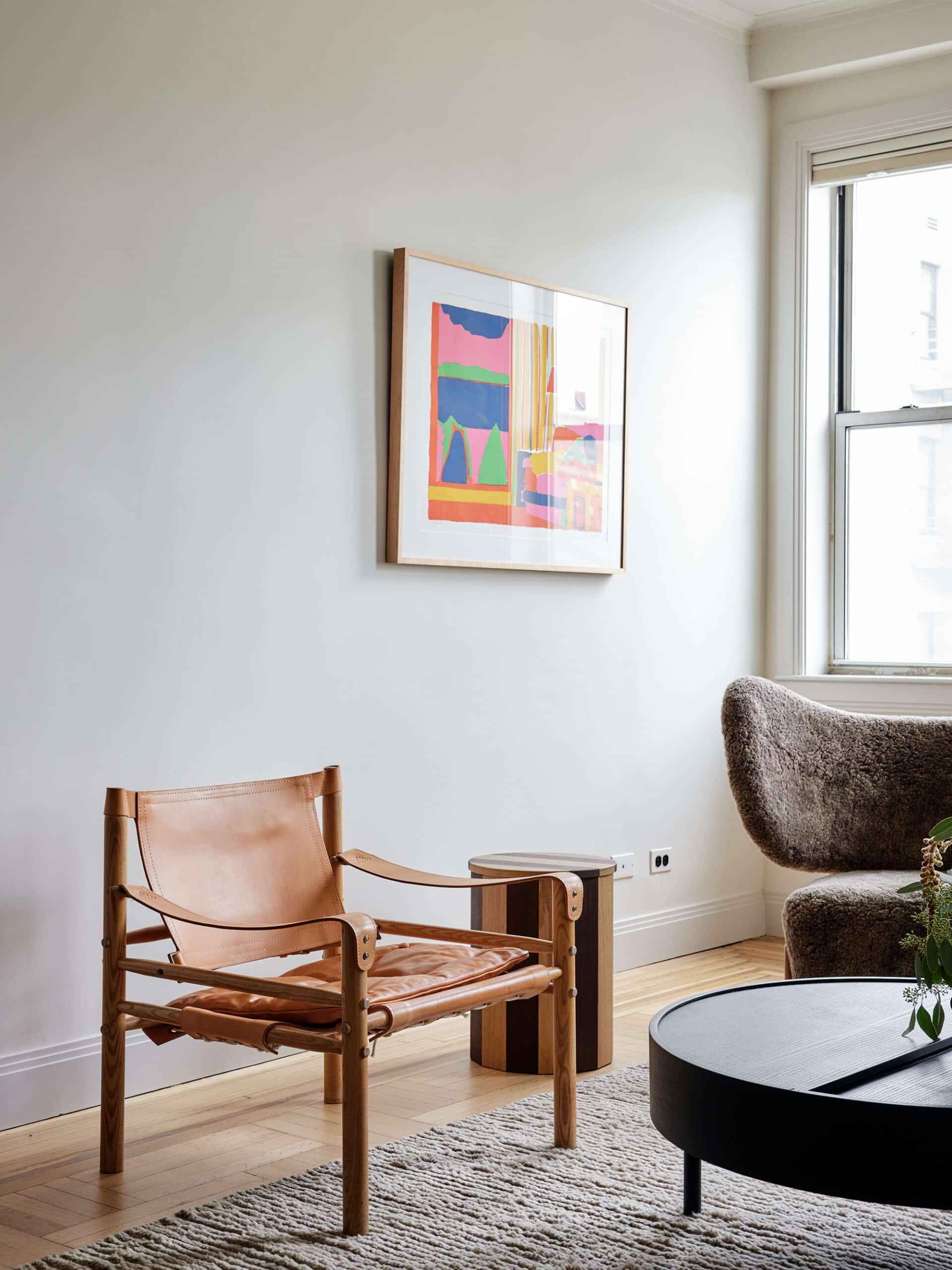
A gray sofa from Hay, two very different modern armchairs, and a round ash coffee table from The Finnish Design Shop round out the living room.
The raw-cotton wall hanging, ‘Rice Field,’ made in Mexico, was sourced from the online store Caralarga. A silkscreen by the late American artist John Grillo provides a shot of color.
In choosing a ceiling light, “We wanted to pick a fixture that could mediate between the living room and dining room,” said Fisk. They zeroed in on the Compas pendant by LA-based Atelier de Troupe, a single sheet of bent brass that, though metal, “appears light and ethereal.”
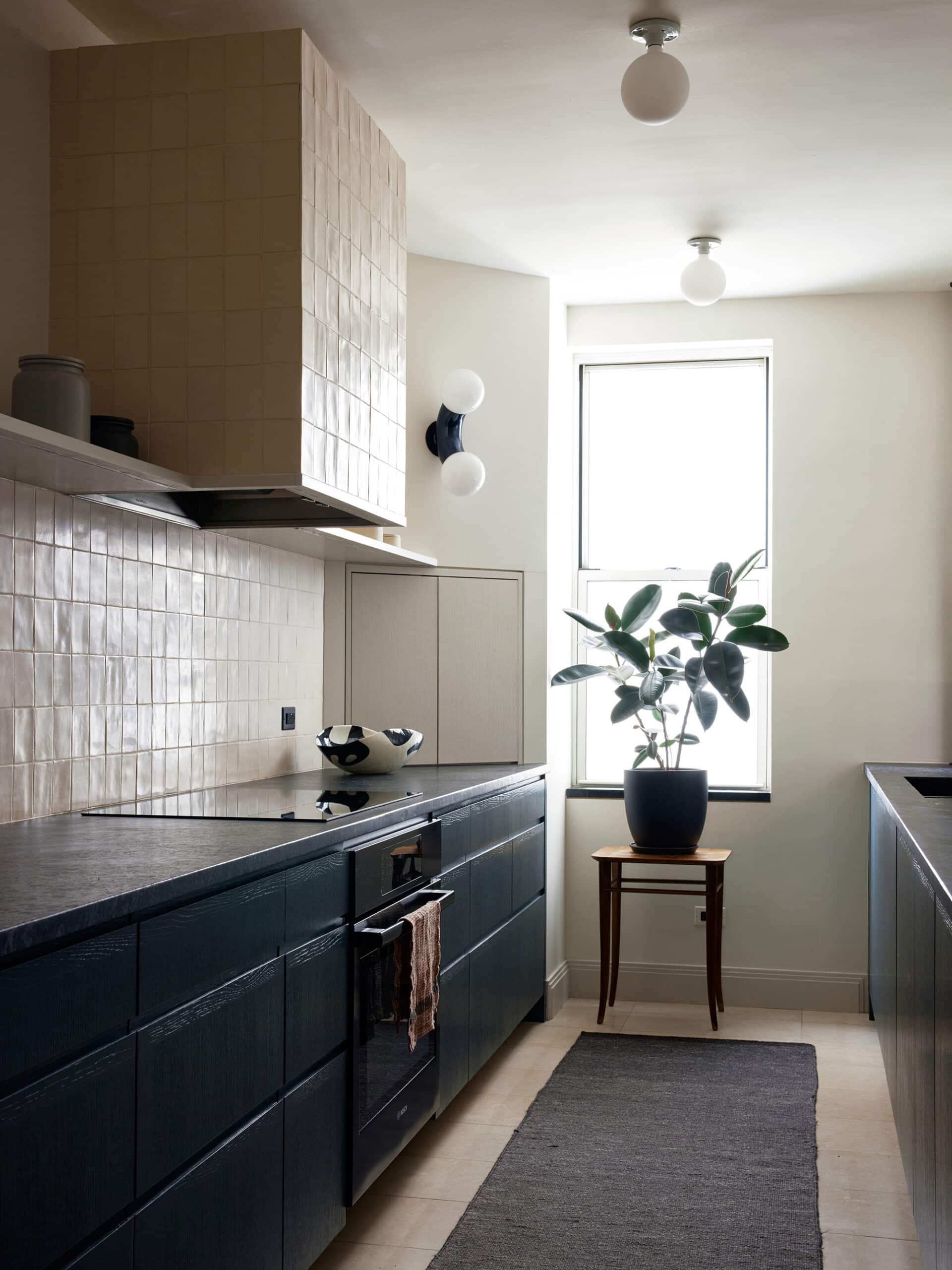
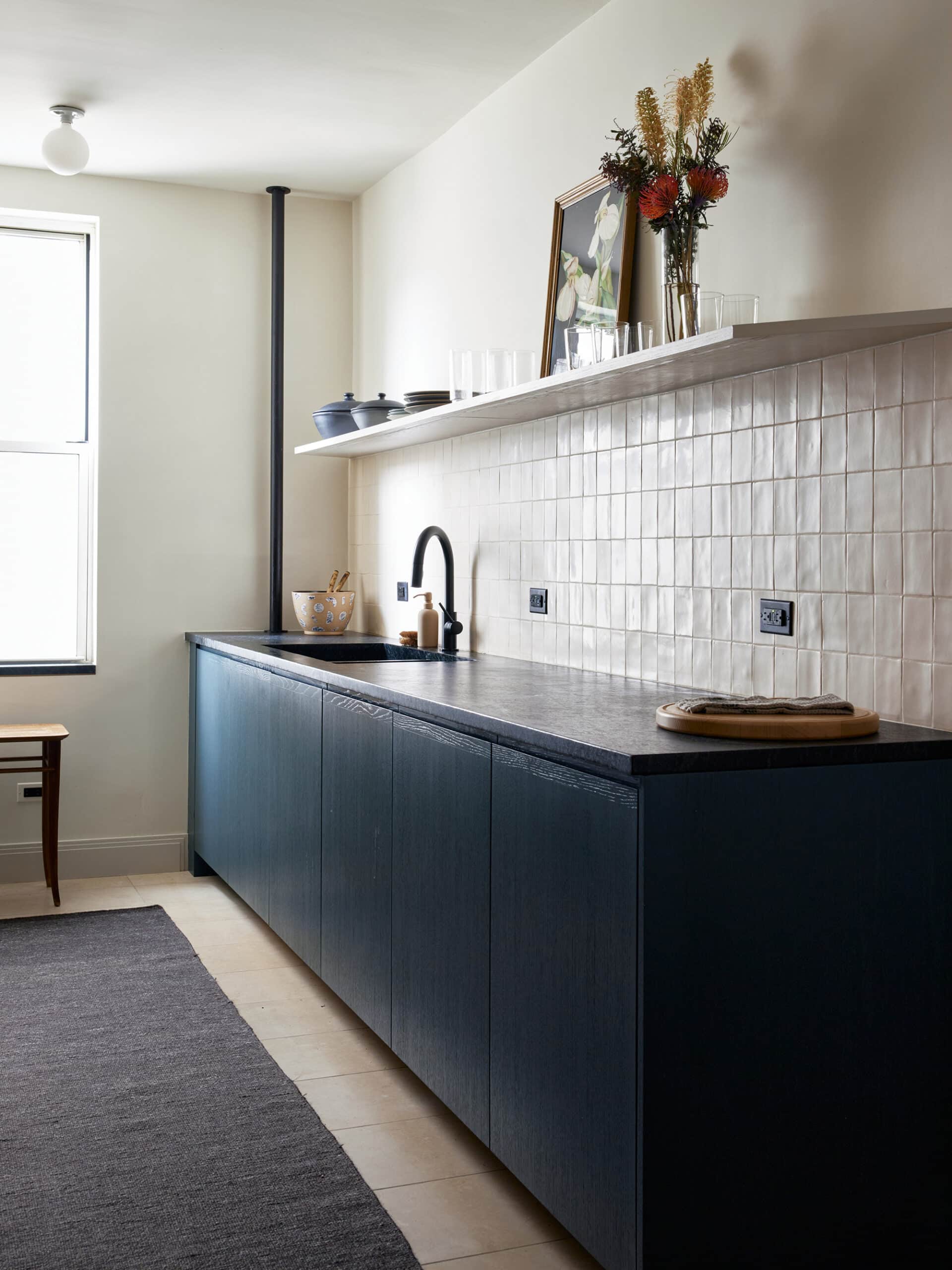
Eschewing upper cabinets in the all-new, somewhat narrow kitchen kept the space feeling “open, airy, and clean,” Hinshaw said. There’s plenty of storage tucked away in tall pantry cabinets behind the sink wall, in space that formerly contained the original galley kitchen.
Terra-cotta wall tile from Portugal has a reflective glaze; the dark countertops are soapstone with an integrated sink.
Originally, Shapeless Studio spec’d an Ikea kitchen, but the contractor offered custom millwork for the same price. The architects pulled deep blue tones from the natural stone counters for painting the hardwood cabinetry with wire-brushed detailing, a technique that roughs up the grain of painted wood so that it “reads as wood instead of MDF,” Hinshaw said.
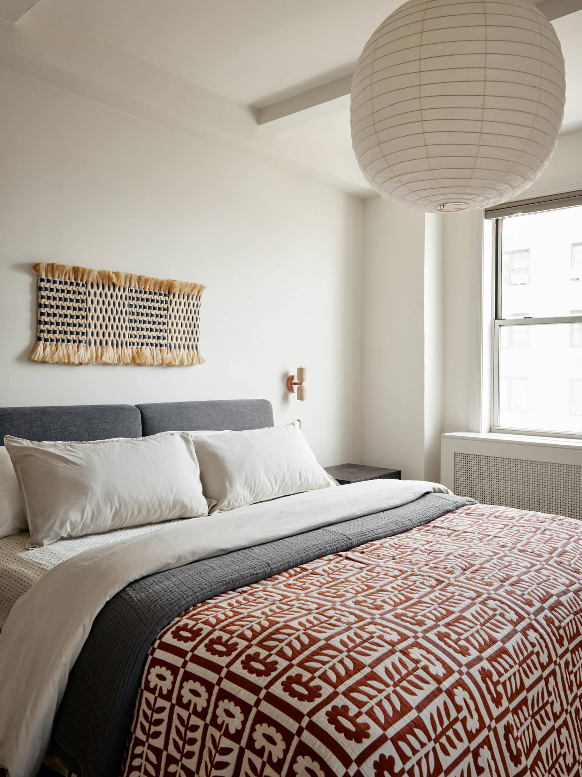
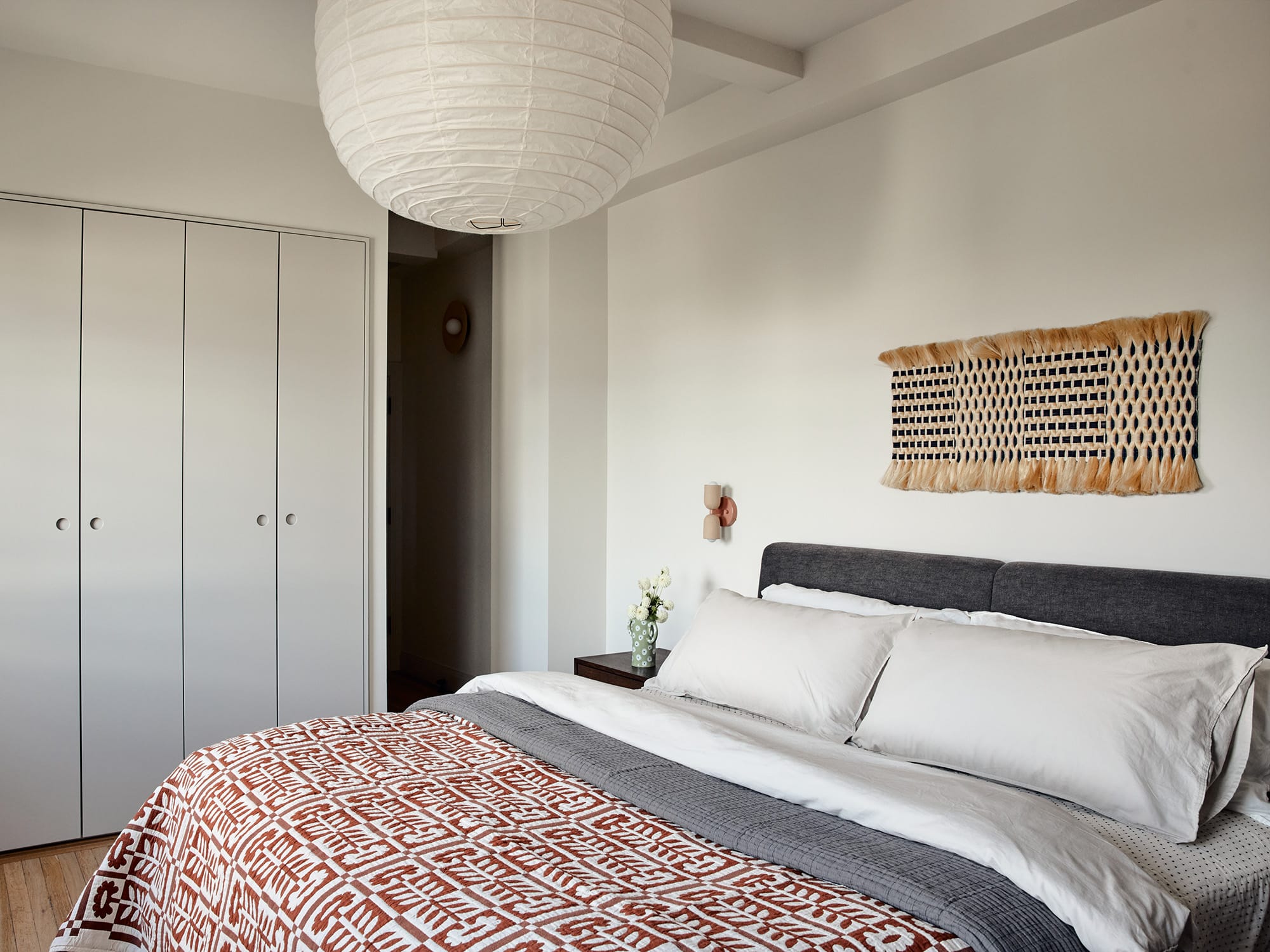
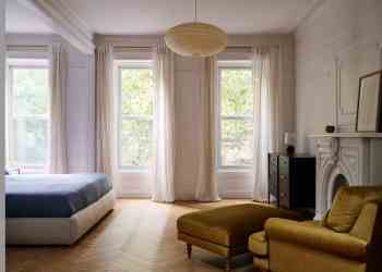
A bed from Parachute Home, night tables from Bicyclette, sconces from In Common With lighting, and a classic Noguchi Akari pendant continue the serene, minimalist feel into the primary bedroom.
The woven piece above the bed is by California-based fabric artist Molly Haynes.
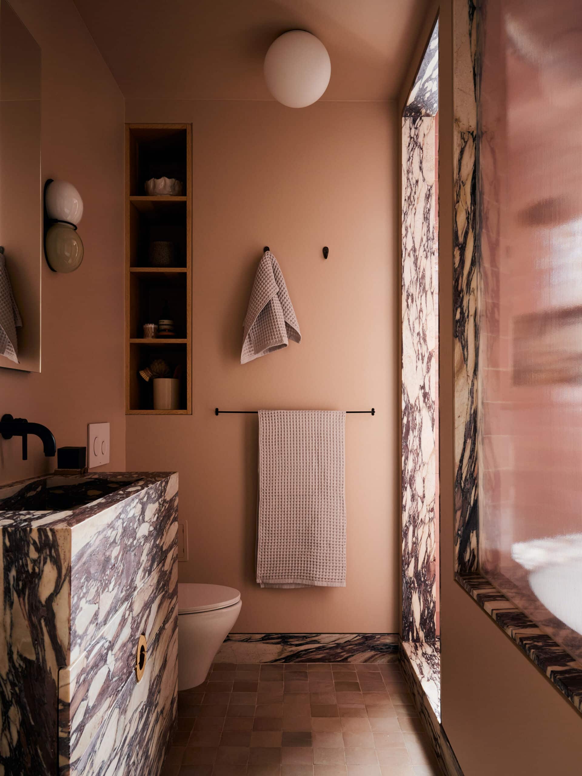
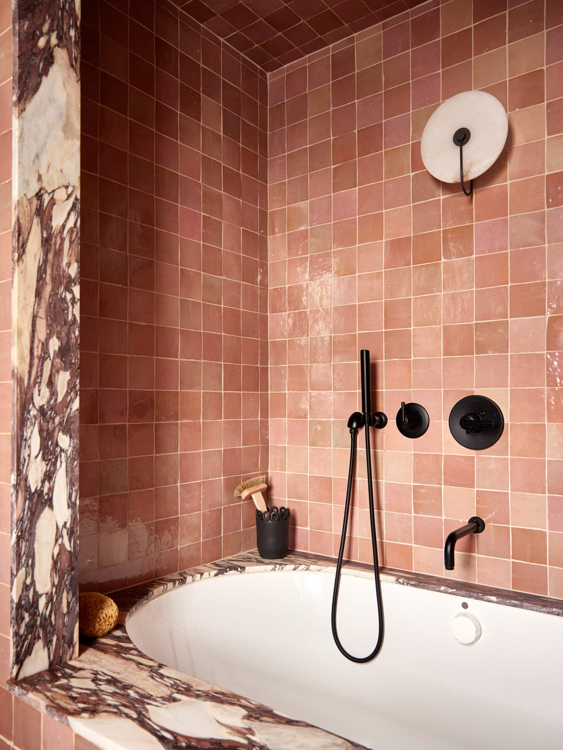
Zellige tile and Calacatta viola marble with bold veining, including a custom-fabricated vanity and intricate stonework detailing, distinguish the primary bath. The wall color is Chocolate Mousse by Benjamin Moore.
[Photos by Kate Sears]
The Insider is Brownstoner’s weekly in-depth look at a notable interior design/renovation project, by design journalist Cara Greenberg. Find it here every Thursday morning.
Related Stories
- The Insider: Gut Reno Recasts Brooklyn Heights Apartment as Luxe, Meticulously Detailed Cocoon
- The Insider: Brand New Boerum Hill Condo Gains Character With Custom Millwork, New Furnishings
- The Insider: Prospect Lefferts Gardens Unit Set Apart by Unusual Shapes, Colors, Materials
Email tips@brownstoner.com with further comments, questions or tips. Follow Brownstoner on Twitter and Instagram, and like us on Facebook.




What's Your Take? Leave a Comment