The Insider: Tile, Millwork Banish Developer Gray in Fort Greene Duplex
Clever tweaks such as opening up a staircase encased in Sheetrock breathed life into a generic flip of a vintage row house.

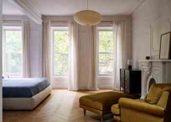
Photo by Jonathan Hokklo
Got a project to propose for The Insider? Contact Cara at caramia447 [at] gmail [dot] com
Architect Denise Lee’s clients took a smart approach when they purchased the upper duplex in a vintage row house that had been voided of character in a recent flip. They waited patiently, living in the 2,000-square-foot, four-bedroom space for about a year before deciding what they wanted to do.
“It was an old townhouse that developers had renovated pretty cheaply. Everything in there was new, gray, and lifeless,” said Lee, who founded her Brooklyn-based firm in 2014 after nine years with Tod Williams Billie Tsien Architects. “It didn’t feel right to just tear out brand new stuff, so we focused on two main priorities: adding warmth, and elements that needed opening up.”
The generously sized apartment has open living/dining/kitchen space at the front of its lower level, with two bedrooms and a bath at the rear, plus two additional bedrooms, a home office and auxiliary spaces above. The existing switchback stair connecting the two levels, located in the middle of the apartment, cried out for attention. “It was completely enclosed in Sheetrock,” the architect recalled. Lee removed the walls, substituting wood railings with slender balusters that allow light to flood the apartment from an existing skylight above.
Upstairs, Lee did some wall-shifting. “Some spaces were awkwardly big, and some too small to be usedful,” she said. She created a proper primary suite with an ensuite bath, squeezed extra living space out of what were previously odd wasted corners, and added storage throughout.
The new homeowners had provided images and mood boards of the look they were after, which tended toward neutral colors with darker touches here and there. Playing off the existing steel-framed windows and a Workstead chandelier the clients found for above the kitchen island, walls were kept a creamy white, with black used for the new stair rail and other accents.
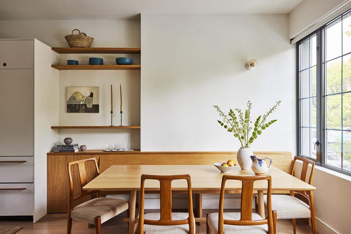
Wide-plank hardwood floors, already in place, were a plus. New millwork crafted by Long Island-based Buddy Savoie, including shelving, a built-in banquette, a vanity in the primary bath and other items, went a long way toward instilling the warmth the space had lacked.
The design-savvy homeowners led the way on furnishings. Almost all were purchased new, with a clean-lined and occasionally playful modernist aesthetic, as in the modular living room sofa from the Belgian company Ethnicraft.


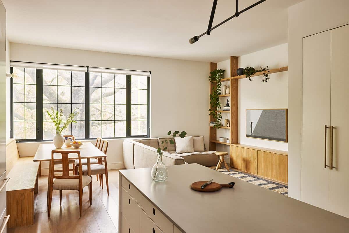
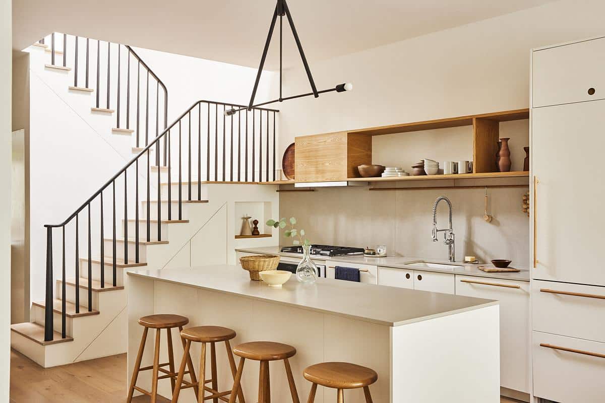
In the open central kitchen, Lee kept the cooktop and oven but redid all the cabinetry, using base cabinets of painted wood from Reform. Long wood custom handles indicate the integrated dishwasher and fridge.
The center island was added, along with a built-in bench for dining and a tall wall of closets opposite the sink wall.
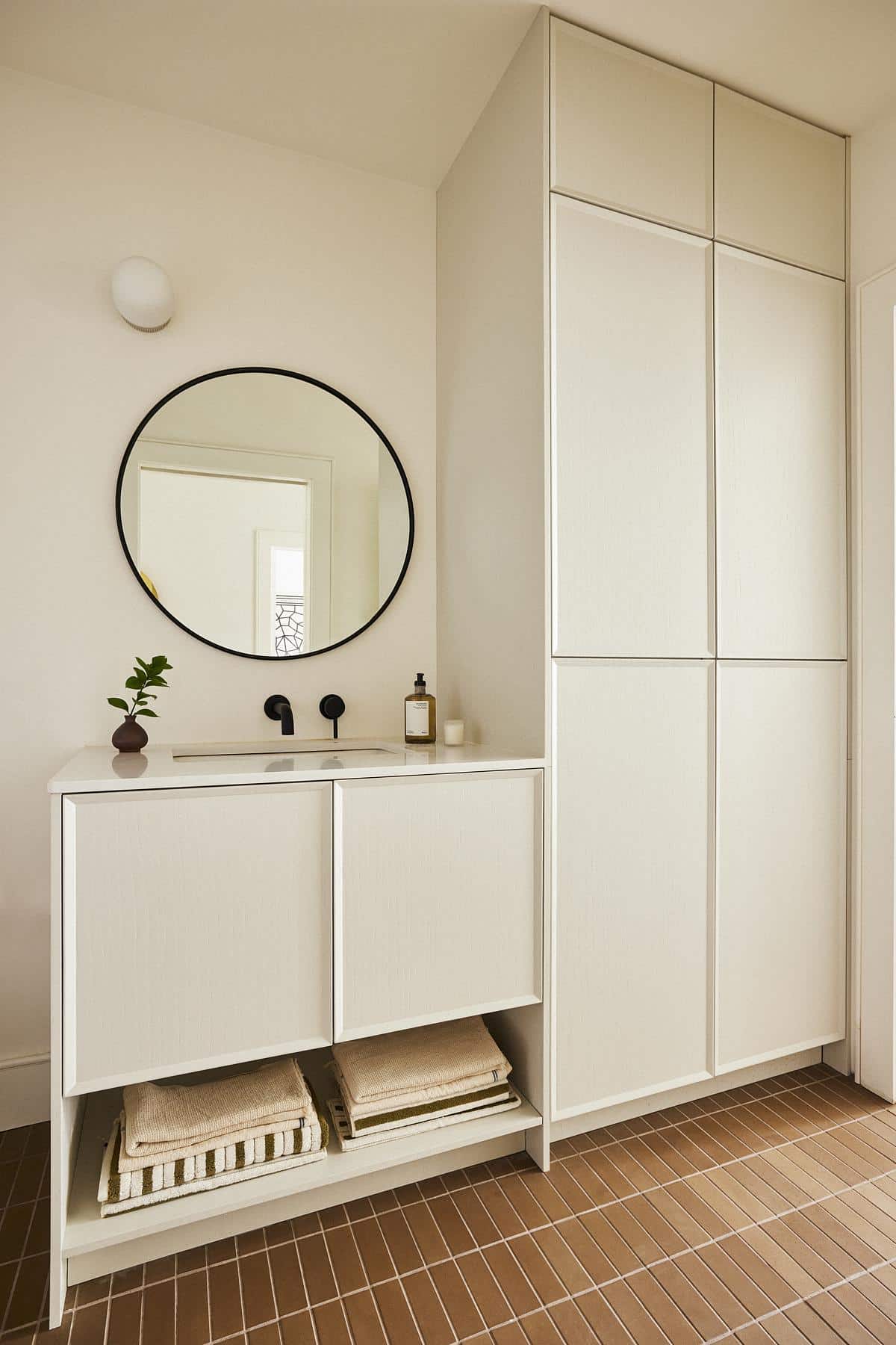
A full bath on the apartment’s lower level is distinguished by abundant storage from Reform and floor tiles from Heath.

The architect inserted new pull-out pantry storage under the stair.

Lee created a wide arched opening at the top of the newly opened stairwell. “It’s a nice, friendly shape to soften things up,” she said. A volume containing a water heater, laundry machines, and other utilities previously “stuck out where the short railing is,” blocking light from the windows. She opened this area up to create a gracious landing, moving the washer/dryer into a closet with a closed door and relocating the other utilities.
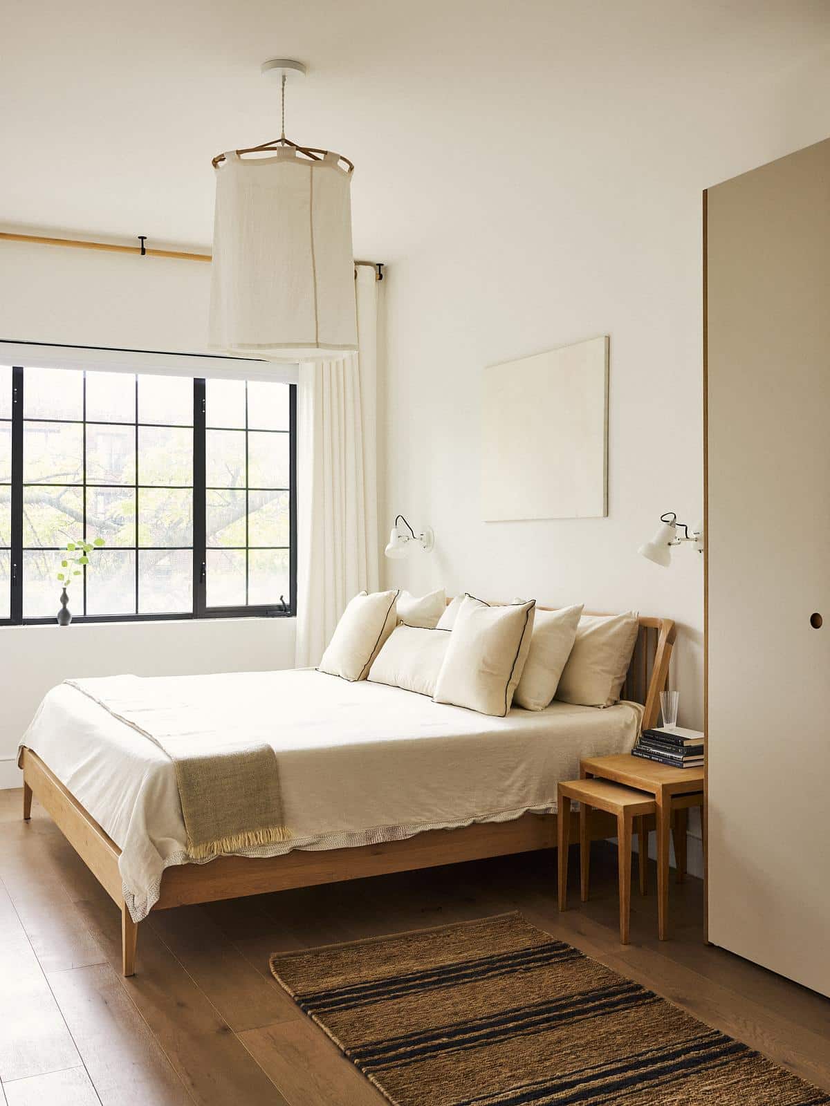
New wardrobes from Reform were chosen for the primary bedroom because, in Lee’s words, “They look like a piece of furniture in the room rather than a typical closet.”
Her clients selected the bed, ceiling fixture and even the curtain rod.
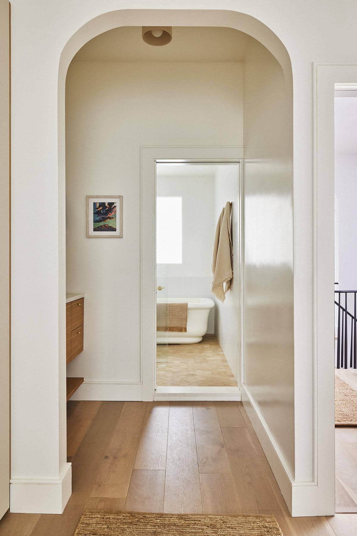
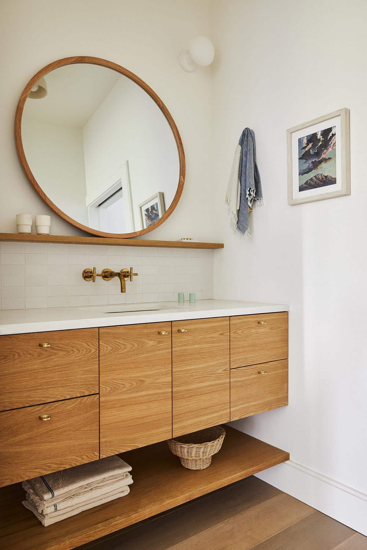
Part of the new primary suite is a vanity area between the bedroom and bath — “kind of a hotel situation,” as Lee put it — with a custom millwork vanity of white oak, topped by a mirror from Zara Home.
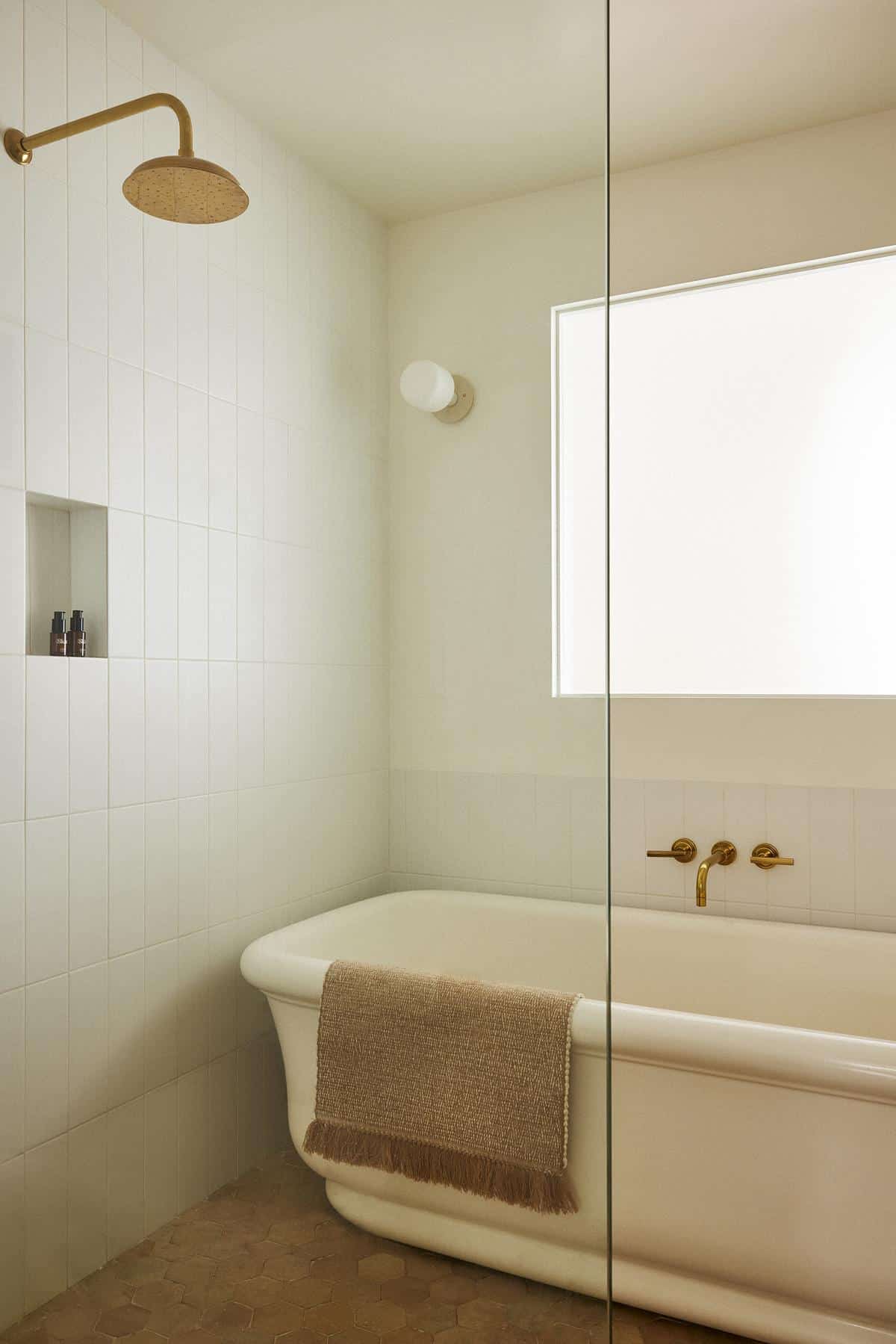
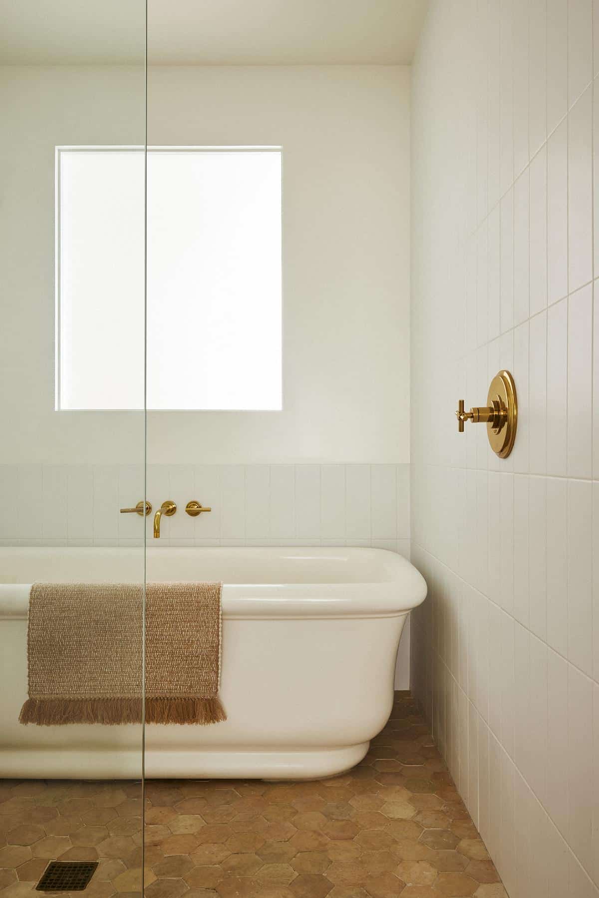
There was a long hunt for the right tub. “We knew we wanted a freestanding tub with soft lines,” Lee said. Brass hardware from Rohl is consistent throughout. White Heath tile on the walls and hex tile from Clé on the floor bring a natural, handmade quality to the space.
The window above the tub area is an interior one, bringing light by way of the home office behind the bathroom, which has a window facing the rear of the building.
[Photos by Jonathan Hokklo]
The Insider is Brownstoner’s weekly in-depth look at a notable interior design/renovation project, by design journalist Cara Greenberg. Find it here every Thursday morning.
Related Stories
- The Insider: Vibrant Color and a ’70s Vibe Personalize a Family’s Fort Greene Brownstone
- The Insider: Surgical Moves Brighten, Customize Fort Greene Townhouse
- The Insider: Color, Millwork Warm Up Park Slope New Build
Email tips@brownstoner.com with further comments, questions or tips. Follow Brownstoner on Twitter and Instagram, and like us on Facebook.




Pleasant renovation. I don’t quite understand why one would install a freestanding tub up against walls. It seems really difficult to keep the outside clean. The back of my original clawfoot tub has probably not been cleaned in decades, if ever.