The Insider: Clutter-Free Park Slope Studio
Japanese author Marie Kondo, famed for her “If it doesn’t spark joy, throw it out” manifesto, has nothing on Ilene Rosen. “She’s preaching to the converted,” said Rosen, who lives with her husband Mark Sherry, a pharmacologist, in a 510-square-foot studio overlooking Grand Army Plaza. “For me, the joy is not having stuff around, being…
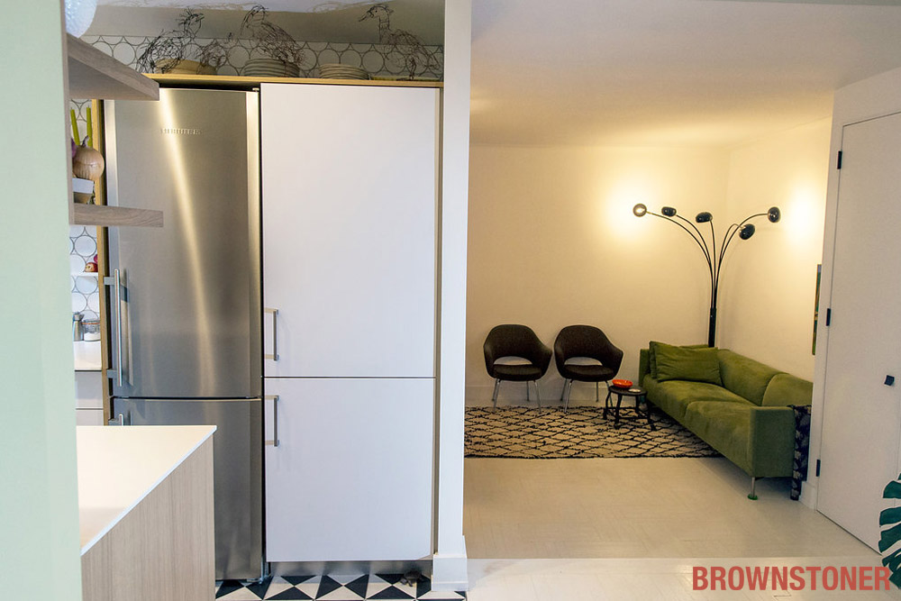
Japanese author Marie Kondo, famed for her “If it doesn’t spark joy, throw it out” manifesto, has nothing on Ilene Rosen. “She’s preaching to the converted,” said Rosen, who lives with her husband Mark Sherry, a pharmacologist, in a 510-square-foot studio overlooking Grand Army Plaza. “For me, the joy is not having stuff around, being able to see a long swath of kitchen counter with nothing on it, or a lot of empty floor space.”
The couple bought their apartment — one large square room with a galley kitchen and a bathroom behind a sliding barn door — a little over a year ago, downsizing from a two-bedroom, two-bath duplex in the neighborhood. “The children are clearly not coming back,” said Rosen, a partner in R&D Foods, the gourmet grocery and takeout shop on Vanderbilt Avenue in Prospect Heights. “It seemed like the right time to downsize.” (Her 21-year-old twin daughters have their own apartments, and their dad’s Manhattan pad to sleep in if they choose.)
Rosen, who got degrees from Parsons in both environmental and product design before embarking on a culinary career, put her schooling to use in designing the studio to her exact specifications. She had assistance from Stuart Basseches, an architect friend now based in Sag Harbor. Despite the place’s diminutive size, construction took eight months. Contractor Heidi Peterson of Heidi Home resolved dilemmas like how to make the new tile floors in the bathroom and kitchen absolutely flush with the wood floor of the entry foyer (the main living space is two steps down). “It was very important to me that there be no door saddles, that everything be on one plane, in order to make the apartment feel seamless,” Rosen said.
Benjamin Moore’s Simply White sets off a spare collection of mostly mid-20th-century furnishings, with graphic punch coming from triangular black-and-white floor tiles and round white Turkish wall tiles in the all-new kitchen and bath.
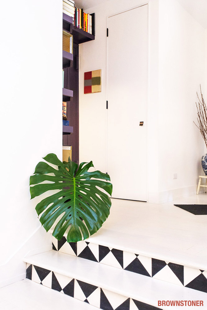
Two steps, their risers emphasized with ceramic tiles from Mosaic House, lead from the entry foyer into the main living space.
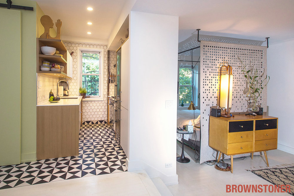
At a glance as you enter: galley kitchen straight ahead, bathroom behind green-painted barn door, sleeping area to the right. Originally, there was to have been a low partition wall dividing the sleeping area from the living room, but when Rosen saw a piece of perforated felt from Filzfelt in the Knoll showroom, “I said, ‘Skip the wall, we’re getting a piece of felt!'” They ordered it with a rod pocket and hung it on plumbing pipe. “The perforations make beautiful shadows on the wall when the morning light comes through.”
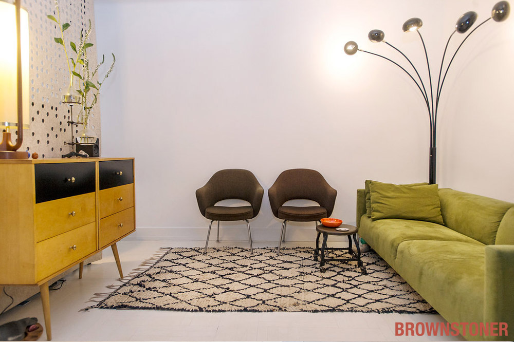
The simple green ultrasuede sofa has been part of Rosen’s life for years. as have the Saarinen chairs. The blonde Paul McCobb dresser is from One Kings Lane, as is the multi-arm vintage standing lamp. The tiny coffee table on wheels came from Paula Rubenstein’s NoHo store.
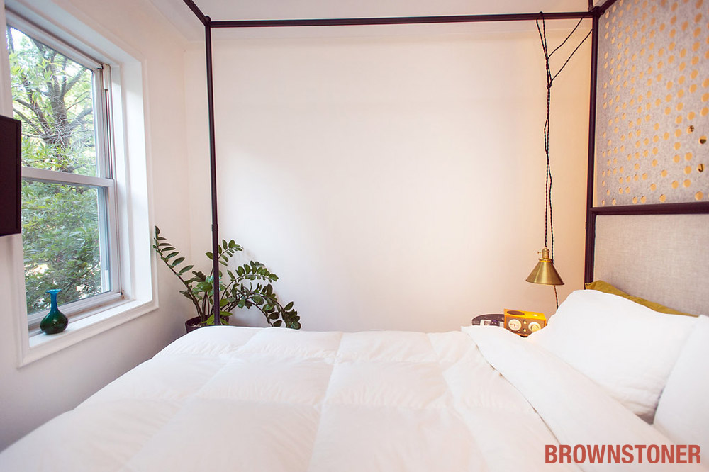
The apartment has four windows: one in the bath, two in the kitchen and two in the sleeping area, from which light penetrates into the living room.
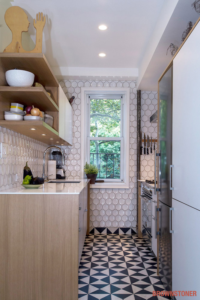
Concave circular tiles from Classic Tile in Brooklyn proved tricky to lay where walls were not completely plumb. The white laminate and gray oak cabinets are semi-custom from Henrybuilt. The countertops are HiMacs — “similar to Corian, but made in the U.S.,” Rosen said. Selected objects on open shelves include a Russell Wright teapot and a wooden sculpture found at Brooklyn Flea.
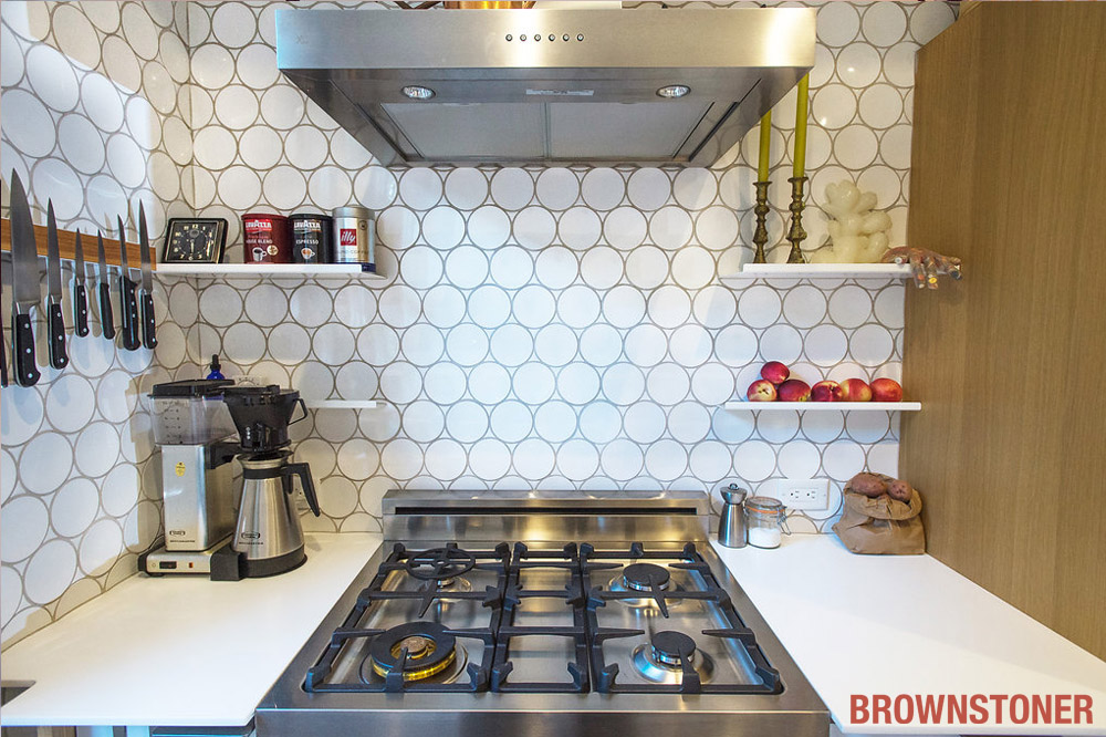
High-end European appliances include a Bertazzoni stove, Liebherr fridge and Miele dishwasher.
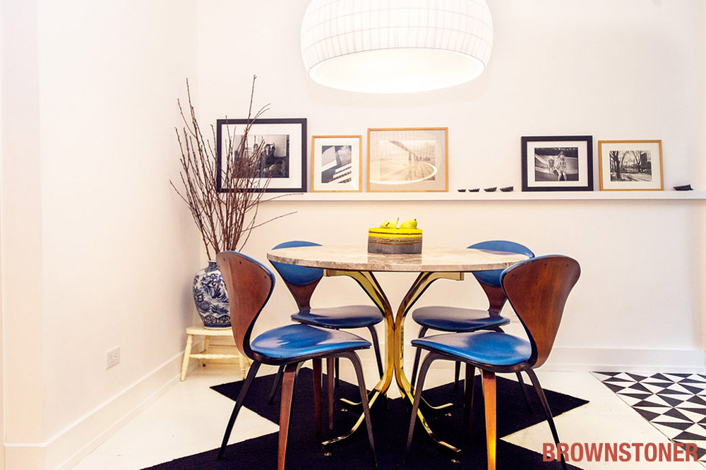
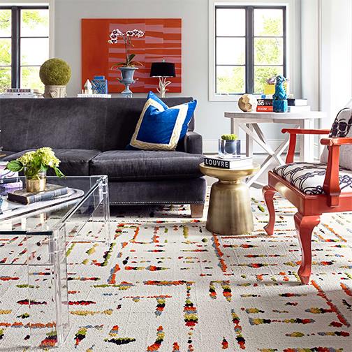
Rosen bought the dining table’s marble top on eBay, the base on Etsy; the contractor put it together. 1950s Norman Cherner chairs with pleather seats came from Etsy as well. Rosen devised the X-shaped rug of FLOR carpet tiles to prevent chair legs from gouging holes in the white painted floor.
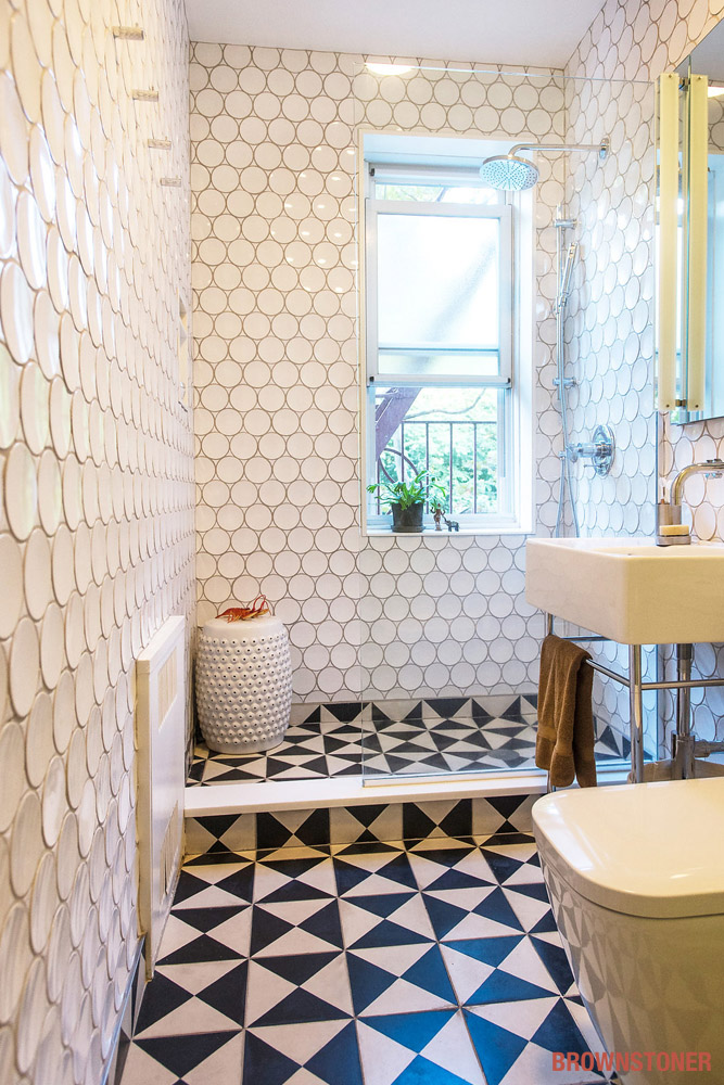
The couple eliminated the existing tub and decided on a stall shower to gain bathroom space. The black-and-white floor tiles run from the kitchen into the bathroom, just as the green paint above the kitchen shelves melds into that of the barn door around the corner — “to make it all feel like one big space,” Rosen said. The toilet and sink are from Duravit.
Photos by Jarreau Weber
The Insider is Brownstoner’s in-depth look at a notable interior design/renovation project, by design journalist Cara Greenberg. The stories are original to Brownstoner; the photos may have been published before. If you have a project to propose for The Insider, please contact Cara at caramia447 at gmail dot com.
Related Stories
The Insider: Toning Down an Ornate Park Slope Townhouse
The Insider: “Transformative Moves” Light Up a Park Slope Kitchen
The Insider: Architect Takes Bold Steps to Make a Small Park Slope Home Feel Bigger









so 4 = 1 + 2 + 2? only 1 window in the kitchen. love the felt wall!
so 4 = 1 + 2 + 2? only 1 window in the kitchen. love the felt wall!
Love it. What a great use of the space.
Love it. What a great use of the space.