The Insider: Parlor Floor Upgrade in Boerum Hill
The Insider, Brownstoner’s weekly in-depth look at interior design and renovation, appears every Thursday at 11:30AM. Written and produced by Cara Greenberg, a design journalist who also blogs at casaCARA: Old Houses for Fun & Profit. Photo: Elizabeth Lippman This revamp of a parlor floor in a brick Boerum Hill row house was two-fold. First,…
The Insider, Brownstoner’s weekly in-depth look at interior design and renovation, appears every Thursday at 11:30AM. Written and produced by Cara Greenberg, a design journalist who also blogs at casaCARA: Old Houses for Fun & Profit.
Photo: Elizabeth Lippman
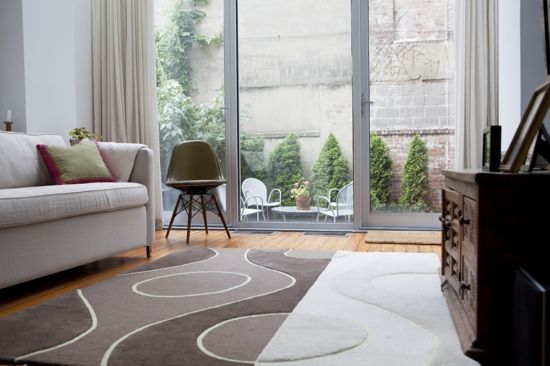
This revamp of a parlor floor in a brick Boerum Hill row house was two-fold. First, Brooklyn-based architect Alicia Balocco opened up an existing 17-foot extension on the 20’x40’ building with a bank of aluminum-framed glass doors; a new atrium-like skylight spanning almost the full width of the building lets even more sun shine in. She also improved the kitchen layout and added a bathroom with distinctive tile walls.
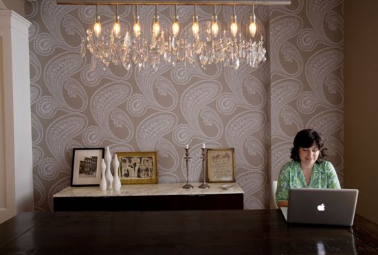
Then, local interior designer Julia Mack (that’s Julia in the photo, above) gave the clients, a couple with two teenage kids, the fresh and modern look they wanted. “The house didn’t have a lot of lavish detail,” Mack says. “It seemed a perfect opportunity to bring in some modern design and not feel you were turning your back on anything that was already there.” As always, Mack made a special effort to work with local suppliers in sourcing furnishings both vintage and new.
Kitchen/bathroom/extension photos: Courtesy Alicia Balocco; Living/dining room photos: Elizabeth Lippman
More photos and info on the jump…
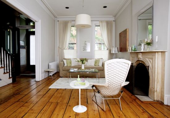
The basic white color scheme in the front parlor emphasizes the spare, uncluttered feel of the space.
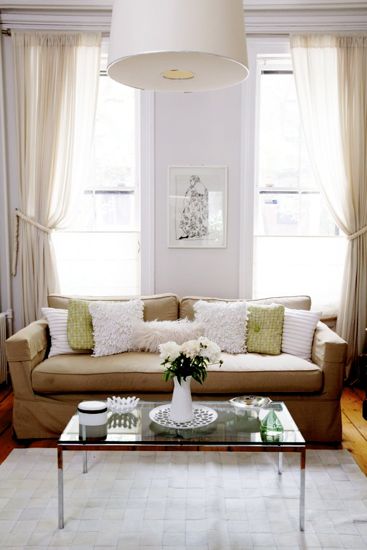
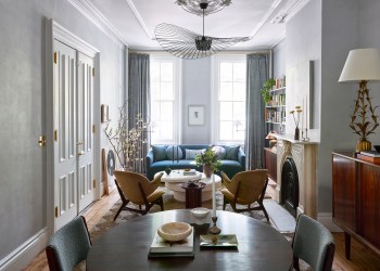
Mack decided to work with the clients’ existing sofa, dressing it up with an assortment of throw pillows, some made with Fortuny fabric. The hanging drum shade is from Zia Previn, formerly of Brooklyn, now of L.A. Wool curtains were custom-made from fabric bought at ABC Carpet.
A vintage chrome and glass Knoll coffee table and Steelcase armchair came from Two Jakes, a secondhand furniture store in Williamsburg. The strong wall color in the hallway is Benjamin Moore’s Normandy.
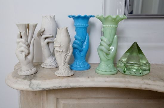
A collection of Art Deco hand vases on the mantel provides a burst of color.
A 1950s Harry Bertoia ‘Bird’ chair in white, new from Knoll, sits comfortably on wide-plank sub-floors of 100 years earlier.
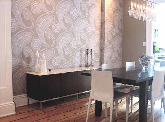
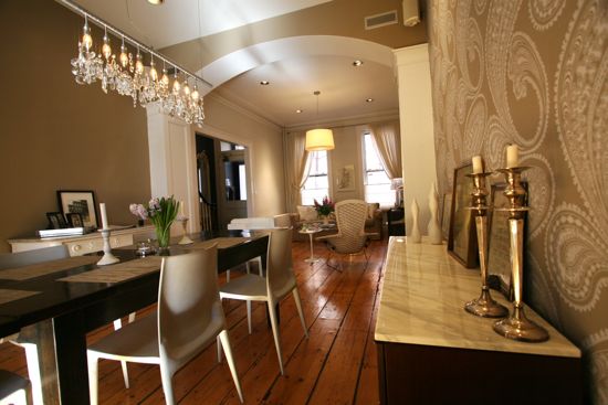
Cole & Sons paisley wallpaper on one wall of the dining room, visible as soon as one enters from the hall, is meant to be “a bit of a surprise and delight,” Mack says. She picked up the paper’s background color for the room’s other walls.
Over the dining table is an Austrian crystal ‘Cellula’ chandelier from Moss in SoHo. The marble-topped credenza was bought new from Knoll, the dining chairs from the MoMA Store.
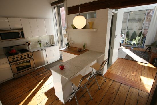
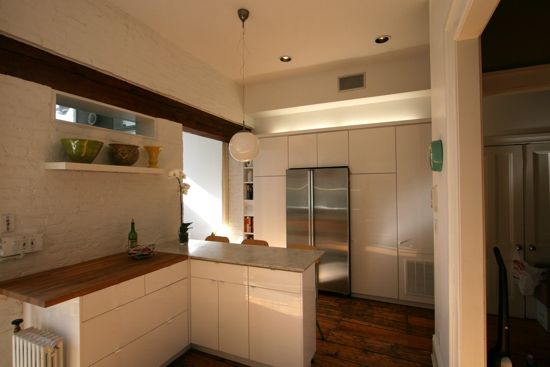
The kitchen had been renovated with wood painted cabinets when the house was converted a few years ago from a three-family to a one-family. More recently, Balocco relocated the refrigerator to the opposite storage wall, below, and added an L-shaped island in the center.
Behind the white-painted brick wall on the left is a new bathroom, below.
The tile, ceramic designed to mimic slate, is from Stone Source.
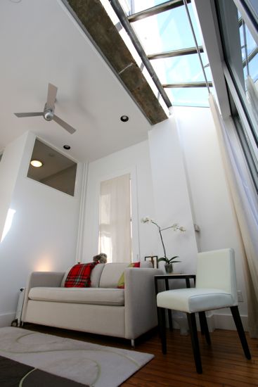
The enormous skylight was dictated by the placement of a structural beam. “We removed the dropped ceiling in the existing extension and saw this nice textured-concrete beam there,” Balocco recalls. “It was the perfect location for the skylight, between the beam and the back wall — a continuation of the glass element.”
The new extension, with a ‘Jazz’ rug from Kia Carpets on Atlantic Avenue and a vintage Eames chair with wood dowel legs, is used as a family room and for entertaining, leading out to the small landscaped backyard.
If you’ve missed any installments of The Insider, catch up here.







It just dawned on me how brilliant the bathroom is. They’ve fit a walk-in shower that will probably accommodate a wheelchair into the ground floor bath where normally there would be room only for a powder room. This is brilliant design to make the house livable as you get older.
It just dawned on me how brilliant the bathroom is. They’ve fit a walk-in shower that will probably accommodate a wheelchair into the ground floor bath where normally there would be room only for a powder room. This is brilliant design to make the house livable as you get older.
Gosh closet curator, you are so right! And I hope the owners of the house are always careful to turn on the faucet and not the shower when washing their hands in that tricky little bathroom/ shower combo they got goin for them! That could easily create some disasters for sure!
Gosh closet curator, you are so right! And I hope the owners of the house are always careful to turn on the faucet and not the shower when washing their hands in that tricky little bathroom/ shower combo they got goin for them! That could easily create some disasters for sure!