The Insider: This Light, Bright Williamsburg Row House Was Rebuilt From the Ground Up
This brand-new row house, built from the ground up by Brooklyn-based CWB Architects for a high-profile tech-world figure and his family, slips right into its north Brooklyn streetscape as if it had been there since 1910. “We weren’t intending to take down the whole building, but it was in such bad shape [that] that’s what…
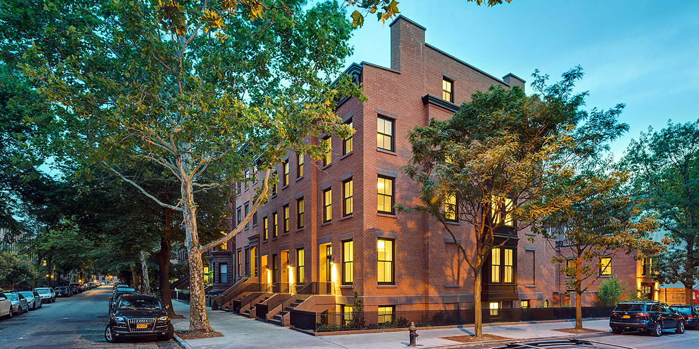
This brand-new row house, built from the ground up by Brooklyn-based CWB Architects for a high-profile tech-world figure and his family, slips right into its north Brooklyn streetscape as if it had been there since 1910.
“We weren’t intending to take down the whole building, but it was in such bad shape [that] that’s what happened,” said Yuliya Ilizarov, managing director of CWB.
The architects created a new structural steel frame, following the original, 1,000-square-foot-per-floor proportions of the three-story building, but configuring it for one family instead of three.
Nothing is left of the original structure except the street-level ironwork and the cornice on the front facade, which had been hidden underneath vinyl sheathing. It was removed, restored and put back. “The building had this terrible yellow vinyl siding,” recalled Ilizarov. That is now replaced with cedar siding in front, painted a chic slate gray, and noncombustible cement board on the side wall, per code.
Inside, the ground floor is open plan, with dining at the front, kitchen in the middle and living room at the back. A family room with a fireplace and a guest bedroom/office and guest bath are on the floor above. There are two bedrooms on the top floor, each with an en suite bath.
The interiors are characterized by an abundance of clean-lined built-ins made of quarter-sawn white oak, which provide storage on every level, and a general bright airiness.
“We tried to provide a warm, neutral base,” Ilizarov said, “with color coming from furnishings, rugs and drapery fabric.” The décor, incorporating mid-20th-century classics and fabrics sourced from India, is the work of Brooklyn-based Jesse Parris-Lamb Interior Design.
The general contractor was Creative Renovations. Ilizarov was project architect on this job, along with Scott Kunstadt; the partner in charge was Brendan Coburn.
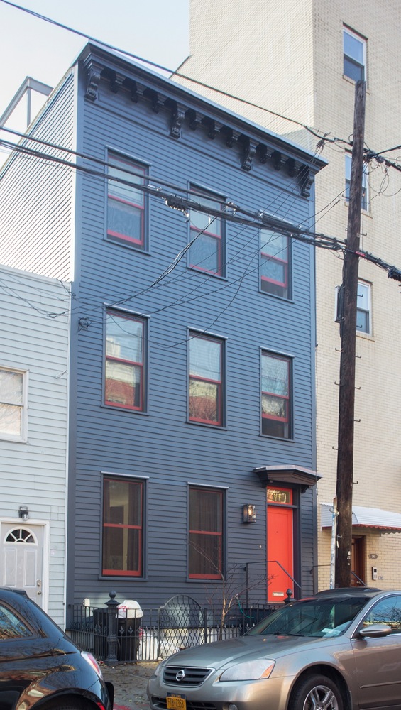
The street-level ironwork and wooden cornice are all that remain of the original building. All paint colors are Benjamin Moore: the new cedar siding is Blue Note, the cornice a slightly darker Midnight Dream, and the popping orange window frames and entry door are Warm Comfort.
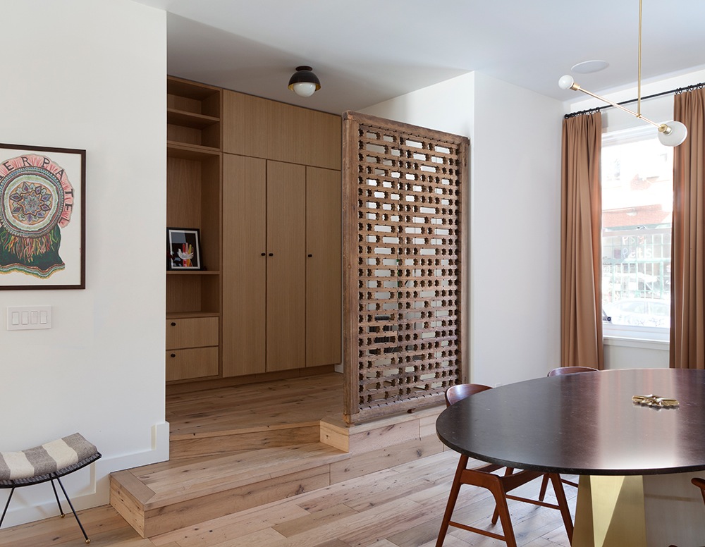
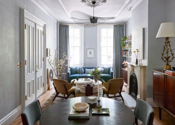
The entry vestibule, with built-in closets, is divided from the dining area by an antique wooden screen from India.
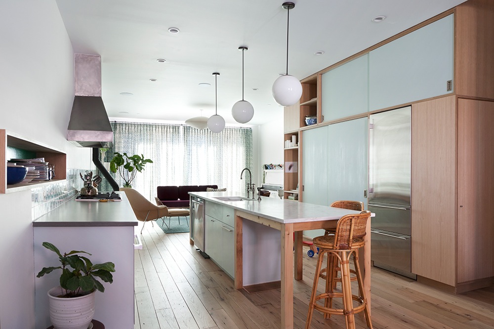
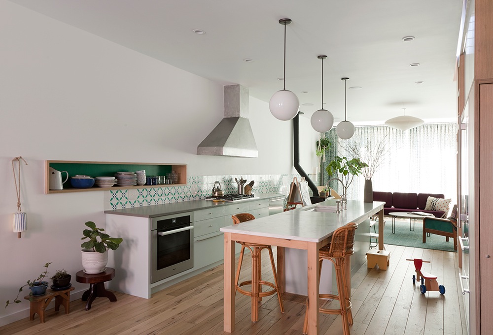
The open kitchen is simple, with a central island whose Calacatta marble top, from ABC Stone in Williamsburg, serves as a secondary dining surface.
The bank of appliances along the party wall is topped with a quartz countertop, with a backsplash made of custom Portuguese porcelain tile from Country Floors. The opposite wall contains the refrigerator and built-in custom storage reaching to the ceiling.
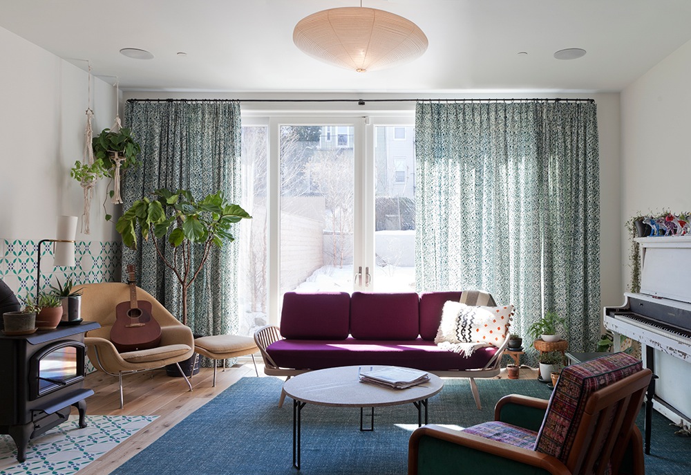
A floor-to-ceiling glass wall at the rear of the ground floor opens directly into the garden. All windows are from Loewen.
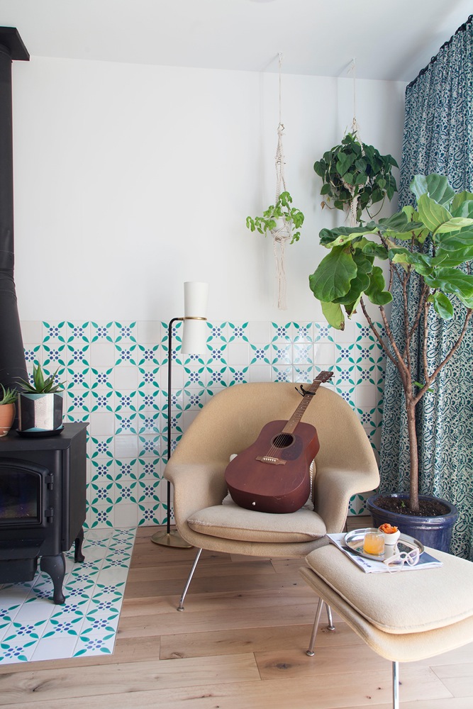
Custom patterned tile flows from the kitchen into the living room, where it clads the wall behind the wood-burning stove and folds down to the floor, becoming a hard stone.
The Eero Saarinen Womb chair and ottoman from Knoll are seminal designs of the 1950s.
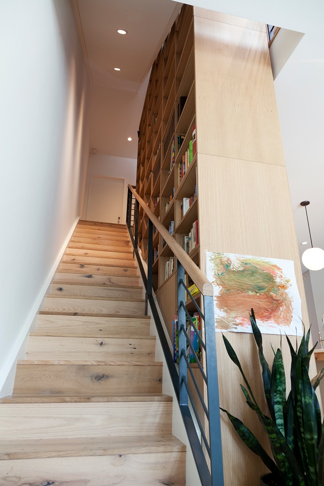
Bookshelves behind the kitchen storage wall flank the staircase to the second floor.
Flooring and stairs throughout the house are made of reclaimed oak from LV Wood. The design of the custom metal stair rail introduces “a bit of rhythm,” Ilizarov said.
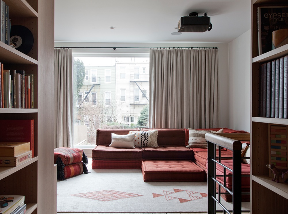
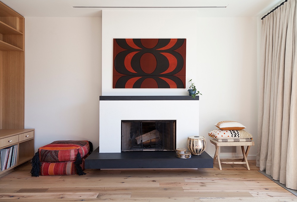
A projection TV mounted on the ceiling of the second floor family room is aimed toward a retractable screen over the fireplace, pictured in the top photo.
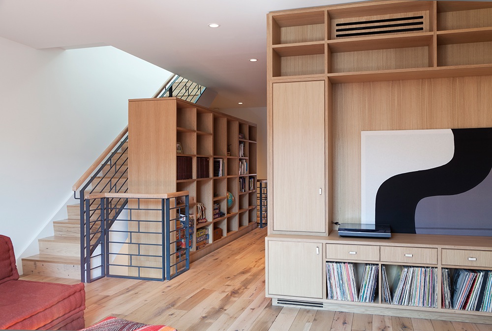
Built-in storage for records and books, plus closed cabinets and drawers, continue onto the second floor.
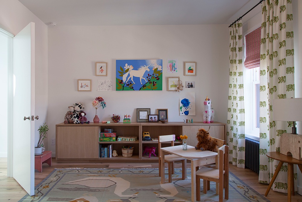
The homeowners’ daughter’s room is at the front of the top floor, with an en suite bath.
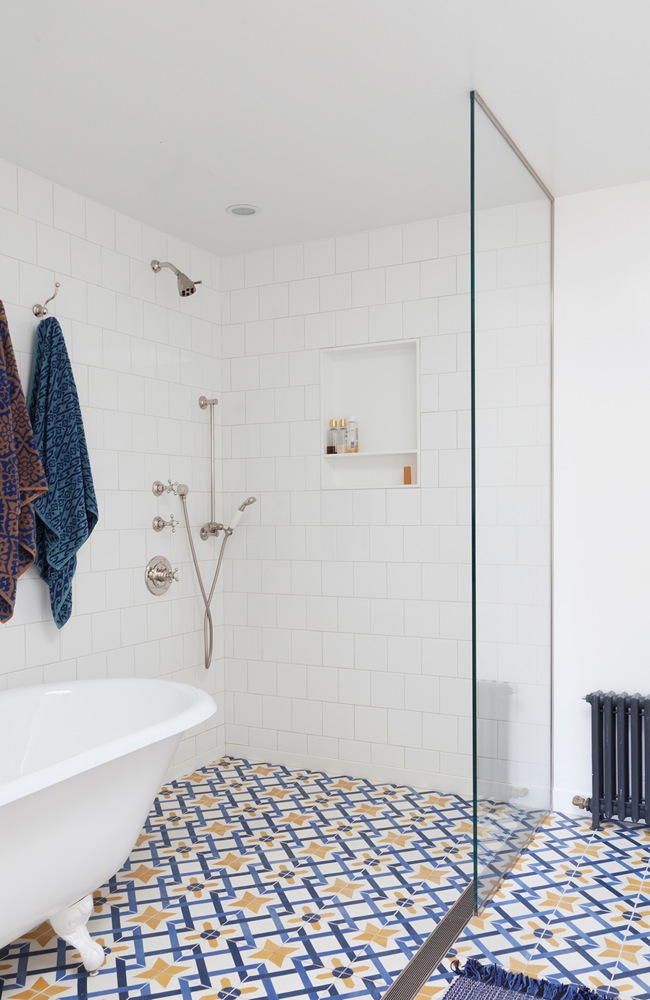
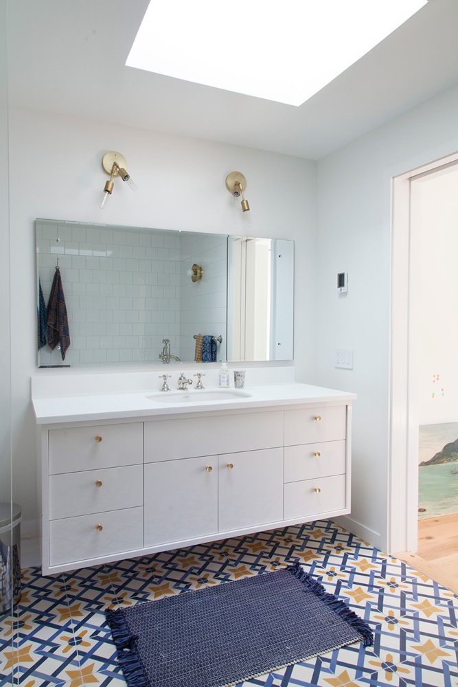
Encaustic concrete tile from Country Floors brings bold patterning to the master bath. Bathroom faucets are from Restoration Hardware.
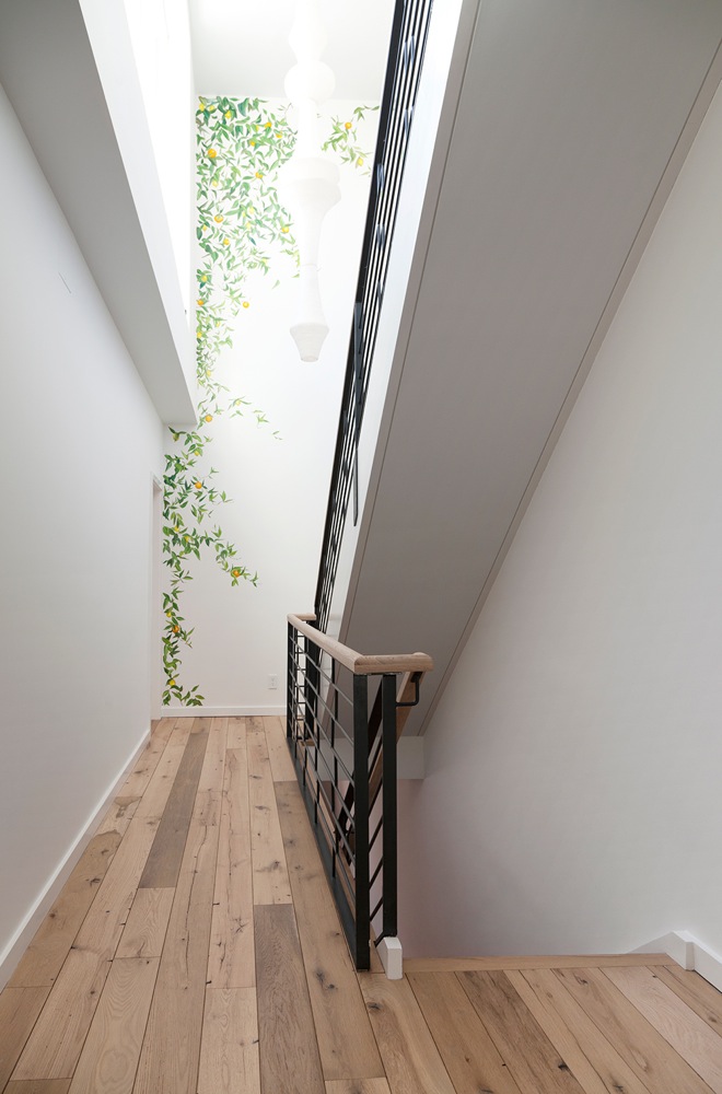
The top-floor hall is especially bright, with a bank of windows looking out to a roof garden. A citrus-orchard mural helps bring the outdoors in.
[Photos by Rachael Stollar]
The Insider is Brownstoner’s weekly in-depth look at a notable interior design/renovation project, by design journalist Cara Greenberg. The stories are original to Brownstoner; the photos may have been published before. Got a project to propose for The Insider? Please contact Cara at caramia447 at gmail dot com.
Related Stories
The Insider: ‘No Compromises’ Reno in Brooklyn Heights
Last and Biggest Strong Place Townhouse in Cobble Hill Hits Market for $7.5Million
The Insider: Rethinking a Carroll Gardens Brownstone from the Ground Up
Businesses Mentioned Above
Email tips@brownstoner.com with further comments, questions or tips. Follow Brownstoner on Twitter and Instagram, and like us on Facebook.
[sc:daily-email-signup ]









Have to agree, would have taken the tile to the ceiling. And love the tile–given those resources the biggest change I would have made to this design was to add more tile. Everywhere. And maybe have darker floors, but that’s personal preference.
Stair bookcase is a great and well-planned thing.
anyone recognize the dining light?
This from interior designer Whitney Parris-Lamb, PPW:
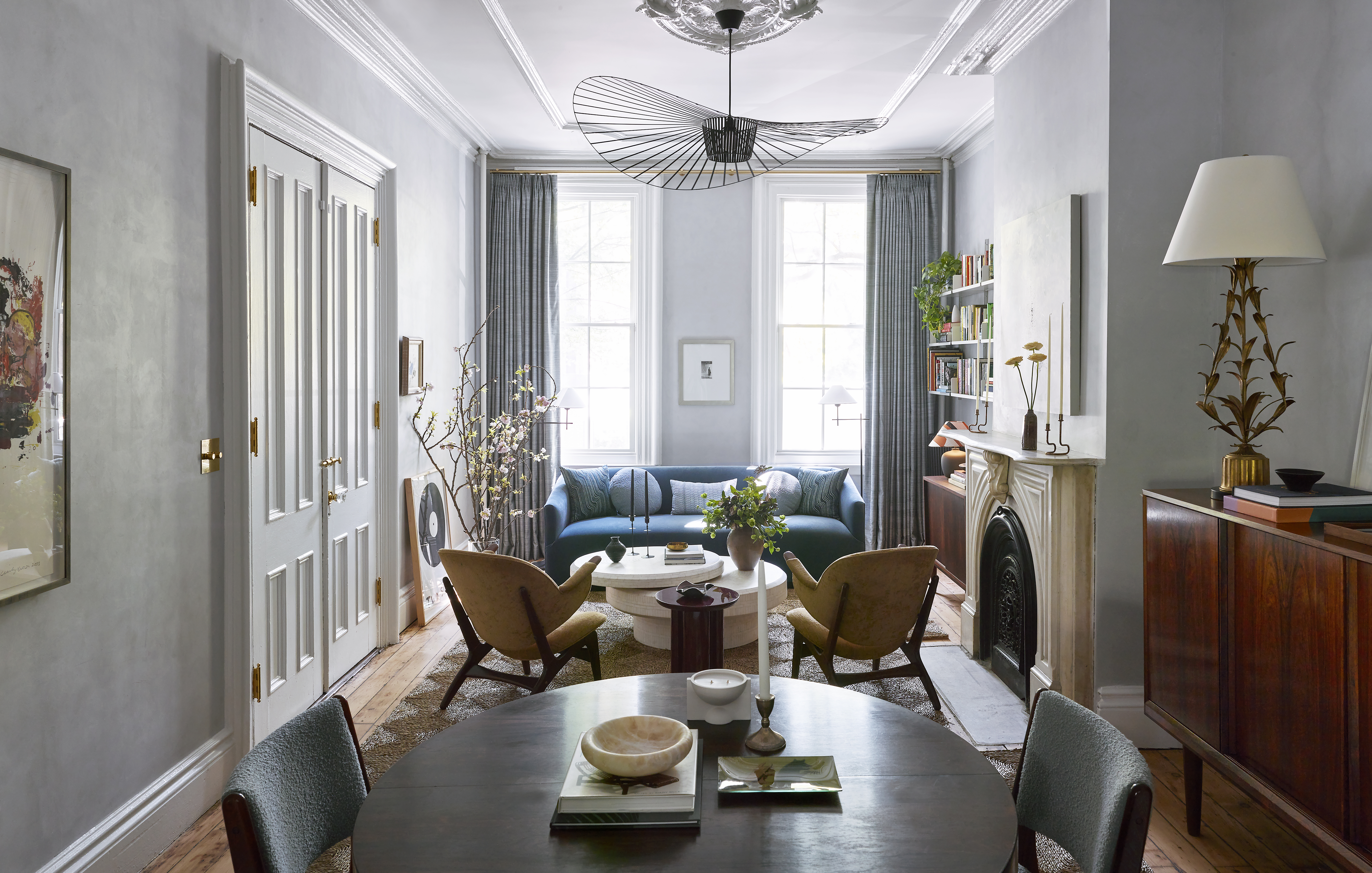
The pendant over the dining table is by Lambert et Fils – it’s called Antipode.
The flushmount in the dining area entry is by Allied Maker – it’s called the Flush Dome.
nicely done house.
one of my biggest pet peeves is diffusers; location and style . This is how it’s done right! linear or slotted and inconspicuous.
the nitpicker in me wants to complain about the projector. Why wasn’t it built into the wall or ceiling.
and while I like the kitchen wall tile, I don’t like that is stops 12″ +/- above the counter. Looks unfinished. I think it should have been taken to the ceiling. Make it a feature.
Wood burning stove in a new house – is it legal?
This from the project architect:
The building was filed as an Alt-1 for change of use (it was originally a three-family), and not as new building as we were intending to maintain the existing structure until we uncovered it’s poor state (some of the joists showed charring from a fire). We ended up rebuilding the full structure because of this. The wood-burning stove requirements came after this building was approved.
Thanks for the props, Karen:-) As for the retractable screen, it’s an Access Electric Projection Screen by Draper.
I wasn’t trying to nitpick. I just wanted to know if I could get a wood burning stove for my house!