The Insider: Smart, Strategic Crown Heights Townhouse Reno Keeps Budget Top of Mind
When a couple who had been living in a small modern condo carved out of an old building in Prospect Heights went shopping for a more spacious home for their family, they were open to a modern vibe and wanted rental income.

Photo by Ty Cole
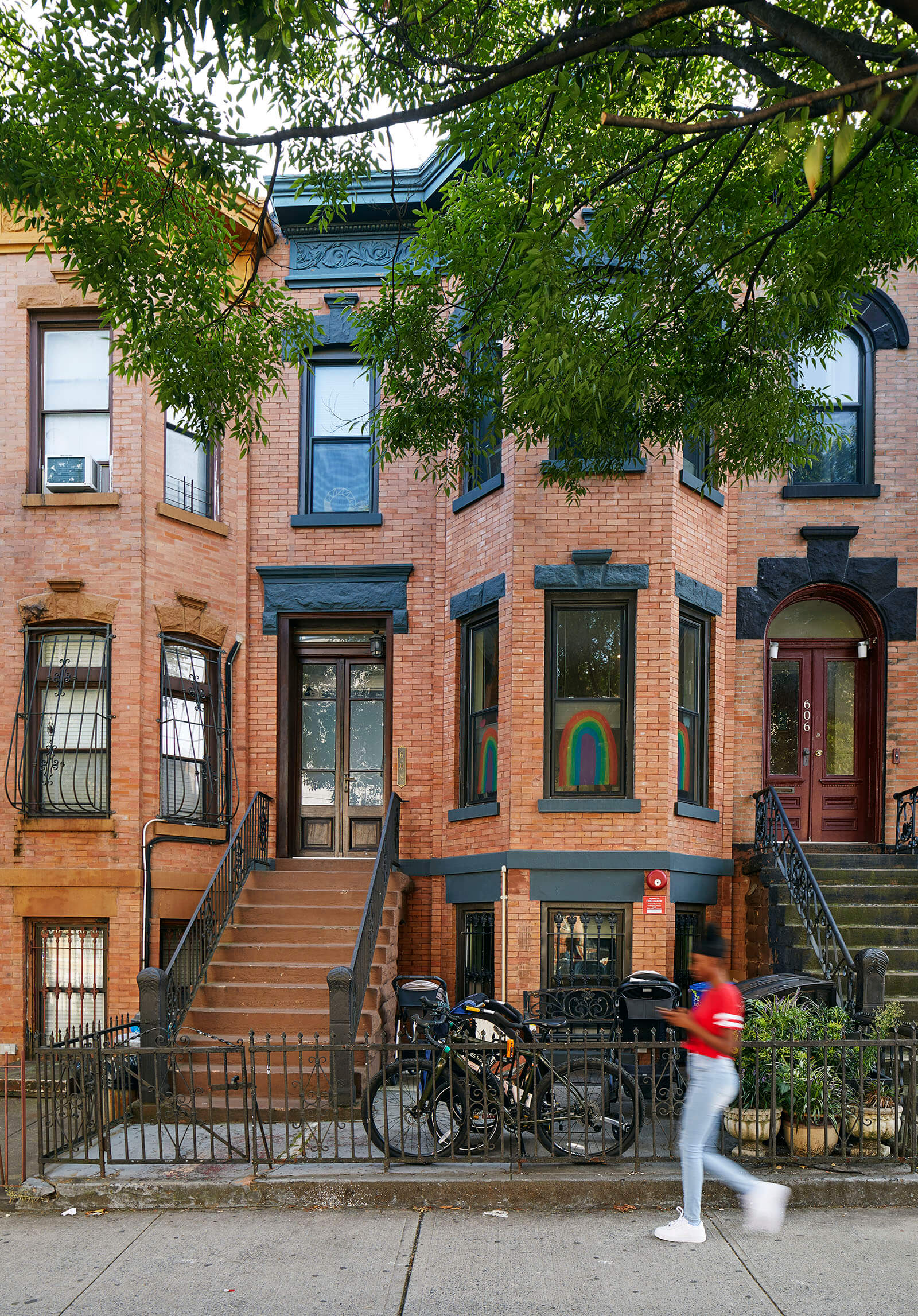
When a couple who had been living in a small modern condo carved out of an old building in Prospect Heights went shopping for a more spacious home for their family, which includes two school-age children, “They were open to the same kind of vibe” as existed in their prior space, said Long Island City-based architect Sarah Jacoby. “They did not want a lot of complicated original detail that needed to be restored.”
They did want rental income, however. In Crown Heights, one neighborhood over, they found a three-story brick row house with a front bay and attractive original cornice. It was in “OK shape, pretty decent structurally,” said Jacoby, who masterminded the overhaul. “We did a solid, clean, but not insane renovation,” saving money where possible by carefully prioritizing wants and needs, and spending judiciously on fixtures and materials.
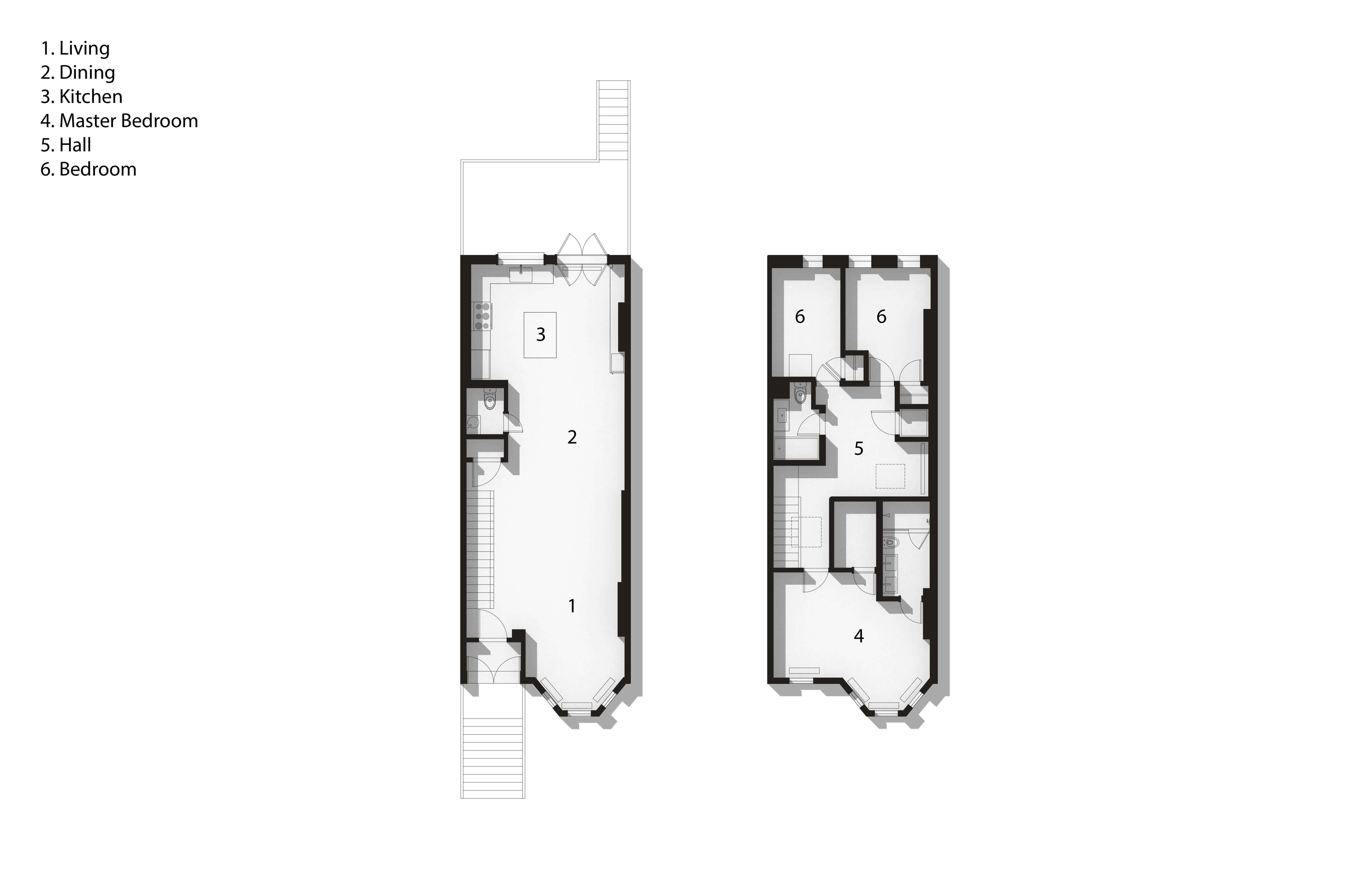
The house had long been used as three floor-through apartments. Transforming the layout to create an owner duplex with a garden rental took some doing, though short of a gut. The clients moved in upon closing and lived in the downstairs rental unit (which remained as it was), while renovation proceeded upstairs for the better part of a year.
“We took down many walls on the parlor floor and reconfigured the front of the second floor, opening up that stair hall,” the architect said. The parlor level is now wide open, with a loft-like feel, but they resisted the popular urge to blow out the entire back wall. Instead, they inserted a large new window and double door, avoiding the need for a massive steel lintel and allowing for a sink overlooking the garden.
To economize in the kitchen, “We used finishes that weren’t crazy, inexpensive tile, a regular fridge — smart decisions that worked well.” But they splashed out on a few things that were important to them, like a wine cooler tucked into a long bank of new closets along one of the kitchen walls.
Upstairs, the two rear bedrooms and an existing bath, used by the couple’s children, weren’t touched at all. “We used paint to make the kids’ rooms feel special,” Jacoby said.
In the front half of the top floor, Jacoby constructed a new primary suite, with plenty of closet space and a new full bath — a ‘must’ for her clients — taking advantage of existing plumbing where a former kitchen had been.
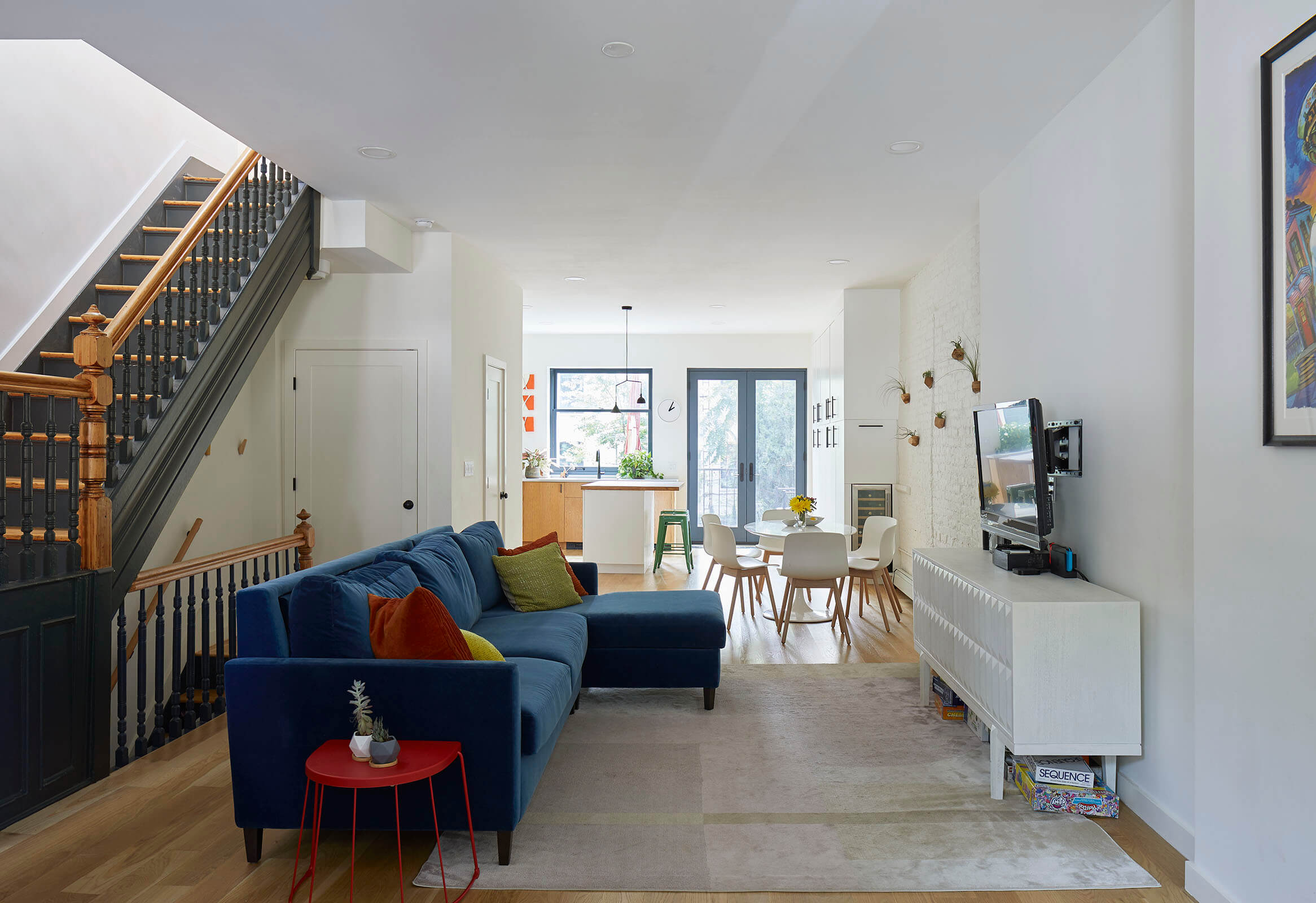
New hardwood flooring was limited to the parlor level. The homeowners bought themselves all new furnishings in a simple modern vein.
A big bank of closets at the rear of the parlor floor serves both for outerwear and as pantry storage.
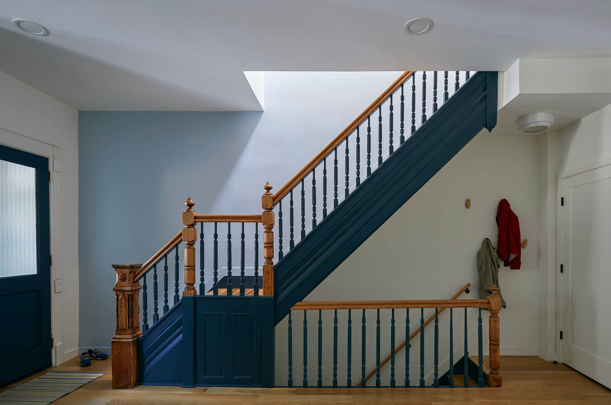
A fine staircase, the interior’s only remaining original element, was thankfully in sound shape. They left handrails and newels unpainted, and highlighted the sides and spindles with Benjamin Moore’s Blue Note.
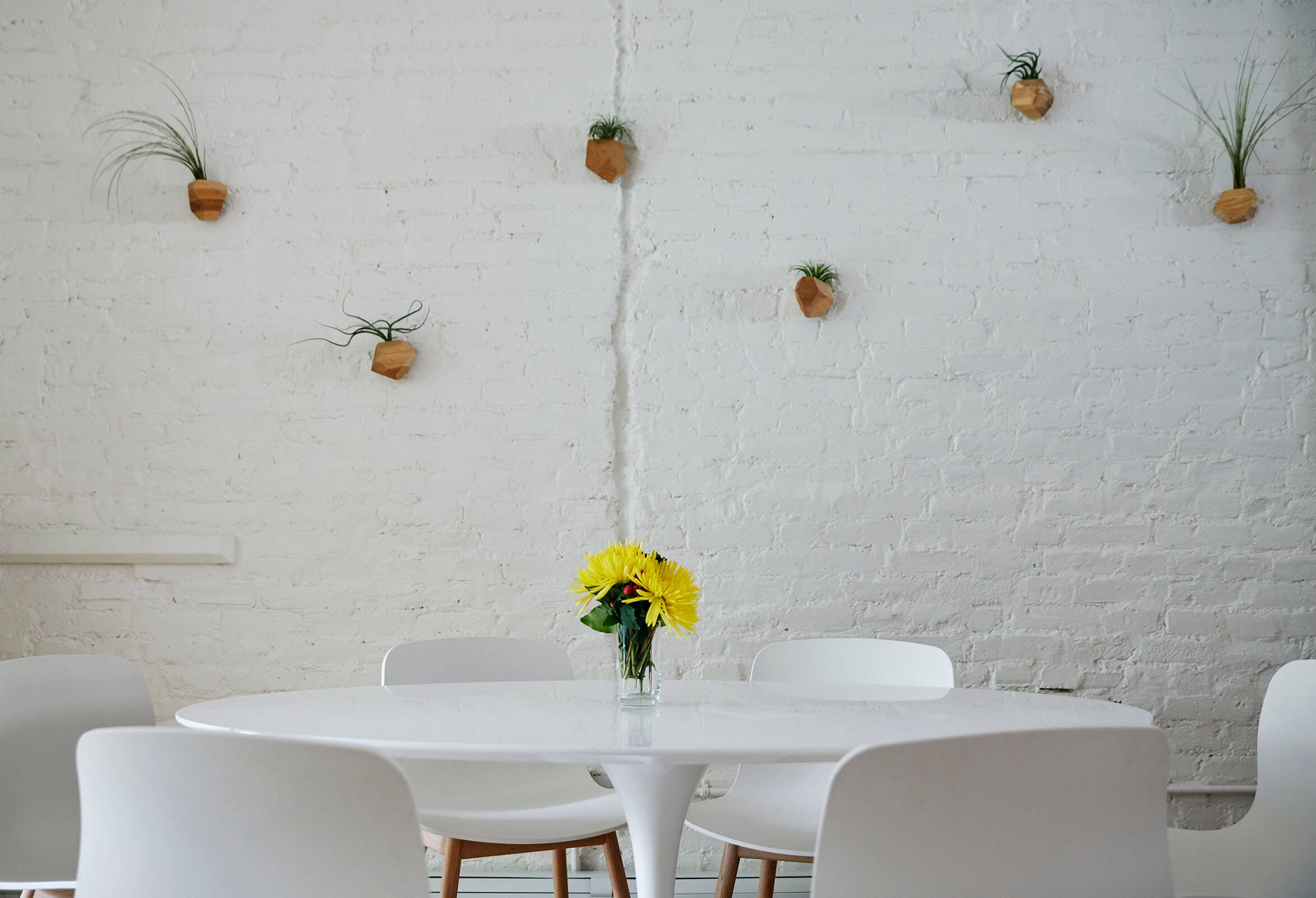
A section of wall in the dining area was left as exposed brick, for textural interest and “to remind us we’re in New York City,” Jacoby said.
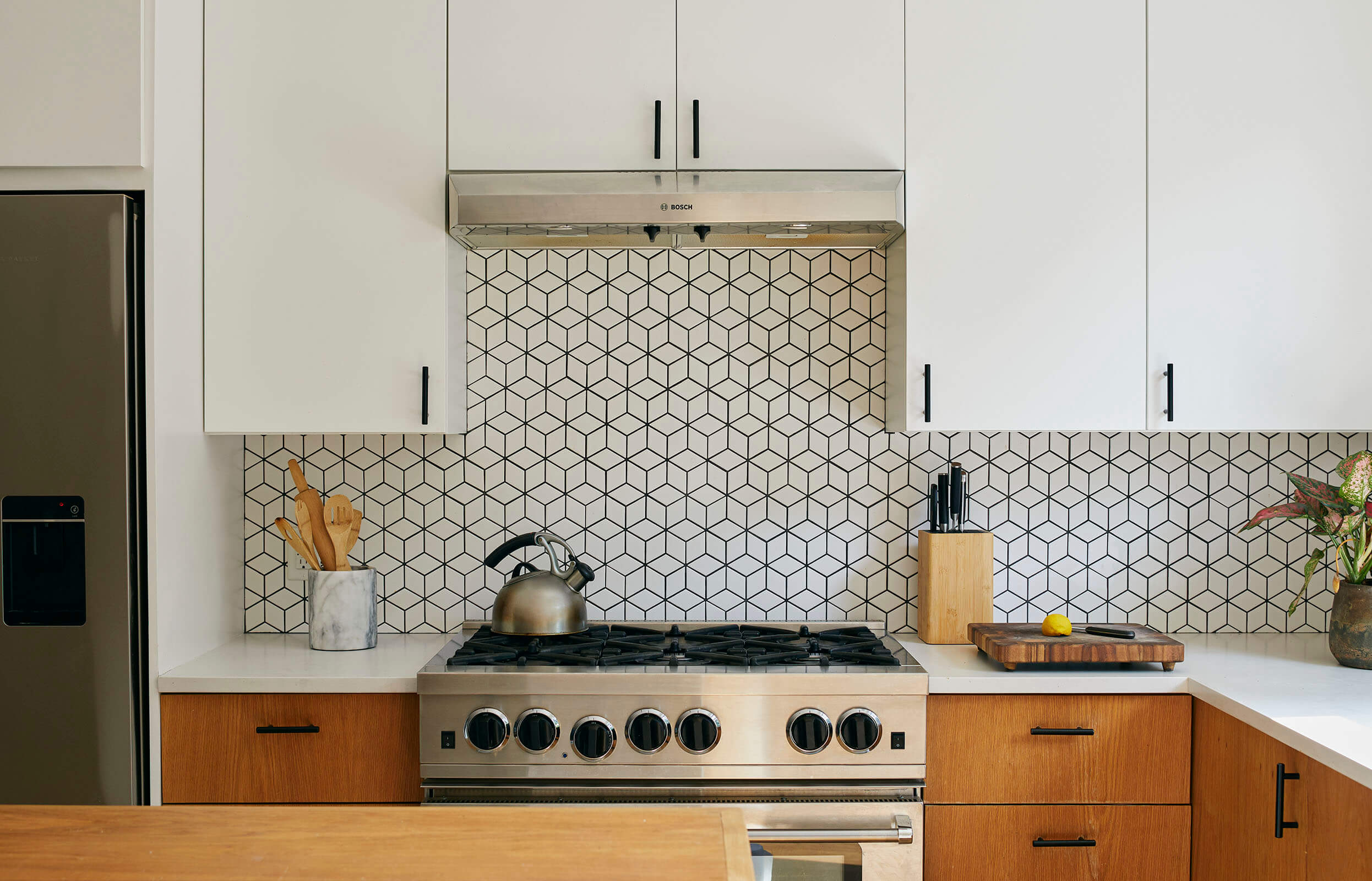
The general contractor built basic custom cabinets in the kitchen — wood veneer below, painted white above. The geometric tile with black grout, used for the backsplash, “was not expensive but has pizzazz,” Jacoby said.
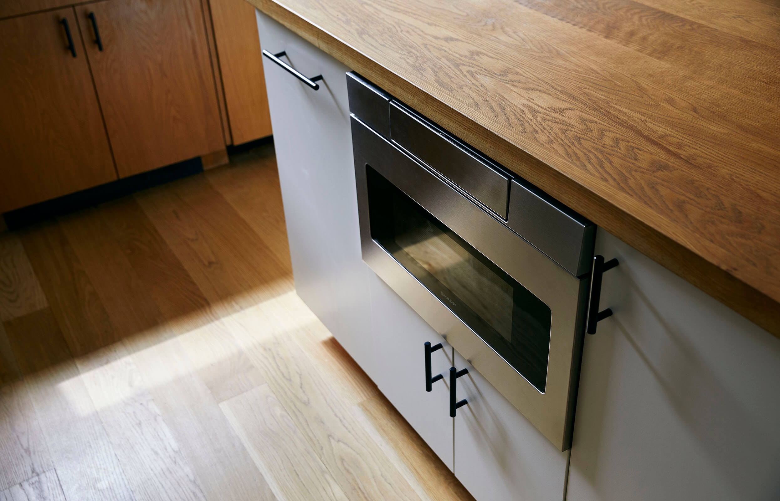
An under-counter microwave drawer in the center island is easily reached by the homeowners’ children.
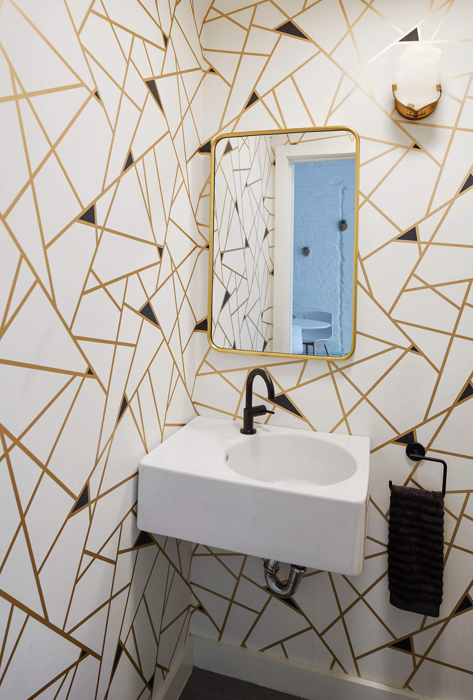
The homeowners found this snazzy wallpaper for the downstairs powder room early on in the renovation process and remained committed to it. The asymmetrical sink is from Duravit.
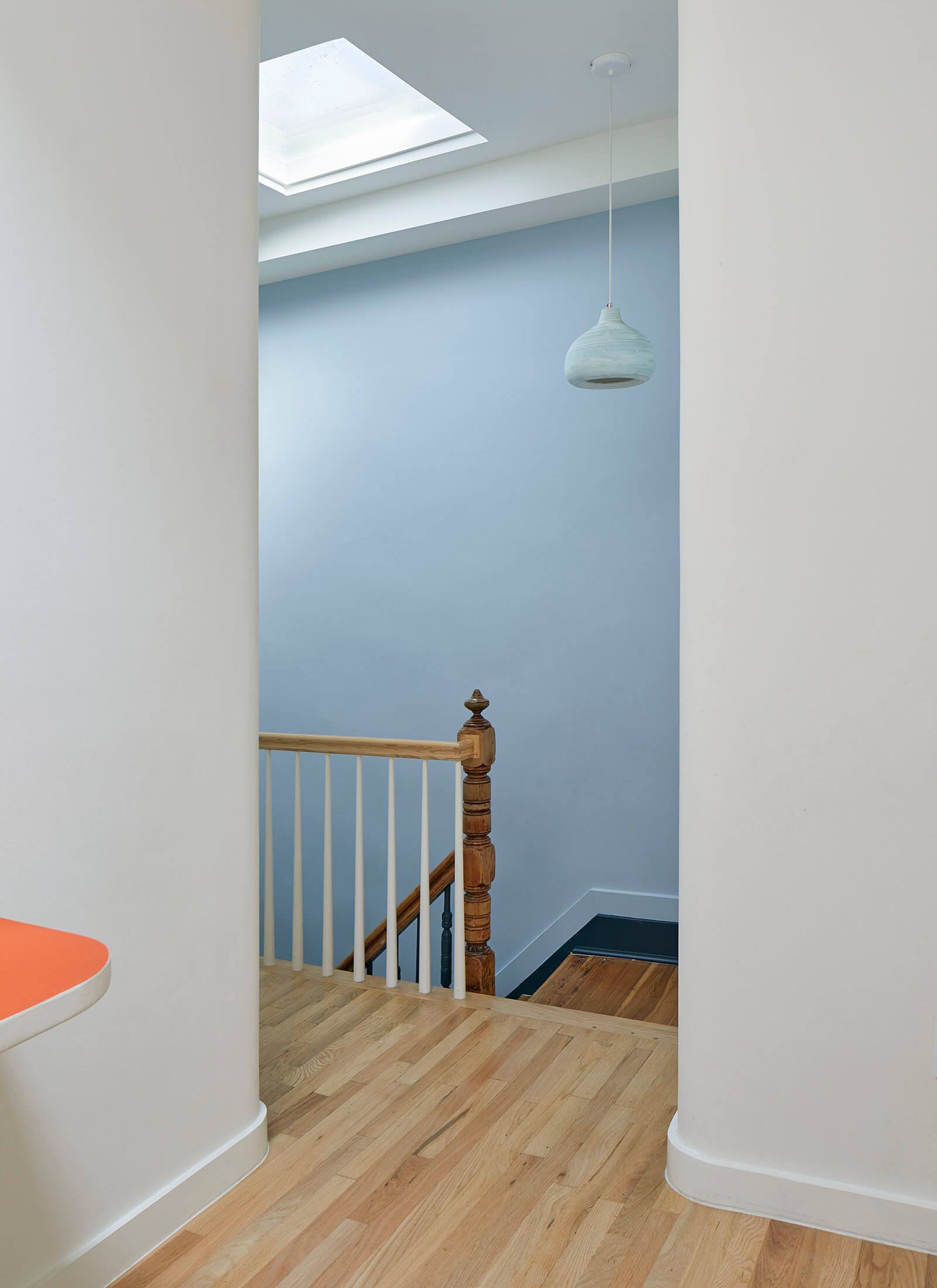
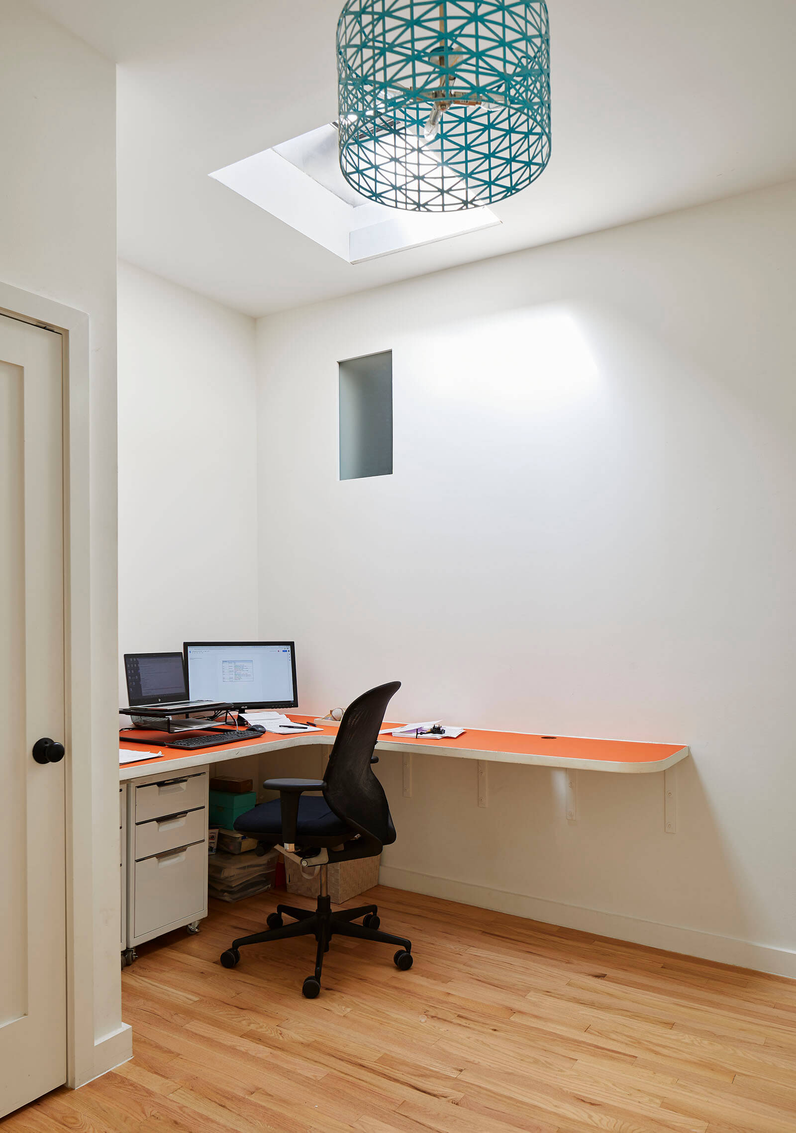
Jacoby created a skylit multi-purpose area adjacent to the top-floor landing. Used during the pandemic as a home office, it is destined to become play space.
The small opening in the wall admits light to the new master bath.
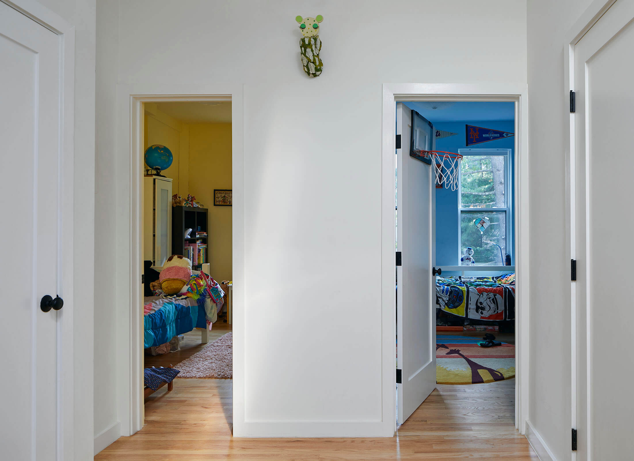
The children of the household each have distinctively painted rooms, one yellow, one blue.
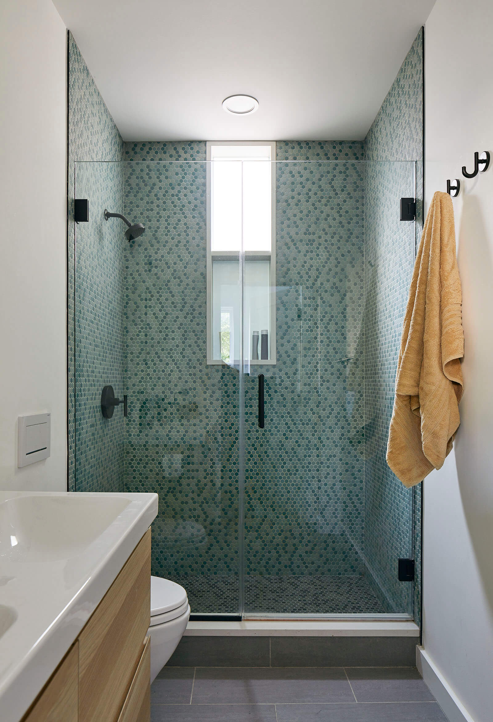
The new top floor bathroom is illuminated by an interior window in the stall shower.
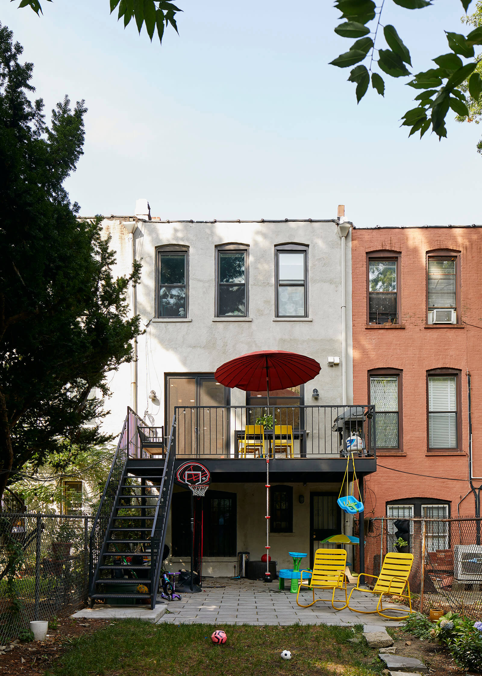
A new steel deck of straightforward design leads down to the garden.
[Photos by Ty Cole]
The Insider is Brownstoner’s weekly in-depth look at a notable interior design/renovation project, by design journalist Cara Greenberg. Find it here every Thursday morning.
Got a project to propose for The Insider? Email Cara Greenberg at caramia447 [at] gmail [dot] com.
Related Stories
- The Insider: Brownstoner’s in-Depth Look at Notable Interior Design and Renovation Projects
- The Insider: New Kitchen with Retro Vibe Enlivens Park Slope Condo for Family on a Budget
- The Insider: Budget-Conscious Couple Turn Flatbush Row House into Bright Family Home





What's Your Take? Leave a Comment