The Insider: Derelict Crown Heights Row House Gains Four Spacious, Gracious Rental Units
A young couple and their architect transformed a dilapidated Crown Heights townhouse into four rentals that graciously blend the old and new.

A young couple, serious about their entrée into the world of investment property, bought a four-story, four-family row house in dire condition and hired Lower East Side-based MNDPC Architecture to renovate it. Their goal: to create four attractive rental units, each just under 900 square feet, that could hold their own against the new developments springing up all over the borough.
The 22-foot-wide house needed a full-on gut reno. There was a structural issue requiring a new steel beam in the basement, and it was crying out for new mechanicals and all new windows, too.
In an unusual move, the homeowners decided to convert the existing two-bedroom apartments to one-bedrooms. “It’s counterpoint to a lot of rental strategies, but getting top dollar wasn’t as much a concern as offering a more luxurious residence with generous spatial quality,” said Jonathan Garnett, one of three partners at MNDPC.
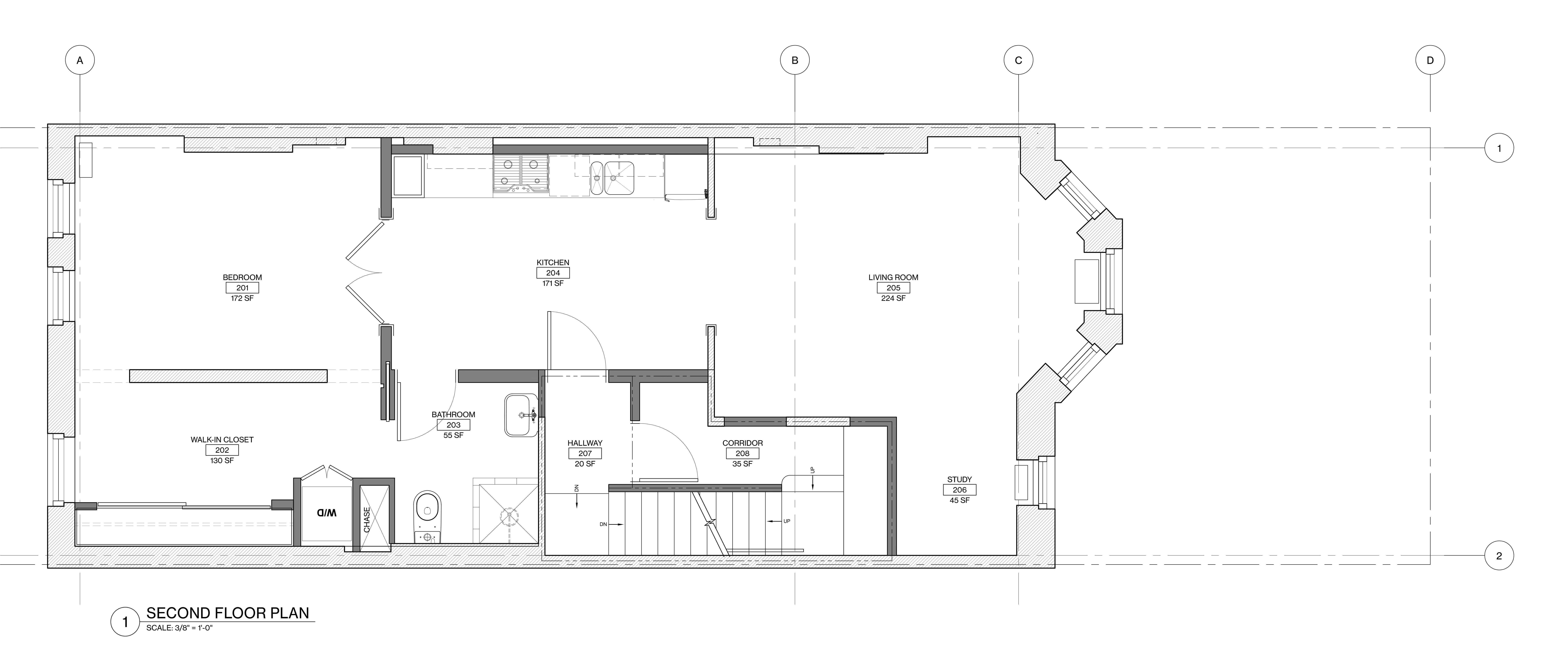
Instead of two small bedrooms, they would offer a larger, more gracious one bedroom, with an en suite windowed area next to it that could be used for a nursery, home office or dressing room.
As of this writing, the parlor floor and the floor above it have been completed, with the top floor and garden level renovations still under way. The homeowners have been living in the second-floor apartment, pictured in this post — “test-driving it,” the architect said, for eventual renters.
In designing all four apartments, MNDPC followed the same basic layout: living area at the front, kitchen in the middle, bedroom at the back of the building.
“We wanted the open, flow-through feeling of a modern home, but we were also interested in returning some classic formality to it,” said Garnett. French doors between the kitchen and the bedroom is one way they “struck a balance” between modern and “making it seem like it was always there.”
The architects and their clients didn’t jettison everything in the gut reno, however. They retained every possible piece of original wood trim and matched the rest, and kept the original narrow-plank flooring. They even replaced the old cast iron radiators, which were in bad shape, with new cast iron radiators. “Our goal was to make it feel like you are living in an older building,” the architect said.
Toward this end, also, they strove for the higher ceilings of vintage buildings, gaining about nine inches by removing the dropped acoustical tile ceiling, and making the wide openings between the rooms a stately 8 feet tall (standard is 6 feet, 8 inches).
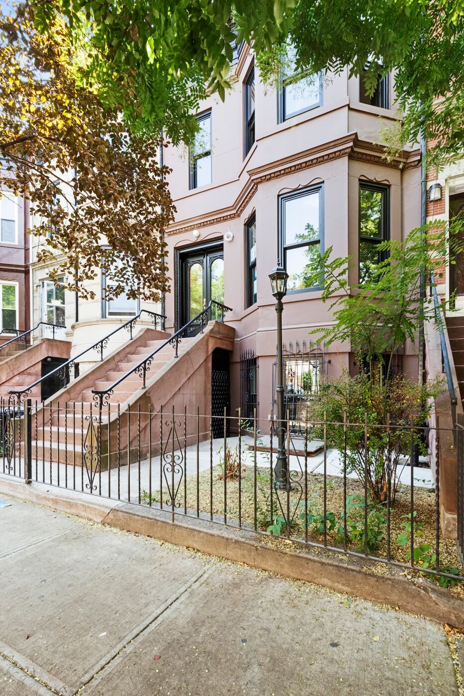
A 1970s door and awning were removed and replaced with historically accurate mahogany double doors. Black window trim contrasts smartly with Velvet Plum paint from Benjamin Moore on the exterior.
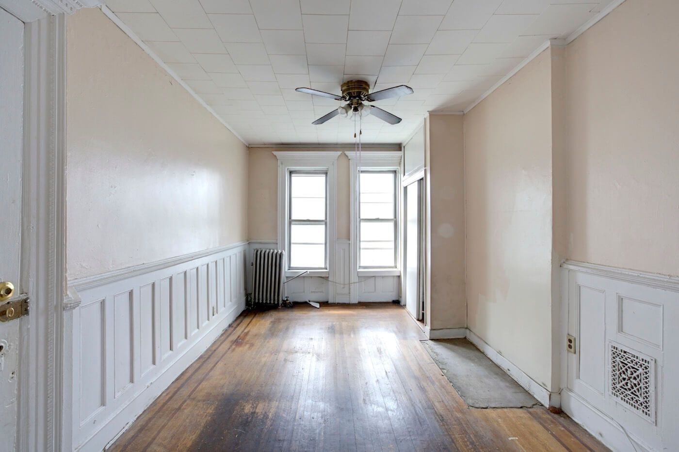
Salvageable from the second-floor living space (seen in the “before” photo above) were window moldings and original wood floors. The dropped ceiling was removed, yielding another 9 inches of ceiling height, and the room widened by removal of the closet at right.
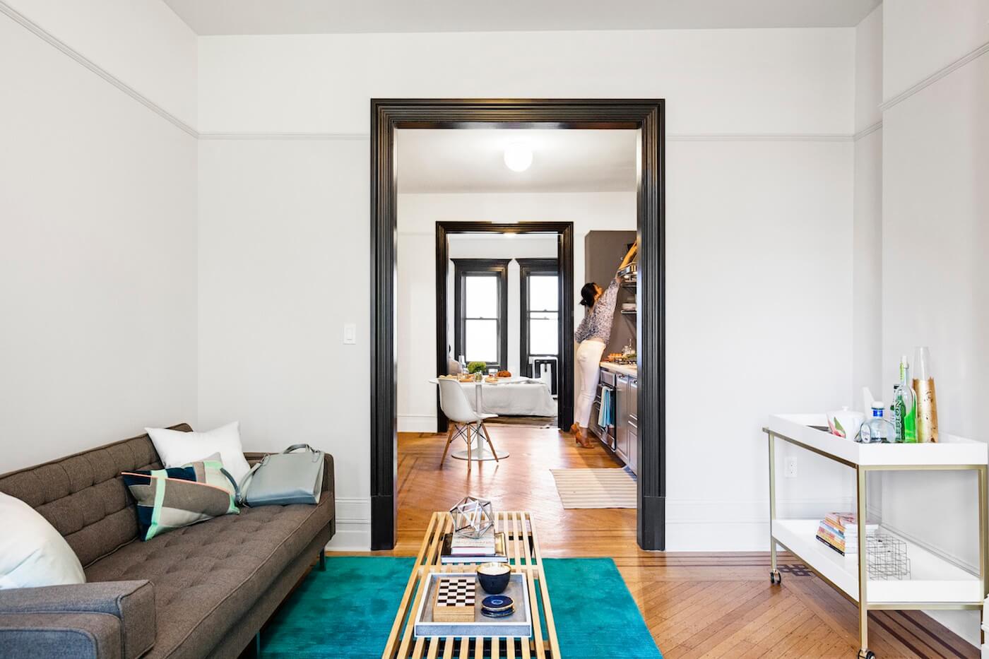
“I had seen a few apartments in Milan where there was an enfilade progression from room to room, with rooms connected by openings,” Garnett said. “One of our goals was to make the kitchen a room that just happened to have cabinetry, that could be another room for socializing, so we left the floor continuous.”
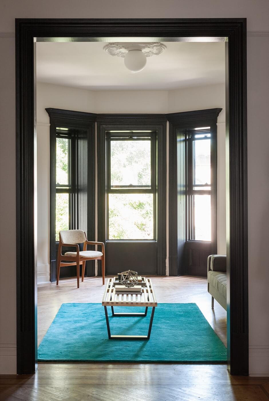
The new door openings and original window surrounds were picked out with off-black paint, a bold move for rental units. “We wanted to make the molding more visible,” said Garnett, “and dark around the windows frames the view.”
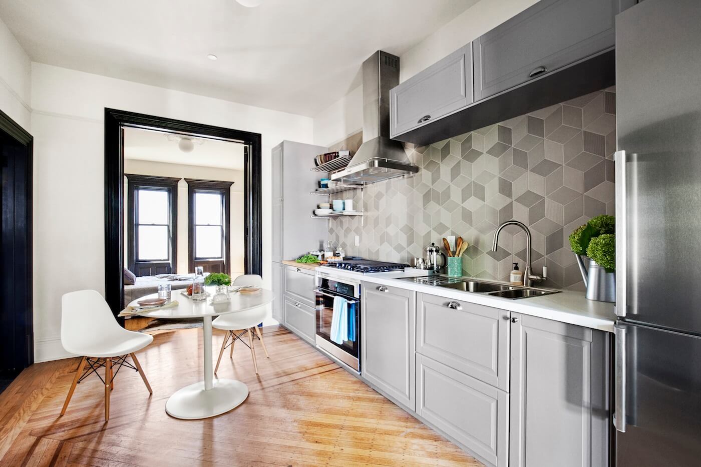
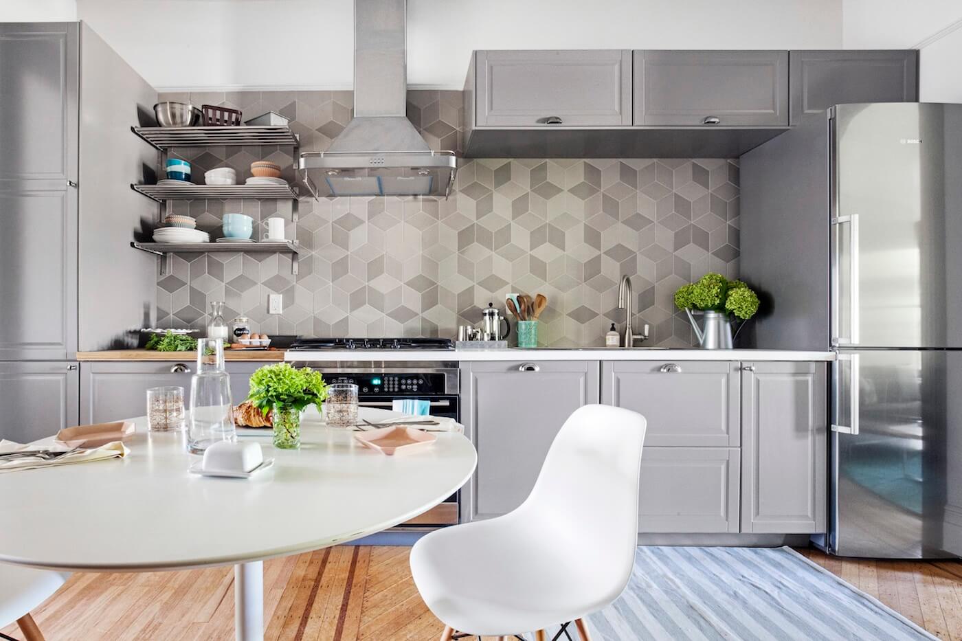
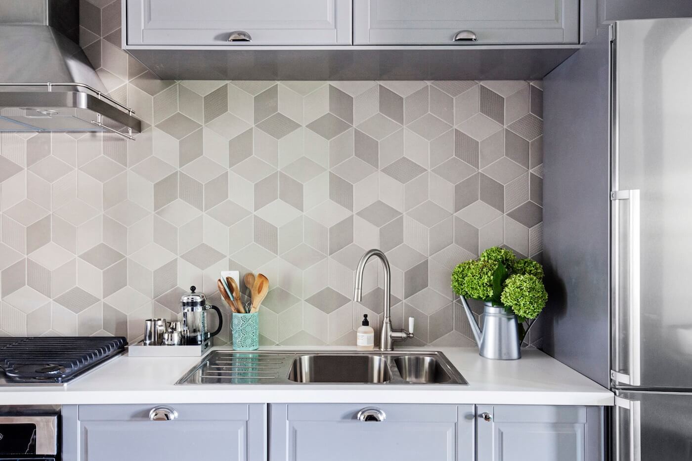
Standard IKEA cabinetry, painted a neutral gray, was paired with a special backsplash treatment, using tile from Mutina Tex. The appliances are from IKEA as well, except for the counter-depth Bosch fridge.
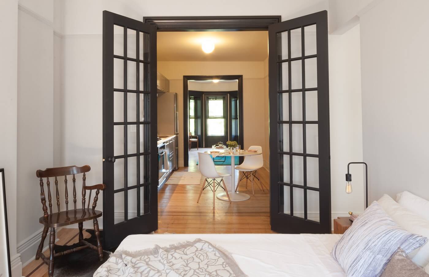
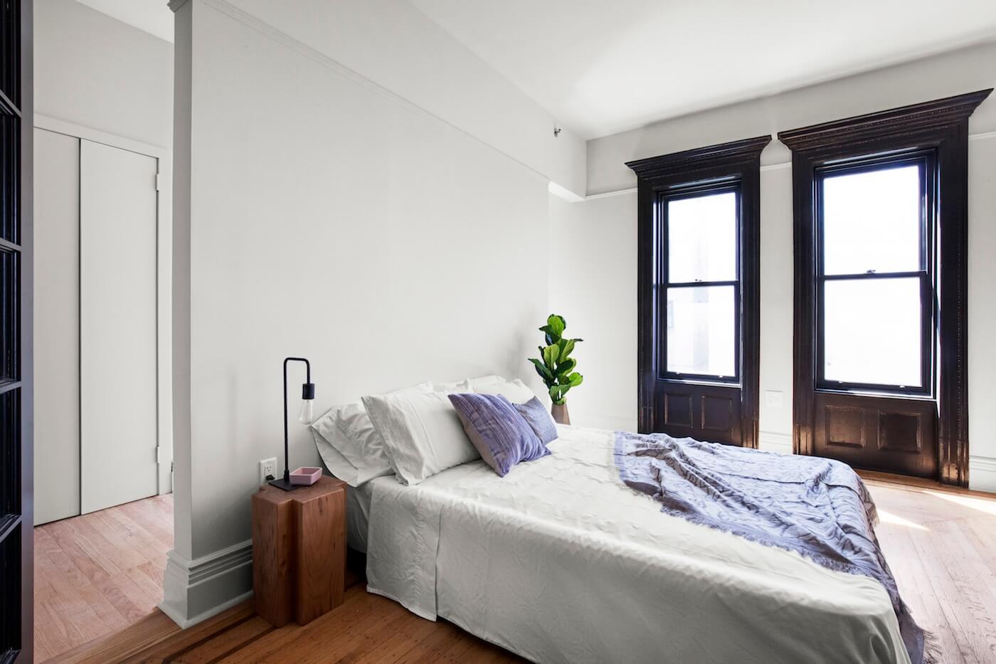

The bedroom is plenty large enough for a king-size bed. Openings on either side of the bed lead to the adjacent flexible space.
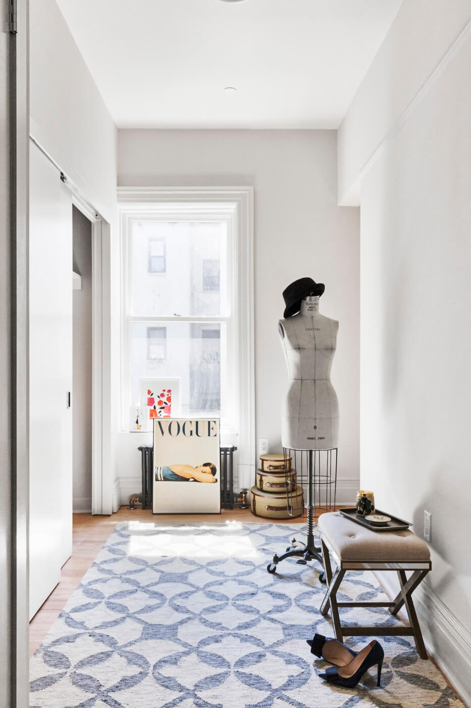
At the rear of the apartment, the area that once was a kitchen is now a dressing room, with a 14-foot-long closet and a full-sized LG washer/dryer.
“We wanted to address the age-old issue of living in New York, which is never having enough storage,” the architect said. “Having plenty of storage makes life organized, easy and generous.”
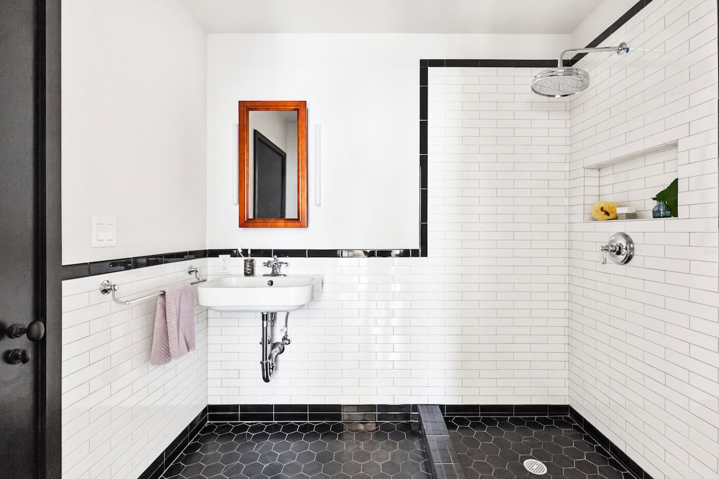
The new black-and-white bathroom has a vintage feel. Wall tiles are an elongated variation of traditional subway tiles. Matte-finish Seta Nera hexagon tiles were used underfoot. The wall-mounted sink is from Duravit, with a faucet and a shower head from Kohler.
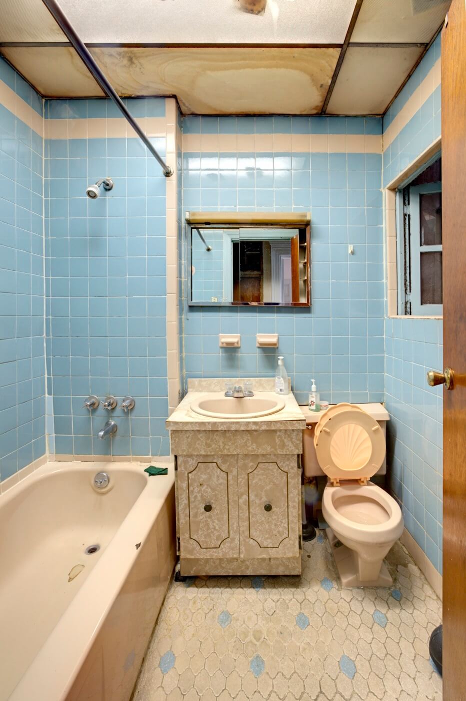
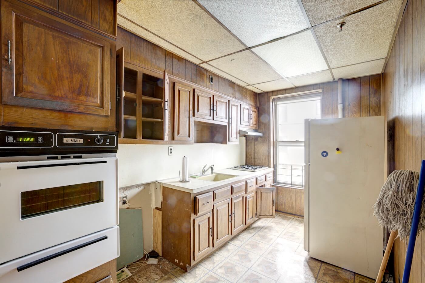
For contrast, check out the dated, depressing and derelict bathroom and kitchen in the “before” shot, below.
[Photos courtesy of Sweeten, unless otherwise noted]
The Insider is Brownstoner’s in-depth look at a notable interior design/renovation project, by design journalist Cara Greenberg. Find it here Thursday mornings.
Got a project to propose for The Insider? Contact Cara at caramia447 [at] gmail [dot] com
Top Brownstoner Stories
- The Insider: Crown Heights Reno Brings Light into New Top-Floor Kitchen
- The Insider: New-in-Town Designer Does Up Own Bushwick Pad Around Dramatic Wall of Windows
- The Insider: Modest Fort Greene Reno Becomes a Total Gut, with Happy Results
Email tips@brownstoner.com with further comments, questions or tips. Follow Brownstoner on Twitter and Instagram, and like us on Facebook.











What's Your Take? Leave a Comment