The Insider: Fort Greene Condo Upgrades Stand Out for High-End Materials, Polished Design
A dark, dated condo kitchen becomes something bright, sleek and sophisticated for a family relocating from London to Brooklyn.

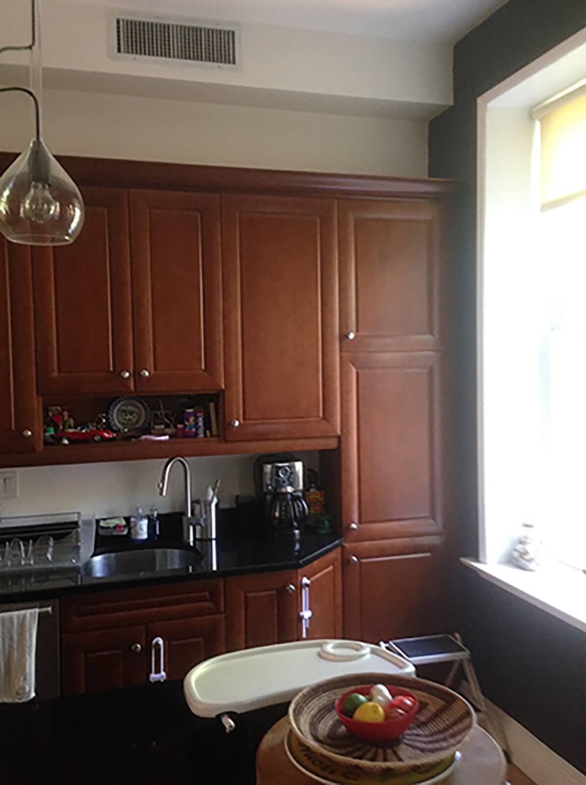
When Anshu Bangia’s clients relocated to New York from London, the last thing they wanted was an oppressively dark kitchen in the townhouse apartment they had just purchased.
All detail had been stripped from the upper triplex when the five-story townhouse was converted to two condominium units around 2002 and “very generically renovated for sale,” said Bangia, a founding partner of Carroll Gardens-based Bangia Agostinho Architecture.
The existing cabinetry, as well as the awkward layout of the unit’s lower level, “made the whole space feel heavy and dark,” Bangia said. A powder room situated in the middle of the floor, between the kitchen at the front of the building and the living room at the rear, “blocked light, and there was no feeling of visual connection” between the two areas.
The architects focused their efforts on reconfiguring and entirely re-designing the kitchen to achieve a bright, open space, devoid of upper cabinets that would make it feel enclosed. They devoted resources to custom cabinetry “detailed like furniture,” Bangia said, to co-exist gracefully with the adjacent dining room in the middle of the space and the living room beyond.
The powder room was relocated, with its volume now tucked discreetly into a wall of pantry storage.
As part of the job, Bangia Agostinho reimagined the master bath on the unit’s top floor (bedrooms for the homeowners’ two children are located on the floor in between), specifying custom cabinetry that ties in with the polished new kitchen two floors below.
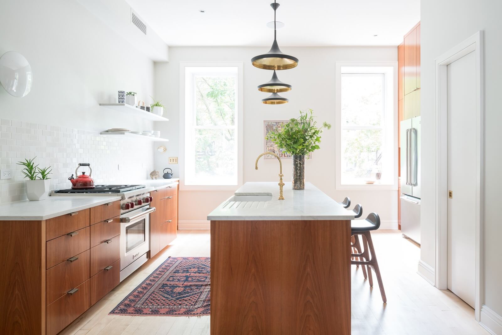
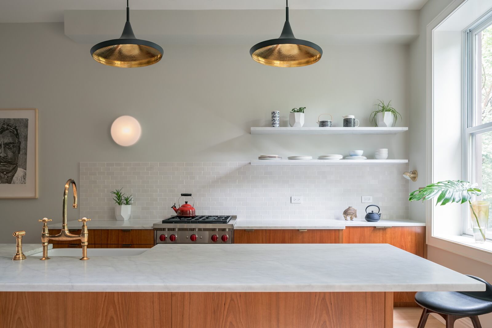
Sequenced cherry veneer (a set of veneer sheets produced in order from the same log) elevates the custom cabinetwork to the level of fine furniture.
There are no upper cabinets, just a pair of floating stone shelves above the Carrara marble countertop.
Existing maple floors were repaired and refinished. Baseboards and window trim are new.
Carefully considered accessories include a Rohl faucet in unlacquered brass, pendant lights by Tom Dixon and leather and wood counter stools by Danish mid-century designer Erik Buch.
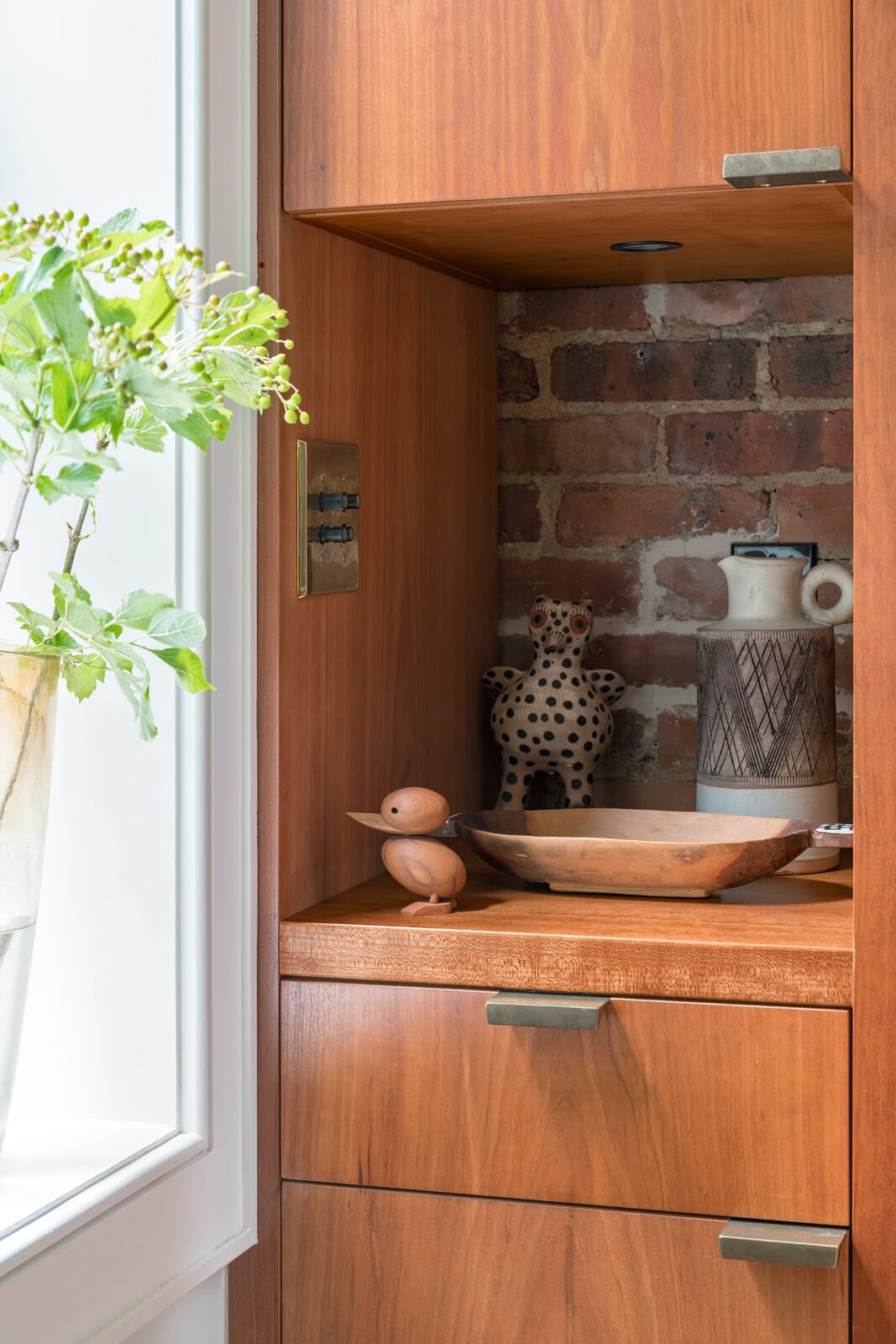
Bronze hardware from Rocky Mountain Hardware lends a handcrafted element to the materials palette.
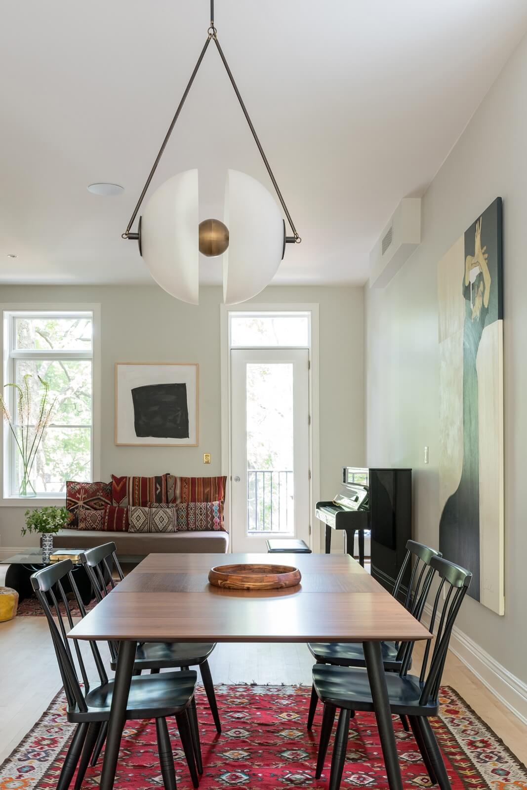
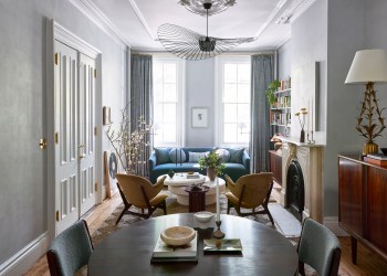
The dining area, located alongside the building’s main stairwell, connects the kitchen at the front with the living room at the rear. The door leads to a small Juliet balcony.
The striking light fixture over the table is the Synapse by Apparatus.
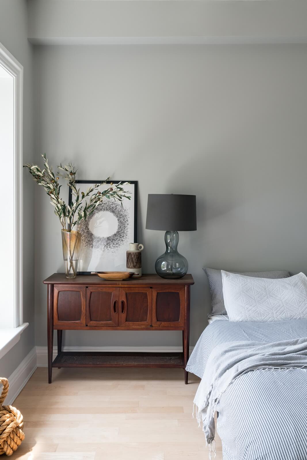
Furnishings belong to the homeowners.
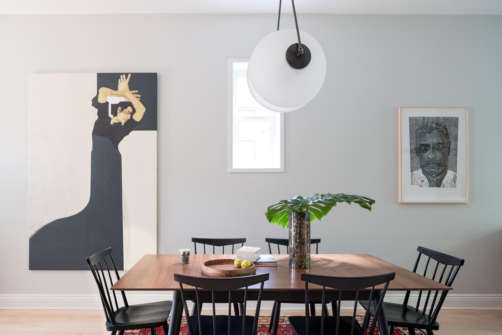
A small window on the side of the building shows up in the dining area.
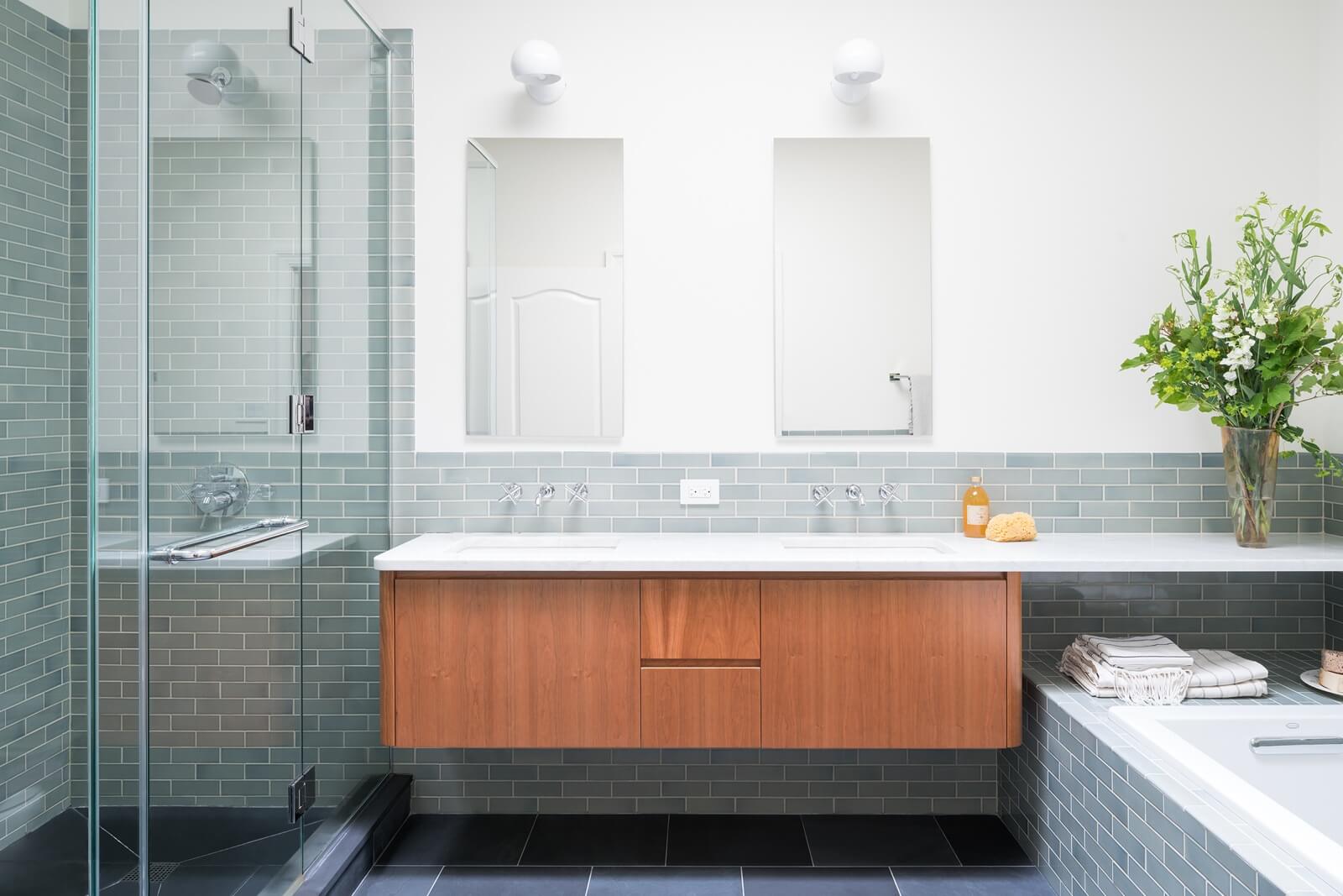
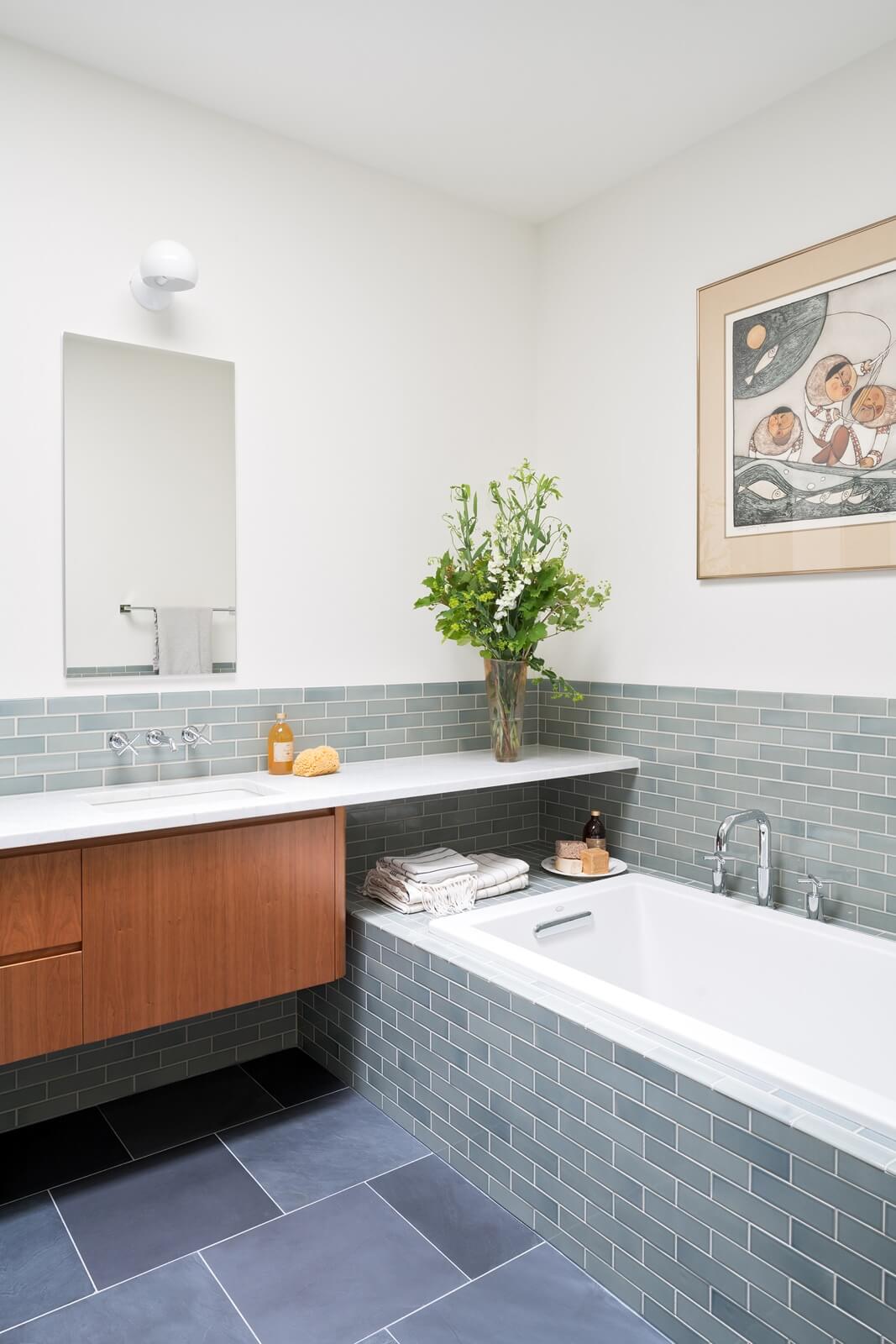
The footprint of the soft blue master bath, formerly a “standard contractor remodel with beige tiles,” Bangia said, remained the same. Even plumbing lines stayed mostly in place.
A big skylight, a customized cherry vanity from Lacava, ceramic tiles from Heath and slate flooring add up to a serene and spa-like bathroom.
Below, for contrast, the kitchen ‘Before’:
[Photos by Adam Friedberg]
The Insider is Brownstoner’s weekly in-depth look at a notable interior design/renovation project, by design journalist Cara Greenberg. Find it here every Thursday morning.
Got a project to propose for The Insider? Contact Cara at caramia447 [at] gmail [dot] com
Check out ‘The Insider’ mini-site: brownstoner.com/the-insider
Related Stories
- The Insider: Brownstoner’s in-Depth Look at Notable Interior Design and Renovation Projects
- The Insider: Cohesive Design, Upscale Materials Distinguish Renovated Carroll Gardens Home
- The Insider: Restored Woodwork and Modern Upgrades Create Chic Prospect Heights Home




What's Your Take? Leave a Comment