House of the Day: 442 Hancock Street
A flip two years ago, this house at 442 Hancock Street caught our attention for its unusual renovation with a double height living room with balcony and half exposed brick, half paneled walls. It sold for $1,020,000 — way over what we expected. Now the buyers have put it back on the market with new photos and new staging. The…
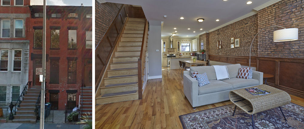

A flip two years ago, this house at 442 Hancock Street caught our attention for its unusual renovation with a double height living room with balcony and half exposed brick, half paneled walls. It sold for $1,020,000 — way over what we expected. Now the buyers have put it back on the market with new photos and new staging. The new price is $1,700,000. Think they’ll get it?
442 Hancock Street [Brown Harris Stevens] GMAP
442 Hancock Street Coverage [Brownstoner]

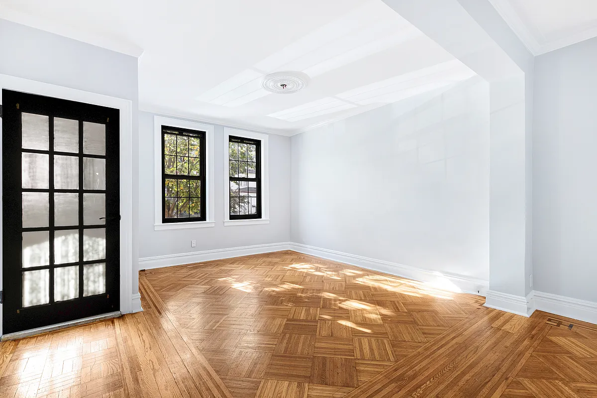
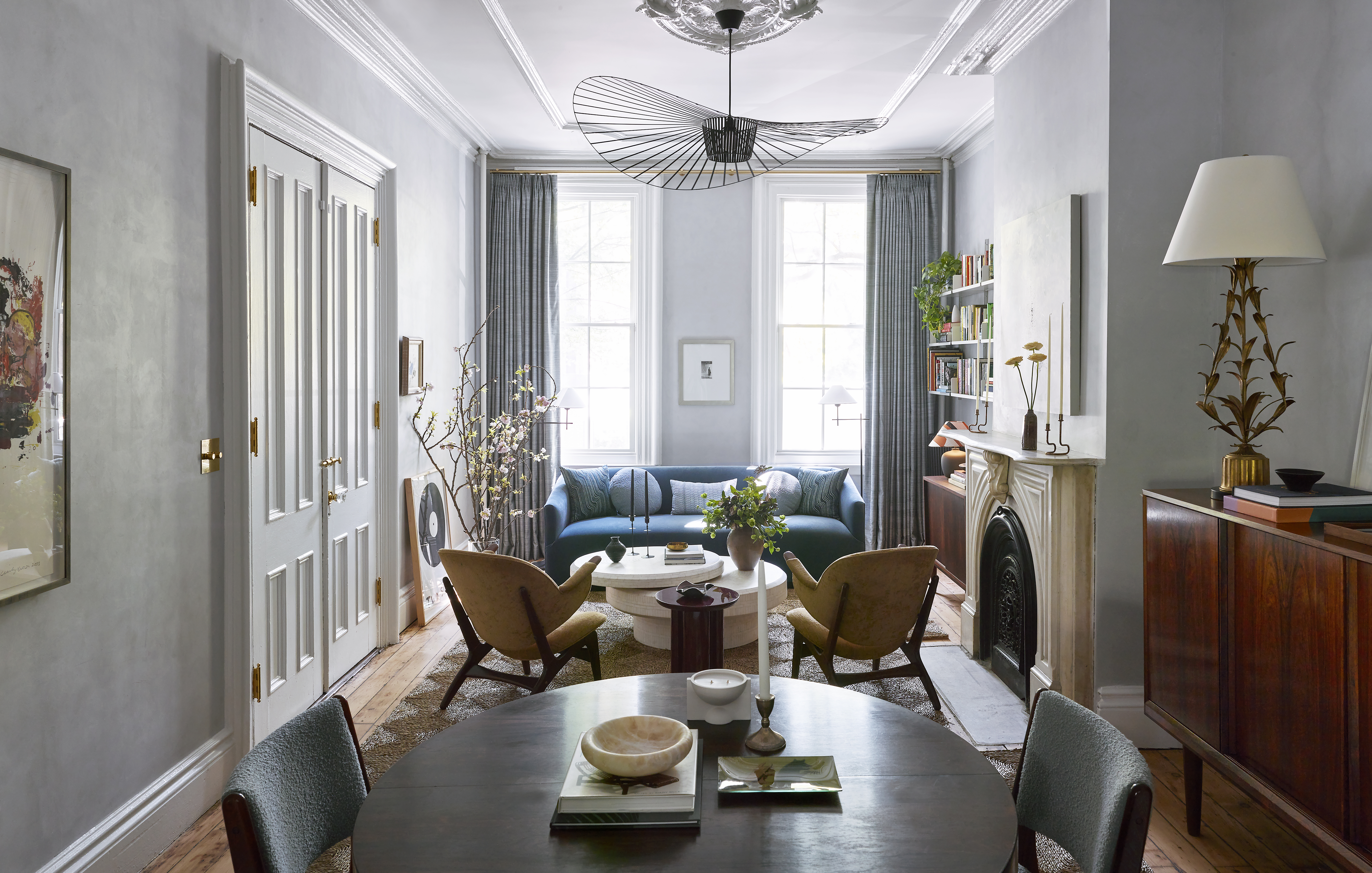





It’s not “hideous”. It has some kitschy details whose cost to replace will be irrelevant to whomever the buyer is. It lacks original details that some people (I’m not one of them) aren’t into. The price is aggressive, considering that you can get a proper four story, 20′ wide house for around the same price. But my bet is that they get within $150k of ask. It’s a very big house in a really nice location with a good layout. And Bed-Stuy, in case anyone hasn’t noticed, is really really expensive.
Fair enough. Bed-Stuy prices have gone way up, and it’s a nice looking block. Drop another $100k and one can remedy most the current style choices.
I agree that’s a lot of recessed lighting! but yes…. I think it would get close to asking…. it’s a beautiful home!
I doubt it. It seems like folks spending that kind of money in Bed-Stuy want Victorian interiors with lots of original detail. Not this ill-conceived mess.
That renovation is hideous. Utterly hideous. That is all.
I have nothing nice to say about the renovation choices. The 1.7mil price seems insane even the 1mil it sold for two years ago seems crazy town.
This site sometimes assumes everyone wants “period details” and to drown in dark wood. Some people prefer a logical arrangement of a modern living room (w/TV, etc.) over a pier mirror and a butler’s pantry or whatever.
.
That said, the double height thing is a bit silly, and hopefully not too expensive to “put back”. Also way too much recessed lighting, in really haphazard patterns (?). All in all, it’s pretty nice, and definitely a lot of space.
Thank You!!! Brooklyn 72
True. If you’re paying 1.7 mil then you probably have an extra 100K around to change the finishes.
My problem is that double height ceiling utter waste of space.