Modern Facade for 574 Carroll
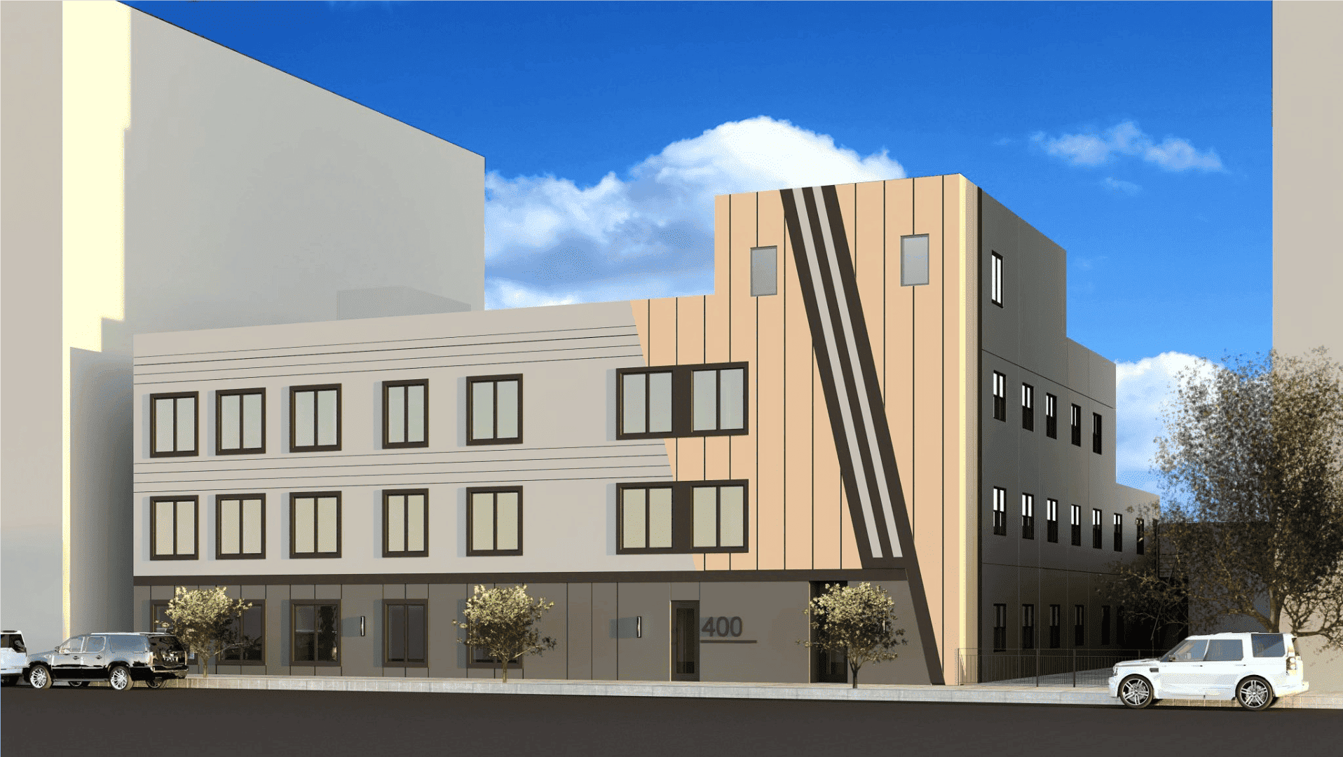
The Gowanus/Park Slope border of Carroll Street has become an interesting breeding ground for modern design. There’s 580 Caroll, if course, and the all-white residence at #461. There’s also 458 Carroll, which you can see after the jump. And this here is 574 Carroll, which looks like it recently got a new facade. It was…


The Gowanus/Park Slope border of Carroll Street has become an interesting breeding ground for modern design. There’s 580 Caroll, if course, and the all-white residence at #461. There’s also 458 Carroll, which you can see after the jump. And this here is 574 Carroll, which looks like it recently got a new facade. It was originally a brick building, and the window configuration has been kept intact. Do you like? GMAP


your house is ugly
@Too Cool – perhaps the seven year-old just isn’t yet jaded and cynical. Appreciating design doesn’t have rules, it’s a feeling, just like appreciating unicorns.
Sorry I keep forgeting to shift the cap lock on my computer. I did mean throw,
I am not at all angry just confused. People comment on architecture as if it were an experiment in silly. One person commented on how her 7 year old thought it looked nice.
Is this now the standard of design we need to reach. A 7 year old thinks unicorns are cool.
architecture and design can be eye catching and inspirational even in the most simplistic of design. Use of lines and symetry are key to any building of substance. I just dont understand how most of what people feel is nice on this blog is at all worthy of compliment. This is design 101 at apex technical. these architects and designers are as visionless as lady gaga and Just as ridiculous. They use simple elements and make it look complicated and cold.
@TOO COOL – I think you meant “throw” (or “THROW,” if you’re shouting). Also, you clearly need to deal with your anger and stop taking it out on houses 🙂
This is good design. It adds the warmth of wood to a drab, formerly blighted neighborhood. The wood should weather well, but if i starts to look bad in 20 years, they can refinish – you have to do that with any wood finished house anyway. Actually, this looks pretty modular, so they can probably just replace the wood altogether in 20 or 30 years.
By the way, brownstone is perhaps the worst building material ever used, it is soft, porous and expensive. It is just one step above adobe.
458 does nothing for me – no design there (as someone said, barf).
574 looks very nice. I like the mix of wood (? – I assume – I suppose it could be terra cotta) and metal panels. Is it an actual (functional) rain screen system? If so, very interesting way of doing it.
The original looks like it was faux brick (in other words, DIBS, the original facade used roofing shingles on the facade!)
Looks like ipe – should age well.
I like it – though I wish they would have done something more with the first floor – more glazing – maybe a glass garage door or something?
anyway, everyone’s a critic…
I’ll be interested to see how the bottom one looks after they finish it- I sort of figure that the lower story has some work yet to do.
Wood stripey one looks nice, though I wonder not as much about the wood wearing (though there’s that) as with crap accumulating behind it. That said, a nice job, and I like the red door.
(too cool- I’d suspect most of america wouldn’t think brownstones look like real houses either.)